I’m a wanna-be physicist; which is probably why one of my most memorable summers was spent at the Sante Fe Institute’s (SFI) Complex Systems Summer School (CSSS) in 2006.
But this is not a recent fad, my International Baccalaureate (IB) courses in 1996 included advanced physics, advanced calculus and graph theory and advanced computer science. One of my favorite books at the time was Numerical Recipes in C. In fact, my extended essay for the IB was actually a software program that determines the degree of randomness of stellar distributions. This required writing code that could determine what constituted a star in any given picture with variable resolution, i.e., pattern recognition. Oh, the good old days.
My interest in the hard sciences explains why I’m still an avid reader of scientific journals, and why I just came across a special edition of The New Journal of Physics focused on visualization in physics. Some excerpts and pictures:
Early on in this twenty-first century, scientific communities are just starting to explore the potential of digital visualization. Whether visualization is used to represent and communicate complex concepts, or to understand and interpret experimental data, or to visualize solutions to complex dynamical equations, the basic tools of visualization are shared in each of these applications and implementations.
The effectiveness of visualization arises by exploiting the unmatched capability of the human eye and visual cortex to process the large information content of images. In a brief glance, we recognize patterns or identify subtle features even in noisy data, something that is difficult or impossible to achieve with more traditional forms of data analysis.
The advantages of visualization found for simulated data also hold for real world data as well. With the application of computerized acquisition many scientific disciplines are witnessing exponential growth rates of the volume of accumulated raw data [c.f., crowdsourcing conflict data], which often makes it daunting to condense the information into a manageable form, a challenge that can be addressed by modern visualization techniques.
This image shows a simulation of the distortion due to a spaceship inside a warp bubble moving past the Earth and Moon, as seen from space.
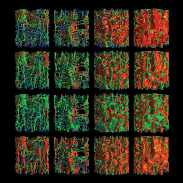
3D images of human bone can help predict fracture risk due to osteoporosis.
As one article in the Special Edition noted, visualization tools can be used to show internal properties of complex networks. As more raw, geo-referenced crisis data is collected, our field of conflict early warning and crisis mapping will need to start making sense of the volumes of new data. This is where the new field of Crisis Mapping Analytics (CMA) begins.
The purpose of CMA is to develop metrics and methods to identify patterns in conflict data over space and time. For more on CMA, see these two blog entries on “Crisis Mapping, Dynamic Visualization and Pattern Recognition” and “Tracking Genocide by Remote Sensing.” My hunch is that we should be talking to our colleagues in the hard sciences for tips on data visualization and patterns analysis.


Just to clarify for anyone who might have completely missed the point about this blog entry, the pictures above have nothing to do with crisis mapping. The point here is about data *visualization* and the fact that different visualization techniques can shed light on patterns that might otherwise remain undetected. The pictures are simply fun.
Wow but bone density is a fascinating connection to crisismapping: visualizing areas of weakness and strength.
What is striking to me is the comparatively anemic approach that most crisis mapping is taking.
Ushahidi, for example, works with maps that contain maybe 100 incident reports. That’s extremely rudimentary when you prop it next to that MRI with millions of data points.
I’d be interested to know how we might expand collaborative crisismapping to include a much broader data set to facilitate actual simulation and prediction (such as, say, the location of hospitals, the capacity of highways, likelihood of flooding).
I want to know what crisismapping looks like in 10 years. Will we ever be able to practice higher level visualizations like this? Simulations? Predictions? At this point I sadly doubt the rigor or utility of the bone density map could ever be realized in web-based crisismapping communities, if only because of the sorry state of open data.
Thanks very much for your comments, Chris. Your thoughts definitely resonate with mine. I should have been more specific about what I had in mind vis-a-vis the future of crisis mapping. Here’s a good example:
https://irevolution.wordpress.com/2008/06/12/tracking-genocide-by-remote-sensing
In other words, it’s not about mapping violent events only but rather the entire context, e.g., the social system, environmental system, economic system and interaction effects. As the above study on tracking genocide shows, there are some interesting possibilities given the immense data sets available.
The author of the study (Russ Schimmer) and I are collaborating to (hopefully) lay the groundwork to expand this kind of crisis mapping to other conflict zones.
Thanks again for taking the time to share your comments.
Oh, well, that’s quite amazing, I just discovered your blog and did not realize that you had already contributed so much to the field. In particular, your conclusion (in the above link) is exactly what I am talking about:
“we should redouble our efforts to pursue a more systematic and rigorous research agenda that focuses explicitly on multi-modal pattern analysis of proxy indicators.”
But my primary interest here is not the research or even the primary sources, but rather the online community development that can happen around that data.
Once we have large, relevant, open data sets, how can we encourage people to collaboratively take the time and have the sense of the urgency to condense that information into a revelatory visualization?
I’m imagining hundreds of people building maps and finding the patterns in the first few hours of a crisis. Following #mumbai on Twitter has had me both depressed and elated in this regard; it seems possible now, but still so far away.