Category Archives: Social Computing

The Future of Crisis Mapping is Finally Here

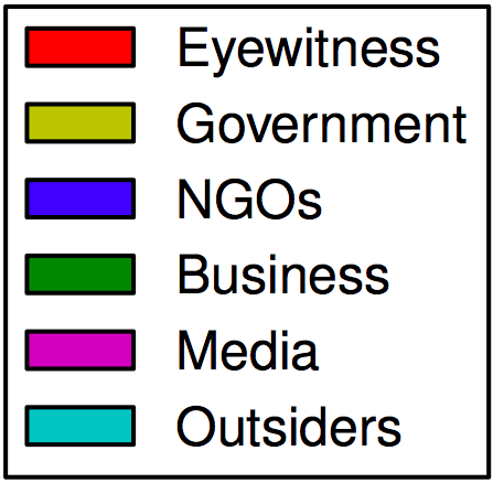
In 2010, I had the opportunity to participate in the very first Disaster Response Working Group meeting held at Facebook. The digital humanitarian response to the tragic Haiti earthquake months earlier was the main point of discussion. Digital Humanitarians at the time had crowdsourced social media monitoring and satellite imagery analysis to create a unique set of crisis maps used by a range of responders. Humanitarian organizations to this day point to the Haiti response as a pivotal milestone in the history of crisis mapping. Today marks an equally important milestone thanks to three humanitarian groups and Facebook.

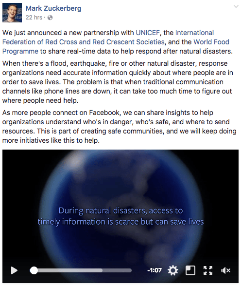
Facebook just announced a new partnership with UNICEF, the International Federation of the Red Cross (IFRC), American Red Cross (ARC) and the World Food Program (WFP) to begin sharing actionable, real-time data that will fill critical data gaps that exist in the first hours of a sudden onset disaster. UNICEF, IFRC, ARC and WFP deserve considerable praise in partnering on such an innovative effort. As the IFRC’s World Disaster Report noted in 2005, having access to information during disasters is equally important as having access to food, water and medicine. But unlike these other commodities, information has a far shorter shelf life. In other words, the value of information depreciates very quickly; information rots fast.

Disaster responders need information that is both reliable and timely. Both are typically scarce after disasters. Saving time can make all the difference. The faster responders get reliable information, the faster they can prioritize and mobilize relief efforts based on established needs. Information takes time to analyze, however, especially unstructured information. Digital Humanitarians encountered this Big Data challenge first hand during the Haiti Earthquake response, and after most disasters since then. Still, online data has the potential to fill crucial data gaps. This is especially true if this data is made available in a structured and responsible way by a company like Facebook; a platform that reaches nearly 2 billion people around the world. And by listening to what aid organizations need, Facebook is providing this information in a format that is actually usable and useful.

Listening to Humanitarian Needs

In early 2016, I began consulting with Facebook on their disaster mapping initiative. One of our first orders of business was to reach out to subject matter experts around the world. It is all too easy for companies in Silicon Valley to speculate about solutions that could be useful to humanitarian organizations. The problem with that approach is that said companies almost never consult seasoned humanitarian professionals in the process. Facebook took a different approach. They spent well over half-a-year meeting with and listening to humanitarian professionals across a number of different aid organizations. Then, they co-developed the solution together with experts from UNCIEF, IFRC, ARC, WFP and myself. This process insured that they built solutions that are actually needed by the intended end users. Other Silicon Valley companies really ought to take the same approach when seeking to support social good efforts in a meaningful manner.

UNICEF, IFRC, ARC and WFP bring extensive expertise and global reach to this new partnership with Facebook. They have both the capacity and strong interest to fully leverage the new disaster maps being made available. And each of these humanitarian organizations have spent a considerable amount of time and energy collaborating with Facebook to iterate on the disaster maps. This type of commitment, partnership and leadership from the humanitarian sector is vital and indeed absolutely necessary to innovate and scale innovation.

One of the areas in which Facebook exercised great care was in applying protection standards. This was another area in which I provided guidance, along with colleagues at the International Committee of the Red Cross (ICRC). We worked closely with Facebook to ensure that their efforts followed established protection protocols in the humanitarian sector. In September 2016, for example, three Facebookers and I participated in a full-day protection workshop organized the ICRC. Facebook presented on the new mapping project – still in its very early stages – and actively solicited feedback from the ICRC and a dozen other humanitarian organizations that participated in the workshop. Facebook noted upfront that they didn’t have all the answers and welcomed as much input as humanitarian professionals could give. As it turns out, they were already well on their way to being fully in line with the ICRC’s own protection protocols.

Facebook also worked with its own internal privacy, security and legal teams to ensure that the datasets it produced were privacy-preserving and consistent with legal standards around the world. This process took a long time. Some insight from the “inside”: I began joking that this process makes the UN look fast. But the fact that Facebook was so careful and meticulous when it came to data privacy was certainly reassuring. To be sure, Facebook developed a rigorous review process to ensure that our applied research was carried out responsibly and ethically. This demonstrates that using data for high-impact, social good projects need not be at odds with privacy—we can achieve both. By using data aggregating and spatial smoothing, for example, we can reduce noise in the data and identify important trends while following its data privacy standards.

Another important area of collaboration very early on focused specifically on data bias. The team at Facebook was careful to emphasize that their data was not a silver bullet – it is representative of people who use Facebook on mobile with Location Services enabled. To this end, one of the areas I worked on closely with Facebook was validation. For example, in an early iteration of the maps, I analyzed mainstream media news reports on the Fort McMurray Fires in Canada and matched them with specific patterns we had observed on Facebook’s maps. The results suggested that Facebook’s geospatial data was providing reliable insights about evacuation and safety on the ground albeit in real time compared to the media reports which were published many hours later.

Facebook Safety Check

Within 24 hours of activating Safety Check, we see that there are far fewer people than usual in the town of Fort McMurray. Areas that are color-coded red reflect much lower numbers of Facebook users there compared to the same time the week before. This makes sense since these locations are affected by the wildfires and have thus been evacuated.

We can use Facebook’s Safety Check data to create live disaster maps that quickly highlight where groups of users are checking in safe, and also where they are not checking in safe. This could provide a number of important proxies such as disaster damage, for example.

Facebook Location Maps

We see that before the crisis began (left plot) people were located in the town in expected numbers, but quickly vacated over the next 24 hour period (map turning red). Even within just an hour and half into the crisis we can tell that users are evacuating the town (the red color indicating low values of people present compared to baseline data). This signal becomes even more clear and consistent as the crisis progresses.

Population here refers to the population of Facebook users. These aggregated maps can provide a proxy for population density and movement before, during and after humanitarian disasters.

In the above video, the blue line that stretches diagonally across the map is Highway 63, which was the primary evacuation route for many in McMurray. The video shows where the general population of Facebook users is moving over time at half-hour intervals. Notice that the blue line becomes even denser between 1 and 3 A.M. local time. Reports from the mainstream media published that afternoon revealed that many drivers ended up having to “camp” along the highway overnight.

Take the map below of the Kaikoura Earthquake in New Zealand as another example. The disaster maps for the earthquake show the location and movement of people in Kaikoura following the disaster. One day after the earthquake, we notice that the population begins to evacuate the city. Using news articles, we can cross validate that residents of Kaikoura were evacuated to Christchurch, 200 kilometers away. Several days later, we notice from the Facebook maps that individuals are starting to return to Kaikoura, presumably to repair and rebuild their community.

It’s still early days, and Facebook plans to work closely alongside their partners to better understand and report biases in the data. This is another reason why Facebook’s partnership with UNICEF, IFRC, ARC and WFP is so critical. These groups have the capacity to compare the disaster maps with other datasets, validate the maps with field surveys, and support Facebook in understanding how to address issues of representativeness. One approach they are exploring is to compare the disaster maps to the population density datasets that Facebook has already open-sourced. By making this comparison, we can clearly communicate any areas that are likely to be inadequately covered by the disaster data. They are also working with Facebook’s Connectivity Lab to develop bias-correcting solutions based on maps of cell phone connectivity. For more on social media, bias and crisis mapping, see Chapter 2 of Digital Humanitarians.

Moving Forward

Our humanitarian partners are keen to use Facebook’s new solution in their relief efforts. Thanks to Facebook’s data, we can create a series of unique maps that in turn provide unique insights and do so in real-time. These maps can be made available right away and updated at 15 minute intervals if need be. Let me repeat that: every 15 minutes. This is the first time in history that humanitarian organizations will have access to such high frequency, privacy-preserving structured data powered by some 1.86 billion online users.

There is no doubt that responders would’ve had far more situational awareness and far more quickly had these crisis maps existed in the wake of Haiti’s tragic earthquake in 2010. Since the maps aggregate Facebook data to administrative boundaries, humanitarian partners can also integrate this unique dataset into their own systems. During the first Facebook Disaster Working Group meeting back in 2010, we asked ourselves how Facebook might leverage it’s own data to create unique maps to help aid organizations reduce suffering and loss of life. Today, not only do we have an answer to this question, we also have the beginnings of an operational solution that humanitarians can use directly.

Facebook’s new disaster mapping solution is not a silver bullet, however; all my colleagues at Facebook recognize this full well, as do our humanitarian partners. These maps simply serve as new, unique and independent sources of real-time data and insights for humanitarian organizations. The number of Facebook users has essentially doubled since the Haiti Earthquake, nearing 2 billion users today. The more people around the planet connect and share on Facebook, the more insights responders gain on how best to carry out relief efforts during major disasters. This information is a public good that has the potential to save lives, and it’s crucial that insights derived from the data be made available to those who can put it to use. I sincerely hope that other Silicon Valley companies take note of these efforts and following in Facebook’s footsteps.

As a next step, Facebook is looking to both international and local humanitarian partners to help improve, validate and measure the impact of these new disaster maps. As the Facebook team works to validate the maps with the humanitarian community, they also hope to make the maps available to aid organizations though a dedicated API and Visualization tool. Interested organizations will be asked to follow a simple application process to gain access to the disaster maps.

Facebook disaster maps are really unique and we’ve only begun to scratch the surface vis-à-vis the different humanitarian efforts these maps can inform. For example, my team and I at WeRobotics were recently in the Dominican Republic (DR) where we ran a full-fledged disaster response exercise with the country’s Emergency Operations Center (EOC) and the World Food Program (WFP). The purpose of the simulation—which focused on searching for survivors and assessing disaster damage—was to develop and test coordination mechanisms to facilitate the rapid deployment of small drones or Unmanned Aerial Vehicles (UAVs). As the drone pilots began to program their drones to carry out the aerial surveys, I turned to my WFP colleague Gabriela and said:

“What if, during the next disaster, we used Facebook’s Safety Check Map to prioritize which areas the drones should search? What if we used Facebook’s Population Map to prioritize aerial surveys of areas that are being abandoned, possibly to due to collapsed buildings or other types of infrastructure damage? Since the Facebook maps are available in near real-time, we could program the drone flights within minutes of a disaster. What do you think?”

Gaby looked back at the drones and said:

“Wow. This would change everything.”


New Findings: Rapid Assessment of Disaster Damage Using Social Media

The latest peer-reviewed, scientific research on social media & crisis computing has just been published in the prestigious journal, Science. The authors pose a question that many of us in the international humanitarian space have been asking, debating and answering since 2009: Can social media data aid in disaster response and damage assessment?

hurricane-sandy-social-media
To answer this question, the authors of the new study carry out “a multiscale analysis of Twitter activity before, during, and after Hurricane Sandy” and “examine the online response of 50 metropolitan areas of the US.” They find a “strong relationship between proximity to Sandy’s path and hurricane-related social media activity.” In addition, they “show that real and perceived threats, together with physical disaster effects, are directly observable through the intensity and composition of Twitter’s message stream.”

Screen Shot 2016-03-17 at 12.18.11 PM

What’s more, they actually “demonstrate that per-capita Twitter activity strongly correlates with the per-capita economic damage inflicted by the hurricane.” The authors found these results to hold true for a “wide range of [US-based] disasters and suggest that massive online social networks can be used for rapid assessment of damage caused by a large-scale disaster.”

Screen Shot 2016-03-17 at 12.26.51 PM

Unlike the vast majority of crisis computing studies in the scientific literature, this is one of the few (perhaps the only?) study of its kind that uses actual post-disaster damage data, i.e. actual ground-truthing, to demonstrate that “the per-capita number of Twitter messages corresponds directly to disaster-inflicted monetary damage.” What’s more, “The correlation is especially pronounced for persistent post-disaster activity and is weakest at the peak of the disaster.”

Screen Shot 2016-03-17 at 1.16.11 PM

The authors thus conclude that social media is a “viable platform for preliminary rapid damage assessment in the chaotic time immediately after a disaster.” As such, their results suggest that “officials should pay attention to normalized activity levels, rates of original content creation, and rates of content rebroadcast to identify the hardest hit areas in real time. Immediately after a disaster, they should focus on persistence in activity levels to assess which areas are likely to need the most assistance.”

Screen Shot 2016-03-17 at 12.37.02 PM

In sum, the authors found that “Twitter activity during a large-scale natural disaster—in this instance Hurricane Sandy—is related to the proximity of the region to the path of the hurricane. Activity drops as the distance from the hurricane increases; after a distance of approximately 1200 to 1500 km, the influence of proximity disappears. High-level analysis of the composition of the message stream reveals additional findings. Geo-enriched data (with location of tweets inferred from users’ profiles) show that the areas close to the disaster generate more original content […].”

Five years ago, professional humanitarians were still largely dismissive of social media’s added value in disasters. Three years ago, it was the turn of ivory tower academics in the social sciences to dismiss the value added of social media for disaster response. The criticisms focused on the notion that reports posted on social media were simply untrustworthy and hardly representative. The above peer-reviewed scientific study dismisses these limitations as inconsequential.

Screen Shot 2016-03-17 at 1.11.17 PM

QED – Goodbye Doha, Hello Adventure!

Quod Erat Demonstrandum (QED) is Latin for “that which had to be proven.” This abbreviation was traditionally used at the end of mathematical proofs to signal the completion of said proofs. I joined the Qatar Computing Research Institute (QCRI) well over 3 years ago with a very specific mission and mandate: to develop and deploy next generation humanitarian technologies. So I built the Institute’s Social Innovation Program from the ground up and recruited the majority of the full-time experts (scientists, engineers, research assistants, interns & project manager) who have become integral to the Program’s success. During these 3+years, my team and I partnered directly with humanitarian and development organizations to empirically prove that methods from advanced computing can be used to make sense of Big (Crisis) Data. The time has thus come to add “QED” to the end of that proof and move on to new adventures. But first a reflection.

Over the past 3.5 years, my team and I at QCRI developed free and open source solutions powered by crowdsourcing and artificial intelligence to make sense of Tweets, text messages, pictures, videos, satellite and aerial imagery for a wide range of humanitarian and development projects. We co-developed and co-deployed these platforms (AIDR and MicroMappers) with the United Nations and the World Bank in response to major disasters such as Typhoons Haiyan and RubyCyclone Pam and both the Nepal & Chile Earthquakes. In addition, we carried out peer-reviewed, scientific research on these deployments to better understand how to meet the information needs of our humanitarian partners. We also tackled the information reliability question, experimenting with crowd-sourcing (Verily) and machine learning (TweetCred) to assess the credibility of information generated during disasters. All of these initiatives were firsts in the humanitarian technology space.

We later developed AIDR-SMS to auto-classify text messages; a platform that UNICEF successfully tested in Zambia and which the World Food Program (WFP) and the International Federation of the Red Cross (IFRC) now plan to pilot. AIDR was also used to monitor a recent election, and our partners are now looking to use AIDR again for upcoming election monitoring efforts. In terms of MicroMappers, we extended the platform (considerably) in order to crowd-source the analysis of oblique aerial imagery captured via small UAVs, which was another first in the humanitarian space. We also teamed up with excellent research partners to crowdsource the analysis of aerial video footage and to develop automated feature-detection algorithms for oblique imagery analysis based on crowdsourced results derived from MicroMappers. We developed these Big Data solutions to support damage assessment efforts, food security projects and even this wildlife protection initiative.

In addition to the above accomplishments, we launched the Internet Response League (IRL) to explore the possibility of leveraging massive multiplayer online games to process Big Crisis Data. Along similar lines, we developed the first ever spam filter to make sense of Big Crisis Data. Furthermore, we got directly engaged in the field of robotics by launching the Humanitarian UAV Network (UAViators), yet another first in the humanitarian space. In the process, we created the largest repository of aerial imagery and videos of disaster damage, which is ripe for cutting-edge computer vision research. We also spearheaded the World Bank’s UAV response to Category 5 Cyclone Pam in Vanuatu and also directed a unique disaster recovery UAV mission in Nepal after the devastating earthquakes. (I took time off from QCRI to carry out both of these missions and also took holiday time to support UN relief efforts in the Philippines following Typhoon Haiyan in 2013). Lastly, on the robotics front, we championed the development of international guidelines to inform the safe, ethical & responsible use of this new technology in both humanitarian and development settings. To be sure, innovation is not just about the technology but also about crafting appropriate processes to leverage this technology. Hence also the rationale behind the Humanitarian UAV Experts Meetings that we’ve held at the United Nations Secretariat, the Rockefeller Foundation and MIT.

All  of the above pioneering-and-experimental projects have resulted in extensive media coverage, which has placed QCRI squarely on the radar of international humanitarian and development groups. This media coverage has included the New York Times, Washington Post, Wall Street Journal, CNN, BBC News, UK Guardian, The Economist, Forbes and Times Magazines, New Yorker, NPR, Wired, Mashable, TechCrunch, Fast Company, Nature, New Scientist, Scientific American and more. In addition, our good work and applied research has been featured in numerous international conference presentations and keynotes. In sum, I know of no other institute for advanced computing research that has contributed this much to the international humanitarian space in terms of thought-leadership, strategic partnerships, applied research and operational expertise through real-world co-deployments during and after major disasters.

There is, of course, a lot more to be done in the humanitarian technology space. But what we have accomplished over the past 3 years clearly demonstrates that techniques from advanced computing can indeed provide part of the solution to the pressing Big Data challenge that humanitarian & development organizations face. At the same time, as I wrote in the concluding chapter of my new book, Digital Humanitarians, solving the Big Data challenge does not alas imply that international aid organizations will actually make use of the resulting filtered data or any other data for that matter—even if they ask for this data in the first place. So until humanitarian organizations truly shift towards both strategic and tactical evidence-based analysis & data-driven decision-making, this disconnect will surely continue unabated for many more years to come.

Reflecting on the past 3.5 years at QCRI, it is crystal clear to me that the number one most important lesson I (re)learned is that you can do anything if you have an outstanding, super-smart and highly dedicated team that continually goes way above and beyond the call of duty. It is one thing for me to have had the vision for AIDR, MicroMappers, IRL, UAViators, etc., but vision alone does not amount to much. Implementing said vision is what delivers results and learning. And I simply couldn’t have asked for a more talented & stellar team to translate these visions into reality over the past 3+years. You each know who you are, partners included; it has truly been a privilege and honor working with you. I can’t wait to see what you do next at/with QCRI. Thank you for trusting me; thank you for sharing my vision; thanks for your sense of humor, and thank you for your dedication and loyalty to science and social innovation.

So what’s next for me? I’ll be lining up independent consulting work with several organizations (likely including QCRI). In short, I’ll be open for business. I’m also planning to work on a new project that I’m very excited about, so stay tuned for updates; I’ll be sure to blog about this new adventure when the time is right. For now, I’m busy wrapping up my work as Director of Social Innovation at QCRI and working with the best team there is. QED.

Social Media for Disaster Response – Done Right!

To say that Indonesia’s capital is prone to flooding would be an understatement. Well over 40% of Jakarta is at or below sea level. Add to this a rapidly growing population of over 10 million and you have a recipe for recurring disasters. Increasing the resilience of the city’s residents to flooding is thus imperative. Resilience is the capacity of affected individuals to self-organize effectively, which requires timely decision-making based on accurate, actionable and real-time information. But Jakarta is also flooded with information during disasters. Indeed, the Indonesian capital is the world’s most active Twitter city.

JK1

So even if relevant, actionable information on rising flood levels could somehow be gleaned from millions of tweets in real-time, these reports could be inaccurate or completely false. Besides, only 3% of tweets on average are geo-located, which means any reliable evidence of flooding reported via Twitter is typically not actionable—that is, unless local residents and responders know where waters are rising, they can’t take tactical action in a timely manner. These major challenges explain why most discount the value of social media for disaster response.

But Digital Humanitarians in Jakarta aren’t your average Digital Humanitarians. These Digital Jedis recently launched one of the most promising humanitarian technology initiatives I’ve seen in years. Code named Peta Jakarta, the project takes social media and digital humanitarian action to the next level. Whenever someone posts a tweet with the word banjir (flood), they receive an automated tweet reply from @PetaJkt inviting them to confirm whether they see signs of flooding in their area: “Flooding? Enable geo-location, tweet @petajkt #banjir and check petajakarta.org.” The user can confirm their report by turning geo-location on and simply replying with the keyword banjir or flood. The result gets added to a live, public crisis map, like the one below.

Credit: Peta Jakarta

Over the course of the 2014/2015 monsoon season, Peta Jakarta automatically sent 89,000 tweets to citizens in Jakarta as a call to action to confirm flood conditions. These automated invitation tweets served to inform the user about the project and linked to the video below (via Twitter Cards) to provide simple instructions on how to submit a confirmed report with approximate flood levels. If a Twitter user forgets to turn on the geo-location feature of their smartphone, they receive an automated tweet reminding them to enable geo-location and resubmit their tweet. Finally, the platform “generates a thank you message confirming the receipt of the user’s report and directing them to PetaJakarta.org to see their contribution to the map.” Note that the “overall aim of sending programmatic messages is not to simply solicit a high volume of replies, but to reach active, committed citizen-users willing to participate in civic co-management by sharing nontrivial data that can benefit other users and government agencies in decision-making during disaster scenarios.”

A report is considered verified when a confirmed geo-tagged tweet includes a picture of the flooding, like in the tweet below. These confirmed and verified tweets get automatically mapped and also shared with Jakarta’s Emergency Management Agency (BPBD DKI Jakarta). The latter are directly involved in this initiative since they’re “regularly faced with the difficult challenge of anticipating & responding to floods hazards and related extreme weather events in Jakarta.” This direct partnership also serves to limit the “Data Rot Syndrome” where data is gathered but not utilized. Note that Peta Jakarta is able to carry out additional verification measures by manually assessing the validity of tweets and pictures by cross-checking other Twitter reports from the same district and also by monitoring “television and internet news sites, to follow coverage of flooded areas and cross-check reports.”

Screen Shot 2015-06-29 at 2.38.54 PM

During the latest monsoon season, Peta Jakarta “received and mapped 1,119 confirmed reports of flooding. These reports were formed by 877 users, indicating an average tweet to user ratio of 1.27 tweets per user. A further 2,091 confirmed reports were received without the required geolocation metadata to be mapped, highlighting the value of the programmatic geo-location ‘reminders’ […]. With regard to unconfirmed reports, Peta Jakarta recorded and mapped a total of 25,584 over the course of the monsoon.”

The Live Crisis Maps could be viewed via two different interfaces depending on the end user. For local residents, the maps could be accessed via smartphone with the visual display designed specifically for more tactical decision-making, showing flood reports at the neighborhood level and only for the past hour.

PJ2

For institutional partners, the data is visualized in more aggregate terms for strategic decision-making based trends-analysis and data integration. “When viewed on a desktop computer, the web-application scaled the map to show a situational overview of the city.”

Credit: Peta Jakarta

Peta Jakarta has “proven the value and utility of social media as a mega-city methodology for crowdsourcing relevant situational information to aid in decision-making and response coordination during extreme weather events.” The initiative enables “autonomous users to make independent decisions on safety and navigation in response to the flood in real-time, thereby helping increase the resilience of the city’s residents to flooding and its attendant difficulties.” In addition, by “providing decision support at the various spatial and temporal scales required by the different actors within city, Peta Jakarta offers an innovative and inexpensive method for the crowdsourcing of time-critical situational information in disaster scenarios.” The resulting confirmed and verified tweets were used by BPBD DKI Jakarta to “cross-validate formal reports of flooding from traditional data sources, supporting the creation of information for flood assessment, response, and management in real-time.”


My blog post is based several conversations I had with Peta Jakarta team and on this white paper, which was just published a week ago. The report runs close to 100 pages and should absolutely be considered required reading for all Digital Humanitarians and CrisisMappers. The paper includes several dozen insights which a short blog post simply cannot do justice to. If you can’t find the time to read the report, then please see the key excerpts below. In a future blog post, I’ll describe how the Peta Jakarta team plans to leverage UAVs to complement social media reporting.

  • Extracting knowledge from the “noise” of social media requires designed engagement and filtering processes to eliminate unwanted information, reward valuable reports, and display useful data in a manner that further enables users, governments, or other agencies to make non-trivial, actionable decisions in a time-critical manner.
  • While the utility of passively-mined social media data can offer insights for offline analytics and derivative studies for future planning scenarios, the critical issue for frontline emergency responders is the organization and coordination of actionable, real-time data related to disaster situations.
  • User anonymity in the reporting process was embedded within the Peta Jakarta project. Whilst the data produced by Twitter reports of flooding is in the public domain, the objective was not to create an archive of users who submitted potentially sensitive reports about flooding events, outside of the Twitter platform. Peta Jakarta was thus designed to anonymize reports collected by separating reports from their respective users. Furthermore, the text content of tweets is only stored when the report is confirmed, that is, when the user has opted to send a message to the @petajkt account to describe their situation. Similarly, when usernames are stored, they are encrypted using a one-way hash function.
  • In developing the Peta Jakarta brand as the public face of the project, it was important to ensure that the interface and map were presented as community-owned, rather than as a government product or academic research tool. Aiming to appeal to first adopters—the young, tech-savvy Twitter-public of Jakarta—the language used in all the outreach materials (Twitter replies, the outreach video, graphics, and print advertisements) was intentionally casual and concise. Because of the repeated recurrence of flood events during the monsoon, and the continuation of daily activities around and through these flood events, the messages were intentionally designed to be more like normal twitter chatter and less like public service announcements.
  • It was important to design the user interaction with PetaJakarta.org to create a user experience that highlighted the community resource element of the project (similar to the Waze traffic app), rather than an emergency or information service. With this aim in mind, the graphics and language are casual and light in tone. In the video, auto-replies, and print advertisements, PetaJakarta.org never used alarmist or moralizing language; instead, the graphic identity is one of casual, opt-in, community participation.
  • The most frequent question directed to @petajkt on Twitter was about how to activate the geo-location function for tweets. So far, this question has been addressed manually by sending a reply tweet with a graphic instruction describing how to activate geo-location functionality.
  • Critical to the success of the project was its official public launch with, and promotion by, the Governor. This endorsement gave the platform very high visibility and increased legitimacy among other government agencies and public users; it also produced a very successful media event, which led substantial media coverage and subsequent public attention.

  • The aggregation of the tweets (designed to match the spatio-temporal structure of flood reporting in the system of the Jakarta Disaster Management Agency) was still inadequate when looking at social media because it could result in their overlooking reports that occurred in areas of especially low Twitter activity. Instead, the Agency used the @petajkt Twitter stream to direct their use of the map and to verify and cross-check information about flood-affected areas in real-time. While this use of social media was productive overall, the findings from the Joint Pilot Study have led to the proposal for the development of a more robust Risk Evaluation Matrix (REM) that would enable Peta Jakarta to serve a wider community of users & optimize the data collection process through an open API.
  • Developing a more robust integration of social media data also means leveraging other potential data sets to increase the intelligence produced by the system through hybridity; these other sources could include, but are not limited to, government, private sector, and NGO applications (‘apps’) for on- the-ground data collection, LIDAR or UAV-sourced elevation data, and fixed ground control points with various types of sensor data. The “citizen-as- sensor” paradigm for urban data collection will advance most effectively if other types of sensors and their attendant data sources are developed in concert with social media sourced information.

A Force for Good: How Digital Jedis are Responding to the Nepal Earthquake (Updated)

Digital Humanitarians are responding in full force to the devastating earthquake that struck Nepal. Information sharing and coordination is taking place online via CrisisMappers and on multiple dedicated Skype chats. The Standby Task Force (SBTF), Humanitarian OpenStreetMap (HOT) and others from the Digital Humanitarian Network (DHN) have also deployed in response to the tragedy. This blog post provides a quick summary of some of these digital humanitarian efforts along with what’s coming in terms of new deployments.

Update: A list of Crisis Maps for Nepal is available below.

Credit: http://www.thestar.com/content/dam/thestar/uploads/2015/4/26/nepal2.jpg

At the request of the UN Office for the Coordination of Humanitarian Affairs (OCHA), the SBTF is using QCRI’s MicroMappers platform to crowdsource the analysis of tweets and mainstream media (the latter via GDELT) to rapidly 1) assess disaster damage & needs; and 2) Identify where humanitarian groups are deploying (3W’s). The MicroMappers CrisisMaps are already live and publicly available below (simply click on the maps to open live version). Both Crisis Maps are being updated hourly (at times every 15 minutes). Note that MicroMappers also uses both crowdsourcing and Artificial Intelligence (AIDR).

Update: More than 1,200 Digital Jedis have used MicroMappers to sift through a staggering 35,000 images and 7,000 tweets! This has so far resulted in 300+ relevant pictures of disaster damage displayed on the Image Crisis Map and over 100 relevant disaster tweets on the Tweet Crisis Map.

Live CrisisMap of pictures from both Twitter and Mainstream Media showing disaster damage:

MM Nepal Earthquake ImageMap

Live CrisisMap of Urgent Needs, Damage and Response Efforts posted on Twitter:

MM Nepal Earthquake TweetMap

Note: the outstanding Kathmandu Living Labs (KLL) team have also launched an Ushahidi Crisis Map in collaboration with the Nepal Red Cross. We’ve already invited invited KLL to take all of the MicroMappers data and add it to their crisis map. Supporting local efforts is absolutely key.

WP_aerial_image_nepal

The Humanitarian UAV Network (UAViators) has also been activated to identify, mobilize and coordinate UAV assets & teams. Several professional UAV teams are already on their way to Kathmandu. The UAV pilots will be producing high resolution nadir imagery, oblique imagery and 3D point clouds. UAViators will be pushing this imagery to both HOT and MicroMappers for rapid crowdsourced analysis (just like was done with the aerial imagery from Vanuatu post Cyclone Pam, more on that here). A leading UAV manufacturer is also donating several UAVs to UAViators for use in Nepal. These UAVs will be sent to KLL to support their efforts. In the meantime, DigitalGlobePlanet Labs and SkyBox are each sharing their satellite imagery with CrisisMappers, HOT and others in the Digital Humanitarian Network.

There are several other efforts going on, so the above is certainly not a complete list but simply reflect those digital humanitarian efforts that I am involved in or most familiar with. If you know of other major efforts, then please feel free to post them in the comments section. Thank you. More on the state of the art in digital humanitarian action in my new book, Digital Humanitarians.


List of Nepal Crisis Maps

Please add to the list below by posting new links in this Google Spreadsheet. Also, someone should really create 1 map that pulls from each of the listed maps.

Code for Nepal Casualty Crisis Map:
http://bit.ly/1IpUi1f 

DigitalGlobe Crowdsourced Damage Assessment Map:
http://goo.gl/bGyHTC

Disaster OpenRouteService Map for Nepal:
http://www.openrouteservice.org/disaster-nepal

ESRI Damage Assessment Map:
http://arcg.is/1HVNNEm

Harvard WorldMap Tweets of Nepal:
http://worldmap.harvard.edu/maps/nepalquake 

Humanitarian OpenStreetMap Nepal:
http://www.openstreetmap.org/relation/184633

Kathmandu Living Labs Crowdsourced Crisis Map: http://www.kathmandulivinglabs.org/earthquake

MicroMappers Disaster Image Map of Damage:
http://maps.micromappers.org/2015/nepal/images/#close

MicroMappers Disaster Damage Tweet Map of Needs:
http://maps.micromappers.org/2015/nepal/tweets

NepalQuake Status Map:
http://www.nepalquake.org/status-map

UAViators Crisis Map of Damage from Aerial Pics/Vids:
http://uaviators.org/map (takes a while to load)

Visions SDSU Tweet Crisis Map of Nepal:
http://vision.sdsu.edu/ec2/geoviewer/nepal-kathmandu#

Artificial Intelligence for Monitoring Elections (AIME)

AIME logo

I published a blog post with the same title a good while back. Here’s what I wrote at the time:

Citizen-based, crowdsourced election observation initiatives are on the rise. Leading election monitoring organizations are also looking to leverage citizen-based reporting to complement their own professional election monitoring efforts. Meanwhile, the information revolution continues apace, with the number of new mobile phone subscriptions up by over 1 billion in just the past 36 months alone. The volume of election-related reports generated by “the crowd” is thus expected to grow significantly in the coming years. But international, national and local election monitoring organizations are completely unprepared to deal with the rise of Big (Election) Data.

I thus introduced a new project to “develop a free and open source platform to automatically filter relevant election reports from the crowd.” I’m pleased to report that my team and I at QCRI have just tested AIME during an actual election for the very first time—the 2015 Nigerian Elections. My QCRI Research Assistant Peter Mosur (co-author of this blog post) collaborated directly with Oludotun Babayemi from Clonehouse Nigeria and Chuks Ojidoh from the Community Life Project & Reclaim Naija to deploy and test the AIME platform.

AIME is a free and open source (experimental) solution that combines crowd-sourcing with Artificial Intelligence to automatically identify tweets of interest during major elections. As organizations engaged in election monitoring well know, there can be a lot chatter on social media as people rally behind their chosen candidates, announce this to the world, ask their friends and family who they will be voting for, and updating others when they have voted while posting about election related incidents they may have witnessed. This can make it rather challenging to find reports relevant to election monitoring groups.

WP1

Election monitors typically monitor instances of violence, election rigging, and voter issues. These incidents are monitored because they reveal problems that arise with the elections. Election monitoring initiatives such as Reclaim Naija & Uzabe also monitor several other type of incidents but for the purposes of testing the AIME platform, we selected three types of events mentioned above. In order to automatically identify tweets related to these events, one must first provide AIME with example tweets. (Of course, if there is no Twitter traffic to begin with, then there won’t be much need for AIME, which is precisely why we developed an SMS extension that can be used with AIME).

So where does the crowdsourcing comes in? Users of AIME can ask the crowd to tag tweets related to election-violence, rigging and voter issues by simply clicking on tagging tweets posted to the AIME platform with the appropriate event type. (Several quality control mechanisms are built in to ensure data quality. Also, one does not need to use crowdsourcing to tag the tweets; this can be done internally as well or instead). What AIME does next is use a technique from Artificial Intelligence (AI) called statistical machine learning to understand patterns in the human-tagged tweets. In other words, it begins to recognize which tweets belong in which category type—violence, rigging and voter issues. AIME will then auto-classify new tweets that are related to these categories (and can auto-classify around 2 millions tweets or text messages per minute).

Screen Shot 2015-04-10 at 8.33.08 AM

Before creating our automatic classifier for the Nigerian Elections, we first needed to collect examples of tweets related to election violence, rigging and voter issues in order to teach AIME. Oludotun Babayemi and Chuks Ojidoh kindly provided the expert local knowledge needed to identify the keywords we should be following on Twitter (using AIME). They graciously gave us many different keywords to use as well as a list of trusted Twitter accounts to follow for election-related messages. (Due to difficulties with AIME, we were not able to use the trusted accounts. In addition, many of the suggested keywords were unusable since words like “aggressive”, “detonate”, and “security” would have resulted in large amount of false positives).

Here is the full list of keywords used by AIME:

Nigeria elections, nigeriadecides, Nigeria decides, INEC, GEJ, Change Nigeria, Nigeria Transformation, President Jonathan, Goodluck Jonathan, Sai Buhari, saibuhari, All progressives congress, Osibanjo, Sambo, Peoples Democratic Party, boko haram, boko, area boys, nigeria2015, votenotfight, GEJwinsit, iwillvoteapc, gmb2015, revoda, thingsmustchange,  and march4buhari   

Out of this list, “NigeriaDecides” was by far the most popular keyword used in the elections. It accounted for over 28,000 Tweets of a batch of 100,000. During the week leading up to the elections, AIME collected roughly 800,000 Tweets. Over the course of the elections and the few days following, the total number of collected Tweets jumped to well over 4 million.

We sampled just a handful of these tweets and manually tagged those related to violence, rigging and other voting issues using AIME. “Violence” was described as “threats, riots, arming, attacks, rumors, lack of security, vandalism, etc.” while “Election Rigging” was described as “Ballot stuffing, issuing invalid ballot papers, voter impersonation, multiple voting, ballot boxes destroyed after counting, bribery, lack of transparency, tampered ballots etc.” Lastly, “Voting Issues” was defined as “Polling station logistics issues, technical issues, people unable to vote, media unable to enter, insufficient staff, lack of voter assistance, inadequate voting materials, underage voters, etc.”

Any tweet that did not fall into these three categories was tagged as “Other” or “Not Related”. Our Election Classifiers were trained with a total of 571 human-tagged tweets which enabled AIME to automatically classify well over 1 million tweets (1,263,654 to be precise). The results in the screenshot below show accurate AIME was at auto-classifying tweets based on the different event types define earlier. AUC is what captures the “overall accuracy” of AIME’s classifiers.

AIME_Nigeria

AIME was rather good at correctly tagging tweets related to “Voting Issues” (98% accuracy) but drastically poor at tagging related to “Election Rigging” (0%). This is not AIME’s fault : ) since it only had 8 examples to learn from. As for “Violence”, the accuracy score was 47%, which is actually surprising given that AIME only had 14 human-tagged examples to learn from. Lastly, AIME did fairly well at auto-classifying unrelated tweets (accuracy of 86%).

Conclusion: this was the first time we tested AIME during an actual election and we’ve learned a lot in the process. The results are not perfect but enough to press on and experiment further with the AIME platform. If you’d like to test AIME yourself (and if you fully recognize that the tool is experimental and still under development, hence not perfect), then feel free to get in touch with me here. We have 2 slots open for testing. In the meantime, big thanks to my RA Peter for spearheading both this deployment and the subsequent research.

Artificial Intelligence Powered by Crowdsourcing: The Future of Big Data and Humanitarian Action

There’s no point spewing stunning statistics like this recent one from The Economist, which states that 80% of adults will have access to smartphones before 2020. The volume, velocity and variety of digital data will continue to skyrocket. To paraphrase Douglas Adams, “Big Data is big. You just won’t believe how vastly, hugely, mind-bogglingly big it is.”

WP1

And so, traditional humanitarian organizations have a choice when it comes to battling Big Data. They can either continue business as usual (and lose) or get with the program and adopt Big Data solutions like everyone else. The same goes for Digital Humanitarians. As noted in my new book of the same title, those Digital Humanitarians who cling to crowdsourcing alone as their pièce de résistance will inevitably become the ivy-laden battlefield monuments of 2020.

bookcover

Big Data comprises a variety of data types such as text, imagery and video. Examples of text-based data includes mainstream news articles, tweets and WhatsApp messages. Imagery includes Instagram, professional photographs that accompany news articles, satellite imagery and increasingly aerial imagery as well (captured by UAVs). Television channels, Meerkat and YouTube broadcast videos. Finding relevant, credible and actionable pieces of text, imagery and video in the Big Data generated during major disasters is like looking for a needle in a meadow (haystacks are ridiculously small datasets by comparison).

Humanitarian organizations, like many others in different sectors, often find comfort in the notion that their problems are unique. Thankfully, this is rarely true. Not only is the Big Data challenge not unique to the humanitarian space, real solutions to the data deluge have already been developed by groups that humanitarian professionals at worst don’t know exist and at best rarely speak with. These groups are already using Artificial Intelligence (AI) and some form of human input to make sense of Big Data.

Data digital flow

How does it work? And why do you still need some human input if AI is already in play? The human input, which can be via crowdsourcing or a few individuals is needed to train the AI engine, which uses a technique from AI called machine learning to learn from the human(s). Take AIDR, for example. This experimental solution, which stands for Artificial Intelligence for Disaster Response, uses AI powered by crowdsourcing to automatically identify relevant tweets and text messages in an exploding meadow of digital data. The crowd tags tweets and messages they find relevant and the AI engine learns to recognize the relevance patterns in real-time, allowing AIDR to automatically identify future tweets and messages.

As far as we know, AIDR is the only Big Data solution out there that combines crowdsourcing with real-time machine learning for disaster response. Why do we use crowdsourcing to train the AI engine? Because speed is of the essence in disasters. You need a crowd of Digital Humanitarians to quickly tag as many tweets/messages as possible so that AIDR can learn as fast as possible. Incidentally, once you’ve created an algorithm that accurately detects tweets relaying urgent needs after a Typhoon in the Philippines, you can use that same algorithm again when the next Typhoon hits (no crowd needed).

What about pictures? After all, pictures are worth a thousand words. Is it possible to combine artificial intelligence with human input to automatically identify pictures that show infrastructure damage? Thanks to recent break-throughs in computer vision, this is indeed possible. Take Metamind, for example, a new startup I just met with in Silicon Valley. Metamind is barely 6 months old but the team has already demonstrated that one can indeed automatically identify a whole host of features in pictures by using artificial intelligence and some initial human input. The key is human input since this is what trains the algorithms. The more human-generated training data you have, the better your algorithms.

My team and I at QCRI are collaborating with Metamind to create algorithms that can automatically detect infrastructure damage in pictures. The Silicon Valley start-up is convinced that we’ll be able to create a highly accurate algorithms if we have enough training data. This is where MicroMappers comes in. We’re already using MicroMappers to create training data for tweets and text messages (which is what AIDR uses to create algorithms). In addition, we’re already using MicroMappers to tag and map pictures of disaster damage. The missing link—in order to turn this tagged data into algorithms—is Metamind. I’m excited about the prospects, so stay tuned for updates as we plan to start teaching Metamind’s AI engine this month.

Screen Shot 2015-03-16 at 11.45.31 AM

How about videos as a source of Big Data during disasters? I was just in Austin for SXSW 2015 and met up with the CEO of WireWax, a British company that uses—you guessed it—artificial intelligence and human input to automatically detect countless features in videos. Their platform has already been used to automatically find guns and Justin Bieber across millions of videos. Several other groups are also working on feature detection in videos. Colleagues at Carnegie Melon University (CMU), for example, are working on developing algorithms that can detect evidence of gross human rights violations in YouTube videos coming from Syria. They’re currently applying their algorithms on videos of disaster footage, which we recently shared with them, to determine whether infrastructure damage can be automatically detected.

What about satellite & aerial imagery? Well the team driving DigitalGlobe’s Tomnod platform have already been using AI powered by crowdsourcing to automatically identify features of interest in satellite (and now aerial) imagery. My team and I are working on similar solutions with MicroMappers, with the hope of creating real-time machine learning solutions for both satellite and aerial imagery. Unlike Tomnod, the MicroMappers platform is free and open source (and also filters social media, photographs, videos & mainstream news).

Screen Shot 2015-03-16 at 11.43.23 AM

Screen Shot 2015-03-16 at 11.41.21 AM

So there you have it. The future of humanitarian information systems will not be an App Store but an “Alg Store”, i.e, an Algorithm Store providing a growing menu of algorithms that have already been trained to automatically detect certain features in texts, imagery and videos that gets generated during disasters. These algorithms will also “talk to each other” and integrate other feeds (from real-time sensors, Internet of Things) thanks to data-fusion solutions that already exist and others that are in the works.

Now, the astute reader may have noted that I omitted audio/speech in my post. I’ll be writing about this in a future post since this one is already long enough.

This is How Social Media Can Inform UN Needs Assessments During Disasters

My team at QCRI just published their latest findings on our ongoing crisis computing and humanitarian technology research. They focused on UN/OCHA, the international aid agency responsible for coordinating humanitarian efforts across the UN system. “When disasters occur, OCHA must quickly make decisions based on the most complete picture of the situation they can obtain,” but “given that complete knowledge of any disaster event is not possible, they gather information from myriad available sources, including social media.” QCRI’s latest research, which also drew on multiple interviews, shows how “state-of-the-art social media processing methods can be used to produce information in a format that takes into account what large international humanitarian organizations require to meet their constantly evolving needs.”

ClusterPic

QCRI’s new study (PDF) focuses specifically on the relief efforts in response to Typhoon Yolanda (known locally as Haiyan). “When Typhoon Yolanda struck the Philippines, the combination of widespread network access, high Twitter use, and English proficiency led to many located in the Philippines to tweet about the typhoon in English. In addition, outsiders located elsewhere tweeted about the situation, leading to millions of English-language tweets that were broadcast about the typhoon and its aftermath.”

When disasters like Yolanda occur, the UN uses the Multi Cluster/Sector Initial Rapid Assessment (MIRA) survey to assess the needs of affected populations. “The first step in the MIRA process is to produce a ‘Situation Analysis’ report,” which is produced within the first 48 hours of a disaster. Since the Situation Analysis needs to be carried out very quickly, “OCHA is open to using new sources—including social media communications—to augment the information that they and partner organizations so desperately need in the first days of the immediate post-impact period. As these organizations work to assess needs and distribute aid, social media data can potentially provide evidence in greater numbers than what individuals and small teams are able to collect on their own.”

My QCRI colleagues therefore analyzed the 2 million+ Yolanda-related tweets published between November 7-13, 2013 to assess whether any of these could have augmented OCHA’s situational awareness at the time. (OCHA interviewees stated that this “six-day period would be of most interest to them”). QCRI subsequently divided the tweets into two periods:

Screen Shot 2015-02-14 at 8.31.58 AM

Next, colleagues geo-located the tweets by administrative region and compared the frequency of tweets in each region with the number of people who were later found to have been affected in the respective region. The result of this analysis is displayed below (click to enlarge).

Screen Shot 2015-02-14 at 8.33.21 AM

While the “activity on Twitter was in general more significant in regions heavily affected by the typhoon, the correlation is not perfect.” This should not come as a surprise. This analysis is nevertheless a “worthwhile exercise, as it can prove useful in some circumstances.” In addition, knowing exactly what kinds of biases exist on Twitter, and which are “likely to continue is critical for OCHA to take into account as they work to incorporate social media data into future response efforts.”

QCRI researchers also analyzed the 2 million+ tweets to determine which  contained useful information. An informative tweet is defined as containing “information that helps you understand the situation.” They found that 42%-48% of the 2 million tweets fit this category, which is particularly high. Next, they classified those one million informative tweets using the Humanitarian Cluster System. The Up/Down arrows below indicate a 50%+ increase/decrease of tweets in that category during period 2.

Screen Shot 2015-02-14 at 8.35.53 AM

“In the first time period (roughly the first 48 hours), we observe concerns focused on early recovery and education and child welfare. In the second time period, these concerns extend to topics related to shelter, food, nutrition, and water, sanitation and hygiene (WASH). At the same time, there are proportionally fewer tweets regarding telecommunications, and safety and security issues.” The table above shows a “significant increase of useful messages for many clusters between period 1 and period 2. It is also clear that the number of potentially useful tweets in each cluster is likely on the order of a few thousand, which are swimming in the midst of millions of tweets. This point is illustrated by the majority of tweets falling into the ‘None of the above’ category, which is expected and has been shown in previous research.”

My colleagues also examined how “information relevant to each cluster can be further categorized into useful themes.” They used topic modeling to “quickly group thousands of tweets [and] understand the information they contain. In the future, this method can help OCHA staff gain a high- level picture of what type of information to expect from Twitter, and to decide which clusters or topics merit further examination and/or inclusion in the Situation Analysis.” The results of this topic modeling is displayed in the table below (click to enlarge).

Screen Shot 2015-02-14 at 8.34.37 AM

When UN/OCHA interviewees were presented with these results, their “feedback was positive and favorable.” One OCHA interviewee noted that this information “could potentially give us an indicator as to what people are talking most about— and, by proxy, apply that to the most urgent needs.” Another interviewee stated that “There are two places in the early hours that I would want this: 1) To add to our internal “one-pager” that will be released in 24-36 hours of an emergency, and 2) the Situation Analysis: [it] would be used as a proxy for need.” Another UN staffer remarked that “Generally yes this [information] is very useful, particularly for building situational awareness in the first 48 hours.” While some of the analysis may at times be too general, an OCHA interviewee “went on to say the table [above] gives a general picture of severity, which is an advantage during those first hours of response.”

As my QCRI team rightly notes, “This validation from UN staff supports our continued work on collecting, labeling, organizing, and presenting Twitter data to aid humanitarian agencies with a focus on their specific needs as they perform quick response procedures.” We are thus on the right track with both our AIDR and MicroMappers platforms. Our task moving forward is to use these platforms to produce the analysis discussed above, and to do so in near real-time. We also need to (radically) diversify our data sources and thus include information from text messages (SMS), mainstream media, Facebook, satellite imagery and aerial imagery (as noted here).

But as I’ve noted before, we also need enlightened policy making to make the most of these next generation humanitarian technologies. This OCHA proposal  on establishing specific social media standards for disaster response, and the official social media strategy implemented by the government of the Philippines during disasters serve as excellent examples in this respect.

bookcover

Lots more on humanitarian technology, innovation, computing as well as policy making in my new book Digital Humanitarians: How Big Data is Changing the Face of Humanitarian Action.

Could This Be The Most Comprehensive Study of Crisis Tweets Yet?

I’ve been looking forward to blogging about my team’s latest research on crisis computing for months; the delay being due to the laborious process of academic publishing, but I digress. I’m now able to make their  findings public. The goal of their latest research was to “understand what affected populations, response agencies and other stakeholders can expect—and not expect—from [crisis tweets] in various types of disaster situations.”

Screen Shot 2015-02-15 at 12.08.54 PM

As my colleagues rightly note, “Anecdotal evidence suggests that different types of crises elicit different reactions from Twitter users, but we have yet to see whether this is in fact the case.” So they meticulously studied 26 crisis-related events between 2012-2013 that generated significant activity on twitter. The lead researcher on this project, my colleague & friend Alexandra Olteanu from EPFL, also appears in my new book.

Alexandra and team first classified crisis related tweets based on the following categories (each selected based on previous research & peer-reviewed studies):

Screen Shot 2015-02-15 at 11.01.48 AM

Written in long form: Caution & Advice; Affected Individuals; Infrastructure & Utilities; Donations & Volunteering; Sympathy & Emotional Support, and Other Useful Information. Below are the results of this analysis sorted by descending proportion of Caution & Advice related tweets (click to enlarge).

Screen Shot 2015-02-15 at 10.59.55 AM

The category with the largest number of tweets is “Other Useful Info.” On average 32% of tweets fall into this category (minimum 7%, maximum 59%). Interestingly, it appears that most crisis events that are spread over a relatively large geographical area (i.e., they are diffuse), tend to be associated with the lowest number of “Other” tweets. As my QCRI rightly colleagues note, “it is potentially useful to know that this type of tweet is not prevalent in the diffused events we studied.”

Tweets relating to Sympathy and Emotional Support are present in each of the 26 crises. On average, these account for 20% of all tweets. “The 4 crises in which the messages in this category were more prevalent (above 40%) were all instantaneous disasters.” This finding may imply that “people are more likely to offer sympathy when events […] take people by surprise.”

On average, 20% of tweets in the 26 crises relate to Affected Individuals. “The 5 crises with the largest proportion of this type of information (28%–57%) were human-induced, focalized, and instantaneous. These 5 events can also be viewed as particularly emotionally shocking.”

Tweets related to Donations & Volunteering accounted for 10% of tweets on average. “The number of tweets describing needs or offers of goods and services in each event varies greatly; some events have no mention of them, while for others, this is one of the largest information categories. “

Caution and Advice tweets constituted on average 10% of all tweets in a given crisis. The results show a “clear separation between human-induced hazards and natural: all human induced events have less caution and advice tweets (0%–3%) than all the events due to natural hazards (4%–31%).”

Finally, tweets related to Infrastructure and Utilities represented on average 7% of all tweets posted in a given crisis. The disasters with the highest number of such tweets tended to be flood situations.

In addition to the above analysis, Alexandra et al. also categorized tweets by their source:

Screen Shot 2015-02-15 at 11.23.19 AM

The results depicted below (click to enlarge) are sorted by descending order of eyewitness tweets.

Screen Shot 2015-02-15 at 11.27.57 AM

On average, about 9% of tweets generated during a given crises were written by Eyewitnesses; a figure that increased to 54% for the haze crisis in Singapore. “In general, we find a larger proportion of eyewitness accounts during diffused disasters caused by natural hazards.”

Traditional and/or Internet Media were responsible for 42% of tweets on average. ” The 6 crises with the highest fraction of tweets coming from a media source (54%–76%) are instantaneous, which make “breaking news” in the media.

On average, Outsiders posted 38% of the tweets in a given crisis while NGOs were responsible for about 4% of tweets and Governments 5%. My colleagues surmise that these low figures are due to the fact that both NGOs and governments seek to verify information before they release it. The highest levels of NGO and government tweets occur in response to natural disasters.

Finally, Businesses account for 2% of tweets on average. The Alberta floods of 2013 saw the highest proportion (9%) of tweets posted by businesses.

All the above findings are combined and displayed below (click to enlarge). The figure depicts the “average distribution of tweets across crises into combinations of information types (rows) and sources (columns). Rows and columns are sorted by total frequency, starting on the bottom-left corner. The cells in this figure add up to 100%.”

Screen Shot 2015-02-15 at 11.42.39 AM

The above analysis suggests that “when the geographical spread [of a crisis] is diffused, the proportion of Caution and Advice tweets is above the median, and when it is focalized, the proportion of Caution and Advice tweets is below the median. For sources, […] human-induced accidental events tend to have a number of eyewitness tweets below the median, in comparison with intentional and natural hazards.” Additional analysis carried out by my colleagues indicate that “human-induced crises are more similar to each other in terms of the types of information disseminated through Twitter than to natural hazards.” In addition, crisis events that develop instantaneously also look the same when studied through the lens of tweets.

In conclusion, the analysis above demonstrates that “in some cases the most common tweet in one crisis (e.g. eyewitness accounts in the Singapore haze crisis in 2013) was absent in another (e.g. eyewitness accounts in the Savar building collapse in 2013). Furthermore, even two events of the same type in the same country (e.g. Typhoon Yolanda in 2013 and Typhoon Pablo in 2012, both in the Philippines), may look quite different vis-à-vis the information on which people tend to focus.” This suggests the uniqueness of each event.

“Yet, when we look at the Twitter data at a meta-level, our analysis reveals commonalities among the types of information people tend to be concerned with, given the particular dimensions of the situations such as hazard category (e.g. natural, human-induced, geophysical, accidental), hazard type (e.g. earth-quake, explosion), whether it is instantaneous or progressive, and whether it is focalized or diffused. For instance, caution and advice tweets from government sources are more common in progressive disasters than in instantaneous ones. The similarities do not end there. When grouping crises automatically based on similarities in the distributions of different classes of tweets, we also realize that despite the variability, human-induced crises tend to be more similar to each other than to natural hazards.”

Needless to say, these are exactly the kind of findings that can improve the way we use MicroMappers & other humanitarian technologies for disaster response. So if want to learn more, the full study is available here (PDF). In addition, all the Twitter datasets used for the analysis are available at CrisisLex. If you have questions on the research, simply post them in the comments section below and I’ll ask my colleagues to reply there.

bookcover

In the meantime, there is a lot more on humanitarian technology and computing in my new book Digital Humanitarians. As I note in said book, we also need enlightened policy making to tap the full potential of social media for disaster response. Technology alone can only take us so far. If we don’t actually create demand for relevant tweets in the first place, then why should social media users supply a high volume of relevant and actionable tweets to support relief efforts? This OCHA proposal on establishing specific social media standards for disaster response, and this official social media strategy developed and implemented by the Filipino government are examples of what enlightened leadership looks like.

Aerial Imagery Analysis: Combining Crowdsourcing and Artificial Intelligence

MicroMappers combines crowdsourcing and artificial intelligence to make sense of “Big Data” for Social Good. Why artificial intelligence (AI)? Because regular crowdsourcing alone is no match for Big Data. The MicroMappers platform can already be used to crowdsource the search for relevant tweets as well as pictures, videos, text messages, aerial imagery and soon satellite imagery. The next step is therefore to add artificial intelligence to this crowdsourced filtering platform. We have already done this with tweets and SMS. So we’re now turning our attention to aerial and satellite imagery.

Our very first deployment of MicroMappers for aerial imagery analysis was in Africa for this wildlife protection project. We crowdsourced the search for wild animals in partnership with rangers from the Kuzikus Wildlife Reserve based in Namibia. We were very pleased with the results, and so were the rangers. As one of them noted: “I am impressed with the results. There are at times when the crowd found animals that I had missed!” We were also pleased that our efforts caught the attention of CNN. As noted in that CNN report, our plan for this pilot was to use crowdsourcing to find the wildlife and to then combine the results with artificial intelligence to develop a set of algorithms that can automatically find wild animals in the future.

To do this, we partnered with a wonderful team of graduate students at EPFL, the well known polytechnique in Lausanne, Switzerland. While these students were pressed for time due to a number of deadlines, they were nevertheless able to deliver some interesting results. Their applied, computer vision research is particularly useful given our ultimate aim: to create an algorithm that can learn to detect features of interest in aerial and satellite imagery in near real-time (as we’re interested in applying this to disaster response and other time-sensitive events). For now, however, we need to walk before we can run. This means carrying out the tasks of crowdsourcing and artificial intelligence in two (not-yet-integrated) steps.

MM Oryx

As the EPFL students rightly note in their preliminary study, the use of thermal imaging (heat detection) to automatically identify wildlife in the bush is some-what problematic since “the temperature difference between animals and ground is much lower in savannah […].” This explains why the research team used the results of our crowdsourcing efforts instead. More specifically, they focused on automatically detecting the shadows of gazelles and ostriches by using an object based support vector machine (SVM). The whole process is summarized below.

Screen Shot 2015-02-09 at 12.46.38 AM

The above method produces results like the one below (click to enlarge). The circles represents the objects used to train the machine learning classifier. The discerning reader will note that the algorithm has correctly identified all the gazelles save for one instance in which two gazelles were standing close together were identified as one gazelle. But no other objects were mislabeled as a gazelle. In other words, EPFL’s gazelle algorithm is very accurate. “Hence the classifier could be used to reduce the number of objects to assess manually and make the search for gazelles faster.” Ostriches, on the other hand, proved more difficult to automatically detect. But the students are convinced that this could be improved if they had more time.

Screen Shot 2015-02-09 at 12.56.17 AM

In conclusion, more work certainly needs to be done, but I am pleased by these preliminary and encouraging results. In addition, the students at EPFL kindly shared some concrete features that we can implement on the MicroMappers side to improve the crowdsourced results for the purposes of developing automated algorithms in the future. So a big thank you to Briant, Millet and Rey for taking the time to carry out the above research. My team and I at QCRI very much look forward to continuing our collaboration with them and colleagues at EPFL.

In the meantime, more on all this in my new bookDigital Humanitarians: How Big Data is Changing the Face of Humanitarian Response, which has already been endorsed by faculty at Harvard, MIT, Stanford, Oxford, etc; and by experts at the UN, World Bank, Red Cross, Twitter, etc.