Category Archives: Satellite Imagery

Digital Humanitarians in Space: Planet Launches Rapid Response Team

Planet has an unparalleled constellation of satellites in orbit. In addition to their current constellation of 130 micro-satellites, they have 5 RapidEye satellites and the 7 SkySat satellites (recently acquired from Google). What’s more, 48 new micro-satellites were just launched into orbit this July, bringing the total number of Planet satellites to 190. And once the 48 satellites begin imaging, Planet will have global, daily coverage of the entire Earth, covering over 150 million square kilometers every day. Never before has the humanitarian community had access to such a vast amount of timely satellite imagery.

As described in my book, Digital Humanitarians, this vast amount of new data adds to the rapidly growing Big Data challenge that humanitarian organizations are facing. As such, what humanitarians need is not just data philanthropy—i.e., free and rapid access to relevant data—they also need insight philanthropy. This is where Planet’s new Rapid Response Team comes in.

Planet just launched this new digital volunteer program in partnership with the Digital Humanitarian Network to help ensure that Planet’s data and insights get to the right people at the right time to accelerate and improve humanitarian response. After major disasters hit, members of the Rapid Response Team can provide the latest satellite images available and/or geospatial analysis directly to field-based aid organizations.

So if you’re an established humanitarian group and need rapid access to satellite imagery and/or analysis after major disasters, simply activate the Digital Humanitarian Network. You can request satellite images of disaster affected areas on a daily basis as well as before/after analysis (sliders) of those areas as shown above. This is an exciting and generous new resource being made available to the international humanitarian community by Planet, so please do take advantage.

In the meantime, if you have any questions or suggestions, please feel free to get in touch by email or via the comments section below. I serve as an advisor to Planet and am keen to make the Rapid Response initiative as useful as possible to humanitarian organizations.

The Value of Timely Information During Disasters (Measured in Hours)

In the 2005 World Disaster Report (PDF), the International Federation of the Red Cross states unequivocally that access to information during disasters is equally important as access to food, water, shelter and medication. Of all these commodities, however, crisis information is the most perishable. In other words, the “sell-by” or “use-by” date of information for decision-making during crisis is very short. Put simply: information rots fast, especially in the field (assuming that information even exists in the first place). But how fast exactly as measured in hours and days?

Screen Shot 2016-03-31 at 2.49.16 PM

Enter this handy graph by FEMA, which is based on a large survey of emergency management professionals across the US. As you’ll note, there is a very clear cut-off at 72 hours post-disaster by which time the value of information for decision making purposes has depreciated by 60% to 85%. Even at 48 hours, information has lost 35% to 65% of its initial tactical value. Disaster responders don’t have the luxury of waiting around for actionable information to inform their decisions during the first 24-72 hours after a disaster. So obviously they’ll take those decisions whether or not timely data is available to guide said decisions.

In a way, the graph also serves as a “historical caricature” of the availability of crisis information over the past 25 years:

11qsii

During the early 1990s, when the web and mobile phones were still in their infancy, it often took weeks to collect detailed information on disaster damage and needs following major disasters. Towards the end of the 2000’s, thanks to the rapid growth in smartphones, social media and the increasing availability of satellite imagery plus improvements in humanitarian information management systems, the time it took to collect crisis information was shortened. One could say we crossed the 72-hour time barrier on January 12, 2010 when a devastating earthquake struck Haiti. Five years later, the Nepal earthquake in April 2015 may have seen a number of formal responders crossing the 48-hour threshold.

While these observations are at best the broad brushstrokes of a caricature, the continued need for timely information is very real, especially for tactical decision making in the field. This is why we need to shift further left in the FEMA graph. Of course, information that is older than 48 hours is still useful, particularly for decision-makers at headquarters who do not need to make tactical decisions.

Screen Shot 2016-03-31 at 3.29.18 PM

In fact, the real win would be to generate and access actionable information within the first 12- to 24-hour mark. By the end of the 24-hours, the value of information has “only” depreciated by 10% to 35%. So how do we get to the top left corner of the graph? How do we get to “Win”?

Screen Shot 2016-03-31 at 3.31.16 PM

By integrating new and existing sensors and combining these with automated analysis solutions. New sensors: like Planet Lab’s growing constellation of micro-satellites, which will eventually image the entire planet once every 24 hours at around 3-meter resolution. And new automated analysis solutions: powered by crowdsourcing and artificial intelligence (AI), and in particular deep learning techniques to process the Big Data generated by these “neo-sensors” in near real-time, including multimedia posted to social media sites and the Web in general.

And the need for baseline data is no less important for comparative analysis and change detection purposes. As a colleague of mine recently noted, the value of baseline information before a major disaster is at an all time high but then itself depreciates as well post-disaster.

Screen Shot 2016-03-31 at 3.41.18 PM

Of course, access to real-time information does not make a humanitarian organization a real-time response organization. There are always delays regard-less of how timely (or not) the information is (assuming it is even available). But the real first responders are the local communities. So the real win here would be to make make this real-time analysis directly available to local partners in disaster prone countries. They often have more of an immediate incentive to generate and consume timely, tactical information. I described this information flow as “crowdfeeding” years ago.

In sum, the democratization of crisis information is key (keeping in mind data-protection protocols). But said democratization isn’t enough. The know-how and technologies to generate and analyze crisis information during the first 12-24 hours must also be democratized. The local capacity to respond quickly and effectively must exist; otherwise timely, tactical information will just rot away.


I’d be very interested to hear from human rights practitioners to get their thoughts on how/when the above crisis information framework does, and does not, apply when applied to human rights monitoring.

A 10 Year Vision: Future Trends in Geospatial Information Management

Screen Shot 2016-02-07 at 12.35.09 PM

The United Nations Committee of Experts on Global Geospatial Information Management (UN-GGIM) recently published their second edition of Future Trends in Geospatial Information Management. I blogged about the first edition here. Below are some of the excerpts I found interesting or noteworthy. The report itself is a 50-page document (PDF 7.1Mb).

  • The integration of smart technologies and efficient governance models will increase and the mantra of ‘doing more for less’ is more relevant than ever before.
  • There is an increasing tendency to bring together data from multiple sources: official statistics, geospatial information, satellite data, big data and crowdsourced data among them.
  • New data sources and new data collection technologies must be carefully applied to avoid a bias that favors countries that are wealthier and with established data infrastructures. The use of innovative tools might also favor those who have greater means to access technology, thus widening the gap between the ‘data poor’ and the ‘data rich’.
  • The paradigm of geospatial information is changing; no longer is it used just for mapping and visualization, but also for integrating with other data sources, data analytics, modeling and policy-making.
  • Our ability to create data is still, on the whole, ahead of our ability to solve complex problems by using the data.  The need to address this problem will rely on the development of both Big Data technologies and techniques (that is technologies that enable the analysis of vast quantities of information within usable and practical timeframes) and artificial intelligence (AI) or machine learning technologies that will enable the data to be processed more efficiently.
  • In the future we may expect society to make increasing use of autonomous machines and robots, thanks to a combination of aging population, 
rapid technological advancement in unmanned autonomous systems and AI, and the pure volume of data being beyond a human’s ability to process it.
  • Developments in AI are beginning to transform the way machines interact with the world. Up to now machines have mainly carried out well-defined tasks such as robotic assembly, or data analysis using pre-defined criteria, but we are moving into an age where machine learning will allow machines to interact with their environment in more flexible and adaptive ways. This is a trend we expect to 
see major growth in over the next 5 to 10 years as the technologies–and understanding of the technologies–become more widely recognized.
  • Processes based on these principles, and the learning of geospatial concepts (locational accuracy, precision, proximity etc.), can be expected to improve the interpretation of aerial and satellite imagery, by improving the accuracy with which geospatial features can be identified.
  • Tools may run persistently on continuous streams of data, alerting interested parties to new discoveries and events.  Another branch of AI that has long been of interest has been the expert system, in which the knowledge and experience of human experts 
is taught to a machine.
  • The principle of collecting data once only at the highest resolution needed, and generalizing ‘on the fly’ as required, can become reality.  Developments of augmented and virtual reality will allow humans to interact with data in new ways.
  • The future of data will not be the conflation of multiple data sources into a single new dataset, rather there will be a growth in the number of datasets that are connected and provide models to be used across the world.
  • Efforts should be devoted to integrating involuntary sensors– mobile phones, RFID sensors and so
on–which aside from their primary purpose may produce information regarding previously difficult to collect information. This leads to more real-time information being generated.
  • Many developing nations have leapfrogged in areas such as mobile communications, but the lack of core processing power may inhibit some from taking advantage of the opportunities afforded by these technologies.
  • Disaggregating data at high levels down to small area geographies. This will increase the need to evaluate and adopt alternative statistical modeling techniques to ensure that statistics can be produced at the right geographic level, whilst still maintaining the quality to allow them to be reported against.
  • The information generated through use of social media and the use of everyday devices will further reveal patterns and the prediction of behaviour. This is not a new trend, but as the use of social media 
for providing real-time information and expanded functionality increases it offers new opportunities for location based services.
  • There seems to have been
 a breakthrough from 2D to 3D information, and
 this is becoming more prevalent.

 Software already exists to process this information, and to incorporate the time information to create 4D products and services. It 
is recognized that a growth area over the next five to ten years will be the use of 4D information in a wide variety of industries.
  • 
 The temporal element is crucial to a number of applications such as emergency service response, for simulations and analytics, and the tracking of moving objects. 
 4D is particularly relevant in the context of real-time information; this has been linked to virtual reality technologies.
  • Greater coverage, quality and resolution has been achieved by the availability of both low-cost and affordable satellite systems, and unmanned aerial vehicles (UAVs). This has increased both the speed of collection and acquisition in remote areas, but also reduced the cost barriers of entry.
  • UAVs can provide real-time information to decision-makers on the ground providing, for example, information for disaster manage-ment. They are
 an invaluable tool when additional information 
is needed to improve vital decision making capabilities and such use of UAVs will increase.
  • The licensing of data in an increasingly online world is proving to be very challenging. There is a growth in organisations adopting simple machine-readable licences, but these have not resolved the issues to data. Emerging technologies such as web services and the growth of big data solutions drawn from multiple sources will continue to create challenges for the licensing of data.
  • A wider issue is the training and education of a broader community of developers and users of location-enabled content. At the same time there is a need for more automated approaches to ensuring the non-geospatial professional community get the right data at the right time. 
Investment in formal training in the use of geospatial data and its implementation is still indispensable.
  • Both ‘open’ and ‘closed’ VGI 
data play an important and necessary part of the wider data ecosystem.

UN Crisis Map of Fiji Uses Aerial Imagery (Updated)

Update 1: The Crisis Map below was produced pro bono by Tonkin + Taylor so they should be credited accordingly.

Update 2: On my analysis of Ovalau below, I’ve been in touch with the excellent team at Tonkin & Taylor. It would seem that the few images I randomly sampled were outliers since the majority of the images taken around Ovalau reportedly show damage, hence the reason for Tonkin & Taylor color-coding the island red. Per the team’s explanation: “[We] have gone through 40 or so photographs of Ovalau. The area is marked red because the majority of photographs meet the definition of severe, i.e.,: 1) More than 50% of all buildings sustaining partial loss of amenity/roof; and 2) More than 20% of damaged buildings with substantial loss of amenity/roof.” Big thanks to the team for their generous time and for their good work on this crisis map.


Fiji Crisis Map

Fiji recently experienced the strongest tropical cyclone in its history. Named Cyclone Winston, the Category 5 Cyclone unleashed 285km/h (180 mph) winds. Total damage is estimated at close to half-a-billion US dollars. Approximately 80% of the country’s population lost power; 40,000 people required immediate assistance; some 24,000 homes were damaged or destroyed leaving around 120,000 people in need of shelter assistance; 43 people tragically lost their lives.

As a World Bank’s consultant on UAVs (aerial robotics), I was asked to start making preparations for the possible deployment of a UAV team to Fiji should an official request be made. I’ve therefore been in close contact with the Civil Aviation Authority of Fiji; and several professional and certified UAV teams as well. The purpose of this humanitarian robotics mission—if requested and authorized by relevant authorities—would be to assess disaster damage in support of the Post Disaster Needs Assessment (PDNA) process. I supported a similar effort last year in neighboring Vanuatu after Cyclone Pam.

World Bank colleagues are currently looking into selecting priority sites for the possible aerial surveys using a sampling method that would make said sites representative of the disaster’s overall impact. This is an approach that we were unable to take in Vanuatu following Cyclone Pam due to the lack of information. As part of this survey sampling effort, I came across the United Nations Office for the Coordination of Humanitarian Affairs (UN/OCHA) crisis map below, which depicts areas of disaster damage.

Fiji Crisis Map 2

I was immediately struck by the fact that the main dataset used to assess the damage depicted on this map comes from (declassified) aerial imagery provided by the Royal New Zealand Air Force (RNZAF). Several hundred high-resolution oblique aerial images populate the crisis map along with dozens of ground-based photographs like the ones below. Note that the positional accuracy of the aerial images is +/- 500m (meaning not particularly accurate).

Fiji_2

Fiji_!

I reached out to OCHA colleagues in Fiji who confirmed that they were using the crisis map as one source of information to get a rough idea about which areas were the most affected.  What makes this data useful, according to OCHA, is that it had good coverage over a large area. In contrast, satellite imagery could only provide small snapshots of random villages which were not as useful for trying to understand the scale and scope of a disasters. The limited value added of satellite imagery was reportedly due to cloud cover, which is typical after atmospheric hazards like Cyclones.

Below is the damage assessment methodology used vis-a-vis the interpret the aerial imagery. Note that this preliminary assessment was not carried out by the UN but rather an independent company.

Fiji Crisis Map 3

  • Severe Building Damage (Red): More than 50% of all buildings sustaining partial loss of amenity/roof or more than 20% of damaged buildings with substantial loss of amenity/roof.
  • Moderate Building Damage (Orange): Damage generally exceeding minor [damage] with up to 50% of all buildings sustaining partial loss of amenity/roof and up to 20% of damaged buildings with substantial loss of amenity/roof.
  • Minor Building Damage (Blue):  Up to 5% of all buildings with partial loss of amenity/roof or up to 1% of damaged buildings with substantial loss of amenity/roof.

The Fiji Crisis Map includes an important note: The primary objective of this preliminary assessment was to communicate rapid high-level building damage trends on a regional scale. This assessment has been undertaken on a regional scale (generally exceeding 100 km2) and thus may not accurately reflect local variation in damage. I wish more crisis maps provided qualifiers like the above. That said, while I haven’t had the time to review the hundreds of aerial images on the crisis map to personally assess the level of damage depicted in each, I was struck by the assessment of Ovalau, which I selected at random.

Fiji Crisis Map 4

As you’ll note, the entire island is color coded as severe damage. But I selected several aerial images at random and none showed severe building damage. The images I reviewed are included below.

Ovalau0 Ovalau1 Ovalau2 Ovalau3

This last one may seem like there is disaster damage but a closer inspection by zooming in reveals that the vast majority of buildings are largely intact.

Ovalau5

I shall investigate this further to better understand the possible discrepancy. In any event, I’m particularly pleased to see the UN (and others) make use of aerial imagery in their disaster damage assessment efforts. I’d also like to see the use of aerial robotics for the collection of very high resolution, orthorectified aerial imagery. But using these robotics solutions to their full potential for damage assessment purposes requires regulatory approval and robust coordination mechanisms. Both are absolutely possible as we demonstrated in neighboring Vanuatu last year.

Increasing the Reliability of Aerial Imagery Analysis for Damage Assessments

In March 2015, I was invited by the World Bank to spearhead an ambitious humanitarian aerial robotics (UAV) mission to Vanuatu following Cyclone Pam, a devastating Category 5 Cyclone. This mission was coordinated with Heliwest and X-Craft, two outstanding UAV companies who were identified through the Humanitarian UAV Network (UAViators) Roster of Pilots. You can learn more about the mission and see pictures here. Lessons learned from this mission (and many others) are available here.

Screen Shot 2016-02-22 at 6.12.21 PM

The World Bank and partners were unable to immediately analyze the aerial imagery we had collected because they faced a Big Data challenge. So I suggested the Bank activate the Digital Humanitarian Network (DHN) to request digital volunteer assistance. As a result, Humanitarian OpenStreetMap (HOT) analyzed some of the orthorectified mosaics and MicroMappers focused on analyzing the oblique images (more on both here).

This in turn produced a number of challenges. To cite just one, the Bank needed digital humanitarians to identify which houses or buildings were completely destroyed, versus partially damaged versus largely intact. But there was little guidance on how to determine what constituted fully destroyed versus partially damaged or what such structures in Vanuatu look like when damaged by a Cyclone. As a result, data quality was not as high as it could have been. In my capacity as consultant for the World Bank’s UAVs for Resilience Program, I decided to do something about this lack of guidelines for imagery interpretation.

I turned to my colleagues at the Harvard Humanitarian Initiative (where I had previously co-founded and co-directed the HHI Program on Crisis Mapping) and invited them to develop a rigorous guide that could inform the consistent interpretation of aerial imagery of disaster damage in Vanuatu (and nearby Island States). Note that Vanuatu is number one on the World Bank’s Risk Index of most disaster-prone countries. The imagery analysis guide has just published (PDF) by the Signal Program on Human Security and Technology at HHI.

Big thanks to the HHI team for having worked on this guide and for my Bank colleagues and other reviewers for their detailed feedback on earlier drafts. The guide is another important step towards improving data quality for satellite and aerial imagery analysis in the context of damage assessments. Better data quality is also important for the use of Artificial Intelligence (AI) and computer vision as explained here. If a humanitarian UAV mission does happen in response to the recent disaster in Fiji, then the guide may also be of assistance there depending on how similar the building materials and architecture is. For now, many thanks to HHI for having produced this imagery guide.

Assessing Disaster Damage: How Close Do You Need to Be?

“What is the optimal spatial resolution for the analysis of disaster damage?”

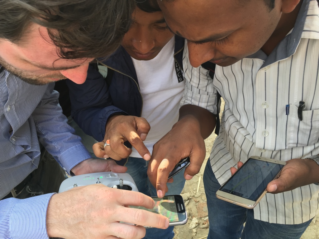
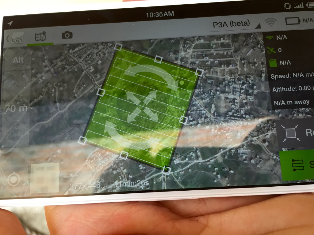
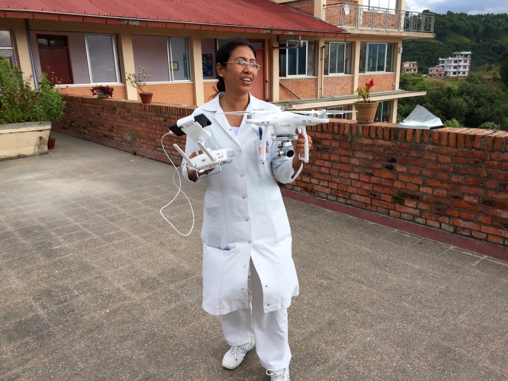
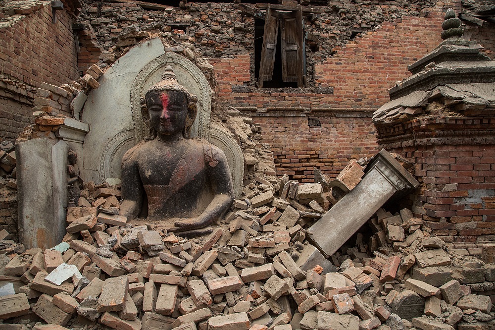
I posed this question during an hour-long presentation I gave to the World Bank in May 2015. The talk was on the use of remote sensing aerial robotics (UAVs) for disaster damage assessments; I used Cyclone Pam in Vanuatu and the double Nepal Earthquakes as case studies.

WPa
One advantage of aerial robotics over space robotics (satellites) is that the former can capture imagery at far higher spatial resolutions—sub 1-centimeter if need be. Without hesitation, a World Bank analyst in the conference room replied to my question: “Fifty centimeters.” I was taken aback by the rapid reply. Had I per chance missed something? Was it so obvious that 50 cm resolution was optimal? So I asked, “Why 50 centimeters?” Again, without hesitation: “Because that’s the resolution we’ve been using.” Ah ha! “But how do you know this is the optimal resolution if you haven’t tried 30 cm or even 10 cm?”

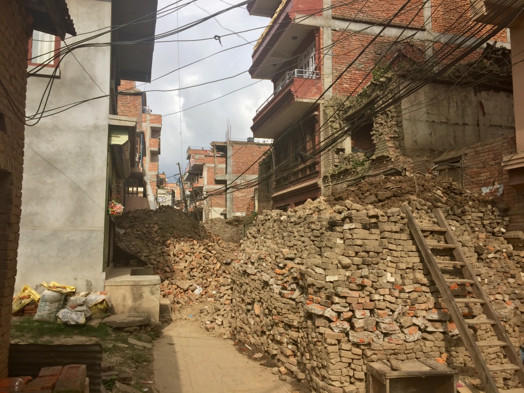
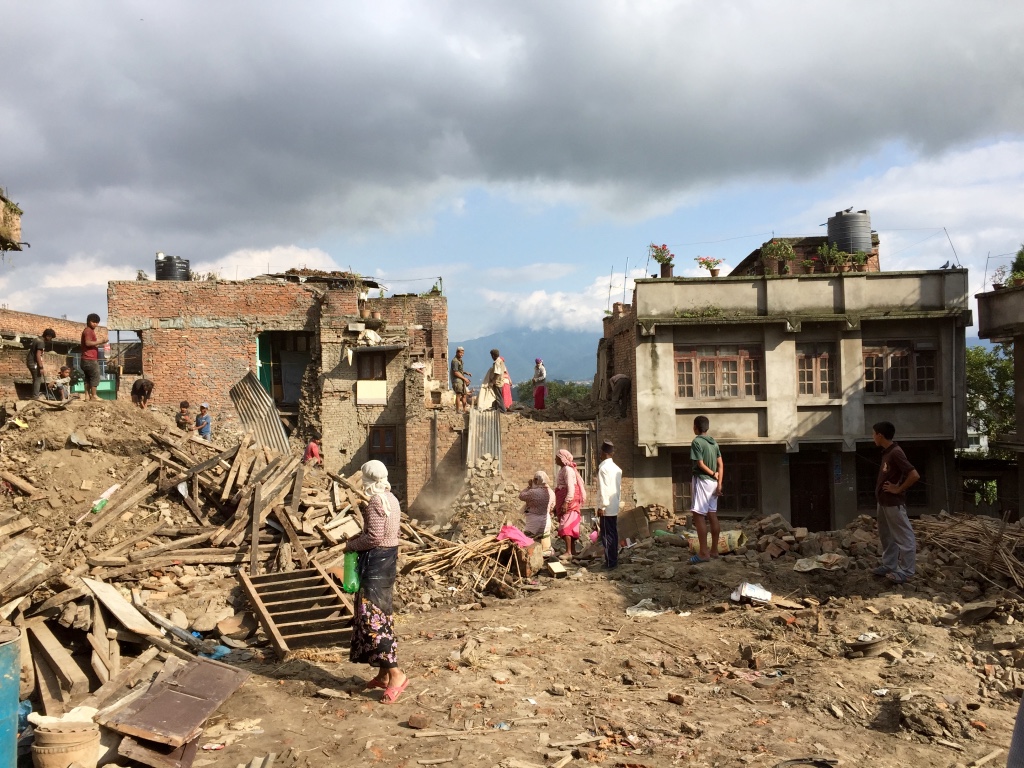
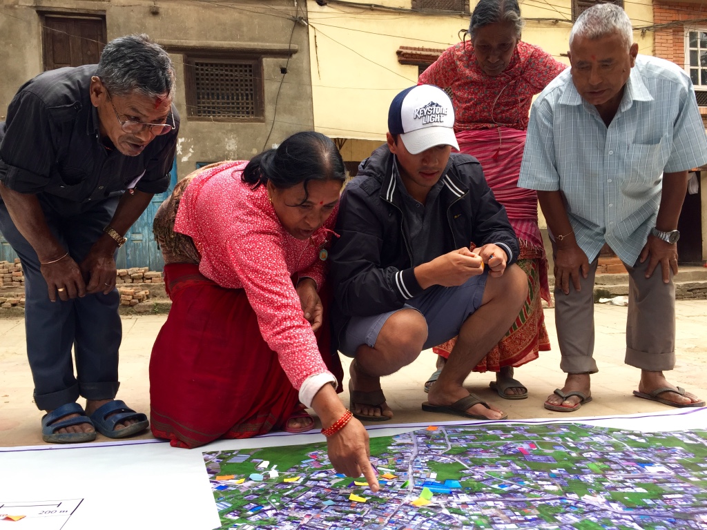
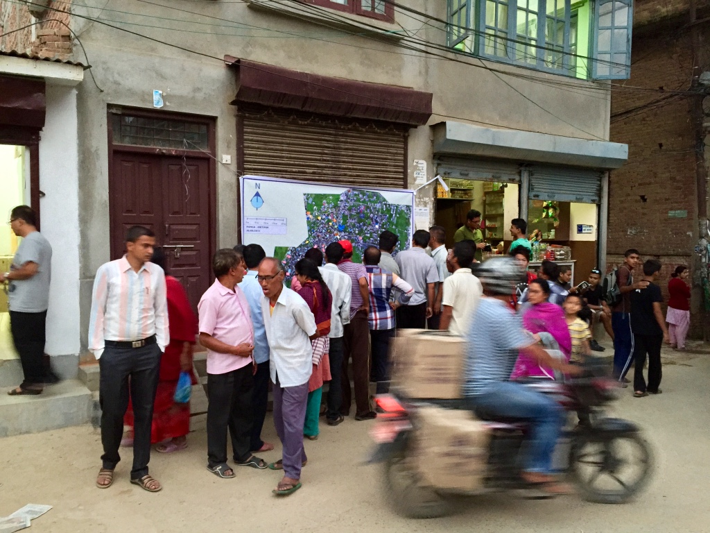
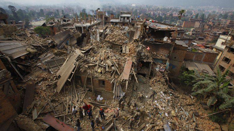
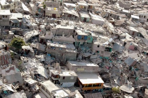
Lets go back to the fundamentals. We know that “rapid damage assessment is essential after disaster events, especially in densely built up urban areas where the assessment results provide guidance for rescue forces and other immediate relief efforts, as well as subsequent rehabilitation and reconstruction. Ground-based mapping is too slow, and typically hindered by disaster-related site access difficulties” (Gerke & Kerle 2011). Indeed, studies have shown that the inability of physically access damaged areas results in field teams underestimating the damage (Lemoine et al 2013). Hence one reason for the use of remote sensing.

We know that remote sensing can be used for two purposes following disasters. The first, “Rapid Mapping”, aims at providing impact assessments as quickly as possible after a disaster. The second, “Economic Mapping” assists in quantifying the economic impact of the damage. “Major distinctions between the two categories are timeliness, completeness and accuracies” (2013).  In addition, Rapid Mapping aims to identify the relative severity of the damage (low, medium, high) rather than absolute damage figures. Results from Economic Mapping are combined with other geospatial data (building size, building type, etc) and economic parameters (e.g., cost per unit area, relocation costs, etc) to compute a total cost estimate (2013). The Post-Disaster Needs Assessment (PDNA) is an example of Economic Mapping.

It is worth noting that a partially destroyed building may be seen as a complete economic loss, identical to a totally destroyed structure (2011). “From a casualty / fatality assessment perspective, however, a structure that is still partly standing […] offers a different survival potential” (2011).

Screen Shot 2016-02-07 at 10.31.27 AM

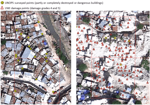
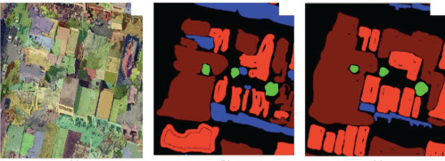
We also know that “damage detectability is primarily a function of image resolution” (2011). The Haiti Earthquake was “one of the first major disasters in which very high resolution satellite and airborne imagery was embraced to delineate the event impact (2013). It was also “the first time that the PDNA was based on damage assessment produced with remotely sensed data” (2013). Imagery analysis of the impact confirmed that a “moderate resolution increase from 41 cm to 15 cm has profound effects on damage mapping accuracy” (2011). Indeed, a number of validation studies carried out since 2010 have confirmed that “the higher detail airborne imagery performs much better [than lower resolution] satellite imagery” (2013). More specifically, the detection of very heavy damage and destruction in Haiti aerial imagery “is approximately a factor 8 greater than in the satellite imagery.”

Comparing the aerial imagery analysis with field surveys, Lemoine et al. find that “the number of heavily affected and damaged buildings in the aerial point set is slightly higher than that obtained from the field survey” (2013). The correlation between the results of the aerial imagery analysis and field surveys is sensitive to land-use (e.g., commercial, downtown, industrial, residential high density, shanty, etc). In highly populated areas such as shanty zones, “the over-estimation of building damage from aerial imagery could simply be a result of an incomplete field survey while, in downtown, where field surveys seem to have been conducted in a more systematic way, the damage assessment from aerial imagery matches very well the one obtained from the field” (2013).

WPb

In sum, the results from Haiti suggests that the “damage assessment from aerial imagery currently represents the best possible compromise between timeliness and accuracy” (2013). The Haiti case study also “showed that the damage derived from satellite imagery was underestimated by a factor of eight, compared to the damage derived from aerial imagery. These results suggest that despite the fast availability of very high resolution satellite imagery […], the spatial resolution of 50 cm is not sufficient for an accurate interpretation of building damage.”

In other words, even though “damage assessments depend very much on the timeliness of the aerial images acquisitions and requires a considerable effort of visual interpretation as an element of compromise; [aerial imagery] remains the best trade-of in terms of required quality and timeliness for producing detailed damage assessments over large affected areas compared to satellite based assessments (insufficient quality) and exhaustive field inventories (too slow).” But there’s a rub with respect to aerial imagery. While the above results do “show that the identification of building damage from aerial imagery […] provides a realistic estimate of the spatial pattern and intensity of damage,” the aerial imagery analysis still “suffers from several limitations due to the nadir imagery” (2013).

“Essentially all conventional airborne and spacebar image data are taken from a quasi-vertical perspective” (2011). Vertical (or nadir) imagery is particularly useful for a wide range of applications, for sure. But when it comes to damage mapping, vertical data have great limitations, particularly when concerning structural building damage (2011). While complete collapse can be readily identified using vertical imagery (e.g., disintegrated roof structures and associated high texture values, or adjacent rubble piles, etc), “lower levels of damage are much harder to map. This is because such damage effects are largely expressed along the façades, which are not visible in such imagery” (2011). According to Gerke and Kerle, aerial oblique imagery is more useful for disaster damage assessment than aerial or satellite imagery taken with a vertical angle. I elaborated on this point vis-a-vis a more recent study in this blog post.

WPd

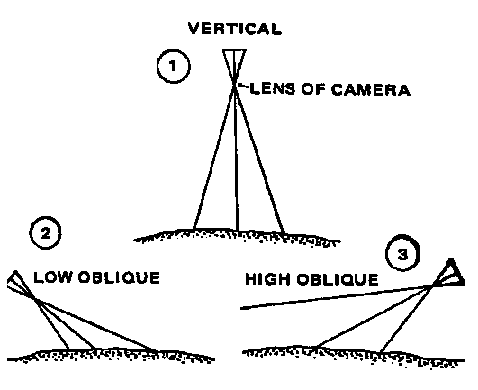
Clearly, “much of the challenge in detecting damage stems from the complex nature of damage” (2011). For some types and sizes of damage, using only vertical (nadir) imagery will result in missed damage (2013). The question, therefore, is not simply one of spatial resolution but the angle at which the aerial or space-based image is taken, land-use and the type of damage that needs to be quantified. Still, we do have a partial answer to the first question. Technically, the optimal spatial resolution for disaster damage assessments is certainly not 50 cm since 15 cm proved far more useful in Haiti.

Of course, if higher-resolution imagery is not available in time (or at all), than clearly 50 cm imagery is infinitely more optimal than no imagery. In fact, even 5 meter imagery that is available within 24-48 hours of a disaster can add value if this imagery comes with baseline imagery, i.e., imagery of the location of interest before the disaster. Baseline data enables the use of automated change-detection algorithms that can provide a first estimate of damage severity and the location or scope of that severity. What’s more, these change-detection algorithms could automatically plot a series of waypoints to chart the flight plan of an autonomous aerial robot (UAV) to carry out closer inspection. In other words, satellite and aerial data can be complementary, and the drawbacks of low resolution imagery can be offset if said imagery is available at a higher temporal frequency.

WPc

On the flip side, just because the aerial imagery used in the Haiti study was captured at 15 cm resolution does not imply that 15 cm resolution is the most optimal spatial resolution for disaster damage. It could very well be 10 cm. This depends entirely on the statistical distribution of the size of damaged features (e.g, the size of a crack, a window, a tile, etc,), the local architecture (e.g., type of building materials used and so on) and the type of hazard (e.g, hurricane, earthquake, etc). That said, “individual indicators of destruction, such as a roof or façade damage, do not linearly add to a given damage class [e.g., low, medium, high]” (2011). This limitation is alas “fundamental in remote sensing where no assessment of internal structural integrity is possible” (2011).

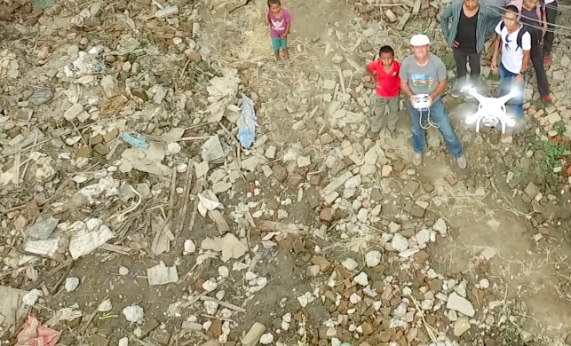
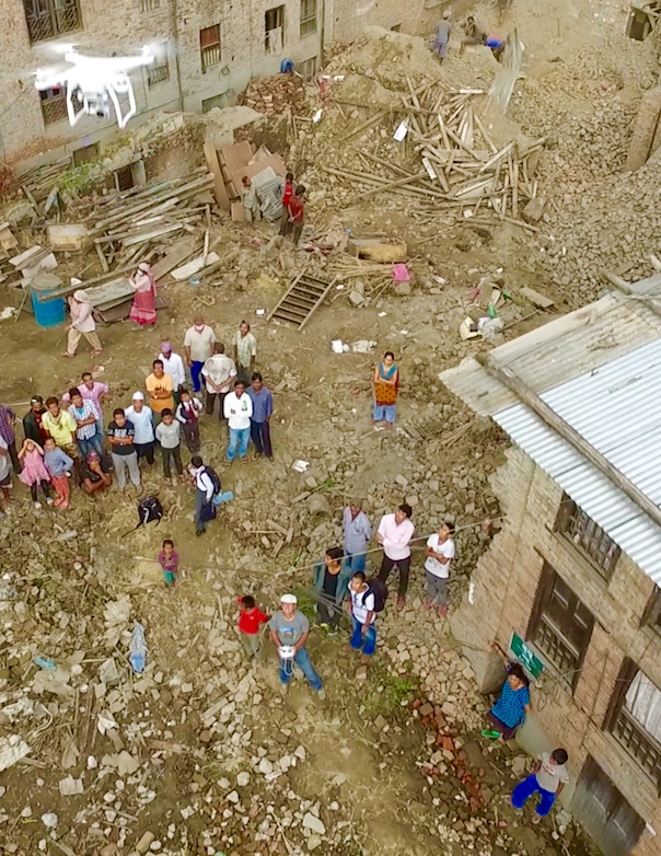
In any event, one point is certain: there was no need to capture aerial imagery (both nadir and obliques) at 5 centimeter resolution during the World Bank’s humanitarian UAV mission after Cyclone Pam—at least not for the purposes of 2D imagery analysis. This leads me to one final point. As recently noted during my opening Keynote at the 2016 International Drones and Robotics for Good Awards in Dubai, disaster damage is a 3D phenomenon, not a 2D experience. “Buildings are three-dimensional, and even the most detailed view at only one of those dimensions is ill-suited to describe the status of such features” (2011). In other words, we need “additional perspectives to provide a more comprehensive view” (2011).

There are very few peer-reviewed scientific papers that evaluate the use of high-resolution 3D models for the purposes of damage assessments. This one is likely the most up-to-date study. An earlier research effort by Booth et al. found that the overall correlation between the results from field surveys and 3D analysis of disaster damage was “an encouraging 74 percent.” But this visual analysis was carried out manually, which could have introduced non-random errors. After all, “the subjectivity inherent in visual structure damage mapping is considerable” (2011). Could semi-automated methods for the analysis of 3D models thus yield a higher correlation? This is the research question posed by Gerke and Kerle in their 2011 study.

Screen Shot 2016-02-07 at 5.39.06 AM

The authors tested this question using aerial imagery from the Haiti Earthquake. When 3D features were removed from their automated analysis, “classification performance declined, for example by some 10 percent for façades, the class that benefited most from the 3D derivates” (2011). The researchers also found that trained imagery analysts only agreed at most 76% of the time in their visual interpretation and assessments of aerial data. This is in part due to the lack of standards for damage categories (2011).

Screen Shot 2016-02-07 at 5.40.36 AM

I made this point more bluntly in this earlier blog post. Just imagine when you have hundreds of professionals and/or digital volunteers analyzing imagery (e.g, through crowdsourcing) and no standardized categories of disaster damage to inform the consistent interpretation of said imagery. This collective subjectivity introduces a non-random error into the overall analysis. And because it is non-random, this error cannot be accounted for. In contrast, a more semi-automated solution would render this error more random, which means the overall model could potentially be adjusted accordingly.

Gerke and Kerle conclude that high quality 3D models are “in principle well-suited for comprehensive semi-automated damage mapping. In particular façades, which are critical [to the assessment process], can be assessed [when] multiple views are provided.” That said, the methodology used by the authors was “still essentially based on projecting 3D data into 2D space, with conceptual and geometric limitations. [As such], one goal should be to perform the actual damage assessment and classification in 3D.” This explains why I’ve been advocating for Virtual Reality (VR) based solutions as described here.

3D_1

Geek and Kerle also “required extensive training data and substantial subjective evidence integration in the final damage class assessment. This raises the question to what extent rules could be formulated to create a damage ontology as the basis for per-building damage scoring.” This explains why I invited the Harvard Humanitarian Initiative (HHI) to create a damage ontology based on the aerial imagery from Cyclone Pam in Vanuatu. This ontology is based on 2D imagery, however. Ironically, very high spatial resolution 2D imagery can be more difficult to interpret than lower-res imagery since the high resolution imagery inevitably adds more “noise” to the data.

Ultimately, we’ll need to move on to 3D damage ontologies that can be visualized using VR headsets. 3D analysis is naturally more intuitive to us since we live in a mega-high resolution 3D world rather than a 2D one. As a result, I suspect there would be more agreement between different analysts studying dynamic, very high-resolution 3D models versus 2D static images at the same spatial res.

Screen Shot 2016-02-07 at 12.53.27 PM

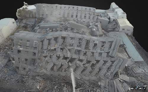
Taiwan’s National Cheng Kung University created this 3D model from aerial imagery captured by UAV. This model was created and uploaded to Sketchfab on the same day the earthquake struck. Note that Sketchfab recently added a VR feature to their platform, which I tried out on this model. Simply open this page on your mobile device to view the disaster damage in Taiwan in VR. I must say it works rather well, and even seems to be higher resolution in VR mode compared to the 2D projections of the 3D model above. More on the Taiwan model here.

Screen Shot 2016-02-07 at 12.52.06 PM

But to be useful for disaster damage assessments, the VR headset would need to be combined with wearable technology that enables the end-user to digitally annotate (or draw on) the 3D models directly within the same VR environment. This would render the analysis process more intuitive while also producing 3D training data for the purposes of machine learning—and thus automated feature detection.

I’m still actively looking for a VR platform that will enable this, so please do get in touch if you know of any group, company, research institute, etc., that would be interested in piloting the 3D analysis of disaster damage from the Nepal Earthquake entirely within a VR solution. Thank you!

QED – Goodbye Doha, Hello Adventure!

Quod Erat Demonstrandum (QED) is Latin for “that which had to be proven.” This abbreviation was traditionally used at the end of mathematical proofs to signal the completion of said proofs. I joined the Qatar Computing Research Institute (QCRI) well over 3 years ago with a very specific mission and mandate: to develop and deploy next generation humanitarian technologies. So I built the Institute’s Social Innovation Program from the ground up and recruited the majority of the full-time experts (scientists, engineers, research assistants, interns & project manager) who have become integral to the Program’s success. During these 3+years, my team and I partnered directly with humanitarian and development organizations to empirically prove that methods from advanced computing can be used to make sense of Big (Crisis) Data. The time has thus come to add “QED” to the end of that proof and move on to new adventures. But first a reflection.

Over the past 3.5 years, my team and I at QCRI developed free and open source solutions powered by crowdsourcing and artificial intelligence to make sense of Tweets, text messages, pictures, videos, satellite and aerial imagery for a wide range of humanitarian and development projects. We co-developed and co-deployed these platforms (AIDR and MicroMappers) with the United Nations and the World Bank in response to major disasters such as Typhoons Haiyan and RubyCyclone Pam and both the Nepal & Chile Earthquakes. In addition, we carried out peer-reviewed, scientific research on these deployments to better understand how to meet the information needs of our humanitarian partners. We also tackled the information reliability question, experimenting with crowd-sourcing (Verily) and machine learning (TweetCred) to assess the credibility of information generated during disasters. All of these initiatives were firsts in the humanitarian technology space.

We later developed AIDR-SMS to auto-classify text messages; a platform that UNICEF successfully tested in Zambia and which the World Food Program (WFP) and the International Federation of the Red Cross (IFRC) now plan to pilot. AIDR was also used to monitor a recent election, and our partners are now looking to use AIDR again for upcoming election monitoring efforts. In terms of MicroMappers, we extended the platform (considerably) in order to crowd-source the analysis of oblique aerial imagery captured via small UAVs, which was another first in the humanitarian space. We also teamed up with excellent research partners to crowdsource the analysis of aerial video footage and to develop automated feature-detection algorithms for oblique imagery analysis based on crowdsourced results derived from MicroMappers. We developed these Big Data solutions to support damage assessment efforts, food security projects and even this wildlife protection initiative.

In addition to the above accomplishments, we launched the Internet Response League (IRL) to explore the possibility of leveraging massive multiplayer online games to process Big Crisis Data. Along similar lines, we developed the first ever spam filter to make sense of Big Crisis Data. Furthermore, we got directly engaged in the field of robotics by launching the Humanitarian UAV Network (UAViators), yet another first in the humanitarian space. In the process, we created the largest repository of aerial imagery and videos of disaster damage, which is ripe for cutting-edge computer vision research. We also spearheaded the World Bank’s UAV response to Category 5 Cyclone Pam in Vanuatu and also directed a unique disaster recovery UAV mission in Nepal after the devastating earthquakes. (I took time off from QCRI to carry out both of these missions and also took holiday time to support UN relief efforts in the Philippines following Typhoon Haiyan in 2013). Lastly, on the robotics front, we championed the development of international guidelines to inform the safe, ethical & responsible use of this new technology in both humanitarian and development settings. To be sure, innovation is not just about the technology but also about crafting appropriate processes to leverage this technology. Hence also the rationale behind the Humanitarian UAV Experts Meetings that we’ve held at the United Nations Secretariat, the Rockefeller Foundation and MIT.

All  of the above pioneering-and-experimental projects have resulted in extensive media coverage, which has placed QCRI squarely on the radar of international humanitarian and development groups. This media coverage has included the New York Times, Washington Post, Wall Street Journal, CNN, BBC News, UK Guardian, The Economist, Forbes and Times Magazines, New Yorker, NPR, Wired, Mashable, TechCrunch, Fast Company, Nature, New Scientist, Scientific American and more. In addition, our good work and applied research has been featured in numerous international conference presentations and keynotes. In sum, I know of no other institute for advanced computing research that has contributed this much to the international humanitarian space in terms of thought-leadership, strategic partnerships, applied research and operational expertise through real-world co-deployments during and after major disasters.

There is, of course, a lot more to be done in the humanitarian technology space. But what we have accomplished over the past 3 years clearly demonstrates that techniques from advanced computing can indeed provide part of the solution to the pressing Big Data challenge that humanitarian & development organizations face. At the same time, as I wrote in the concluding chapter of my new book, Digital Humanitarians, solving the Big Data challenge does not alas imply that international aid organizations will actually make use of the resulting filtered data or any other data for that matter—even if they ask for this data in the first place. So until humanitarian organizations truly shift towards both strategic and tactical evidence-based analysis & data-driven decision-making, this disconnect will surely continue unabated for many more years to come.

Reflecting on the past 3.5 years at QCRI, it is crystal clear to me that the number one most important lesson I (re)learned is that you can do anything if you have an outstanding, super-smart and highly dedicated team that continually goes way above and beyond the call of duty. It is one thing for me to have had the vision for AIDR, MicroMappers, IRL, UAViators, etc., but vision alone does not amount to much. Implementing said vision is what delivers results and learning. And I simply couldn’t have asked for a more talented & stellar team to translate these visions into reality over the past 3+years. You each know who you are, partners included; it has truly been a privilege and honor working with you. I can’t wait to see what you do next at/with QCRI. Thank you for trusting me; thank you for sharing my vision; thanks for your sense of humor, and thank you for your dedication and loyalty to science and social innovation.

So what’s next for me? I’ll be lining up independent consulting work with several organizations (likely including QCRI). In short, I’ll be open for business. I’m also planning to work on a new project that I’m very excited about, so stay tuned for updates; I’ll be sure to blog about this new adventure when the time is right. For now, I’m busy wrapping up my work as Director of Social Innovation at QCRI and working with the best team there is. QED.

Aerial Robotics in the Land of Buddha

Buddhist Temples adorn Nepal’s blessed land. Their stupas, like Everest, stretch to the heavens, yearning to democratize the sky. We felt the same yearning after landing in Kathmandu with our UAVs. While some prefer the word “drone” over “UAVs”, the reason our Nepali partners use the latter dates back some 3,000 years to the spiritual epic Mahabharata (Great Story of Bharatas). The ancient story features Drona, a master of advanced military arts who slayed hundreds of thousands with his bow & arrows. This strong military connotation explains why our Nepali partners use “UAV” instead, which is the term we also used for our Humanitarian UAV Mission in the land of Buddha. Our purpose: to democratize the sky.

Screen Shot 2015-09-28 at 12.05.09 AM

Unmanned Aerial Vehicles (UAVs) are aerial robots. They are the first wave of robotics to impact the humanitarian space. The mission of the Humanitarian UAV Network (UAViators) is to enable the safe, responsible and effective use of UAVs in a wide range of humanitarian and development settings. We thus spearheaded a unique and weeklong UAV Mission in Nepal in close collaboration with Kathmandu University (KU), Kathmandu Living Labs (KLL), DJI and Pix4D. This mission represents the first major milestone for Kathmandu Flying Labs (please see end of this post for background on KFL).

WP1

Our joint UAV mission combined both hands-on training and operational deployments. The full program is available here. The first day comprised a series of presentations on Humanitarian UAV Applications, Missions, Best Practices, Guidelines, Technologies, Software and Regulations. These talks were given by myself, KU, DJI, KLL and the Civil Aviation Authority (CAA) of Nepal. The second day  focused on direct hands-on training. DJI took the lead by training 30+ participants on how to use the Phantom 3 UAVs safely, responsibly. Pix4D, also on site, followed up by introducing their imagery-analysis software.

WP2

WP3

WP4

The second-half of the day was dedicated to operations. We had already received written permission from the CAA to carry out all UAV flights thanks to KU’s outstanding leadership. KU also selected the deployment sites and enabled us to team up with the very pro-active Community Disaster Management Committee (CDMC-9) of Kirtipur to survey the town of Panga, which had been severely affected by the earthquake just months earlier. The CDMC was particularly keen to gain access to very high-resolution aerial imagery of the area to build back faster and better, so we spent half-a-day flying half-a-dozen Phantom 3’s over parts of Panga as requested by our local partners.

WP5

WP6

WP7

WP8

The best part of this operation came at the end of the day when we had finished the mission and were packing up: Our Nepali partners politely noted that we had not in fact finished the job; we still had a lot more area to cover. They wanted us back in Panga the following day to complete our mapping mission. We thus changed our plans and returned the next day during which—thanks to DJI & Pix4D—we flew several dozen additional UAV flights from four different locations across Panga (without taking a single break; no lunch was had). Our local partners were of course absolutely invaluable throughout since they were the ones informing the flight plans. They also made it possible for us to launch and land all our flights from the highest rooftops across town. (Click images to enlarge).

WP8b

WP8bb

WP8c

WP8cc

WP8d

Meanwhile, back at KU, our Pix4D partners provided hands-on training on how to use their software to analyze the aerial imagery we had collected the day before. KLL also provided training on how to use the Humanitarian Open Street Map Tasking Manager to trace this aerial imagery. Incidentally, we flew well over 60 UAV flights all in all over the course of our UAV mission, which includes all our training flights on campus as well as our aerial survey of a teaching hospital. Not a single incident or accident occurred; everyone followed safety guidelines and the technology worked flawlessly.

WP8e

WP8f

WP8g

With more than 800 aerial photographs in hand, the Pix4D team worked through the night to produce a very high-resolution orthorectified mosaic of Panga. Here are some of the results.

WP9

WP10

WP11

WP12

Compare these results with the resolution and colors of the satellite imagery for the same area (maximum zoom).

Screen Shot 2015-09-28 at 12.32.36 AM

WP10

We can now use MicroMappers to crowdsource the analysis & digital annotation of oblique aerial pictures and videos collected throughout the mission. This is an important step in the development of automated feature-detection algorithms using techniques from computer vision and machine learning. The reason we want automated solutions is because aerial imagery already presents a Big Data challenge for humanitarian and development organizations. Indeed, a single 20- minute UAV flight can generate some 800 images. A trained analyst needs at least one minute to analyze a single image, which means that more than 13 hours of human time is needed to analyze imagery captured from just one 20-minute UAV flight. More on this Big Data challenge here.

Incidentally, since Pix4D also used their software to produce a number of stunning 3D models, I’m keen to explore ways to crowdsource 3D models via MicroMappers and to explore possible Virtual Reality solutions to the Big Data challenge. In any event, we generated all the aerial data requested by our local partners by the end of the day.

While this technically meant that we had successfully completed our mission, it didn’t feel finished to me. I really wanted to “liberate” the data completely and place it directly into the hands of the CDCM and local community in Panga. What’s the point of “open data” if most of Panga’s residents are not able to view or interact with the resulting maps? So I canceled my return flight and stayed an extra day to print out our aerial maps on very large roll-able and waterproof banners (which are more durable than paper-based maps).

WP13

WP14

WP15

We thus used these banner-maps and participatory mapping methods to engage the local community directly. We invited community members to annotate the very-high resolution aerial maps themselves by using tape and color-coded paper we had brought along. In other words, we used the aerial imagery as a base map to catalyze a community-wide discussion; to crowdsource and to visualize the community’s local knowledge. Participatory mapping and GIS (PPGIS) can play an impactful role in humanitarian and development projects, hence the initiative with our local partners (more here on community mapping).

In short, our humanitarian mission combined aerial robotics, computer vision, waterproof banners, tape, paper and crowdsourcing to inform the rebuilding process at the community level.

WP16

WP20

WP19

WP18

WP17

WP16b

WP24

WP23

WP22

WP21

WP25

The engagement from the community was absolutely phenomenal and definitely for me the highlight of the mission. Our CDMC partners were equally thrilled and excited with the community engagement that the maps elicited. There were smiles all around. When we left Panga some four hours later, dozens of community members were still discussing the map, which our partners had hung up near a popular local teashop.

There’s so much more to share from this UAV mission; so many angles, side-stories and insights. The above is really just a brief and incomplete teaser. So stay tuned, there’s a lot more coming up from DJI and Pix4D. Also, the outstanding film crew that DJI invited along is already reviewing the vast volume of footage captured during the week. We’re excited to see the professionally edited video in coming weeks, not to mention the professional photographs that both DJI and Pix4D took throughout the mission. We’re especially keen to see what our trainees at KU and KLL do next with the technology and software that are now in their hands. Indeed, the entire point of our mission was to help build local capacity for UAV missions in Nepal by transferring knowledge, skills and technology. It is now their turn to democratize the skies of Nepal.

WP26

WP27

Acknowledgements: Some serious acknowledgements are in order. First, huge thanks to Lecturer Uma Shankar Panday from KU for co-sponsoring this mission, for hosting us and for making our joint efforts a resounding success. The warm welcome and kind hospitality we received from him, KU’s faculty and executive leadership was truly very touching. Second, special thanks to the CAA of Nepal for participating in our training and for giving us permission to fly. Third, big, big thanks to the entire DJI and Pix4D Teams for joining this UAViators mission and for all their very, very hard work throughout the week. Many thanks also to DJI for kindly donating 10 Smartisan phones and 10 Phantom 3’s to KU and KLL; and kind thanks to Pix4D for generously donating licenses of their software to both KU and KLL. Fourth, many thanks to KLL for contributing to the training and for sharing our vision behind Kathmandu Flying Labs. Fifth, I’d like to express my sincere gratitude to Smartisan for co-sponsoring this mission. Sixth, deepest thanks to CDMC and Dhulikhel Hospital for partnering with us on the ops side of the mission. Their commitment and life-saving work are truly inspiring. Seventh, special thanks to the film and photography crew for being so engaged throughout the mission; they were absolutely part of the team. In closing, I want to specifically thank my colleagues Andrew Schroeder from UAViators and Paul & William from DJI for all the heavy lifting they did to make this entire mission possible. On a final and personal note, I’ve made new friends for life as a result of this UAV mission, and for that I am infinitely grateful.


Kathmandu Flying Labs: My colleague Dr. Nama Budhathoki and I began discussing the potential role that small UAVs could play in his country in early 2014, well over a year-and-half before Nepal’s tragic earthquakes. Nama is the Director of Kathmandu Living Labs, a crack team of Digital Humanitarians whose hard work has been featured in The New York Times and the BBC. Nama and team create open-data maps for disaster risk reduction and response. They use Humanitarian OpenStreetMap’s Tasking Server to trace buildings and roads visible from orbiting satellites in order to produce these invaluable maps. Their primary source of satellite imagery for this is Bing. Alas, said imagery is both low-resolution and out-of-date. And they’re not sure they’ll have free access to said imagery indefinitely either.

KFL logo draft

So Nama and I decided to launch a UAV Innovation Lab in Nepal, which I’ve been referring to as Kathmandu Flying Labs. A year-and-a-half later, the tragic earthquake struck. So I reached out to DJI in my capacity as founder of the Humanitarian UAV Network (UAViators). The mission of UAViators is to enable the safe, responsible and effective use of UAVs in a wide range of humanitarian and development settings. DJI, who are on the Advisory Board of UAViators, had deployed a UAV team in response to the 6.1 earthquake in China the year before. Alas, they weren’t able to deploy to Nepal. But they very kindly donated two Phantom 2’s to KLL.

A few months later, my colleague Andrew Schroeder from UAViators and Direct Relief reconnected with DJI to explore the possibility of a post-disaster UAV Mission focused on recovery and rebuilding. Both DJI and Pix4D were game to make this mission happen, so I reached out to KLL and KU to discuss logistics. Professor Uma at KU worked tirelessly to set everything up. The rest, as they say, is history. There is of course a lot more to be done, which is why Nama, Uma and I are already planning the next important milestones for Kathmandu Flying Labs. Do please get in touch if you’d like to be involved and contribute to this truly unique initiative. We’re also exploring payload delivery options via UAVs and gearing up for new humanitarian UAV missions in other parts of the planet.

A Force for Good: How Digital Jedis are Responding to the Nepal Earthquake (Updated)

Digital Humanitarians are responding in full force to the devastating earthquake that struck Nepal. Information sharing and coordination is taking place online via CrisisMappers and on multiple dedicated Skype chats. The Standby Task Force (SBTF), Humanitarian OpenStreetMap (HOT) and others from the Digital Humanitarian Network (DHN) have also deployed in response to the tragedy. This blog post provides a quick summary of some of these digital humanitarian efforts along with what’s coming in terms of new deployments.

Update: A list of Crisis Maps for Nepal is available below.

Credit: http://www.thestar.com/content/dam/thestar/uploads/2015/4/26/nepal2.jpg

At the request of the UN Office for the Coordination of Humanitarian Affairs (OCHA), the SBTF is using QCRI’s MicroMappers platform to crowdsource the analysis of tweets and mainstream media (the latter via GDELT) to rapidly 1) assess disaster damage & needs; and 2) Identify where humanitarian groups are deploying (3W’s). The MicroMappers CrisisMaps are already live and publicly available below (simply click on the maps to open live version). Both Crisis Maps are being updated hourly (at times every 15 minutes). Note that MicroMappers also uses both crowdsourcing and Artificial Intelligence (AIDR).

Update: More than 1,200 Digital Jedis have used MicroMappers to sift through a staggering 35,000 images and 7,000 tweets! This has so far resulted in 300+ relevant pictures of disaster damage displayed on the Image Crisis Map and over 100 relevant disaster tweets on the Tweet Crisis Map.

Live CrisisMap of pictures from both Twitter and Mainstream Media showing disaster damage:

MM Nepal Earthquake ImageMap

Live CrisisMap of Urgent Needs, Damage and Response Efforts posted on Twitter:

MM Nepal Earthquake TweetMap

Note: the outstanding Kathmandu Living Labs (KLL) team have also launched an Ushahidi Crisis Map in collaboration with the Nepal Red Cross. We’ve already invited invited KLL to take all of the MicroMappers data and add it to their crisis map. Supporting local efforts is absolutely key.

WP_aerial_image_nepal

The Humanitarian UAV Network (UAViators) has also been activated to identify, mobilize and coordinate UAV assets & teams. Several professional UAV teams are already on their way to Kathmandu. The UAV pilots will be producing high resolution nadir imagery, oblique imagery and 3D point clouds. UAViators will be pushing this imagery to both HOT and MicroMappers for rapid crowdsourced analysis (just like was done with the aerial imagery from Vanuatu post Cyclone Pam, more on that here). A leading UAV manufacturer is also donating several UAVs to UAViators for use in Nepal. These UAVs will be sent to KLL to support their efforts. In the meantime, DigitalGlobePlanet Labs and SkyBox are each sharing their satellite imagery with CrisisMappers, HOT and others in the Digital Humanitarian Network.

There are several other efforts going on, so the above is certainly not a complete list but simply reflect those digital humanitarian efforts that I am involved in or most familiar with. If you know of other major efforts, then please feel free to post them in the comments section. Thank you. More on the state of the art in digital humanitarian action in my new book, Digital Humanitarians.


List of Nepal Crisis Maps

Please add to the list below by posting new links in this Google Spreadsheet. Also, someone should really create 1 map that pulls from each of the listed maps.

Code for Nepal Casualty Crisis Map:
http://bit.ly/1IpUi1f 

DigitalGlobe Crowdsourced Damage Assessment Map:
http://goo.gl/bGyHTC

Disaster OpenRouteService Map for Nepal:
http://www.openrouteservice.org/disaster-nepal

ESRI Damage Assessment Map:
http://arcg.is/1HVNNEm

Harvard WorldMap Tweets of Nepal:
http://worldmap.harvard.edu/maps/nepalquake 

Humanitarian OpenStreetMap Nepal:
http://www.openstreetmap.org/relation/184633

Kathmandu Living Labs Crowdsourced Crisis Map: http://www.kathmandulivinglabs.org/earthquake

MicroMappers Disaster Image Map of Damage:
http://maps.micromappers.org/2015/nepal/images/#close

MicroMappers Disaster Damage Tweet Map of Needs:
http://maps.micromappers.org/2015/nepal/tweets

NepalQuake Status Map:
http://www.nepalquake.org/status-map

UAViators Crisis Map of Damage from Aerial Pics/Vids:
http://uaviators.org/map (takes a while to load)

Visions SDSU Tweet Crisis Map of Nepal:
http://vision.sdsu.edu/ec2/geoviewer/nepal-kathmandu#

Artificial Intelligence Powered by Crowdsourcing: The Future of Big Data and Humanitarian Action

There’s no point spewing stunning statistics like this recent one from The Economist, which states that 80% of adults will have access to smartphones before 2020. The volume, velocity and variety of digital data will continue to skyrocket. To paraphrase Douglas Adams, “Big Data is big. You just won’t believe how vastly, hugely, mind-bogglingly big it is.”

WP1

And so, traditional humanitarian organizations have a choice when it comes to battling Big Data. They can either continue business as usual (and lose) or get with the program and adopt Big Data solutions like everyone else. The same goes for Digital Humanitarians. As noted in my new book of the same title, those Digital Humanitarians who cling to crowdsourcing alone as their pièce de résistance will inevitably become the ivy-laden battlefield monuments of 2020.

bookcover

Big Data comprises a variety of data types such as text, imagery and video. Examples of text-based data includes mainstream news articles, tweets and WhatsApp messages. Imagery includes Instagram, professional photographs that accompany news articles, satellite imagery and increasingly aerial imagery as well (captured by UAVs). Television channels, Meerkat and YouTube broadcast videos. Finding relevant, credible and actionable pieces of text, imagery and video in the Big Data generated during major disasters is like looking for a needle in a meadow (haystacks are ridiculously small datasets by comparison).

Humanitarian organizations, like many others in different sectors, often find comfort in the notion that their problems are unique. Thankfully, this is rarely true. Not only is the Big Data challenge not unique to the humanitarian space, real solutions to the data deluge have already been developed by groups that humanitarian professionals at worst don’t know exist and at best rarely speak with. These groups are already using Artificial Intelligence (AI) and some form of human input to make sense of Big Data.

Data digital flow

How does it work? And why do you still need some human input if AI is already in play? The human input, which can be via crowdsourcing or a few individuals is needed to train the AI engine, which uses a technique from AI called machine learning to learn from the human(s). Take AIDR, for example. This experimental solution, which stands for Artificial Intelligence for Disaster Response, uses AI powered by crowdsourcing to automatically identify relevant tweets and text messages in an exploding meadow of digital data. The crowd tags tweets and messages they find relevant and the AI engine learns to recognize the relevance patterns in real-time, allowing AIDR to automatically identify future tweets and messages.

As far as we know, AIDR is the only Big Data solution out there that combines crowdsourcing with real-time machine learning for disaster response. Why do we use crowdsourcing to train the AI engine? Because speed is of the essence in disasters. You need a crowd of Digital Humanitarians to quickly tag as many tweets/messages as possible so that AIDR can learn as fast as possible. Incidentally, once you’ve created an algorithm that accurately detects tweets relaying urgent needs after a Typhoon in the Philippines, you can use that same algorithm again when the next Typhoon hits (no crowd needed).

What about pictures? After all, pictures are worth a thousand words. Is it possible to combine artificial intelligence with human input to automatically identify pictures that show infrastructure damage? Thanks to recent break-throughs in computer vision, this is indeed possible. Take Metamind, for example, a new startup I just met with in Silicon Valley. Metamind is barely 6 months old but the team has already demonstrated that one can indeed automatically identify a whole host of features in pictures by using artificial intelligence and some initial human input. The key is human input since this is what trains the algorithms. The more human-generated training data you have, the better your algorithms.

My team and I at QCRI are collaborating with Metamind to create algorithms that can automatically detect infrastructure damage in pictures. The Silicon Valley start-up is convinced that we’ll be able to create a highly accurate algorithms if we have enough training data. This is where MicroMappers comes in. We’re already using MicroMappers to create training data for tweets and text messages (which is what AIDR uses to create algorithms). In addition, we’re already using MicroMappers to tag and map pictures of disaster damage. The missing link—in order to turn this tagged data into algorithms—is Metamind. I’m excited about the prospects, so stay tuned for updates as we plan to start teaching Metamind’s AI engine this month.

Screen Shot 2015-03-16 at 11.45.31 AM

How about videos as a source of Big Data during disasters? I was just in Austin for SXSW 2015 and met up with the CEO of WireWax, a British company that uses—you guessed it—artificial intelligence and human input to automatically detect countless features in videos. Their platform has already been used to automatically find guns and Justin Bieber across millions of videos. Several other groups are also working on feature detection in videos. Colleagues at Carnegie Melon University (CMU), for example, are working on developing algorithms that can detect evidence of gross human rights violations in YouTube videos coming from Syria. They’re currently applying their algorithms on videos of disaster footage, which we recently shared with them, to determine whether infrastructure damage can be automatically detected.

What about satellite & aerial imagery? Well the team driving DigitalGlobe’s Tomnod platform have already been using AI powered by crowdsourcing to automatically identify features of interest in satellite (and now aerial) imagery. My team and I are working on similar solutions with MicroMappers, with the hope of creating real-time machine learning solutions for both satellite and aerial imagery. Unlike Tomnod, the MicroMappers platform is free and open source (and also filters social media, photographs, videos & mainstream news).

Screen Shot 2015-03-16 at 11.43.23 AM

Screen Shot 2015-03-16 at 11.41.21 AM

So there you have it. The future of humanitarian information systems will not be an App Store but an “Alg Store”, i.e, an Algorithm Store providing a growing menu of algorithms that have already been trained to automatically detect certain features in texts, imagery and videos that gets generated during disasters. These algorithms will also “talk to each other” and integrate other feeds (from real-time sensors, Internet of Things) thanks to data-fusion solutions that already exist and others that are in the works.

Now, the astute reader may have noted that I omitted audio/speech in my post. I’ll be writing about this in a future post since this one is already long enough.