
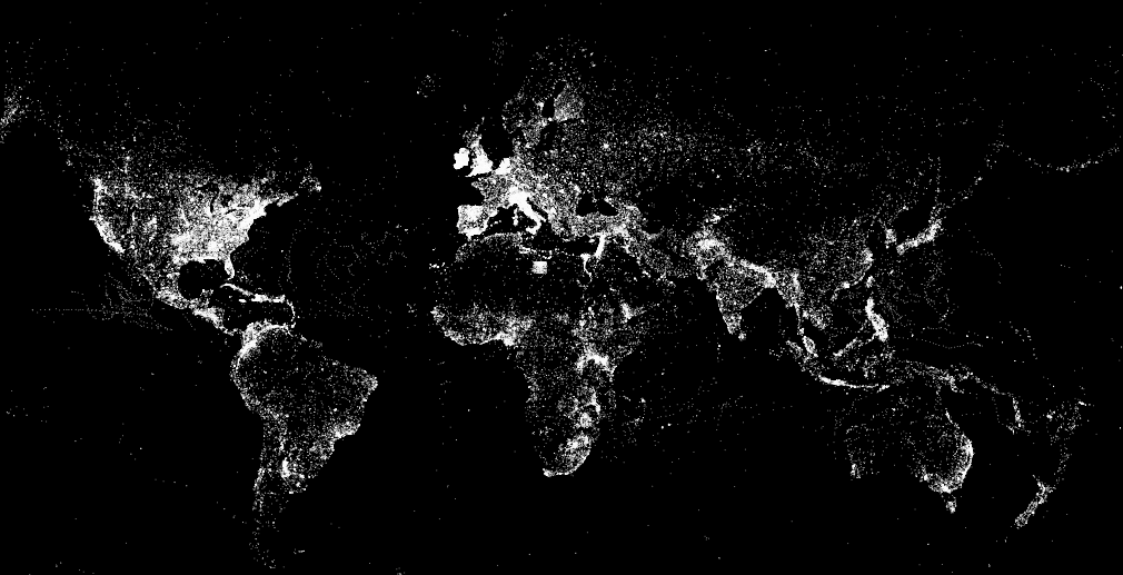
Ushahidi has just uploaded the location of all CrowdMap reports to DevSeed’s awesome MapBox and the result looks gorgeous. Click this link to view the map below in an interactive, full-browser window. Ushahidi doesn’t disclose the actual number of reports depicted, only the number of maps that said reports have been posted to and the number of countries that CrowdMaps have been launched for. But I’m hoping they’ll reveal that figure soon as well. (Update from Ushahidi: This map shows the 246,323 unique locations used for reports from the launch of Crowdmap on Aug 9, 2010 to Jan 18, 2013).
In any event, I’ve just emailed my colleagues at Ushahidi to congratulate them and ask when their geo-dataset will be made public since they didn’t include a link to said dataset in their recent blog post. I’ll be sure to let readers know in the comments section as soon as I get a reply. There are a plethora of fascinating research questions that this dataset could potentially help us answer. I’m really excited and can’t wait for my team and I at QCRI to start playing with the data. I’d also love to see this static map turned into a live map; one that allows users to actually click on individual reports as they get posted to a CrowdMap and to display the category (or categories) they’ve been tagged with. Now that would be just be so totally über cool—especially if/when Ushahidi opens up that data to the public, even if at a spatially & temporally aggregated level.
For more mesmerizing visualizations like this one, see my recent blog post entitled “Social Media: Pulse of the Planet?” which is also cross-posted on the National Geographic blog here. In the meantime, I’m keeping my fingers crossed that Ushahidi will embrace an Open Data policy from here on out and highly recommend the CrowdGlobe Report to readers interested in learning more about CrowdMap and Ushahidi.

