My colleague Kalev Leetaru recently co-authored this comprehensive study on the various sources and accuracies of geographic information on Twitter. This is the first detailed study of its kind. The detailed analysis, which runs some 50-pages long, has important implications vis-a-vis the use of social media in emergency management and humanitarian response. Should you not have the time to analyze the comprehensive study, this blog post highlights the most important and relevant findings.
Kalev et al. analyzed 1.5 billion tweets (collected from the Twitter Decahose via GNIP) between October 23 and November 30th, 2012. This came to 14.3 billion words posted by 35% of all active users at the time. Note that 2.9% of the world’s population are active Twitter users and that 87% of all tweets ever posted since the launch of Twitter in 2006 were posted in the past 24 months alone. On average, Kalev and company found that the lowest number of tweets posted per hour is one million; the highest is 2 million. In addition, almost 50% of all tweets are posted by 5% of users. (Click on images to enlarge).
In terms of geography, there are two ways to easily capture geographic data from Twitter. The first is from the location information specified by a user when registering for a Twitter account (selected from a drop down menu of place names). The second, which is automatically generated, is from the coordinates of the Twitter user’s location when tweeting, which is typically provided via GPS or cellular triangulation. On a typical day, about 2.7% of Tweets contain GPS or cellular data while 2.02% of users list a place name when registering (1.4% have both). The figure above displays all GPS/cellular coordinates captured from tweets during the 39 days of study. In contrast, the figure below combines all Twitter locations, adding registered place names and GPS/cellular data (both in red), and overlays this with the location of electric lights (blue) based on satellite imagery obtained from NASA.
White areas depict locations with an equal balance of tweets and electricity. Red areas reveal a higher density of tweets than night lights while blue areas have more night lights than tweets.” Iran and China show substantially fewer tweets than their electricity levels would suggest, reflecting their bans on Twitter, while India shows strong clustering of Twitter usage along the coast and its northern border, even as electricity use is far more balanced throughout the country. Russia shows more electricity usage in its eastern half than Twitter usage, while most countries show far more Twitter usage than electricity would suggest.”
The Pearson correlation between tweets and lights is 0.79, indicating very high similarity. That is, wherever in the world electricity exists, the chances of there also being Twitter users is very high indeed. That is, tweets are evenly distributed geographically according to the availability of electricity. And so, event though “less than three percent of all tweets having geolocation information, this suggests they could be used as a dynamic reference baseline to evaluate the accuracy of other methods of geographic recovery.” Keep in mind that the light bulb was invented 134 years ago in contrast to Twitter’s short 7-year history. And yet, the correlation is already very strong. This is why they call it an information revolution. Still, just 1% of all Twitter users accounted for 66% of all georeferenced tweets during the period of study, which means that relying purely on these tweets may provide a skewed view of the Twitterverse, particularly over short periods of time. But whether this poses a problem ultimately depends on the research question or task at hand.
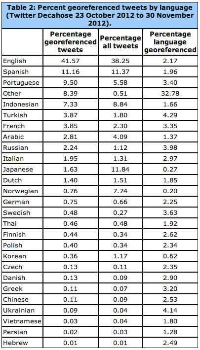
The linguistic geography of Twitter is critical: “If English is rarely used outside of the United States, or if English tweets have a fundamentally different geographic profile than other languages outside of the United States, this will significantly skew geocoding results.” As the table below reveals, georeferenced tweets with English content constitute 41.57% of all geo-tagged tweets.
The data from the above table is displayed geographically below for the European region. See the global map here. “In cases where multiple languages are present at the same coordinate, the point is assigned to the most prevalent language at that point and colored accordingly.” Statistical analyses of geo-tagged English tweets compared to all other languages suggests that “English offers a spatial proxy for all languages and that a geocoding algorithm which processes only English will still have strong penetration into areas dominated by other languages (though English tweets may discuss different topics or perspectives).”
Another important source of geographic information is a Twitter user’s bio. This public location information was available for 71% of all tweets studied by Kalev and company. Interestingly, “Approximately 78.4 percent of tweets include the user’s time zone in textual format, which offers an approximation of longitude […].” As Kalev et al. note, “Nearly one third of all locations on earth share their name with another location somewhere else on the planet, meaning that a reference to ‘Urbana’ must be disambiguated by a geocoding system to determine which of the 12 cities in the world it might refer to, including 11 cities in the United States with that name.”
There are several ways to get around this challenging, ranging from developing a Full Text Geocoder to using gazetteers such a Wikipedia Gazetteer and MaxFind which machine translation. Applying the latter has revealed that the “textual geographic density of Twitter changes by more than 53 percent over the course of each day. This has enormous ramifications for the use of Twitter as a global monitoring system, as it suggests that the representativeness of geographic tweets changes considerably depending on time of day.” That said, the success of a monitoring system is solely dependent on spatial data. Temporal factors and deviations from a baseline also enable early detection. In any event, “The small volume of georeferenced tweets can be dramatically enhanced by applying geocoding algorithms to the textual content and metadata of each tweet.”
Kalet et al. also carried out a comprehensive analysis of geo-tagged retweets. They find that “geography plays little role in the location of influential users, with the volume of retweets instead simply being a factor of the total population of tweets originating from that city.” They also calculated that the average geographical distance between two Twitter users “connected” by retweets (RTs) and who geotag their tweets is about 750 miles or 1,200 kilometers. When a Twitter user references another (@), the average geographical distance between the two is 744 miles. This means that RTs and @’s cannot be used for geo-referencing Twitter data, even when coupling this information with time zone data. The figure below depicts the location of users retweeting other users. The geodata for this comes from the geotagged tweets (rather than account information or profile data).
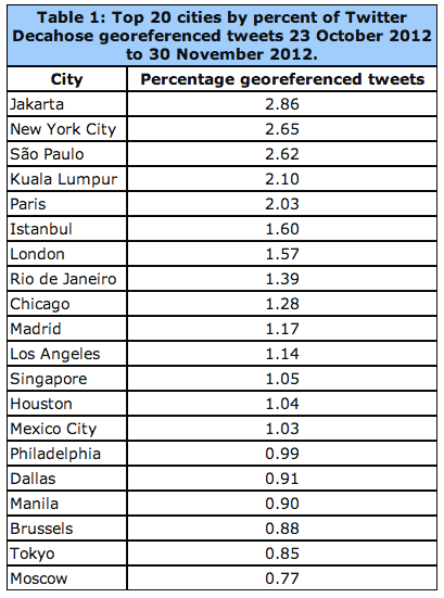
On average, about 15.85% of geo-tagged tweets contain links. The most popular links for these include Foursquare, Instagram, Twitter and Facebook. See my previous blog post on the analysis & value of such content for disaster response. In terms of Twitter geography versus that of mainstream news, Kalev et al. analyzed all news items available via Google News during the same period as the tweets they collected. This came to over 3.3 million articles pointing to just under 165,000 locations. The latter are color-coded red in the data ziv below, while Tweets are blue and white areas denote equal balance of both.
“Mainstream media appears to have significantly less coverage of Latin America and vastly better greater of Africa. It also covers China and Iran much more strongly, given their bans on Twitter, as well as having enhanced coverage of India and the Western half of the United States. Overall, mainstream media appears to have more even coverage, with less clustering around major cities.” This suggests “there is a strong difference in the geographic profiles of Twitter and mainstream media and that the intensity of discourse mentioning a country does not necessarily match the intensity of discourse emanating from that country in social media. It also suggests that Twitter is not simply a mirror of mainstream media, but rather has a distinct geographic profile […].”
In terms of future growth, “the Middle East and Eastern Europe account for some of Twitter’s largest new growth areas, while Indonesia, Western Europe, Africa, and Central America have high proportions of the world’s most influential Twitter users.”
See also:


Pingback: 09-Jun-2013 07:37 » HON 2000
Pingback: Big Data for Disaster Response: A List of Wrong Assumptions | iRevolution
Pingback: The Geography of Twitter: Mapping the Global Heartbeat | iRevolution | Jose Murilo's Weblog
Interesting research. I’m curious – what’s the red rectangle around Japan in the second map? Are people geo-tagging tweets or registering cell phones from the surrounding ocean?
Thanks for reading, Priya, Kalev said you already got in touch with him re your question.
Thanks for the follow up. Kalev did get back to me and answered the question.
Pingback: Using Twitter to Map Blackouts During Hurricane Sandy | iRevolution
Pingback: Geotagged Twitter Map: Mapping Travel, Languages & Mobile OS Usage