Tag Archives: Ushahidi

GeoSurveillance for Crisis Mapping Analytics

Having blogged at length on the rationale for Crisis Mapping Analytics (CMA), I am now interested in assessing the applicability of existing tools for crisis mapping vis-a-vis complex humanitarian emergencies.

In this blog post, I review an open-source software package called GeoSurveillance that combines spatial statistical techniques and GIS routines to perform tests for the detection and monitoring of spatial clustering.

The post is based on the new peer-reviewed article “GeoSurveillance: a GIS-based system for the detection and monitoring of spatial clusters” published in the Journal of Geographical Systems and authored by Ikuho Yamada, Peter Rogerson and Gyoungju Lee.

Introduction

The detection of spatial clusters—testing the null hypothesis of spatial randomness—is a key focus of spatial analysis. My first research project in this area dates back to 1996, when I wrote a software algorithm in C++ to determine the randomness (or non-randomness) of stellar distributions.

stars

The program would read a graphics file of a high-quality black-and-white image of a stellar distribution (that I had scanned from a rather expensive book) and run a pattern analysis procedure to determine what constituted a star and then detect them. Note that the stars were of various sizes and resolutions, with many overlapping in part.

Once the stars were detected, I manually approximated the number of stars in the stellar distributions to evaluate the reliability of my algorithm. The program would then assign (x, y) coordinates to each star. I compared this series of numbers with a series of pseudo-random numbers that I generated independently.

Using the Kolmogorov-Smirnov test in two-dimensions, I could then test the probability that the series of (x, y) coordinates pseudo-random numbers were samples that came from the same set.

Retrospective vs Prospective Analysis

This type of spatial cluster analysis on stellar distributions is retrospective and the majority of methods developed to date belong to this class of tests.

The other class of spatial cluster detection is called prospective testing. This testing is designed for time-series data that is updated over time and test statistics are computed when new data becomes available. “While retrospective tests focus on a static aspect of spatial patterns, prospective tests take into account their dynamic nature and attempt to find new, emergent clusters as quickly as possible.”

There has been a surge of interest in this prospective approach following the anthrax attacks of 2001 and the perceived threat of bioterrorism since. But as the authors of the GeoSurveillance study note, prospective monitoring approaches have broader application, “including the detection of outbreaks of food poisoning and infectious diseases and the detection of emergent crime hotspots.” And I would add crisis mapping for complex humanitarian emergencies.

Very little work has been done using retrospective analysis for crisis mapping and even less using prospective techniques. Both are equally important. The former is critical if we want to have a basis (and indeed baseline) to know what deviations and patterns to look for. The former is important since as humanitarian practitioners and policy makers, we are interested in operational conflict prevention.

Spatial Analysis Software

While several GIS software packages provide functionalities for retrospective analysis of spatial patterns, “few provide for prospective analysis,” with the notable exception of SaTScan, which enables both applications. SaTScan does has two drawbacks, however.

The first is that “prospective analysis in SaTScan is not adjusted in a statistically rigorous manner for repeated time-periodic tests conducted as new data become available.” Secondly, the platform “does not offer any GIS functionality for quick visual assessment of detected clusters.”

What is needed is a platform that provides a convenient graphical user-interface (GUI) that allows users to identify spatial clusters both statistically and visually. GeoSurveillance seeks to do just this.

Introducing GeoSurveillance

This spatial analysis software consists of three components: a cluster detection and monitoring component, a GIS component and a support tool component as depicted below.

GeoSurveillance

  • “The cluster detection and monitoring component is further divided into retrospective and prospective analysis tools, each of which has a corresponding user-interface where parameters and options for the analysis are to be set. When the analysis is completed, the user-interfaces also provide a textual and/or graphical summary of results.”
  • “The GIS component generates map representation of the results, where basic GIS functionalities such as zoom in/out, pan, and identify are available. For prospective analysis, the resulting map representation is updated every time a statistical computation for a time unit is completed so that spatial patterns changing over time can be visually assessed as animation.”
  • “The support tool component provides various auxiliary tools for user.”

The table below presents a summary (albeit not exhaustive) of statistical tests for cluster detection. The methods labeled in bold are currently available within GeoSurveillance.

GeoSurveillance2

GeoSurveillance uses the local score statistic for retrospective analysis and applies the univariate cumulative sum (cusum) method. Cusum methods are familiar to public health professionals since they are often applied to public health monitoring.

Both methods are somewhat involved mathematically speaking so I won’t elaborate on them here. Suffice it to say that the complexity of spatial analysis techniques needs to be “hidden” from the average user if this kind of platform is to be used by humanitarian practitioners in the field.

Applying GeoSurveillance

The authors Yamada et. al used the platform to carry out a particularly interesting study of low birth weight (LBW) incidence data in Los Angeles, California.

Traditional studies “on LBW have focused on individual-level risk factors such as race/ethnicity, maternal age, maternal education, use of prenatal care, smoking and other substance abuse during pregnancy.” However, such individual factors have had little ability to explain the risk of LBW. To this end, “increasing attention has been directed to neighborhood-level risk factors including […] racial/ethnic composition, economic status, crime rate, and population growth trend.”

The authors of the GeoSurveillance study thus hypothesize that “the risk of LBW incidence and its change over time have non-random spatial patterns reflecting background distributions of neighborhood-level risk factors.” The results of the retrospective and prospective analysis using GeoSurveillance is available both in tabular and map formats. The latter format is displayed and interpreted below.

GeoSurveillance3

Using GeoSurveillance’s retrospective analysis functionality enable the authors to automatically detect high risk areas of LWB (marked in red) as well as the zone with the highest abnormal incidents of LBW (marked in yellow). The maps above indicate that a large concentration of neighborhoods with high risk of LBW are found “near downtown Los Angeles extending toward the northwest, and three smaller ones in the eastern part of the county.”

GeoSurveillance4

Carrying out prospective analysis on the LWB data enabled the authors to conclude that high the risk of LBW “used to be concentrated in particular parts of the county but is now more broadly spread throughout the county.” This result now provides the basis for further investigation to “identify individual- and neighborhood-level factors that relate to this change in the spatial distribution of the LBW risk.”

Conclusion

The developers of GeoSurveillance plan to implement more methods in the next version, especially for prospective analysis given the limited availability of such methods in other GIS software. The GeoSurveillance software as well as associated documentation and sample datasets can be downloaded here.

I have downloaded the software myself and will start experimenting shortly with some Ushahidi and/or PRIO data if possible. Stay tuned for an update.

Patrick Philippe Meier

Ushahidi for Mobile Banking

I just participated in a high-level mobile banking (mBanking) conference in Nairobi, which I co-organized with colleagues from The Fletcher School.

Participants included the Governor of Kenya’s Central Bank, Kenya’s Finance Minister, the directors/CEO’s of Safaricom, Equity Bank, Bankable Frontier Associates, Iris Wireless, etc, and senior representatives from the Central Banks of Tanzania, Rwanda and Burundi as well as CGAP, Google, DAI, etc.

mBanking1

The conference blog is available here and the Twitter feed I set up is here. The extensive work that went into organizing this international conference explains my relative absence from iRevolution; that and my three days off the grid in Lamu with Fletcher colleagues and Erik Hersman.

I have already blogged about mBanking here so thought I’d combine  my interest in the subject with my ongoing work with Ushahidi.

One of the issues that keeps cropping up when discussing mBanking (and branchless banking) is the challenge of agent reliability and customer service. How does one ensure the trustworthiness of a growing network of agents and simultaneously handle customer complaints?

A number of speakers at Fletcher’s recent conference highlighted these challenges and warned they would become more pressing with time. So this got me thinking about an Ushahidi-for-mBanking platform.

Since mBanking customers by definition own a mobile phone, a service like M-Pesa or Zap could provide customers with a dedicated short code which they could use to text in concerns or report complaints along with location information. These messages could then be mapped in quasi real-time on an Ushahidi platform. This would provide companies like Safaricom and Zain with a crowdsourced approach to monitoring their growing agent network.

A basic spatial analysis of these customer reports over time would enable Safaricom and Zain to identify trends in customer complaints. The geo-referenced data could also provide the companies with a way to monitor agent-reliability by location. Safaricom could then offer incentives to M-Pesa agents to improve agent compliance and reward them accordingly.

In other words, the “balance of power” would shift from the agent to the customer since the latter would now be in position to report on quality of service.

But why wait for Safaricom and Zain to kick this off? Why not simply launch two public parallel platforms, one for M-Pesa and the other for Zap to determine which of the two companies receive more complaints and how quickly they respond to them?

To make the sites sustainable, one could easily come up with a number of business plan models. One idea might be to provide advertising space on the Ushahidi-mBanking site. In addition, the platform would provide a way to collect the mobile phone numbers of individual clients; this information could then be used to broadcast ads-by-SMS on a weekly basis, for example.

If successful, this approach could be replicated with Wizzit and MTN in South Africa and gCash in the Philippines. I wish I had several more weeks in Nairobi to spearhead this but I’m heading back to the Sudan to continue my consulting work with the UN’s Threat and Risk Mapping Analysis (TRMA).

Patrick Philippe Meier

Moving Forward with Swift River

This is an update on the latest Swift River open group meeting that took place this morning at the InSTEDD office in Palo Alto. Ushahidi colleague Kaushal Jhalla first proposed the idea behind Swift River after the terrorist attacks on Mumbai last November. Ushahidi has since taken on the initiative as a core project since the goal of Swift River is central to the group’s mission: the crowdsourcing of crisis information.

Kaushal and Chris Blow gave the first formal presentation of Swift River during our first Ushahidi strategy meeting in Orlando last March where we formally established the Swift River group, which includes Andrew Turner, Sean Gourely, Erik Hersman and myself in addition to Kaushal and Chris. Andrew has played a pivotal role in getting Swift River and Vote Report India off the ground and I highly recommend reading his blog post on the initiative.

The group now includes several new friends of Ushahidi, a number of whom kindly shared their time and insights this morning after Chris kicked off the meeting to bring everyone up to speed.  The purpose of this blog post is to outline how I hope Swift River moves forward based on this morning’s fruitful session. Please see my previous blog post for an overview of the basic methodology.

The purpose of the Swift River platform, as I proposed this morning, is to provide two core services. The first, to borrow Guarva Mishra‘s description, is to crowdsource the tagging of crisis information. The second is to triangulate the tagged information to assign reality scores to individual events. Confused? Not to worry, it’s actually really straightforward.

Crowdsourcing Tagging

Information on a developing crisis can be captured from several text-based sources such articles from online news media, Tweets and SMS, for example. Of course, video footage, pictures and satellite imagery can also provide important information, but we’re more interested in text-based data for now.

The first point to note is that information can range from being very structured to highly unstructured. The word structure is simply another way of describing how organized information is. A few examples are in order vis-a-vis text-based information.

A book is generally highly structured information. Why? Well, because the author hopefully used page numbers, chapter headings, paragraphs, punctuation, an index and table of contents. The fact that the book is structured makes it easier for the reader to find the information she is looking for. The other end of the “structure spectrum” would be a run-on sentence with nospacesandpunctuation. Not terribly helpful.

Below is a slide from a seminar I taught on disaster and conflict early warning back in 2006; ignore the (c).

ewstructure

The slide above depicts the tradeoff between control and structure. We can impose structure on data collected if we control the data entry process. Surveys are an example of a high-control process that yields high-structure. We want high structure because this allows us to find and analyze the data more easily (c.f. entropy). This has generally been the preferred approach, particularly amongst academics.

If we give up control, as one does when crowdsourcing crisis information, we open ourselves up to the possibility of having to deal with a range of structured and unstructured information. To make sense of this information typically requires data mining and natural language processing (NLP) techniques that can identify structure in said information. For example, we would want to identify nouns, verbs, places and dates in order to extra event-data.

One way to do this would be to automatically tag an article with the parameters “who, what, where and when.” A number of platforms such as Open Calais and Virtual Research Associate’s FORECITE already do this. However, these platforms are not customized for crowdsourcing of crisis information and most are entirely closed. (Note: I did consulting work for VRA many years ago).

So we need to draw (and modify) relevant algorithms that are publically available and provide and a user-friendly interface for human oversight of the automated tagging (what we also referred to as crowdsourcing the filter). Here’s a proposed interface that Chris recently designed for Swift River.

swiftriver

The idea would be to develop an algorithm that parses the text (on the left) and auto-suggests answers for the tags (on the right). The user would then confirm or correct the suggested tags and the algorithm would learn from it’s mistakes. In other words, the algorithm would become more accurate over time and the need for human oversight would decrease. In short, we’d be developing a data-driven ontology backed up by Freebase to provide semantic linkages.

VRA already does this but, (1) the data validation is carried out by one (poor) individual, (2) the articles were restricted to the headlines from Reuters and Agence France Press (AFP) newswires, and (3) the project did not draw on semantic analysis. The validation component entailed making sure that events described in the headlines were correctly coded by the parser and ensuring there were no duplicates. See VRA’s patent for the full methodology (PDF).

Triangulation and Scoring

The above tagging process would yield a highly structured event dataset like the example depicted below.

dataset

We could then use simple machine analysis to cluster the same events together and thereby do away with any duplicate event-data. The four records above would then be collapsed into one record:

datafilter2

But that’s not all. We would use a simple weighting or scoring schema to assign a reality score to determine the probability that the event reported really happened. I already described this schema in my previous post so will just give one example: An event that is reported by more than one source is more likely to have happened. This increases the reality score of the event above and pushes it higher up the list. One could also score an event by the geographical proximity of the source to the reported event, and so on. These scores could be combined to give an overall score.

Compelling Visualization

The database output above is not exactly compelling to most people. This is where we need some creative visualization techniques to render the information more intuitive and interesting. Here are a few thoughts. We could draw on Gapminder to visualize the triangulated event-data over time. We could also use the idea of a volume equalizer display.

equalize

This is not the best equalizer interface around for sure, but hopefully gets the point across. Instead of decibels on the Y-axis, we’d have probability scores that an event really happened. Instead of frequencies on the X-axis, we’d have the individual events. Since the data coming in is not static, the bars would bounce up and down as more articles/tweets get tagged and dumped into the event database.

I think this would be an elegant way to visualize the data, not least because the animation would resemble the flow or waves of a swift river but the idea of using a volume equalizer could be used as analogy to quiet the unwanted noise. For the actual Swift River interface, I’d prefer using more colors to denote different characteristics about the event and would provide the user with the option of double-clicking on a bar to drill down to the event sources and underlying text.

Patrick Philippe Meier

Video Introduction to Crisis Mapping

I’ve given many presentations on crisis mapping over the past two years but these were never filmed. So I decided to create this video presentation with narration in order to share my findings more widely and hopefully get a lot of feedback in the process. The presentation is not meant to be exhaustive although the video does run to about 30 minutes.

The topics covered in this presentation include:

  • Crisis Map Sourcing – information collection;
  • Mobile Crisis Mapping – mobile technology;
  • Crisis Mapping Visualization – data visualization;
  • Crisis Mapping Analysis – spatial analysis.

The presentation references several blog posts of mine in addition to several operational projects to illustrate the main concepts behind crisis mapping. The individual blog posts featured in the presentation are listed below:

This research is the product of a 2-year grant provided by Humanity United  (HU) to the Harvard Humanitarian Initiative’s (HHI) Program on Crisis Mapping and Early Warning, where I am a doctoral fellow.

I look forward to any questions/suggestions you may have on the video primer!

Patrick Philippe Meier

Folksomaps: Gold Standard for Community Mapping

There were a number of mapping-related papers, posters and demo’s at ICTD2009. One paper in particular caught my intention given the topic’s direct relevance to my ongoing consulting work with the UN’s Threat and Risk Mapping Analysis (TRMA) project in the Sudan and the upcoming ecosystem project in Liberia with Ushahidi and Humanity United.

Introduction

Entitled “Folksomaps – Towards Community Intelligent Maps for Developing Regions,” the paper outlines a community-driven approach for creating maps by drawing on “Web 2.0 principles” and “Semantic Web technologies” but without having to rely entirely on a web-based interface. Indeed, Folksomaps “makes use of web and voice applications to provide access to its services.”

I particularly value the authors’ aim to “provide map-based services that represent user’s intuitive way of finding locations and directions in developing regions.” This is an approach that definitely resonates with me. Indeed, it is our responsibility to adapt and customize our community-based mapping tools to meet the needs, habits and symbology of the end user; not the other way around.

I highly recommend this paper (or summary below) to anyone doing work in the crisis mapping field. In fact, I consider it required reading. The paper is co-authored by Arun Kumar, Dipanjan Chakraborty, Himanshu Chauhan, Sheetal Agarwal and Nitendra Rajput of IBM India Research Lab in New Delhi.

Background

Vast rural areas of developing countries do not have detailed maps or mapping tools. Rural populations are generally semi-literate, low-income and non-tech savvy. They are hardly like to have access to neogeography platforms like Google Earth. Moreover, the lack of electricity access and Internet connection also complicates the situation.

We also know that cities, towns and villages in developing countries “typically do not have well structured naming of streets, roads and houses,” which means “key landmarks become very important in specifying locations and directions.”

Drawing on these insights, the authors seek to tap the collective efforts of local communities to populate, maintain and access content for their own benefit—an approach I have described as crowdfeeding.

Surveys of Tech and Non-Tech Users

The study is centered on end-user needs, which is rather refreshing. The authors carried out a series of surveys to be better understand the profiles of end-users, e.g., tech and non-tech users.

The first survey sought to identify answers to the following questions:

  • How do people find out points of interest?
  • How do much people rely on maps versus people on the streets?
  • How do people provide local information to other people?
  • Whether people are interested in consuming and feeding information for a community-driven map system?

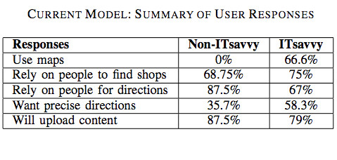
The results are listed in the table below:

folksotb1

Non-tech savvy users did not use maps to find information about locations and only 36% of these users required precise information. In addition, 75% of non-tech respondents preferred the choice of a phone-based interface, which really drives home the need for what I have coined “Mobile Crisis Mapping” or MCM.

Tech-users also rely primarily on others (as opposed to maps) for location related information. The authors associate this result with the lack of signboards in countries like India. “Many a times, the maps do not contain fine-grained information in the first place.”

Most tech-users responded that a phone-based location and direction finding system in addition to a web-based interface. Almost 80% expressed interest in “contributing to the service by uploading content either over the phone or though a web-based portal.”

The second survey sought to identify how tech and non-tech users express directions and local information. For example:

  • How do you give directions to people on the road or to friends?
  • How do you describe proximity of a landmark to another one?
  • How do you describe distance? Kilometers or using time-to-travel?

The results are listed in the table below:

folksotb2

The majority of non-tech savvy participants said they make use of landmarks when giving directions. “They use names of big roads […] and use ‘near to’, ‘adjacent to’, ‘opposite to’ relations with respect to visible and popular landmarks […].” Almost 40% of responders said they use time only to describe the distance between any two locations.

Tech-savvy participants almost always use both time and kilometers as a measure to represent distance. Only 10% or so of participants used kilometers only to represent distance.

The Technology

The following characteristics highlight the design choices that differentiate Folksomaps from established notions of map systems:

  • Relies on user generated content rather than data populated by professionals;
  • Strives for spatial integrity in the logical sense and does not consider spatial integrity in the physical sense as essential (which is a defining feature of social maps);
  • Does not consider visual representation as essential, which is important considering the fact that a large segment of users in developing countries do not have access to Internet (hence my own emphasis on mobile crisis mapping);
  • Is non-static and intelligent in the sense that it infers new information from what is entered by the users.
  • User input is not verified by the system and it is possible that pieces of incorrect information in the knowledgebase may be present at different points of time. Folksomaps adopts the Wiki model and allows all users to add, edit and remove content freely while keeping maps up-to-date.

Conceptual Design

Folksomaps uses “landmark” as the basic unit in the mapping knowledgebase model while “location” represents more coarse-grained geographical areas such as a village, city or country. The model then seeks to capture a few key logical characteristics of locations such as direction, distance, proximity and reachability and layer.

The latter constitutes the granularity of the geographic area that a location represents. “The notion of direction and distance from a location is interpreted with respect to the layer that the location represents. In other words, direction and distance could be viewed as binary operator over locations of the same level. For instance, ‘is towards left of ’ would be appropriate if the location pair being considered is <Libya, Egypt>,” but not if the pair is <Nairobi, India>.

The knowledgebase makes use of two modules, the Web Ontology Language (OWL) and a graph database, to represent and store the above concepts. The Semantic Web language OWL is used to model the categorical characteristics of a landmark (e.g., direction, proximity, etc), and thence infer new relationships not explicitly specified by users of the system. In other words, OWL provides an ontology of locations.

The graph database is used represent distance (numerical relationships) between landmarks. “The locations are represented by nodes and the edges between two nodes of the graph are labeled with the distance between the corresponding locations.” Given the insights gained from user surveys, precise distances and directions are not integral components of community-based maps.

The two modules are used to generate answers to queries submitted by users.

User Interaction

The authors rightly recognize that the user interface design is critical to the success of community-based mapping projects. To be sure, users of may be illiterate, or semi-illiterate and not very tech-savvy. Furthermore, users will tend to query the map system when they need it most, e.g., “when they are stuck on the road looking for directions […] and would be pressed for time.” This very much holds true for crisis mapping as well.

Users can perform three main tasks with the system: “find place”, “trace path” and “add info.” In addition, some or all users may be granted the right to edit or remove entries from the knowledgebase. The Folksomaps system can also be bootstrapped from existing databases to populate instances of location types. “Two such sources of data in the absence of a full-fledged Geographical Information System (GIS) come from the Telecom Industry and the Postal Department.”

folksofig3

How the users interface with the system to carry out these tasks will depend on how tech-savvy or literate they are and what type of access they have to information and communication technologies.

Folksomaps thus provides three types of interface: web-based, voice-based and SMS-based. Each interface allows the user to query and update the database. The web-based interface was developed using Java Server Pages (JSP) while the voice-based interface uses JSPs and VoiceXML.

folksofig41

I am particularly interested in the voice-based interface. The authors point to previous studies that suggest a voice-based interaction works well with users who are illiterate or semi-illiterate and who cannot afford to have high-end devices but can use ordinary low-end phones.

folksofig1

I will share this with the Ushahidi development team with the hopes that they will consider adding a voice-based interface for the platform later this year. To be sure, could be very interesting to integrate Freedom Fone’s work in this area.

Insights from User Studies

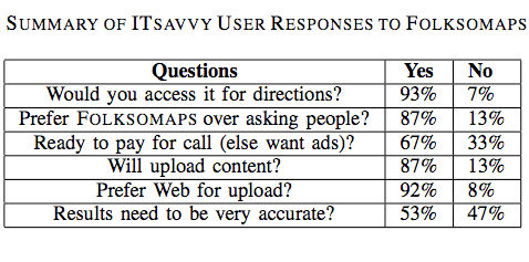
The authors conducted user studies to verify the benefit and acceptability of Folksomaps. Tech-savvy used the web-based interface while non-tech savvy participants used the voice-based interface. The results are shown in the two tables below.

folksotb3

Several important insights surfaced from the results of the user studies. For example, an important insight gained from the non-tech user feedback was “the sense of security that they would get with such a system. […] Even though asking for travel directions from strangers on the street is an option, it exposes the enquirer to criminal elements […].”

Another insight gain was the fact that many non-tech savvy participants were willing to pay for the call even a small premium over normal charges as they saw value to having this information available to them at all times.” That said, the majority of participants “preferred the advertisement model where an advertisement played in the beginning of the call pays for the entire call.”

Interestingly, almost all participants preferred the voice-based interface over SMS even though the former led to a number of speech recognition errors. The reason being that “many people are either not comfortable using SMS or not comfortable using a mobile phone itself.”

There were also interesting insights on the issue of accuracy from the perspective of non-tech savvy participants. Most participants asked for full accuracy and only a handful were tolerant of minor mistakes. “In fact, one of the main reasons for preferring a voice call over asking people for directions was to avoid wrong directions.”

This need for high accuracy is driven by the fact that most people use public transportation, walk or use a bicycle to reach their destination, which means the cost of incorrect information is large compared to someone who owns a car.

This is an important insight since the authors had first assumed that tolerance for incorrect information was higher. They also learned that meta information is as important to non-tech savvy users as the landmarks themselves. For instance, low-income participants were more interested in knowing the modes of available transportation, timetables and bus route numbers than the road route from a source to a destination.

folkstb4

In terms of insights from tech-savvy participants, they did not ask for fine-grained directions all the time. “They were fight with getting high level directions involving major landmarks.” In addition, the need for accuracy was not as strong as for the non-tech savvy respondents and they preferred the content from the queries sent to them via SMS so they could store it for future access, “pointing out that it is easy to forget the directions if you just hear it.”

Some tech-savvy participants also suggested that the directions provided by Folksomaps should “take into consideration the amount of knowledge the subject already has about the area, i.e., it should be personalized based upon user profile. Other participants mentioned that “frequent changes in road plans due to constructions should be captured by such a system—thus making it more usable than just getting directions.”

Conclusion

In sum, the user interface of Folksomaps needs to be “rich and adaptive to the information needs of the user […].” To be sure, given user preference towards “voice-based interface over SMS, designing an efficient user-friendly voice-based user interface […].” In addition, “dynamic and real-time information augmented with traditional services like finding directions and locations would certainly add value to Folksomaps.” Furthermore, the authors recognize that Folksomaps can “certainly benefit from user interface designs,” and “multi-model front ends.”

Finally, the user surveys suggest “the community is very receptive towards the concept of a community-driven map,” so it is important that the TRMA project in the Sudan and the ecosystem Liberia project build on the insights and lessons learned provided in this study.

Patrick Philippe Meier

ICT for Development Highlights

Credit: http://farm2.static.flickr.com/1403/623843568_7fa3c0cbe9.jpg?v=0

For a moment there, during the 8-hour drive from Kassala back to Khartoum, I thought Doha was going to be a miss. My passport was still being processed by the Sudanese Ministry of Foreign Affairs and my flight to Doha was leaving in a matter of hours. I began resigning myself to the likelihood that I would miss ICT4D 2009. But thanks to the incredible team at IOM, not only did I get my passport back, but I got a one-year, mulitple re-entry visa as well.

I had almost convinced myself that missing ICT4D would ok. How wrong I would have been. When the quality of poster presentations and demo’s at a conference rival the panels and presentation, you know that you’re in for a treat. As the title of this posts suggest, I’m just going to point out a few highlights here and there.

Panels

  • Onno Purbo gave a great presentation on wokbolic, a  cost saving wi-fi receiver  antenna made in Indonesia using a wok. The wokbolic has as 4km range, costs $5-$10/month. Great hack.

wok

  • Kentaro Toyama with Microsoft Research India (MSR India) made the point that all development is paternalistic and that we should stop fretting about this since development will by definition be paternalistic. I’m not convinced. Partnership is possible without paternalism.
  • Ken Banks noted the work of QuestionBox, which I found very interesting. I’d be interested to know how they remain sustainable, a point made by another colleague of mine at DigiActive.
  • Other interesting comments by various panelists included (and I paraphrase): “Contact books and status are more important than having an email address”; “Many people still think of mobile phones as devices one holds to the ear… How do we show that phones can also be used to view and edit content?”

Demo’s & Posters

I wish I could write more about the demo’s and posters below but these short notes and few pictures will have to do for now.

dudes

  • Analyzing Statistical Relationships between Global Indicators through Visualization:

geostats

  • Numeric Paper Forms for NGOs:

paperforms

  • Uses of Mobile Phones in Post-Conflict Liberia:

liberiaphones

  • Improving Data Quality with Dynamic Forms

datavalidate

  • Open Source Data Collection Tools:

opensourcecollection

Patrick Philippe Meier

Developing Swift River to Validate Crowdsourcing

Swift River is an Ushahidi initiative to crowdsource the process of data validation. We’re developing a Swift River pilot to complement the VoteReport India crowdsourcing platform we officially launched this week. As part of the Swift River team, I’d like to share with iRevolution readers what I hope the Swift River tool will achieve.

We had an excellent series of brainstorming sessions several weeks ago in Orlando and decided we would combine both natural language processing (NLP) and decentralized human filtering to get one step closer at validating crowdsourced data. Let me expand on how I see both components working individually and together.

Automated Parsing

Double-counting has typically been the bane of traditional NLP or automated event-data extraction algorithms. At Virtual Research Associates (VRA), for example, we would parse headlines of Reuters newswires in quasi real-time, which meant that a breaking story would typically be updated throughout the day or week.

But the natural language parser was specifically developed to automate event-data extraction based on the parameters “Who did what, to whom, where and when?” In other words, the parser could not distinguish whether coded events were actually the same or related. This tedious task was left to VRA analysts to carry out.

Digital Straw

The logic behind eliminating double counting (duplicate event-data) is inevitably reversed given the nature of crowdsourcing. To be sure, the more reports are collected about a specific event, the more likely it is that the event in question actually took place as described by the crowd. Ironically, that is precisely why we want to “drink from the fire hose,” the swift river of data gushing through the wires of social media networks.

We simply need a clever digital straw to filter the torrent of data. This is where our Swift River project comes in and why I first addressed the issue of double counting. One of the central tasks I’d like Swift River to do is to parse the incoming reports from VoteReport India and to cluster them into unique event-clusters. This would be one way to filter the cascading data. Moreover, the parser could potentially help filter fabricated reports.

An Example

For example, if 17 individual reports from different sources are submitted over a two-day period about “forged votes,” then the reports in effect self-triangulate or validate each other. Of course, someone (with too much time on their hands) might decide to send 17 false reports about “forged votes.”

Our digital straw won’t filter all the impurities, but automating this first-level filter is surely better than nothing. Automating this process would require that the digital straw automate the extraction of nouns, verbs and place names from each report, i.e., actor, action and location. Date and time would automatically be coded based on when the report was submitted.

Reports that use similar verbs (synonyms) and refer to the same or similar actors at the same location on the same day can then be clustered into appropriate event-clusters. More on that in the section on crowdsourcing the filter below.

More Filters

A second-level filter would compare the content of the reports to determine if they were exact replicas. In other words, if someone were simply copying and pasting the same report, Swift River could flag those identical reports as suspicious. This means someone gaming the system would have to send multiple reports with different wording, thus making it a bit more time consuming to game the system.

A third-level filter or trip-wire could compare the source of the 17 reports. For example, perhaps 10 reports were submitted by email, 5 by SMS and two by Twitter. The greater the diversity of media used to report an event, the more likely that event actually happened. This means that someone wanting to game the system would have to send several emails, text messages and Tweets using different language to describe a particular event.

A fourth-level filter could identify the email addresses, IP addresses and mobile phone numbers in question to determine if they too were different. A crook trying to game the system would now have to send emails from different accounts and IP addresses, different mobile phone numbers, and so on. Anything “looking suspicious” would be flagged for a human to review; more on that soon. The point is to make the gaming of the system as time consuming and frustrating as possible.

Gaming the System

Of course, if someone is absolutely bent on submitting fabricated data that passes all the filters, then they will.  But those individuals probably constitute a minority of offenders. Perhaps the longer and more often they do this, the more likely someone in the crowd will pick up on the con. As for the less die-hard crooks out there, they may try and game the system only to see that their reports do not get mapped. Hopefully they’ll give up.

I do realize I’m giving away some “secrets” to gaming the system, but I hope this will be more a deterrent than an invitation to crack the system. If you do happen to be someone bent on gaming the platform, I wish you’d get in touch with us instead and help us improve the filters. Either way, we’ll learn from you.

No one on the Swift River team claims that 100% of the dirt will be filtered. What we seek to do is develop a digital filter that makes the data that does come through palatable enough for public consumption.

Crowdsourcing the Filter

Remember the unique event-clusters idea from above? These could be visualized in a simple and intuitive manner for human volunteers (the crowd) to filter. Flag icons, perhaps using three different colors—green, orange and red—could indicate how suspicious a specific series of reports might be based on the results of the individual filters described above.

A green flag would indicate that the report has been automatically mapped on VoteReport upon receipt. An orange flag would indicate the need for review by the crowd while a red flag would send an alert for immediate review.

If a member of the crowd does confirm that a series of reports were indeed fabricated, Swift River would note the associated email address(es), IP address(es) and/or mobile phone number(s) and automatically flag future reports from those sources as red. In other words, Swift River would start rating the credibility of users as well.

If we can pull this off, Swift River may actually start to provide “early warning” signals. To be sure, if we fine tune our unique event-cluster approach, a new event-cluster would be created by a report that describes an event which our parser determines has not yet been reported on.

This should set off a (yellow) flag for immediate review by the crowd. This could either be a legitimate new event or a fabricated report that doesn’t fit into pre-existing cluster. Of course, we will get a number of false positives, but that’s precisely why we include the human crowdsourcing element.

Simplicity

Either way, as the Swift River team has already agreed, this process of crowdsourcing the filter needs to be rendered as simple and seamless as possible. This means minimizing the number of clicks and “mouse motions” a user has to make and allowing for short-cut keys to be used, just like in Gmail. In addition, a userfiendly version of the interface should be designed specifically for mobile phones (various platforms and brands).

As always, I’d love to get your feedback.

Patrick Philippe Meier

Ushahidi Comes to India for the Elections (Updated)

I’m very please to announce that the Ushahidi platform has been deployed at VoteReport.in to crowdsource the monitoring of India’s upcoming elections. The roll out followed our preferred model: an amazing group of Indian partners took the initiative to drive the project forward and are doing a superb job. I’m learning a lot from their strategic thinking.

picture-3

We’re also excited about developing Swift River as part of VoteReport India to apply a crowdsourcing approach to filter the incoming information for accuracy. This is of course all experimental and we’ll be learning a lot in the process. For a visual introduction to Swift River, please see Erik Hersman’s recent video documentary on our conversations on Swift River, which we had a few weeks ago in Orlando.

picture-5

As per our latest Ushahidi deployments, VoteReport users can report on the Indian elections by email, SMS, Tweet or by submitting an incident directly online at VoteReport. Users can also subscribe to email alerts—a functionality I’m particularly excited about as this closes the crowdsourcing to crowdfeeding feedback loop; so I’m hoping we can also add SMS alerts, funding permitted. For more on crowdfeeding, please see my previous post on “Ushahidi: From Crowdsourcing to Crowdfeeding.

picture-4

You can read more about the project here and about the core team here. It really is an honor to be a part of this amazing group. We also have an official VoteReport blog here. I also highly recommend reading Gaurav Mishra‘s blog post on VoteReport here and Ushahidi’s here.

Next Steps

  • We’re thinking of using a different color to depict “All Categories” since red has cognitive connotations of violence and we don’t want this to be the first impression given by the map.
  • I’m hoping we can add a “download feature” that will allow users to directly download the VoteReport data as a CSV file and as a KML Google Earth Layer. The latter will allow users to dynamically visualize VoteReports over space and time just like [I did here] with the Ushahidi data during the Kenyan elections.
  • We’re also hoping to add a feature that asks those submitting incidents to check-off that the information they submit is true. The motivation behind this is inspired from recent lessons learned in behavioral economics as explained in my blog post on “Crowdsourcing Honesty.

Patrick Philippe Meier

iRevolution One Year On…

I started iRevolution exactly one year ago and it’s been great fun! I owe the Fletcher A/V Club sincere thanks for encouraging me to blog. Little did I know that blogging was so stimulating or that I’d be blogging from the Sudan.

Here are some stats from iRevolution Year One:

  • Total number of blog posts = 212
  • Total number of comments = 453
  • Busiest day ever = December 15, 2008

And the Top 10 posts:

  1. Crisis Mapping Kenya’s Election Violence
  2. The Past and Future of Crisis Mapping
  3. Mobile Banking for the Bottom Billion
  4. Impact of ICTs on Repressive Regimes
  5. Towards an Emergency News Agency
  6. Intellipedia for Humanitarian Warning/Response
  7. Crisis Mapping Africa’s Cross-border Conflicts
  8. 3D Crisis Mapping for Disaster Simulation
  9. Digital Resistance: Digital Activism and Civil Resistance
  10. Neogeography and Crisis Mapping Analytics

I do have a second blog that focuses specifically on Conflict Early Warning, which I started at the same time. I have authored a total of 48 blog posts.

That makes 260 posts in 12 months. Now I know where all the time went!

The Top 10 posts:

  1. Crimson Hexagon: Early Warning 2.0
  2. CSIS PCR: Review of Early Warning Systems
  3. Conflict Prevention: Theory, Police and Practice
  4. New OECD Report on Early Warning
  5. Crowdsourcing and Data Validation
  6. Sri Lanka: Citizen-based Early Warning/Response
  7. Online Searches as Early Warning Indicators
  8. Conflict Early Warning: Any Successes?
  9. Ushahidi and Conflict Early Response
  10. Detecting Rumors with Web-based Text Mining System

I look forward to a second year of blogging! Thanks to everyone for reading and commenting, I really appreciate it!

Patrick Philippe Meier

Peer Producing Human Rights

Molly Land at New York Law School has written an excellent paper on peer producing human rights, which will appear in the Alberta Law Review, 2009. This is one of the best pieces of research that I have come across on the topic. I highly recommend reading her article when published.

Molly considers Wikipedia, YouTube and Witness.org in her excellent research but somewhat surprisingly does not reference Ushahidi. I thus summarize her main points below and draw on the case study of Ushahidi—particularly Swift River—to compare and contrast her analysis with my own research and experience.

Introduction

Funding for human rights monitoring and advocacy is particularly limited, which is why “amateur involvement in human rights activities has the potential to have a significant impact on the field.” At the same time, Molly recognizes that peer producing human rights may “present as many problems as it solves.”

Human rights reporting is the most professionalized activity of human rights organizations. This professionalization exists “not because of an inherent desire to control the process, but rather as a practical response to the demands of reporting-namely, the need to ensure accuracy of the information contained in the report.” The question is whether peer-produced human rights reporting can achieve the same degree of accuracy without a comparable centralized hierarchy.

Accurate documentation of human rights abuses is very important for building up a reputation as a credible human rights organization. Accuracy is also important to counter challenges by repressive regimes that question the validity of certain human rights reports. Moreover, “inaccurate reporting risks injury not only to the organization’s credibility and influence but also to those whose behalf the organization advocates.”

Control vs Participation

A successful model for peer producing human rights monitoring would represent an important leap forward in the human rights community. Such a model would enable us to process a lot more information in a timelier manner and would also “increase the extent to which ordinary individuals connect to human rights issues, thus fostering the ability of the movement to mobilize broad constituencies and influence public opinion in support of human rights.”

Increased participation is often associated with an increased risk of inaccuracy. In fact, “even the perception of unreliability can be enough to provide […] a basis for critiquing the information as invalid.” Clearly, ensuring the trustworthiness of information in any peer-reviewed project is a continuing challenge.

Wikipedia uses corrective editing as the primary mechanism to evaluate the accuracy of crowdsourced information. Molly argues that this may not work well in the human rights context because direct observation, interviews and interpretation are central to human rights research.

To this end, “if the researcher contributes this information to a collaboratively-edited report, other contributors will be unable to verify the statements because they do not have access to either the witness’s statement or the information that led the researcher to conclude it was reliable.” Even if they were able to verify statements, much of human rights reporting is interpretive, which means that even experienced human rights professionals disagree about interpretive conclusions.

Models for Peer Production

Molly presents three potential models to outline how human rights reporting and advocacy might be democratized. The first two models focus on secondary and primary information respectively, while the third proposes certification by local NGOs. Molly outlines the advantages and challenges that each model presents. Below is a summary with my critiques. I do not address the third model because as noted by Molly it is not entirely participatory.

Model 1. This approach would limit peer-production to collecting, synthesizing and verifying secondary information. Examples include “portals or spin-offs of existing portals, such as Wikipedia,” which could “allow participants to write about human rights issues but require them to rely only on sources that are verifiable […].” Accuracy challenges could be handled in the same way that Wikipedia does; namely through a “combination of collaborative editing and policies; all versions of the page are saved and it is easy for editors who notice gaming or vandalism to revert to the earlier version.”

The two central limitations of this approach are that (1) the model would be limited to a subset of available information restricted to online or print media; and (2) even limiting the subset of information might be insufficient to ensure reliability. To this end, this model might be best used to complement, not substitute, existing fact-finding efforts.

Model 2. This approach would limit the peer-production of human rights report to those with first-hand knowledge. While Molly doesn’t reference Ushahidi in her research, she does mention the possibility of using a website that would allow witnesses to report human rights abuses that they saw or experienced. Molly argues that this first-hand information on human rights violations could be particularly useful for human rights organizations that seek to “augment their capacity to collect primary information.”

This model still presents accuracy problems, however. “There would be no way to verify the information contributed and it would be easy for individuals to manipulate the system.” I don’t agree. The statement: “there would be no way to verify the information” is an exaggeration. There multiple methods that could be employed to determine the probability that the contributed information is reliable, which is the motivation behind our Swift River project at Ushahidi, which seeks to use crowdsourcing to filter human rights information.

Since Swift River deserves an entire blog post to itself, I won’t describe the project. I’d just like to mention that the Ushahidi team just spent two days brainstorming creative ways that crowdsourced information could be verified. Stay tuned for more on Swift River.

We can still address Molly’s concerns without reference to Ushahidi’s Swift River.

Individuals who wanted to spread false allegations about a particular government or group, or to falsely refute such allegations, might make multiple entries (which would therefore corroborate each other) regarding a specific incident. Once picked up by other sources, such allegations ‘may take on a life of their own.’ NGOs using such information may feel compelled to verify this information, thus undermining some of the advantages that might otherwise be provided by peer production.

Unlike Molly, I don’t see the challenge of crowdsourced human rights data as first and foremost a problem of accuracy but rather volume. Accuracy, in many instances, is a function of how many data points exist in our dataset.

To be sure, more crowdsourced information can provide an ideal basis for triangulation and validation of peer produced human rights reporting-particularly if we embrace multimedia in addition to simply text. In addition, more information allows us to use probability analysis to determine the potential reliability of incoming reports. This would not undermine the advantages of peer-production.

Of course, this method also faces some challenges since the success of triangulating crowdsourced human rights reports is dependent on volume. I’m not suggesting this is a perfect fix, but I do argue that this method will become increasingly tenable since we are only going to see more user-generated content, not less. For more on crowdsourcing and data validation, please see my previous posts here.

Molly is concerned that a website allowing peer-production based on primary information may “become nothing more than an opinion site.” However, a crowdsourcing platform like Ushahidi is not an efficient platform for interactive opinion sharing. Witnesses simply report on events, when they took place and where. Unlike blogs, the platform does not provide a way for users to comment on individual reports.

Capacity Building

Molly does raise an excellent point vis-à-vis the second model, however. The challenges of accuracy and opinion competition might be resolved by “shifting the purpose for which the information is used from identifying violations to capacity building.” As we all know, “most policy makers and members of the political elite know the facts already; what they want to know is what they should do about them.”

To this end, “the purpose of reporting in the context of capacity building is not to establish what happened, but rather to collect information about particular problems and generate solutions. As a result, the information collected is more often in the form of opinion testimony from key informants rather than the kind of primary material that needs to be verified for accuracy.”

This means that the peer produced reporting does not “purport to represent a kind of verifiable ‘truth’ about the existence or non-existence of a particular set of facts,” so the issue of “accuracy is somewhat less acute.” Molly suggests that accuracy might be further improved by “requiring participants to register and identify themselves when they post information,” which would “help minimize the risk of manipulation of the system.” Moreover, this would allow participants to view each other’s contributions and enable a contributor to build a reputation for credible contributions.

However, Molly points out that these potential solutions don’t change the fact that only those with Internet access would be able to contribute human right reports, which could “introduce significant bias considering that most victims and eyewitnesses of human rights violations are members of vulnerable populations with limited, if any, such access.” I agree with this general observation, but I’m surprised that Molly doesn’t reference the use of mobile phones (and other mobile technologies) as a way to collect testimony from individuals without access to the Internet or in inaccessible areas.

Finally, Molly is concerned that Model 2 by itself “lacks the deep participation that can help mobilize ordinary individuals to become involved in human rights advocacy.” This is increasingly problematic since “traditional  ‘naming and shaming’ may, by itself, be increasingly less effective in its ability to achieve changes state conduct regarding human rights.” So Molly rightly encourages the human rights community to “investigate ways to mobilize the public to become involved in human rights advocacy.”

In my opinion, peer produced advocacy faces the same challenges as traditional human rights advocacy. It is therefore important that the human rights community adopt a more tactical approach to human rights monitoring. At Ushahidi, for example, we’re working to add a “subscribe-to-alerts” feature, which will allow anyone to receive SMS alerts for specific locations.

P2P Human Rights

The point is to improve the situational awareness of those who find themselves at risk so they can get out of harm’s way and not become another human rights statistic. For more on tactical human rights, please see my previous blog post.

Human rights organizations that are engaged in intervening to prevent human rights violations would also benefit from subscribing to Ushahidi. More importantly, the average person on the street would have the option of intervening as well. I, for one, am optimistic about the possibility of P2P human rights protection.

Patrick Philippe Meier