Tag Archives: Neogeography

Crisis Mapping, Neogeography and the Delusion of Democratization

Professor Muki Haklay kindly shared with me this superb new study in which he questions the alleged democratization effects of Neogeography. As my colleague Andrew Turner explained in 2006, “Neogeography means ‘new geography’ and consists of a set of techniques and tools that fall outside the realm of traditional GIS, Geographic Information Systems. […] Essentially, Neogeography is about people using and creating their own maps, on their own terms and by combining elements of an existing toolset. Neogeography is about sharing location information with friends & visitors, helping shape context, and conveying under-standing through knowledge of place.” To this end, as Muki writes, “it is routinely argued that the process of producing and using geographical information has been fundamentally democratized.” For example, as my colleague Nigel Snoad argued in 2011, “[…] Google, Microsoft and OpenStreetMap have really demo-cratized mapping.” Other CrisisMappers, including myself, have made similar arguments over the years.

neogeo1

Muki explores this assertion by delving into the various meanings of demo-cratization. He adopts the specific notion of democratization that “evokes ideas about participation, equality, the right to influence decision making, support to individual and group rights, access to resources and opportunities, etc.” With this definition in hand, Muki argues that “using this stronger interpretation of democratization reveals the limitation of current neogeographic practices and opens up the possibility of considering alternative development of technologies that can, indeed, be considered democratizing.” To explore this further, he turns to Andrew Feenberg‘s critical philosophy of technology. Feenberg identifies “four main streams of thought on the essence of technology and its linkage to society: instrumentalism, determinism, substantivism & critical theory.”

Screen Shot 2013-03-16 at 6.19.43 PM

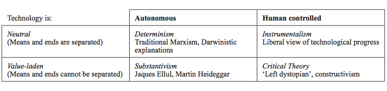
Feenberg’s own view is constructivist, “emphasizing that technology development is humanly controlled and encapsulates values and politics; it should thus be open to democratic control and intervention.” In other words, “technology can and should be seen as a result of political negotiations that lead to its production and use. In too many cases, the complexities of technological systems are used to concentrate power within small groups of technological, financial, and political elites and to prevent the wider body of citizens from meaningful participation in shaping it and deciding what role it should have in the everyday.” Furthermore, “Feenberg highlights that technology encapsulates an ambivalence between the ‘conservation of hierarchy’, which most technologies promote and reproduce—hence the continuity in power structures in advanced capitalist societies despite technological upheaval—and ‘democratic rationalisation’, which are the aspects of new technologies that undermine existing power structures and allow new opportunities for marginalized or ignored groups to assert themselves.”

To this end, Feenberg calls for a “deep democratization” of technology as an alternative to technocracy. “Instead of popular agency appearing as an anomaly and an interference, it would be normalized and incorporated into the standard procedures of technical design.” In other words, deep democratization is about empowerment: “providing the tools that will allow increased control over the technology by those in disadvantaged and marginalized positions in society.” Muki contrasts this with neogeography, which is “mostly represented in a decon-textualised way—as the citation in the introduction from Turner’s (2006) Intro-duction to Neogeography demonstrates: it does not discuss who the people are who benefit and whether there is a deeper purpose, beyond fun, for their engage-ment in neogeography.” And so, as neogeographers would have it, since “there is nothing that prevents anyone, anytime, and anywhere, and for any purpose from using the system, democratization has been achieved.” Or maybe not. Enter the Digital Divides.

digidivide

Yes, there are multiple digital divides. Differential access to computers & comm-unication technology is just one. “Beyond this, there is secondary digital ex-clusion, which relates to the skills and abilities of people to participate in online activities beyond rudimentary browsing.” Related to this divide is the one between the “Data Haves” and the “Data Have Nots”. There is also an important divide in speed—as anyone who has worked in say Liberia will have experienced—it takes a lot longer to upload/download/transfer content than in Luxembourg. “In summary, the social, economic, structural, and technical evidence should be enough to qualify and possibly withdraw the democratization claims that are attached to neogeographic practices.”

That said, the praxis of neogeography still has democratic potential. “To address the potential of democratization within neogeographic tools, we need to return to Feenberg’s idea of deep democratization  and the ability of ordinary citizens to direct technical codes and influence them so that they can include alternative meanings and values. By doing so, we can explore the potential of neogeographic practices to support democratisation in its fuller sense. At the very least, citizens should be able to reuse existing technology and adapt it so that it can be used to their own goals and to represent their own values.” So Muki adds a “Hierarchy of Hacking” to Feeberg’s conceptual framework, i.e., the triangle below.

Screen Shot 2013-03-16 at 7.03.49 PM

While the vast majority can participate in a conversation about what to map (Meaning), only a “small technical elite within society” can contribute to “Deep Technical Hacking,” which “requires very significant technical knowledge in creating new geographic data collection tools, setting up servers, and configuring database management systems.” Muki points to Map Kibera as an example of Deep Technical Hacking. I would add that “Meaning Hacking” is often hijacked by “Deep Technical Hackers” who tend to be the ones introducing-and-controlling local neogeography projects despite their “best” intentions. But the fact is this: Deep Tech Hackers typically have little to no actual experience in community development and are often under pressure to hype up blockbuster-like successes at fancy tech conferences in the US. This may explain why most take full owner-ship over all decisions having to do with Meaning- and Use-Hacking right from the start of a project. See this blog post’s epilogue, for more on this dynamic.

One success story, however, is Liberia’s Innovation Lab (iLab). My field visit to Monrovia in 2011 made me realize just how many completely wrong assumptions I had about the use of neogeography platforms in developing countries. Instead of parachuting in and out, the co-founders of iLab became intimately familiar with the country by spending a considerable amount of time in Monrovia and outside the capital city to understand the social, political and historical context in which they were introducing neogeography. And so, while they initially expected to provide extensive training on neogeography platforms right off the bat, they quickly realized that this was the wrong approach entirely for several reasons. As Muki observers, “Because of the reduced barriers, neogeography does offer some increased level of democratization but, to fulfill this potential, it requires careful implementation that takes into account social and political aspects,” which is precisely what the team at the iLab have done and continue to do impressively well. Note that one of the co-founders is a development expert, not a technology hacker. And while the other is a hacker, he spent several years working in Liberia. (Another equally impressive success story is this one from Brazil’s Mare shantytown).

blank

I thus fully subscribe to Muki’s hacking approach and made a very similar ar-gument in this 2011 blog post: “Democratizing ICT for Development with DIY Innovation and Open Data.” I directly challenged the “participatory” nature of these supposedly democratizing technologies and in effect questioned whether Deep Technical Hackers really do let go of control vis-a-vis the hacking of “Meaning” and “Use”. While I used Ushahidi as an example of a DIY platform, it is clear from Muki’s study that Ushahidi like other neogeography platforms also falls way short of deep democratization and hack-ability. That said, as I wrote then, “it is worth remembering that the motivations driving this shift [towards neogeography] are more important than any one technology. For example, recall the principles behind the genesis of the Ushahidi platform: Democratizing information flows and access; promoting Open Data and Do it Yourself (DIY) Innovation with free, highly hackable (i.e., open source) technology; letting go of control.” In other words, the democratizing potential should not be dismissed outright even if we’re not quite there yet (or ever).

As I noted in 2011,  hackable and democratizing technologies ought to be like a “choose your own adventure game. The readers, not the authors, finish the story. They are the main characters who bring the role playing games and stories to life.” This explains why I introduced the notion a “Fischer Price Theory of Tech-nology” five years ago at this meeting with Andrew Turner and other colleagues. As argued then, “What our colleagues in the tech-world need to keep in mind is that the vast majority of our partners in the field have never taken a computer science or software engineering course. […] The onus thus falls on the techies to produce the most simple, self-explanatory, intuitive interfaces.”

I thus argued that neogeography platforms ought to be as easy to use (and yes hack) as simple as computer games, which is why I was excited to see the latest user interface (UI) developments for OpenStreetMap (image below). Of course, as Muki has ably demonstrated, UI design is just the tip of the iceberg vis-a-vis democratization effects. But democratization is both relative and a process, and neogeography platforms are unlikely to become less democratizing over time, for instance. While some platforms still have a long road ahead with respect to reaching their perceived potential (if ever), a few instances may already have made in-roads in terms of their local political effects as argued here and in my doctoral dissertation.

OSMneogeo

Truly hackable technology, however, needs to go beyond the adventure story and Fischer Price analogies described above. The readers should have the choice of becoming authors before they even have a story in mind, while gamers should have the option of creating their own games in the first place. In other words, as Muki argues, “the artful alteration of technology beyond the goals of its original design or intent,” enables “Deep Democratization.” To this end, “Freely pro-viding the hackable building blocks for DIY Innovation is one way to let go of control and democratize [neogeography platforms],” not least if the creators can make a business out of their buildings. 

Muki concludes by noting that, “the main error in the core argument of those who promote [neogeography] as a democratic force is the assumption that, by increasing the number of people who utilise geographic information in different ways and gain access to geographic technology, these users have been em-powered and gained more political and social control. As demonstrated in this paper, neogeography has merely opened up the collection and use of this information to a larger section of the affluent, educated, and powerful part of society.”  What’s more, “The control over the information is kept, by and large, by major corporations and the participant’s labor is enrolled in the service of these corporations, leaving the issue of payback for this effort a moot point. Significantly, the primary intention of the providers of the tools is not to empower communities or to include marginalized groups, as they do not re-present a major source of revenue.” I argued this exact point here a year ago.

bio

iRevolution One Year On…

I started iRevolution exactly one year ago and it’s been great fun! I owe the Fletcher A/V Club sincere thanks for encouraging me to blog. Little did I know that blogging was so stimulating or that I’d be blogging from the Sudan.

Here are some stats from iRevolution Year One:

  • Total number of blog posts = 212
  • Total number of comments = 453
  • Busiest day ever = December 15, 2008

And the Top 10 posts:

  1. Crisis Mapping Kenya’s Election Violence
  2. The Past and Future of Crisis Mapping
  3. Mobile Banking for the Bottom Billion
  4. Impact of ICTs on Repressive Regimes
  5. Towards an Emergency News Agency
  6. Intellipedia for Humanitarian Warning/Response
  7. Crisis Mapping Africa’s Cross-border Conflicts
  8. 3D Crisis Mapping for Disaster Simulation
  9. Digital Resistance: Digital Activism and Civil Resistance
  10. Neogeography and Crisis Mapping Analytics

I do have a second blog that focuses specifically on Conflict Early Warning, which I started at the same time. I have authored a total of 48 blog posts.

That makes 260 posts in 12 months. Now I know where all the time went!

The Top 10 posts:

  1. Crimson Hexagon: Early Warning 2.0
  2. CSIS PCR: Review of Early Warning Systems
  3. Conflict Prevention: Theory, Police and Practice
  4. New OECD Report on Early Warning
  5. Crowdsourcing and Data Validation
  6. Sri Lanka: Citizen-based Early Warning/Response
  7. Online Searches as Early Warning Indicators
  8. Conflict Early Warning: Any Successes?
  9. Ushahidi and Conflict Early Response
  10. Detecting Rumors with Web-based Text Mining System

I look forward to a second year of blogging! Thanks to everyone for reading and commenting, I really appreciate it!

Patrick Philippe Meier

Crime Mapping Analytics

There are important parallels between crime prevention and conflict prevention.  About half-a-year ago I wrote a blog post on what crisis mapping might learn from crime mapping. My colleague Joe Bock from Notre Dame recently pointed me to an excellent example of crime mapping analytics.

The Philadelphia Police Department (PPD) has a Crime Analysis and Mapping Unit  (CAMU) that integrates Geographic Information System (GIS) to improve crime analysis. The Unit was set up in 1997 and the GIS data includes a staggering 2.5 million new events per year. The data is coded from emergency distress calls and police reports and overlaid with other data such as bars and liquor stores, nightclubs, locations of surveillance cameras, etc.

For this blog post, I draw on the following two sources: (1) Theodore (2009). “Predictive Modeling Becomes a Crime-Fighting Asset,” Law Officer Journal, 5(2), February 2009; and (2) Avencia (2006). “Crime Spike Detector: Using Advanced GeoStatistics to Develop a Crime Early Warning System,” (Avencia White Paper, January 2006).

Introduction

Police track criminal events or ‘incidents’ which are “the basic informational currency of policing—crime prevention cannot take place if there is no knowledge of the location of crime.” Pin maps were traditionally used to represent this data.

pinmap

GIS platforms now make new types of analysis possible beyond simply “eyeballing” patterns depicted by push pins. “Hot spot” (or “heat map”) analysis is one popular example in which the density of events is color coded to indicate high or low densities.

Hotspot analysis, however, in itself, does not tell people much they did not already know. Crime occurs in greater amounts in downtown areas and areas where there are more people. This is common sense. Police organize their operations around these facts already.

The City of Philadelphia recognized that traditional hot spot analysis was of limited value and therefore partnered with Avencia to develop and deploy a crime early warning system known as the Crime Spike Detector.

Crime Spike Detector

The Crime Spike Detector is an excellent example of a crime analysis analytics tool that serves as an early warning system for spikes in crime.

The Crime Spike Detector applies geographic statistical tools to discover  abrupt changes in the geographic clusters of crime in the police incident database. The system isolates these aberrations into a cluster, or ‘crime spike’. When such a cluster is identified, a detailed report is automatically e-mailed to the district command staff responsible for the affected area, allowing them to examine the cluster and take action based on the new information.

The Spike Detector provides a more rapid and highly focused evaluation of current conditions in a police district than was previously possible. The system also looks at clusters that span district boundaries and alerts command staff on both sides of these arbitrary administrative lines, resulting in more effective deployment decisions.

spikedetector

More specfically, the spike detector analyzes changes in crime density over time and highlights where the change is statistically significant.

[The tool] does this in automated fashion by examining, on a nightly basis, millions of police incident records, identifying aberrations, and e-mailing appropriate police personnel. The results are viewed on a map, so exactly where these crime spikes are taking place are immediately understandable. The map supports ‘drill-through’ capabilities to show detailed graphs, tables, and actual incident reports of crime at that location.

Spike Detection Methodology

The Spike Detector compares the density of individual crime events over both space and time. To be sure, information is more actionable if it is geographically specified for a given time period regarding a specific type of crime. For example, a significant increase in drug related incidents in a specific neighborhood for a given day is more concrete and actable than simply observing a general increase in crime in Philadelphia.

The Spike Detector interface allows the user to specify three main parameters: (1) the type of crime under investigation; (2) the spatial and, (3) the temporal resolutions to analyze this incident type.

Obviously, doing this in just one way produces very limited information. So the Spike Detector enables end users to perform its operations on a number of different ways of breaking up time, space and crime type. Each one of these is referred to as a user defined search pattern.

To describe what a search pattern looks like, we first need to understand how the three parameters can be specified.

Space. The Spike Detector divides the city into circles of a given radius. As depicted below, the center points of these circles from a grid. Once the distance between these center points is specified, the radius of the circle is set such that the area of the circles completely covers the map. Thus a pattern contains a definition of the distance between the center points of circles.

circles

Time. The temporal parameter is specified such that a recent period of criminal incidents can be compared to a previous period. By contrasting the densities in each circle across different time periods, any significant changes in density can be identified. Typically, the most recent month is compared to the previous year. This search pattern is know as bloc style comparison. A second search pattern is periodic, which “enables search patterns based on crime types that vary on a seasonal basis.”

Incident. Each crime is is assigned a Uniform Crime Reporting code. Taking all three parameters together, a search pattern might look like the following

“Robberies no Gun, 1800, 30, Block, 365”

This means the user is looking for robberies committed without a gun, with distance between cicle center points of 1,800 feet, over the past 30 days of crime data compared to the previous year’s worth of crime.

Determining Search Patterns

A good search pattern is determined by a combination of three factors: (1) crime type density; (2) short-term versus long-term patterns; and (3) trial and error. Crime type is typically the first and easiest parameter of the search pattern to be specified. Defining the spatial and temporal resolutions requires more thought.

The goal in dividing up time and space is to have enough incidents such that comparing a recent time period to a comparison time period is meaningful. If the time or space divisions are too small, ‘spikes’ are discovered which represent a single incident or few incidents.

The rule of thumb is to have an average of at least 4-6 crimes each in each circle area. More frequent crimes will permit smaller circle areas and shorter time periods, which highlights spikes more precisely in time and space.

Users are typically interested in shorter and most recent time periods as this is most useful to law enforcement while “though the longer time frames might be of interest to other user communities studying social change or criminology.” In any event,

Patterns need to be tested in practice to see if they are generating useful information. To facilitate this, several patterns can be set up looking at the same crime type with different time and space parameters. After some time, the most useful pattern will become apparent and the other patterns can be dispensed with.

Running Search Patterns

The spike detection algorithm uses simple statistical analysis to determine whether the  probability that the number of recent crimes as compared to the comparison period crimes in a given circle area is possible due to chance alone. The user specifies the confidence level or sensitivity of the analysis. The number is generally set at 0.5% probability.

Each pattern results in a probability (or p-value) lattice assigned to every circle center point. The spike detector uses this lattice to construct the maps, graphs and reports that the spike detector presents to the user. A “Hypergeometic Distribution” is used to determine the p-values:

hypergeometric

Where, for example:

N – total number of incidents in all Philadelphia for both the previous 365 days and the current 30 days.

G – total number of incidents in all Philadelphia for just the past 30 days.

n – number of incidents in just this circle for both the previous 365 days and the past 30 days.

x – number of incidents in just this circle for the past 30 days.

After the probability lattice is generated, the application displays spikes in order of severity and whether they have increased or decreased as compared to the previous day.

Conclusion

One important element of crisis mapping which is often overlooked is the relevance to monitoring and evaluation. With the Spike Detector, the Police Department “can assess the impact and effectiveness of anticrime strategies.” This will be the subject of a blog post in the near future.

For now, I conclude with the following comment from the Philadelphia Police Department:

GIS is changing the way we operate. All police personnel, from the police commissioner down to the officer in the patrol car, can use maps as part of their daily work. Our online mapping applications needed to be fast and user-friendly because police officers don’t have time to become computer experts. I think we’ve delivered on this goal, and it’s transforming what we do and how we serve the community.

Clearly, crime mapping analytics has a lot offer those of us interested in crisis mapping of violent conflict in places like the DRC and Zimbabwe. What we need is a Neogeography version of the Spike Detector.

Patrick Philippe Meier

A Brief History of Crisis Mapping (Updated)

Introduction

One of the donors I’m in contact with about the proposed crisis mapping conference wisely recommended I add a big-picture background to crisis mapping. This blog post is my first pass at providing a brief history of the field. In a way, this is a combined summary of several other posts I have written on this blog over the past 12 months plus my latest thoughts on crisis mapping.

Evidently, this account of history is very much influenced by my own experience so I may have unintentionally missed a few relevant crisis mapping projects. Note that by crisis  I refer specifically to armed conflict and human rights violations. As usual, I welcome any feedback and comments you may have so I can improve my blog posts.

From GIS to Neogeography: 2003-2005

The field of dynamic crisis mapping is new and rapidly changing. The three core drivers of this change are the increasingly available and accessible of (1) open-source, dynamic mapping tools; (2) mobile data collection technologies; and lastly (3) the development of new methodologies.

Some experts at the cutting-edge of this change call the results “Neogeography,” which is essentially about “people using and creating their own maps, on their own terms and by combining elements of an existing toolset.” The revolution in applications for user-generated content and mobile technology provides the basis for widely distributed information collection and crowdsourcing—a term coined by Wired less than three years ago. The unprecedented rise in citizen journalism is stark evidence of this revolution. New methodologies for conflict trends analysis increasingly take spatial and/or inter-annual dynamics into account and thereby reveal conflict patterns that otherwise remain hidden when using traditional methodologies.

Until recently, traditional mapping tools were expensive and highly technical geographic information systems (GIS), proprietary software that required extensive training to produce static maps.

In terms of information collection, trained experts traditionally collected conflict and human rights data and documented these using hard-copy survey forms, which typically became proprietary once completed. Scholars began coding conflict event-data but data sharing was the exception rather than the rule.

With respect to methodologies, the quantitative study of conflict trends was virtually devoid of techniques that took spatial dynamics into account because conflict data at the time was largely macro-level data constrained by the “country-year straightjacket.”

That is, conflict data was limited to the country-level and rarely updated more than once a year, which explains why methodologies did not seek to analyze sub-national and inter-annual variations for patterns of conflict and human rights abuses. In addition, scholars in the political sciences were more interested in identifying when conflict as likely to occur as opposed to where. For a more in-depth discussion of this issue, please see my paper from 2006  “On Scale and Complexity in Conflict Analysis” (PDF).

Neogeography is Born: 2005

The pivotal year for dynamic crisis mapping was 2005. This is the year that Google rolled out Google Earth. The application marks an important milestone in Neogeography because the free, user-friendly platform drastically reduced the cost of dynamic and interactive mapping—cost in terms of both availability and accessibility. Microsoft has since launched Virual Earth to compete with Google Earth and other  potential contenders.

Interest in dynamic crisis mapping did exist prior to the availability of Google Earth. This is evidenced by the dynamic mapping initiatives I took at Swisspeace in 2003. I proposed that the organization use GIS tools to visualize, animate and analyze the geo-referenced conflict event-data collected by local Swisspeace field monitors in conflict-ridden countries—a project called FAST. In a 2003 proposal, I defined dynamic crisis maps as follows:

FAST Maps are interactive geographic information systems that enable users of leading agencies to depict a multitude of complex interdependent indicators on a user-friendly and accessible two-dimensional map. […] Users have the option of selecting among a host of single and composite events and event types to investigate linkages [between events]. Events and event types can be superimposed and visualized through time using FAST Map’s animation feature. This enables users to go beyond studying a static picture of linkages to a more realistic dynamic visualization.

I just managed to dig up old documents from 2003 and found the interface I had designed for FAST Maps using the template at the time for Swisspeace’s website.

fast-map1

fast-map2

However, GIS software was (and still is) prohibitively expensive and highly technical. To this end, Swisspeace was not compelled to make the necessary investments in 2004 to develop the first crisis mapping platform for producing dynamic crisis maps using geo-referenced conflict data. In hindsight, this was the right decision since Google Earth was rolled out the following year.

Enter PRIO and GROW-net: 2006-2007

With the arrival of Google Earth, a variety of dynamic crisis maps quickly emerged. In fact, one if not the first application of Google Earth for crisis mapping was carried out in 2006 by Jen Ziemke and I. We independently used Google Earth and newly available data from the Peace Research Institute, Oslo (PRIO) to visualize conflict data over time and space. (Note that both Jen and I were researchers at PRIO between 2006-2007).

Jen used Google Earth to explain the dynamics and spatio-temporal variation in violence during the Angolan war. To do this, she first coded nearly 10,000 battle and massacre events as reported in the Portuguese press that took place over a 40 year period.

Meanwhile, I produced additional dynamic crisis maps of the conflict in the Democratic Republic of the Congo (DRC) for PRIO and of the Colombian civil war for the Conflict Analysis Resource Center (CARC) in Bogota. At the time, researchers in Oslo and Bogota used proprietary GIS software to produce static maps (PDF) of their newly geo-referenced conflict data. PRIO eventually used Google Earth but only to publicize the novelty of their new geo-referenced historical conflict datasets.

Since then, PRIO has continued to play an important role in analyzing the spatial dynamics of armed conflict by applying new quantitative methodologies. Together with universities in Europe, the Institute formed the Geographic Representations of War-net (GROW-net) in 2006, with the goal of “uncovering the causal mechanisms that generate civil violence within relevant historical and geographical and historical configurations.” In 2007, the Swiss Federal Institute of Technology in Zurich (ETH), a member of GROW-net, produced dynamic crisis maps using Google Earth for a project called WarViews.

Crisis Mapping Evolves: 2007-2008

More recently, Automated Crisis Mapping (ACM), real-time and automated information collection mechanisms using natural language processing (NLP) have been developed for the automated and dynamic mapping of disaster and health-related events. Examples of such platforms include the Global Disaster Alert and Crisis System (GDACS), CrisisWire, Havaria and HealthMap. Similar platforms have been developed for  automated mapping of other news events, such as Global Incident Map, BuzzTracker, Development Seed’s Managing the News, and the Joint Research Center’s European Media Monitor.

Equally recent is the development of Mobile Crisis Mapping (MCM), mobile crowdsourcing platforms designed for the dynamic mapping of conflict and human rights data as exemplified by Ushahidi (with FrontLineSMS) and the Humanitarian Sensor Web (SensorWeb).

Another important development around this time is the practice of participatory GIS preceded by the recognition that social maps and conflict maps can empower local communities and be used for conflict resolution. Like maps of natural disasters and environmental degradation, these can be developed and discussed at the community level to engage conversation and joint decision-making. This is a critical component since one of the goals of crisis mapping is to empower individuals to take better decisions.

HHI’s Crisis Mapping Project: 2007-2009

The Harvard Humanitarian Initiative (HHI) is currently playing a pivotal role in crafting the new field of dynamic crisis mapping. Coordinated by Jennifer Leaning and myself, HHI is completing a two-year applied research project on Crisis Mapping and Early Warning. This project comprised a critical and comprehensive evaluation of the field and the documentation of lessons learned, best practices as well as alternative and innovative approaches to crisis mapping and early warning.

HHI also acts as an incubator for new projects and  supported the conceptual development of new crisis mapping platforms like Ushahidi and the SensorWeb. In addition, HHI produced the first comparative and dynamic crisis map of Kenya by drawing on reports from the mainstream media, citizen journalists and Ushahidi to analyze spatial and temporal patterns of conflict events and communication flows during a crisis.

HHI’s Sets a Research Agenda: 2009

HHI has articulated an action-oriented research agenda for the future of crisis mapping based on the findings from the two-year crisis mapping project. This research agenda can be categorized into the following three areas, which were coined by HHI:

  1. Crisis Map Sourcing
  2. Mobile Crisis Mapping
  3. Crisis Mapping Analytics

1) Crisis Map Sourcing (CMS) seeks to further research on the challenge of visualizing disparate sets of data ranging from structural and dynamic data to automated and mobile crisis mapping data. The challenge of CMS is to develop appropriate methods and best practices for mashing data from Automated Crisis Mapping (ACM) tools and Mobile Crisis Mapping platforms (see below) to add value to Crisis Mapping Analytics (also below).

2) The purpose of setting an applied-research agenda for Mobile Crisis Mapping, or MCM, is to recognize that the future of distributed information collection and crowdsourcing will be increasingly driven by mobile technologies and new information ecosystems. This presents the crisis mapping community with a host of pressing challenges ranging from data validation and manipulation to data security.

These hurdles need to be addressed directly by the crisis mapping community so that new and creative solutions can be applied earlier rather than later. If the persistent problem of data quality is not adequately resolved, then policy makers may question the reliability of crisis mapping for conflict prevention, rapid response and the documentation of human rights violations. Worse still, inaccurate data may put lives at risk.

3) Crisis Mapping Analytics (CMA) is the third critical area of research set by HHI. CMA is becoming increasingly important given the unprecedented volume of geo-referenced data that is rapidly becoming available. Existing academic platforms like WarViews and operational MCM platforms like Ushahidi do not include features that allow practitioners, scholars and the public to query the data and to visually analyze and identify the underlying spatial dynamics of the conflict and human rights data. This is largely true of Automated Crisis Mapping (ACM) tools as well.

In other words, new and informative metrics are need to be developed to identify patterns in human rights abuses and violent conflict both retrospectively and in real-time. In addition, existing techniques from spatial econometrics need to be rendered more accessible to non-statisticians and built into existing dynamic crisis mapping platforms.

Conclusion

Jen Ziemke and I thus conclude that the most pressing need in the field of crisis mapping is to bridge the gap between scholars and practitioners who self-identify as crisis mappers. This is the most pressing issue because bridging that divide will enable the field of crisis mapping to effectively and efficiently move forward by pursuing the three research agendas set out by the Harvard Humanitarian Initiative (HHI).

We think this is key to moving the crisis-mapping field into more mainstream humanitarian and human rights work—i.e., operational response. But doing so first requires that leading crisis mapping scholars and practitioners proactively bridge the existing gap. This is the core goal of the crisis mapping conference that we propose to organize.

Patrick Philippe Meier