Tag Archives: Crisis Mapping

Crisis Mapping the Conflict in Georgia (Updated)

Update: Jon Thompson had initially mistakenly blogged that all roads/cities in Georgia had “disappeared” from Google Maps and Google Earth. A colleague of mine at Google has since informed me that they never had a roads layer for Georgia. According to this same contact, Google has just released this formal statement:

It is untrue to suggest, as some media reports have, that Google has removed data or imagery from our Google Maps product in Georgia, Armenia or Azerbaijan.  We have never had local data for those countries and that is why local details such as landmarks and cities do not appear.

An initial crisis map of the escalating violence between Georgia and Russia has been created for Google Earth. While dynamic maps add more value than static maps, we need a more interactive interface that permits for crowdsourcing crisis information in quasi-real time with fully geo-referenced information.

Here I am thinking of Ushahidi and the Humanitarian Sensor Web (HSW). Humanitarian organizations have already moved into the disputed region and have no doubt learned important information, which is likely changing every hour. But the one person behind these initial Google Earth maps may not have easy access to organizations on the ground.

This is precisely when we need a crisis mapping platform that enables field-based organizations and local communities to text in important information on events as they unfold. As more information surfaces, we’ll need that same platform to provide quantitative, time-stamped analysis within the same interface. Finally, we would want to let affected communities know how to receive or subscribe to this information as it is posted and validated. This is where Dial-Up-Radio could come in handy.

Patrick Philippe Meier


Powering Crisis Mapping with Google Earth

I coined the term  “Crisis Mapping Analytics” to highlight the fact that crisis mapping is more valuable when the data that is visually displayed can be analyzed quantitatively within the same interface. Recent crisis mapping initiatives are certainly breaking new ground, but they would be even more useful if they included a meaningful analytical component (which could be used locally). Since the field of conflict early warning typically lags behind in adopting new technologies, we must look to other fields of study for possible insights on mapping analytics.

One such field is energy resource management. Researchers at Oak Ridge National Labs have developed a new mapping tool (screenshot above) that combines images from Google Earth and data on electricity consumption to visualize the status of the national electric grid in real-time. According to NetworkWorld, the tool can be used by federal state and local agencies to “coordinate and respond to major problems such as wide-area power outages, natural disasters and other catastrophic events.”

The Visualizing Energy Resources Dynamically on Earth (VERDE) system, announced this week, mashes together images and stats of everything from real-time status of the electric grid and weather information to power grid behavior modeling and simulation. VERDE ultimately enhances situational awareness and speeds recovery times from power outages, ORNL scientists said. The tool also can predict the transmission lines particularly at risk of storm damage as well as the population in specific areas likely to lose power as a result of destructive winds from storms, ORNL said.

“With this tool we are able to monitor individual transmission lines and place the system as a whole in the context of potential impact on population, transportation and critical infrastructures,” said Mallikarjun Shankar of ORNL’s Computational Sciences and Engineering Division in a release.

The team at Oak Ridge just released the video below which demo’s more of VERDE’s functionalities.

Patrick Philippe Meier

Crisis Mapping, Dynamic Visualization and Pattern Recognition

My interest in dynamic networks and data visualization dates back several years. Indeed, one of the reasons I participated in the Santa Fe Institute’s (SFI) Complex Systems Summer School (CSSS) back in 2006 was precisely because of my long-time interest in applying this area of research to conflict analysis. But it wasn’t until recently that I began to connect those dots to my current research on crisis mapping and pattern recognition in complex emergencies.

Below is one rendering of a dynamic network that I used when co-teaching a  graduate seminar on “Managing Complex Systems” in Fall 2007. The visualization depicts flight patterns across the US. I used this simply to illustrate that certain patterns emerge when data is visualized geographically and temporally across multiple scales.

Another example is the dynamic rendering of information flow in the Blogosphere. I’ve included a picture below but the video for this animation is also worth watching. What does this have to do with crisis mapping? The point is to provide comparable visual renderings of dynamic conflict data at multiple levels of analysis, both spatially and temporally. When doing so, potential patterns and linkages can emerge. Mapping the “fluid dynamics” of conflict, or contagion effects, can be particularly insightful.

One really stunning rendering of a dynamic network was recently posted on the BBC’s technology news site. Using satellite imagery and ground breaking computer imaging we can for the first time visualize stunning patterns that emerge across the UK as seen from the sky. Like the flight tracking video above, this short BBC video is also highly worth watching.

These examples may serve as worthy goals for the new field of crisis mapping analytics, or CMA. It remains to be seen whether we can pull this off. More importantly, however, the question is whether this exercise will get us any closer to saving lives in complex emergencies.

Patrick Philippe Meier

NearMap Better Than Google Maps for Crisis Mapping?

NearMap, a geospatial media company bought out by Ipernica this week, claims that its “breakthrough technology enables photomaps to be updated much more frequently than other providers such as Google Earth, which can be many months out of date.”

NearMap’s technology enables very high resolution aerial photomaps with multiple angle views to be created at a fraction of the cost of traditional solutions… For the first time, people will be able to see the environment change over time, as NearMap’s online photomaps allow users to move back and forward month by month to see changes occur, such as the construction of a home or development of a new road. [And] with NearMap’s revolutionary approach to high resolution photomaps, it has achieved its objective of a 20-fold operating cost reduction over current industry practices.

Ipernica says that NearMap’s ultimate goal is to cover over 20 percent of the world’s population (700 cities) with photomaps updated at least on a monthly basis.According to Ipernica, NearMap has fully automated the process of creating very high definition photomaps and has developed a complete chain of technologies to address these challenging requirements.

If NearMap (or a competing company) broadens its scope to rural populations, the technology could be a particularly useful tool for the purposes of data collection and crisis mapping.

Patrick Philippe Meier

Crisis Mapping and Data Visualization

I’ve written on “Crisis Mapping Analytics” before but the subject warrants more attention. When I looked into developing conflict maps for FAST back in 2004, I realized that the conflict early warning community was simply following in the footsteps of the disaster management community. The latter have been developing all sorts of crisis maps for decades.

Why the lag? Most likely because the majority of conflict data is not geo-referenced (beyond the country level, or admin 1). We’ve also been more interested in the temporal dimension of conflict forecasting rather than the spatial dimension—even though the latter can reveal important spatial patterns useful for  temporal forecasting. In any case, the disaster community continues to be in the lead vis-a-vis crisis mapping. Of course, they have the advantage of drawing on a wide network of physical sensors around the world to monitor spatially and in real time such hazards as earthquakes, hurricanes, etc. See for example the real-time updated maps by GDACS and Havaria below.

The latest in these developments is HealthMap, which is supported by Google.org’s Predict and Prevent Initiative. As reported by Wired, the underlying algorithm parses text from Google News and the World Health Organization to populate the map.

But that’s not all, the algorithm also parses discussion groups, filtering the information and boiling it down into mapped data which can be used to track new disease outbreaks.

HealthMap goes beyond the standard mashup and is more like a small-scale implementation of the long-awaited semantic web. […]

In a study published this March in the Journal of the American Medical Informatics Association, the researchers found that their automated classification system was accurate 84 percent of the time. Algorithm improvements have pushed accuracy close to 90 percent now, according to the researchers. […]

Right now, the researchers are focused on adding more sources, particularly in other languages, as well as improving their methodologies.

Freifeld and Brownstein are looking into using more social media sources, but they’ve encountered a problem that most internet users are already familiar with: There’s too much noise.

“We have certainly explored looking at more free and noisier sources like blogs and things like Twitter,” Freifeld said. “But they pose the problem of capturing a good quality signature from all that stuff.”

Is the conflict early warning/response field likely to follow suite?

Back in 2006, Google.org head Larry Brilliant told Wired.com about his vision for a service that looks a lot like HealthMap.

“I envision a kid (in Africa) getting online and finding that there is an outbreak of cholera down the street. I envision someone in Cambodia finding out that there is leprosy across the street,” Brilliant said.

Healthmap is not quite there yet vis-a-vis spatial resolution but the question is whether a similar platform for (micro) conflict monitoring would bridge the warning-response gap if it could be operationalized?

Patrick Philippe Meier

Global Voices and Humanitarian Action

What a treat, I’ve been in the beautiful city of Budapest for a week to participate in both the 2-day Berkman Center conference on Internet and Democracy as well the 3-day Global Voices 2008 Summit. Out of some 200+ participants I was one of three with active links to the humanitarian community. My other two colleagues were Sameer Padania of The Hub at Witness and Ivan Sigal from USIP. There should have been more but three is a start.

It is becoming increasingly clear to me that there really is something to the hunch I’ve had over the past year. Namely that the various “fields” of activist blogging a la Global Voices, nonviolent action, humanitarian technology, conflict prevention and crisis response are not as distinct as one might think.

Take Ushahidi, for example, which was developed by several bloggers following Kenya’s elections in December 2007. The field of conflict early warning/response is increasingly shifting towards crisis mapping, which is in effect what Ushahidi is. I find this convergence of interests from different areas of expertise particularly exciting.

Indeed, I’ve been working since June 2007 (one year now) on a crisis mapping tool called the “Humanitarian Sensor Web” (or HSW) to facilitate dynamic, real-time mapping of humanitarian infrastructure and crisis-related events. The Sensor Web includes SMS and we too are looking at using Jott to allow for voice-to-text data collection.

Erik Hersman and I had a particularly fruitful day-long brainstorming session in April 2008. He was interested in the lessons learned and best practices from the humanitarian side while I wanted to learn more about the technical aspect of crisis mapping. The conflict early warning community has had to address the challenges of information collection, data validation (quality control), indicator development and frameworks, data analysis, field-based security of monitors, etc.

I think we have a lot to offer and a lot to learn from the activist blogging community. They are often closer to the ground than some of us in the humanitarian community are. They have their ears to the ground, are part of a local  social and information network, provide critical information when the mainstream media becomes unreliable or inaccessible in times of conflict, and have shown time and time again that they can mobilize a movement for action. Isn’t that what conflict prevention is about?

This is part of a broader conversation that we will be having with other colleagues at an upcoming workshop in Boston hosted by the Harvard Humanitarian Initiative (HHI), where I am a doctoral research fellow. The workshop will explore, amongst other issues, the application of information communication technology for conflict early warning, crisis mapping and humanitarian response. Sameer from Witness will be joining us, as well colleagues from Microsoft‘s Humanitarian Information Systems Group, the Geotechnology and Human Rights project at AAAS, the Eyes on Darfur project at Amnesty International (AI), the US Holocaust Memorial Museum (USHMM), and many more (we’ll be about 20 in all).

I’ll be sure to share all that I have learned from participating in the Global Voices summit during the HHI workshop. It is time we bridge our respective fields of practice and exchange best practices.

Patrick Philippe Meier

Crisis Mapping DRC

The International Peace Information Service (IPIS) provides another interesting approach to crisis mapping:

Mapping interests in conflict areas: Katanga reports on the presence of (ex-) combatants in the Congolese province of Katanga, in other words, the armed men who participated in the consecutive Congo wars. It tries to answer the questions who they are, where they are quartered, why they are quartered there and what should be done to prevent them from causing security problems. It relates to the situation in March-April-May 2007 and focuses on two conflicting parties: the “Forces Armées de la République Démocratique du Congo” (FARDC) and the Mayi-Mayi militias.

  • You can change the level of detail on the maps by zooming in or out. The maps are available at three different scales: 1:7,500,000 (initial view), 1:3,000,000 and 1:1,000,000. To zoom in or out, move the scroll slide (in the bottom left corner) up or down, or just move the mouse wheel up or down. For clarity reasons some map elements are hidden while viewing at a large scale but revealed after zooming in.
  • You can easily navigate through the map by dragging it with the mouse pointer. After a double click, the clicked-on position is displayed in the centre of the map.
  • The maps feature an advanced geographical search function that locates strings of characters.
  • When clicking the ‘Overview’ button a useful overview map appears in an extra window at the top left corner of the screen .
  • A legend is provided for each map.
  • You can search thematically for data by clicking the ‘Lists’ button. The map will centre on the requested map element and automatically a table will appear with additional information on the map element.
  • The same additional information on map elements can be retrieved by clicking on the item directly on the map itself (the arrow of your mouse cursor should change in a hand first).
  • Can blogging about culture and non-political issues invite more credibility for bloggers? Cultural issues are not a threat to governments, this could be an entry point.

Patrick Philippe Meier

Crisis Mapping Analytics and Pattern Recognition

Traditional conflict analysis indicators have ranged from low per capita GNI and ethnic diversity to high youth unemployment and restricted political rights. These indicators are generally drawn from government statistics, which are rarely updated more than once a year. This national-level data is useful for understanding “why, when and how conflict originate,” but the data is actually “less useful in explaining or predicting when or how violent interactions will occur…” (1).

In other words, recognizing patterns in structural data is inherently difficult since the aggregate nature of such data means that intra-annual and sub-national data variation is particularly muted. In sum, one cannot solely rely on the statistics produced by leading international development agencies to monitor potential for conflict escalation.

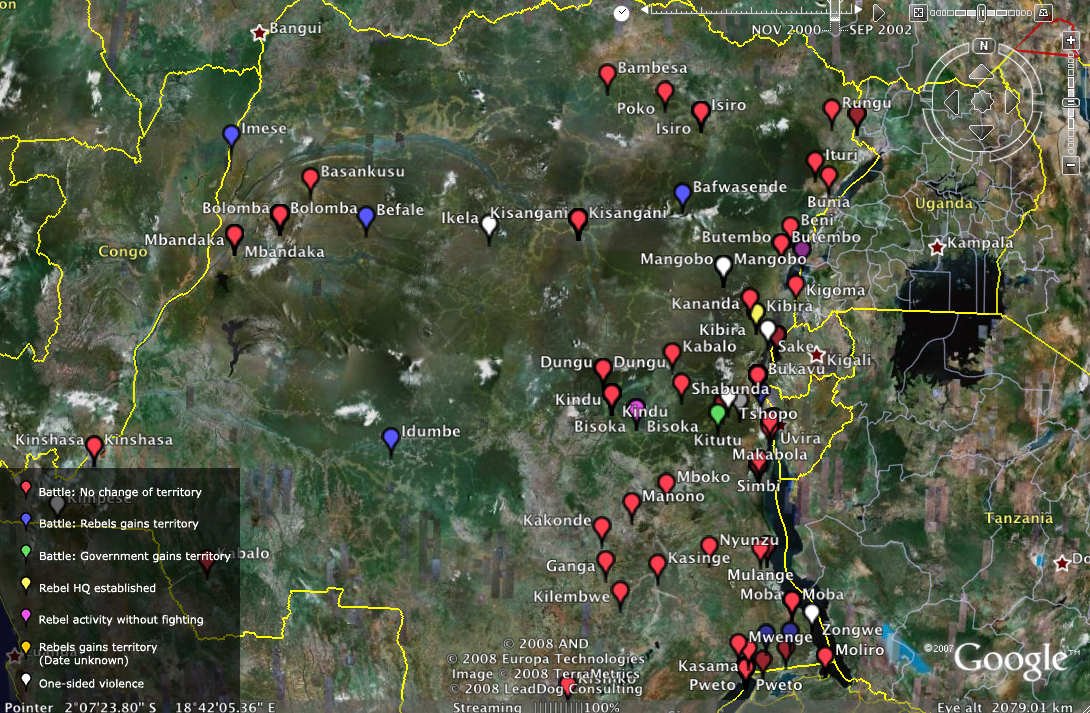
Location, location, location. The purpose of crisis mapping is to shift away from structural and tabular conflict analysis towards more dynamic, real-time and geo-referenced modeling. Think of Serious Gaming such as “A Force More Powerful” or “Food Force” only with real spatial data on real actors and in quasi-real time—a.k.a. reality mining.

Reality Mining” is a relatively new concept pioneered by MIT.

[The term] defines the collection of machine-sensed environmental data pertaining to human social behavior. This new paradigm of data mining makes possible the modeling of conversation context, proximity sensing, and temporospatial location throughout large communities of individuals. Mobile phones (and similarly innocuous devices) are used for data collection, opening social network analysis to new methods of empirical stochastic modeling.

This approach facilitates in-situ pattern recognition and simulation by capturing “the view from below,” which means we need to rethink what constitutes an indicator since the underlying data sets required are not readily available. However, the recent study, “Tracking Genocide using Remote Sensing,” shows the untapped potential of remote sensing technology and data to identify patterns in humanitarian crises.

An analogy worth noting here is the field of earthquake physics. Geophysicists have long struggled to predict the place and time of major earthquakes by drawing on seismic data, rock composition and fault lines. A few weeks ago, however, NASA scientists revealed that they could be on the verge of a break through in their efforts to forecast conflict.

Researchers say they have found a close link between electrical disturbances on the edge of our atmosphere and impending quakes on the ground below. Just such a signal was spotted in the days leading up to the recent devastating event in China.

Of course, human behavior and social systems are also highly complex systems. But we are creatures of habit and conditioned by social norms, or patterns. Tactics employed by perpetrators are none other than patterns. If violence is organized, there is pattern. Just this month, the journal Nature published findings from a research project that drew on mobile phone data from 100,000 individuals in a European country “and found that most follow very predictable routines. Knowing those routines means that you can set probabilities for them, and track how they change” (2).

Clearly, accessing mobile phone data in conflict zones is not presently feasible, and may not be for a while. However, location-aware social networking technology may provide new data not heretofore available. Remote sensing and GIS data may also capture proxy indicators that reveal underlying patterns and their associated probabilities in future conflict situations. The point is that as new consumer-based location-aware information communication technologies become more widespread, new data sets may become available. Besides, as the Tracking Genocide study evidently shows, geo-referenced, time-stamped data sets already exists.

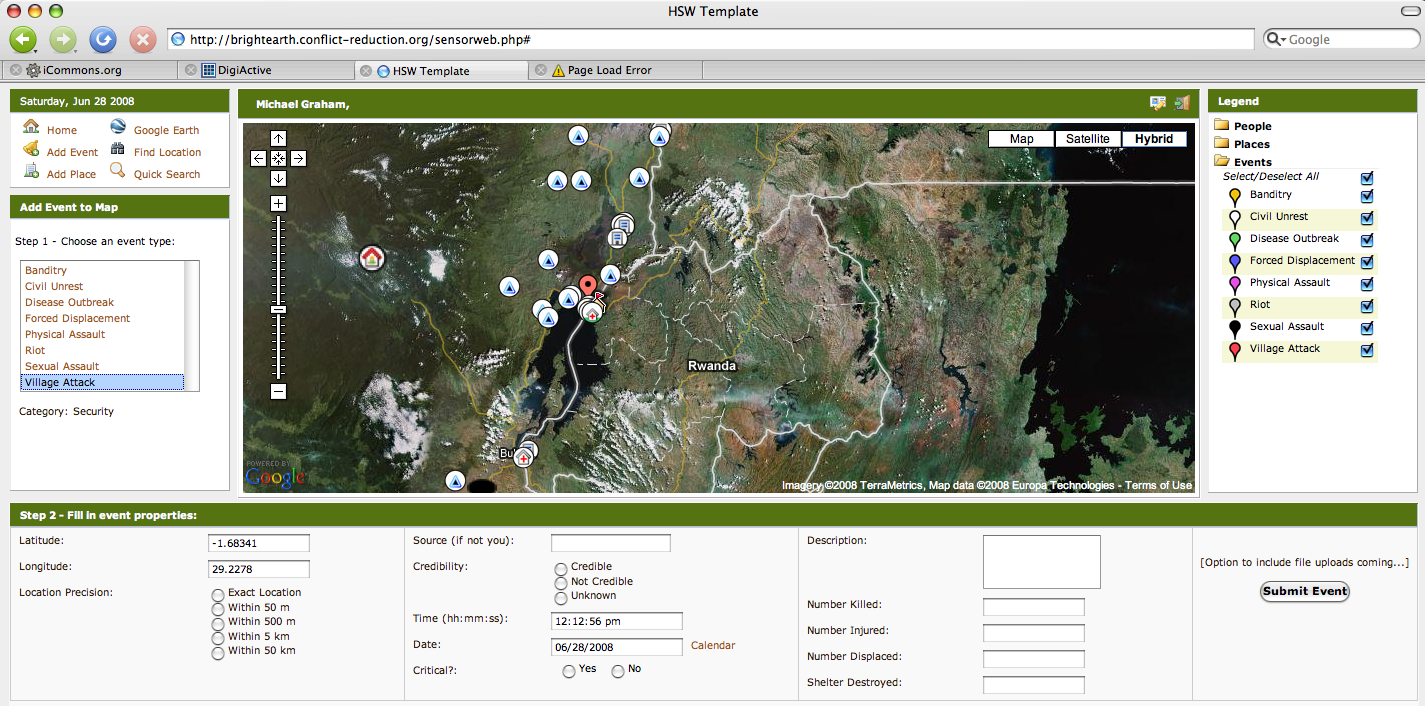
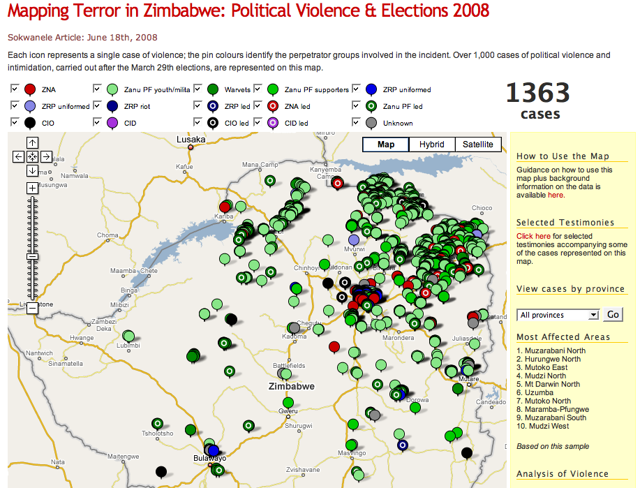
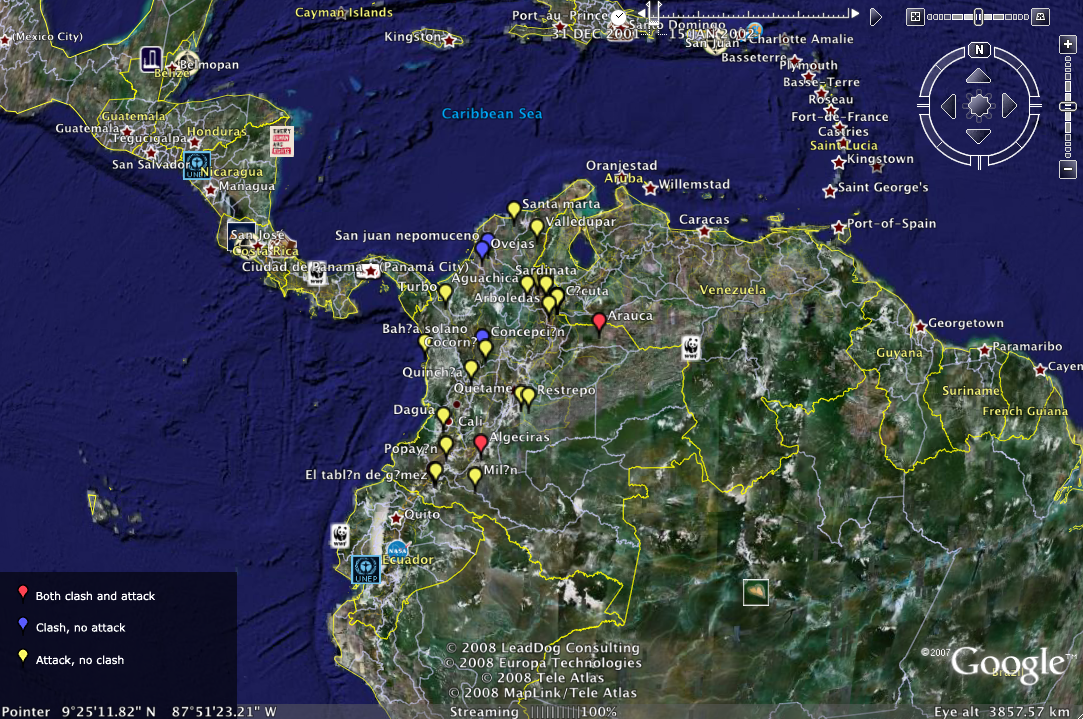
Making sense of this data is admittedly no small feat. But initiatives such as Sense Networks, a new software company in New York, is seeking to do just that. The company recently released Macrosense, “a tool that applies complex statistical algorithms to sift through the growing heaps of data about location and to make predictions or recommendations on various questions…” (3). We’re note quite there yet vis-a-vis conflict analysis, but the concept of crisis mapping is becoming increasingly talked about in the humanitarian technology community. Crisis mapping is also gaining donor attention, as evidenced by the momentum behind Ushahidi.

The new field of Crisis Mapping Analytics (CMA) is in its infancy and requires a strong academic base, such as Harvard University, to serve as an incubator. Ultimately, the success of CMA resides on whether or not this methodology is more effective in galvanizing early and effective response, both top-town and bottom-up. Moreover, prediction alone will rarely ensure effective response. Just like disaster management in the case of earthquakes, preparedness and contingency planning at the local level will continue to be key for crisis response to save lives.

Patrick Philippe Meier

Crisis Mapping Zimbabwe

As a doctoral research fellow with the Harvard Humanitarian Initiative (HHI), Jennifer Leaning and I are pursuing applied research on crisis mapping to identify innovative approaches that can be scaled up to maximize impact. The following initiatives are two projects of potential interest.

Sokwanele follows in the footsteps of Ushahidi in providing a web-based interface to map election-related violence in Zimbabwe. The design is simple and self-explanatory. Each incident is associated with the identity of the perpetrating party, e.g., Zanu youth.

It would be particularly useful to have a time-animation functionality in order to depict any patterns in the spread of the violence as this could reveal tactics of perpetrators. A colleague and I created crisis maps for Colombia and the DRC back in July 2007 using Google Earth (KML). We added the time-bar functionality and visualized the data over time, immediately taking note of distinct patterns. The underlying conflict data was drawn from the Conflict Analysis Resource Center (CERAC) in Bogota and from the Peace Research Institute, Oslo (PRIO) respectively, both of which I have been affiliated with as a researcher. Clicking on the pictures below will provide you with a full-screen shot of the interface.

Another crisis map of Zimbabwe depicts Morgan Tsvangirai’s campaign “with information on campaign stops, detentions by police, vehicle impoundments, and references to all information from on-line news sources.” The Google Earth KML file is regularly updated.

The question that remains for me is what methods can be used to measure the impact these projects are having?

Patrick Philippe Meier