Tag Archives: Humanitarian

Crisis Mapping Libya: This is No Haiti (Updated)

Update: Public version of Libya Crisis Map now available:

http://libyacrisismap.net

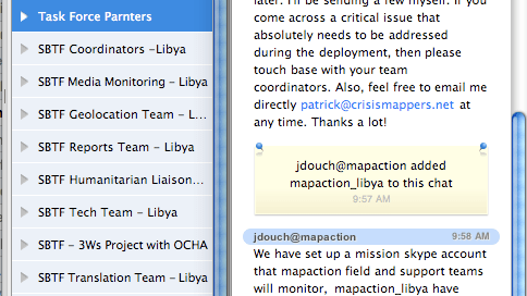
We activated the Standby Volunteer Task Force (SBTF) on March 1st and quickly launched a Crisis Map of Libya to support humanitarian preparedness opera-tions. This is the largest deployment of the Task Force since it was formed at the 2010 International Conference on Crisis Mapping in Boston (ICCM 2010). Task Force partners include CrisisMappers, CrisisCommons, Humanity Road, ICT4Peace, Open Street Map and MapAction. The Task Force currently has trained 166 volunteers. I’m amazed at how far we’ve come since the response to the Haiti earthquake.

Crisis mapping Libya is definitely no Haiti, for many reasons. The first is that unlike Haiti, we didn’t have to recruit crisis mapping volunteers from scratch. We didn’t have to spend a third of our time training volunteers. We didn’t have to develop new work flows and protocols from thin air. All we had to do was activate the Standby Task Force and everyone knew what to do, like set up dedicated Skype chats (communicating via email is too slow in these scenarios, networked communication is the way to go). Our volunteer CrisisMappers had already been trained and had even participated in an official UN crisis simulation exercise with OCHA in Colombia a few months earlier.

The second reason why this is no Haiti is because the request for activation of the Standby Task Force to provide live crisis mapping support came directly from the UN OCHA’s Information Management unit in Geneva. This was not the case in Haiti since there was no precedent for the crisis mapping efforts we launched at the time. We did not have buy in from the humanitarian community and the latter was reluctant to draw on anything other than official sources of information. Crowdsourcing and social media were unchartered territories. OCHA also reached out to CrisisCommons and OpenStreetMap and we are all working together more closely than ever before.

Contrast this to the case of Libya this week which saw an established humanitarian organization specifically request a volunteer technical community for a live map of reports generated from Twitter, Facebook, Flickr, YouTube and mainstream media sources. Seriously, I have never been more impressed by the humanitarian community than I am today. The pro-active approach they have taken and their constructive engagement is absolutely remarkable. This is truly spectacular and the group deserve very high praise.

From the official annoucement:

OCHA, UNOSAT and NetHope have been collaborating with the Volunteer Technical Community (VTC) specifically including the CrisisMappers, Crisis Commons, Open Street Map, and the Google Crisis Response Team over the past week. The CrisisMappers Standby Task Force has been undertaking a mapping of social media and new reports from within Libya and along the borders at the request of OCHA.  As well, the Task Force is aiding in the collection and mapping of 3W information for the response. UNOSAT is kindly hosting the Common Operational Datasets to be used during the emergency (http://www.unitar.org/unosat/libya). Interaction with these groups is being coordinated by OCHA’s Information Services Section. Focal Point: Andrej Verity [verity@un.org].

The third reason this is no Haiti is because we are creating a live map of a hostile situation still unfolding. Haiti provided a permissive environment, politically and geographically. Libya couldn’t be more different. We experienced the serious challenges of crisis mapping a hostile environment when we created a crisis map of Khartoum at the request of local Sudanese activists. This was a stressful deployment but one that was able to provide an important window into what was happening in Khartoum.

In the case of Libya, our humanitarian partner requested that the crisis map be password protected. We intend to make the map public after this phase of the humanitarian operations is over. In the meantime, the screenshots below provide a good picture of what the platform looks like. In the first 48 hours since the activation of the Task Force, over 220 individual reports have been mapped, many including pictures and some with video footage.

We also pulled in the data from the Google Map created by @Arasmus to complement our own live mapping:

None of the above would be possible without such a dedicated network of skilled crisis mapping volunteers. They are truly outstanding and a testament to what civic engagement can do online from thousands of miles away. There’s no doubt that our approach can still be improved. But there’s equally no doubt that all the learning we did in Haiti, Chile and Pakistan went beyond just recommendations but were actually  put into practice in a big way thanks to the Task Force.

The Task Force has over 160 volunteers from 18 different countries. Do you want to become one of those crisis mappers? If so, please send an email to join@standbytaskforce.com and we’ll train you on how to become a real pro in crisis mapping.

OCHA’s Humanitarian Dashboard

I recently gave a presentation on Crisis Mapping for UN-OCHA in Nairobi and learned a new initiative called the Humanitarian Dashboard. The Dashboard is still in its development phase so the content of this post is subject to change in the near future.

I was pleasantly surprised to find out that Nick Haan, a colleague from years back, is behind the initiative. I had consulted Nick on a regular basis back in 2004-2005 when working on CEWARN. He was heading the Food Security Assessment Unit (FSAU) at the time.

Here’s a quick introduction to the Humanitarian Dashboard:

The goal of the Dashboard is to ensure evidence-based humanitarian decision making for more needs-based, effective, and timely action.  The business world is well-accustomed to dashboards for senior executives in order to provide them with a real-time overview of core business data, alert them of potential problems, and keep operations on-track for desired results.

Stephen Few, a leader in dashboard design defines a dashboard as “a single-screen display of the most important information people need to do a job, presented in a way that allows them to monitor what’s going on in an instant.”   Such a single-screen or single-page overview, updated in real time, does not currently exist in the humanitarian world.”

The added values of the Dashboard:

  1. It would allow humanitarian decision-makers to more quickly access the core and common humanitarian information that they require and to more easily compare this information across various emergencies;
  2. It would provide a common platform from which essential big picture and cross sectoral information can be discussed and debated among key stakeholders, fostering greater consensus and thus a more coordinated and effective humanitarian response;
  3. It would provide a consolidated platform of essential information with direct linkages to underlying evidence in the form of reports and data sets, thus providing a much needed organizational tool for the plethora of humanitarian information;
  4. It would provide a consistently structured core data set that would readily enable a limitless range of humanitarian analysis across countries and over-time.

I look forward to fully evaluating this new tool, which is currently being piloted in Somalia, Kenya and Pakistan.

Patrick Philippe Meier

Updated: Humanitarian Situation Risk Index (HSRI)

The Humanitarian Situation Risk Index (HSRI) is a tool created by UN OCHA in Colombia. The objective of HSRI is to determine the probability that a humanitarian situation occurs in each of the country’s municipalities in relation to the ongoing complex emergency. HSRI’s overall purpose is to serve as a “complementary analytical tool in decision-making allowing for humanitarian assistance prioritization in different regions as needed.”

UPDATE: I actually got in touch with the HSRI group back in February 2009 to let them know about Ushahidi and they have since “been running some beta-testing on Ushahidi, and may as of next week start up a pilot effort to organize a large number of actors in northeastern Colombia to feed data into [their] on-line information system.” In addition, they “plan to move from a logit model calculating probability of a displacement situation for each of the 1,120 Colombian municipalities, to cluster analysis, and have been running the identical model on data [they] have for confined communities.”

hsrimap

HSRI uses statistical tools (principal component analysis and the Logit model) to estimate the risk indexes. The indexes range from 0 to 1, where 0 is no risk and 1 is maximum risk. The team behind the project clearly state that the tool does not indicate the current situation in each municipality given that the data is not collected in real-time. Nor does the tool quantify the precise number of persons at risk.

The data used to estimate the Humanitarian Situation Risk Index “mostly comes from official sources, due to the fact that the vast majority of data collected and processed are from State entities, and in the remaining cases the data is from non-governmental or multilateral institutions.” The following table depicts the data collected.

hsri

I’d be interested to know whether the project will move towards doing any temporal analysis of the data over time. This would enable trends analysis which could more directly inform decision-making than a static map representing static data. One other thought might be to complement this “baseline” type data with event-data by using mobile phones and a “bounded crowdsourcing” approach a la Ushahidi.

Patrick Philippe Meier