Tag Archives: Map

From Russia with Love: A Match.com for Disaster Response

I’ve been advocating for the development of a “Match.com” for disaster response since early 2010. Such a platform would serve to quickly match hyperlocal needs with relevant resources available at the local and national level, thus facilitating and accelerating self-organization following major disasters. Why advocate for a platform modeled after an online dating website? Because self-organized mutual-aid is an important driver of community resilience.

Russian Bell

Obviously, self-organization is not dependent on digital technology. The word Rynda, for example, is an old Russian word for a “village bell” which was used by local communities to self-organize during emergencies. Interestingly, Rynda became a popular meme on social media during fires in 2010. As my colleague Gregory Asmolov notes in his brilliant new study, a Russian blogger at the time of the fires “posted an emotional open letter to Prime Minister Putin, describing the lack of action by local authorities and emergency services.” In effect, the blogger demanded a “return to an old tradition of self-organization in local communities,” subsequently exclaiming “bring back the Rynda!” This demand grew into a popular meme symbolizing the catastrophic failure of the formal system’s response to the massive fires.

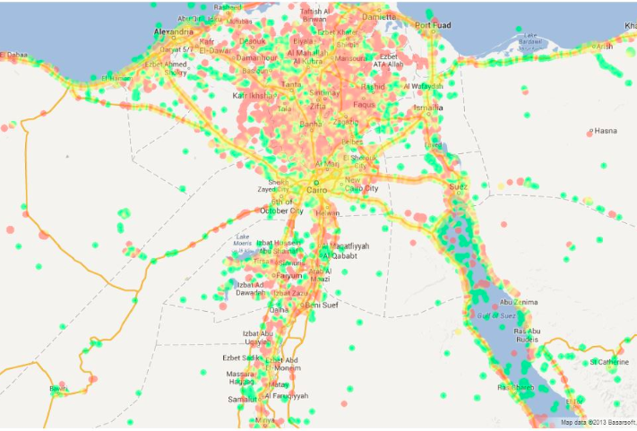
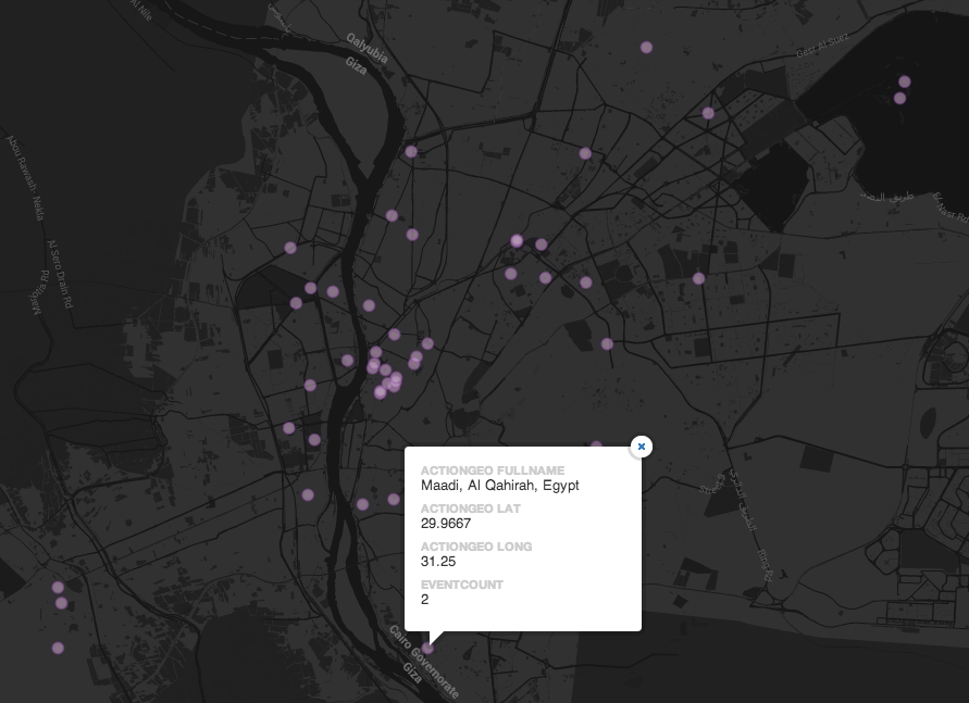
At the time, my colleagues Gregory, Alexey Sidorenko & Glafira Parinos launched the Help Map above in an effort to facilitate self-organization and mutual aid. But as Gregory notes in his new study, “The more people were willing to help, the more difficult it was to coordinate the assistance and to match resources with needs.” Moreover, the Help Map continued to receive reports on needs and offers-of-help after the fires had subsided. To be sure, reports of flooding soon found their way to the map, for example. Gregory, Alexey, Glarifa and team thus launched “Virtual Rynda: The Help Atlas” to facilitate self-help in response to a variety of situations beyond sudden-onset crises.

“We believed that in order to develop the capacity and resilience to respond to crisis situations we would have to develop the potential for mutual aid in everyday life. This would rely on an idea that emergency and everyday-life situations were interrelated. While people’s motivation to help one another is lower during non-emergency situations, if you facilitate mutual aid in everyday life and allow people to acquire skills in using Internet-based technologies to help one another or in asking for assistance, this will help to create an improved capacity to fulfill the potential of mutual aid the next time a disaster happens. […] The idea was that ICTs could expand the range within which the tolling of the emergency bell could be heard. Everyone could ‘ring’ the ‘Virtual Rynda’ when they needed help, and communication networks would magnify the sound until it reached those who could come and help.”

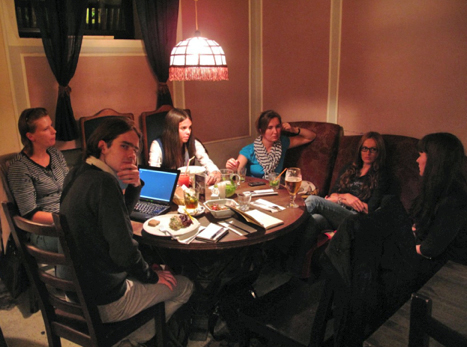
In order to accelerate and scale the matching of needs & resources, Gregory and team (pictured below) sought to develop a matchmaking algorithm. Rynda would ask users to specify what the need was, where (geographically) the need was located and when (time-wise) the need was requested. “On the basis of this data, computer-based algorithms & human moderators could match offers with requests and optimize the process of resource allocation.” Rynda also included personal profiles, enabling volunteers “to develop an online reputation and increase trust between those needing help and those who could offer assistance. Every volunteer profile included not only personal information, but also a history of the individual’s previous activities within the platform.” To this end, in addition to “Help Requests” & “Help Offers,” Rynda also included an entry for “Help Provided” to close the feedback loop.

Asmolov1

As Gregory acknowledges, the results were mixed but certainly interesting and insightful. “Most of the messages [posted to the Rynda platform dealt] with requests for various types of social help, like clothing and medical equipment for children, homes for orphans, people with limited capabilities, or families in need. […]. Some requests from environmental NGOs were related to the mobilization of volunteers to fight against deforestation or to fight wildfires. […]. In another case, a volunteer who responded to a request on the platform helped to transport resources to a family with many children living far from a big city. […]. Many requests concern[ed] children or disabled people. In one case, Rynda found a volunteer who helped a young woman leave her flat for walks, something she could not do alone. In some cases, the platform helped to provide medicine.” In any event, an analysis of the needs posted to Rynda suggests that “the most needed resource is not the thing itself, but the capacity to take it to the person who needs it. Transportation becomes a crucial resource, especially in a country as big as Russia.”

Alas, “Despite the efforts to create a tool that would automatically match a request with a potential help provider, the capacity of the algorithm to optimize the allocation of resources was very limited.” To this end, like the Help Map initiative, digital volunteers who served as social moderators remained pivotal to the Virtual Ryndal platform. As Alexey notes, “We’ve never even got to the point of the discussion of more complex models of matching.” Perhaps Rynda should have included more structured categories to enable more automated-matching since the volunteer match-makers are simply not scalable. “Despite the intention that the ‘matchmaking’ algorithm would support the efficient allocation of resources between those in need and those who could help, the success of the ‘matchmaking’ depended on the work of the moderators, whose resources were limited. As a result, a gap emerged between the broad issues that the project could address and the limited resources of volunteers.”

To this end, Gregory readily admits that “the initial definition of the project as a general mutual aid platform may have been too broad and unspecific.” I agree with this diagnostic. Take the online dating platform Match.com for example. Match.com’s sole focus is online dating; Airbnb’s sole purpose is to match those looking for a place to stay with those offering their places; Uber’s sole purpose is matching those who need to get somewhere with a local car service. To this end, matching platform for mutual-aid may indeed been too broad—at least to begin with. Amazon began with books, but later diversified.

In any case, as Gregory rightly notes, “The relatively limited success of Rynda didn’t mean the failure of the idea of mutual aid. What […] Rynda demonstrates is the variety of challenges encountered along the way of the project’s implementation.” To be sure, “Every society or community has an inherent potential mutual aid structure that can be strengthened and empowered. This is more visible in emergency situations; however, major mutual aid capacity building is needed in everyday, non-emergency situations.” Thanks to Gregory and team, future digital matchmakers can draw on the above insights and Rynda’s open source code when designing their own mutual-aid and self-help platforms.

For me, one of the key take-aways is the need for a scalable matching platform. Match.com would not be possible if the matching were done primarily manually. Nor would Match.com work as well if the company sought to match interests beyond the romantic domain. So a future Match.com for mutual-aid would need to include automated matching and begin with a very specific matching domain. 

Bio


See also:

  • Using Waze, Uber, AirBnB, SeeClickFix for Disaster Response [link]
  • MatchApp: Next Generation Disaster Response App? [link]
  • A Marketplace for Crowdsourcing Crisis Response [link]

Live: Crowdsourced Crisis Map of UAV/Aerial Photos & Videos for Disaster Response (Updated)

Update: Crisis Map now includes features to post photos in addition to videos!

The latest version of the Humanitarian UAV Network’s Crisis Map of UAV/aerial photos & videos is now live on the Network’s website. The crowdsourced map already features dozens of aerial videos of recent disasters. Now, users can also post aerial photographs areas. Like the use of social media for emergency management, this new medium—user-generated (aerial) content—can be used by humanitarian organizations to complement their damage assessments and thus improve situational awareness.

UAViators Map

The purpose of this Humanitarian UAV Network (UAViators) map is not only to provide humanitarian organizations and disaster-affected communities with an online repository of aerial information on disaster damage to augment their situational awareness; this crisis map also serves to raise awareness on how to safely & responsibly use small UAVs for rapid damage assessments. This explains why users who upload new content to the map must confirm that they have read the UAViator‘s Code of Conduct. They also have to confirm that the photos & videos conform to the Network’s mission and that they do not violate privacy or copyrights. In sum, the map seeks to crowdsource both aerial footage and critical thinking for the responsible use of UAVs in humanitarian settings.

UAViators Map 4

As noted above, this is the first version of the map, which means several other features are currently in the works. These new features will be rolled out incrementally over the next weeks and months. In the meantime, feel free to suggest any features you’d like to see in the comments section below. Thank you.

Bio

  • Humanitarian UAV Network: Strategy for 2014-2015 [link]
  • Humanitarians in the Sky: Using UAVs for Disaster Response [link]
  • Humanitarian UAV Missions During Balkan Floods [link]
  • Using UAVs for Disaster Risk Reduction in Haiti [link]
  • Using MicroMappers to Make Sense of UAV/Aerial Imagery During Disasters [link]

Taking the Pulse of the Boston Marathon Bombings on Twitter

Social media networks are evolving a new nervous system for our planet. These real-time networks provide immediate feedback loops when media-rich societies experience a shock. My colleague Todd Mostak recently shared the tweet map below with me which depicts tweets referring to “marathon” (in red) shortly after the bombs went off during Boston’s marathon. The green dots represent all the other tweets posted at the time. Click on the map to enlarge. (It is always difficult to write about data visualizations of violent events because they don’t capture the human suffering, thus seemingly minimizing the tragic events).

Credit: Todd Mostak

Visualizing a social system at this scale gives a sense that we’re looking at a living, breathing organism, one that has just been wounded. This impression is even more stark in the dynamic visualization captured in the video below.

This an excerpt of Todd’s longer video, available here. Note that this data visualization uses less than 3% of all posted tweets because 97%+ of tweets are not geo-tagged. So we’re not even seeing the full nervous system in action. For more analysis of tweets during the marathon, see this blog post entitled “Boston Marathon Explosions: Analyzing First 1,000 Seconds on Twitter.”

bio

Stunning Wind Map of Hurricane Sandy

Surface wind data from the National Digital Forecast Database is updated on an hourly basis. More galleries of stunning wind maps here.

bio

Map: 24 hours of Tweets in New York

The map below depicts geo-tagged tweets posted between May 4-5, 2013 in the New York City area. Over 36,000 tweets are posted on the map (click to enlarge). Since less than 3% of all tweets are geo-tagged, the map is missing the vast majority of tweets posted in this area during those 24 hours.

New York Tweets 24 hours

Contrast the above with the 1-month worth of tweets (April-May 2013) depicted in the map below. Again, the visualization misses the vast majority of tweets since these are not geo-tagged and thus not mappable.

New York 1 Month Tweets

These visuals are screenshots of Harvard’s Tweetmap platform, which is publicly available here. My colleague Todd Mostak is one of the main drivers behind Tweetmap, so worth sending him a quick thank you tweet! Todd is working on some exciting extensions and refinements, so stay tuned as I’ll be sure to blog about them when they go live.

Bio

Egypt Twitter Map of iPhone, Android and Blackberry Users

Colleagues at GNIP and MapBox recently published this high-resolution map of iPhone, Android and Blackberry users in the US (click to enlarge). “More than 280 million Tweets posted from mobile phones reveal geographic usage patterns in unprecedented detail.” These patterns are often insightful. Some argue that “cell phone brands say something about socio-economics – it takes a lot of money to buy a new iPhone 5,” for example (1). So a map of iPhone users based on where these users tweet reveals where relatively wealthy people live.

Phones USA

As announced in this blog post, colleagues and I at QCRI, Harvard, MIT and UNDP are working on an experimental R&D project to determine whether Big Data can inform poverty reduction strategies in Egypt. More specifically, we are looking to test whether tweets provide a “good enough” signal of changes in unemployment and poverty levels. To do this, we need ground truth data. So my MIT colleague Todd Mostak put together the following maps of cell phone brand ownerships in Egypt using ~3.5 million geolocated tweets from October 2012 to June 2013. Red dots represent the location of tweets posted by Android users; Green dots – iPhone; Purple – Blackberry. Click figures below to enlarge.

Egypt Mobile Phones

Below is a heatmap of the % of Android users. As Todd pointed out in our email exchanges, “Note the lower intensity around Cairo.”

Egypt Android

This heatmap depicts the density of tweeting iPhone users:

Egypt iPhone users

Lastly, the heatmap below depicts geo-tagged tweets posted by Blackberry users.

BB Egypt

As Todd notes, “We can obviously break these down by shyiyakha and regress against census data to get a better idea of how usage of these different devices correlate with proxy for income, but at least from these maps it seems clear that iPhone and Blackberry are used more in urban, higher-income areas.” Since this data is time-stamped, we may be able to show whether/how these patterns changed during last week’s widespread protests and political upheaval.

bio

Global Heat Map of Protests in 2013

My colleague Kalev Leetaru recently launched GDELT (Global Data on Events, Location and Tone), which includes over 250 million events ranging from riots and protests to diplomatic exchanges and peace appeals. The data is based on dozens of news sources such as AFP, AP, BBC, UPI, Washington Post, New York Times and all national & international news from Google News. Given the recent wave of protests in Cairo and Istanbul, a collaborator of Kalev’s, John Beieler, just produced this digital dynamic map of protests events thus far in 2013. John left out the US because “it was a shining beacon of protest activity that distracted from the other parts of the map.” Click on the maps below to enlarge & zoom in.

World

Heat Map Protests

Egypt

Egypt Protests

India

GDELT India

As Kalev notes, “Right now its just a [temporally] static map, it was done as a pilot just to see what it would look like in the first place, but the ultimate goal would be to do realtime updates, we just need to find someone with the interest and time to do this.” Any readers want to take up the challenge? Having a live map of protests (including US data) with “slow motion replay” functionality could be quite insightful given current upheavals. In the meantime, other stunning visualizations of the GDELT data are available here.

And to think that the quantitative analysis section of my doctoral dissertation was an econometric analysis of protest data coded at the country-year level based on just one news source, Reuters. I wonder if/how my findings would change with GDELT’s data. Anyone looking for a dissertation topic?

bio

Using Twitter to Map Blackouts During Hurricane Sandy

I recently caught up with Gilal Lotan during a hackathon in New York and was reminded of his good work during Sandy, the largest Atlantic hurricane on record. Amongst other analytics, Gilal created a dynamic map of tweets referring to power outages. “This begins on the evening October 28th as people mostly joke about the prospect of potentially losing power. As the storm evolves, the tone turns much more serious. The darker a region on the map, the more aggregate Tweets about power loss that were seen for that region.” The animated map is captured in the video below.

Hashtags played a key role in the reporting. The #NJpower hashtag, for example, was used to ‘help  keep track of the power situation throughout the state (1). As depicted in the tweet below, “users and news outlets used this hashtag to inform residents where power outages were reported and gave areas updates as to when they could expect their power to come back” (1). 

NJpower tweet

As Gilal notes, “The potential for mapping out this kind of information in realtime is huge. Think of generating these types of maps for different scenarios– power loss, flooding, strong winds, trees falling.” Indeed, colleagues at FEMA and ESRI had asked us to automatically extract references to gas leaks on Twitter in the immediate aftermath of the Category 5 Tornado in Oklahoma. One could also use a platform like GeoFeedia, which maps multiple types of social media reports based on keywords (i.e., not machine learning). But the vast majority of Twitter users do not geo-tag their tweets. In fact, only 2.7% of tweets are geotagged, according to this study. This explains why enlightened policies are also important for humanitarian technologies to work—like asking the public to temporally geo-tag their social media updates when these are relevant to disaster response.

While basing these observations on people’s Tweets might not always bring back valid results (someone may jokingly tweet about losing power),” Gilal argues that “the aggregate, especially when compared to the norm, can be a pretty powerful signal.” The key word here is norm. If an established baseline of geo-tagged tweets for the northeast were available, one would have a base-map of “normal” geo-referenced twitter activity. This would enable us to understand deviations from the norm. Such a base-map would thus place new tweets in temporal and geo-spatial context.

In sum, creating live maps of geo-tagged tweets is only a first step. Base-maps should be rapidly developed and overlaid with other datasets such as population and income distribution. Of course, these datasets are not always available acessing historical Twitter data can also be a challenge. The latter explains why Big Data Philanthropy for Disaster Response is so key.

bio

Map or Be Mapped: Otherwise You Don’t Exist

“There are hardly any street signs here. There are no official zip codes. No addresses. Just word of mouth” (1). Such is the fate of Brazil’s Mare shanty-town and that of most shantytowns around the world where the spoken word is king (and not necessarily benevolent). “The sprawling complex of slums, along with the rest of Rio de Janerio’s favelas, has hung in a sort of ‘legal invisibility’ since 1937, when a city ordinance ruled that however unsightly, favelas should be kept off maps because they were merely ‘temporary'” (2).

shantytown

The socio-economic consequences were far-reaching. For decades, this infor-mality meant that “entire neighborhoods did not receive mail. It had also blocked people from giving required information on job applications, getting a bank account or telling the police or fire department where to go in an emergency call. Favela residents had to pick up their mail from their neighborhood associations, and entire slums housing a small town’s worth of residents had to use the zip code of the closest officially recognized street” (3).

All this is starting to change thanks to a grassroots initiative that is surveying Mare’s 16 favelas, home to some 130,000 people. This community-driven project has appropriated the same survey methodology used by the Brazilian government’s Institute of Geography and Statistics. The collected data includes “not only street names but the history of the original smaller favelas that make up the community” (4). This data is then “formatted into pocket guides and distributed gratis to residents. These guides also offer background on certain streets’ namesakes, but leave some blank so that residents can fill them in as Mare […] continues shifting out from the shadows of liminal space to a city with distinct identities” (5). And so, “residents of Rio’s famed favelas are undergoing their first real and ‘fundamental step toward citizenship'” (6).

These bottom-up, counter-mapping efforts are inherently political—call it guerrilla mapping. Traditionally, maps have represented “not just the per-spective of the cartographer herself, but of much larger institutions—of corporations, organizations, and governments” (7). The scale was fixed at one and only one scale, that of the State. Today, informal communities can take matters into their own hands and put themselves on the map; at the scale of their choosing. But companies like Google still have the power to make these communities vanish. In Brazil, Google said it “would tweak the site’s [Google Maps’] design, namely its text size and district labeling to show favela names only after users zoomed in on those areas.”

GmapNK

Meanwhile, Google is making North Korea’s capital city more visible. But I had an uncomfortable feeling after reading National Geographic’s take on Google’s citizen mapping expedition to North Korea. The Director for National Geographic Maps, Juan José Valdéscautions that, “In many parts of the world such citizen mapping has proven challenging, if not downright dangerous. In many places, little can be achieved without the approval of local and or national authorities—especially in North Korea.” Yes, but in many parts of the world citizen mapping is safe and possible. More importantly, citizen mapping can be a powerful tool for digital activism. My entire doctoral dissertation focuses on exactly this issue.

Yes, Valdés is absolutely correct when he writes that “In many countries, place-names, let alone the alignment of boundaries, remain a powerful symbol of independence and national pride, and not merely indicators of location. This is where citizen cartographers need to understand the often subtle nuances and potential pitfalls of mapping.” As the New Yorker notes, “Maps are so closely associated with power that dictatorships regard information on geography as a state secret.” But map-savvy digital activists already know this better than most, and they deliberately seek to exploit this to their advantage in their struggles for democracy.

National Geographic’s mandate is of course very different. “From National Geographic’s perspective, all a map should accomplish is the actual portrayal of national sovereignty, as it currently exists. It should also reflect the names as closely as possible to those recognized by the political entities of the geographic areas being mapped. To do otherwise would give map readers an unrealistic picture of what is occurring on the ground.”

natgeomaps

This makes perfect sense for National Geographic. But as James Scott reminds us in his latest book, “A great deal of the symbolic work of official power is precisely to obscure the confusion, disorder, spontaneity, error, and improvisation of political power as it is in fact exercised, beneath a billiard-ball-smooth surface of order, deliberation, rationality, and control. I think of this as the ‘miniaturization of order.'” Scott adds that, “The order, rationality, abstractness and synoptic legibility of certain kinds of schemes of naming, landscape, architecture, and work processes lend themselves to hierarchical power […] ‘landscapes of control and appropriation.'”

Citizen mapping, especially in repressive environments, often seeks to change that balance of power by redirecting the compass of political power with the  use of subversive digital maps. Take last year’s example of Syrian pro-democracy activists changing place & street names depicted on on the Google Map of Syria. They did this intentionally as an act of resistance and defiance. Again, I fully understand and respect that National Geographic’s mandate is completely different to that of pro-democracy activists fighting for freedom. I just wish that Valdés had a least added one sentence to acknowledge the importance of maps for the purposes of resistance and pro-democracy movements. After all, he is himself a refugee from Cuba’s political repression.

There is of course a flip side to all this. While empowering, visibility and legibility can also undermine a community’s autonomy. As Pierre-Joseph Proudhon famously put it, “To be governed is to be watched, inspected, spied upon, directed, law-driven, numbered, regulated, enrolled, indoctrinated, preached at, controlled, checked, estimated, valued, censured, commanded, by creatures who have neither the right nor the wisdom nor the virtue to do so.” To be digitally mapped is to be governed, but perhaps at multiple scales including the preferred scale of self-governance and self-determination.

And so, we find ourselves repeating the words of Shakespeare’s famous character Hamlet: “To be, or not to be,” to map, or not to map.


See also:

  • Spying with Maps [Link]
  • How to Lie With Maps [Link]
  • Folksomaps for Community Mapping [Link]
  • From Social Mapping to Crisis Mapping [Link]
  • Crisis Mapping Somalia with the Diaspora [Link]
  • Perils of Crisis Mapping: Lessons from Gun Map [Link]
  • Crisis Mapping the End of Sudan’s Dictatorship? [Link]
  • Threat and Risk Mapping Analysis in the Sudan [Link]
  • Rise of Amateur Professionals & Future of Crisis Mapping [Link]
  • Google Inc + World Bank = Empowering Citizen Cartographers? [Link]

Note: Readers interested in the topics discussed above may also be interested in a forthcoming book to be published by Oxford University Press entitled “Information and Communication Technologies in Areas of Limited State-hood.” I have contributed a chapter to this book entitled “Crisis Mapping in Areas of Limited Statehood,” which analyzes how the rise of citizen-genera-ted crisis mapping replaces governance in areas of limited statehood. The chapter distills the conditions for the success of these crisis mapping efforts in these non-permissive and resource-restricted environments. 

Perils of Crisis Mapping: Lessons from Gun Map

Any CrisisMapper who followed the social firestorm surrounding the gun map published by the Journal News will have noted direct parallels with the perils of Crisis Mapping. The digital and interactive gun map displayed the (lega-lly acquired) names and addresses of 33,614 handgun permit holders in two counties of New York. Entitled “The Gun Owner Next Door,” the project was launched on December 23, 2012 to highlight the extent of gun proliferation in the wake of the school shooting in Newtown. The map has been viewed over 1 million times since. This blog post documents the consequences of the gun map and explains how to avoid making the same mistakes in the field of Crisis Mapping.

gunmap

The backlash against Journal News was swift, loud and intense. The interactive map included the names and addresses of police officers and other law enforcement officials such as prison guards. The latter were subsequently threatened by inmates who used the map to find out exactly where they lived. Former crooks and thieves confirmed the map would be highly valuable for planning crimes (“news you can use”). They warned that criminals could easily use the map either to target houses with no guns (to avoid getting shot) or take the risk and steal the weapons themselves. Shotguns and hand-guns have a street value of $300-$400 per gun. This could lead to a proliferation of legally owned guns on the street.

The consequences of publishing the gun map didn’t end there. Law-abiding citizens who do not own guns began to fear for their safety. A Democratic legislator told the media: “I never owned a gun but now I have no choice […]. I have been exposed as someone that has no gun. And I’ll do anything, anything to protect my family.” One resident feared that her ex-husband, who had attempted to kill her in the past, might now be able to find her thanks to the map. There were also consequences for the journalists who published the map. They began to receive death threats and had to station an armed guard outside one of their offices. One disenchanted blogger decided to turn the tables (reverse panopticon) by publishing a map with the names and addresses of key editorial staffers who work at  Journal News. The New York Times reported that the location of the editors’ children’s schools had also been posted online. Suspicious packages containing white powder were also mailed to the newsroom (later found to be harmless).

News about a burglary possibly tied to the gun map began to circulate (although I’m not sure whether the link was ever confirmed). But according to one report, “said burglars broke in Saturday evening, and went straight for the gun safe. But they could not get it open.” Even if there was no link between this specific burglary and the gun map, many county residents fear that their homes have become a target. The map also “demonized” gun owners.

gunmap2

After weeks of fierce and heated “debate” the Journal News took the map down. But were the journalists right in publishing their interactive gun map in the first place? There was nothing illegal about it. But should the map have been published? In my opinion: No. At least not in that format. The rationale behind this public map makes sense. After all, “In the highly charged debate over guns that followed the shooting, the extent of ownership was highly relevant. […] By publishing the ‘gun map,’ the Journal News gave readers a visceral understanding of the presence of guns in their own community.” (Politico). It was the implementation of the idea that was flawed.

I don’t agree with the criticism that suggests the map was pointless because criminals obviously don’t register their guns. Mapping criminal activity was simply not the rationale behind the map. Also, while Journal News could simply have published statistics on the proliferation of gun ownership, the impact would not have been as … dramatic. Indeed, “ask any editor, advertiser, artist or curator—hell, ask anyone whose ever made a PowerPoint presentation—which editorial approach would be a more effective means of getting the point across” (Politico). No, this is not an endorsement of the resulting map, simply an acknowledgement that the decision to use mapping as a medium for data visualization made sense.

The gun map could have been published without the interactive feature and without corresponding names and addresses. This is eventually what the jour-nalists decided to do, about four weeks later. Aggregating the statistics would have also been an option in order to get away from individual dots representing specific houses and locations. Perhaps a heat map that leaves enough room for geographic ambiguity would have been less provocative but still effective in de-picting the extent of gun proliferation. Finally, an “opt out” feature should have been offered, allowing those owning guns to remove themselves from the map (still in the context of a heat map). Now, these are certainly not perfect solutions—simply considerations that could mitigate some of the negative consequences that come with publishing a hyper-local map of gun ownership.

The point, quite simply, is that there are various ways to map sensitive data such that the overall data visualization is rendered relatively less dangerous. But there is another perhaps more critical observation that needs to be made here. The New York Time’s Bill Keller gets to the heart of the matter in this piece on the gun map:

“When it comes to privacy, we are all hypocrites. We howl when a newspaper publishes public records about personal behavior. At the same time, we are acquiescing in a much more sweeping erosion of our privacy —government surveillance, corporate data-mining, political micro-targeting, hacker invasions—with no comparable outpouring of protest. As a society we have no coherent view of what information is worth defending and how to defend it. When our personal information is exploited this way, we may grumble, or we may seek the largely false comfort of tweaking our privacy settings […].”

In conclusion, the “smoking guns” (no pun intended) were never found. Law enforcement officials and former criminals seemed to imply that thieves would go on a rampage with map in hand. So why did we not see a clear and measurable increase in burglaries? The gun map should obviously have given thieves the edge. But no, all we have is just one unconfirmed report of an unsuccessful crime that may potentially be linked to the map. Surely, there should be an arsenal of smoking guns given all the brouhaha.

In any event, the controversial gun map provides at least six lessons for those of us engaged in crisis mapping complex humanitarian emergencies:

First, just because data is publicly-accessible does not mean that a map of said data is ethical or harmless. Second, there are dozens of ways to visualize and “blur” sensitive data on a map. Third, a threat and risk mitigation strategy should be standard operating procedure for crisis maps. Fourth, since crisis mapping almost always entails risk-taking when tracking conflicts, the benefits that at-risk communities gain from the resulting map must always and clearly outweigh the expected costs. This means carrying out a Cost Benefit Analysis, which goes to the heart of the “Do No Harm” principle. Fifth, a code of conduct on data protection and data security for digital humanitarian response needs to be drafted, adopted and self-enforced; something I’m actively working on with both the International Committee of the Red Cross (ICRC) and GSMA’s  Disaster Response Program. Sixth, the importance of privacy can—and already has—been hijacked by attention-seeking hypocrites who sensationalize the issue to gain notoriety and paralyze action. Non-action in no way implies no-harm.

Update: Turns out the gan ownership data was highly inaccurate!

See also:

  • Does Digital Crime Mapping Work? Insights on Engagement, Empowerment & Transparency [Link]
  • On Crowdsourcing, Crisis Mapping & Data Protection [Link]
  • What do Travel Guides and  Nazi Germany have to do with Crisis Mapping and Security? [Link]