
I enjoy thinking about the different analogies one can use to describe crisis mapping. I’ve likened crisis mapping to the Nascza Lines here and to cymatics here, for example. In a recent interview with Reuters/Alertnet (published here), I used the following analogy:
“Crisis mapping is to the humanitarian space what x-rays are to emergency rooms.”
I wanted to find an analogy that would steer clear of technical jargon and capture the public’s imagination. I thought through several analogies before the interview. For example, I debated using Magnetic Resonance Imaging (MRI) as analogy instead of x-rays since, well, it’s a more accurate comparison.
Why?
Have a look at the first minute of this rather amusing video, which first shows some x-ray pictures and then MRI scans.
MRI scans provide “quantitative, real-time, thermal images of the treated area” (1). All x-rays do is display static, albeit still useful, information. It’s a bit like comparing today’s high-speed digital video cameras with the cameras of bygone days that produced black and white photographs.
I thought about these analogies again this evening while walking home from MIT’s conference on data visualization. That’s when something very obvious dawned on me. The biggest problem with crisis maps is the word “maps”. The majority of the world’s population including myself associate maps with printed maps—no thanks to pirates.
The term “animated map” almost seems like an oxymoron, much like the word “airbus” must have come across when the company was founded 40 years ago. For you fellow Harry Potter fans, perhaps the best way to describe what I’m trying to convey is by referring to The Daily Prophet, the magical newspaper whose articles include moving pictures. Or perhaps the magical Marauder’s map which tracks the movement of students and teachers at Hogwarts in real-time.

Source: newlaunches.com
Fictional protagonists aside, Albert Einstein was spot on when he wrote:
“Imagination is more important than knowledge. For knowledge is limited to all we now know and understand, while imagination embraces the entire world, and all there ever will be to know and understand.”
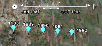
We know a lot about maps but if we were to play the word association game we’d likely come up with static descriptions rather than words associated with moving pictures. The time slider feature on Google Earth is perhaps starting to shift people’s conception of maps. Hans Rosling‘s work with Gapminder is also stirring our imagination since he talks about time series data much like a sports commentator describes a horse race (see his really neat TED talk here).
source: google earth
But we’re even more trapped by our archaic conception of maps than we realize. Playing the word association game with the word “map” may conjure Google Earth’s time slider for a few neogeographers, but I doubt that anyone would blurt out “3D!” for example. And yet, that’s what some of us crisis mappers are increasingly thinking about.
Google invited me to participate in a full-day workshop at their DC office last week and sure enough they told us to expect that all structures (e.g., buildings, mountains) on Google Earth would be rendered in 3D within about 2 years. The team is looking to integrate Mapmaker, My Maps, and Sketch-Up with Google Earth. And we already know they have a great flight simulator.

Source: gizmodo
Now compare the above screenshot of Google Earth with a screenshot of Simcity 4 below. And then, of course, there’s also Second Life, and more recently live video integrated into Google Earth.

In the meantime, the most accurate 3D map of any city on Earth has just been created using very high resolution lasers—some 7 million individual points of light to be exact. You could call this the best MRI of a terrestrial city yet!
I’ve already blogged about crisis maps evolving into 3D virtual worlds with live data feeds and agent-based models for scenario development, simulation and forecasting:
- 3D Crisis Mapping for Disaster Simulation Training (link)
- GeoTime: Visual Crisis Mapping in 3D (link)
All these systems are part of the evolving info webs I recently blogged about. But the italicized attributes above hardly come to mind when we hear the word map. And I think this is biggest problem with the term “crisis maps.” Perhaps we should come up with an entirely new term. But coming back to my interview with Reuters/Alertnet, a new more accurate term would simply add more technical jargon and definitely lose the public’s imagination (and mine with it).
So I’ve got an alternative “solution” … maybe. We keep the word map, or rather M.A.P.S. Yes, that’s right “Crisis MAPS.” All we need now is to be as creative as InSTEDD and find a way to fit this acronym with something sensible.
So how’s this?
Crisis MAPS = Crisis Movies and Platform Simulations


