Tag Archives: mapping

Armed Conflict and Location Event Dataset (ACLED)

I joined the Peace Research Institute, Oslo (PRIO) as a researcher in 2006 to do some data development work on a conflict dataset and to work with Norways’ former Secretary of State on assessing the impact of armed conflict on women’s health for the Ministry of Foreign Affairs (MFA).

I quickly became interested in a related PRIO project that had recently begun called the “Armed Conflict and Location Event Dataset, or ACLED. Having worked with conflict event-datasets as part of operational conflict early warning systems in the Horn, I immediately took interest in the project.

While I have referred to ACLED in a number of previous blog posts, two of my main criticisms (until recently) were (1) the lack of data on recent conflicts; and (2) the lack of an interactive interface for geospatial analysis, or at least more compelling visualization platform.

Introducing SpatialKey

Independently, I came across UniveralMind back November of last year when Andrew Turner at GeoCommons made a reference to the group’s work in his presentation at an Ushahidi meeting. I featured one of the group’s products, SpatialKey, in my recent video primer on crisis mapping.

As it turns out, ACLED is now using SpatialKey to visualize and analyze some of it’s data. So the team has definitely come a long way from using ArcGIS and Google Earth, which is great. The screenshot below, for example, depicts the ACLED data on Kenya’s post-election violence using SpatialKey.

ACLEDspatialkey

If the Kenya data is not drawn from the Ushahidi then this could be an exciting research opportunity to compare both datasets using visual analysis and applied geo-statistics. I write “if” because PRIO somewhat surprisingly has not made the Kenya data available. They are usually very transparent so I will follow up with them and hope to get the data. Anyone interested in co-authoring this study?

Academics Get up To Speed

It’s great to see ACLED developing conflict data for more recent conflicts. Data on Chad, Sudan and the Central African Republic (CAR) is also depicted using SpatialKey but again the underlying spreadsheet data does not appear to be available regrettably. If the data were public, then the UN’s Threat and Risk Mapping Analysis (TRMA) project may very well have much to gain from using the data operationally.

ACLEDspatialkey2

Data Hugging Disorder

I’ll close with just one—perhaps unwarranted—concern since I still haven’t heard back from ACLED about accessing their data. As academics become increasingly interested in applying geospatial analysis to recent or even current conflicts by developing their own datasets (a very positive move for sure), will these academics however keep their data to themselves until they’ve published an article in a peer-reviewed journal, which can often take up to a year or more to publish?

To this end I share the concern that my colleague Ed Jezierski from InSTEDD articulated in his excellent blog post yesterday: “Academic projects that collect data with preference towards information that will help to publish a paper rather than the information that will be the most actionable or help community health the most.” Worst still, however, would be academics collecting data very relevant to the humanitarian or human rights community and not sharing that data until their academic papers are officially published.

I don’t think there needs to be competition between scholars and like-minded practitioners. There are increasingly more scholar-practitioners who recognize that they can contributed their research and skills to the benefit of the humanitarian and human rights communities. At the same time, the currency of academia remains the number of peer-reviewed publications. But humanitarian practitioners can simply sign an agreement such that anyone using the data for humanitarian purposes cannot publish any analysis of said data in a peer-reviewed forum.

Thoughts?

Patrick Philippe Meier

Research Agenda for Visual Analytics

I just finished reading “Illuminating the Path: The Research and Development Agenda for Virtual Analytics.” The National Visualization and Analytics Center (NVACs) published the 200-page book in 2004 and the volume is absolutely one of the best treaties I’ve come across on the topic yet. The purpose of this series of posts that follow is to share some highlights and excerpts relevant for crisis mapping.

NVACcover

Co-edited by James Thomas and Kristin Cook,  the book focuses specifically on homeland security but there are numerous insights to be gained on how “virtual analytics” can also illuminate the path for crisis mapping analytics. Recall that the field of conflict early warning originated in part from World War II and  the lack of warning during Pearl Harbor.

Several coordinated systems for the early detection of a Soviet bomber attack on North America were set up in the early days of the Cold War. The Distant Early Warning Line, or Dew Line, was the most sophisticated of these. The point to keep in mind is that the national security establishment is often in the lead when it comes to initiatives that can also be applied for humanitarian purposes.

The motivation behind the launching of NVACs and this study was 9/11. In my opinion, this volume goes a long way to validating the field of crisis mapping. I highly recommend it to colleagues in both the humanitarian and human rights communities. In fact, the book is directly relevant to my current consulting work with the UN’s Threat and Risk Mapping Analysis (TRMA) project in the Sudan.

So this week, iRevolution will be dedicated to sharing daily higlights from the NVAC study. Taken together, these posts will provide a good summary of the rich and in-depth 200-page study. So check back here post for live links to NVAC highlights:

Part 1: Visual Analytics

Part 2: Data Flooding and Platform Scarcity

Part 3: Data Tetris and Information Synthesis

Part 4: Automated Analysis and Uncertainty Visualized

Part 5: Data Visualization and Interactive Interface Design

Part 6: Mobile Technologies and Collaborative Analytics

Part 7: Towards a Taxonomy of Visual Analytics

Note that the sequence above does not correspond to specific individual chapters in the NVAC study. This structure for the summary is what made most sense.

Patrick Philippe Meier

Video Introduction to Crisis Mapping

I’ve given many presentations on crisis mapping over the past two years but these were never filmed. So I decided to create this video presentation with narration in order to share my findings more widely and hopefully get a lot of feedback in the process. The presentation is not meant to be exhaustive although the video does run to about 30 minutes.

The topics covered in this presentation include:

  • Crisis Map Sourcing – information collection;
  • Mobile Crisis Mapping – mobile technology;
  • Crisis Mapping Visualization – data visualization;
  • Crisis Mapping Analysis – spatial analysis.

The presentation references several blog posts of mine in addition to several operational projects to illustrate the main concepts behind crisis mapping. The individual blog posts featured in the presentation are listed below:

This research is the product of a 2-year grant provided by Humanity United  (HU) to the Harvard Humanitarian Initiative’s (HHI) Program on Crisis Mapping and Early Warning, where I am a doctoral fellow.

I look forward to any questions/suggestions you may have on the video primer!

Patrick Philippe Meier

Folksomaps: Gold Standard for Community Mapping

There were a number of mapping-related papers, posters and demo’s at ICTD2009. One paper in particular caught my intention given the topic’s direct relevance to my ongoing consulting work with the UN’s Threat and Risk Mapping Analysis (TRMA) project in the Sudan and the upcoming ecosystem project in Liberia with Ushahidi and Humanity United.

Introduction

Entitled “Folksomaps – Towards Community Intelligent Maps for Developing Regions,” the paper outlines a community-driven approach for creating maps by drawing on “Web 2.0 principles” and “Semantic Web technologies” but without having to rely entirely on a web-based interface. Indeed, Folksomaps “makes use of web and voice applications to provide access to its services.”

I particularly value the authors’ aim to “provide map-based services that represent user’s intuitive way of finding locations and directions in developing regions.” This is an approach that definitely resonates with me. Indeed, it is our responsibility to adapt and customize our community-based mapping tools to meet the needs, habits and symbology of the end user; not the other way around.

I highly recommend this paper (or summary below) to anyone doing work in the crisis mapping field. In fact, I consider it required reading. The paper is co-authored by Arun Kumar, Dipanjan Chakraborty, Himanshu Chauhan, Sheetal Agarwal and Nitendra Rajput of IBM India Research Lab in New Delhi.

Background

Vast rural areas of developing countries do not have detailed maps or mapping tools. Rural populations are generally semi-literate, low-income and non-tech savvy. They are hardly like to have access to neogeography platforms like Google Earth. Moreover, the lack of electricity access and Internet connection also complicates the situation.

We also know that cities, towns and villages in developing countries “typically do not have well structured naming of streets, roads and houses,” which means “key landmarks become very important in specifying locations and directions.”

Drawing on these insights, the authors seek to tap the collective efforts of local communities to populate, maintain and access content for their own benefit—an approach I have described as crowdfeeding.

Surveys of Tech and Non-Tech Users

The study is centered on end-user needs, which is rather refreshing. The authors carried out a series of surveys to be better understand the profiles of end-users, e.g., tech and non-tech users.

The first survey sought to identify answers to the following questions:

  • How do people find out points of interest?
  • How do much people rely on maps versus people on the streets?
  • How do people provide local information to other people?
  • Whether people are interested in consuming and feeding information for a community-driven map system?

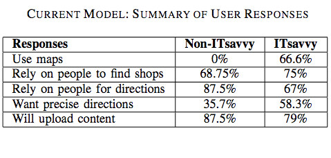
The results are listed in the table below:
folksotb1

Non-tech savvy users did not use maps to find information about locations and only 36% of these users required precise information. In addition, 75% of non-tech respondents preferred the choice of a phone-based interface, which really drives home the need for what I have coined “Mobile Crisis Mapping” or MCM.

Tech-users also rely primarily on others (as opposed to maps) for location related information. The authors associate this result with the lack of signboards in countries like India. “Many a times, the maps do not contain fine-grained information in the first place.”

Most tech-users responded that a phone-based location and direction finding system in addition to a web-based interface. Almost 80% expressed interest in “contributing to the service by uploading content either over the phone or though a web-based portal.”

The second survey sought to identify how tech and non-tech users express directions and local information. For example:

  • How do you give directions to people on the road or to friends?
  • How do you describe proximity of a landmark to another one?
  • How do you describe distance? Kilometers or using time-to-travel?

The results are listed in the table below:

folksotb2

The majority of non-tech savvy participants said they make use of landmarks when giving directions. “They use names of big roads […] and use ‘near to’, ‘adjacent to’, ‘opposite to’ relations with respect to visible and popular landmarks […].” Almost 40% of responders said they use time only to describe the distance between any two locations.

Tech-savvy participants almost always use both time and kilometers as a measure to represent distance. Only 10% or so of participants used kilometers only to represent distance.

The Technology

The following characteristics highlight the design choices that differentiate Folksomaps from established notions of map systems:

  • Relies on user generated content rather than data populated by professionals;
  • Strives for spatial integrity in the logical sense and does not consider spatial integrity in the physical sense as essential (which is a defining feature of social maps);
  • Does not consider visual representation as essential, which is important considering the fact that a large segment of users in developing countries do not have access to Internet (hence my own emphasis on mobile crisis mapping);
  • Is non-static and intelligent in the sense that it infers new information from what is entered by the users.
  • User input is not verified by the system and it is possible that pieces of incorrect information in the knowledgebase may be present at different points of time. Folksomaps adopts the Wiki model and allows all users to add, edit and remove content freely while keeping maps up-to-date.

Conceptual Design

Folksomaps uses “landmark” as the basic unit in the mapping knowledgebase model while “location” represents more coarse-grained geographical areas such as a village, city or country. The model then seeks to capture a few key logical characteristics of locations such as direction, distance, proximity and reachability and layer.

The latter constitutes the granularity of the geographic area that a location represents. “The notion of direction and distance from a location is interpreted with respect to the layer that the location represents. In other words, direction and distance could be viewed as binary operator over locations of the same level. For instance, ‘is towards left of ’ would be appropriate if the location pair being considered is <Libya, Egypt>,” but not if the pair is <Nairobi, India>.

The knowledgebase makes use of two modules, the Web Ontology Language (OWL) and a graph database, to represent and store the above concepts. The Semantic Web language OWL is used to model the categorical characteristics of a landmark (e.g., direction, proximity, etc), and thence infer new relationships not explicitly specified by users of the system. In other words, OWL provides an ontology of locations.

The graph database is used represent distance (numerical relationships) between landmarks. “The locations are represented by nodes and the edges between two nodes of the graph are labeled with the distance between the corresponding locations.” Given the insights gained from user surveys, precise distances and directions are not integral components of community-based maps.

The two modules are used to generate answers to queries submitted by users.

User Interaction

The authors rightly recognize that the user interface design is critical to the success of community-based mapping projects. To be sure, users of may be illiterate, or semi-illiterate and not very tech-savvy. Furthermore, users will tend to query the map system when they need it most, e.g., “when they are stuck on the road looking for directions […] and would be pressed for time.” This very much holds true for crisis mapping as well.

Users can perform three main tasks with the system: “find place”, “trace path” and “add info.” In addition, some or all users may be granted the right to edit or remove entries from the knowledgebase. The Folksomaps system can also be bootstrapped from existing databases to populate instances of location types. “Two such sources of data in the absence of a full-fledged Geographical Information System (GIS) come from the Telecom Industry and the Postal Department.”

folksofig3

How the users interface with the system to carry out these tasks will depend on how tech-savvy or literate they are and what type of access they have to information and communication technologies.

Folksomaps thus provides three types of interface: web-based, voice-based and SMS-based. Each interface allows the user to query and update the database. The web-based interface was developed using Java Server Pages (JSP) while the voice-based interface uses JSPs and VoiceXML.

folksofig41

I am particularly interested in the voice-based interface. The authors point to previous studies that suggest a voice-based interaction works well with users who are illiterate or semi-illiterate and who cannot afford to have high-end devices but can use ordinary low-end phones.

folksofig1

I will share this with the Ushahidi development team with the hopes that they will consider adding a voice-based interface for the platform later this year. To be sure, could be very interesting to integrate Freedom Fone’s work in this area.

Insights from User Studies

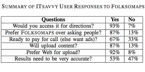
The authors conducted user studies to verify the benefit and acceptability of Folksomaps. Tech-savvy used the web-based interface while non-tech savvy participants used the voice-based interface. The results are shown in the two tables below.

folksotb3

Several important insights surfaced from the results of the user studies. For example, an important insight gained from the non-tech user feedback was “the sense of security that they would get with such a system. […] Even though asking for travel directions from strangers on the street is an option, it exposes the enquirer to criminal elements […].”

Another insight gain was the fact that many non-tech savvy participants were willing to pay for the call even a small premium over normal charges as they saw value to having this information available to them at all times.” That said, the majority of participants “preferred the advertisement model where an advertisement played in the beginning of the call pays for the entire call.”

Interestingly, almost all participants preferred the voice-based interface over SMS even though the former led to a number of speech recognition errors. The reason being that “many people are either not comfortable using SMS or not comfortable using a mobile phone itself.”

There were also interesting insights on the issue of accuracy from the perspective of non-tech savvy participants. Most participants asked for full accuracy and only a handful were tolerant of minor mistakes. “In fact, one of the main reasons for preferring a voice call over asking people for directions was to avoid wrong directions.”

This need for high accuracy is driven by the fact that most people use public transportation, walk or use a bicycle to reach their destination, which means the cost of incorrect information is large compared to someone who owns a car.

This is an important insight since the authors had first assumed that tolerance for incorrect information was higher. They also learned that meta information is as important to non-tech savvy users as the landmarks themselves. For instance, low-income participants were more interested in knowing the modes of available transportation, timetables and bus route numbers than the road route from a source to a destination.
folkstb4

In terms of insights from tech-savvy participants, they did not ask for fine-grained directions all the time. “They were fight with getting high level directions involving major landmarks.” In addition, the need for accuracy was not as strong as for the non-tech savvy respondents and they preferred the content from the queries sent to them via SMS so they could store it for future access, “pointing out that it is easy to forget the directions if you just hear it.”

Some tech-savvy participants also suggested that the directions provided by Folksomaps should “take into consideration the amount of knowledge the subject already has about the area, i.e., it should be personalized based upon user profile. Other participants mentioned that “frequent changes in road plans due to constructions should be captured by such a system—thus making it more usable than just getting directions.”

Conclusion

In sum, the user interface of Folksomaps needs to be “rich and adaptive to the information needs of the user […].” To be sure, given user preference towards “voice-based interface over SMS, designing an efficient user-friendly voice-based user interface […].” In addition, “dynamic and real-time information augmented with traditional services like finding directions and locations would certainly add value to Folksomaps.” Furthermore, the authors recognize that Folksomaps can “certainly benefit from user interface designs,” and “multi-model front ends.”

Finally, the user surveys suggest “the community is very receptive towards the concept of a community-driven map,” so it is important that the TRMA project in the Sudan and the ecosystem Liberia project build on the insights and lessons learned provided in this study.

Patrick Philippe Meier

Threat and Risk Mapping Analysis in Sudan

Massively informative.

That’s how I would describe my past 10 days with the UNDP‘s Threat and Risk Mapping Analysis (TRMA) project in the Sudan. The team here is doing some of the most exciting work I’ve seen in the field of crisis mapping. Truly pioneering. I can’t think of  a better project to apply the past two years of work I have done with the Harvard Humanitarian Initiative’s (HHI) Crisis Mapping and Early Warning Program.

TRMA combines all the facets of crisis mapping that I’ve been focusing on since 2007. Namely, crisis map sourcing, (CMS), mobile crisis mapping (MCM), crisis mapping visualization (CMV), crisis mapping analytics (CMA) and crisis mapping platforms (CMP). I’ll be blogging about each of these in more detail later but wanted to provide a sneak previous in the meantime.

Crisis Map Sourcing (CMS)

The team facilitates 2-day focus groups using participatory mapping methods. Participants identify and map the most pressing crisis factors in their immediate vicinity. It’s really quite stunning to see just how much conversation a map can generate. Rich local knowledge.

trma1

What’s more, TRMA conducts these workshops at two levels for each locality (administrative boundaries within a state): the community-level and at the state-level. They can then compare the perceived threats and risks from both points of view. Makes for very interesting comparisons.

trma2

In addition to this consultative approach to crisis map sourcing, TRMA has played a pivotal role in setting up an Information Management Working Group (IMWG) in the Sudan, which includes the UN’s leading field-based agencies.

What is truly extraordinary about this initiative is that each agency has formally signed an information sharing protocol to share their geo-referenced data. TRMA had already been using much of this data but the process until now had always been challenging since it required repeated bilateral efforts. TRMA has also developed a close professional relationship with the Central Bureau of Statistics Office.

Mobile Crisis Mapping (MCM)

The team has just partnered with a multinational communications corporation to introduce the use of mobile phones for information collection. I’ll write more about this in the coming weeks. Needless to say, I’m excited. Hopefully it won’t be too late to bring up FrontlineSMS‘s excellent work in this area, as well as Ushahidi‘s.

Crisis Mapping Visualization (CMV)

The team needs some help in this area, but then again, that’s one of the reasons I’m here. Watching first reactions during focus groups when we show participants the large GIS maps of their state is  really very telling. Lots more to write about on this and lots to contribute to TRMA’s work. I don’t yet know which maps can be made public but I’ll do my utmost best to get permission to post one or two in the coming weeks.

Crisis Mapping Analytics (CMA)

The team has produced a rich number of different layers of data which can be superimposed to identify visual correlations and otherwise hidden patterns. Perhaps one of the most exciting examples is when the team started drawing fault lines on the maps based on the data collected and their own local area expertise. The team subsequently realized that these fault lines could potential serve as “early warning” markers since a number of conflict incidents subsequently took place along those lines. Like the other crisis mapping components described above, there’s much more to write on this!

Crisis Mapping Platforms (CMP)

TRMA’s GIS team has used ArcGIS but this has been challenging given the US embargo on the Sudan. They therefore developed their own in-house mapping platforms using open-source software. These platforms include the “Threat Mapper” for data entry during (or shortly after) the focus groups and “4Ws” which stands for Who, What, Where and When. The latter tool is operational and will soon be fully developed. 4Ws will actually be used by members of the IMWG to share and visualize their data.

In addition, TRMA makes it’s many maps and layers available by distributing a customized DVD with ArcReader (which is free). Lots more on this in the coming weeks and hopefully some screenshots as well.

Closing the Feedback Loop

I’d like to add with one quick thought, which I will also expand on in the next few weeks. I’ve been in Blue Nile State over the past three days, visiting a number of different local ministries and civil society groups, including the Blue Nile’s Nomadic Union. We distributed dozens of poster-size maps and had at times hour long discussions while pouring over these maps. As I hinted above, the data visualization can be improved. But the question I want to pose at the moment is: how can we develop a manual GIS platform?

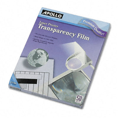
While the maps we distributed were of huge interest to our local partners, they were static, as hard-copy maps are bound to be. This got me thinking about possibly using transparencies to overlap different data/thematic layers over a general hard-copy map. I know transparencies can be printed on. I’m just not sure what size they come in or just how expensive they are, but they could start simulating the interactive functionality of ArcReader.

transparency

Even if they’re only available in A4 size, we could distribute binders with literally dozens of transparencies each with a printed layer of data. This would allow community groups to actually start doing some analysis themselves and could be far more compelling than just disseminating poster-size static maps, especially in rural areas. Another idea would be to use transparent folders like those below and hand-draw some of the major layers. Alternatively, there might a type of thin plastic sheet available in the Sudan.

I’m thinking of trying to pilot this at some point. Any thoughts?

folders

Patrick Philippe Meier

Field Guide to Humanitarian Mapping

MapAction just released an excellent mapping guide for the humanitarian community. Authored principally by Naomi Morris, the guide comprises four chapters that outline a range of mapping methods suitable for humanitarian field word.

The first chapter serves as an introduction to humanitarian mapping. Chapter two explains how to make the best use of GPS for data collection. Note that the latest version of Google Earth (v5.0) includes GPS connectivity. The third and fourth chapters provide a user-friendly, hands-on tutorial on how to use Google Earth and MapWindow for humanitarian mapping.

The purpose of this post is to quickly summarize some of the points I found most interesting in the Guide and to offer some suggestions for further research. I do not summarize the tutorials but I do comment on Google Earth and MapWindow might be improved for humanitarian mapping. The end of this post includes a list of recommended links.

Introduction

John Holmes, the UN Emergency Relief Coordinator and Under-Secretary-General for Humanitarian Affairs argues that “information is very directly about saving lives. If we take the wrong decisions, make the wrong choices about where we put our money and our effort because our knowledge is poor, we are condemning some of the most deserving to death or destitution.”

I completely agree with this priority-emphasis on information. The purpose of crisis mapping and particularly mobile crisis mapping is for at-risk communities to improve their situational awareness during humanitarian crises. The hope is that relevant and timely information will enable communities to make more informed—and thus better— decisions on how to get out of harm’s way. Recall the purpose of people-centered early warning as defined by the UNISDR:

To empower individuals and communities threatened by hazards to act in sufficient time and in an appropriate manner so as to reduce the possibility of personal injury, loss of life, damage to property and the environment, and loss of livelihoods.

Naomi also cites a Senior Officer from the IFRC who explains the need to map vulnerability and develop baselines prior to a disaster context. “The data for these baselines would include scientific hazard data and the outputs from qualitative assessments at community level.”

This point is worth expanding on. I’ve been meaning to write a blog post specifically on crisis mapping baselines for monitoring and impact evaluation. I hope to do so shortly. In the meantime, the importance of baselines vis-à-vis crisis mapping is a pressing area for further research.

Community Mapping

I really appreciate Naomi’s point that humanitarian mapping does not require sophisticated, proprietary software. As she note, “there has been a steady growth in the number of ‘conventional’ desktop GIS packages available under free or open-source licenses.”

Moreover, maps can also be “created using other tools including a pad of graph paper and a pencil, or even an Excel spreadsheet.” Indeed, we should always “consider whether ‘low/no tech’ methods [can meet our] needs before investing time in computer-based methods.”

To this end, Naomi includes a section in her introduction on community-level mapping techniques.

Community-level mapping is a powerful method for disaster risk mitigation and preparedness.  It is driven by input from the beneficiary participants; this benefits the plan output with a broader overview of the area, while allowing the community to be involved. Local people can, using simple maps that they have created, quickly see and analyse important patterns in the risks they face.

Again, Naomi emphasizes the fact that computer-based tools are not essential for crisis mapping at the community level. Instead, we can “compile sketches, data from assessments and notes into representations of the region [we] are looking at using tools like pen and paper.”

To be sure, “in a situation with no time or resources, a map can be enough to help to identify the most at-risk areas of a settlement, and to mark the location of valuable services […].”

Conclusion

I highly recommend following the applied  Google Earth and MapWindow tutorials in the Guide. They are written in a very accessible way that make it easy to follow or use as a teaching tool, so many thanks to Naomi for putting this together.

I would have liked to see more on crisis mapping analysis in the Guide but the fact of the matter is that Google Earth and MapWindow provide little in the way of simple features for applied geostatistics. So this is not a criticism of the report or the author.

Links

Patrick Philippe Meier

WikiMapAid, Ushahidi and Swift River

Keeping up to date with science journals always pays off. The NewScientist just published a really interesting piece related to crisis mapping of diseases this morning. I had to hop on a flight back to Boston so am uploading my post now.

The cholera outbreak in Zimbabwe is becoming increasingly serious but needed data on the number cases and fatalities to control the problem is difficult to obtain. The World Health Organization (WHO) in Zimbabwe has stated that “any system that improves data collecting and sharing would be beneficial.”

This is where WikiMapAid comes in. Developed by Global Map Aid, the wiki enables humanitarian workers to map information on a version of Google Maps that can be viewed by anyone. “The hope is that by circumventing official information channels, a clearer picture of what is happening on the ground can develop.” The website is based on a “Brazilian project called Wikicrimes, launched last year, in which members of the public share information about crime in their local area.”

wikimapaid

WikiMapAid allows users to create markers and attach links to photographs or to post a report of the current situation in the area. Given the context of Zimbabwe, “if people feel they will attract attention from the authorities by posting information, they could perhaps get friends on the outside to post information for them.”

As always with peer-produced data, the validity of the information will depend on those supplying it. While moderators will “edit and keep track of postings […], unreliable reporting could be a problem. In order to address this, the team behind the project is “developing an algorithm that will rate the reputation of users according to whether the information they post is corroborated, or contradicted.”

This is very much in line with the approach we’re taking at Ushahidi for the Swift River project. As WikiMapAid notes, “even if we’re just 80 per cent perfect, we will still have made a huge step forward in terms of being able to galvanize public opinion, raise funds, prioritize need and speed the aid on those who need it most.”

Time to get in touch with the good folks at WikiMapAid.

Patrick Philippe Meier

UN World Food Program to use UAVs

I met with the World Food Program’s (WFP) Emergency Information Management team in Rome late last year and was pleasantly surprised when the term UAVs came up; Unmanned Areal Vehicles, otherwise known as drones and predators in different contexts. The fact that a leading field-based UN agency is actively engaged in a pilot program to use UAVs as early as this summer is particularly surprising and exciting at the same time.

Why surprising? UN Member States have been consistently touchy vis-a-vis issues of sovereignty. Indeed, much time has passed since President Dwight Eisenhower’s 1960 proposal for a “UN aerial reconnaissance capability […] to detect preparations for attack” to operate “in the territories of all nations prepared to accept such inspection.” Eisenhower had pledged that “the United States is prepared not only to accept United Nations aerial surveillance, but to do everything in its power to contribute to the rapid organization and successful operation of such international surveillance.” My, my how times have changed.

Why exciting? There is a notable albeit delayed “spill-over” effect between the use of ICTs by the disaster management and subsequently by the conflict prevention and human rights community. Furthermore, the occurrence of natural disasters amid complex political emergencies is an increasingly widespread phenomenon: over 140 natural disasters have occurred in complex political emergencies in the past five years alone.

The team at WFP is collaborating with ITHACA to build the UAV prototype Pelican. ITHACA is the Information Technology for Humanitarian Assistance, Cooperation and Action, a center of Excellence created by Politecnico di Torino (DITAG) and the Istituto Superiore sui Sistemi Territoriali per l’Innovazione (Si.T.I)

The main goal of the UAV project is to support disaster management through an innovative and effective tool for rapid mapping purposes in the early impact stage. The UAV is easily transportable on normal aircrafts and usable on the field, autonomously, by a couple of operators. The platform is equipped with the autopilot MP2128g, which allows an autonomous flight except for take-off and landing, and with digital sensors characterized by geometric and radiometric resolutions suitable for digital photogrammetry. […]

If satellite data are not available or not suitable to supply radiometric and geometric information, in situ missions must be foresaw. To this end the Pelican is equipped with a GPS/IMU navigation system and different photographic sensors suitable for digital photogrammetric shootings with satisfying geometric and radiometric quality. It can be easily transportable on normal aircrafts and usable on the field by a couple of operators.

The aircraft is equipped with the MP2128g autopilot that allows autonomous flights and provides a real-time attitude of flight. The software HORIZONmp provides flight path and current sensor values in real-time. The operator can also insert a flight plan (up to 1000 waypoints) on a preloaded map and upload them during the flight. Besides the system can be connected with the payload cameras, so it is possible to schedule an automatic shooting time. The operations of take-off and landing must be accomplished manually due to the insufficient GPS’s in-flight accuracy.

The Pelican uses the Ricoh GR commercial digital camera. The use of two Ricohs (stereo pairs) allows the Pelican to rapidly update existing maps and to perform 3D feature extraction devoted to the identification of areas that require further investigations.

When I spoke to the team at WFP, they quoted a price range of $12-$10K, which is definitely the cheapest price tag I’ve come across for a UAV with the Pelican’s specs. The folks in Torino are also working to push the range of the Pelican to 200km with longer endurance limits. One could then operate the Pelican from Thailand/Burmese border and fly the UAV into Burma to identify movement of soldiers.

Of course, the military junta could try and take the bird down, but even if the small Pelican took a hit, all the data would have been captured before impact thanks to the real-time video downlink made possible by the Ricoh. The potential for an iRevolution would be met if video footage could be beamed to individual mobile phones, perhaps using the video encryption technology I recently blogged about.

Patrick Philippe Meier