Tag Archives: Visual Analytics

Applying Fluid Dynamics to Crisis Mapping

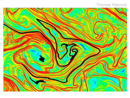
The Economist just published a fascinating article on fluid dynamics called “The Skeleton of Water” which may have important implications for Crisis Mapping Analytics. We often speak of conflict in terms of waves, e.g., “preventing the next wave of conflict,” but there may be more to the analogy than meets the eye.

Source: The Economist

One of the main challenges that Crisis Mapping Analytics faces is the complexity involved in modeling conflict dynamics over space and time. But we’re hardly the first to face this challenge. Take the field of fluid dynamics, which is the subject of the article in question. Breakthrough research now reveals that hidden structures within liquids and gasses guide the movement of everything from pollution to airplanes.

The atmosphere and the ocean are, it seems, dominated by invisible barriers that have come to be known as Lagrangian Coherent Structures.

To understand what a Lagrangian Coherent Structure [LCS] is, it helps to imagine a crowd at a railway terminus […]. Some people will be arriving. Some will be leaving. And, whichever they are doing, they will be going to and from numerous different platforms.

The result is chaos, but structured chaos. What emerges is a shifting pattern of borders between groups of people with different goals. These borders are Lagrangian coherent structures. They are intangible, immaterial and would be undetectable if the passengers stopped moving. But they are also real enough to be treated mathematically.

And it turns out to be easier to study the behaviour of such fluids by looking at the barriers than at the bodies of fluid which those barriers separate.

Scientists across numerous fields are now jumping on the Lagrangian bandwagon to explore the applicability of LCS to their work.

For example, a professor at CalTech recently “used the technique to study the hunting behaviour of jellyfish. He has shown how parts of the ocean are temporarily protected from the depredations of these creatures because they cannot cross the invisible barriers imposed by Lagrange.” Meanwhile, another professor notes that “the coherent-structure approach might also be used to help predictions of the passage of hurricanes; they, too, are constrained by the invisible barriers that Lagrange’s theory describes.”

There is also reason to believe that conflict follows a power law (like earthquakes, forest fires, etc.). In other words, conflict may be scale invariant. This may imply that there is no “average size” of conflict regardless of scale, i.e., from interpersonal to international conflict. As it turns out,  “Lagrangian coherent structures can appear at all sorts of scales. What goes for an airport or a bay can be scaled up to an ocean, or the air above it, and down to the flow off an aircraft’s wingtip, or a ship’s hull.”

One of the exciting conclusions from this latest research in fluid dynamics is that “boundaries between things are often as important as the things themselves.” In other words, we need to think more about what artists call negative space, which is “ the space around and between the subject(s) of an image. Negative space may be most evident when the space around a subject, and not the subject itself, forms an interesting or artistically relevant shape, and such space is occasionally used to artistic effect as the “real” subject of an image.”

Take the following picture, for example.

Source: Wikipedia

There is an intimate relationship between the object and the space around it. Negative spaces are important because they may reveal otherwise hidden patterns. In crisis mapping, like fluid dynamics, we need to delineate this negative space over time to identify patterns in three dimensional space. This is what the mathematics of Lagrangian Coherent Structures may allow us to do.

And so, it is very tempting to start thinking about conflict (and peace) in terms of fluid dynamics given the context of crisis mapping. Have we been too preoccupied with crisis data instead of modeling the boundaries and event trajectories? Perhaps conflict flows like a river, with turbulent eddies producing violent pathways while other areas are clear, still pools of peace. So why not collaborate with mathematicians to find out whether LCS’s can shed light on why “islands of peace” sometimes exist in a sea of conflict?

Patrick Philippe Meier with Guest Blogger Jen Ziemke

Cymatic Insights for Crisis Mapping

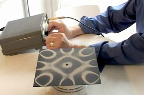
I just came across Evan Grant’s fascinating TED 2009 talk on “Making Sound Visible through Cymatics.” Cymatics describes the process of visualizing sound. Sound waves create vibrations—patterns—that can be visualized on the surface of a plate covered with sand as depicted below.

cymatics

In his talk, Evan demonstrates how different sound frequencies create distinctly different geometric sand patterns. As the sound frequencies increase, so does the complexity of the sand patterns themselves. He describes cymatics as a “looking glass into a hidden world” that can “unveil the substance of things not seen.”

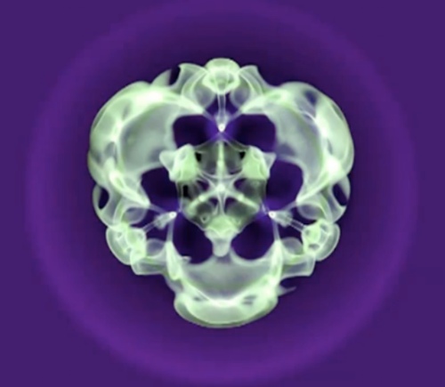
For example, a lexicon of dolphin language is actually being created using cymatics by visualizing the sonar beams that dolphins emit. Cymatics can also be used to create natural art forms. The picture below is a visualization of Beethoven’s 9th Symphony created using a cymatic device. Cymatics can also recreate archetypal forms of nature such as snowflakes or starfish.

cymatics3

It’s not entirely clear what all this means. As Evan notes, cymatics is still a very young field and not many people are working in this line of research. Cymatics shows that sound has form and can effect form in matter. So Evan asks us to think about the universe forming, “about the immense sound of the universe forming, and to ponder on that … perhaps cymatics had an influence on the formation of the universe itself.” Watch Evan’s 5-minute TED Talk below.

In closing, Evan encourage us to apply our passions, knowledge and skills to areas like cymatics. I find this field very interesting because of the analogies with crisis mapping. As often mentioned on iRevolution, crisis mapping is about rendering otherwise hidden patterns visible to improve situational awareness and decision-making.

One can think of conflict processes as sound waves or vibrations and the “plates” as crisis mapping platforms like Ushahidi. We need to “vibrate” conflict data at different frequencies and to develop visual analytics—different templates for data visualization—in order to visualize patterns in a compelling fashion. One might call this the “String Theory” of Crisis Mapping.

——————————————————————————————–

A colleague and I tried analyzing conflict data as music back in 2006 when I was at the Santa Fe Institute (SFI). I had been inspired by the work of an Italian geophysicist who had taken seismic data (tremblings of the earth) and analyzed the data as music in order to look for “melodic” patterns. We used conflict event-data from Afghanistan but the result was not particularly music to my ears—but then again, neither is war.

Patrick Philippe Meier

Literature Review: GIS for Conflict Analysis

This interesting peer-reviewed study (PDF) was authored by researchers at the Joint Research Center (JRC) and published in the International Studies Review in September 2009.

Political and social scientists have quantitatively analyzed the drivers of conflicts in a large number of studies. Geographic components and territorial concepts have emerged as important drivers in interstate disputes. However, geographic components are rarely defined or measured with the same technique.

This study reviews geographic and territorial concepts, associated data sets and analysis methods. The study objective is to represent geographic and territorial concepts with Geographic Information Systems (GIS). The paper describes the challenges and potential opportunities for creating an integrated GIS model of security.

The literature review is a good introduction for anyone interested in the application of GIS to the spatial analysis of conflict. As a colleague mentioned, however, the authors of the study do not cite more recent work in this area, which is rather surprising and unfortunate. Perhaps this is due to the fact that the academic peer-review process can seemingly take forever.

Patrick Philippe Meier

Promises and Pitfalls in the Spatial Prediction of Ethnic Violence

My colleague Nils Weidmann just published this co-authored piece with Harvard Professor Monica Toft. The paper deserves serious attention. Weidmann and Toft review this article on the spatial prediction of ethnic conflict that was authored by Lim, Metzler and Bar-Yam (LMB) and published in the prestigious journal Science.

I reviewed the article myself earlier this year and while I was highly suspicious of the findings—correlations of 0.9 (!) and above—I did not dig deeper. But Weidmann and Toft have done just this and their findings are worth reading.

The authors clearly show that the analysis by LMB “suffers from a biased selection of groups and regions, an inadequate null hypothesis and unit of analysis.” This really begs the following question: how did the LMB paper ever make it through the peer-review process?

The authors’ case selection is seriously biased as it “seems to adjust the group map as to better fit the model predictions,” for example. The isolationist policy recommendations that LMB put forward are thus founded on misleading methods and ought to be entirely dismissed.

Better yet, Science should retract the LMB paper or at least publish the commentary by Weidmann and Toft. Indeed, another question that follows from the conclusion reached by Weidmann and Toft is this: how many other below-par papers have been accepted and published by Science?

In sum, not only are the methods used by LMB questionable, but as Weidmann and Toft conclude, “the model provides little advance on prior research” in the field of crisis mapping.

On the plus side, the fact that there is push back on early articles in the field of crisis mapping is also a good sign and evidence that the field is becoming more formalized. In addition, the general approach taken by LMB still holds much promise for crisis mapping—it simply needs to be done with a lot more care and transparency. Indeed, combining agent-based models with real world empirical data and a sound understanding of ethnic conflict could become a winning strategy for crisis mapping analytics.

In closing, I look forward to following Nils Weidmann’s work at Princeton and have no doubt that he will continue to play an important role in the development of the field, and will do so with integrity and rigorous scholarship.

Patrick Philippe Meier

Mapping Massacres: GIS and State Terror in Guatemala

This is the title of a paper published in Geoforum in 2006 (PDF). Note that the paper was actually submitted in 2003 but the peer-review process appears to have taken 3 years. Ridiculous. I sympathize with the authors and hope they’ve turned to blogging. But the content of their paper is actually what I want to blog about here.

The authors use GIS to visually display the locations of massacres associated with Guatemala’s civil war at the department level and include information on indigenous populations as well as physical geography. They note that “maps have become tools of empowerment in Central America and elsewhere,” and highlight how indigenous groups “have begun to use maps as tools in their fight for land and marine resources, as well as greater political economy.”

It is worth understanding that “among some sectors of Guatemalan society, there is still wholesale denial and rejection of past violent events.” To this end, the purpose of “displaying exactly where violent acts took place is to […] educate the Guatemalan public regarding the terrible violence of the recent past.” The authors suggest that “knowing the name of a specific town where a massacre took place is more concrete, potentially leading to perception of place and people, rather than simply being aware of violence in the countryside.”

Guatemala massacres

The authors produced the maps above, which clearly show that most massacres were concentrated in landscapes whose majority populations are indigenous. “Massacres were not random events in Guatemala. Instead, they took place in very specific cultural landscapes. “

The following short excerpts very much resonate with my thinking on crisis mapping:

“Even information that is easily comprehensible without maps takes on new meaning when it is portrayed spatially.”

“However, knowing in a general sense where the violence took place is not enough. If we fail to accurately display such information spatially, we fail to fully understand where and especially why these events took place. […] By using some basic geographic information systems technologies, relationships between ethnicity, location, physical environment, and violence become much clearer.”

“Mapping these tragic events is critical because these maps also serve as another type of memorial for victims and their families. Many Guatemalans have yet to come to grips with the violence of the past. Maps, more so than words can help deconstruct violent events by providing a mental image of a location and event in the onlookers mind.”

The authors have certainly contributed a better spatial understanding of the violence thanks to this study. What is perhaps missing is an equally compelling temporal resolution so that events can be incrementally analyzed over time and space. Doing so may shed more light on the tactics and strategies employed to carry out the violence. These may produce specific patterns or a library of “fingerprints” that could then be used to investigate massacres in other countries.

Patrick Philippe Meier

Doctor Snow’s Health Map Propaganda

Doctor John Snow’s cholera map of 1854 is often heralded as an example of how mapping can illuminate powerful insights on otherwise hidden patterns. Not so, writes Mark Monmonier in his excellent book on “Spying with Maps” which I just reviewed here.

cholera-snow-map

Mark writes the following on John Snow’s famous map:

“If disease mapping has a poster child, it’s John Snow (1813-1858), the London anesthesiologist credited with discovering the water borne transmission of cholera. […] Snow is best known for his 1854 map showing victims’ homes clustered around Soho’s infamous Broad Street Pump, which he identified as a source of contaminated water. According to epidemiological lore, the good doctor tried unsuccessfully to convince public officials to close down the pump.”

“Undaunted, he too matters in his own hands, removed the pump’s handle, and demonstrated the correctness of his theory when new cases plummeted. Truth be told, the epidemic had already run its course. What’s more, Snow made his famous dot map several months later, for a revised edition of his book on cholera transmission. Even so, his pin map continues to embellish discussions of GIS and disease.”

“Medical geographers, GIS experts, and some epidemiologists perpetuate the Snow myth because it promotes disease mapping as a discovery tool and enhances the stature of their own disciplines. But a careful examination of Snow’s writings indicates that he understood cholera’s mode of transmission well before he made the map.”

“Although Snow was a thoughtful observer, neither his map nor those of his rivals were of any value in generating insightful hypotheses. Snow’s famous cholera map was pure propaganda—and copycat propaganda at that—but proved eminently useful later in the century, when public officials needed convincing arguments to isolate drinking water from sewage.”

Although Mark is rightfully critical of Dr. John Snow’s legendary map, the last sentence above is quite insightful. The map, while unhelpful in knowledge discovery of cholera’s source, did become “eminently useful” to influence public health policy.

Patrick Philippe Meier

Spying with Maps

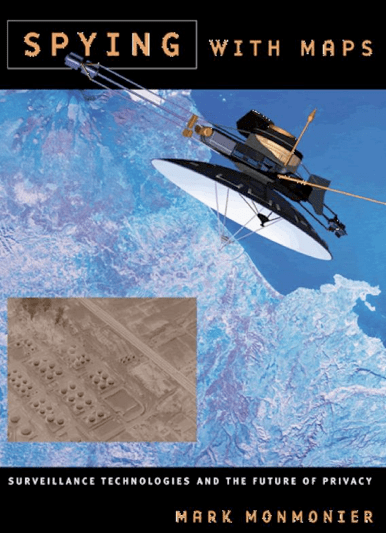
Mark Monmonier has written yet another excellent book on maps. I relished and reviewed his earlier book on “How To Lie with Maps” and enjoyed this one even more on “Spying with Maps.” I include below some short excerpts that I found particularly neat and interesting.

Picture 1

“Mapping, it turns out, can reveal quite a bit about what we do and who we are. I say mapping, rather than maps, because cartography is not limited to static maps printed on paper or displayed on computer screens. In the new cartographies of surveillance, the maps one looks at are less important than the spatial data systems that store and integrate facts about where we live and work. Location is a powerful key for relating disparate databanks and unearthing information […].”

Big Brother is doing most of the watching, at least for now, but corporations, local governments, and other Little Brothers are quickly getting involved.”

“Much depends, of course, on who’s in charge, us or them, and on who ‘them’ is. A police state could exploit geographic technology to round up dissidents—imagine the Nazi SS with a GeoSurveillance Corps. By contrast, a capitalist marketer can exploit locational data by making a cleverly tailored pitch at a time and place when you’re most receptive. Control is control whether it’s blatant or subtle.”

Corrona Satellites

“Spy satellites became a top priority during the Cold War, and Congress generously supported remote sensing. […] analysts with security clearances pored over images from the CIA’s top-secret Corona satellites at the agency’s clandestine National Reconnaissance Office (NRO).” By 1967, “a massive research and development effort had refined the [resolution] down to an impressive 1.5 meters (5 ft.).” Today’s “intelligence satellites have even sharper eyes: various estimates suggest that pictures from Corona’s most advanced successors have a resolution of roughly 3 inches.”

“Because image intelligence focuses on detecting change, 1-meter satellite imagery is often more informative [then people realize]. A new railway spur or clearing, for instance, could signify a new missile site or weapons factory. And a suspicious accumulation of vehicles might presage an imminent attack. As John Pike observes, ‘if a picture is worth 1,000 words, two pictures are worth 10,000 words.'”

“Washington strongly discourages the sale of high-resolution satellite imagery of Israel, and during the 2001 Middle Eastern campaign, the government thwarted enemy media hopes by buying exclusive rights to Ikonos imagery of Afghanistan.”

I really appreciated Mark’s take on the panopticon. His points below are largely ignored by the mainstream literature on the subject and go a long way to explaining just why satellite imagery has not (yet?) acted a strong deterrent against genocide and crimes against humanity. For more on this, please see this post on geospatial technologies for genocide prevention.

Panopticon

Panopticon

“Although the [panopticon] metaphor seems largely appropriate, I am not convinced  that the similarity between Bentham’s model prison and video surveillance tells us anything that’s not obvious about the watcher’s power over the watched. My hunch is that the prison’s walls and bars as well as the isolation of inmates in individual cells exert far greater control over prisoners’ lives than a ready ability to spy on their actions. […] What’s relevant […] is the power of surveillance to intimidate someone already under the watcher’s control, like a prisoner (who can be beaten), an employee (who can be fired), or a motorist who runs red lights (and could be fined or lose his or her license.”

I had come across ShotSpotter a while back but rediscovered the tool in Mark’s book. What is neat is that ShotSpotter combines audio and mapping in a way that may also be applicable to crisis mapping.

Shotspotter

Shotspotter

“[…] police in several California cities rely on ShotSpotter, which its investors describe as an ‘automatic real-time gunshot locator and display system’ […] a clever marriage of seismic analysis and acoustic filtering. […] Like an earthquake, a gunshot generates a sharply defined circular pulse, which expands outward at constant speed. […] ShotSpotter’s microphones detect the wave at slightly different times depending on their distance from the shooter’s location [which the computer can use] to triangulate a location in either two or three dimension. […] The process pinpoints gunshots within 15 yards […].”

Patrick Philippe Meier

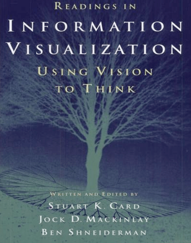
Information Visualization: Using Vision to Think

I just finished paging through “Readings in Information Visualization: Using Vision to Think” and came across some interesting tidbits. I’ve shared these below in the form of short excerpts.

Information Visualization

“To understand something is called “seeing” it. We try to make our ideas ‘clear,’ to bring them into ‘focus,’ to ‘arrange’ our thoughts. The ubiquity of visual metaphors in describing cognitive processes hints at a nexus of relationships between what we see and what we think.”

“The purpose of visualization is insight, not pictures.”

“The power of the unaided mind is highly overrated. Without external aids, memory, thought, and reasoning are all constrained. But human intelligence is highly flexible and adaptive, superb at inventing procedures and objects that overcome its own limits. The real powers come from devising external aids that enhance cognitive abilities. How have we increased memory, thought and reasoning? By the invention of external aids: It is these things that make us smart. An important class of external aids that make us smart are graphical inventions of all sorts.”

The progress of civilization can be read in the invention of visual artifacts, from writing to mathematics, to maps, to printing, to diagrams, to visual computing. […] Information visualization is about […] exploiting the dynamic, interactive, inexpensive medium of graphical computerse to devise new external aids enhancing cognitive abilities.”

“A few years ago the power of this new medium was applied to science, resulting in scientific visualization. Now it is possible to apply the medium more generally to business, to scholarship and to education.”

“It is sometimes said, ‘A picture is worth ten thousand words.’ […] This quotation was simply made up [in 1921] by ad writer Frederick R. Barnard as an invented ‘Chinese proverb’ in a streetcar advertisement for Royal Baking Power. (The company assumed that consumers would be compelled to buy a product that had the weight of Chinese philosophy behind it). The ad writer wanted to make the point that pictures can attract attention faster than other media.”

“In 1985 […] satellites were sending back large quantities of data, so visualization was useful as a method to accelerate its analysis and to enhance the identification of interesting phenomena.”

“Information visualization is particularly useful for monitoring large amounts of data in real time and under time pressure to make decision.”

Patrick Philippe Meier

Towards a “Theory” (or analogy) of Crisis Mapping?

The etymology of the word “theory” is particularly interesting. The word originates from the ancient Greek; theoros means “spectator,” from thea “a view” + horan “to see.” In 1638, theory was used to describe “an explanation based on observation and reasoning.” How fitting that the etymologies of “theory” resonate with the purpose of crisis mapping.

But is there a formal theory of crisis mapping per se?  There are little bits and pieces here and there, sprinkled across various disciplines, peer-reviewed journals and conference presentations. But I have yet to come across a “unified theory” of crisis mapping. This may be because the theory (or theories) are implicit and self-evident. Even so, there may be value in rendering the implicit—why we do crisis mapping—more visible.

Crises occur in time and space. Yet our study of crises (and conflict in particular) has generally focused on identifying trends over time rather than over space. Why? Because unlike the field of disaster management, we do not have seismographs scattered around the planet that  precisely pint point the source of escalating social tremors. This means that the bulk of our datasets describe conflict as an event happening in countries and years, not cities and days, let alone towns and hours.

This is starting to change thanks to several factors: political scientists are now painstakingly geo-referencing conflict data (example); natural language processing algorithms are increasingly able to extract time and place data from online media and user-generated content (example);  and innovative crowdsourcing platforms are producing new geo-referenced conflict datasets (example).

In other words, we have access to more disaggregated data, which allows us to study conflict dynamics at a more appropriate scale. By the way, this stands in contrast to the “goal of the modern state [which] is to reduce the chaotic, disorderly, constantly changing social reality beneath it to something more closely resembling the administrative grid of its observations” (1). Instead of Seeing Like a State, crisis mapping corrects the myopic grid to give us The View from Below.

Crises are patterns; by this I mean that crises are not random. Military or militia tactics are not random either. There is a method to the madnes—the fog of war not withstanding. Peace is also a pattern. Crisis mapping gives us the opportunity to detect peace and conflict patterns at a finer temporal and spatial resolution than previously possible; a resolution that more closely reflects reality at the human scale.

Why do scientists increasingly build more sophisticated microscopes? So they can get more micro-level data that might explain patterns at a macro-scale. (I wonder whether this means we’ll get to a point where we cannot reconcile quantum conflict mechanics with the general theory of conflict relativity). But I digress.

Compare analog televisions with today’s high-definition digital televisions. The latter is a closer reflection of reality. Or picture a crystal clear lake on a fine Spring day. You peer over the water and see the pattern of rocks on the bottom of the lake. You also see a perfect reflection of the leaves on the trees by the lake shore. If the wind picks up, however, or if rain begins to fall, the water drops cause ripples (“noise” in the data) that prevent us from seeing the same patterns as clearly. Crisis mapping calms the waters.

Keeping with the lake analogy, the ripples form certain patterns. Conflict is also the result of ripples in the socio-political fabric. The question is how to dampen or absorb the ripples without causing unintended ripples elsewhere? What kinds of new patterns might we generate to “cancel out” conflict patterns and amplify peaceful patterns? Thinking about patterns and anti-patterns in time and space may be a useful way to describe a theory of crisis mapping.

Some patterns may be more visible or detectable at certain temporal-spatial scales or resolutions than at others. Crisis mapping allows us to vary this scale freely; to see the Nazsca Lines of conflict from another perspective and at different altitudes. In short, crisis mapping allow us to escape the linear, two-dimensional world of Euclidean political science to see patterns that otherwise remain hidden.

In theory then, adding spatial data should improve the accuracy and explanatory power of conflict models. This should provide us with better and more rapid ways detect the patterns behind conflict ripples before they become warring tsunamis. But we need more rigorous and data-driven studies that demonstrate this theory in practice.

This is one theory of crisis mapping. Problem is, I have many others! There’s more to crisis mapping than modeling. In theory, crisis mapping should also provide better decision support, for example. Also, crisis mapping should theoretically be more conducive to tactical early response, not to mention monitoring & evaluation. Why? I’ll ramble on about that some other day. In the meantime, I’d be grateful for feedback on the above.

Patrick Philippe Meier