I recently caught up with Gilal Lotan during a hackathon in New York and was reminded of his good work during Sandy, the largest Atlantic hurricane on record. Amongst other analytics, Gilal created a dynamic map of tweets referring to power outages. “This begins on the evening October 28th as people mostly joke about the prospect of potentially losing power. As the storm evolves, the tone turns much more serious. The darker a region on the map, the more aggregate Tweets about power loss that were seen for that region.” The animated map is captured in the video below.

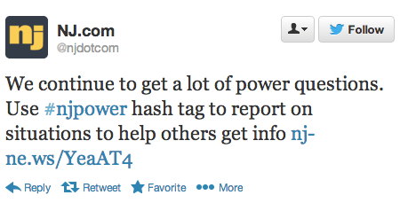
Hashtags played a key role in the reporting. The #NJpower hashtag, for example, was used to ‘help keep track of the power situation throughout the state (1). As depicted in the tweet below, “users and news outlets used this hashtag to inform residents where power outages were reported and gave areas updates as to when they could expect their power to come back” (1).
As Gilal notes, “The potential for mapping out this kind of information in realtime is huge. Think of generating these types of maps for different scenarios– power loss, flooding, strong winds, trees falling.” Indeed, colleagues at FEMA and ESRI had asked us to automatically extract references to gas leaks on Twitter in the immediate aftermath of the Category 5 Tornado in Oklahoma. One could also use a platform like GeoFeedia, which maps multiple types of social media reports based on keywords (i.e., not machine learning). But the vast majority of Twitter users do not geo-tag their tweets. In fact, only 2.7% of tweets are geotagged, according to this study. This explains why enlightened policies are also important for humanitarian technologies to work—like asking the public to temporally geo-tag their social media updates when these are relevant to disaster response.
“While basing these observations on people’s Tweets might not always bring back valid results (someone may jokingly tweet about losing power),” Gilal argues that “the aggregate, especially when compared to the norm, can be a pretty powerful signal.” The key word here is norm. If an established baseline of geo-tagged tweets for the northeast were available, one would have a base-map of “normal” geo-referenced twitter activity. This would enable us to understand deviations from the norm. Such a base-map would thus place new tweets in temporal and geo-spatial context.
In sum, creating live maps of geo-tagged tweets is only a first step. Base-maps should be rapidly developed and overlaid with other datasets such as population and income distribution. Of course, these datasets are not always available acessing historical Twitter data can also be a challenge. The latter explains why Big Data Philanthropy for Disaster Response is so key.