Tag Archives: Hurricane

Using Social Media to Anticipate Human Mobility and Resilience During Disasters

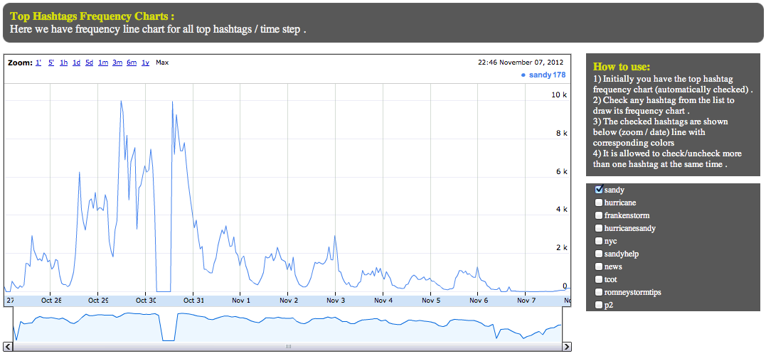
The analysis of cell phone data can already be used to predict mobility patterns after major natural disasters. Now, a new peer-reviewed scientific study suggests that travel patterns may also be predictable using tweets generated following large disasters. In “Quantifying Human Mobility Perturbation and Resilience in Hurricane Sandy,” co-authors Qi Wang and John Taylor analyze some 700,000 geo-tagged tweets posted by ~53,000 individuals as they moved around over the course of 12 days. Results of the analysis confirm that “Sandy did impact the mobility patterns of individuals in New York City,” but this “perturbation was surprisingly brief and the mobility patterns encouragingly resilient. This resilience occurred even in the large-scale absence of mobility infrastructure.”

Twitter Mobility

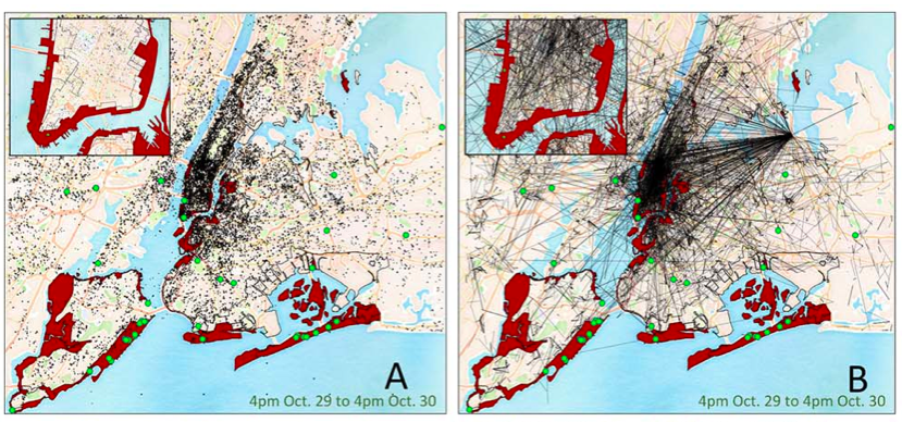
In sum, this new study suggests that “Human mobility appears to possess an inherent resilience—even in perturbed states—such that movement deviations, in aggregate, follow predictable patterns in hurricanes. Therefore, it may be possible to use human mobility data collected in steady states to predict perturbation states during extreme events and, as a result, develop strategies to improve evacuation effectiveness & speed critical disaster response to minimize loss of life and human suffering.”

Authors Wang and Taylor are now turning their attention to “10 other storms and typhoons that they’ve collected data on.” They hope to further demonstrate that quantifying mobility patterns before and after disasters will eventually help cities “predict mobility in the face of a future disaster, and thereby protect and serve residents better.” They also want to “understand where the ‘upper limit’ of resilience lies. ‘After Haiyan,’—the deadliest-ever Philippine Typhoon that struck last November—’there was a total breakdown in mobility patterns,’ says Taylor.”

Of course, Twitter data comes with well-known limitations such as demographic bias, for example. This explains why said data must be interpreted carefully and why the results simply augment rather than replace the analysis of traditional data sources used for damage after needs assessments after disasters.

bio

See also:

  • Social Media & Emergency Management: Supply and Demand [link]
  • Using AIDR to Automatically Classify Disaster Tweets [link]
  • Visualization of Photos Posted to Instagram During Sandy [link]
  • Using Twitter to Map Blackouts During Hurricane Sandy [link]
  • Analyzing Foursquare Check-Ins During Hurricane Sandy [link]

Radical Visualization of Photos Posted to Instagram During Hurricane Sandy

Sandy Instagram Pictures

This data visualization (click to enlarge) displays more than 23,500 photos taken in Brooklyn and posted to Instagram during Hurricane Sandy. A picture’s distance from the center (radius) corresponds to its mean hue while a picture’s position along the perimeter (angle) corresponds to the time that picture was taken. “Note the demarcation line that reveals the moment of a power outage in the area and indicates the intensity of the shared experience (dramatic decrease in the number of photos, and their darker colors to the right of the line)” (1).

Sandy Instagram 2

Click here to interact with the data visualization. The research methods behind this visualization are described here along with other stunning visuals.

bio

Stunning Wind Map of Hurricane Sandy

Surface wind data from the National Digital Forecast Database is updated on an hourly basis. More galleries of stunning wind maps here.

bio

Analyzing Crisis Hashtags on Twitter (Updated)

Update: You can now upload your own tweets to the Crisis Hashtags Analysis Dashboard here

Hashtag footprints can be revealing. The map below, for example, displays the top 200 locations in the world with the most Twitter hashtags. The top 5 are Sao Paolo, London, Jakarta, Los Angeles and New York.

Hashtag map

A recent study (PDF) of 2 billion geo-tagged tweets and 27 million unique hashtags found that “hashtags are essentially a local phenomenon with long-tailed life spans.” The analysis also revealed that hashtags triggered by external events like disasters “spread faster than hashtags that originate purely within the Twitter network itself.” Like other metadata, hashtags can be  informative in and of themselves. For example, they can provide early warning signals of social tensions in Egypt, as demonstrated in this study. So might they also reveal interesting patterns during and after major disasters?

Tens of thousands of distinct crisis hashtags were posted to Twitter during Hurricane Sandy. While #Sandy and #hurricane featured most, thousands more were also used. For example: #SandyHelp, #rallyrelief, #NJgas, #NJopen, #NJpower, #staysafe, #sandypets, #restoretheshore, #noschool, #fail, etc. NJpower, for example, “helped keep track of the power situation throughout the state. Users and news outlets used this hashtag to inform residents where power outages were reported and gave areas updates as to when they could expect their power to come back” (1).

Sandy Hashtags

My colleagues and I at QCRI are studying crisis hashtags to better understand the variety of tags used during and in the immediate aftermath of major crises. Popular hashtags used during disasters often overshadow more hyperlocal ones making these less discoverable. Other challenges include the: “proliferation of hashtags that do not cross-pollinate and a lack of usability in the tools necessary for managing massive amounts of streaming information for participants who needed it” (2). To address these challenges and analyze crisis hashtags, we’ve just launched a Crisis Hashtags Analytics Dashboard. As displayed below, our first case study is Hurricane Sandy. We’ve uploaded about half-a-million tweets posted between October 27th to November 7th, 2012 to the dashboard.

QCRI_Dashboard

Users can visualize the frequency of tweets (orange line) and hashtags (green line) over time using different time-steps, ranging from 10 minute to 1 day intervals. They can also “zoom in” to capture more minute changes in the number of hashtags per time interval. (The dramatic drop on October 30th is due to a server crash. So if you have access to tweets posted during those hours, I’d be  grateful if you could share them with us).

Hashtag timeline

In the second part of the dashboard (displayed below), users can select any point on the graph to display the top “K” most frequent hashtags. The default value for K is 10 (e.g., top-10 most frequent hashtags) but users can change this by typing in a different number. In addition, the 10 least-frequent hashtags are displayed, as are the 10 “middle-most” hashtags. The top-10 newest hashtags posted during the selected time are also displayed as are the hashtags that have seen the largest increase in frequency. These latter two metrics, “New K” and “Top Increasing K”, may provide early warning signals during disasters. Indeed, the appearance of a new hashtag can reveal a new problem or need while a rapid increase in the frequency of some hashtags can denote the spread of a problem or need.

QCRI Dashboard 2

The third part of the dashboard allows users to visualize and compare the frequency of top hashtags over time. This feature is displayed in the screenshot below. Patterns that arise from diverging or converging hashtags may indicate important developments on the ground.

QCRI Dashboard 3

We’re only at the early stages of developing our hashtags analytics platform (above), but we hope the tool will provide insights during future disasters. For now, we’re simply experimenting and tinkering. So feel free to get in touch if you would like to collaborate and/or suggest some research questions.

Bio

Acknowledgements: Many thanks to QCRI colleagues Ahmed Meheina and Sofiane Abbar for their work on developing the dashboard.

Using Twitter to Map Blackouts During Hurricane Sandy

I recently caught up with Gilal Lotan during a hackathon in New York and was reminded of his good work during Sandy, the largest Atlantic hurricane on record. Amongst other analytics, Gilal created a dynamic map of tweets referring to power outages. “This begins on the evening October 28th as people mostly joke about the prospect of potentially losing power. As the storm evolves, the tone turns much more serious. The darker a region on the map, the more aggregate Tweets about power loss that were seen for that region.” The animated map is captured in the video below.

Hashtags played a key role in the reporting. The #NJpower hashtag, for example, was used to ‘help  keep track of the power situation throughout the state (1). As depicted in the tweet below, “users and news outlets used this hashtag to inform residents where power outages were reported and gave areas updates as to when they could expect their power to come back” (1). 

NJpower tweet

As Gilal notes, “The potential for mapping out this kind of information in realtime is huge. Think of generating these types of maps for different scenarios– power loss, flooding, strong winds, trees falling.” Indeed, colleagues at FEMA and ESRI had asked us to automatically extract references to gas leaks on Twitter in the immediate aftermath of the Category 5 Tornado in Oklahoma. One could also use a platform like GeoFeedia, which maps multiple types of social media reports based on keywords (i.e., not machine learning). But the vast majority of Twitter users do not geo-tag their tweets. In fact, only 2.7% of tweets are geotagged, according to this study. This explains why enlightened policies are also important for humanitarian technologies to work—like asking the public to temporally geo-tag their social media updates when these are relevant to disaster response.

While basing these observations on people’s Tweets might not always bring back valid results (someone may jokingly tweet about losing power),” Gilal argues that “the aggregate, especially when compared to the norm, can be a pretty powerful signal.” The key word here is norm. If an established baseline of geo-tagged tweets for the northeast were available, one would have a base-map of “normal” geo-referenced twitter activity. This would enable us to understand deviations from the norm. Such a base-map would thus place new tweets in temporal and geo-spatial context.

In sum, creating live maps of geo-tagged tweets is only a first step. Base-maps should be rapidly developed and overlaid with other datasets such as population and income distribution. Of course, these datasets are not always available acessing historical Twitter data can also be a challenge. The latter explains why Big Data Philanthropy for Disaster Response is so key.

bio

The Most Impressive Live Global Twitter Map, Ever?

My colleague Kalev Leetaru has just launched The Global Twitter Heartbeat Project in partnership with the Cyber Infrastructure and Geospatial Information Laboratory (CIGI) and GNIP. He shared more information on this impressive initiative with the CrisisMappers Network this morning.

According to Kalev, the project “uses an SGI super-computer to visualize the Twitter Decahose live, applying fulltext geocoding to bring the number of geo-located tweets from 1% to 25% (using a full disambiguating geocoder that uses all of the user’s available information in the Twitter stream, not just looking for mentions of major cities), tone-coding each tweet using a twitter-customized dictionary of 30,000 terms, and applying a brand-new four-stage heatmap engine (this is where the supercomputer comes in) that makes a map of the number of tweets from or about each location on earth, a second map of the average tone of all tweets for each location, a third analysis of spatial proximity (how close tweets are in an area), and a fourth map as needed for the percent of all of those tweets about a particular topic, which are then all brought together into a single heatmap that takes all of these factors into account, rather than a sequence of multiple maps.”

Kalev added that, “For the purposes of this demonstration we are processing English only, but are seeing a nearly identical spatial profile to geotagged all-languages tweets (though this will affect the tonal results).” The Twitterbeat team is running a live demo showing both a US and world map updated in realtime at Supercomputing on a PufferSphere and every few seconds on the SGI website here.”


So why did Kalev share all this with the CrisisMappers Network? Because he and his team created a rather unique crisis map composed of all tweets about Hurricane Sandy, see the YouTube video above. “[Y]ou  can see how the whole country lights up and how tweets don’t just move linearly up the coast as the storm progresses, capturing the advance impact of such a large storm and its peripheral effects across the country.” The team also did a “similar visualization of the recent US Presidential election showing the chaotic nature of political communication in the Twittersphere.”


To learn more about the project, I recommend watching Kalev’s 2-minute introductory video above.

Crowdsourcing the Evaluation of Post-Sandy Building Damage Using Aerial Imagery

Update (Nov 2): 5,739 aerial images tagged by over 3,000 volunteers. Please keep up the outstanding work!

My colleague Schuyler Erle from Humanitarian OpenStreetMap  just launched a very interesting effort in response to Hurricane Sandy. He shared the info below via CrisisMappers earlier this morning, which I’m turning into this blog post to help him recruit more volunteers.

Schuyler and team just got their hands on the Civil Air Patrol’s (CAP) super high resolution aerial imagery of the disaster affected areas. They’ve imported this imagery into their Micro-Tasking Server MapMill created by Jeff Warren and are now asking volunteers to help tag the images in terms of the damage depicted in each photo. “The 531 images on the site were taken from the air by CAP over New York, New Jersey, Rhode Island, and Massachusetts on 31 Oct 2012.”

To access this platform, simply click here: http://sandy.hotosm.org. If that link doesn’t work,  please try sandy.locative.us.

“For each photo shown, please select ‘ok’ if no building or infrastructure damage is evident; please select ‘not ok’ if some damage or flooding is evident; and please select ‘bad’ if buildings etc. seem to be significantly damaged or underwater. Our *hope* is that the aggregation of the ok/not ok/bad ratings can be used to help guide FEMA resource deployment, or so was indicated might be the case during RELIEF at Camp Roberts this summer.”

A disaster response professional working in the affected areas for FEMA replied (via CrisisMappers) to Schuyler’s efforts to confirm that:

“[G]overnment agencies are working on exploiting satellite imagery for damage assessments and flood extents. The best way that you can help is to help categorize photos using the tool Schuyler provides […].  CAP imagery is critical to our decision making as they are able to work around some of the limitations with satellite imagery so that we can get an area of where the worst damage is. Due to the size of this event there is an overwhelming amount of imagery coming in, your assistance will be greatly appreciated and truly aid in response efforts.  Thank you all for your willingness to help.”

Schuyler notes that volunteers can click on the Grid link from the home page of the Micro-Tasking platform to “zoom in to the coastlines of Massachusetts or New Jersey” and see “judgements about building damages beginning to aggregate in US National Grid cells, which is what FEMA use operationally. Again, the idea and intention is that, as volunteers judge the level of damage evident in each photo, the heat map will change color and indicate at a glance where the worst damage has occurred.” See above screenshot.

Even if you just spend 5 or 10 minutes tagging the imagery, this will still go a long way to supporting FEMA’s response efforts. You can also help by spreading the word and recruiting others to your cause. Thank you!

What Was Novel About Social Media Use During Hurricane Sandy?

We saw the usual spikes in Twitter activity and the typical (reactive) launch of crowdsourced crisis maps. We also saw map mashups combining user-generated content with scientific weather data. Facebook was once again used to inform our social networks: “We are ok” became the most common status update on the site. In addition, thousands of pictures where shared on Instagram (600/minute), documenting both the impending danger & resulting impact of Hurricane Sandy. But was there anything really novel about the use of social media during this latest disaster?

I’m asking not because I claim to know the answer but because I’m genuinely interested and curious. One possible “novelty” that caught my eye was this FrankenFlow experiment to “algorithmically curate” pictures shared on social media. Perhaps another “novelty” was the embedding of webcams within a number of crisis maps, such as those below launched by #HurricaneHacker and Team Rubicon respectively.

Another “novelty” that struck me was how much focus there was on debunking false information being circulated during the hurricane—particularly images. The speed of this debunking was also striking. As regular iRevolution readers will know, “information forensics” is a major interest of mine.

This Tumblr post was one of the first to emerge in response to the fake pictures (30+) of the hurricane swirling around the social media whirlwind. Snopes.com also got in on the action with this post. Within hours, The Atlantic Wire followed with this piece entitled “Think Before You Retweet: How to Spot a Fake Storm Photo.” Shortly after, Alexis Madrigal from The Atlantic published this piece on “Sorting the Real Sandy Photos from the Fakes,” like the one below.

These rapid rumor-bashing efforts led BuzzFeed’s John Herman to claim that Twitter acted as a truth machine: “Twitter’s capacity to spread false information is more than cancelled out by its savage self-correction.” This is not the first time that journalists or researchers have highlighted Twitter’s tendency for self-correction. This peer-reviewed, data-driven study of disaster tweets generated during the 2010 Chile Earthquake reports the same finding.

What other novelties did you come across? Are there other interesting, original and creative uses of social media that ought to be documented for future disaster response efforts? I’d love to hear from you via the comments section below. Thanks!