In March 2015, I was invited by the World Bank to spearhead an ambitious humanitarian aerial robotics (UAV) mission to Vanuatu following Cyclone Pam, a devastating Category 5 Cyclone. This mission was coordinated with Heliwest and X-Craft, two outstanding UAV companies who were identified through the Humanitarian UAV Network (UAViators) Roster of Pilots. You can learn more about the mission and see pictures here. Lessons learned from this mission (and many others) are available here.
The World Bank and partners were unable to immediately analyze the aerial imagery we had collected because they faced a Big Data challenge. So I suggested the Bank activate the Digital Humanitarian Network (DHN) to request digital volunteer assistance. As a result, Humanitarian OpenStreetMap (HOT) analyzed some of the orthorectified mosaics and MicroMappers focused on analyzing the oblique images (more on both here).
This in turn produced a number of challenges. To cite just one, the Bank needed digital humanitarians to identify which houses or buildings were completely destroyed, versus partially damaged versus largely intact. But there was little guidance on how to determine what constituted fully destroyed versus partially damaged or what such structures in Vanuatu look like when damaged by a Cyclone. As a result, data quality was not as high as it could have been. In my capacity as consultant for the World Bank’s UAVs for Resilience Program, I decided to do something about this lack of guidelines for imagery interpretation.
I turned to my colleagues at the Harvard Humanitarian Initiative (where I had previously co-founded and co-directed the HHI Program on Crisis Mapping) and invited them to develop a rigorous guide that could inform the consistent interpretation of aerial imagery of disaster damage in Vanuatu (and nearby Island States). Note that Vanuatu is number one on the World Bank’s Risk Index of most disaster-prone countries. The imagery analysis guide has just published (PDF) by the Signal Program on Human Security and Technology at HHI.
Big thanks to the HHI team for having worked on this guide and for my Bank colleagues and other reviewers for their detailed feedback on earlier drafts. The guide is another important step towards improving data quality for satellite and aerial imagery analysis in the context of damage assessments. Better data quality is also important for the use of Artificial Intelligence (AI) and computer vision as explained here. If a humanitarian UAV mission does happen in response to the recent disaster in Fiji, then the guide may also be of assistance there depending on how similar the building materials and architecture is. For now, many thanks to HHI for having produced this imagery guide.
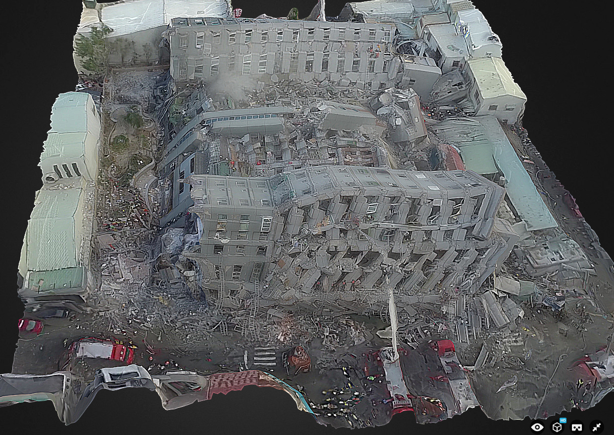
The tragic 6.4 magnitude earthquake struck southern Taiwan shortly before 4 in the morning on Saturday, February 6th. Later in the day, aerial robots were used to capture areal videos and images of the disaster damage, like below.
Within 10 hours of the earthquake, Dean Hosp at Taiwan’s National Cheng Kung University used screenshots of aerial videos posted on YouTube by various media outlets to create the 3D model below. As such, Dean used “second hand” data to create the model, which is why it is low resolution. Having the original imagery first hand would enable a far higher-res 3D model. Says Dean: “If I can fly myself, results can produce more fine and faster.”
Click the images below to enlarge.
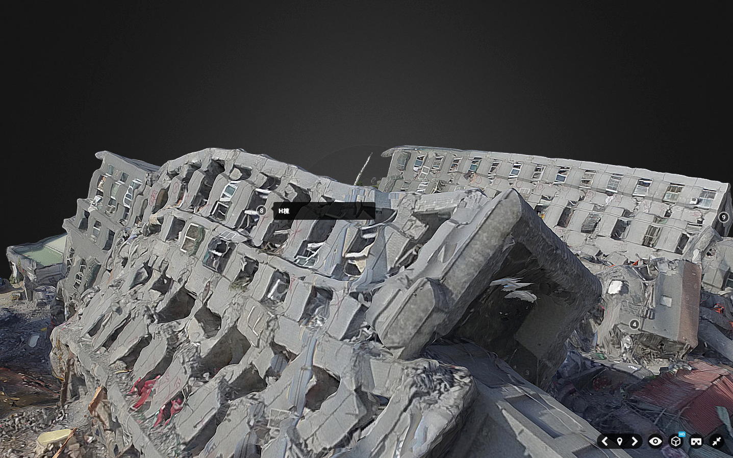
Update: About 48 hours after the earthquake, Dean and team used their own UAV to create this much higher resolution version (see below), which they also annotated (click to enlarge).
Here’s the embedded 3D model:
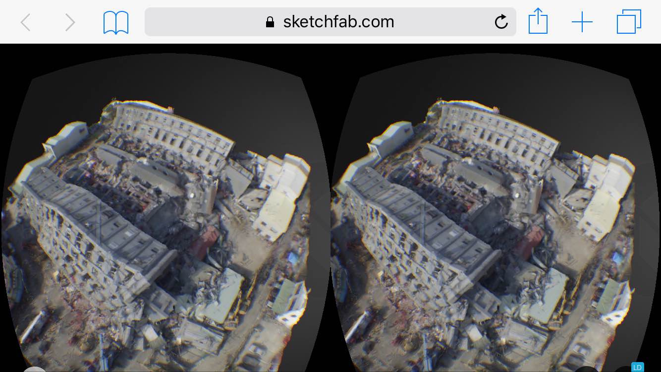
These 3D models were processed using AgiSoft PhotoScan and then uploaded to Sketchfab on the same day the earthquake struck. I’ve blogged about Sketchfab in the past—see this first-ever 3D model of a refugee camp, for example. A few weeks ago, Sketchfab added a Virtual Reality feature to their platform, so I just tried this out on the above model.
The model appears equally crisp when viewed in VR mode on a mobile device (using Google Cardboard in my case). Simply open this page on your mobile device to view the disaster damage in VR. This works rather well; the model does seem to be of high resolution in Virtual Reality as well.
This is a good first step vis-a-vis VR applications. As a second step, we need to develop 3D disaster ontologies to ensure that imagery analysts actually interpret 3D models in the same way. As a third step, we need to combine VR headsets with wearable technology that enables the end-user to annotate (or draw on) the 3D models directly within the same VR environment. This would make the damage assessment process more intuitive while also producing 3D training data for the purposes of machine learning—and thus automated feature detection.
I’m still actively looking for a VR platform that will enable this, so please do get in touch if you know of any group, company, research institute, etc., that would be interested in piloting the 3D analysis of disaster damage from the Taiwan or Nepal Earthquakes entirely within a VR solution. Thank you.
Click here to view 360 aerial visual panoramas of the disaster damage.
Many thanks to Sebastien Hodapp for pointing me to the Taiwan model.
Analyzing satellite and aerial imagery to assess disaster damage is fraught with challenges. This is true for both digital humanitarians and professional imagery analysts alike. Why? Because distinguishing between infrastructure that is fully destroyed and partially damaged can be particularly challenging. Professional imagery analysts with years of experience have readily admitted that trained analysts regularly interpret the same sets of images differently. Consistency in the interpretation of satellite and aerial imagery is clearly no easy task. My colleague Joel Kaiser from Medair recently suggested another approach.
Joel and I both serve on the “Core Team” of the Humanitarian UAV Network (UAViators). It is in this context that we’ve been exploring ways to render aerial imagery more actionable for rapid disaster damage assessments and tactical decision making. To overcome some of the challenges around the consistent analysis of aerial imagery, Joel suggested we take a rank-order approach. His proposal is quite simple: display two geo-tagged aerial images side by side with the following question: “Which of the two images shows more disaster damage?” Each combination of images could be shown to multiple individuals. Images that are voted as depicting more damage would “graduate” to the next display stage and in turn be compared to each other, and so on and so forth along with those images voted as showing less damage.
In short, a dedicated algorithm would intelligently select the right combination of images to display side by side. The number and type of votes could be tabulated to compute reliability and confidence scores for the rankings. Each image would have a unique damage score which could potentially be used to identify thresholds for fully destroyed versus partially damaged versus largely intact infrastructure. Much of this could be done on MicroMappers or similar microtasking solutions. Such an approach would do away with the need for detailed imagery interpretation guides. As noted above, consistent analysis is difficult even when such guides are available. The rank-order approach could help quickly identify and map the most severely affected areas to prioritize tactical response efforts. Note that this approach could be used with both crowd-sourced analysis and professional analysis. Note also that the GPS coordinates for each image would not be made publicly available for data privacy reasons.
Is this strategy worth pursuing? What are we missing? Joel and I would be keen to get some feedback. So please feel free to use the comments section below to share your thoughts or to send an email here.
Humanitarian and development organizations like the United Nations and the World Bank typically carry out disaster damage and needs assessments following major disasters. The ultimate goal of these assessments is to measure the impact of disasters on the society, economy and environment of the affected country or region. This includes assessing the damage caused to building infrastructure, for example. These assessment surveys are generally carried out in person—that is, on foot and/or by driving around an affected area. This is a very time-consuming process with very variable results in terms of data quality. Can 3D (Point Clouds) derived from very high resolution aerial imagery captured by UAVs accelerate and improve the post-disaster damage assessment process? Yes, but a number of challenges related to methods, data & software need to be overcome first. Solving these challenges will require pro-active cross-disciplinary collaboration.
The following three-tiered scale is often used to classify infrastructure damage: “1) Completely destroyed buildings or those beyond repair; 2) Partially destroyed buildings with a possibility of repair; and 3) Unaffected buildings or those with only minor damage . By locating on a map all dwellings and buildings affected in accordance with the categories noted above, it is easy to visualize the areas hardest hit and thus requiring priority attention from authorities in producing more detailed studies and defining demolition and debris removal requirements” (UN Handbook). As one World Bank colleague confirmed in a recent email, “From the engineering standpoint, there are many definitions of the damage scales, but from years of working with structural engineers, I think the consensus is now to use a three-tier scale – destroyed, heavily damaged, and others (non-visible damage).”
That said, field-based surveys of disaster damage typically overlook damage caused to roofs since on-the-ground surveyors are bound by the laws of gravity. Hence the importance of satellite imagery. At the same time, however, “The primary problem is the vertical perspective of [satellite imagery, which] largely limits the building information to the roofs. This roof information is well suited for the identification of extreme damage states, that is completely destroyed structures or, to a lesser extent, undamaged buildings. However, damage is a complex 3-dimensional phenomenon,” which means that “important damage indicators expressed on building façades, such as cracks or inclined walls, are largely missed, preventing an effective assessment of intermediate damage states” (Fernandez Galaretta et al. 2014).
This explains why “Oblique imagery [captured from UAVs] has been identified as more useful, though the multi-angle imagery also adds a new dimension of complexity” as we experienced first-hand during the World Bank’s UAV response to Cyclone Pam in Vanuatu (Ibid, 2014). Obtaining photogrammetric data for oblique images is particularly challenging. That is, identifying GPS coordinates for a given house pictured in an oblique photograph is virtually impossible to do automatically with the vast majority of UAV cameras. (Only specialist cameras using gimbal mounted systems can reportedly infer photogrammetric data in oblique aerial imagery, but even then it is unclear how accurate this inferred GPS data is). In any event, oblique data also “lead to challenges resulting from the multi-perspective nature of the data, such as how to create single damage scores when multiple façades are imaged” (Ibid, 2014).
To this end, my colleague Jorge Fernandez Galarreta and I are exploring the use of 3D (point clouds) to assess disaster damage. Multiple software solutions like Pix4D and PhotoScan can already be used to construct detailed point clouds from high-resolution 2D aerial imagery (nadir and oblique). “These exceed standard LiDAR point clouds in terms of detail, especially at façades, and provide a rich geometric environment that favors the identification of more subtle damage features, such as inclined walls, that otherwise would not be visible, and that in combination with detailed façade and roof imagery have not been studied yet” (Ibid, 2014).
Unlike oblique images, point clouds give surveyors a full 3D view of an urban area, allowing them to “fly through” and inspect each building up close and from all angles. One need no longer be physically onsite, nor limited to simply one façade or a strictly field-based view to determine whether a given building is partially damaged. But what does partially damaged even mean when this kind of high resolution 3D data becomes available? Take this recent note from a Bank colleague with 15+ years of experience in disaster damage assessments: “In the [Bank’s] official Post-Disaster Needs Assessment, the classification used is to say that if a building is 40% damaged, it needs to be repaired. In my view this is too vague a description and not much help. When we say 40%, is it the volume of the building we are talking about or the structural components?”
In their recent study, Fernandez Galaretta et al. used point clouds to generate per-building damage scores based on a 5-tiered classification scale (D1-D5). They chose to compute these damage scores based on the following features: “cracks, holes, intersection of cracks with load-carrying elements and dislocated tiles.” They also selected non-damage related features: “façade, window, column and intact roof.” Their results suggest that the visual assessment of point clouds is very useful to identify the following disaster damage features: total collapse, collapsed roof, rubble piles, inclined façades and more subtle damage signatures that are difficult to recognize in more traditional BDA [Building Damage Assessment] approaches. The authors were thus able to compute a per building damage score, taking into account both “the overall structure of the building,” and the “aggregated information collected from each of the façades and roofs of the building to provide an individual per-building damage score.”
Fernandez Galaretta et al. also explore the possibility of automating this damage assessment process based on point clouds. Their conclusion: “More research is needed to extract automatically damage features from point clouds, combine those with spectral and pattern indicators of damage, and to couple this with engineering understanding of the significance of connected or occluded damage indictors for the overall structural integrity of a building.” That said, the authors note that this approach would “still suffer from the subjectivity that characterizes expert-based image analysis.”
Hence my interest in using crowdsourcing to analyze point clouds for disaster damage. Naturally, crowdsourcing alone will not eliminate subjectivity. In fact, having more people analyze point clouds may yield all kinds of disparate results. This is explains why a detailed and customized imagery interpretation guide is necessary; like this one, which was just released by my colleagues at the Harvard Humanitarian Initiative (HHI). This also explains why crowdsourcing platforms require quality-control mechanisms. One easy technique is triangulation: have ten different volunteers look at each point cloud and tag features in said cloud that show cracks, holes, intersection of cracks with load-carrying elements and dislocated tiles. Surely more eyes are better than two for tasks that require a good eye for detail.
Next, identify which features have the most tags—this is the triangulation process. For example, if one area of a point cloud is tagged as a “crack” by 8 or more volunteers, chances are there really is a crack there. One can then count the total number of distinct areas tagged as cracks by 8 or more volunteers across the point cloud to calculate the total number of cracks per façade. Do the same with the other metrics (holes, dislocated titles, etc.), and you can compute a per building damage score based on overall consensus derived from hundreds of crowdsourced tags. Note that “tags’ can also be lines or polygons; meaning that individual cracks could be traced by volunteers, thus providing information on the approximate lengths/size of a crack. This variable could also be factored in the overall per-building damage score.
In sum, crowdsourcing could potentially overcome some of the data quality issues that have already marked field-based damage assessment surveys. In addition, crowdsourcing could potentially speed up the data analysis since professional imagery and GIS analysts tend to already be hugely busy in the aftermath of major disasters. Adding more data to their plate won’t help anyone. Crowdsourcing the analysis of 3D point clouds may thus be our best bet.
So why hasn’t this all been done yet? For several reasons. For one, creating very high-resolution point clouds requires more pictures and thus more UAV flights, which can be time consuming. Second, processing aerial imagery to construct point clouds can also take some time. Third, handling, sharing and hosting point clouds can be challenging given how large those files quickly get. Fourth, no software platform currently exists to crowdsource the annotation of point clouds as described above (particularly when it comes to the automated quality control mechanisms that are necessary to ensure data quality). Fifth, we need more robust imagery interpretation guides. Sixth, groups like the UN and the World Bank are still largely thinking in 2D rather than 3D. And those few who are considering 3D tend to approach this from a data visualization angle rather than using human and machine computing to analyze 3D data. Seventh, this area, point cloud analysis for 3D feature detection, is still a very new area of research. Many of the methodology questions that need answers have yet to be answered, which is why my team and I at QCRI are starting to explore this area from the perspective of computer vision and machine learning.
The holy grail? Combining crowdsourcing with machine learning for real-time feature detection of disaster damage in 3D point clouds rendered in real-time via airborne UAVs surveying a disaster site. So what is it going to take to get there? Well, first of all, UAVs are becoming more sophisticated; they’re flying faster and for longer and will increasingly be working in swarms. (In addition, many of the new micro-UAVs come with a “follow me” function, which could enable the easy and rapid collection of aerial imagery during field assessments). So the first challenge described above is temporary as are the second and third challenges since computer processing power is increasing, not decreasing, over time.
This leaves us with the software challenge and imagery guides. I’m already collaborate with HHI on the latter. As for the former, I’ve spoken with a number of colleagues to explore possible software solutions to crowdsource the tagging of point clouds. One idea is simply to extend MicroMappers. Another is to add simple annotation features to PLAS.io and PointCloudViz since these platforms are already designed to visualize and interact with point clouds. A third option is to use a 3D model platform like SketchFab, which already enables annotations. (Many thanks to colleague Matthew Schroyer for pointing me to SketchFab last week). I’ve since had a long call with SketchFab and am excited by the prospects of using this platform for simple point cloud annotation.
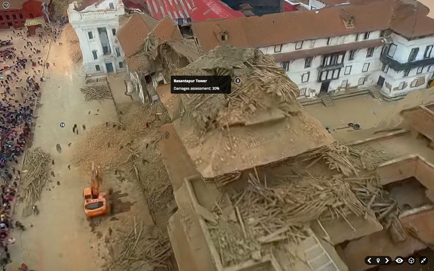
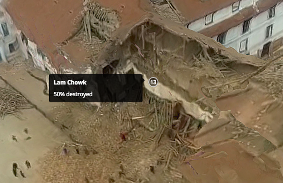
In fact, Matthew already used SketcFab to annotate a 3D model of Durbar Square neighborhood in downtown Kathmandu post-earthquake. He found an aerial video of the area, took multiple screenshots of this video, created a point cloud from these and then generated a 3D model which he annotated within SketchFab. This model, pictured below, would have been much higher resolution if he had the original footage or 2D images. Click pictures to enlarge.
Here’s a short video with all the annotations in the 3D model:
And here’s the link to the “live” 3D model. And to drive home the point that this 3D model could be far higher resolution if the underlying imagery had been directly accessible to Matthew, check out this other SketchFab model below, which you can also access in full here.
The SketchFab team has kindly given me a SketchFab account that allows up to 50 annotations per 3D model. So I’ll be uploading a number of point clouds from Vanuatu (post Cyclone Pam) and Nepal (post earthquakes) to explore the usability of SketchFab for crowdsourced disaster damage assessments. In the meantime, one could simply tag-and-number all major features in a point cloud, create a Google Form, and ask digital volunteers to rate the level of damage near each numbered tag. Not a perfect solution, but one that works. Ultimately, we’d need users to annotate point clouds by tracing 3D polygons if we wanted a more easy way to use the resulting data for automated machine learning purposes.
In any event, if readers do have any suggestions on other software platforms, methodologies, studies worth reading, etc., feel free to get in touch via the comments section below or by email, thank you. In the meantime, many thanks to colleagues Jorge, Matthew, Ferda & Ji (QCRI), Salvador (PointCloudViz), Howard (PLAS.io) and Corentin (SketchFab) for the time they’ve kindly spent brainstorming the above issues with me.
Point Clouds, or 3D models derived from high resolution aerial imagery, are in fact nothing new. Several software platforms already exist to reconstruct a series of 2D aerial images into fully fledged 3D-fly-through models. Check out these very neat examples from my colleagues at Pix4D and SenseFly:
What does a castle, Jesus and a mountain have to do with humanitarian action? As noted in my previous blog post, there’s only so much disaster damage one can glean from nadir (that is, vertical) imagery and oblique imagery. Lets suppose that the nadir image below was taken by an orbiting satellite or flying UAV right after an earthquake, for example. How can you possibly assess disaster damage from this one picture alone? Even if you had nadir imagery for these houses before the earthquake, your ability to assess structural damage would be limited.
This explains why we also captured oblique imagery for the World Bank’s UAV response to Cyclone Pam in Vanuatu (more here on that humanitarian mission). But even with oblique photographs, you’re stuck with one fixed perspective. Who knows what these houses below look like from the other side; your UAV may have simply captured this side only. And even if you had pictures for all possible angles, you’d literally have 100’s of pictures to leaf through and make sense of.
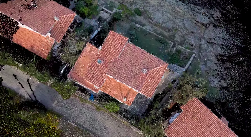
What’s that famous quote by Henry Ford again? “If I had asked people what they wanted, they would have said faster horses.” We don’t need faster UAVs, we simply need to turn what we already have into Point Clouds, which I’m indeed hoping to do with the aerial imagery from Vanuatu, by the way. The Point Cloud below was made only from single 2D aerial images.
It isn’t perfect, but we don’t need perfection in disaster response, we need good enough. So when we as humanitarian UAV teams go into the next post-disaster deployment and ask what humanitarians they need, they may say “faster horses” because they’re not (yet) familiar with what’s really possible with the imagery processing solutions available today. That obviously doesn’t mean that we should ignore their information needs. It simply means we should seek to expand their imaginations vis-a-vis the art of the possible with UAVs and aerial imagery. Here is a 3D model of a village in Vanuatu constructed using 2D aerial imagery:
Now, the title of my blog post does lead with the word crowdsourcing. Why? For several reasons. First, it takes some decent computing power (and time) to create these Point Clouds. But if the underlying 2D imagery is made available to hundreds of Digital Humanitarians, we could use this distributed computing power to rapidly crowdsource the creation of 3D models. Second, each model can then be pushed to MicroMappers for crowdsourced analysis. Why? Because having a dozen eyes scrutinizing one Point Cloud is better than 2. Note that for quality control purposes, each Point Cloud would be shown to 5 different Digital Humanitarian volunteers; we already do this with MicroMappers for tweets, pictures, videos, satellite images and of course aerial images as well. Each digital volunteer would then trace areas in the Point Cloud where they spot damage. If the traces from the different volunteers match, then bingo, there’s likely damage at those x, y and z coordinate. Here’s the idea:
We could easily use iPads to turn the process into a Virtual Reality experience for digital volunteers. In other words, you’d be able to move around and above the actual Point Cloud by simply changing the position of your iPad accordingly. This technology already exists and has for several years now. Tracing features in the 3D models that appear to be damaged would be as simple as using your finger to outline the damage on your iPad.
What about the inevitable challenge of Big Data? What if thousands of Point Clouds are generated during a disaster? Sure, we could try to scale our crowd-sourcing efforts by recruiting more Digital Humanitarian volunteers, but wouldn’t that just be asking for a “faster horse”? Just like we’ve already done with MicroMappers for tweets and text messages, we would seek to combine crowdsourcing and Artificial Intelligence to automatically detect features of interest in 3D models. This sounds to me like an excellent research project for a research institute engaged in advanced computing R&D.
I would love to see the results of this applied research integrated directly within MicroMappers. This would allow us to integrate the results of social media analysis via MicroMappers (e.g, tweets, Instagram pictures, YouTube videos) directly with the results of satellite imagery analysis as well as 2D and 3D aerial imagery analysis generated via MicroMappers.
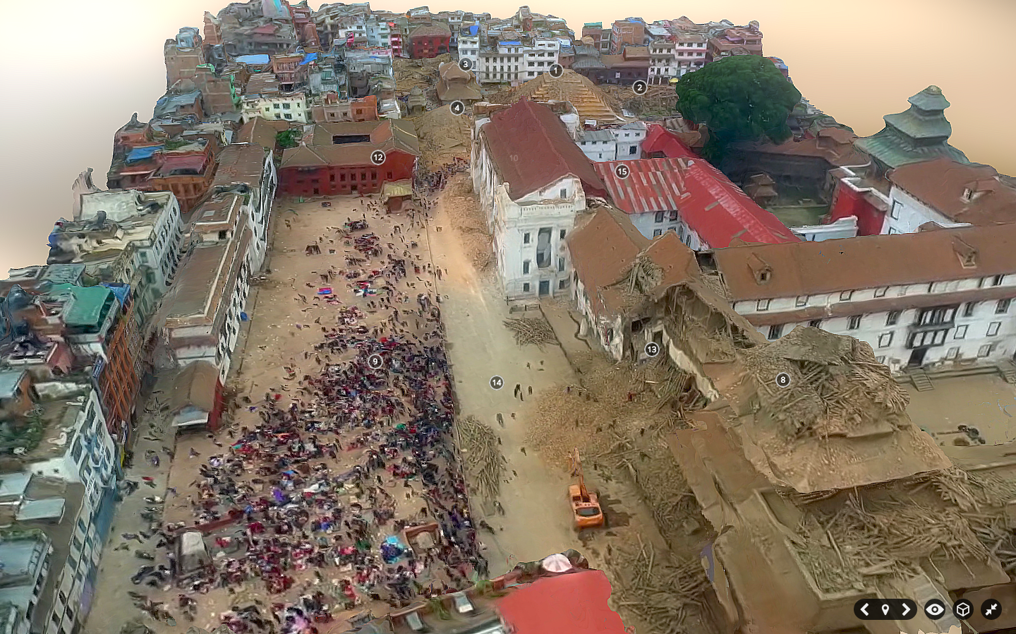
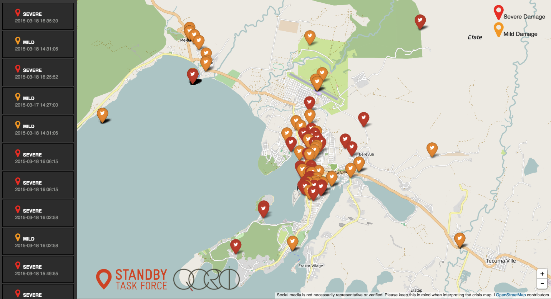
Digital Humanitarians sprung to action just hours after the Category 5 Cyclone collided with Vanuatu’s many islands. This first deployment focused on rapidly assessing the damage by analyzing multimedia content posted on social media and in the mainstream news. This request came directly from the United Nations (OCHA), which activated the Digital Humanitarian Network (DHN) to carry out the rapid damage assessment. So the Standby Task Force (SBTF), a founding member of the DHN, used QCRI′s MicroMappers platform to produce a digital, interactive Crisis Map of some 1,000+ geo-tagged pictures of disaster damage (screenshot below).
Within days of Cyclone Pam making landfall, the World Bank (WB) activated the Humanitarian UAV Network (UAViators) to quickly deploy UAV pilots to the affected islands. UAViators has access to a global network of 700+ professional UAV pilots is some 70+ countries worldwide. The WB identified two UAV teams from the Humanitarian UAV Network and deployed them to capture very high-resolution aerial photographs of the damage to support the Government’s post-disaster damage assessment efforts. Pictures from these early UAV missions are available here. Aerial images & videos of the disaster damage were also posted to the UAViators Crowdsourced Crisis Map.
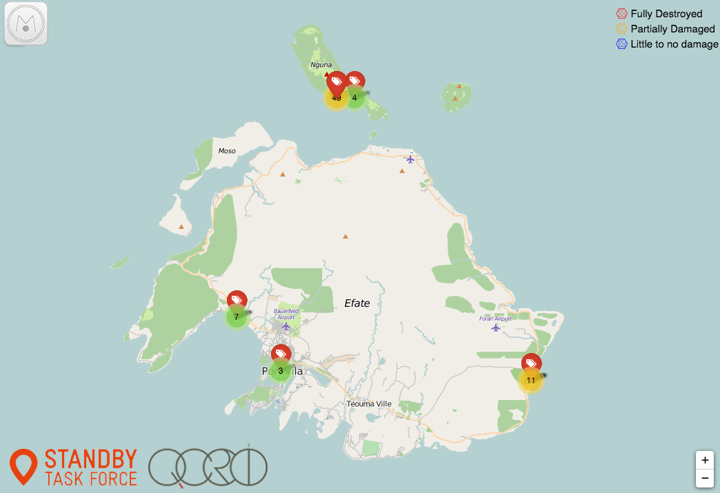
Last week, the World Bank activated the DHN (for the first time ever) to help analyze the many, many GigaBytes of aerial imagery from Vanuatu. So Digital Jedis from the DHN are now using Humanitarian OpenStreetMap (HOT) and MicroMappers (MM) to crowdsource the search for partially damaged and fully destroyed houses in the aerial imagery. The OSM team is specifically looking at the “nadir imagery” captured by the UAVs while MM is exclusively reviewing the “oblique imagery“. More specifically, digital volunteers are using MM to trace destroyed houses red, partially damaged houses orange, and using blue to denote houses that appear to have little to no damage. Below is an early screenshot of the Aerial Crisis Map for the island of Efate. The live Crisis Map is available here.
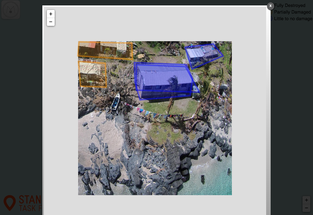
Clicking on one of these markers will open up the high resolution aerial pictures taken at that location. Here, two houses are traced in blue (little to no damage) and two on the upper left are traced in orange (partial damage expected).
The cameras on the UAVs captured the aerial imagery in very high resolution, as you can see from the close up below. You’ll note two traces for the house. These two traces were done by two independent volunteers (for the purposes of quality control). In fact, each aerial image is shown to at least 3 different Digital Jedis.
Once this MicroMappers deployment is over, we’ll be using the resulting traces to create automated featured detection algorithms; just like we did here for the MicroMappers Namibia deployment. This approach, combining crowdsourcing with Artificial Intelligence (AI), is explored in more detail here vis-a-vis disaster response. The purpose of taking this hybrid human-machine computing solution is to accelerate (semi-automate) future damage assessment efforts.
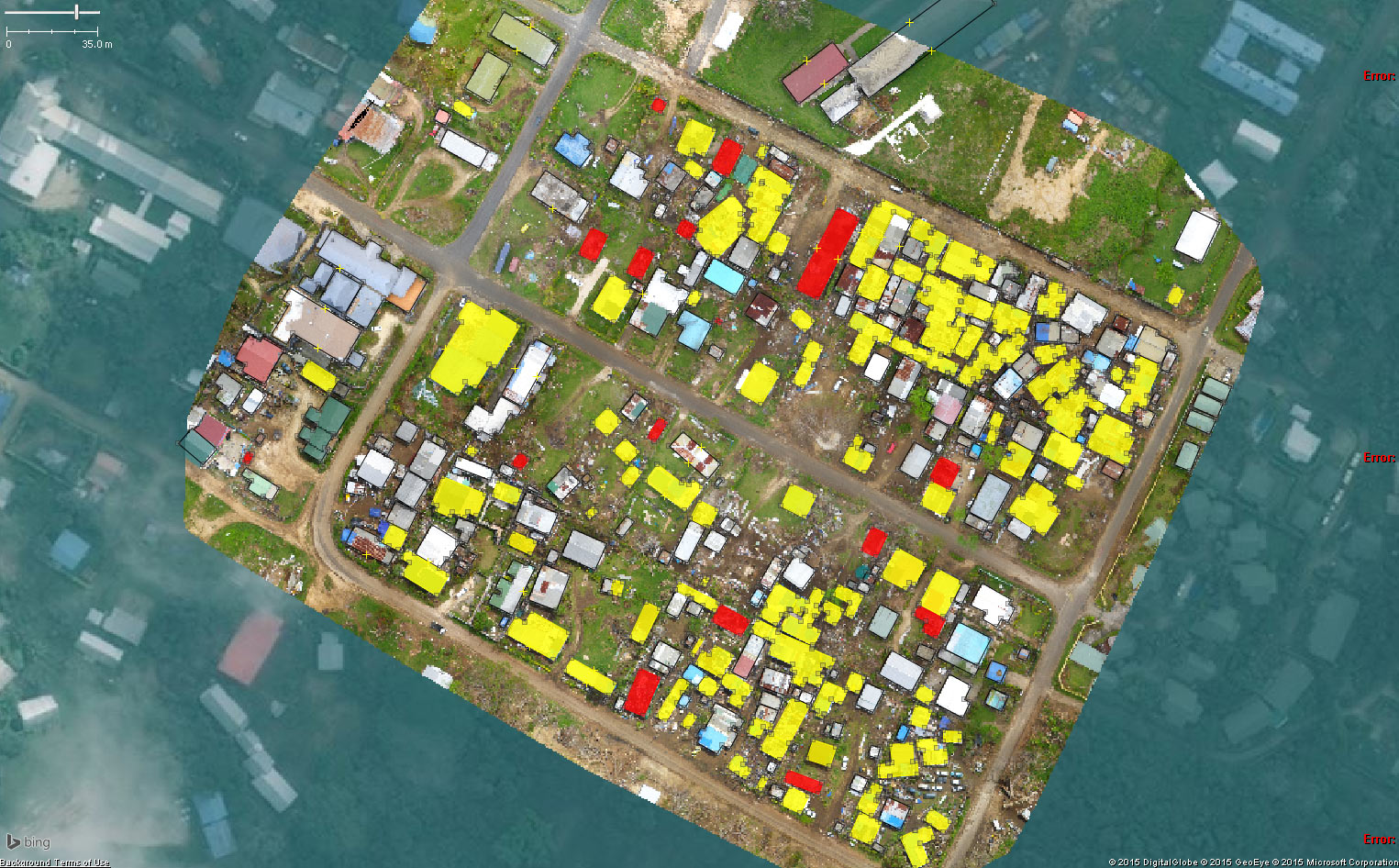
Meanwhile, back in Vanuatu, the HOT team has already carried out some tentative, preliminary analysis of the damage based on the aerial imagery provided. They are also up-dating their OSM maps of the affected islands thanks this imagery. Below is an initial damage assessment carried out by HOT for demonstration purposes only. Please visit their deployment page on the Vanuatu response for more information.
So what’s next? Combining both the nadir and oblique imagery to interpret disaster damage is ultimately what is needed, so we’re actually hoping to make this happen (today) by displaying the nadir imagery directly within the Aerial Crisis Map produced by MicroMappers. (Many thanks to the MapBox team for their assistance on this). We hope this integration will help HOT and our World Bank partners better assess the disaster damage. This is the first time that we as a group are doing anything like this, so obviously lots of learning going on, which should improve future deployments. Ultimately, we’ll need to create 3D models (point clouds) of disaster affected areas (already easy to do with high-resolution aerial imagery) and then simply use MicroMappers to crowdsource the analysis of these 3D models.
And here’s a 3D model of a village in Vanuatu constructed using 2D aerial photos taken by UAV:
For now, though, Digital Jedis will continue working very closely with the World Bank to ensure that the latter have the results they need in the right format to deliver a comprehensive damage assessment to the Government of Vanuatu by the end of the week. In the meantime, if you’re interested in learning more about digital humanitarian action, then please check out my new book, which features UAViators, HOT, MM and lots more.
I’ve been looking forward to blogging about my team’s latest research on crisis computing for months; the delay being due to the laborious process of academic publishing, but I digress. I’m now able to make their findings public. The goal of their latest research was to “understand what affected populations, response agencies and other stakeholders can expect—and not expect—from [crisis tweets] in various types of disaster situations.”
As my colleagues rightly note, “Anecdotal evidence suggests that different types of crises elicit different reactions from Twitter users, but we have yet to see whether this is in fact the case.” So they meticulously studied 26 crisis-related events between 2012-2013 that generated significant activity on twitter. The lead researcher on this project, my colleague & friend Alexandra Olteanu from EPFL, also appears in my new book.
Alexandra and team first classified crisis related tweets based on the following categories (each selected based on previous research & peer-reviewed studies):
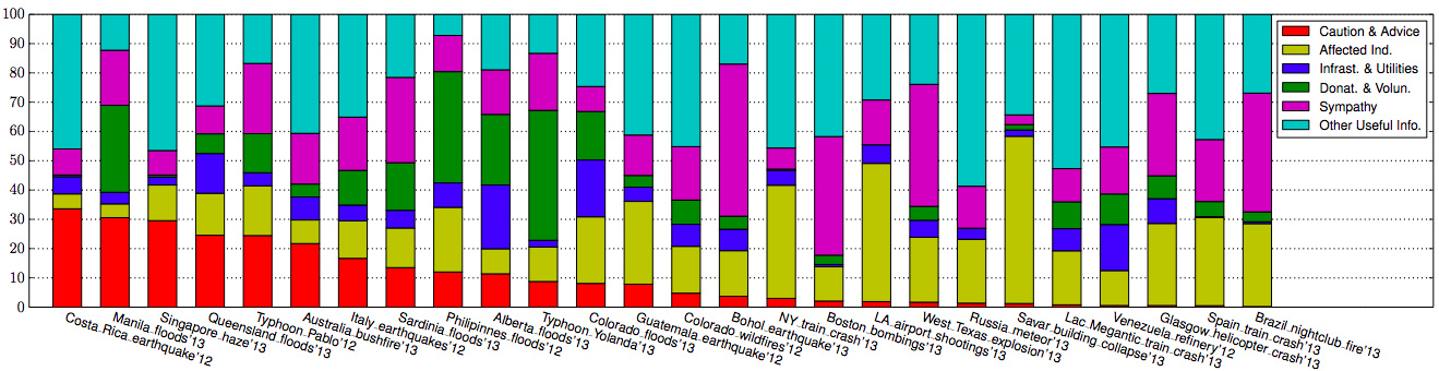
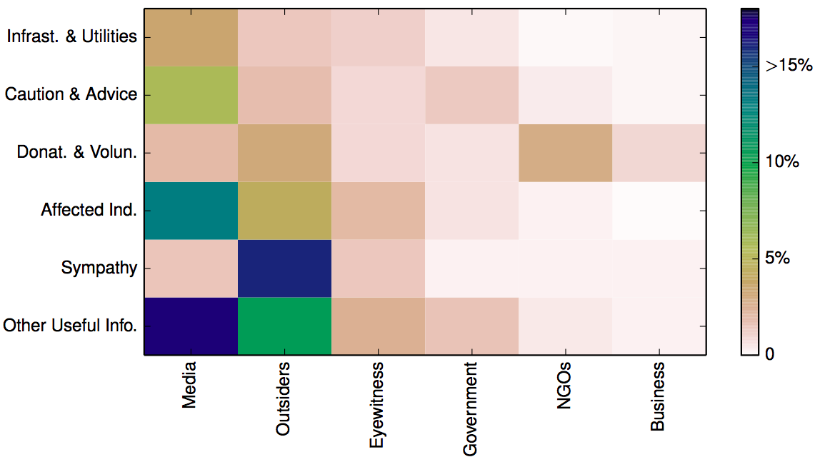
Written in long form: Caution & Advice; Affected Individuals; Infrastructure & Utilities; Donations & Volunteering; Sympathy & Emotional Support, and Other Useful Information. Below are the results of this analysis sorted by descending proportion of Caution & Advice related tweets (click to enlarge).
The category with the largest number of tweets is “Other Useful Info.” On average 32% of tweets fall into this category (minimum 7%, maximum 59%). Interestingly, it appears that most crisis events that are spread over a relatively large geographical area (i.e., they are diffuse), tend to be associated with the lowest number of “Other” tweets. As my QCRI rightly colleagues note, “it is potentially useful to know that this type of tweet is not prevalent in the diffused events we studied.”
Tweets relating to Sympathy and Emotional Support are present in each of the 26 crises. On average, these account for 20% of all tweets. “The 4 crises in which the messages in this category were more prevalent (above 40%) were all instantaneous disasters.” This finding may imply that “people are more likely to offer sympathy when events […] take people by surprise.”
On average, 20% of tweets in the 26 crises relate to Affected Individuals. “The 5 crises with the largest proportion of this type of information (28%–57%) were human-induced, focalized, and instantaneous. These 5 events can also be viewed as particularly emotionally shocking.”
Tweets related to Donations & Volunteering accounted for 10% of tweets on average. “The number of tweets describing needs or offers of goods and services in each event varies greatly; some events have no mention of them, while for others, this is one of the largest information categories. “
Caution and Advice tweets constituted on average 10% of all tweets in a given crisis. The results show a “clear separation between human-induced hazards and natural: all human induced events have less caution and advice tweets (0%–3%) than all the events due to natural hazards (4%–31%).”
Finally, tweets related to Infrastructure and Utilities represented on average 7% of all tweets posted in a given crisis. The disasters with the highest number of such tweets tended to be flood situations.
In addition to the above analysis, Alexandra et al. also categorized tweets by their source:
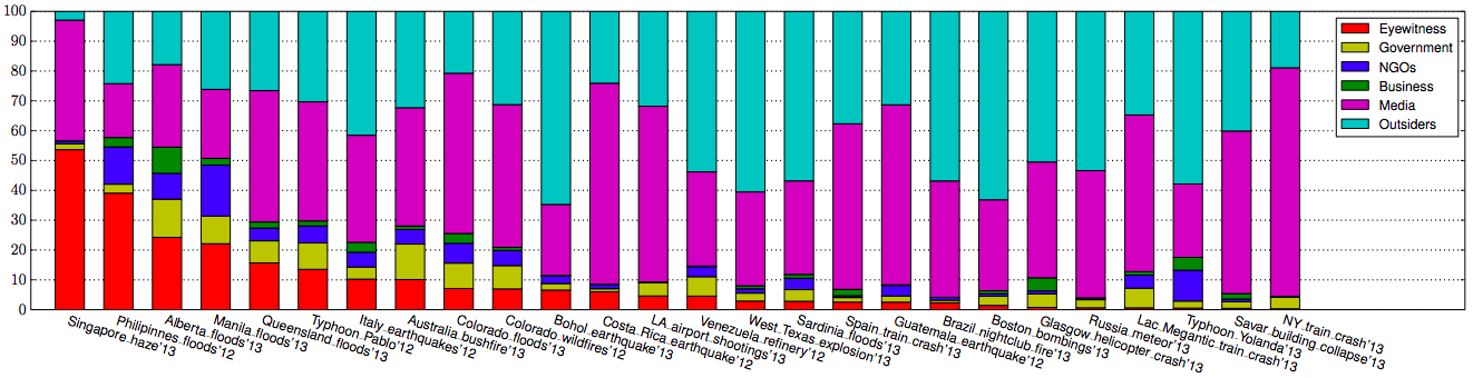
The results depicted below (click to enlarge) are sorted by descending order of eyewitness tweets.
On average, about 9% of tweets generated during a given crises were written by Eyewitnesses; a figure that increased to 54% for the haze crisis in Singapore. “In general, we find a larger proportion of eyewitness accounts during diffused disasters caused by natural hazards.”
Traditional and/or Internet Media were responsible for 42% of tweets on average. ” The 6 crises with the highest fraction of tweets coming from a media source (54%–76%) are instantaneous, which make “breaking news” in the media.
On average, Outsiders posted 38% of the tweets in a given crisis while NGOs were responsible for about 4%of tweets and Governments 5%. My colleagues surmise that these low figures are due to the fact that both NGOs and governments seek to verify information before they release it. The highest levels of NGO and government tweets occur in response to natural disasters.
Finally, Businesses account for 2% of tweets on average. The Alberta floods of 2013 saw the highest proportion (9%) of tweets posted by businesses.
All the above findings are combined and displayed below (click to enlarge). The figure depicts the “average distribution of tweets across crises into combinations of information types (rows) and sources (columns). Rows and columns are sorted by total frequency, starting on the bottom-left corner. The cells in this figure add up to 100%.”
The above analysis suggests that “when the geographical spread [of a crisis] is diffused, the proportion of Caution and Advice tweets is above the median, and when it is focalized, the proportion of Caution and Advice tweets is below the median. For sources, […] human-induced accidental events tend to have a number of eyewitness tweets below the median, in comparison with intentional and natural hazards.” Additional analysis carried out by my colleagues indicate that “human-induced crises are more similar to each other in terms of the types of information disseminated through Twitter than to natural hazards.” In addition, crisis events that develop instantaneously also look the same when studied through the lens of tweets.
In conclusion, the analysis above demonstrates that “in some cases the most common tweet in one crisis (e.g. eyewitness accounts in the Singapore haze crisis in 2013) was absent in another (e.g. eyewitness accounts in the Savar building collapse in 2013). Furthermore, even two events of the same type in the same country (e.g. Typhoon Yolanda in 2013 and Typhoon Pablo in 2012, both in the Philippines), may look quite different vis-à-vis the information on which people tend to focus.” This suggests the uniqueness of each event.
“Yet, when we look at the Twitter data at a meta-level, our analysis reveals commonalities among the types of information people tend to be concerned with, given the particular dimensions of the situations such as hazard category (e.g. natural, human-induced, geophysical, accidental), hazard type (e.g. earth-quake, explosion), whether it is instantaneous or progressive, and whether it is focalized or diffused. For instance, caution and advice tweets from government sources are more common in progressive disasters than in instantaneous ones. The similarities do not end there. When grouping crises automatically based on similarities in the distributions of different classes of tweets, we also realize that despite the variability, human-induced crises tend to be more similar to each other than to natural hazards.”
Needless to say, these are exactly the kind of findings that can improve the way we use MicroMappers & other humanitarian technologies for disaster response. So if want to learn more, the full study is available here (PDF). In addition, all the Twitter datasets used for the analysis are available at CrisisLex. If you have questions on the research, simply post them in the comments section below and I’ll ask my colleagues to reply there.
In the meantime, there is a lot more on humanitarian technology and computing in my new bookDigital Humanitarians. As I note in said book, we also need enlightened policy making to tap the full potential of social media for disaster response. Technology alone can only take us so far. If we don’t actually create demand for relevant tweets in the first place, then why should social media users supply a high volume of relevant and actionable tweets to support relief efforts? This OCHA proposal on establishing specific social media standards for disaster response, and this official social media strategy developed and implemented by the Filipino government are examples of what enlightened leadership looks like.
My research team and I at the Humanitarian UAV Network (UAViators) have compiled a list of more than 30 common software platforms used to operate UAVs and analyze resulting aerial imagery. We carried out this research to provide humanitarian organizations with a single repository where they can review existing software platforms (including free & open source solutions) for their humanitarian UAV missions. The results, available here, provide a brief description of each software platform along with corresponding links for additional information and download. We do realize that this list is not (yet) comprehensive, so we hope you’ll help us fill remaining gaps. This explains why we’ve made our research available as an open, editable Google Doc.
Many thanks to my research assistant Peter Mosur for taking the lead on this. We have additional research documents available here on the UAViators website.
See also:
Humanitarian UAV Network: Strategy for 2014-2015 [link]
Humanitarians in the Sky: Using UAVs for Disaster Response [link]
Low-Cost UAV Applications for Post-Disaster Damage Assessments: A Streamlined Workflow [Link]
Colleagues Matthew Cua, Charles Devaney and others recently co-authored this excellent study on their latest use of low-cost UAVs/drones for post-disaster assessments, environmental development and infrastructure development. They describe the “streamlined workflow—flight planning and data acquisition, post-processing, data delivery and collaborative sharing,” that they created “to deliver acquired images and orthorectified maps to various stakeholders within [their] consortium” of partners in the Philippines. They conclude from direct hands-on experience that “the combination of aerial surveys, ground observations and collaborative sharing with domain experts results in richer information content and a more effective decision support system.”
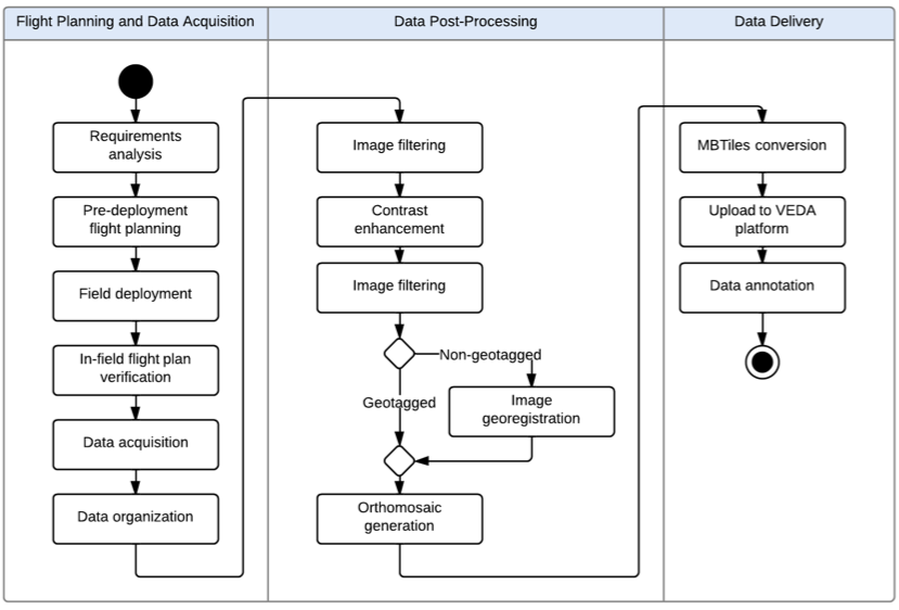
UAVs have become “an effective tool for targeted remote sensing operations in areas that are inaccessible to conventional manned aerial platforms due to logistic and human constraints.” As such, “The rapid development of unmanned aerial vehicle (UAV) technology has enabled greater use of UAVs as remote sensing platforms to complement satellite and manned aerial remote sensing systems.” The figure above (click to enlarge) depicts the aerial imaging workflow developed by the co-authors to generate and disseminate post-processed images. This workflow, the main components of which are “Flight Planning & Data Acquisition,” “Data Post-Processing” and “Data Delivery,” will “continuously be updated, with the goal of automating more activities in order to increase processing speed, reduce cost and minimize human error.”
Flight Planning simply means developing a flight plan based on clearly defined data needs. The screenshot above (click to enlarge) is a “UAV flight plan of the coastal section of Tacloban city, Leyte generated using APM Mission Planner. The [flight] plan involved flying a small UAV 200 meters above ground level. The raster scan pattern indicated by the yellow line was designed to take images with 80% overlap & 75% side overlap. The waypoints indicating a change in direction of the UAV are shown as green markers.” The purpose of the overlapping is to stitch and accurately geo-referenced the images during post-processing. A video on how to program UAV flight is available here. This video specifically focuses on post-disaster assessments in the Philippines.
“Once in the field, the team verifies the flight plans before the UAV is flown by performing a pre-flight survey [which] may be done through ground observations of the area, use of local knowledge or short range aerial observations with a rotary UAV to identify launch/recovery sites and terrain characteristics. This may lead to adjustment in the flight plans. After the flight plans have been verified, the UAV is deployed for data acquisition.”
Matthew, Charles and team initially used a Micropilot MP-Vision UAV for data acquisition. “However, due to increased cost of maintenance and significant skill requirements of setting up the MP-Vision,” they developed their own custom UAV instead, which “uses semi-professional and hobby- grade components combined with open-source software” as depicted in the above figure (click to enlarge). “The UAV’s airframe is the Super SkySurfer fixed-wing EPO foam frame.” The team used the “ArduPilot Mega (APM) autopilot system consisting of an Arduino-based microprocessor board, airspeed sensor, pressure and tem-perature sensor, GPS module, triple-axis gyro and other sensors. The firmware for navigation and control is open-source.”
The custom UAV, which costs approximately $2,000, has “an endurance of about 30-50 minutes, depending on payload weight and wind conditions, and is able to survey an area of up to 4 square kilometers.” The custom platform was “easier to assemble, repair, maintain, modify & use. This allowed faster deploy-ability of the UAV. In addition, since the autopilot firmware is open-source, with a large community of developers supporting it, it became easier to identify and address issues and obtain software updates.” That said, the custom UAV was “more prone to hardware and software errors, either due to assembly of parts, wiring of electronics or bugs in the software code.” Despite these drawbacks, “use of the custom UAV turned out to be more feasible and cost effective than use of a commercial-grade UAV.”
In terms of payloads (cameras), three different kinds were used: Panasonic Lumix LX3, Canon S100, and GoPro Hero 3. These cameras come with both advantages and disadvantages for aerial mapping. The LX3 has better image quality but the servo triggering the shutter would often fail. The S100 is GPS-enabled and does not require mechanical triggering. The Hero-3 was used for video reconnaissance specifically.
“The workflow at [theData-Processing] stage focuses on the creation of an orthomosaic—an orthorectified, georeferenced and stitched map derived from aerial images and GPS and IMU (inertial measurement unit values, particularly yaw, pitch and roll) information.” In other words, “orthorectification is the process of stretching the image to match the spatial accuracy of a map by considering location, elevation, and sensor information.”
Transforming aerial images into orthomosaics involves: (1) manually removing take-off/landing, burry & oblique images; (2) applying contrast enhancement to images that are either over- or under-exposed using commercial image-editing software; (3) geo-referencing the resulting images; (4) creating an orthomosaic from the geo-tagged images. The geo-referencing step is not needed if the images are already geo-referenced (i.e., have GPS coordinates, like those taken with the Cannon S100. “For non-georeferenced images, georeferencing is done by a custom Python script that generates a CSV file containing the mapping between images and GPS/IMU information. In this case, the images are not embedded with GPS coordinates.” The sample orthomosaic above uses 785 images taken during two UAV flights (click to enlarge).
Matthew, Charles and team used the “Pix4Dmapper photomapping software developed by Pix4D to render their orthomosaics. “The program can use either geotagged or non-geotagged images. For non-geotagged images, the software accepts other inputs such as the CSV file generated by the custom Python script to georeference each image and generate the photomosaic. Pix4D also outputs a report containing information about the output, such as total area covered and ground resolution. Quantum GIS, an open-source GIS software, was used for annotating and viewing the photomosaics, which can sometimes be too large to be viewed using common photo viewing software.”
Data Delivery involves uploading the orthomosaics to a common, web-based platform that stakeholders can access. Orthomosaics “generally have large file sizes (e.g around 300MB for a 2 sq. km. render),” so the team created a web-based geographic information systems (GIS) to facilitate sharing of aerial maps. “The platform, named VEDA, allows viewing of rendered maps and adding metadata. The key advantage of using this platform is that the aerial imagery data is located in one place & can be accessed from any computer with a modern Internet browser. Before orthomosaics can be uploaded to the VEDA platform, they need to be converted into an approprate format supported by the platform. The current format used is MBTiles developed by Mapbox. The MBTiles format specifies how to partition a map image into smaller image tiles for web access. Once uploaded, the orthomosaic map can then be annotated with additional information, such as markers for points of interest.” The screenshot above (click to enlarge) shows the layout of a rendered orthomosaic in VEDA.
Matthew, Charles and team have applied the above workflow in various mission-critical UAV projects in the Philippines including damage assessment work after Typhoon Haiyan in 2013. This also included assessing the impact of the Typhoon on agriculture, which was an ongoing concern for local government during the recovery efforts. “The coconut industry, in particular, which plays a vital role in the Philippine economy, was severely impacted due to millions of coconut trees being damaged or flattened after the storm hit. In order to get an accurate assessment of the damage wrought by the typhoon, and to make a decision on the scale of recovery assistance from national government, aerial imagery coupled with a ground survey is a potentially promising approach.”
So the team received permission from local government to fly several missions over areas in Eastern Visayas that [were] devoted to coconut stands prior to Typhoon Haiyan.” (As such, “The UAV field team operated mostly in rural areas and wilderness, which reduced the human risk factor in case of aircraft failure. Also, as a safety guideline, the UAV was not flown within 3 miles from an active airport”). The partners in the Philippines are developing image processing techniques to distinguish “coconut trees from wild forest and vegetation for land use assessment and carbon source and sink estimates. One technique involved use of superpixel classification, wherein the image pixels are divided into homogeneous regions (i.e. collection of similar pixels) called superpixels which serve as the basic unit for classification.”
The image below shows the “results of the initial test run where areas containing coconut trees [above] have been segmented.”
“Similar techniques could also be used for crop damage assessment after a disaster such as Typhoon Haiyan, where for example standing coconut trees could be distinguished from fallen ones in order to determine capacity to produce coconut-based products.” This is an area that my team and I at QCRI are exploring in partnership with Matthew, Charles and company. In particular, we’re interested in assessing whether crowdsourcing can be used to facilitate the development of machine learning classifiers for image feature detection. More on this here, here and on CNN here. In addition, since “aerial imagery augmented with ground observations would provide a richer source of informa-tion than either one could provide alone,” we are also exploring the integration of social media data with aerial imagery (as described here).
In conclusion, Matthew, Charles and team are looking to further develop the above framework by automating more processes, “such as image filtering and image contrast enhancement. Autonomous take-off & landing will be configured for the custom UAV in order to reduce the need for a skilled pilot. A catapult system will be created for the UAV to launch in areas with a small clearing and a parachute system will be added in order to reduce the risk of damage due to belly landings.” I very much look forward to following the team’s progress and to collaborating with them on imagery analysis for disaster response.
See Also:
Official UN Policy Brief on Humanitarian UAVs [link]
Common Misconceptions About Humanitarian UAVs [link]
Humanitarians in the Sky: Using UAVs for Disaster Response [link]
Humanitarian UAVs Fly in China After Earthquake [link]
Humanitarian UAV Missions During Balkan Floods [link]
My QCRI colleague Dr. Imran is using our AIDR platform (Artificial Intelligence for Disaster Response) to collect & analyze tweets related to Malaysia Flight 370 that went missing several days ago. He has collected well over 850,000 English-language tweets since March 11th; using the following keywords/hashtags: Malaysia Airlines flight, #MH370m #PrayForMH370 and #MalaysiaAirlines.
Imran then used AIDR to create a number of “machine learning classifiers” to automatically classify all incoming tweets into categories that he is interested in:
Informative: tweets that relay breaking news, useful info, etc
Praying: tweets that are related to prayers and faith
Personal: tweets that express personal opinions
The process is super simple. All he does is tag several dozen incoming tweets into their respective categories. This teaches AIDR what an “Informative” tweet should “look like”. Since our novel approach combines human intelligence with artificial intelligence, AIDR is typically far more accurate at capturing relevant tweets than Twitter’s keyword search.
And the more tweets that Imran tags, the more accurate AIDR gets. At present, AIDR can auto-classify ~500 tweets per second, or 30,000 tweets per minute. This is well above the highest velocity of crisis tweets recorded thus far—16,000 tweets/minute during Hurricane Sandy.
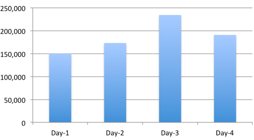
The graph below depicts the number of tweets generated since the day we started collecting the AIDR collection, i.e., March 11th.
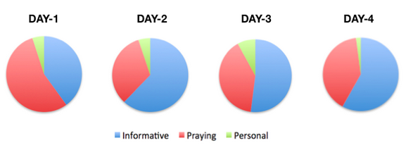
This series of pie charts simply reflects the relative share of tweets per category over the past four days.
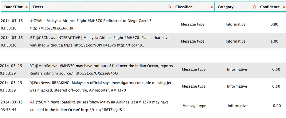
Below are some of the tweets that AIDR has automatically classified as being Informative (click to enlarge). The “Confidence” score simply reflects how confident AIDR is that it has correctly auto-classified a tweet. Note that Imran could also have crowdsourced the manual tagging—that is, he could have crowdsourced the process of teaching AIDR. To learn more about how AIDR works, please see this short overview and this research paper (PDF).
If you’re interested in testing AIDR (still very much under development) and/or would like the Tweet ID’s for the 850,000+ tweets we’ve collected using AIDR, then feel free to contact me. In the meantime, we’ll start a classifier that auto-collects tweets related to hijacking, criminal causes, and so on. If you’d like us to create a classifier for a different topic, let us know—but we can’t make any promises since we’re working on an important project deadline. When we’re further along with the development of AIDR, anyone will be able to easily collect & download tweets and create & share their own classifiers for events related to humanitarian issues.
Acknowledgements: Many thanks to Imran for collecting and classifying the tweets. Imran also shared the graphs and tabular output that appears above.
I thrive when working across disciplines, building diverse cross-cutting coalitions to create, translate and apply innovative strategies driven by shared values. This has enabled the 20+ organizations I’ve worked with, and those I’ve led, to accelerate meaningful and inclusive social impact.
Which is why I've been called a social entrepreneur and a translational leader by successful innovators. President Clinton once called me a digital pioneer, while recent colleagues describe me as kind, dedicated, values-driven, authentic, creative, ethical, and impactful.