MAPme can be used to “create anything from travel guides for any entire country, or a detailed view of a specific street. The maps can be personal (and private if required) or community based (where content is moderated) or a complete free for all (where anyone can contribute). Hopefully these various map ‘types’ will give map creators enough flexibility to adjust the way that other people view and relate to the maps they create. Users can add images, videos and comments, which means that the map content can be dynamic. Other features are on the way, including the ability to add trails and a Facebook Application.”
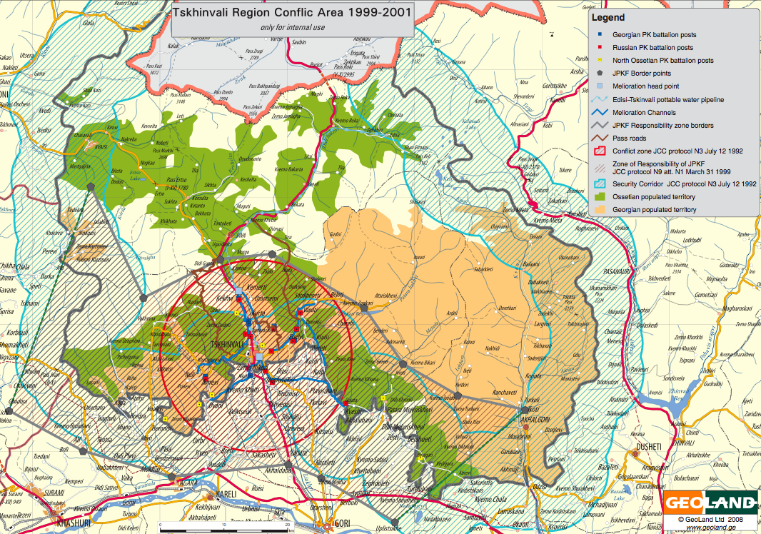
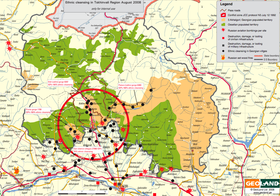
New highly detailed maps of South Ossetia provided by the Georgian Ministry of Internal Affairs. The titles associated with each map also comes from the Georgian government. I imagine these maps will eventually be available as KML files on Google Earth.
(1) Tskhinvali Region Conflict Area (1999-2001) [PDF]
(2) Ethnic Cleansing in Tskhinvali Region August 2008 [PDF]
(3) South Ossetia Ethnic Landscape Before Ethnic Cleansing [PDF]
(4) South Ossetia Ethnic Landscape After Ethnic Cleansing [PDF]
(5) Russian Invasion and Occupation of Georgia [PDF]
All maps (with the exception of 2 and 3) are accompanied by the explanatory legends and are otherwise self-explanatory.
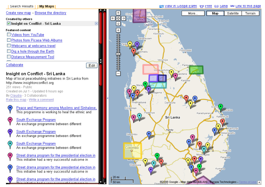
Insight on Conflict, initially mentioned on campus-adr, is a new portal dedicated to rendering more visible “the unknown, virtually invisible, civil society peacebuilding initiatives which exist in tens, hundreds or even thousands in every conflict area.” The goal of the project is to “make them visible to policy makers, the media and other peace practitioners.”
The portal enables users to map and track activities based on seven core themes:
Community Action
Culture & Media
Development
Human Rights
Religious and Ethnic Diversity
Women
Young People
The platform also allows users to navigate the web-based interface by region, and provides RSS feeds, detailed country profiles and interactive maps.
The User Guide includes a visual review of the key features of the site.
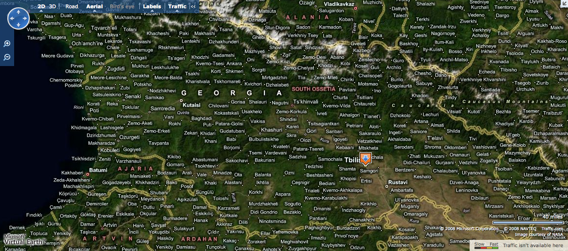
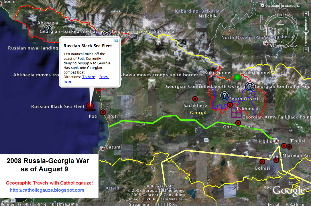
A new set of crisis maps of Georgia have been posted over the past few days. Jonathan Thomas has kept us well informed of these developments, which include a detailed map provided by Microsoft, an OCHA map and updated layers on Google Earth, all pictured below.
The Google Earth layer above includes a handful of geo-referenced cities that were not available last week. It’s a start, but there’s a long way to go until the layer is comparable to the one above from Microsoft’s Virtual Earth.
The map below is from Stratfor, and of little value, in my opinion. We need to move towards more dynamic, geo-referenced and real-time mapping. The maps by Stratfor and OCHA are obsolete within hours of publication.
Update: Jon Thompson had initially mistakenly blogged that all roads/cities in Georgia had “disappeared” from Google Maps and Google Earth. A colleague of mine at Google has since informed me that they never had a roads layer for Georgia. According to this same contact, Google has just released this formal statement:
It is untrue to suggest, as some media reports have, that Google has removed data or imagery from our Google Maps product in Georgia, Armenia or Azerbaijan. We have never had local data for those countries and that is why local details such as landmarks and cities do not appear.
An initial crisis map of the escalating violence between Georgia and Russia has been created for Google Earth. While dynamic maps add more value than static maps, we need a more interactive interface that permits for crowdsourcing crisis information in quasi-real time with fully geo-referenced information.
Here I am thinking of Ushahidi and the Humanitarian Sensor Web (HSW). Humanitarian organizations have already moved into the disputed region and have no doubt learned important information, which is likely changing every hour. But the one person behind these initial Google Earth maps may not have easy access to organizations on the ground.
This is precisely when we need a crisis mapping platform that enables field-based organizations and local communities to text in important information on events as they unfold. As more information surfaces, we’ll need that same platform to provide quantitative, time-stamped analysis within the same interface. Finally, we would want to let affected communities know how to receive or subscribe to this information as it is posted and validated. This is where Dial-Up-Radio could come in handy.
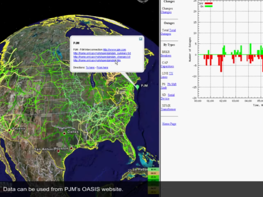
I coined the term “Crisis Mapping Analytics” to highlight the fact that crisis mapping is more valuable when the data that is visually displayed can be analyzed quantitatively within the same interface. Recent crisis mapping initiatives are certainly breaking new ground, but they would be even more useful if they included a meaningful analytical component (which could be used locally). Since the field of conflict early warning typically lags behind in adopting new technologies, we must look to other fields of study for possible insights on mapping analytics.
One such field is energy resource management. Researchers at Oak Ridge National Labs have developed a new mapping tool (screenshot above) that combines images from Google Earth and data on electricity consumption to visualize the status of the national electric grid in real-time. According to NetworkWorld, the tool can be used by federal state and local agencies to “coordinate and respond to major problems such as wide-area power outages, natural disasters and other catastrophic events.”
The Visualizing Energy Resources Dynamically on Earth (VERDE) system, announced this week, mashes together images and stats of everything from real-time status of the electric grid and weather information to power grid behavior modeling and simulation. VERDE ultimately enhances situational awareness and speeds recovery times from power outages, ORNL scientists said. The tool also can predict the transmission lines particularly at risk of storm damage as well as the population in specific areas likely to lose power as a result of destructive winds from storms, ORNL said.
“With this tool we are able to monitor individual transmission lines and place the system as a whole in the context of potential impact on population, transportation and critical infrastructures,” said Mallikarjun Shankar of ORNL’s Computational Sciences and Engineering Division in a release.
The team at Oak Ridge just released the video below which demo’s more of VERDE’s functionalities.
And the gold medals for beating the Chinese Firewall go to:
Witopia for securing your wireless communications.
WASTE again for allowing you to create a decentralized and secure private mesh network using an unsecured network, such as the internet.
Off-the-Record Messaging for enabling you to have private conversations over instant messaging by providing encryption, authentication, deniability and perfect forward secrecy.
Freedom Stick for providing you with a flash drive pre-loaded with software which will secure the communications of any computer it is slotted into. The drive uses the TOR network to cloak your connections, routing traffic around the world through anonymous computers, thus avoiding detection.
My interest in dynamic networks and data visualization dates back several years. Indeed, one of the reasons I participated in the Santa Fe Institute’s (SFI) Complex Systems Summer School (CSSS) back in 2006 was precisely because of my long-time interest in applying this area of research to conflict analysis. But it wasn’t until recently that I began to connect those dots to my current research on crisis mapping and pattern recognition in complex emergencies.
Below is one rendering of a dynamic network that I used when co-teaching a graduate seminar on “Managing Complex Systems” in Fall 2007. The visualization depicts flight patterns across the US. I used this simply to illustrate that certain patterns emerge when data is visualized geographically and temporally across multiple scales.
Another example is the dynamic rendering of information flow in the Blogosphere. I’ve included a picture below but the video for this animation is also worth watching. What does this have to do with crisis mapping? The point is to provide comparable visual renderings of dynamic conflict data at multiple levels of analysis, both spatially and temporally. When doing so, potential patterns and linkages can emerge. Mapping the “fluid dynamics” of conflict, or contagion effects, can be particularly insightful.
One really stunning rendering of a dynamic network was recently posted on the BBC’s technology news site. Using satellite imagery and ground breaking computer imaging we can for the first time visualize stunning patterns that emerge across the UK as seen from the sky. Like the flight tracking video above, this short BBC video is also highly worth watching.
These examples may serve as worthy goals for the new field of crisis mapping analytics, or CMA. It remains to be seen whether we can pull this off. More importantly, however, the question is whether this exercise will get us any closer to saving lives in complex emergencies.
Senior Army officials are increasingly concerned that they are missing out on the iRevolution, i.e., “the breakneck development of cheap digital communications including cell phones, digital cameras and Web 2.0 Internet sites such as blogs and Facebook,” according to Wired.
That helps explain how “just one man in a cave that’s hooked up to the Internet has been able to out-communicate the greatest communications society in the history of the world—the United States,” says the US Army Secretary Pete Geren.
One solution: “Find a blog to be a part of,” Geren said.
But embracing that high-tech, second language could be hard for the Army, just as it poses challenges for the defense industry.”I was talking to a senior executive this week, one of our major defense contractors,” Geren recounted. “And he said that they’ve assigned a young person to every senior executive to be like his or her translator and connect with the new information technologies.”
NearMap, a geospatial media company bought out by Ipernica this week, claims that its “breakthrough technology enables photomaps to be updated much more frequently than other providers such as Google Earth, which can be many months out of date.”
NearMap’s technology enables very high resolution aerial photomaps with multiple angle views to be created at a fraction of the cost of traditional solutions… For the first time, people will be able to see the environment change over time, as NearMap’s online photomaps allow users to move back and forward month by month to see changes occur, such as the construction of a home or development of a new road. [And] with NearMap’s revolutionary approach to high resolution photomaps, it has achieved its objective of a 20-fold operating cost reduction over current industry practices.
Ipernica says that NearMap’s ultimate goal is to cover over 20 percent of the world’s population (700 cities) with photomaps updated at least on a monthly basis.According to Ipernica, NearMap has fully automated the process of creating very high definition photomaps and has developed a complete chain of technologies to address these challenging requirements.
If NearMap (or a competing company) broadens its scope to rural populations, the technology could be a particularly useful tool for the purposes of data collection and crisis mapping.
I thrive when working across disciplines, building diverse cross-cutting coalitions to create, translate and apply innovative strategies driven by shared values. This has enabled the 20+ organizations I’ve worked with, and those I’ve led, to accelerate meaningful and inclusive social impact.
Which is why I've been called a social entrepreneur and a translational leader by successful innovators. President Clinton once called me a digital pioneer, while recent colleagues describe me as kind, dedicated, values-driven, authentic, creative, ethical, and impactful.