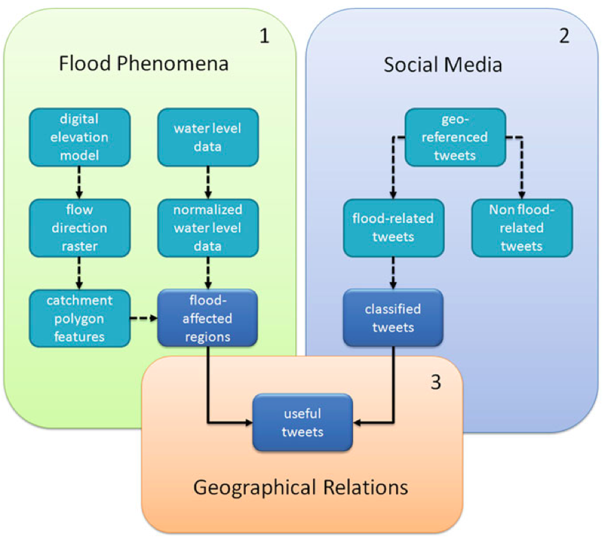
A new data-driven study on the flooding of River Elbe in 2013 (one of the most severe floods ever recorded in Germany) shows that geo-data can enhance the process of extracting relevant information from social media during disasters. The authors use “specific geographical features like hydrological data and digital elevation models to prioritize crisis-relevant twitter messages.” The results demonstrate that an “approach based on geographical relations can enhance information extraction from volunteered geographic information,” which is “valuable for both crisis response and preventive flood monitoring.” These conclusions thus support a number of earlier studies that show the added value of data integration. This analysis also confirms several other key assumptions, which are important for crisis computing and disaster response.
The authors apply a “geographical approach to prioritize [the collection of] crisis-relevant information from social media.” More specifically, they combine information from “tweets, water level measurements & digital elevation models” to answer the following three research questions:
-
Does the spatial and temporal distribution of flood-related tweets actually match the spatial and temporal distribution of the flood phenomenon (despite Twitter bias, potentially false info, etc)?
- Does the spatial distribution of flood-related tweets differ depending on their content?
- Is geographical proximity to flooding a useful parameter to prioritize social media messages in order to improve situation awareness?
The authors analyzed just over 60,000 disaster-related tweets generated in Germany during the flooding of River Elbe in June 2013. Only 398 of these tweets (0.7%) contained keywords related to the flooding. The geographical distribution of flood-related tweets versus non-flood related tweets is depicted below (click to enlarge).
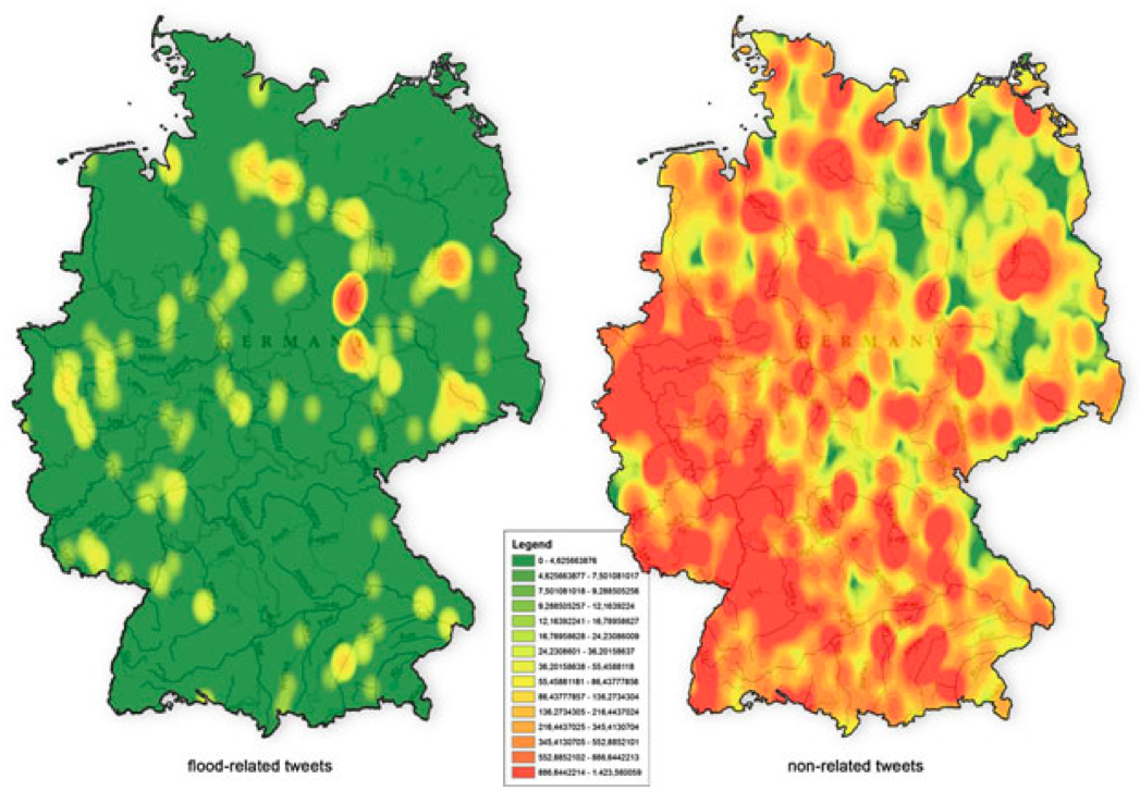
As the authors note, “a considerable amount” of flood-related tweets are geo-located in areas of major flooding. So they tested the statistical correlation between the location of flood-related tweets and the actual flooding, which they found to be “statistically significantly lower compared to non-related Twitter messages.” This finding “implies that the locations of flood-related twitter messages and flood-affected catchments match to a certain extent. In particular this means that mostly people in regions affected by the flooding or people close to these regions posted twitter messages referring to the flood.” To this end, major urban areas like Munich and Hamburg were not the source of most flood-related tweets. Instead, “The majority of tweet referring to the flooding were posted by locals” closer to the flooding.
Given that “most flood-related tweets were posted by locals it seems probable that these messages contain local knowledge only available to people on site.” To this end, the authors analyzed the “spatial distribution of flood-related tweets depending on their content.” The results, depicted below (click to enlarge), show that the geographical distribution of tweets do indeed differ based on their content. This is especially true of tweets containing information about “volunteer actions” and “flood level”. The authors confirm these results are statistically significant when compared with tweets related to “media” and “other” issues.
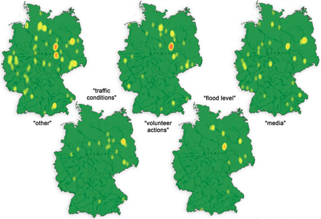
These findings also reveal that the content of Twitter messages can be combined into three groups given their distance to actual flooding:
Group A: flood level & volunteer related tweets are closest to the floods.
Group B: tweets on traffic conditions have a medium distance to the floods.
Group C: other and media related tweets a furthest to the flooding.
Tweets belonging to “Group A” yield greater situational awareness. “Indeed, information about current flood levels is crucial for situation awareness and can complement existing water level measurements, which are only available for determined geographical points where gauging stations are located. Since volunteer actions are increasingly organized via social media, this is a type of information which is very valuable and completely missing from other sources.”
In sum, these results show that “twitter messages that are closest to the flood- affected areas (Group A) are also the most useful ones.” The authors thus conclude that “the distance to flood phenomena is indeed a useful parameter to prioritize twitter messages towards improving situation awareness.” To be sure, the spatial distribution of flood-related tweets is “significantly different from the spatial distribution of off-topic messages.” Whether this is also true of other social media platforms like Instagram and Flickr remains to be seen. This is an important area for future research given the increasing use of pictures posted on social media for rapid damage assessments in the aftermath of disasters.
“The integration of other official datasets, e.g. precipitation data or satellite images, is another avenue for future work towards better understanding the relations between social media and crisis phenomena from a geographical perspective.” I would add both aerial imagery (captured by UAVs) and data from mainstream news (captured by GDELT) to this data fusion exercise. Of course, the geographical approach described above is not limited to the study of flooding only but could be extended to other natural hazards.
This explains why my colleagues at GeoFeedia may be on the right track with their crisis mapping platform. That said, the main limitation with GeoFeedia and the study above is the fact that only 3% of all tweets are actually geo-referenced. But this need not be a deal breaker. Instead, platforms like GeoFeedia can be complemented by other crisis computing solutions that prioritize the analysis of social media content over geography.
Take the free and open-source “Artificial Intelligence for Disaster Response” (AIDR) platform that my team and I at QCRI are developing. Humanitarian organizations can use AIDR to automatically identify tweets related to flood levels and volunteer actions (deemed to provide the most situational awareness) without requiring that tweets be geo-referenced. In addition, AIDR can also be used to identify eyewitness tweets regardless of whether they refer to flood levels, volunteering or other issues. Indeed, we already demonstrated that eyewitness tweets can be automatically identified with an accuracy of 80-90% using AIDR. And note that AIDR can also be used on geo-tagged tweets only.
The authors of the above study recently go in touch to explore ways that their insights can be used to further improve AIDR. So stay tuned for future updates on how we may integrate geo-data more directly within AIDR to improve situational awareness during disasters.

See also: