Tag Archives: Syria

Humanitarian UAV/Drones in Conflict Zones: Fears, Concerns and Opportunities

My research team and I at the Humanitarian UAV Network (UAViators) have compiled a list of fears and concerns expressed by humanitarians and others on the use of UAVs in humanitarian settings. To do this, we closely reviewed well over 50 different documents, reports, articles, etc., on humanitarian UAVs as part of this applied research project. The motivation behind this research is to better understand the different and overlapping concerns that humanitarian organizations have over the use of non-lethal drones in crises, particularly crises mired by violent conflict.

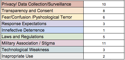
Resarch Table

The results of this research are available in this open & editable spreadsheet and summarized in the table above. We identified a total of 9 different categories of concerns and tallied the unique instances in which these appear in the official humanitarian reports, articles, papers, studies, etc., that we reviewed. The top 3 concerns are: Military Association, Data Privacy and Consent. We very much welcome feedback, so feel free to get in touch via the comments section below and/or add additional content directly to the spreadsheet. This research will feed into an upcoming workshop that my colleague Kristin Sandvik (on the Advisory Board of UAViators) and I are looking to organize in the Spring of 2015. The workshop will address the most pressing issues around the use of civilian UAVs in conflict zones.

I tend to believe that UAV initiatives like the Syria Airlift Project (video above) can play a positive role in conflict settings. In fact, I wrote about this exact use of UAVs back in 2008 for PeaceWork Magazine (scroll down) and referred to previous (conventional) humanitarian airlift examples from the Berlin Airlift in the 1940’s to the Biafran Airlift in the 1960’s as a basis for remotely piloted aircraft systems. As such, I suggested that UAVs could be used in Burma at the time to transport relief supplies in response to the complex emergency. While fraught with risks, these risks can at times be managed when approached with care, integrity and professionalism, especially if a people-centered, community-based approach is taken, which prioritizes both safety and direct empowerment.

While some humanitarians may be categorically against any and all uses of non-lethal UAVs in conflict zones regardless of the circumstances, the fact is that their opinions won’t prevent affected communities and others from using UAVs anyway. More and more individuals will have access to cheaper and cheaper UAVs in the months and years ahead. As a UN colleague noted with respect to the Syria Airlift Project, initiatives like these may well be a sign of things to come. This sentiment is also shared by my colleague Jules Frost at World Vision. See her recent piece entitled: “Eyes in the Sky are Inevitable: UAVs and Humanitarian Response.”

Bio

Acknowledgements: Many thanks to my research assistants Peter Mosur and Jus Mackinnon for taking the lead in this research.

See also:

  • On UAVs for Peacebuilding and Conflict Prevention [link]
  • The Use of Drones for Nonviolent Civil Resistance [link]
  • Drones for Human Rights: Brilliant or Foolish [link]

Crowdsourcing Crisis Information from Syria: Twitter Firehose vs API

Over 400 million tweets are posted every day. But accessing 100% of these tweets (say for disaster response purposes) requires access to Twitter’s “Firehose”. The latter, however, can be prohibitively expensive and also requires serious infrastructure to manage. This explains why many (all?) of us in the Crisis Computing & Humanitarian Technology space use Twitter’s “Streaming API” instead. But how representative are tweets sampled through the API vis-a-vis overall activity on Twitter? This is important question is posed and answered in this new study using Syria as a case study.

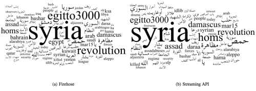
Tweets Syria

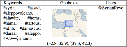
The analysis focused on “Tweets collected in the region around Syria during the period from December 14, 2011 to January 10, 2012.” The first dataset was collected using Firehose access while the second was sampled from the API. The tag clouds above (click to enlarge) displays the most frequent top terms found in each dataset. The hashtags and geoboxes used for the data collection are listed in the table below.

Syria List

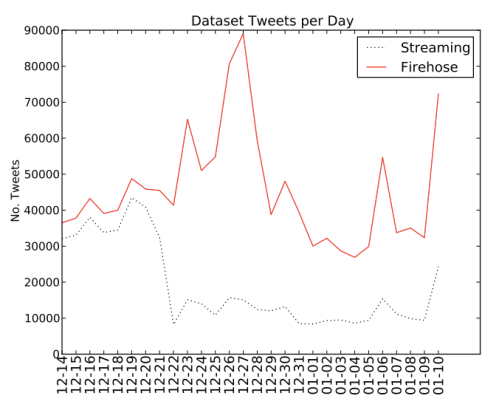
The graph below shows the number of tweets collected between December 14th, 2011 and January 10th, 2012. This amounted 528,592 tweets from the API and 1,280,344 tweets from the Firehose. On average, the API captures 43.5% of tweets available on the Firehose. “One of the more interesting results in this dataset is that as the data in the Firehose spikes, the Streaming API coverage is reduced. One possible explanation for this phenomenon could be that due to the Western holidays observed at this time, activity on Twitter may have reduced causing the 1% threshold to go down.”

Syria Graph

The authors, Fred Morstatter, Jürgen Pfeffer, Huan Liu and Kathleen Carley, also carry out hashtag analysis using each dataset. “Here we see mixed results at small values of n [top hashtags], indicating that the Streaming data may not be good for finding the top hashtags. At larger values of n, we see that the Streaming API does a better job of estimating the top hashtags in the Firehose data.” In addition, the analysis reveals that the “Streaming API data does not consistently find the top hashtags, in some cases revealing reverse correlation with the Firehose data […]. This could be indicative of a filtering process in Twitter’s Streaming API which causes a misrepresentation of top hashtags in the data.”

In terms of social network analysis, the the authors were able to show that “50% to 60% of the top 100 key-players [can be identified] when creating the networks based on one day of Streaming API data.” Aggregating more days’ worth of data “can increase the accuracy substantially. For network level measures, first in-depth analysis revealed interesting correlation between network centralization indexes and the proportion of data covered by the Streaming API.”

Finally, study also compares the geolocation of tweets. More specifically, the authors assess how the “geographic distribution of the geolocated tweets is affected by the sampling performed by the Streaming API. The number of geotagged tweets is low, with only 16,739 geotagged tweets in the Streaming data (3.17%) and 18,579 in the Firehose data (1.45%).” Still, the authors find that “despite the difference in tweets collected on the whole we get 90.10% coverage of geotagged tweets.”

In sum, the study finds that “the results of using the Streaming API depend strongly on the coverage and the type of analysis that the researcher wishes to perform. This leads to the next question concerning the estimation of how much data we actually get in a certain time period.” This is critical if researchers want to place their results into context and potentially apply statistical methods to account (and correct) for bias. The authors suggest that in some cases the Streaming API coverage can be estimated. In future research, they hope to “find methods to compensate for the biases in the Streaming API to provide a more accurate picture of Twitter activity to researchers.” In particularly they want to “determine whether the methodology presented here will yield similar results for Twitter data collected from other domains, such as natural, protest & elections.”

The authors will present their paper at this year’s International Conference on Weblogs and Social Media (ICWSM). So I look forward to meeting them there to discuss related research we are carrying out at QCRI.

bio

 See also:

Map or Be Mapped: Otherwise You Don’t Exist

“There are hardly any street signs here. There are no official zip codes. No addresses. Just word of mouth” (1). Such is the fate of Brazil’s Mare shanty-town and that of most shantytowns around the world where the spoken word is king (and not necessarily benevolent). “The sprawling complex of slums, along with the rest of Rio de Janerio’s favelas, has hung in a sort of ‘legal invisibility’ since 1937, when a city ordinance ruled that however unsightly, favelas should be kept off maps because they were merely ‘temporary'” (2).

shantytown

The socio-economic consequences were far-reaching. For decades, this infor-mality meant that “entire neighborhoods did not receive mail. It had also blocked people from giving required information on job applications, getting a bank account or telling the police or fire department where to go in an emergency call. Favela residents had to pick up their mail from their neighborhood associations, and entire slums housing a small town’s worth of residents had to use the zip code of the closest officially recognized street” (3).

All this is starting to change thanks to a grassroots initiative that is surveying Mare’s 16 favelas, home to some 130,000 people. This community-driven project has appropriated the same survey methodology used by the Brazilian government’s Institute of Geography and Statistics. The collected data includes “not only street names but the history of the original smaller favelas that make up the community” (4). This data is then “formatted into pocket guides and distributed gratis to residents. These guides also offer background on certain streets’ namesakes, but leave some blank so that residents can fill them in as Mare […] continues shifting out from the shadows of liminal space to a city with distinct identities” (5). And so, “residents of Rio’s famed favelas are undergoing their first real and ‘fundamental step toward citizenship'” (6).

These bottom-up, counter-mapping efforts are inherently political—call it guerrilla mapping. Traditionally, maps have represented “not just the per-spective of the cartographer herself, but of much larger institutions—of corporations, organizations, and governments” (7). The scale was fixed at one and only one scale, that of the State. Today, informal communities can take matters into their own hands and put themselves on the map; at the scale of their choosing. But companies like Google still have the power to make these communities vanish. In Brazil, Google said it “would tweak the site’s [Google Maps’] design, namely its text size and district labeling to show favela names only after users zoomed in on those areas.”

GmapNK

Meanwhile, Google is making North Korea’s capital city more visible. But I had an uncomfortable feeling after reading National Geographic’s take on Google’s citizen mapping expedition to North Korea. The Director for National Geographic Maps, Juan José Valdéscautions that, “In many parts of the world such citizen mapping has proven challenging, if not downright dangerous. In many places, little can be achieved without the approval of local and or national authorities—especially in North Korea.” Yes, but in many parts of the world citizen mapping is safe and possible. More importantly, citizen mapping can be a powerful tool for digital activism. My entire doctoral dissertation focuses on exactly this issue.

Yes, Valdés is absolutely correct when he writes that “In many countries, place-names, let alone the alignment of boundaries, remain a powerful symbol of independence and national pride, and not merely indicators of location. This is where citizen cartographers need to understand the often subtle nuances and potential pitfalls of mapping.” As the New Yorker notes, “Maps are so closely associated with power that dictatorships regard information on geography as a state secret.” But map-savvy digital activists already know this better than most, and they deliberately seek to exploit this to their advantage in their struggles for democracy.

National Geographic’s mandate is of course very different. “From National Geographic’s perspective, all a map should accomplish is the actual portrayal of national sovereignty, as it currently exists. It should also reflect the names as closely as possible to those recognized by the political entities of the geographic areas being mapped. To do otherwise would give map readers an unrealistic picture of what is occurring on the ground.”

natgeomaps

This makes perfect sense for National Geographic. But as James Scott reminds us in his latest book, “A great deal of the symbolic work of official power is precisely to obscure the confusion, disorder, spontaneity, error, and improvisation of political power as it is in fact exercised, beneath a billiard-ball-smooth surface of order, deliberation, rationality, and control. I think of this as the ‘miniaturization of order.'” Scott adds that, “The order, rationality, abstractness and synoptic legibility of certain kinds of schemes of naming, landscape, architecture, and work processes lend themselves to hierarchical power […] ‘landscapes of control and appropriation.'”

Citizen mapping, especially in repressive environments, often seeks to change that balance of power by redirecting the compass of political power with the  use of subversive digital maps. Take last year’s example of Syrian pro-democracy activists changing place & street names depicted on on the Google Map of Syria. They did this intentionally as an act of resistance and defiance. Again, I fully understand and respect that National Geographic’s mandate is completely different to that of pro-democracy activists fighting for freedom. I just wish that Valdés had a least added one sentence to acknowledge the importance of maps for the purposes of resistance and pro-democracy movements. After all, he is himself a refugee from Cuba’s political repression.

There is of course a flip side to all this. While empowering, visibility and legibility can also undermine a community’s autonomy. As Pierre-Joseph Proudhon famously put it, “To be governed is to be watched, inspected, spied upon, directed, law-driven, numbered, regulated, enrolled, indoctrinated, preached at, controlled, checked, estimated, valued, censured, commanded, by creatures who have neither the right nor the wisdom nor the virtue to do so.” To be digitally mapped is to be governed, but perhaps at multiple scales including the preferred scale of self-governance and self-determination.

And so, we find ourselves repeating the words of Shakespeare’s famous character Hamlet: “To be, or not to be,” to map, or not to map.


See also:

  • Spying with Maps [Link]
  • How to Lie With Maps [Link]
  • Folksomaps for Community Mapping [Link]
  • From Social Mapping to Crisis Mapping [Link]
  • Crisis Mapping Somalia with the Diaspora [Link]
  • Perils of Crisis Mapping: Lessons from Gun Map [Link]
  • Crisis Mapping the End of Sudan’s Dictatorship? [Link]
  • Threat and Risk Mapping Analysis in the Sudan [Link]
  • Rise of Amateur Professionals & Future of Crisis Mapping [Link]
  • Google Inc + World Bank = Empowering Citizen Cartographers? [Link]

Note: Readers interested in the topics discussed above may also be interested in a forthcoming book to be published by Oxford University Press entitled “Information and Communication Technologies in Areas of Limited State-hood.” I have contributed a chapter to this book entitled “Crisis Mapping in Areas of Limited Statehood,” which analyzes how the rise of citizen-genera-ted crisis mapping replaces governance in areas of limited statehood. The chapter distills the conditions for the success of these crisis mapping efforts in these non-permissive and resource-restricted environments. 

Why USAID’s Crisis Map of Syria is so Unique

While static, this crisis map includes a truly unique detail. Click on the map below to see a larger version as this may help you spot what is so striking.

For a hint, click this link. Still stumped? Look at the sources listed in the Key.


Crisis Mapping Syria: Automated Data Mining and Crowdsourced Human Intelligence

The Syria Tracker Crisis Map is without doubt one of the most impressive crisis mapping projects yet. Launched just a few weeks after the protests began one year ago, the crisis map is spearheaded by a just handful of US-based Syrian activists have meticulously and systematically documented 1,529 reports of human rights violations including a total of 11,147 killings. As recently reported in this NewScientist article, “Mapping the Human Cost of Syria’s Uprising,” the crisis map “could be the most accurate estimate yet of the death toll in Syria’s uprising […].” Their approach? “A combination of automated data mining and crowdsourced human intelligence,” which “could provide a powerful means to assess the human cost of wars and disasters.”

On the data-mining side, Syria Tracker has repurposed the HealthMap platform, which mines thousands of online sources for the purposes of disease detection and then maps the results, “giving public-health officials an easy way to monitor local disease conditions.” The customized version of this platform for Syria Tracker (ST), known as HealthMap Crisis, mines English information sources for evidence of human rights violations, such as killings, torture and detainment. As the ST Team notes, their data mining platform “draws from a broad range of sources to reduce reporting biases.” Between June 2011 and January 2012, for example, the platform collected over 43,o00 news articles and blog posts from almost 2,000 English-based sources from around the world (including some pro-regime sources).

Syria Tracker combines the results of this sophisticated data mining approach with crowdsourced human intelligence, i.e., field-based eye-witness reports shared via webform, email, Twitter, Facebook, YouTube and voicemail. This naturally presents several important security issues, which explains why the main ST website includes an instructions page detailing security precautions that need to be taken while sub-mitting reports from within Syria. They also link to this practical guide on how to protect your identity and security online and when using mobile phones. The guide is available in both English and Arabic.

Eye-witness reports are subsequently translated, geo-referenced, coded and verified by a group of volunteers who triangulate the information with other sources such as those provided by the HealthMap Crisis platform. They also filter the reports and remove dupli-cates. Reports that have a low con-fidence level vis-a-vis veracity are also removed. Volunteers use a dig-up or vote-up/vote-down feature to “score” the veracity of eye-witness reports. Using this approach, the ST Team and their volunteers have been able to verify almost 90% of the documented killings mapped on their platform thanks to video and/or photographic evidence. They have also been able to associate specific names to about 88% of those reported killed by Syrian forces since the uprising began.

Depending on the levels of violence in Syria, the turn-around time for a report to be mapped on Syria Tracker is between 1-3 days. The team also produces weekly situation reports based on the data they’ve collected along with detailed graphical analysis. KML files that can be uploaded and viewed using Google Earth are also made available on a regular basis. These provide “a more precisely geo-located tally of deaths per location.”

In sum, Syria Tracker is very much breaking new ground vis-a-vis crisis mapping. They’re combining automated data mining technology with crowdsourced eye-witness reports from Syria. In addition, they’ve been doing this for a year, which makes the project the longest running crisis maps I’ve seen in a hostile environ-ment. Moreover, they’ve been able to sustain these import efforts with just a small team of volunteers. As for the veracity of the collected information, I know of no other public effort that has taken such a meticulous and rigorous approach to documenting the killings in Syria in near real-time. On February 24th, Al-Jazeera posted the following estimates:

Syrian Revolution Coordination Union: 9,073 deaths
Local Coordination Committees: 8,551 deaths
Syrian Observatory for Human Rights: 5,581 deaths

At the time, Syria Tracker had a total of 7,901 documented killings associated with specific names, dates and locations. While some duplicate reports may remain, the team argues that “missing records are a much bigger source of error.” Indeed, They believe that “the higher estimates are more likely, even if one chooses to disregard those reports that came in on some of the most violent days where names were not always recorded.”

The Syria Crisis Map itself has been viewed by visitors from 136 countries around the world and 2,018 cities—with the top 3 cities being Damascus, Washington DC and, interestingly, Riyadh, Saudia Arabia. The witnessing has thus been truly global and collective. When the Syrian regime falls, “the data may help sub-sequent governments hold him and other senior leaders to account,” writes the New Scientist. This was one of the principle motivations behind the launch of the Ushahidi platform in Kenya over four years ago. Syria Tracker is powered by Ushahidi’s cloud-based platform, Crowdmap. Finally, we know for a fact that the International Criminal Court (ICC) and Amnesty International (AI) closely followed the Libya Crisis Map last year.

Combining Crowdsourced Satellite Imagery Analysis with Crisis Reporting: An Update on Syria

Members of the the Standby Volunteer Task Force (SBTF) Satellite Team are currently tagging the location of hundreds of Syrian tanks and other heavy mili-tary equipment on the Tomnod micro-tasking platform using very recent high-resolution satellite imagery provided by Digital Globe.

We’re focusing our efforts on the following three key cities in Syria as per the request of Amnesty International USA’s (AI-USA) Science for Human Rights Program.

For more background information on the project, please see the following links:

To recap, the purpose of this experimental pilot project is to determine whether satellite imagery analysis can be crowdsourced and triangulated to provide data that might help AI-USA corroborate numerous reports of human rights abuses they have been collecting from a multitude of other sources over the past few months. The point is to use the satellite tagging in combination with other data, not in isolation.
 
To this end, I’ve recommended that we take it one step further. The Syria Tracker Crowdmap has been operations for months. Why not launch an Ushahidiplatform that combines the triangulated features from the crowdsourced satellite imagery analysis with crowdsourced crisis reports from multiple sources?

The satellite imagery analyzed by the SBTF was taken in early September. We could grab the August and September crisis data from Syria Tracker and turn the satellite imagery analysis data into layers. For example, the “Military tag” which includes large military equipment like tanks and artillery could be uploaded to Ushahidi as a KML file. This would allow AI-USA and others to cross-reference their own reports, with those on Syria Tracker and then also place that analysis into context vis-a-vis the location of military equipment, large crowds and check-points over the same time period.

The advantage of adding these layers to an Ushahidi platform is that they could be updated and compared over time. For example, we could compare the location of Syrian tanks versus on-the-ground reports of shelling for the month of August, September, October, etc. Perhaps we could even track the repositioning of  some military equipment if we repeated this crowdsourcing initiative more frequently. Incidentally, President Eisenhower proposed this idea to the UN during the Cold War, see here.

In any case, this initiative is still very much experimental and there’s lots to learn. The SBTF Tech Team headed by Nigel McNie is looking to make the above integration happen, which I’m super excited about. I’d love to see closer integration with satellite imagery analysis data in future Ushahidi deployments that crowdsource crisis reporting from the field. Incidentally, we could scale this feature tagging approach to include hundreds if not thousands of volunteers.

In other news, my SBTF colleague Shadrock Roberts and I had a very positive conference call with UNHCR this week. The SBTF will be partnering with HCR on an official project to tag the location of informal shelters in the Afgooye corridor in the near future. Unlike our trial run from several weeks ago, we will have a far more developed and detailed rule-set & feature-key thanks to some very useful information that our colleagues at HCR have just shared with us. We’ll be adding the triangulated features from the imagery analysis to a dedicated UNHCR Ushahidi platform. We hope to run this project in October and possibly again in January so HCR can do some simple change detection using Ushahidi.

In parallel, we’re hoping to partner with the Joint Research Center (JRC), which has developed automated methods for shelter detection. Comparing crowdsourced feature tagging with an automated approach would provide yet more information to UNHCR to corroborate their assessments.

Help Crowdsource Satellite Imagery Analysis for Syria: Building a Library of Evidence

Update: Project featured on UK Guardian Blog! Also, for the latest on the project, please see this blog post.

This blog post follows from this previous one: “Syria – Crowdsourcing Satellite Imagery Analysis to Identify Mass Human Rights Violations.” As part of the first phase of this project, we are building a library of satellite images for features we want to tag using crowdsourcing.

In particular, we are looking to identify the following evidence using high-resolution satellite imagery:

  • Large military equipment
  • Large crowds
  • Checkpoints
The idea is to provide volunteers the Standby Volunteer Task Force (SBTF) Satellite Team with as much of road map as possible so they know exactly what they’re looking for in the  satellite imagery they’ll be tagging using the Tomnod system:

Here are some of the pictures we’ve been able to identify thanks to the help of my good colleague Christopher Albon:
I’ve placed these and other examples in this Google Doc which is open for comment. We need your help to provide us with other imagery depicting heavy Syrian military equipment, large crowds and checkpoints. Please provide links and screenshots of such imagery in this open and editable Google Doc.Here are some of the links that Chris already sent us for the above imagery:


Syria: Crowdsourcing Satellite Imagery Analysis to Identify Mass Human Rights Violations

Update: See this blog post for the latest. Also, our project was just featured on the UK Guardian Blog!

What if we crowdsourced satellite imagery analysis of key cities in Syria to identify evidence of mass human rights violations? This is precisely the question that my colleagues at Amnesty International USA’s Science for Human Rights Program asked me following this pilot project I coordinated for Somalia. AI-USA has done similar work in the past with their Eyes on Darfur project, which I blogged about here in 2008. But using micro-tasking with backend triangulation to crowdsource the analysis of high resolution satellite imagery for human rights purposes is definitely breaking new ground.

A staggering amount of new satellite imagery is produced every day; millions of square kilometers’ worth according to one knowledgeable colleague. This is a big data problem that needs mass human intervention until the software can catch up. I recently spoke with Professor Ryan Engstrom, the Director of the Spatial Analysis Lab at George Washington University, and he confirmed that automated algorithms for satellite imagery analysis still have a long, long way to go. So the answer for now has to be human-driven analysis.

But professional satellite imagery experts who have plenty of time to volunteer their skills are far and few between. The Satellite Sentinel Project (SSP), which I blogged about here, is composed of a very small team and a few interns. Their focus is limited to the Sudan and they are understandably very busy. My colleagues at AI-USA analyze satellite imagery for several conflicts, but this takes them far longer than they’d like and their small team is still constrained given the number of conflicts and vast amounts of imagery that could be analyzed. This explains why they’re interested in crowdsourcing.

Indeed, crowdsourcing imagery analysis has proven to be a workable solution in several other projects & sectors. The “crowd” can indeed scan and tag vast volumes of satellite imagery data when that imagery is “sliced and diced” for micro-tasking. This is what we did for the Somalia pilot project thanks to the Tomnod platform and the imagery provided by Digital Globe. The yellow triangles below denote the “sliced images” that individual volunteers from the Standby Task Force (SBTF) analyzed and tagged one at a time.

We plan do the same with high resolution satellite imagery of three key cities in Syria selected by the AI-USA team. The specific features we will look for and tag include: “Burnt and/or darkened building features,” “Roofs absent,” “Blocks on access roads,” “Military equipment in residential areas,” “Equipment/persons on top of buildings indicating potential sniper positions,” “Shelters composed of different materials than surrounding structures,” etc. SBTF volunteers will be provided with examples of what these features look like from a bird’s eye view and from ground level.

Like the Somalia project, only when a feature—say a missing roof—is tagged identically  by at least 3 volunteers will that location be sent to the AI-USA team for review. In addition, if volunteers are unsure about a particular feature they’re looking at, they’ll take a screenshot of said feature and share it on a dedicated Google Doc for the AI-USA team and other satellite imagery experts from the SBTF team to review. This feedback mechanism is key to ensure accurate tagging and inter-coder reliability. In addition, the screenshots shared will be used to build a larger library of features, i.e., what a missing roof looks like as well military equipment in residential areas, road blocks, etc. Volunteers will also be in touch with the AI-USA team via a dedicated Skype chat.

There will no doubt be a learning curve, but the sooner we climb that learning curve the better. Democratizing satellite imagery analysis is no easy task and one or two individuals have opined that what we’re trying to do can’t be done. That may be, but we won’t know unless we try. This is how innovation happens. We can hypothesize and talk all we want, but concrete results are what ultimately matters. And results are what can help us climb that learning curve. My hope, of course, is that democratizing satellite imagery analysis enables AI-USA to strengthen their advocacy campaigns and makes it harder for perpetrators to commit mass human rights violations.

SBTF volunteers will be carrying out the pilot project this month in collaboration with AI-USA, Tomnod and Digital Globe. How and when the results are shared publicly will be up to the AI-USA team as this will depend on what exactly is found. In the meantime, a big thanks to Digital Globe, Tomnod and SBTF volunteers for supporting the AI-USA team on this initiative.

If you’re interested in reading more about satellite imagery analysis, the following blog posts may also be of interest:

• Geo-Spatial Technologies for Human Rights
• Tracking Genocide by Remote Sensing
• Human Rights 2.0: Eyes on Darfur
• GIS Technology for Genocide Prevention
• Geo-Spatial Analysis for Global Security
• US Calls for UN Aerial Surveillance to Detect Preparations for Attacks
• Will Using ‘Live’ Satellite Imagery to Prevent War in the Sudan Actually Work?
• Satellite Imagery Analysis of Kenya’s Election Violence: Crisis Mapping by Fire
• Crisis Mapping Uganda: Combining Narratives and GIS to Study Genocide
• Crowdsourcing Satellite Imagery Analysis for Somalia: Results of Trial Run
• Genghis Khan, Borneo & Galaxies: Crowdsourcing Satellite Imagery Analysis
• OpenStreetMap’s New Micro-Tasking Platform for Satellite Imagery Tracing