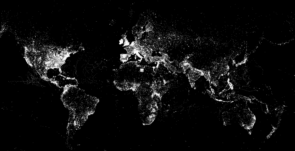
This data visualization (click to enlarge) displays more than 23,500 photos taken in Brooklyn and posted to Instagram during Hurricane Sandy. A picture’s distance from the center (radius) corresponds to its mean hue while a picture’s position along the perimeter (angle) corresponds to the time that picture was taken. “Note the demarcation line that reveals the moment of a power outage in the area and indicates the intensity of the shared experience (dramatic decrease in the number of photos, and their darker colors to the right of the line)” (1).
Click here to interact with the data visualization. The research methods behind this visualization are described here along with other stunning visuals.
Ushahidi has just uploaded the location of all CrowdMap reports to DevSeed’s awesome MapBox and the result looks gorgeous. Click this link to view the map below in an interactive, full-browser window. Ushahidi doesn’t disclose the actual number of reports depicted, only the number of maps that said reports have been posted to and the number of countries that CrowdMaps have been launched for. But I’m hoping they’ll reveal that figure soon as well. (Update from Ushahidi: This map shows the 246,323 unique locations used for reports from the launch of Crowdmap on Aug 9, 2010 to Jan 18, 2013).
In any event, I’ve just emailed my colleagues at Ushahidi to congratulate them and ask when their geo-dataset will be made public since they didn’t include a link to said dataset in their recent blog post. I’ll be sure to let readers know in the comments section as soon as I get a reply. There are a plethora of fascinating research questions that this dataset could potentially help us answer. I’m really excited and can’t wait for my team and I at QCRI to start playing with the data. I’d also love to see this static map turned into a live map; one that allows users to actually click on individual reports as they get posted to a CrowdMap and to display the category (or categories) they’ve been tagged with. Now that would be just be so totally über cool—especially if/when Ushahidi opens up that data to the public, even if at a spatially & temporally aggregated level.
For more mesmerizing visualizations like this one, see my recent blog post entitled “Social Media: Pulse of the Planet?” which is also cross-posted on the National Geographic blog here. In the meantime, I’m keeping my fingers crossed that Ushahidi will embrace an Open Data policy from here on out and highly recommend the CrowdGlobe Report to readers interested in learning more about CrowdMap and Ushahidi.
My colleague Kalev Leetaru has just launched The Global Twitter Heartbeat Project in partnership with the Cyber Infrastructure and Geospatial Information Laboratory (CIGI) and GNIP. He shared more information on this impressive initiative with the CrisisMappers Network this morning.
According to Kalev, the project “uses an SGI super-computer to visualize the Twitter Decahose live, applying fulltext geocoding to bring the number of geo-located tweets from 1% to 25% (using a full disambiguating geocoder that uses all of the user’s available information in the Twitter stream, not just looking for mentions of major cities), tone-coding each tweet using a twitter-customized dictionary of 30,000 terms, and applying a brand-new four-stage heatmap engine (this is where the supercomputer comes in) that makes a map of the number of tweets from or about each location on earth, a second map of the average tone of all tweets for each location, a third analysis of spatial proximity (how close tweets are in an area), and a fourth map as needed for the percent of all of those tweets about a particular topic, which are then all brought together into a single heatmap that takes all of these factors into account, rather than a sequence of multiple maps.”
Kalev added that, “For the purposes of this demonstration we are processing English only, but are seeing a nearly identical spatial profile to geotagged all-languages tweets (though this will affect the tonal results).” The Twitterbeat team is running a live demo showing both a US and world map updated in realtime at Supercomputing on a PufferSphere and every few seconds on the SGI website here.”
So why did Kalev share all this with the CrisisMappers Network? Because he and his team created a rather unique crisis map composed of all tweets about Hurricane Sandy, see the YouTube video above. “[Y]ou can see how the whole country lights up and how tweets don’t just move linearly up the coast as the storm progresses, capturing the advance impact of such a large storm and its peripheral effects across the country.” The team also did a “similar visualization of the recent US Presidential election showing the chaotic nature of political communication in the Twittersphere.”
To learn more about the project, I recommend watching Kalev’s 2-minute introductory video above.
Crisis mapping is often referred to as dots on a map. Perhaps the time has come to move beyond the dot. After all, what’s in a dot? A heck of a lot, as it turns out. When we add data to a map using a dot, we are collapsing important attributes and multiple dimensions into just one single dimension. This reduces entropy but information as well. Of course, simplification is important but this should be optional and not hard-wired in the form of static dot on a map. This is why I’m a big fan of GeoTime, i.e., 3D immersive mapping, which unpacks the temporal dimension by adding a Z-axis to dynamic crisis maps, i.e., time “flows upwards.”
This is a definite improvement in that the GeoTime map gives a more immediate at-a-glance understanding by uncollapsing dots into more dimensions and attributes. The icons still “hide” additional information, however. So how do we unpack as many attributes and dimensions as possible? How do we visualize the underlying DNA of a dot on a crisis map? I recently spoke to a colleague who may have an answer, which looks something like this:
And this:
No longer dots on map. Here, the geometric shapes, sizes, colors, relative distances, etc., all convey information unpacked from a single dot. Tags on steroids basically, especially since they don’t sit still, i.e., they all move or can be made to vibrate at various speeds referencing further information that is other-wise hidden in a collapsed dot. In other words, the toroids can represent live data from the field. Additional toroids and geometric shapes can be added to a “dot” to represent more attributes and temporal elements.
Unpacking dots in this way leads to more perceptivity and discoverability. Patterns that are not otherwise discernible as static dots emerge as curious geometric shapes that beg to be explained. When “flying through” the map below, for example, it was very clear that conflict events had very distinct geometric shapes and constructs that were simply not discernible when in the form of dots. New questions that we didn’t know to ask can now be asked and followed up on with hypothesis testing. This type of visual DNA also allows one to go beyond natural languages and use a common geometric language. Users can also compare their perceptions using objects rather than natural languages.
Reading these maps does require learning a new kind of language, but one that is perhaps easier and more intuitive to learn, not to mention customizable. The above is just a glimpse of the evolving work and the team behind it is not making any claims about anything just yet. The visualization code will be released as open source software in the near future. In the meantime, a big thanks to my colleague Jen Ziemke for putting me in touch with the team behind this remarkable tool.
The Economist just published a fascinating article on fluid dynamics called “The Skeleton of Water” which may have important implications for Crisis Mapping Analytics. We often speak of conflict in terms of waves, e.g., “preventing the next wave of conflict,” but there may be more to the analogy than meets the eye.
Source: The Economist
One of the main challenges that Crisis Mapping Analytics faces is the complexity involved in modeling conflict dynamics over space and time. But we’re hardly the first to face this challenge. Take the field of fluid dynamics, which is the subject of the article in question. Breakthrough research now reveals that hidden structures within liquids and gasses guide the movement of everything from pollution to airplanes.
The atmosphere and the ocean are, it seems, dominated by invisible barriers that have come to be known as Lagrangian Coherent Structures.
To understand what a Lagrangian Coherent Structure [LCS] is, it helps to imagine a crowd at a railway terminus […]. Some people will be arriving. Some will be leaving. And, whichever they are doing, they will be going to and from numerous different platforms.
The result is chaos, but structured chaos. What emerges is a shifting pattern of borders between groups of people with different goals. These borders are Lagrangian coherent structures. They are intangible, immaterial and would be undetectable if the passengers stopped moving. But they are also real enough to be treated mathematically.
And it turns out to be easier to study the behaviour of such fluids by looking at the barriers than at the bodies of fluid which those barriers separate.
Scientists across numerous fields are now jumping on the Lagrangian bandwagon to explore the applicability of LCS to their work.
For example, a professor at CalTech recently “used the technique to study the hunting behaviour of jellyfish. He has shown how parts of the ocean are temporarily protected from the depredations of these creatures because they cannot cross the invisible barriers imposed by Lagrange.” Meanwhile, another professor notes that “the coherent-structure approach might also be used to help predictions of the passage of hurricanes; they, too, are constrained by the invisible barriers that Lagrange’s theory describes.”
There is also reason to believe that conflict follows a power law (like earthquakes, forest fires, etc.). In other words, conflict may be scale invariant. This may imply that there is no “average size” of conflict regardless of scale, i.e., from interpersonal to international conflict. As it turns out, “Lagrangian coherent structures can appear at all sorts of scales. What goes for an airport or a bay can be scaled up to an ocean, or the air above it, and down to the flow off an aircraft’s wingtip, or a ship’s hull.”
One of the exciting conclusions from this latest research in fluid dynamics is that “boundaries between things are often as important as the things themselves.” In other words, we need to think more about what artists call negative space, which is “the space around and between the subject(s) of an image. Negative space may be most evident when the space around a subject, and not the subject itself, forms an interesting or artistically relevant shape, and such space is occasionally used to artistic effect as the “real” subject of an image.”
Take the following picture, for example.
Source: Wikipedia
There is an intimate relationship between the object and the space around it. Negative spaces are important because they may reveal otherwise hidden patterns. In crisis mapping, like fluid dynamics, we need to delineate this negative space over time to identify patterns in three dimensional space. This is what the mathematics of Lagrangian Coherent Structures may allow us to do.
And so, it is very tempting to start thinking about conflict (and peace) in terms of fluid dynamics given the context of crisis mapping. Have we been too preoccupied with crisis data instead of modeling the boundaries and event trajectories? Perhaps conflict flows like a river, with turbulent eddies producing violent pathways while other areas are clear, still pools of peace. So why not collaborate with mathematicians to find out whether LCS’s can shed light on why “islands of peace” sometimes exist in a sea of conflict?
I enjoy thinking about the different analogies one can use to describe crisis mapping. I’ve likened crisis mapping to the Nascza Lines here and to cymatics here, for example. In a recent interview with Reuters/Alertnet (published here), I used the following analogy:
“Crisis mapping is to the humanitarian space what x-rays are to emergency rooms.”
I wanted to find an analogy that would steer clear of technical jargon and capture the public’s imagination. I thought through several analogies before the interview. For example, I debated using Magnetic Resonance Imaging (MRI) as analogy instead of x-rays since, well, it’s a more accurate comparison.
Why?
Have a look at the first minute of this rather amusing video, which first shows some x-ray pictures and then MRI scans.
MRI scans provide “quantitative, real-time, thermal images of the treated area” (1). All x-rays do is display static, albeit still useful, information. It’s a bit like comparing today’s high-speed digital video cameras with the cameras of bygone days that produced black and white photographs.
I thought about these analogies again this evening while walking home from MIT’s conference on data visualization. That’s when something very obvious dawned on me. The biggest problem with crisis maps is the word “maps”. The majority of the world’s population including myself associate maps with printed maps—no thanks to pirates.
The term “animated map” almost seems like an oxymoron, much like the word “airbus” must have come across when the company was founded 40 years ago. For you fellow Harry Potter fans, perhaps the best way to describe what I’m trying to convey is by referring to TheDaily Prophet, the magical newspaper whose articles include moving pictures. Or perhaps the magical Marauder’s map which tracks the movement of students and teachers at Hogwarts in real-time.
Source: newlaunches.com
Fictional protagonists aside, Albert Einstein was spot on when he wrote:
“Imagination is more important than knowledge. For knowledge is limited to all we now know and understand, while imagination embraces the entire world, and all there ever will be to know and understand.”
We know a lot about maps but if we were to play the word association game we’d likely come up with static descriptions rather than words associated with moving pictures. The time slider feature on Google Earth is perhaps starting to shift people’s conception of maps. Hans Rosling‘s work with Gapminder is also stirring our imagination since he talks about time series data much like a sports commentator describes a horse race (see his really neat TED talk here).
source: google earth
But we’re even more trapped by our archaic conception of maps than we realize. Playing the word association game with the word “map” may conjure Google Earth’s time slider for a few neogeographers, but I doubt that anyone would blurt out “3D!” for example. And yet, that’s what some of us crisis mappers are increasingly thinking about.
Google invited me to participate in a full-day workshop at their DC office last week and sure enough they told us to expect that all structures (e.g., buildings, mountains) on Google Earth would be rendered in 3D within about 2 years. The team is looking to integrate Mapmaker, My Maps, and Sketch-Up with Google Earth. And we already know they have a great flight simulator.
In the meantime, the most accurate 3D map of any city on Earth has just been created using very high resolution lasers—some 7 million individual points of light to be exact. You could call this the best MRI of a terrestrial city yet!
I’ve already blogged about crisis maps evolving into 3D virtual worlds with live data feeds and agent-based models for scenario development, simulation and forecasting:
3D Crisis Mapping for Disaster Simulation Training (link)
All these systems are part of the evolving info webs I recently blogged about. But the italicized attributes above hardly come to mind when we hear the word map. And I think this is biggest problem with the term “crisis maps.” Perhaps we should come up with an entirely new term. But coming back to my interview with Reuters/Alertnet, a new more accurate term would simply add more technical jargon and definitely lose the public’s imagination (and mine with it).
So I’ve got an alternative “solution” … maybe. We keep the word map, or rather M.A.P.S. Yes, that’s right “Crisis MAPS.” All we need now is to be as creative as InSTEDD and find a way to fit this acronym with something sensible.
So how’s this?
Crisis MAPS = Crisis Movies and Platform Simulations
I enjoy thinking about the different analogies one can use to describe crisis mapping. I’ve likened crisis mapping to the Nascza Lines here and to cymatics here, for example. In a recent interview with Reuters/Alertnet (published here), I used the following analogy:
“Crisis mapping is to the humanitarian space what x-rays are to emergency rooms.”
I wanted to find an analogy that would steer clear of technical jargon and capture the public’s imagination. I thought through several analogies before the interview. For example, I debated using Magnetic Resonance Imaging (MRI) as analogy instead of x-rays since, well, it’s a more accurate comparison.
Why?
Have a look at the first minute of this rather amusing video, which first shows some x-ray pictures and then MRI scans.
MRI scans provide “quantitative, real-time, thermal images of the treated area” (1). All x-rays do is display static, albeit still useful, information. It’s a bit like comparing today’s high-speed digital video cameras with the cameras of bygone days that produced black and white photographs.
I thought about these analogies again this evening while walking home from MIT’s conference on data visualization. That’s when something very obvious dawned on me. The biggest problem with crisis maps is the word “maps”. The majority of the world’s population including myself associate maps with printed maps—no thanks to pirates.
Source: artfiles.art.com
The term “animated map” almost seems like an oxymoron, much like the word “airbus” must have come across when the company was founded 40 years ago. For you fellow Harry Potter fans, perhaps the best way to describe what I’m trying to convey is by referring to TheDaily Prophet, the magical newspaper whose articles include moving pictures. Or perhaps the magical Marauder’s map which tracks the movement of students and teachers at Hogwarts in real-time.
Source: newlaunches.com
Fictional protagonists aside, Albert Einstein was spot on when he wrote:
“Imagination is more important than knowledge. For knowledge is limited to all we now know and understand, while imagination embraces the entire world, and all there ever will be to know and understand.”
We know a lot about maps but if we were to play the word association game we’d likely come up with static descriptions rather than words associated with moving pictures. The time slider feature on Google Earth is perhaps starting to shift people’s conception of maps. Hans Rosling‘s work with Gapminder is also stirring our imagination since he talks about time series data much like a sports commentator describes a horse race (see his really neat TED talk here).
source: google earth
But we’re even more trapped by our archaic conception of maps than we realize. Playing the word association game with the word “map” may conjure Google Earth’s time slider for a few neogeographers, but I doubt that anyone would blurt out “3D!” for example. And yet, that’s what some of us crisis mappers are increasingly thinking about.
Google invited me to participate in a full-day workshop at their DC office last week and sure enough they told us to expect that all structures (e.g., buildings, mountains) on Google Earth would be rendered in 3D within about 2 years. The team is looking to integrate Mapmaker, My Maps, and Sketch-Up with Google Earth. And we already know they have a great flight simulator.
In the meantime, the most accurate 3D map of any city on Earth has just been created using very high resolution lasers—some 7 million individual points of light to be exact. You could call this the best MRI of a terrestrial city yet!
I’ve already blogged about crisis maps evolving into 3D virtual worlds with live data feeds and agent-based models for scenario development, simulation and forecasting:
3D Crisis Mapping for Disaster Simulation Training (link)
All these systems are part of the evolving info webs I recently blogged about. But the italicized attributes above hardly come to mind when we hear the word map. And I think this is biggest problem with the term “crisis maps.” Perhaps we should come up with an entirely new term. But coming back to my interview with Reuters/Alertnet, a new more accurate term would simply add more technical jargon and definitely lose the public’s imagination (and mine with it).
So I’ve got an alternative “solution” … maybe. We keep the word map, or rather M.A.P.S. Yes, that’s right “Crisis MAPS.” All we need now is to be as creative as InSTEDD and find a way to fit this acronym with something sensible.
So how’s this?
Crisis MAPS = Crisis Movies and Platform Simulations
I just came across Evan Grant’s fascinating TED 2009 talk on “Making Sound Visible through Cymatics.” Cymatics describes the process of visualizing sound. Sound waves create vibrations—patterns—that can be visualized on the surface of a plate covered with sand as depicted below.
In his talk, Evan demonstrates how different sound frequencies create distinctly different geometric sand patterns. As the sound frequencies increase, so does the complexity of the sand patterns themselves. He describes cymatics as a “looking glass into a hidden world” that can “unveil the substance of things not seen.”
For example, a lexicon of dolphin language is actually being created using cymatics by visualizing the sonar beams that dolphins emit. Cymatics can also be used to create natural art forms. The picture below is a visualization of Beethoven’s 9th Symphony created using a cymatic device. Cymatics can also recreate archetypal forms of nature such as snowflakes or starfish.
It’s not entirely clear what all this means. As Evan notes, cymatics is still a very young field and not many people are working in this line of research. Cymatics shows that sound has form and can effect form in matter. So Evan asks us to think about the universe forming, “about the immense sound of the universe forming, and to ponder on that … perhaps cymatics had an influence on the formation of the universe itself.” Watch Evan’s 5-minute TED Talk below.
In closing, Evan encourage us to apply our passions, knowledge and skills to areas like cymatics. I find this field very interesting because of the analogies with crisis mapping. As often mentioned on iRevolution, crisis mapping is about rendering otherwise hidden patterns visible to improve situational awareness and decision-making.
One can think of conflict processes as sound waves or vibrations and the “plates” as crisis mapping platforms like Ushahidi. We need to “vibrate” conflict data at different frequencies and to develop visual analytics—different templates for data visualization—in order to visualize patterns in a compelling fashion. One might call this the “String Theory” of Crisis Mapping.
——————————————————————————————–
A colleague and I tried analyzing conflict data as music back in 2006 when I was at the Santa Fe Institute (SFI). I had been inspired by the work of an Italian geophysicist who had taken seismic data (tremblings of the earth) and analyzed the data as music in order to look for “melodic” patterns. We used conflict event-data from Afghanistan but the result was not particularly music to my ears—but then again, neither is war.
This is the title of a paper published in Geoforum in 2006 (PDF). Note that the paper was actually submitted in 2003 but the peer-review process appears to have taken 3 years. Ridiculous. I sympathize with the authors and hope they’ve turned to blogging. But the content of their paper is actually what I want to blog about here.
The authors use GIS to visually display the locations of massacres associated with Guatemala’s civil war at the department level and include information on indigenous populations as well as physical geography. They note that “maps have become tools of empowerment in Central America and elsewhere,” and highlight how indigenous groups “have begun to use maps as tools in their fight for land and marine resources, as well as greater political economy.”
It is worth understanding that “among some sectors of Guatemalan society, there is still wholesale denial and rejection of past violent events.” To this end, the purpose of “displaying exactly where violent acts took place is to […] educate the Guatemalan public regarding the terrible violence of the recent past.” The authors suggest that “knowing the name of a specific town where a massacre took place is more concrete, potentially leading to perception of place and people, rather than simply being aware of violence in the countryside.”
The authors produced the maps above, which clearly show that most massacres were concentrated in landscapes whose majority populations are indigenous. “Massacres were not random events in Guatemala. Instead, they took place in very specific cultural landscapes. “
The following short excerpts very much resonate with my thinking on crisis mapping:
“Even information that is easily comprehensible without maps takes on new meaning when it is portrayed spatially.”
“However, knowing in a general sense where the violence took place is not enough. If we fail to accurately display such information spatially, we fail to fully understand where and especially why these events took place. […] By using some basic geographic information systems technologies, relationships between ethnicity, location, physical environment, and violence become much clearer.”
“Mapping these tragic events is critical because these maps also serve as another type of memorial for victims and their families. Many Guatemalans have yet to come to grips with the violence of the past. Maps, more so than words can help deconstruct violent events by providing a mental image of a location and event in the onlookers mind.”
The authors have certainly contributed a better spatial understanding of the violence thanks to this study. What is perhaps missing is an equally compelling temporal resolution so that events can be incrementally analyzed over time and space. Doing so may shed more light on the tactics and strategies employed to carry out the violence. These may produce specific patterns or a library of “fingerprints” that could then be used to investigate massacres in other countries.
I thrive when working across disciplines, building diverse cross-cutting coalitions to create, translate and apply innovative strategies driven by shared values. This has enabled the 20+ organizations I’ve worked with, and those I’ve led, to accelerate meaningful and inclusive social impact.
Which is why I've been called a social entrepreneur and a translational leader by successful innovators. President Clinton once called me a digital pioneer, while recent colleagues describe me as kind, dedicated, values-driven, authentic, creative, ethical, and impactful.