Tag Archives: Pictures

Radical Visualization of Photos Posted to Instagram During Hurricane Sandy

Sandy Instagram Pictures

This data visualization (click to enlarge) displays more than 23,500 photos taken in Brooklyn and posted to Instagram during Hurricane Sandy. A picture’s distance from the center (radius) corresponds to its mean hue while a picture’s position along the perimeter (angle) corresponds to the time that picture was taken. “Note the demarcation line that reveals the moment of a power outage in the area and indicates the intensity of the shared experience (dramatic decrease in the number of photos, and their darker colors to the right of the line)” (1).

Sandy Instagram 2

Click here to interact with the data visualization. The research methods behind this visualization are described here along with other stunning visuals.

bio

Automatically Identifying Fake Images Shared on Twitter During Disasters

Artificial Intelligence (AI) can be used to automatically predict the credibility of tweets generated during disasters. AI can also be used to automatically rank the credibility of tweets posted during major events. Aditi Gupta et al. applied these same information forensics techniques to automatically identify fake images posted on Twitter during Hurricane Sandy. Using a decision tree classifier, the authors were able to predict which images were fake with an accuracy of 97%. Their analysis also revealed retweets accounted for 86% of all tweets linking to fake images. In addition, their results showed that 90% of these retweets were posted by just 30 Twitter users.

Fake Images

The authors collected the URLs of fake images shared during the hurricane by drawing on the UK Guardian’s list and other sources. They compared these links with 622,860 tweets that contained links and the words “Sandy” & “hurricane” posted between October 20th and November 1st, 2012. Just over 10,300 of these tweets and retweets contained links to URLs of fake images while close to 5,800 tweets and retweets pointed to real images. Of the ~10,300 tweets linking to fake images, 84% (or 9,000) of these were retweets. Interestingly, these retweets spike about 12 hours after the original tweets are posted. This spike is driven by just 30 Twitter users. Furthermore, the vast majority of retweets weren’t made by Twitter followers but rather by those following certain hashtags. 

Gupta et al. also studied the profiles of users who tweeted or retweeted fake images  (User Features) and also the content of their tweets (Tweet Features) to determine whether these features (listed below) might be predictive of whether a tweet posts to a fake image. Their decision tree classifier achieved an accuracy of over 90%, which is remarkable. But the authors note that this high accuracy score is due to “the similar nature of many tweets since since a lot of tweets are retweets of other tweets in our dataset.” In any event, their analysis also reveals that Tweet-based Features (such as length of tweet, number of uppercase letters, etc.), were far more accurate in predicting whether or not a tweeted image was fake than User-based Features (such as number of friends, followers, etc.). One feature that was overlooked, however, is gender.

Information Forensics

In conclusion, “content and property analysis of tweets can help us in identifying real image URLs being shared on Twitter with a high accuracy.” These results reinforce the proof that machine computing and automated techniques can be used for information forensics as applied to images shared on social media. In terms of future work, the authors Aditi Gupta, Hemank Lamba, Ponnurangam Kumaraguru and Anupam Joshi plan to “conduct a larger study with more events for identification of fake images and news propagation.” They also hope to expand their study to include the detection of “rumors and other malicious content spread during real world events apart from images.” Lastly, they “would like to develop a browser plug-in that can detect fake images being shared on Twitter in real-time.” There full paper is available here.

Needless to say, all of this is music to my ears. Such a plugin could be added to our Artificial Intelligence for Disaster Response (AIDR) platform, not to mention our Verily platform, which seeks to crowdsource the verification of social media reports (including images and videos) during disasters. What I also really value about the authors’ approach is how pragmatic they are with their findings. That is, by noting their interest in developing a browser plugin, they are applying their data science expertise for social good. As per my previous blog post, this focus on social impact is particularly rare. So we need more data scientists like Aditi Gupta et al. This is why I was already in touch with Aditi last year given her research on automatically ranking the credibility of tweets. I’ve just reached out to her again to explore ways to collaborate with her and her team.

bio

Summary: Digital Disaster Response to Philippine Typhoon

Update: How the UN Used Social Media in Response to Typhoon Pablo

The United Nations Office for the Coordination of Humanitarian Affairs (OCHA) activated the Digital Humanitarian Network (DHN) on December 5th at 3pm Geneva time (9am New York). The activation request? To collect all relevant tweets about Typhoon Pablo posted on December 4th and 5th; identify pictures and videos of damage/flooding shared in those tweets; geo-locate, time-stamp and categorize this content. The UN requested that this database be shared with them by 5am Geneva time the following day. As per DHN protocol, the activation request was reviewed within an hour. The UN was informed that the request had been granted and that the DHN was formally activated at 4pm Geneva.

pablo_impact

The DHN is composed of several members who form Solution Teams when the network is activated. The purpose of Digital Humanitarians is to support humanitarian organizations in their disaster response efforts around the world. Given the nature of the UN’s request, both the Standby Volunteer Task Force (SBTF) and Humanity Road (HR) joined the Solution Team. HR focused on analyzing all tweets posted December 4th while the SBTF worked on tweets posted December 5th. Over 20,000 tweets were analyzed. As HR will have a blog post describing their efforts shortly (please check here), I will focus on the SBTF.

Geofeedia Pablo

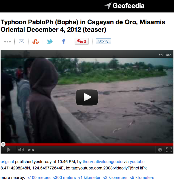
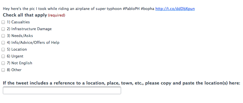
The Task Force first used Geofeedia to identify all relevant pictures/videos that were already geo-tagged by users. About a dozen were identified in this manner. Meanwhile, the SBTF partnered with the Qatar Foundation Computing Research Institute’s (QCRI) Crisis Computing Team to collect all tweets posted on December 5th with the hashtags endorsed by the Philippine Government. QCRI ran algorithms on the dataset to remove (1) all retweets and (2) all tweets without links (URLs). Given the very short turn-around time requested by the UN, the SBTF & QCRI Teams elected to take a two-pronged approach in the hopes that one, at least, would be successful.

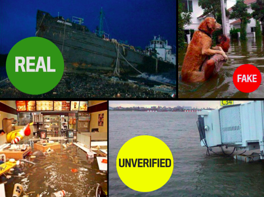
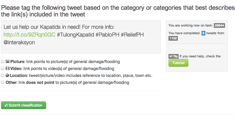
The first approach used  Crowdflower (CF), introduced here. Workers on Crowd-flower were asked to check each Tweet’s URL and determine whether it linked to a picture or video. The purpose was to filter out URLs that linked to news articles. CF workers were also asked to assess whether the tweets (or pictures/videos) provided sufficient geographic information for them to be mapped. This methodology worked for about 2/3 of all the tweets in the database. A review of lessons learned and how to use Crowdflower for disaster response will be posted in the future.

Pybossa Philippines

The second approach was made possible thanks to a partnership with PyBossa, a free, open-source crowdsourcing and micro-tasking platform. This effort is described here in more detail. While we are still reviewing the results of this approach, we expect that  this tool will become the standard for future activations of the Digital Humanitarian Network. I will thus continue working closely with the PyBossa team to set up a standby PyBossa platform ready-for-use at a moment’s notice so that Digital Humanitarians can be fully prepared for the next activation.

Now for the results of the activation. Within 10 hours, over 20,000 tweets were analyzed using a mix of methodologies. By 4.30am Geneva time, the combined efforts of HR and the SBTF resulted in a database of 138 highly annotated tweets. The following meta-data was collected for each tweet:

  • Media Type (Photo or Video)
  • Type of Damage (e.g., large-scale housing damage)
  • Analysis of Damage (e.g., 5 houses flooded, 1 damaged roof)
  • GPS coordinates (latitude/longitude)
  • Province
  • Region
  • Date
  • Link to Photo or Video

The vast majority of curated tweets had latitude and longitude coordinates. One SBTF volunteer (“Mapster”) created this map below to plot the data collected. Another Mapster created a similar map, which is available here.

Pablo Crisis Map Twitter Multimedia

The completed database was shared with UN OCHA at 4.55am Geneva time. Our humanitarian colleagues are now in the process of analyzing the data collected and writing up a final report, which they will share with OCHA Philippines today by 5pm Geneva time.

Needless to say, we all learned a lot thanks to the deployment of the Digital Humanitarian Network in the Philippines. This was the first time we were activated to carry out a task of this type. We are now actively reviewing our combined efforts with the concerted aim of streamlining our workflows and methodologies to make this type effort far easier and quicker to complete in the future. If you have suggestions and/or technologies that could facilitate this kind of digital humanitarian work, then please do get in touch either by posting your ideas in the comments section below or by sending me an email.

Lastly, but definitely most importantly, a big HUGE thanks to everyone who volunteered their time to support the UN’s disaster response efforts in the Philippines at such short notice! We want to publicly recognize everyone who came to the rescue, so here’s a list of volunteers who contributed their time (more to be added!). Without you, there would be no database to share with the UN, no learning, no innovating and no demonstration that digital volunteers can and do make a difference. Thank you for caring. Thank you for daring.

Digital Humanitarian Response to Typhoon Pablo in Philippines

Update: Please help the UN! Tag tweets to support disaster response!

The purpose of this post is to keep notes on our efforts to date with the aim of revisiting these at a later time to write a more polished blog post on said efforts. By “Digital Humanitarian Response” I mean the process of using digital tech-nologies to aid disaster response efforts.

pablo-photos

My colleagues and I at QCRI have been collecting disaster related tweets on Typhoon Pablo since Monday. More specifically, we’ve been collecting those tweets with the hashtags officially endorsed by the government. There were over 13,000 relevant tweets posted on Tuesday alone. We then paid Crowdflower workers to micro-task the tagging of these hash-tagged tweets based on the following categories (click picture to zoom in):

Crowdflower

Several hundred tweets were processed during the first hour. On average, about 750 tweets were processed per hour. Clearly, we’d want that number to be far higher, (hence the need to combine micro-tasking with automated algorithms, as explained in the presentation below). In any event, the micro-tasking could also be accelerated if we increased the pay to Crowdflower workers. As it is, the total cost for processing the 13,000+ tweets came to about $250.

The database of processed tweets was then shared (every couple hours) with the Standby Volunteer Task Force (SBTF). SBTF volunteers (“Mapsters”) only focused on tweets that had been geo-tagged and tagged as relevant (e.g., “Casaualties,” “Infrastructure Damage,” “Needs/Asks,” etc.) by Crowdflower workers. SBTF volunteers then mapped these tweets on a Crowdmap as part of a training exercise for new Mapsters.

Geofeedia Pablo

We’re now talking with a humanitarian colleague in the Philippines who asked whether we can identify pictures/videos shared on social media that show damage, bridges down, flooding, etc. The catch is that these need to have a  location and time/date for them to be actionable. So I went on Geofeedia and scraped the relevant content available there (which Mapsters then added to the Crowdmap). One constraint of Geofeedia (and many other such platforms), however, is that they only map content that has been geo-tagged by users posting said content. This means we may be missing the majority of relevant content.

So my colleagues at QCRI are currently pulling all tweets posted today (Wed-nesday) and running an automated algorithm to identify tweets with URLs/links. We’ll ask Crowdflower workers to process the most recent tweets (and work backwards) by tagging those that: (1) link to pictures/video of damage/flooding, and (2) have geographic information. The plan is to have Mapsters add those tweets to the Crowdmap and to share the latter with our humanitarian colleague in the Philippines.

There are several parts of the above workflows that can (and will) be improved. I for one have already learned a lot just from the past 24 hours. But this is the subject of a future blog post as I need to get back to the work at hand.

What Was Novel About Social Media Use During Hurricane Sandy?

We saw the usual spikes in Twitter activity and the typical (reactive) launch of crowdsourced crisis maps. We also saw map mashups combining user-generated content with scientific weather data. Facebook was once again used to inform our social networks: “We are ok” became the most common status update on the site. In addition, thousands of pictures where shared on Instagram (600/minute), documenting both the impending danger & resulting impact of Hurricane Sandy. But was there anything really novel about the use of social media during this latest disaster?

I’m asking not because I claim to know the answer but because I’m genuinely interested and curious. One possible “novelty” that caught my eye was this FrankenFlow experiment to “algorithmically curate” pictures shared on social media. Perhaps another “novelty” was the embedding of webcams within a number of crisis maps, such as those below launched by #HurricaneHacker and Team Rubicon respectively.

Another “novelty” that struck me was how much focus there was on debunking false information being circulated during the hurricane—particularly images. The speed of this debunking was also striking. As regular iRevolution readers will know, “information forensics” is a major interest of mine.

This Tumblr post was one of the first to emerge in response to the fake pictures (30+) of the hurricane swirling around the social media whirlwind. Snopes.com also got in on the action with this post. Within hours, The Atlantic Wire followed with this piece entitled “Think Before You Retweet: How to Spot a Fake Storm Photo.” Shortly after, Alexis Madrigal from The Atlantic published this piece on “Sorting the Real Sandy Photos from the Fakes,” like the one below.

These rapid rumor-bashing efforts led BuzzFeed’s John Herman to claim that Twitter acted as a truth machine: “Twitter’s capacity to spread false information is more than cancelled out by its savage self-correction.” This is not the first time that journalists or researchers have highlighted Twitter’s tendency for self-correction. This peer-reviewed, data-driven study of disaster tweets generated during the 2010 Chile Earthquake reports the same finding.

What other novelties did you come across? Are there other interesting, original and creative uses of social media that ought to be documented for future disaster response efforts? I’d love to hear from you via the comments section below. Thanks!