Tag Archives: Crisis Mapping

Top 5 iRevolution Posts of 2008

Here are the five most popular posts of 2008 on iRevolution:

  1. The Past and Future of Crisis Mapping
  2. Crisis Mapping Kenya’s Election Violence
  3. SMS and Web 2.0 for Mumbai Early Warning
  4. Intellipedia for Humanitarian Warning/Response
  5. Tracking Genocide by Remote Sensing

Happy Holidays!

Patrick Philippe Meier

Africa’s Crossborder Conflicts on Google Earth

This post is an update on the Humanitarian Information Unit’s (HIU) crisis map of crossborder conflicts in Africa. Dennis King at HIU kindly shared with me the shapefiles for the static conflict map so we could create a Google Earth layer from the data. When I write “we”, I actually mean my colleague Lela Prashad who is the co-Executive Director at NiJeL.org.

NiJeL is a member of CrisisMappers and they are doing some phenomenal work in the mapping space. In fact, they have two excellent projects in the Top 15 of USAID’s Development 2.0 Challenge. When Dennis King agreed to share the HIU data, I therefore turned to Lela to create the Google Earth layer.

HIU

The main conclusion to draw from this little exercise is that time matters. Not exactly earth shattering news but let me spell it out nevertheless. Because the underlying data is static, visualizing the data on Google Earth is not as compelling as mapping dynamic event-data, such as HHI’s Crisis Map of Kenya’s Post-Election Violence. That said, the Google Earth layer at least provides the user with far more “spatial freedom” than the PDF version.

HIU2

The Google Earth layer is available here for download. The Harvard Humanitarian Initiative (HHI) and I hope to collaborate with NiJeL again in early 2009 to create a dynamic (space-time) crisis map of the recent Georgia/Russia conflict. In the mean time, many, many thanks to both Lela and Dennis for their time and kind support.

Patrick Philippe Meier

Depiction – Decision Support for Crisis Mapping

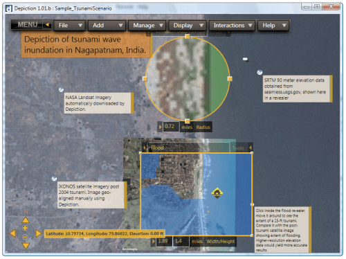
I got word from my colleague Jim Benson at Modus Cooperandi that Depiction just launched. Depiction is a GIS based simulation (what-if-mapping) tool that can quickly building data visualizations and run them through a variety of scenarios using the following three easy steps:

Depiction

  • Location: Select a geographic area, then download or import satellite images, street maps, digital images, spreadsheets, shape files, or even live reports.
  • Integration: Your data immediately becomes interactive, influencing the behavior of other elements. You can add, edit, or even create new elements and make rules to govern the interactions between elements in your Depiction.
  • Exploration: Organize and display data where and when you want it. Measure, count, annotate and more.

I really like the ideas that this platform brings together: crisis mapping, simulation and decision support. Being able to play out what-if scenarios is key to making more informed decisions. For example, this interactive component allows users to identify the best route for an evacuation or the delivery of relief supplies should the primary route become inaccessible.  The platform can also receive live reports via email and have them mapped in real time.  I hope the developers will add an SMS component. In any case, Depiction brings crisis mapping closer to serious gaming.

One scenario the group makes available for free trial purposes is a tsunami hitting India. “Depiction provides a what-if scenario map to explore the functionality of the platform. The scenario shows imagery and data for Nagapatnam, India, including a what-if look at a 15-foot tsunami inundation. All of the data in this tsunami scenario is freely available from the internet.”

Depiction2

Finally, I also like the fact that their tutorials are all video based, far more compelling than a text-based manual.

Patrick Philippe Meier

From Social Mapping to Crisis Mapping

I recently came across the topic of social mapping thanks to a former student who is now doing some excellent people-centered development work in Haiti. Social mapping is about participatory mapping but the purpose of social mapping is not to build exact replicas of one’s environment albeit at a smaller scale. Social mapping is carried out without any rulers; simply with some pens or crayons and whatever paper is available.

The goal of social mapping is to capture local knowledge and social perceptions on a map:

The map will contain information both about physical features of the locality and about people’s attitudes to their community. Often the process of making the map – finding out about the local context and different views on what should go on the map – is just as important as the information the map contains.

Maps can also be used as simple planning. monitoring and evaluation tools. ‘Before’ and ‘after’ maps can be used to record what existed in a community at the beginning of a project and what changes occurred a year later (1).

Social maps are not drawn to scale and are not meant to be complete. The relative size of the symbols  representing available resources and infrastructure may denote their importance to a community. Likewise, the relative distance on the map of these assets may also denote how accessible or inaccessible they are to the local community.

Social mapping excercises may capture tacit knowledge of conflict triggers that would simply not surface clearly using a computer-designed map. These maps provide “The View From Below” as opposed to the top-down myopic perspective of “Seeing Like A State.” Below are a few examples of social maps that I have recently come across.

Social Map from Sudan

social map Sudan

Social Map from West Bengal

Social Map West Bengal

Social Map from Orissa

Social Map Orissa

Social Map from Philippines

Social Map Philippines

Patrick Philippe Meier

3D Crisis Mapping for Disaster Simulation Training

I recently had a fascinating meeting in Seattle with Larry Pixa, Microsoft’s Senior Manager for Disaster Preparedness & Response Program. What I thought would be a half-hour meeting turned into an engaging two-hour conversation. I wish we had had even more time.

Acron

Harvard Humanitarian Initiative (HHI) co-Chair Dr. Jennifer Leaning and I had a conversation two years ago on the need to merge disaster training with serious gaming and 3-D crisis mapping. Her vision, for example, was to recreate downtown Monrovia as a virtual world with avatars and have both live and manual data feeds simulate the virtual environment, a.k.a. immersive realism meets reality mining.

This world would then be used to create scenarios for disaster preparedness and response training, much like my colleagues at ICNC have done by developing a serious game called “A Force More Powerful” which uses artificial intelligence and real-world scenarios to train nonviolent activists.

Force More Powerful

Larry and his colleagues at Acron are pushing the envelope of disaster simulation for training purposes. They are integrating Acron’s serious games know-how with Microsoft ESP and the video game engine of Microsoft’s Flight Simulator platform with dynamic crisis mapping to develop a pilot that closely resembles the vision set out by Jennifer back in 2006. I personally thought we were still a year or two away from having a pilot. Not so. Larry will be presenting the pilot at HHI’s Humanitarian Health Summit in March 2009.

The goal for the pilot, or as we the United Nation’s World Food Program (WFP) call it, the “software-based proof of concept,” is to establish the proof of concept into a “training platform” to be combined with training materials that will serve as a demonstrate the tool to governments and international organizations worldwide; particularly vis-a-vis training to build preparedness & response capabilities and informed decision making for the adoption of technologies to enable or improve disaster response and crisis management.

So our goal is to engage with any/all appropriate agencies to provide training against the “training platform”; the training will be based on some key scenarios in Bangladesh acquired through the partnership between WFP and Microsoft.

Successful training requires that we actually remember the training. But we all know from conventional class learning that we retain little of what we read. On the other hand, our memory retains almost all of what we do and that, according to Larry, is what his new disaster simulations platform seeks to achieve.

Microsoft

What I find particularly compelling about Larry’s work is that the tool he is developing can be used for both disaster training and actual disaster response. That is, once trainees become familiar with the platform, they can use it for in situ disaster response thanks to live data feeds rendering the “virtual” world in quasi-real time. This should eventually enable disaster responders to test out several response scenarios and thereby select the most effective one, all in quasi-real time.

Patrick Philippe Meier

Covering the DRC – opportunities for Ushahidi

This blog entry was inspired by Ory’s recent blog post on “Covering the DRC – challenges for Ushahidi.” The thoughts that follow were originally intended for the comments section of Ushahidi’s blog but they surreptitiously morphed into a more in depth reflection. First, however, many thanks to Ory for taking the time to share the team’s experience in the DRC over the past few weeks.

Much of what Ory writes resonates with my own experience in conflict early warning/response. While several factors contribute to the challenge of Ushahidi’s deployment, I think one in particular regrettably remains a constant in my own experience: the link to early response, or rather the lack thereof. The main point I want to make is this: if Ushahidi addresses the warning-response gap, then Ushahidi-DRC is likely to get far more traction on the ground than it currently is.

To explain, if Ushahidi is going to provide a platform that enables the crowdsourcing of crisis information, then it must also facilitate the crowdsourcing of response. Why? For otherwise the tool is of little added value to the individuals who constitute said crowd, ie, the Bottom of the Pyramid (BoP) in conflict zones. If individuals at the BoP don’t personally benefit from Ushahidi, then they should not be spending time/resources on communicating alerts. As one of my dissertation committee members, Peter Walker wrote in 1991 vis-a-vis famine early warning/response systems in Africa:

It must be clearly understood that the informants are the most important part of the information system. It is their information […] upon which the rest of the system is based […]. The informant must be made to feel, quite rightly, that he or she is an important part of the system, not just a minion at the base, for ever giving and never receiving.

In 1988 (that’s write ’88), Kumar Rupesinghe published a piece on disaster early warning systems in which he writes that civil society has

… a vital role to play in the development of a global, decentralized early warning system. They now need the capacity to build information systems and to provide the basis for rapid information exchange. In general [civil society] will have to confront the monopolization of information with a demand for the democratic access to information technology.

Information on local concerns must be available to the local structures in society. The right to be informed and the right to information have to find entry into international discussions.

Ushahidi’s crowdsourcing approach has the potential to reverse the monopolization of information and thereby create a demand for access to conflict information. Indeed, Ushahidi is starting to influence the international discourse on early warning (forthcoming reports by the EC and OECD). However, it is the mobile crowdsourcing of response that will create value and thereby demand by the BoP for Ushahidi.

Put it this way, Twitter would be far less useful if it were limited to one (and only one) global website on which all tweets were displayed. What makes Twitter valuable is the ability to select specific feeds, and to have those feeds pushed to us effortlessly, using Twhirl or similar programs, and displayed (in less than 141 characters) on our computer screens in real time. At the moment, Ushahidi does the equivalent of the former, but not the latter.

Yet the latter is precisely where the added value to the individual lies. An NGO may be perfectly content with Ushahidi’s current set up, but NGOs do not constitute the BoP; they are not the “fundamental unit” of crowdsourcing—individuals are. (Just imagine if Wikipedia entries could only be written/edited by NGOs).

This mismatch in fundamental units is particularly prevalent in the conflict early warning/response field. NGOs do not have the same incentive structures as individuals. If individuals in at-risk communities were to receive customized alerts on incidents in/near their own town (if they themselves send alerts to Ushahidi), then that response presents a far more direct and immediate return on investment. Receiving geo-specific alerts in quasi real-time improves situational awareness and enables an individual to take a more informed decision about how to respond to the alerts. That is added value. The BoP would have an incentive, empowerment, to crowdsource crisis information.

Here’s a scenario: if an individual texts in an alert for the first time, Ushahidi should: (1) contact that person as soon as possible to thank them for their alert and, (2) ask them what SMS alerts they would like to receive and for what town(s). I guarantee you this person will spread the word through their own social network and encourage others to send in alerts so that they too may receive alerts. (Incidentally, Erik, this is the strategy I would recommend in places like Jos, Nigeria).

In summary, while the Ushahidi team faces a multitude of other challenges in the DRC deployment, I believe that addressing the early response dimension will render the other challenges more manageable. While the vast majority of conflict early warning systems are wired vertically (designed by outsiders for outsiders), the genius of Ushahidi is the paradigm shift to horizontally wired, local early warning/response, aka crowdsourcing.

In a way, it’s very simple: If Ushahidi can create value for the BoP, the client base will necessarily expand (substantially). To this end, Ushahidi should not be pitched as an early warning system, but rather as an early response service. This is one of the reasons why I am trying hard to encourage the operationalization of mobile crisis mapping.

How to Visualize the Immense – Physics

I’m a wanna-be physicist; which is probably why one of my most memorable summers was spent at the Sante Fe Institute’s (SFI) Complex Systems Summer School (CSSS) in 2006.

But this is not a recent fad, my International Baccalaureate (IB) courses in 1996 included advanced physics, advanced calculus and graph theory and advanced computer science. One of my favorite books at the time was Numerical Recipes in C. In fact, my extended essay for the IB was actually a software program that determines the degree of randomness of stellar distributions. This required writing code that could determine what constituted a star in any given picture with variable resolution, i.e., pattern recognition. Oh, the good old days.

My interest in the hard sciences explains why I’m still an avid reader of scientific journals, and why I just came across a special edition of The New Journal of Physics focused on visualization in physics. Some excerpts and pictures:

Early on in this twenty-first century, scientific communities are just starting to explore the potential of digital visualization. Whether visualization is used to represent and communicate complex concepts, or to understand and interpret experimental data, or to visualize solutions to complex dynamical equations, the basic tools of visualization are shared in each of these applications and implementations.

The effectiveness of visualization arises by exploiting the unmatched capability of the human eye and visual cortex to process the large information content of images. In a brief glance, we recognize patterns or identify subtle features even in noisy data, something that is difficult or impossible to achieve with more traditional forms of data analysis.

The advantages of visualization found for simulated data also hold for real world data as well. With the application of computerized acquisition many scientific disciplines are witnessing exponential growth rates of the volume of accumulated raw data [c.f., crowdsourcing conflict data], which often makes it daunting to condense the information into a manageable form, a challenge that can be addressed by modern visualization techniques.

spacetime

This image shows a simulation of the distortion due to a spaceship inside a warp bubble moving past the Earth and Moon, as seen from space.

portfolio1

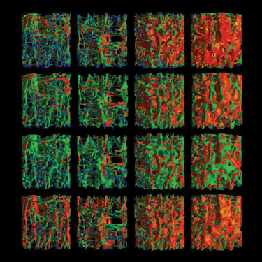
3D images of human bone can help predict fracture risk due to osteoporosis.

As one article in the Special Edition noted, visualization tools can be used to show internal properties of complex networks. As more raw, geo-referenced crisis data is collected, our field of conflict early warning and crisis mapping will need to start making sense of the volumes of new data. This is where the new field of Crisis Mapping Analytics (CMA) begins.

The purpose of CMA is to develop metrics and methods to identify patterns in conflict data over space and time. For more on CMA, see these two blog entries on “Crisis Mapping, Dynamic Visualization and Pattern Recognition” and “Tracking Genocide by Remote Sensing.” My hunch is that we should be talking to our colleagues in the hard sciences for tips on data visualization and patterns analysis.

Patrick Philippe Meier

Crisis Maps of Mumbai (Updated)

Here are initial crisis maps of Mumbai, please let me know if you know of others.

CrisisWire:

picture-51

GeoCommons:

picture-33

Al Jazeera Google Map:

picture-24

My Fox Chicago:

picture-14

Patrick Philippe Meier

Crisis Mapping Africa’s Crossborder Conflicts

My colleague Dennis King just sent me update on the Humanitarian Information Unit’s (HIU) project, “Africa: Conflicts Without Borders 2007-2008.”

Instead of the usual depiction of conflicts as countrywide and defined by national boundaries, this map displays distinct conflict-affected areas in Africa as sub-national and transnational pockets of insecurity, violence, and armed aggression.  Areas of conflict were drawn around locations of reported conflict incidents in 2007 and 2008, as well as concentrations of internally displaced persons and cross-border rebel bases and refugee camps in neighboring countries.

This depiction of areas of conflict more accurately displays where conflict has been occurring in Africa and the sub-national and transnational nature of these conflicts.  In a follow-on project, this new visualization will be used to analyze the relationship between conflict and geo-spatial factors that are also not related to national boundaries, such as topography, natural resources, demographic distributions, and climatic hazards.

A PDF of the map below is available here.

HIU

The map categorizes conflict-affected areas into three types of conflict:

Armed Conflict, Inter-communal Strife, and Political Violence.  In many cases, armed conflicts and political violence are based on inter-communal strife.  The locations of violent food riots, pirate attacks (as of October 2008) and targeted attacks associated with terrorism during 2007-2008 have also been plotted on this map.  Disputed border conflicts are also identified on this map.

HIU zoom

As I have suggested in earlier blogs, I continue to be surprised that crisis maps are still shared as PDFs or JPGs. The above data should be made available in KML with a simple interface that enables users to query the data they are visualizing. At the very minimum, we should be able to visualize the data over time. I find static data less and less compelling in the context of crisis mapping.

For a Google Earth Layer of the above map, please see my follow up blog post.

Patrick Philippe Meier