In 2009 I wrote this blog post entitled “The Biggest Problem with Crisis Maps.” The gist of the post: crises are dynamic over time and space but our crisis maps are 2D and static. More than half-a-decade later, Digital Humanitarians have still not escaped from Plato’s Cave. Instead, they continue tracing 2D shadows cast by crisis data projected on their 2D crisis maps. Is there value in breaking free from our 2D data chains? Yes. And the time will soon come when Digital Humanitarians will have to make a 3D run for it.
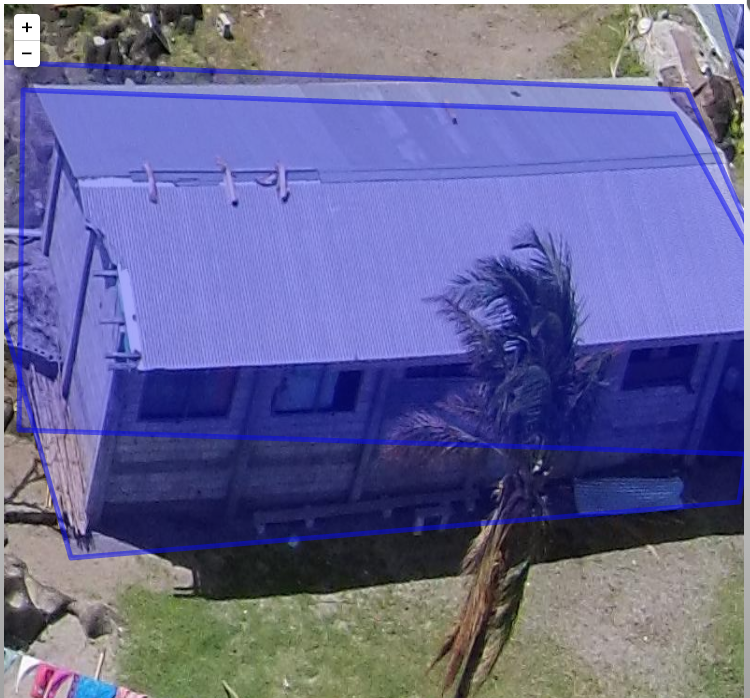
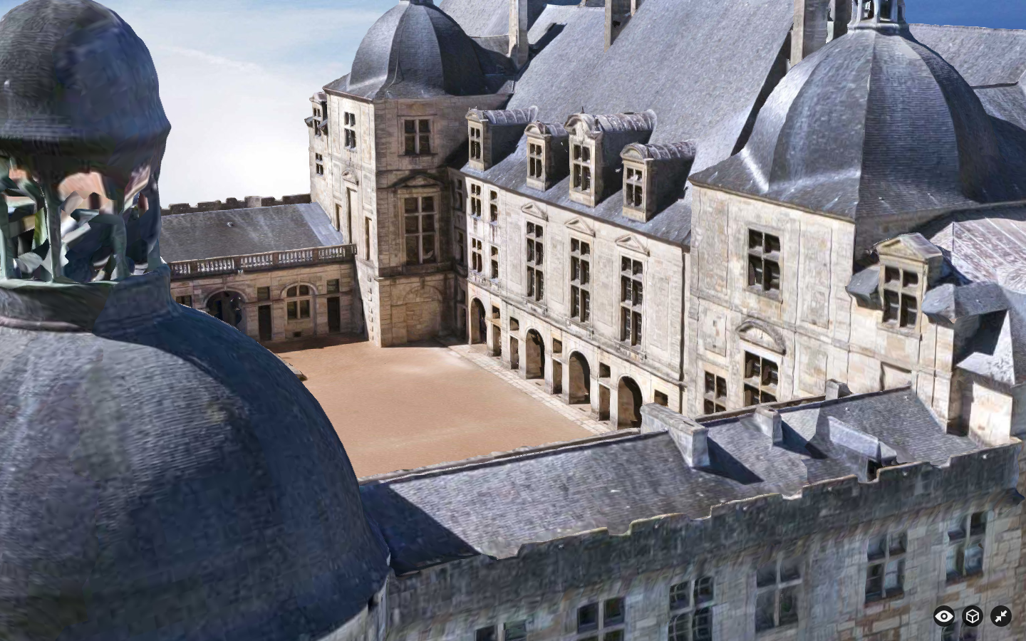
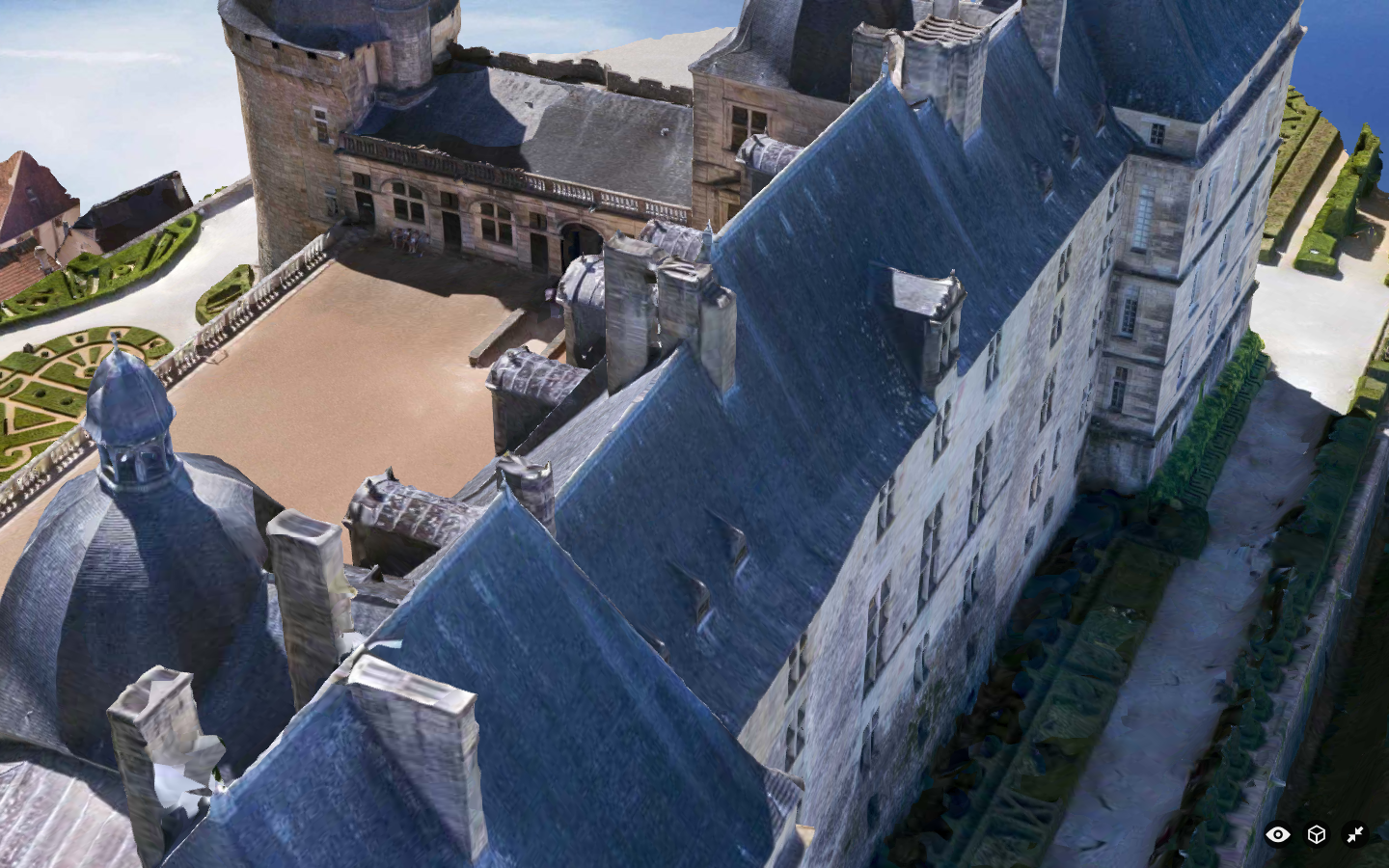
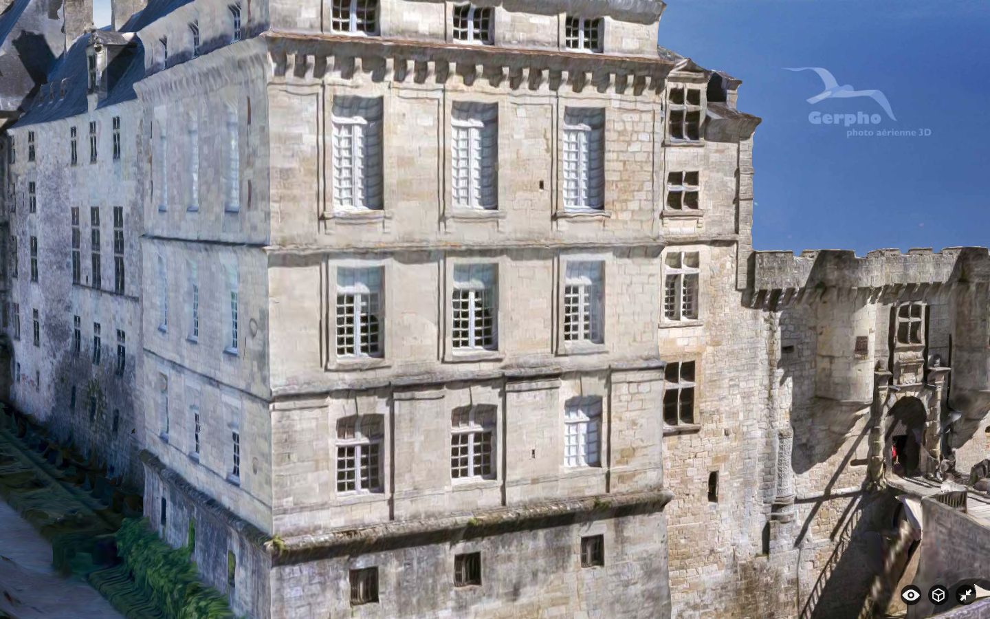
Aerial imagery captured by UAVs (Unmanned Aerial Vehicles) can be used to create very high-resolution 3D point clouds like the one below. It only took a 4-minute UAV flight to capture the imagery for this point cloud. Of course, the processing time to convert the 2D imagery to 3D took longer. But solutions already exist to create 3D point clouds on the fly, and these solutions will only get more sophisticated over time.
Stitching 2D aerial imagery into larger “mosaics” is already standard practice in the UAV space. But that’s so 2014. What we need is the ability to stitch together 3D point clouds. In other words, I should be able to mesh my 3D point cloud of a given area with other point clouds that overlap spatially with mine. This would enable us to generate high-resolution 3D point clouds for larger areas. Lets call these accumulated point clouds Cumulus Clouds. We could then create baseline data in the form of Cumulus Clouds. And when a disaster happens, we could create updated Cumulus Clouds for the affected area and compare them with our baseline Cumulus Cloud for changes. In other words, instead of solely generating 2D mapping data for the Missing Maps Project, we could add Cumulus Clouds.
Meanwhile, breakthroughs in Virtual Reality will enable Digital Humanitarians to swarm through these Cumulus Clouds. Innovations such as Oculus Rift, the first consumer-targeted virtual reality headsets, may become the pièce de résistance of future Digital Humanitarians. This shift to 3D doesn’t mean that our methods for analyzing 2D crisis maps are obsolete when we leave Plato’s Cave. We simply need to extend our microtasking and crowdsourcing solutions to the 3D space. As such, a 3D “tasking manager” would just assign specific areas of a Cumulus Cloud to individual Digital Jedis. This is no different to how field-based disaster assessment surveys get carried out in the “Solid World” (Real Word). Our Oculus headsets would “simply” need to allow Digital Jedis to “annotate” or “trace various” sections of the Cumulus Clouds just like they already do with 2D maps; otherwise we’ll be nothing more than disaster tourists.
The shift to 3D is not without challenges. This shift necessarily increases visual complexity. Indeed, 2D images are a radical (and often welcome) simplification of the Solid World. This simplification comes with a number of advantages like reducing the signal to noise ratio. But 2D imagery, like satellite imagery, “hides” information, which is one reason why imagery-interpretation and analysis is difficult, often requiring expert training. But 3D is more intuitive; 3D is the world we live in. Interpreting signs of damage in 3D may thus be easier than doing so with a lot less information in 2D. Of course, this also depends on the level of detail required for the 3D damage assessments. Regardless, appropriate tutorials will need to be developed to guide the analysis of 3D point clouds and Cumulus Clouds. Wait a minute—shouldn’t existing assessment methodologies used for field-based surveys in the Solid World do the trick? After all, the “Real World” is in 3D last time I checked.
Ah, there’s the rub. Some of the existing methodologies developed by the UN and World Bank to assess disaster damage are largely dysfunctional. Take for example the formal definition of “partial damage” used by the Bank to carry out their post-disaster damage and needs assessments: “the classification used is to say that if a building is 40% damaged, it needs to be repaired. In my view this is too vague a description and not much help. When we say 40%, is it the volume of the building we are talking about or the structural components?” The question is posed by a World Bank colleague with 15+ years of experience. Since high-resolution 3D data enables more of us to more easily see more details, our assessment methodologies will necessarily need to become more detailed both for manual and automated analysis solutions. This does add more complexity but such is the price if we actually want reliable damage assessments regardless.
Isn’t it ironic that our shift to Virtual Reality may ultimately improve the methodologies (and thus data quality) of field-based surveys carried out in the Solid World? In any event, I can already “hear” the usual critics complaining; the usual theatrics of cave-bound humanitarians who eagerly dismiss any technology that appears after the radio (and maybe SMS). Such is life. Moving along. I’m exploring practical ways to annotate 3D point clouds here but if anyone has additional ideas, do please get in touch. I’m also looking for any solutions out there (imperfect ones are fine too) that can can help us build Cumulus Clouds—i.e., stitch overlapping 3D point clouds. Lastly, I’d love to know what it would take to annotate Cumulus Clouds via Virtual Reality. Thanks!
Acknowledgements: Thanks to colleagues from OpenAerialMap, Cadasta and MapBox for helping me think through some of the ideas above.
Humanitarian and development organizations like the United Nations and the World Bank typically carry out disaster damage and needs assessments following major disasters. The ultimate goal of these assessments is to measure the impact of disasters on the society, economy and environment of the affected country or region. This includes assessing the damage caused to building infrastructure, for example. These assessment surveys are generally carried out in person—that is, on foot and/or by driving around an affected area. This is a very time-consuming process with very variable results in terms of data quality. Can 3D (Point Clouds) derived from very high resolution aerial imagery captured by UAVs accelerate and improve the post-disaster damage assessment process? Yes, but a number of challenges related to methods, data & software need to be overcome first. Solving these challenges will require pro-active cross-disciplinary collaboration.
The following three-tiered scale is often used to classify infrastructure damage: “1) Completely destroyed buildings or those beyond repair; 2) Partially destroyed buildings with a possibility of repair; and 3) Unaffected buildings or those with only minor damage . By locating on a map all dwellings and buildings affected in accordance with the categories noted above, it is easy to visualize the areas hardest hit and thus requiring priority attention from authorities in producing more detailed studies and defining demolition and debris removal requirements” (UN Handbook). As one World Bank colleague confirmed in a recent email, “From the engineering standpoint, there are many definitions of the damage scales, but from years of working with structural engineers, I think the consensus is now to use a three-tier scale – destroyed, heavily damaged, and others (non-visible damage).”
That said, field-based surveys of disaster damage typically overlook damage caused to roofs since on-the-ground surveyors are bound by the laws of gravity. Hence the importance of satellite imagery. At the same time, however, “The primary problem is the vertical perspective of [satellite imagery, which] largely limits the building information to the roofs. This roof information is well suited for the identification of extreme damage states, that is completely destroyed structures or, to a lesser extent, undamaged buildings. However, damage is a complex 3-dimensional phenomenon,” which means that “important damage indicators expressed on building façades, such as cracks or inclined walls, are largely missed, preventing an effective assessment of intermediate damage states” (Fernandez Galaretta et al. 2014).
This explains why “Oblique imagery [captured from UAVs] has been identified as more useful, though the multi-angle imagery also adds a new dimension of complexity” as we experienced first-hand during the World Bank’s UAV response to Cyclone Pam in Vanuatu (Ibid, 2014). Obtaining photogrammetric data for oblique images is particularly challenging. That is, identifying GPS coordinates for a given house pictured in an oblique photograph is virtually impossible to do automatically with the vast majority of UAV cameras. (Only specialist cameras using gimbal mounted systems can reportedly infer photogrammetric data in oblique aerial imagery, but even then it is unclear how accurate this inferred GPS data is). In any event, oblique data also “lead to challenges resulting from the multi-perspective nature of the data, such as how to create single damage scores when multiple façades are imaged” (Ibid, 2014).
To this end, my colleague Jorge Fernandez Galarreta and I are exploring the use of 3D (point clouds) to assess disaster damage. Multiple software solutions like Pix4D and PhotoScan can already be used to construct detailed point clouds from high-resolution 2D aerial imagery (nadir and oblique). “These exceed standard LiDAR point clouds in terms of detail, especially at façades, and provide a rich geometric environment that favors the identification of more subtle damage features, such as inclined walls, that otherwise would not be visible, and that in combination with detailed façade and roof imagery have not been studied yet” (Ibid, 2014).
Unlike oblique images, point clouds give surveyors a full 3D view of an urban area, allowing them to “fly through” and inspect each building up close and from all angles. One need no longer be physically onsite, nor limited to simply one façade or a strictly field-based view to determine whether a given building is partially damaged. But what does partially damaged even mean when this kind of high resolution 3D data becomes available? Take this recent note from a Bank colleague with 15+ years of experience in disaster damage assessments: “In the [Bank’s] official Post-Disaster Needs Assessment, the classification used is to say that if a building is 40% damaged, it needs to be repaired. In my view this is too vague a description and not much help. When we say 40%, is it the volume of the building we are talking about or the structural components?”
In their recent study, Fernandez Galaretta et al. used point clouds to generate per-building damage scores based on a 5-tiered classification scale (D1-D5). They chose to compute these damage scores based on the following features: “cracks, holes, intersection of cracks with load-carrying elements and dislocated tiles.” They also selected non-damage related features: “façade, window, column and intact roof.” Their results suggest that the visual assessment of point clouds is very useful to identify the following disaster damage features: total collapse, collapsed roof, rubble piles, inclined façades and more subtle damage signatures that are difficult to recognize in more traditional BDA [Building Damage Assessment] approaches. The authors were thus able to compute a per building damage score, taking into account both “the overall structure of the building,” and the “aggregated information collected from each of the façades and roofs of the building to provide an individual per-building damage score.”
Fernandez Galaretta et al. also explore the possibility of automating this damage assessment process based on point clouds. Their conclusion: “More research is needed to extract automatically damage features from point clouds, combine those with spectral and pattern indicators of damage, and to couple this with engineering understanding of the significance of connected or occluded damage indictors for the overall structural integrity of a building.” That said, the authors note that this approach would “still suffer from the subjectivity that characterizes expert-based image analysis.”
Hence my interest in using crowdsourcing to analyze point clouds for disaster damage. Naturally, crowdsourcing alone will not eliminate subjectivity. In fact, having more people analyze point clouds may yield all kinds of disparate results. This is explains why a detailed and customized imagery interpretation guide is necessary; like this one, which was just released by my colleagues at the Harvard Humanitarian Initiative (HHI). This also explains why crowdsourcing platforms require quality-control mechanisms. One easy technique is triangulation: have ten different volunteers look at each point cloud and tag features in said cloud that show cracks, holes, intersection of cracks with load-carrying elements and dislocated tiles. Surely more eyes are better than two for tasks that require a good eye for detail.
Next, identify which features have the most tags—this is the triangulation process. For example, if one area of a point cloud is tagged as a “crack” by 8 or more volunteers, chances are there really is a crack there. One can then count the total number of distinct areas tagged as cracks by 8 or more volunteers across the point cloud to calculate the total number of cracks per façade. Do the same with the other metrics (holes, dislocated titles, etc.), and you can compute a per building damage score based on overall consensus derived from hundreds of crowdsourced tags. Note that “tags’ can also be lines or polygons; meaning that individual cracks could be traced by volunteers, thus providing information on the approximate lengths/size of a crack. This variable could also be factored in the overall per-building damage score.
In sum, crowdsourcing could potentially overcome some of the data quality issues that have already marked field-based damage assessment surveys. In addition, crowdsourcing could potentially speed up the data analysis since professional imagery and GIS analysts tend to already be hugely busy in the aftermath of major disasters. Adding more data to their plate won’t help anyone. Crowdsourcing the analysis of 3D point clouds may thus be our best bet.
So why hasn’t this all been done yet? For several reasons. For one, creating very high-resolution point clouds requires more pictures and thus more UAV flights, which can be time consuming. Second, processing aerial imagery to construct point clouds can also take some time. Third, handling, sharing and hosting point clouds can be challenging given how large those files quickly get. Fourth, no software platform currently exists to crowdsource the annotation of point clouds as described above (particularly when it comes to the automated quality control mechanisms that are necessary to ensure data quality). Fifth, we need more robust imagery interpretation guides. Sixth, groups like the UN and the World Bank are still largely thinking in 2D rather than 3D. And those few who are considering 3D tend to approach this from a data visualization angle rather than using human and machine computing to analyze 3D data. Seventh, this area, point cloud analysis for 3D feature detection, is still a very new area of research. Many of the methodology questions that need answers have yet to be answered, which is why my team and I at QCRI are starting to explore this area from the perspective of computer vision and machine learning.
The holy grail? Combining crowdsourcing with machine learning for real-time feature detection of disaster damage in 3D point clouds rendered in real-time via airborne UAVs surveying a disaster site. So what is it going to take to get there? Well, first of all, UAVs are becoming more sophisticated; they’re flying faster and for longer and will increasingly be working in swarms. (In addition, many of the new micro-UAVs come with a “follow me” function, which could enable the easy and rapid collection of aerial imagery during field assessments). So the first challenge described above is temporary as are the second and third challenges since computer processing power is increasing, not decreasing, over time.
This leaves us with the software challenge and imagery guides. I’m already collaborate with HHI on the latter. As for the former, I’ve spoken with a number of colleagues to explore possible software solutions to crowdsource the tagging of point clouds. One idea is simply to extend MicroMappers. Another is to add simple annotation features to PLAS.io and PointCloudViz since these platforms are already designed to visualize and interact with point clouds. A third option is to use a 3D model platform like SketchFab, which already enables annotations. (Many thanks to colleague Matthew Schroyer for pointing me to SketchFab last week). I’ve since had a long call with SketchFab and am excited by the prospects of using this platform for simple point cloud annotation.
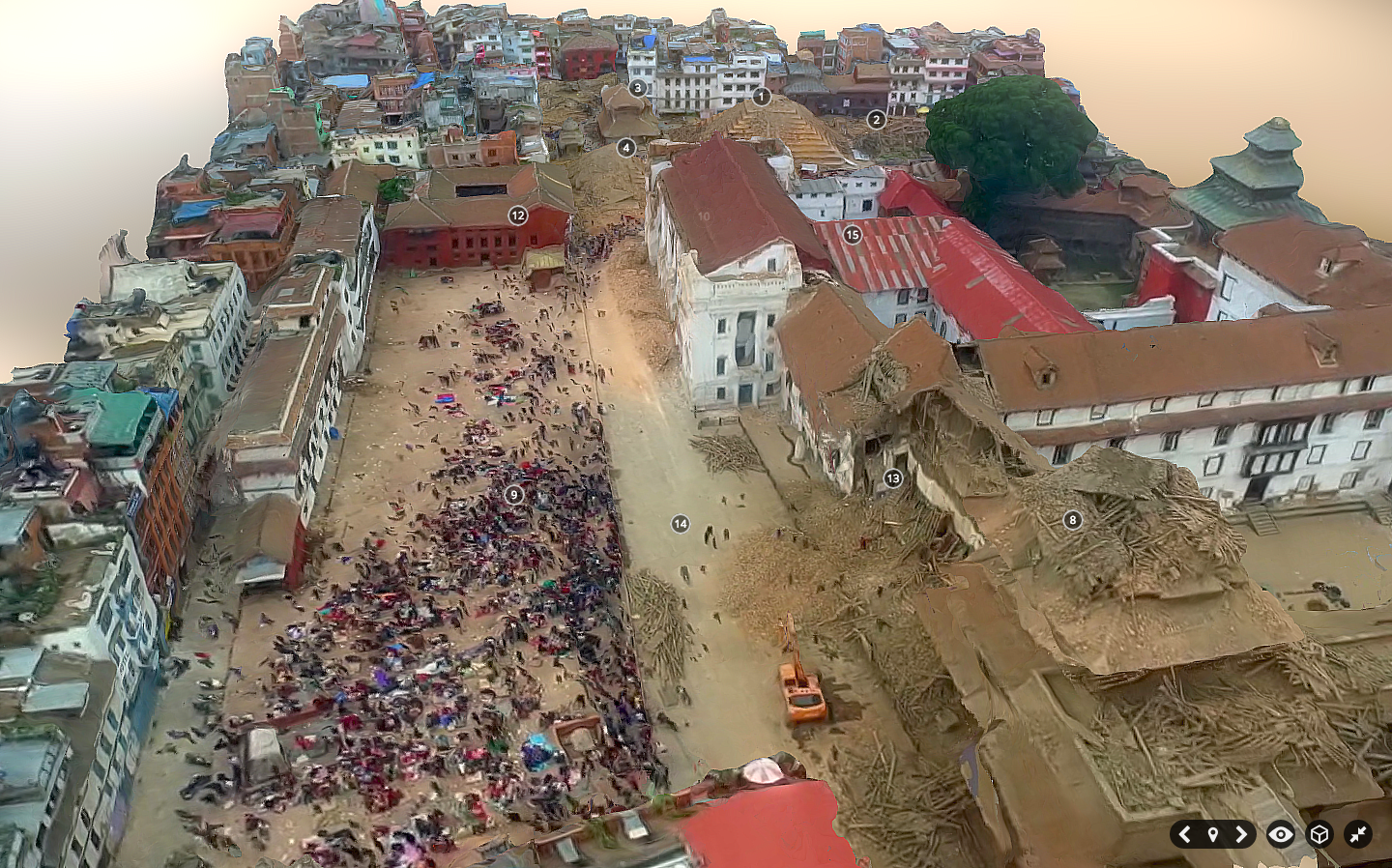
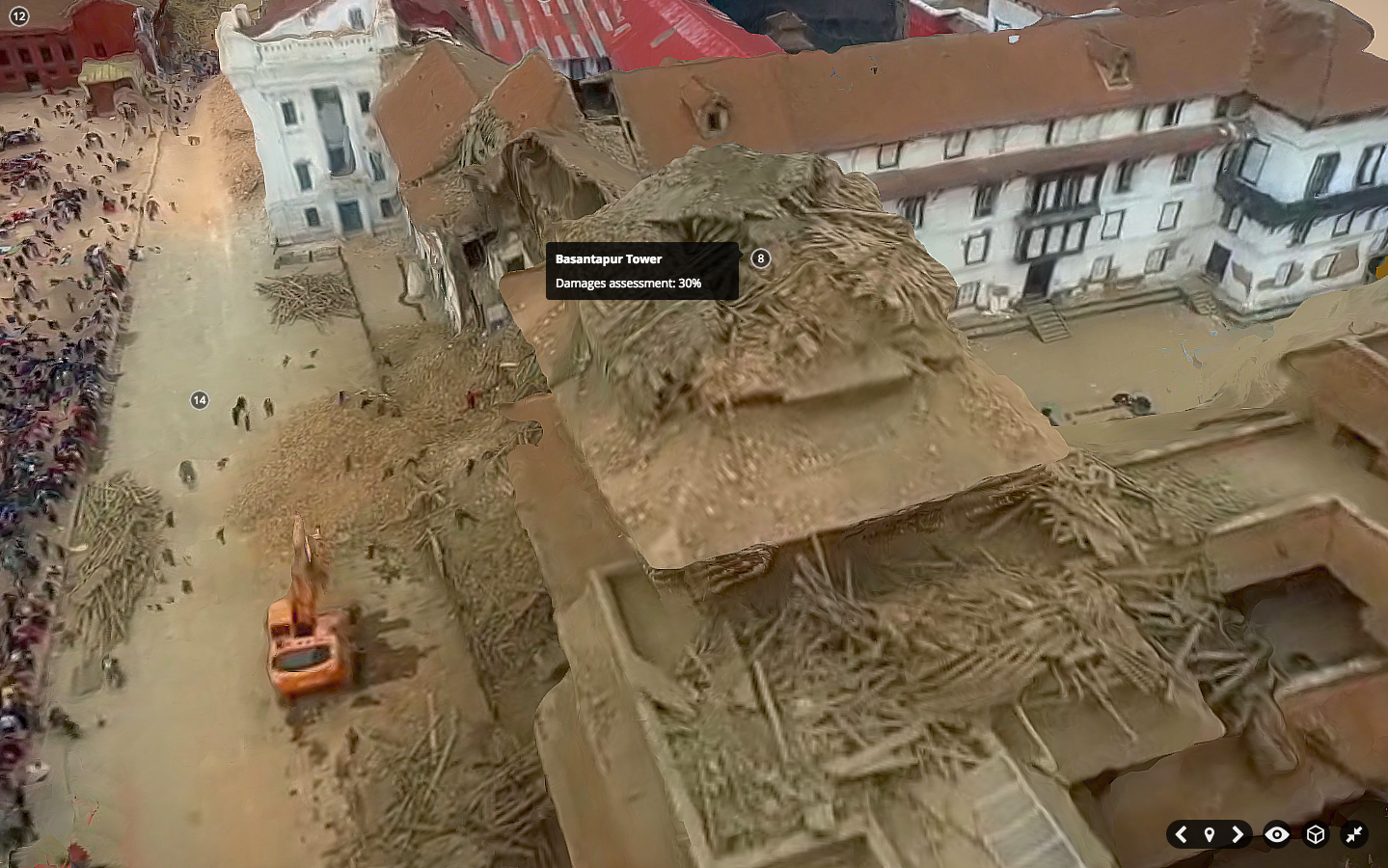
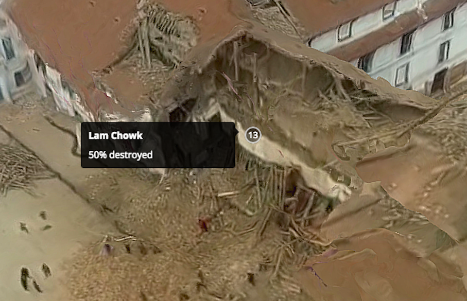
In fact, Matthew already used SketcFab to annotate a 3D model of Durbar Square neighborhood in downtown Kathmandu post-earthquake. He found an aerial video of the area, took multiple screenshots of this video, created a point cloud from these and then generated a 3D model which he annotated within SketchFab. This model, pictured below, would have been much higher resolution if he had the original footage or 2D images. Click pictures to enlarge.
Here’s a short video with all the annotations in the 3D model:
And here’s the link to the “live” 3D model. And to drive home the point that this 3D model could be far higher resolution if the underlying imagery had been directly accessible to Matthew, check out this other SketchFab model below, which you can also access in full here.
The SketchFab team has kindly given me a SketchFab account that allows up to 50 annotations per 3D model. So I’ll be uploading a number of point clouds from Vanuatu (post Cyclone Pam) and Nepal (post earthquakes) to explore the usability of SketchFab for crowdsourced disaster damage assessments. In the meantime, one could simply tag-and-number all major features in a point cloud, create a Google Form, and ask digital volunteers to rate the level of damage near each numbered tag. Not a perfect solution, but one that works. Ultimately, we’d need users to annotate point clouds by tracing 3D polygons if we wanted a more easy way to use the resulting data for automated machine learning purposes.
In any event, if readers do have any suggestions on other software platforms, methodologies, studies worth reading, etc., feel free to get in touch via the comments section below or by email, thank you. In the meantime, many thanks to colleagues Jorge, Matthew, Ferda & Ji (QCRI), Salvador (PointCloudViz), Howard (PLAS.io) and Corentin (SketchFab) for the time they’ve kindly spent brainstorming the above issues with me.
Point Clouds, or 3D models derived from high resolution aerial imagery, are in fact nothing new. Several software platforms already exist to reconstruct a series of 2D aerial images into fully fledged 3D-fly-through models. Check out these very neat examples from my colleagues at Pix4D and SenseFly:
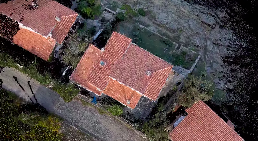
What does a castle, Jesus and a mountain have to do with humanitarian action? As noted in my previous blog post, there’s only so much disaster damage one can glean from nadir (that is, vertical) imagery and oblique imagery. Lets suppose that the nadir image below was taken by an orbiting satellite or flying UAV right after an earthquake, for example. How can you possibly assess disaster damage from this one picture alone? Even if you had nadir imagery for these houses before the earthquake, your ability to assess structural damage would be limited.
This explains why we also captured oblique imagery for the World Bank’s UAV response to Cyclone Pam in Vanuatu (more here on that humanitarian mission). But even with oblique photographs, you’re stuck with one fixed perspective. Who knows what these houses below look like from the other side; your UAV may have simply captured this side only. And even if you had pictures for all possible angles, you’d literally have 100’s of pictures to leaf through and make sense of.
What’s that famous quote by Henry Ford again? “If I had asked people what they wanted, they would have said faster horses.” We don’t need faster UAVs, we simply need to turn what we already have into Point Clouds, which I’m indeed hoping to do with the aerial imagery from Vanuatu, by the way. The Point Cloud below was made only from single 2D aerial images.
It isn’t perfect, but we don’t need perfection in disaster response, we need good enough. So when we as humanitarian UAV teams go into the next post-disaster deployment and ask what humanitarians they need, they may say “faster horses” because they’re not (yet) familiar with what’s really possible with the imagery processing solutions available today. That obviously doesn’t mean that we should ignore their information needs. It simply means we should seek to expand their imaginations vis-a-vis the art of the possible with UAVs and aerial imagery. Here is a 3D model of a village in Vanuatu constructed using 2D aerial imagery:
Now, the title of my blog post does lead with the word crowdsourcing. Why? For several reasons. First, it takes some decent computing power (and time) to create these Point Clouds. But if the underlying 2D imagery is made available to hundreds of Digital Humanitarians, we could use this distributed computing power to rapidly crowdsource the creation of 3D models. Second, each model can then be pushed to MicroMappers for crowdsourced analysis. Why? Because having a dozen eyes scrutinizing one Point Cloud is better than 2. Note that for quality control purposes, each Point Cloud would be shown to 5 different Digital Humanitarian volunteers; we already do this with MicroMappers for tweets, pictures, videos, satellite images and of course aerial images as well. Each digital volunteer would then trace areas in the Point Cloud where they spot damage. If the traces from the different volunteers match, then bingo, there’s likely damage at those x, y and z coordinate. Here’s the idea:
We could easily use iPads to turn the process into a Virtual Reality experience for digital volunteers. In other words, you’d be able to move around and above the actual Point Cloud by simply changing the position of your iPad accordingly. This technology already exists and has for several years now. Tracing features in the 3D models that appear to be damaged would be as simple as using your finger to outline the damage on your iPad.
What about the inevitable challenge of Big Data? What if thousands of Point Clouds are generated during a disaster? Sure, we could try to scale our crowd-sourcing efforts by recruiting more Digital Humanitarian volunteers, but wouldn’t that just be asking for a “faster horse”? Just like we’ve already done with MicroMappers for tweets and text messages, we would seek to combine crowdsourcing and Artificial Intelligence to automatically detect features of interest in 3D models. This sounds to me like an excellent research project for a research institute engaged in advanced computing R&D.
I would love to see the results of this applied research integrated directly within MicroMappers. This would allow us to integrate the results of social media analysis via MicroMappers (e.g, tweets, Instagram pictures, YouTube videos) directly with the results of satellite imagery analysis as well as 2D and 3D aerial imagery analysis generated via MicroMappers.
I thrive when working across disciplines, building diverse cross-cutting coalitions to create, translate and apply innovative strategies driven by shared values. This has enabled the 20+ organizations I’ve worked with, and those I’ve led, to accelerate meaningful and inclusive social impact.
Which is why I've been called a social entrepreneur and a translational leader by successful innovators. President Clinton once called me a digital pioneer, while recent colleagues describe me as kind, dedicated, values-driven, authentic, creative, ethical, and impactful.