Humanitarian organizations and emergency management offices are increasingly interested in capturing multimedia content shared on social media during crises. Last year, the UN Office for the Coordination of Humanitarian Affairs (OCHA) activated the Digital Humanitarian Network (DHN) to identify and geotag pictures and videos shared on Twitter that captured the damage caused by Typhoon Pablo, for example. So I’m collaborating with my colleague Hemant Purohit to analyze the multimedia content shared in the millions of tweets posted after the Category 5 Tornado devastated the city of Moore, Oklahoma on May 20th. The results are shared below along with details of a project I am spearheading at QCRI to provide disaster responders with relevant multimedia content in real time during future disasters.
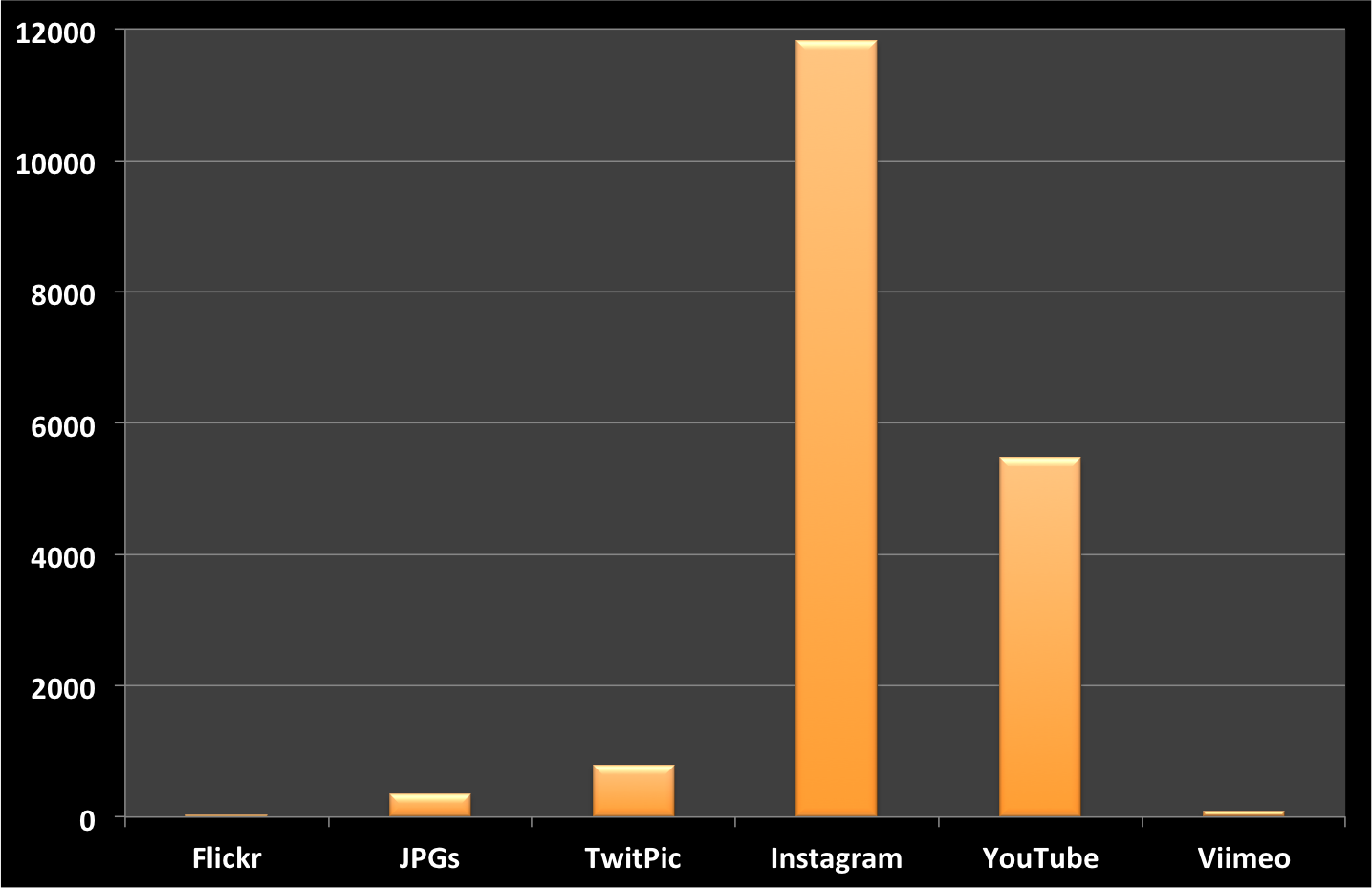
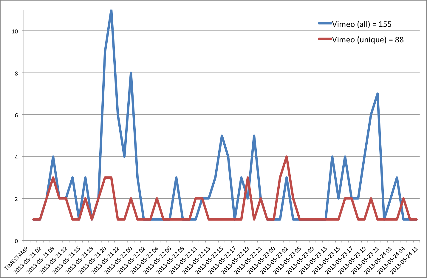
For this preliminary multimedia analysis, we focused on the first 48 hours after the Tornado and specifically on the following multimedia sources/types: Twitpic, Instagram, Flickr, JPGs, YouTube and Vimeo. JPGs refers to URLs shared on Twitter that include “.jpg”. Only ~1% of tweets posted during the 2-day period included URLs to multimedia content. We filtered out duplicate URLs to produce the following unique counts depicted above and listed below.
- Twitpic = 784
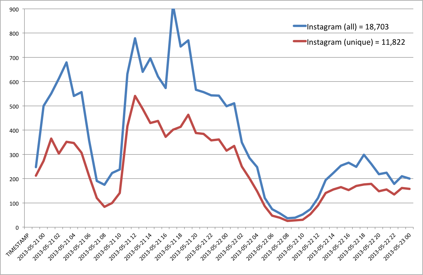
- Instagram = 11,822
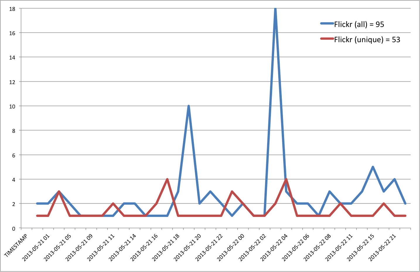
- Flickr = 33
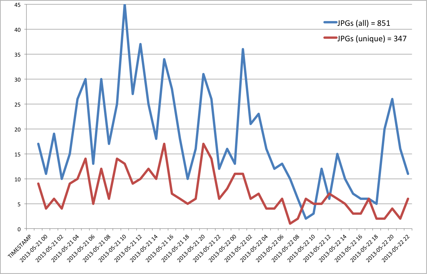
- JPGs = 347
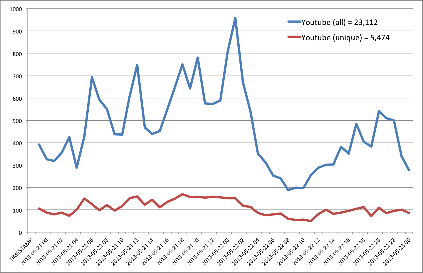
- YouTube = 5,474
- Vimeo = 88
Clearly, Instagram and Youtube are important sources of multimedia content during disasters. The graphs below (click to enlarge) depict the frequency of individual multimedia types by hour during the first 48 hours after the Tornado. Note that we were only able to collect about 2 million tweets during this period using the Twitter Streaming API but expect that millions more were posted, which is why access to the Twitter Firehose is important and why I’m a strong advocate of Big Data Philanthropy for Humanitarian Response.
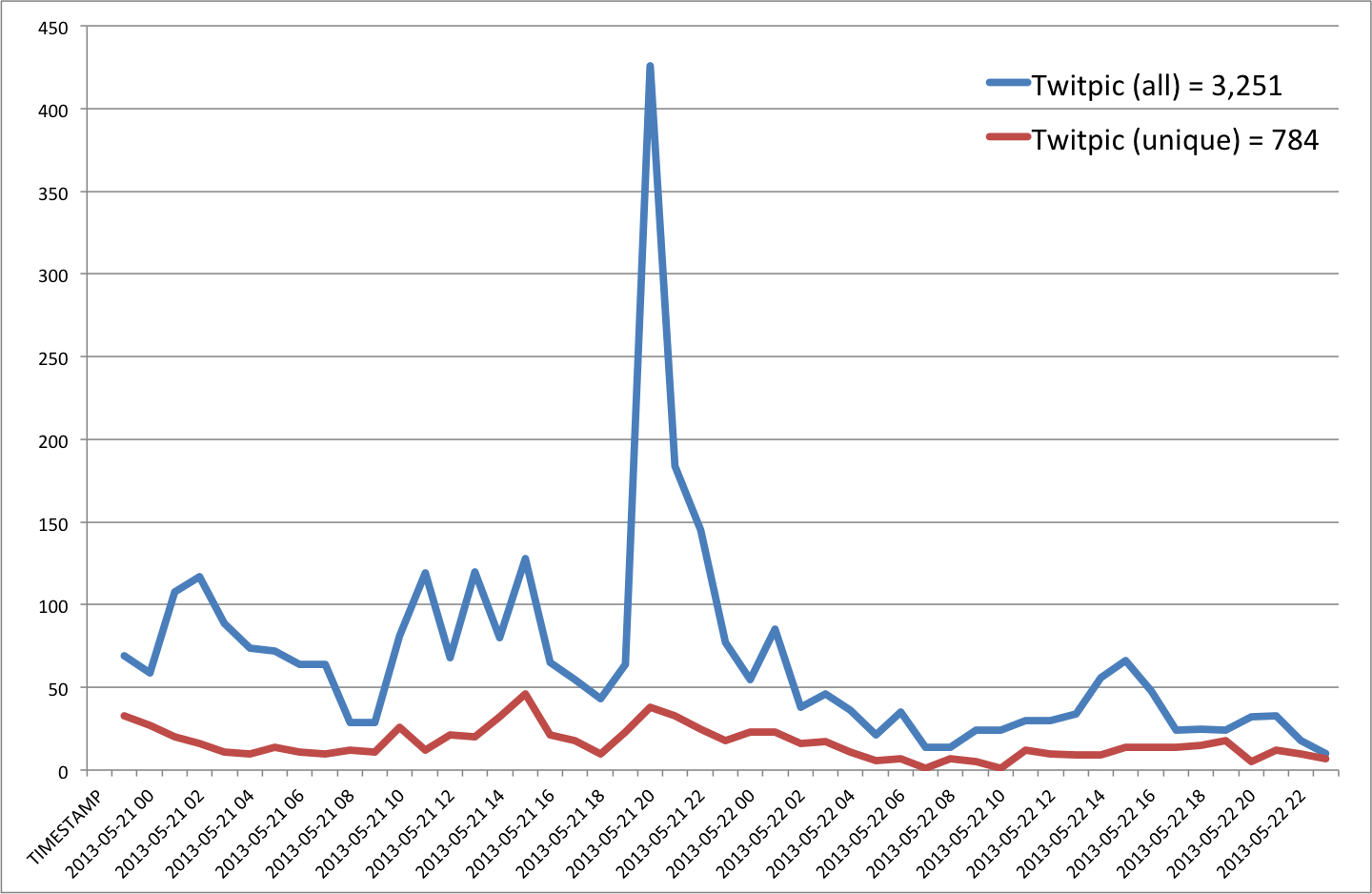
A comparison of the above Twitpic graph with the Instagram one below suggests very little to no time lag between the two unique streams.
Clearly Flickr pictures are not widely shared on Twitter during disasters. Only 53 links to Flickr were tweeted compared to 11,822 unique Instagram pictures.
The sharing of JPG images is more popular than links to Flickr but the total number of uniques still pales in comparison to the number of Instagram pictures.
The frequency of tweets sharing unique links to Youtube videos does not vary considerably over time.
In contrast to the large volume of Youtube links shared on twitter, only 88 unique links to Vimeo were shared.
Geographic information is of course imperative for disaster response. We collected about 2.7 million tweets during the 10-day period after Tornado and found that 51.23% had geographic data—either the tweet was geo-tagged or the Twitter user’s bio included a location. During the first 48 hours, about 45% of Tweets with links to Twitpic had geographic data; 40% for Flickr and 38% for Instagram . Most digital pictures include embedded geographic information (i.e., the GPS coordinates of the phone or camera, for example). So we’re working on automatically extracting this information as well.
An important question that arises is which Instagram pictures & Youtube videos actually captured evidence of the damage caused of the Tornado? Of these, which are already geotagged and which could be quickly geotagged manually? The Digital Humanitarian Network was able to answer these questions within 12 hours following the devastating Typhoon that ravaged the Philippines last year (see map below). The reason it took that long is because we spent most of the time customizing the microtasking apps to tag the tweets/links. Moreover, we were looking at every single link shared on twitter, i.e., not just those that linked directly to Instagram, Youtube, etc. We need to do better, and we can.

This is why we’re launching MicroMappers in partnership with the United Nations. MicroMappers are very user-friendly microtasking apps that allows anyone to support humanitarian response efforts with a simple click of the mouse. This means anyone can be a Digital Humanitarian Volunteer. In the case of the Tornado, volunteers could easily have tagged the Instagram pictures posted on Twitter. During Hurricane Sandy, about half-a-million Instagram pictures were shared. This is certainly a large number but other microtasking communities like my friends at Zooniverse tagged millions of pictures in a matter of days. So it is possible.
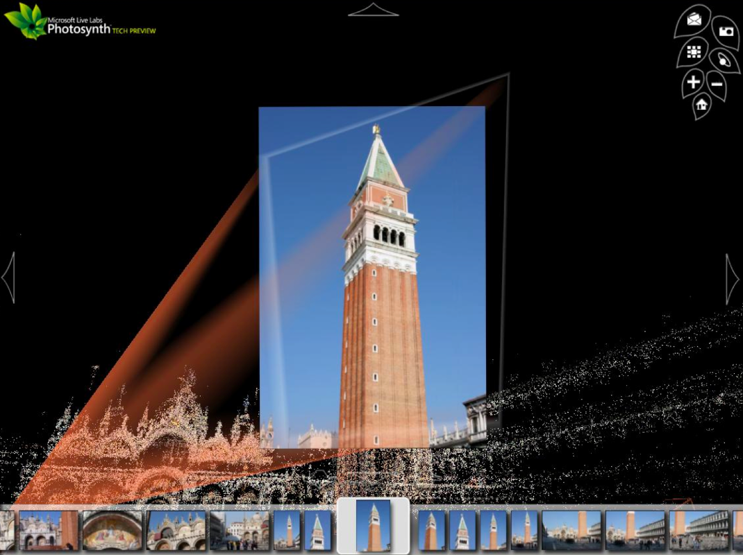
Incidentally, hundreds of the geo-tagged Instagram pictures posted during the Hurricane captured the same damaged infrastructure across New York, like the same fallen crane, blocked road or a flooded neighborhood. These pictures, taken by multiple eyewitnesses from different angles can easily be “stitched” together to create a 2D or even 3D tableau of the damage. Photosynth (below) already does this stitching automatically for free. Think of Photosynth as Google Street View but using crowdsourced pictures instead. One simply needs to a collection of related pictures, which is what MicroMappers will provide.
Disasters don’t wait. Another major Tornado caused havoc in Oklahoma just yesterday. So we are developing MicroMappers as we speak and plan to test the apps soon. Stay tuned for future blog post updates!

See also: Analyzing 2 Million Disaster Tweets from Oklahoma Tornado [Link]