Tag Archives: Flickr

GeoFeedia: Ready for Digital Disaster Response

GeoFeedia was not originally designed to support humanitarian operations. But last year’s blog post on the potential of GeoFeedia for crisis mapping caught the interest of CEO Phil Harris. So he kindly granted the Standby Volunteer Task Force (SBTF) free access to the platform. In return, we provided his team with feedback on what features (listed here) would make GeoFeedia more useful for digital disaster response. This was back in summer 2012. I recently learned that they’ve been quite busy since. Indeed, I had the distinct pleasure of sharing the stage with Phil and his team at this superb conference on social media for emergency management. After listening to their talk, I realized it was high time to publish an update on GeoFeedia, especially since we had used the tool just two months earlier in response to Typhoon Pablo, one of the worst disasters to hit the Philippines in the past 100 years.

The 1-minute video is well worth watching if you’re new to GeoFeedia. The plat-form enables hyper local searches for information by location across multiple social media channels such as Twitter, Youtube, Flickr, Picasa & now Instagram. One of my favorite GeoFeedia features is the awesome geofeed (digital fence), which you can learn more about here. So what’s new besides Instagram? Well, the first suggestion I made last year was to provide users with the option of searching by both location and topic, rather than just location alone. And presto, this now possible, which means that digital humanitarians today can zoom into a disaster-affected area and filter by social media type, date and hashtag. This makes the geofeed feature even more compelling for crisis response, especially since geofeeds can also be saved and shared.

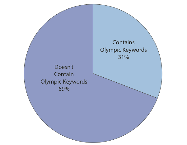
The vast majority of social media monitoring tools out there first filter by key-word and hashtag. Only later do they add location. As Phil points out, this mean they easily miss 70% of hyper local social media reports. Most users and org-anizations, who pay hefty licensing fees to uses these platforms, are typically unaware of this. The fact that GeoFeedia first filters by location is not an accident. This recent study (PDF) of the 2012 London Olympics showed that social media users posted close to 170,000 geo-tagged to Twitter, Instagram, Flickr, Picasa and YouTube during the games. But only 31% of these geo-tagged posts contained any Olympic-specific keywords and/or hashtags! So they decided to analyze another large event and again found the number of results drop by about 70% when not first filtering by location. Phil argues that people in a crisis situation obviously don’t wait for keywords or hashtags to form; so he expects this drop to happen for disasters as well. “Traditional keyword and hashtag search thus be complemented with a geo-graphical search in order to provide a full picture of social media content that is contextually relevant to an event.”

Screen Shot 2013-03-23 at 4.42.25 PM

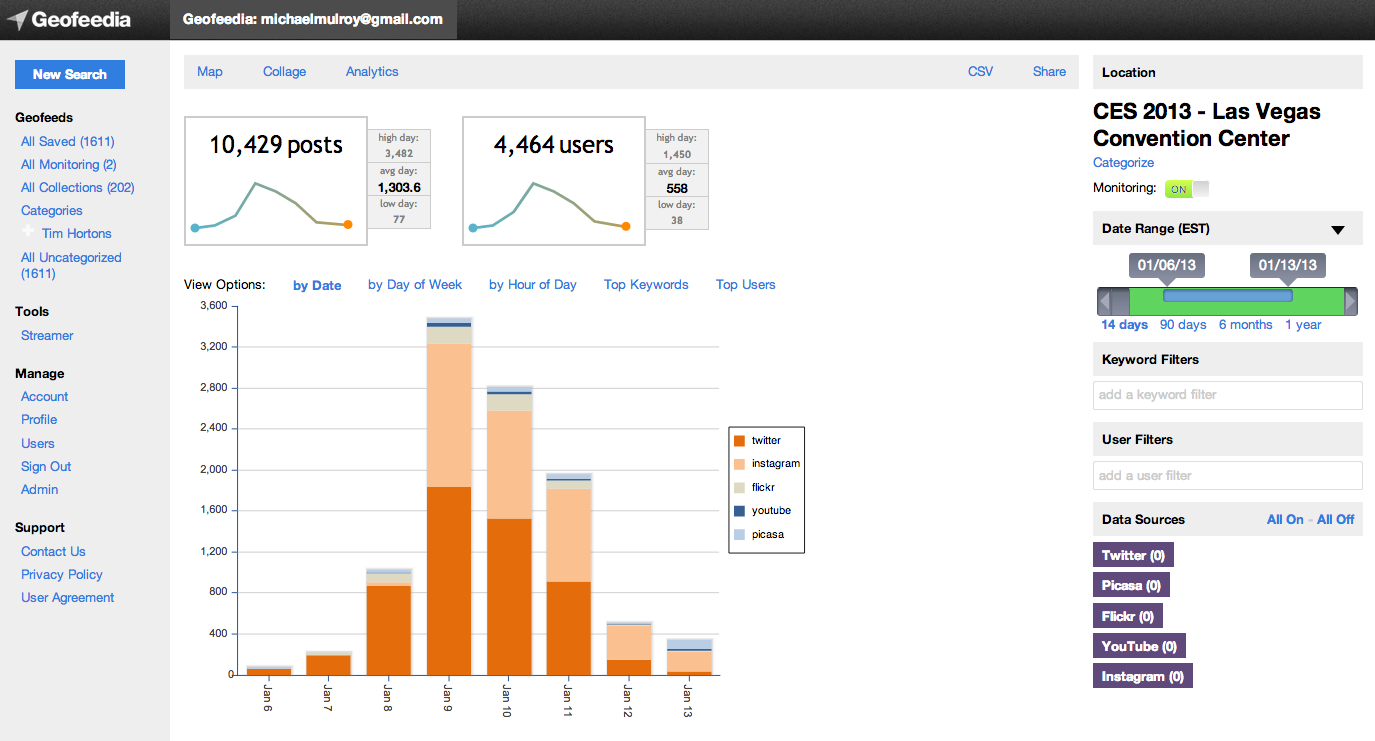
One of my other main recommendations to Phil & team last year had to do with analytics. There is a strong need for an “Analytics function that produces summary statistics and trends analysis for a geofeed of interest. This is where Geofeedia could better capture temporal dynamics by including charts, graphs and simple time-series analysis to depict how events have been unfolding over the past hour vs 12 hours, 24 hours, etc.” Well sure enough, one of GeoFeedia’s major new features is a GeoAnalytics Dashboard; an interface that enables users to discover temporal trends and patterns in social media—and to do so by geofeed. This means a user can now draw a geofeed around a specific area of interest in a given disaster zone and search for pictures that capture major infrastructure damage on a specified date that contain tags or descriptions with the words “#earthquake”, “damage,” “buildings,” etc. As Phil rightly points out, this provides a “huge time advantage during a crisis to give a yet another filtered layer of intelligence; in effect, social media that is highly relevant and actionable ‘bubbling-up to the top’ of the pile.” 

Analytics Screen Shot - CES Data

I truly am a huge fan of the GeoFeedia platform. Plus, Phil & team have been very responsive to our interests in using their tool for disaster response. So I’m ex-cited to see which features they build out next. They’ve already got a “data portability” functionality that enables data export. Users can also publish content from GeoFeedia directly to their own social networks. Moreover, the filtered content produced by geofeeds can also be shared with individual who do not have a GeoFeedia account. In any event, I hope the team will take into account two items from my earlier wish list—namely Sentiment Analysis and GeoAlerts.

A Sentiment Analysis feature would capture the general mood and sentiment  expressed hyper-locally within a defined geofeed in real-time. The automated Geo-Alerts feature would make the geofeed king. A GeoAlerts functionality would enable users to trigger specific actions based on different kinds of social media traffic within a given geofeed of interest. For example, I’d like to be notified if the number of pictures posted within my geofeed that are tagged with the words “#earthquake” and “damage,” increases by more than 20% in any given hour. Similarly, one could set a geofeed’s GeoAlert for a 10% increase in the number of tweets with the words “cholera” and “diarrhea” (these need not be in English, by the way) in any given 10-minute period. Users would then receive GeoAlerts via automated emails, Tweets and/or SMS’s. This feature would in effect make the GeoFeedia more of a mobile and “hands free” platform, like Waze for example.

My first blog post on GeoFeedia was entitled “GeoFeedia: Next Generation Crisis Mapping Technology?” The answer today is a definite “Yes!” While the platform was not originally designed with disaster response in mind, the team has since been adding important features that make the tool increasingly useful for humanitarian applications. And GeoFeedia has plans for more exciting develop-ments in 2013. Their commitment to innovation and strong continued interest in supporting digital disaster response is why I’m hoping to work more closely with them in the years to come. For example, our AIDR (Artificial Intelligence for Disaster Response) platform would really add a strong Machine Learning com-ponent to GeoFeedia’s search function, in effect enabling the tool to go beyond simple keyword search.

Bio

Behind the Scenes: The Digital Operations Center of the American Red Cross

The Digital Operations Center at the American Red Cross is an important and exciting development. I recently sat down with Wendy Harman to learn more about the initiative and to exchange some lessons learned in this new world of digital  humanitarians. One common challenge in emergency response is scaling. The American Red Cross cannot be everywhere at the same time—and that includes being on social media. More than 4,000 tweets reference the Red Cross on an average day, a figure that skyrockets during disasters. And when crises strike, so does Big Data. The Digital Operations Center is one response to this scaling challenge.

Sponsored by Dell, the Center uses customized software produced by Radian 6 to monitor and analyze social media in real-time. The Center itself sits three people who have access to six customized screens that relate relevant information drawn from various social media channels. The first screen below depicts some of key topical areas that the Red Cross monitors, e.g., references to the American Red Cross, Storms in 2012, and Delivery Services.

Circle sizes in the first screen depict the volume of references related to that topic area. The color coding (red, green and beige) relates to sentiment analysis (beige being neutral). The dashboard with the “speed dials” right underneath the first screen provides more details on the sentiment analysis.

Lets take a closer look at the circles from the first screen. The dots “orbiting” the central icon relate to the categories of key words that the Radian 6 platform parses. You can click on these orbiting dots to “drill down” and view the individual key words that make up that specific category. This circles screen gets updated in near real-time and draws on data from Twitter, Facebook, YouTube, Flickr and blogs. (Note that the distance between the orbiting dots and the center does not represent anything).

An operations center would of course not be complete without a map, so the Red Cross uses two screens to visualize different data on two heat maps. The one below depicts references made on social media platforms vis-a-vis storms that have occurred during the past 3 days.

The screen below the map highlights the bio’s of 50 individual twitter users who have made references to the storms. All this data gets generated from the “Engagement Console” pictured below. The purpose of this web-based tool, which looks a lot like Tweetdeck, is to enable the Red Cross to customize the specific types of information they’re looking form, and to respond accordingly.

Lets look at the Consul more closely. In the Workflow section on the left, users decide what types of tags they’re looking for and can also filter by priority level. They can also specify the type of sentiment they’re looking, e.g., negative feelings vis-a-vis a particular issue. In addition, they can take certain actions in response to each information item. For example, they can reply to a tweet, a Facebook status update, or a blog post; and they can do this directly from the engagement consul. Based on the license that the Red Cross users, up to 25 of their team members can access the Consul and collaborate in real-time when processing the various tweets and Facebook updates.

The Consul also allows users to create customized timelines, charts and wordl graphics to better understand trends changing over time in the social media space. To fully leverage this social media monitoring platform, Wendy and team are also launching a digital volunteers program. The goal is for these volunteers to eventually become the prime users of the Radian platform and to filter the bulk of relevant information in the social media space. This would considerably lighten the load for existing staff. In other words, the volunteer program would help the American Red Cross scale in the social media world we live in.

Wendy plans to set up a dedicated 2-hour training for individuals who want to volunteer online in support of the Digital Operations Center. These trainings will be carried out via Webex and will also be available to existing Red Cross staff.


As  argued in this previous blog post, the launch of this Digital Operations Center is further evidence that the humanitarian space is ready for innovation and that some technology companies are starting to think about how their solutions might be applied for humanitarian purposes. Indeed, it was Dell that first approached the Red Cross with an expressed interest in contributing to the organization’s efforts in disaster response. The initiative also demonstrates that combining automated natural language processing solutions with a digital volunteer net-work seems to be a winning strategy, at least for now.

After listening to Wendy describe the various tools she and her colleagues use as part of the Operations Center, I began to wonder whether these types of tools will eventually become free and easy enough for one person to be her very own operations center. I suppose only time will tell. Until then, I look forward to following the Center’s progress and hope it inspires other emergency response organizations to adopt similar solutions.

Web 2.0 Tracks Attacks on Mumbai (Updated)

Twitter, Flickr, Wikipedia, YouTube – a few of the Web 2.0 & mobile applications tracking the Mumbai attacks in quasi real time along with the aftermath. Twitter was apparently faster than CNN in reporting the initial events, according to TechCrunch:

picture-61

From TechMacro: “the local authority advised TV channels to stop broadcasting sensitive information which may help terrorists tracking army’s movements. It is much less likely that the terrorists are now using Twitter to find way to escape.”

For live, crowdsourcing updates, see the following links on Twitter, Flickr, Wikipedia. The Wikipedia entry already includes a picture (probably taken with mobile phone) of one of the terrorists.

Wired also writes that “local bloggers at Metblogs Mumbai have new updates every couple of minutes. So do the folks at GroundReport. Dozens of videos have been uploaded to YouTube. But the most remarkable citizen journalism may be coming from “Vinu,” who is posting a stream of harrowing post-attack pictures to Flickr.”

Patrick Philippe Meier