Tag Archives: Crisis Mapping

Field Guide to Humanitarian Mapping

MapAction just released an excellent mapping guide for the humanitarian community. Authored principally by Naomi Morris, the guide comprises four chapters that outline a range of mapping methods suitable for humanitarian field word.

The first chapter serves as an introduction to humanitarian mapping. Chapter two explains how to make the best use of GPS for data collection. Note that the latest version of Google Earth (v5.0) includes GPS connectivity. The third and fourth chapters provide a user-friendly, hands-on tutorial on how to use Google Earth and MapWindow for humanitarian mapping.

The purpose of this post is to quickly summarize some of the points I found most interesting in the Guide and to offer some suggestions for further research. I do not summarize the tutorials but I do comment on Google Earth and MapWindow might be improved for humanitarian mapping. The end of this post includes a list of recommended links.

Introduction

John Holmes, the UN Emergency Relief Coordinator and Under-Secretary-General for Humanitarian Affairs argues that “information is very directly about saving lives. If we take the wrong decisions, make the wrong choices about where we put our money and our effort because our knowledge is poor, we are condemning some of the most deserving to death or destitution.”

I completely agree with this priority-emphasis on information. The purpose of crisis mapping and particularly mobile crisis mapping is for at-risk communities to improve their situational awareness during humanitarian crises. The hope is that relevant and timely information will enable communities to make more informed—and thus better— decisions on how to get out of harm’s way. Recall the purpose of people-centered early warning as defined by the UNISDR:

To empower individuals and communities threatened by hazards to act in sufficient time and in an appropriate manner so as to reduce the possibility of personal injury, loss of life, damage to property and the environment, and loss of livelihoods.

Naomi also cites a Senior Officer from the IFRC who explains the need to map vulnerability and develop baselines prior to a disaster context. “The data for these baselines would include scientific hazard data and the outputs from qualitative assessments at community level.”

This point is worth expanding on. I’ve been meaning to write a blog post specifically on crisis mapping baselines for monitoring and impact evaluation. I hope to do so shortly. In the meantime, the importance of baselines vis-à-vis crisis mapping is a pressing area for further research.

Community Mapping

I really appreciate Naomi’s point that humanitarian mapping does not require sophisticated, proprietary software. As she note, “there has been a steady growth in the number of ‘conventional’ desktop GIS packages available under free or open-source licenses.”

Moreover, maps can also be “created using other tools including a pad of graph paper and a pencil, or even an Excel spreadsheet.” Indeed, we should always “consider whether ‘low/no tech’ methods [can meet our] needs before investing time in computer-based methods.”

To this end, Naomi includes a section in her introduction on community-level mapping techniques.

Community-level mapping is a powerful method for disaster risk mitigation and preparedness.  It is driven by input from the beneficiary participants; this benefits the plan output with a broader overview of the area, while allowing the community to be involved. Local people can, using simple maps that they have created, quickly see and analyse important patterns in the risks they face.

Again, Naomi emphasizes the fact that computer-based tools are not essential for crisis mapping at the community level. Instead, we can “compile sketches, data from assessments and notes into representations of the region [we] are looking at using tools like pen and paper.”

To be sure, “in a situation with no time or resources, a map can be enough to help to identify the most at-risk areas of a settlement, and to mark the location of valuable services […].”

Conclusion

I highly recommend following the applied  Google Earth and MapWindow tutorials in the Guide. They are written in a very accessible way that make it easy to follow or use as a teaching tool, so many thanks to Naomi for putting this together.

I would have liked to see more on crisis mapping analysis in the Guide but the fact of the matter is that Google Earth and MapWindow provide little in the way of simple features for applied geostatistics. So this is not a criticism of the report or the author.

Links

Patrick Philippe Meier

WikiMapAid, Ushahidi and Swift River

Keeping up to date with science journals always pays off. The NewScientist just published a really interesting piece related to crisis mapping of diseases this morning. I had to hop on a flight back to Boston so am uploading my post now.

The cholera outbreak in Zimbabwe is becoming increasingly serious but needed data on the number cases and fatalities to control the problem is difficult to obtain. The World Health Organization (WHO) in Zimbabwe has stated that “any system that improves data collecting and sharing would be beneficial.”

This is where WikiMapAid comes in. Developed by Global Map Aid, the wiki enables humanitarian workers to map information on a version of Google Maps that can be viewed by anyone. “The hope is that by circumventing official information channels, a clearer picture of what is happening on the ground can develop.” The website is based on a “Brazilian project called Wikicrimes, launched last year, in which members of the public share information about crime in their local area.”

wikimapaid

WikiMapAid allows users to create markers and attach links to photographs or to post a report of the current situation in the area. Given the context of Zimbabwe, “if people feel they will attract attention from the authorities by posting information, they could perhaps get friends on the outside to post information for them.”

As always with peer-produced data, the validity of the information will depend on those supplying it. While moderators will “edit and keep track of postings […], unreliable reporting could be a problem. In order to address this, the team behind the project is “developing an algorithm that will rate the reputation of users according to whether the information they post is corroborated, or contradicted.”

This is very much in line with the approach we’re taking at Ushahidi for the Swift River project. As WikiMapAid notes, “even if we’re just 80 per cent perfect, we will still have made a huge step forward in terms of being able to galvanize public opinion, raise funds, prioritize need and speed the aid on those who need it most.”

Time to get in touch with the good folks at WikiMapAid.

Patrick Philippe Meier

Crime Mapping Analytics

There are important parallels between crime prevention and conflict prevention.  About half-a-year ago I wrote a blog post on what crisis mapping might learn from crime mapping. My colleague Joe Bock from Notre Dame recently pointed me to an excellent example of crime mapping analytics.

The Philadelphia Police Department (PPD) has a Crime Analysis and Mapping Unit  (CAMU) that integrates Geographic Information System (GIS) to improve crime analysis. The Unit was set up in 1997 and the GIS data includes a staggering 2.5 million new events per year. The data is coded from emergency distress calls and police reports and overlaid with other data such as bars and liquor stores, nightclubs, locations of surveillance cameras, etc.

For this blog post, I draw on the following two sources: (1) Theodore (2009). “Predictive Modeling Becomes a Crime-Fighting Asset,” Law Officer Journal, 5(2), February 2009; and (2) Avencia (2006). “Crime Spike Detector: Using Advanced GeoStatistics to Develop a Crime Early Warning System,” (Avencia White Paper, January 2006).

Introduction

Police track criminal events or ‘incidents’ which are “the basic informational currency of policing—crime prevention cannot take place if there is no knowledge of the location of crime.” Pin maps were traditionally used to represent this data.

pinmap

GIS platforms now make new types of analysis possible beyond simply “eyeballing” patterns depicted by push pins. “Hot spot” (or “heat map”) analysis is one popular example in which the density of events is color coded to indicate high or low densities.

Hotspot analysis, however, in itself, does not tell people much they did not already know. Crime occurs in greater amounts in downtown areas and areas where there are more people. This is common sense. Police organize their operations around these facts already.

The City of Philadelphia recognized that traditional hot spot analysis was of limited value and therefore partnered with Avencia to develop and deploy a crime early warning system known as the Crime Spike Detector.

Crime Spike Detector

The Crime Spike Detector is an excellent example of a crime analysis analytics tool that serves as an early warning system for spikes in crime.

The Crime Spike Detector applies geographic statistical tools to discover  abrupt changes in the geographic clusters of crime in the police incident database. The system isolates these aberrations into a cluster, or ‘crime spike’. When such a cluster is identified, a detailed report is automatically e-mailed to the district command staff responsible for the affected area, allowing them to examine the cluster and take action based on the new information.

The Spike Detector provides a more rapid and highly focused evaluation of current conditions in a police district than was previously possible. The system also looks at clusters that span district boundaries and alerts command staff on both sides of these arbitrary administrative lines, resulting in more effective deployment decisions.

spikedetector

More specfically, the spike detector analyzes changes in crime density over time and highlights where the change is statistically significant.

[The tool] does this in automated fashion by examining, on a nightly basis, millions of police incident records, identifying aberrations, and e-mailing appropriate police personnel. The results are viewed on a map, so exactly where these crime spikes are taking place are immediately understandable. The map supports ‘drill-through’ capabilities to show detailed graphs, tables, and actual incident reports of crime at that location.

Spike Detection Methodology

The Spike Detector compares the density of individual crime events over both space and time. To be sure, information is more actionable if it is geographically specified for a given time period regarding a specific type of crime. For example, a significant increase in drug related incidents in a specific neighborhood for a given day is more concrete and actable than simply observing a general increase in crime in Philadelphia.

The Spike Detector interface allows the user to specify three main parameters: (1) the type of crime under investigation; (2) the spatial and, (3) the temporal resolutions to analyze this incident type.

Obviously, doing this in just one way produces very limited information. So the Spike Detector enables end users to perform its operations on a number of different ways of breaking up time, space and crime type. Each one of these is referred to as a user defined search pattern.

To describe what a search pattern looks like, we first need to understand how the three parameters can be specified.

Space. The Spike Detector divides the city into circles of a given radius. As depicted below, the center points of these circles from a grid. Once the distance between these center points is specified, the radius of the circle is set such that the area of the circles completely covers the map. Thus a pattern contains a definition of the distance between the center points of circles.

circles

Time. The temporal parameter is specified such that a recent period of criminal incidents can be compared to a previous period. By contrasting the densities in each circle across different time periods, any significant changes in density can be identified. Typically, the most recent month is compared to the previous year. This search pattern is know as bloc style comparison. A second search pattern is periodic, which “enables search patterns based on crime types that vary on a seasonal basis.”

Incident. Each crime is is assigned a Uniform Crime Reporting code. Taking all three parameters together, a search pattern might look like the following

“Robberies no Gun, 1800, 30, Block, 365”

This means the user is looking for robberies committed without a gun, with distance between cicle center points of 1,800 feet, over the past 30 days of crime data compared to the previous year’s worth of crime.

Determining Search Patterns

A good search pattern is determined by a combination of three factors: (1) crime type density; (2) short-term versus long-term patterns; and (3) trial and error. Crime type is typically the first and easiest parameter of the search pattern to be specified. Defining the spatial and temporal resolutions requires more thought.

The goal in dividing up time and space is to have enough incidents such that comparing a recent time period to a comparison time period is meaningful. If the time or space divisions are too small, ‘spikes’ are discovered which represent a single incident or few incidents.

The rule of thumb is to have an average of at least 4-6 crimes each in each circle area. More frequent crimes will permit smaller circle areas and shorter time periods, which highlights spikes more precisely in time and space.

Users are typically interested in shorter and most recent time periods as this is most useful to law enforcement while “though the longer time frames might be of interest to other user communities studying social change or criminology.” In any event,

Patterns need to be tested in practice to see if they are generating useful information. To facilitate this, several patterns can be set up looking at the same crime type with different time and space parameters. After some time, the most useful pattern will become apparent and the other patterns can be dispensed with.

Running Search Patterns

The spike detection algorithm uses simple statistical analysis to determine whether the  probability that the number of recent crimes as compared to the comparison period crimes in a given circle area is possible due to chance alone. The user specifies the confidence level or sensitivity of the analysis. The number is generally set at 0.5% probability.

Each pattern results in a probability (or p-value) lattice assigned to every circle center point. The spike detector uses this lattice to construct the maps, graphs and reports that the spike detector presents to the user. A “Hypergeometic Distribution” is used to determine the p-values:

hypergeometric

Where, for example:

N – total number of incidents in all Philadelphia for both the previous 365 days and the current 30 days.

G – total number of incidents in all Philadelphia for just the past 30 days.

n – number of incidents in just this circle for both the previous 365 days and the past 30 days.

x – number of incidents in just this circle for the past 30 days.

After the probability lattice is generated, the application displays spikes in order of severity and whether they have increased or decreased as compared to the previous day.

Conclusion

One important element of crisis mapping which is often overlooked is the relevance to monitoring and evaluation. With the Spike Detector, the Police Department “can assess the impact and effectiveness of anticrime strategies.” This will be the subject of a blog post in the near future.

For now, I conclude with the following comment from the Philadelphia Police Department:

GIS is changing the way we operate. All police personnel, from the police commissioner down to the officer in the patrol car, can use maps as part of their daily work. Our online mapping applications needed to be fast and user-friendly because police officers don’t have time to become computer experts. I think we’ve delivered on this goal, and it’s transforming what we do and how we serve the community.

Clearly, crime mapping analytics has a lot offer those of us interested in crisis mapping of violent conflict in places like the DRC and Zimbabwe. What we need is a Neogeography version of the Spike Detector.

Patrick Philippe Meier

A Brief History of Crisis Mapping (Updated)

Introduction

One of the donors I’m in contact with about the proposed crisis mapping conference wisely recommended I add a big-picture background to crisis mapping. This blog post is my first pass at providing a brief history of the field. In a way, this is a combined summary of several other posts I have written on this blog over the past 12 months plus my latest thoughts on crisis mapping.

Evidently, this account of history is very much influenced by my own experience so I may have unintentionally missed a few relevant crisis mapping projects. Note that by crisis  I refer specifically to armed conflict and human rights violations. As usual, I welcome any feedback and comments you may have so I can improve my blog posts.

From GIS to Neogeography: 2003-2005

The field of dynamic crisis mapping is new and rapidly changing. The three core drivers of this change are the increasingly available and accessible of (1) open-source, dynamic mapping tools; (2) mobile data collection technologies; and lastly (3) the development of new methodologies.

Some experts at the cutting-edge of this change call the results “Neogeography,” which is essentially about “people using and creating their own maps, on their own terms and by combining elements of an existing toolset.” The revolution in applications for user-generated content and mobile technology provides the basis for widely distributed information collection and crowdsourcing—a term coined by Wired less than three years ago. The unprecedented rise in citizen journalism is stark evidence of this revolution. New methodologies for conflict trends analysis increasingly take spatial and/or inter-annual dynamics into account and thereby reveal conflict patterns that otherwise remain hidden when using traditional methodologies.

Until recently, traditional mapping tools were expensive and highly technical geographic information systems (GIS), proprietary software that required extensive training to produce static maps.

In terms of information collection, trained experts traditionally collected conflict and human rights data and documented these using hard-copy survey forms, which typically became proprietary once completed. Scholars began coding conflict event-data but data sharing was the exception rather than the rule.

With respect to methodologies, the quantitative study of conflict trends was virtually devoid of techniques that took spatial dynamics into account because conflict data at the time was largely macro-level data constrained by the “country-year straightjacket.”

That is, conflict data was limited to the country-level and rarely updated more than once a year, which explains why methodologies did not seek to analyze sub-national and inter-annual variations for patterns of conflict and human rights abuses. In addition, scholars in the political sciences were more interested in identifying when conflict as likely to occur as opposed to where. For a more in-depth discussion of this issue, please see my paper from 2006  “On Scale and Complexity in Conflict Analysis” (PDF).

Neogeography is Born: 2005

The pivotal year for dynamic crisis mapping was 2005. This is the year that Google rolled out Google Earth. The application marks an important milestone in Neogeography because the free, user-friendly platform drastically reduced the cost of dynamic and interactive mapping—cost in terms of both availability and accessibility. Microsoft has since launched Virual Earth to compete with Google Earth and other  potential contenders.

Interest in dynamic crisis mapping did exist prior to the availability of Google Earth. This is evidenced by the dynamic mapping initiatives I took at Swisspeace in 2003. I proposed that the organization use GIS tools to visualize, animate and analyze the geo-referenced conflict event-data collected by local Swisspeace field monitors in conflict-ridden countries—a project called FAST. In a 2003 proposal, I defined dynamic crisis maps as follows:

FAST Maps are interactive geographic information systems that enable users of leading agencies to depict a multitude of complex interdependent indicators on a user-friendly and accessible two-dimensional map. […] Users have the option of selecting among a host of single and composite events and event types to investigate linkages [between events]. Events and event types can be superimposed and visualized through time using FAST Map’s animation feature. This enables users to go beyond studying a static picture of linkages to a more realistic dynamic visualization.

I just managed to dig up old documents from 2003 and found the interface I had designed for FAST Maps using the template at the time for Swisspeace’s website.

fast-map1

fast-map2

However, GIS software was (and still is) prohibitively expensive and highly technical. To this end, Swisspeace was not compelled to make the necessary investments in 2004 to develop the first crisis mapping platform for producing dynamic crisis maps using geo-referenced conflict data. In hindsight, this was the right decision since Google Earth was rolled out the following year.

Enter PRIO and GROW-net: 2006-2007

With the arrival of Google Earth, a variety of dynamic crisis maps quickly emerged. In fact, one if not the first application of Google Earth for crisis mapping was carried out in 2006 by Jen Ziemke and I. We independently used Google Earth and newly available data from the Peace Research Institute, Oslo (PRIO) to visualize conflict data over time and space. (Note that both Jen and I were researchers at PRIO between 2006-2007).

Jen used Google Earth to explain the dynamics and spatio-temporal variation in violence during the Angolan war. To do this, she first coded nearly 10,000 battle and massacre events as reported in the Portuguese press that took place over a 40 year period.

Meanwhile, I produced additional dynamic crisis maps of the conflict in the Democratic Republic of the Congo (DRC) for PRIO and of the Colombian civil war for the Conflict Analysis Resource Center (CARC) in Bogota. At the time, researchers in Oslo and Bogota used proprietary GIS software to produce static maps (PDF) of their newly geo-referenced conflict data. PRIO eventually used Google Earth but only to publicize the novelty of their new geo-referenced historical conflict datasets.

Since then, PRIO has continued to play an important role in analyzing the spatial dynamics of armed conflict by applying new quantitative methodologies. Together with universities in Europe, the Institute formed the Geographic Representations of War-net (GROW-net) in 2006, with the goal of “uncovering the causal mechanisms that generate civil violence within relevant historical and geographical and historical configurations.” In 2007, the Swiss Federal Institute of Technology in Zurich (ETH), a member of GROW-net, produced dynamic crisis maps using Google Earth for a project called WarViews.

Crisis Mapping Evolves: 2007-2008

More recently, Automated Crisis Mapping (ACM), real-time and automated information collection mechanisms using natural language processing (NLP) have been developed for the automated and dynamic mapping of disaster and health-related events. Examples of such platforms include the Global Disaster Alert and Crisis System (GDACS), CrisisWire, Havaria and HealthMap. Similar platforms have been developed for  automated mapping of other news events, such as Global Incident Map, BuzzTracker, Development Seed’s Managing the News, and the Joint Research Center’s European Media Monitor.

Equally recent is the development of Mobile Crisis Mapping (MCM), mobile crowdsourcing platforms designed for the dynamic mapping of conflict and human rights data as exemplified by Ushahidi (with FrontLineSMS) and the Humanitarian Sensor Web (SensorWeb).

Another important development around this time is the practice of participatory GIS preceded by the recognition that social maps and conflict maps can empower local communities and be used for conflict resolution. Like maps of natural disasters and environmental degradation, these can be developed and discussed at the community level to engage conversation and joint decision-making. This is a critical component since one of the goals of crisis mapping is to empower individuals to take better decisions.

HHI’s Crisis Mapping Project: 2007-2009

The Harvard Humanitarian Initiative (HHI) is currently playing a pivotal role in crafting the new field of dynamic crisis mapping. Coordinated by Jennifer Leaning and myself, HHI is completing a two-year applied research project on Crisis Mapping and Early Warning. This project comprised a critical and comprehensive evaluation of the field and the documentation of lessons learned, best practices as well as alternative and innovative approaches to crisis mapping and early warning.

HHI also acts as an incubator for new projects and  supported the conceptual development of new crisis mapping platforms like Ushahidi and the SensorWeb. In addition, HHI produced the first comparative and dynamic crisis map of Kenya by drawing on reports from the mainstream media, citizen journalists and Ushahidi to analyze spatial and temporal patterns of conflict events and communication flows during a crisis.

HHI’s Sets a Research Agenda: 2009

HHI has articulated an action-oriented research agenda for the future of crisis mapping based on the findings from the two-year crisis mapping project. This research agenda can be categorized into the following three areas, which were coined by HHI:

  1. Crisis Map Sourcing
  2. Mobile Crisis Mapping
  3. Crisis Mapping Analytics

1) Crisis Map Sourcing (CMS) seeks to further research on the challenge of visualizing disparate sets of data ranging from structural and dynamic data to automated and mobile crisis mapping data. The challenge of CMS is to develop appropriate methods and best practices for mashing data from Automated Crisis Mapping (ACM) tools and Mobile Crisis Mapping platforms (see below) to add value to Crisis Mapping Analytics (also below).

2) The purpose of setting an applied-research agenda for Mobile Crisis Mapping, or MCM, is to recognize that the future of distributed information collection and crowdsourcing will be increasingly driven by mobile technologies and new information ecosystems. This presents the crisis mapping community with a host of pressing challenges ranging from data validation and manipulation to data security.

These hurdles need to be addressed directly by the crisis mapping community so that new and creative solutions can be applied earlier rather than later. If the persistent problem of data quality is not adequately resolved, then policy makers may question the reliability of crisis mapping for conflict prevention, rapid response and the documentation of human rights violations. Worse still, inaccurate data may put lives at risk.

3) Crisis Mapping Analytics (CMA) is the third critical area of research set by HHI. CMA is becoming increasingly important given the unprecedented volume of geo-referenced data that is rapidly becoming available. Existing academic platforms like WarViews and operational MCM platforms like Ushahidi do not include features that allow practitioners, scholars and the public to query the data and to visually analyze and identify the underlying spatial dynamics of the conflict and human rights data. This is largely true of Automated Crisis Mapping (ACM) tools as well.

In other words, new and informative metrics are need to be developed to identify patterns in human rights abuses and violent conflict both retrospectively and in real-time. In addition, existing techniques from spatial econometrics need to be rendered more accessible to non-statisticians and built into existing dynamic crisis mapping platforms.

Conclusion

Jen Ziemke and I thus conclude that the most pressing need in the field of crisis mapping is to bridge the gap between scholars and practitioners who self-identify as crisis mappers. This is the most pressing issue because bridging that divide will enable the field of crisis mapping to effectively and efficiently move forward by pursuing the three research agendas set out by the Harvard Humanitarian Initiative (HHI).

We think this is key to moving the crisis-mapping field into more mainstream humanitarian and human rights work—i.e., operational response. But doing so first requires that leading crisis mapping scholars and practitioners proactively bridge the existing gap. This is the core goal of the crisis mapping conference that we propose to organize.

Patrick Philippe Meier

Crisis Mapping Conference Proposal

Bridging the Divide in Crisis Mapping

As mentioned in a recent blog post, my colleague Jen Ziemke and I are organizing a workshop on the topic of crisis mapping. The purpose of this workshop is to bring together a small group of scholars and practitioners who are pioneering the new field of crisis mapping. We are currently exploring funding opportunities with a number of donors and welcome any suggestions you might have for specific sponsors.

The new field of crisis mapping encompasses the collection, dynamic visualization and subsequent analysis of georeferenced information on contemporary conflicts and human rights violations.  A wide range of sources are used to create these crisis maps, (e.g. events data,  newspaper and intelligence parsing, satellite imagery, interview and survey data, SMS, etc). Scholars have developed several analytical methodologies to identify patterns in dynamic crisis maps. These range from computational methods and visualization techniques to spatial econometrics and “hot spot” analysis.

While scholars employ these sophisticated methods in their academic research, operational crisis mapping platforms developed by practitioners are completely devoid of analytical tools. At the same time, scholars often assume that humanitarian practitioners are conversant in quantitative spatial analysis, which is rarely the case. Furthermore, practitioners who are deploying crisis mapping platforms do not have time to the academic literature on this topic.

Mobile Crisis Mapping and Crisis Mapping Analytics

In other words, there is a growing divide between scholars and practitioners in the field of crisis mapping. The purpose of this workshop is to bridge this divide by bringing scholars and practitioners together to shape the future of crisis mapping. At the heart of this lies two new developments: Mobile Crisis Mapping (MCM) and Crisis Mapping Analytics (CMA). See previous blog posts on MCM and CMA here and here.

I created these terms to highlight areas in need for further applied research. As MCM platforms like Ushahidi‘s become more widely available, the amount of crowdsourced data will substantially increase and so mays of the challenges around data validation and analysis. This is why we need to think now about developing a field of Crisis Mapping Analytics (CMA) to make sense of the incoming data and identify new and recurring patterns in human rights abuses and conflict.

This entails developing user-friendly metrics for CMA that practitioners can build in as part of their MCM platforms. However, there is no need to reinvent the circle since scholars who analyze spatial and temporal patterns of conflict already employ sophisticated metrics that can inform the development of CMA metrics. In sum, a dedicated workshop that brings these practitioners and scholars together would help accelerate the developing field of crisis mapping.

Proposed Agenda

Here is a draft agenda that we’ve been sharing with prospective donors. We envisage the workshop to take place over a Friday, Saturday and Sunday. Feedback is very much welcomed.

Day 1 – Friday

Welcome and Introductions

Keynote 1 – The Past & Future of Crisis Mapping

Roundtable 1 – Presentation of Academic and Operational Crisis Mapping projects with Q&A

Lunch

Track 1a – Introduction to Automated Crisis Mapping (ACM): From information collection and data validation to dynamic visualization and dissemination

Track 1b – Introduction to Mobile Crisis Mapping (MCM): From information collection and data validation to dynamic visualization and dissemination

&

Track 2a – Special introduction for newly interested colleagues  and students on spatial thinking in social sciences, using maps to understand crisis, violence and war

Track 2b – Breakout session for students and new faculty: hands-on introduction to GIS and other mapping programs

Dinner

Day 2 – Saturday

Keynote 2 – Crisis Mapping and Patterns Analysis

Roundtable 2 – Interdisciplinary Applications: Innovations & Challenges

Roundtable 3 – Data Collection & Validations: Innovations & Challenges

Lunch

Roundtable 4 – Crisis Mapping Analytics (CMA): Metrics and Taxonomies

Roundtable 5 – Crisis Mapping & Response: Innovations & Challenges

Dinner

Day 3 – Sunday

Keynote 3 – What Happens Next – Shaping the Future of Crisis Mapping

Self-organized Sessions

Wrap-Up

Proposed Participants

Here are some of the main academic institutes and crisis mapping organizations we had in mind:

Institutes

  • John Carrol University (JCU)
  • Harvard Humanitarian Initiative (HHI)
  • Peace Research Institute, Oslo (PRIO)
  • International Conflict Research, ETH Zurich
  • US Institute for Peace (USIP)
  • Political Science Department, Yale University

Organizations

Next Steps

Before we can move forward on any of this, we need to identify potential donors to help co-sponsor the workshop. So please do get in touch if you have any suggestions and/or creative ideas.

Patrick Philippe Meier

GIS and GPS for Dangerous Environments

A colleague of mine recently pointed me to SAIC’s IKE 504, a GIS-integrated encrypted GPS targeting and data capture device. IKE captures the GPS coordinates and other geospatial data for any target from a safe distance (up to 1,000 meters) and provides a verifiable digital image of the target. To this end, IKE can be used for specialized mapping.

ike

Patrick Philippe Meier

HURIDOCS09: Geospatial Technologies for Human Rights

Lars Bromley from AAAS and I just participated in a panel on “Communicating Human Rights Information Through Technology” at the HURIDOCS conference in Geneva. I’ve been following Lars’ project on the use of Geospatial Technologies for Human Rights with great interest over the past two years and have posted several blogs on the topic here, here and here. I’ll be showcasing Lars’ work in the digital democracy course next week since the topic I’ll be leading the discussion on “Human Rights 2.0.”

Introduction

Lars uses satellite imagery to prove or monitor human rights violations. This includes looking for the follwoing:

  • Housing and infrastructure demolition and destruction;
  • New housing and infrastructure such as resulting from force relocation;
  • Natural resource extraction and defoliation;
  • Mass grave mapping.

There are five operational, high-resolution satellites in orbit. These typically have resolutions that range from 50 centimeters to one meter. Their positions can be tracked online via JSatTrak:

aaas1

There are three types of projects that can draw on satellite imagery in human rights contexts:

  1. Concise analysis of a single location;
  2. Large area surveys over long periods of time;
  3. Active monitoring using frequently acquired imagery.

Zimbabwe

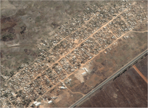
Lars shared satellite imagery from two human rights projects. The first is of a farm in Zimbabwe which was destroyed as part of a voter-intimidation campaign. The picture below was taken in 2002 and cost $250 to purchase. A total of 870 structure were manually counted.

aaas2

Copyright 2009 DigitalGlobe. Produced by AAAS.

The satellite image below was taken in 2006 and cost $1,792:

aaas3

Copyright 2009 DigitalGlobe. Produced by AAAS.

Burma

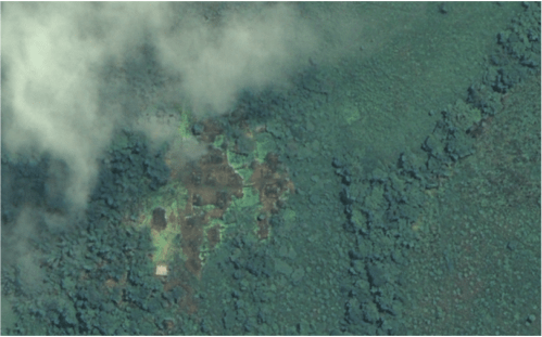
The second project sought to identify burned villages in Burma. Some 70 locations of interest within Burma were compiled using information from local NGOs. The image below is of a village in Papun District taken in December 2006.

aaas41

Copyright 2009 DigitalGlobe. Produced by AAAS.

The satellite image below as taken in June 2007 after the Free Burma Rangers reported an incident of village burning in April.

aaas5

Copyright 2009 DigitalGlobe. Produced by AAAS.

Limitations

Lars is very upfront about the challenges of using satellite imagery to document and monitor human rights abuses. These include:

  • More recent satellite imagery is particularly expensive;
  • Images can take between 2 weeks to 6 months to order;
  • Competition between multiple clients for satellite images;
  • Satellite images tend to be range between 200 megabytes and 2 gigabytes;
  • Requires technical capacity;
  • Cloud interference is a pervasive issue;
  • Images are only snapshots in time;
  • Real time human rights violations have never been captured by satellite;
  • Satellites are owned by governments and companies which present ethical concerns.

Nevertheless, Lars is confident that real-time and rapid use of satellite imagery will be possible in the future.

Conclusion

Here are the key points from Lars’ presentation:

  • The field of geospatial technologies for human rights is still evolving;
  • Satellite imagery is most useful in proving destruction in remote areas;
  • Evidence from satellite imagery becomes more powerful when combined with field-data.

Patrick Philippe Meier

NeoGeography and Crisis Mapping Analytics

WarViews is Neogeography

Colleagues at the Swiss Federal Institute of Technology Zurich (ETH) are starting to publish their research on the WarViews project. I first wrote about this project in 2007 as part of an HHI deliverable on Crisis Mapping for Humanity United. What appeals to me about WarViews is the initiative’s total “Neogeography” approach.

WarView

picture-21

What is Neogeography? Surprisingly, WarViews‘s first formal publication (Weidmann and Kuse, 2009) does not use the term but my CrisisMappers colleague Andrew Turner wrote the defining chapter on Neogeography for O’Reilly back in 2006:

Neogeography means ‘new geography’ and consists of a set of techniques and tools that fall outside the realm of traditional GIS, Geographic Information Systems. Where historically a professional cartographer might use ArcGIS, talk of Mercator versus Mollweide projections, and resolve land area disputes, a neogeographer uses a mapping API like Google Maps, talks about GPX versus KML, and geotags his photos to make a map of his summer vacation.

Essentially, Neogeography is about people using and creating their own maps, on their own terms and by combining elements of an existing toolset. Neogeography is about sharing location information with friends and visitors, helping shape context, and conveying understanding through knowledge of place.

Compare this language with Wiedmann and Kuse, 2009:

[The] use of geographic data requires specialized software and substantial training and therefore involves high entry costs for researchers and practitioners. [The] War Views project [aims] to create an easy-to-use front end for the exploration of GIS data on conflict. It takes advantage of the recent proliferation of Internet-based geographic software and makes geographic data on conflict available for these tools.

With WarViews, geographic data on conflict can be accessed, browsed, and time-animated in a few mouse clicks, using only standard software. As a result, a wider audience can take advantage of the valuable data contained in these databases […].

The team in Zurich used the free GIS server software GeoServer, which reads “vector data in various formats, including the shapefile format used for many conflict-related GIS data sets.” This way, WarViews allows users to visualize data both statically and dynamically using Google Earth.

Evidently, the WarViews project is not groundbreaking compared to many of the applied mapping projects carried out by the CrisisMappers Group. (Colleagues and I in Boston created a Google Earth layer of DRC and Colombia conflict data well before WarViews came online).

That said the academic initiative at the University of Zurich is an important step forward for neogeography and an exciting development for political scientists interested in studying the geographic dimensions of conflict data.

Geographic Data

Geo-tagged conflict data is becoming more widely available. My Alma Matter, the Peace Research Institute in Oslo (PRIO), has made an important contribution with the Armed Conflict Location and Event Dataset (ACLED). This dataset includes geo-tagged conflict data for 12 countries between 1946 to present time.

In addition to ACLED, Wiedman and Kus (2009) also reference two additional geo-tagged datasets. The first is the Political Instability Task Force’s Worldwide Atrocities Dataset (PITF), which comprises a comprehensive collection of violent events against noncombatants. The second is the Peacekeeping Operations Locations and Event Dataset (Doroussen 2007, PDF), which provides geo-tagged data on interventions in civil wars. This dataset is not yet public.

Weidmann and Kuse (2009) do not mention Ushahidi, a Mobile Crisis Mapping (CMC) platform nor do the authors reference HHI’s Google Earth Crisis Map of Kenya’s Post-Election violence (2008). Both initiatives provide unique geo-tagged peace and conflict data. Ushahidi has since been deployed in the DRC, Zimbabwe and Gaza.

Unlike the academic databases referenced above, the Ushahidi data is crowdsourced and geo-tagged in quasi-real time. Given Ushahidi’s rapid deployment to other conflict zones, we can expect a lot more geo-tagged information in 2009. The question is, will we know how to analyze this data to detect patterns?

Crisis Mapping Analytics (CMA)

The WarViews project is “not designed for sophisticated analyses of geographic data […].” This is perhaps ironic given that academics across multiple disciplines have developed a plethora of computational methods and models to analyze geographic data over time and space. These techniques necessarily require advanced expertise in spatial econometric analysis and statistics.

The full potential of neography will only be realized when we have more accessible ways to analyze the data visualized on platforms like Google Earth. Neogeography brought dynamic mapping to many more users, but spatial econometric analysis has no popular equivalent.

This is why I introduced the term Crisis Mapping Analytics (CMA) back in August 2008 and why I blogged about the need to develop the new field of CMA here and here. The Harvard Humanitarian Initiative (HHI) is now spearheading the development of CMA metrics given the pressing need for more accessible albeit rigorous methods to identify patterns in crisis mapping for the purposes of early warning. Watching data played on Google Earth over and over will only take us so far, especially as new volumes of disparate datasets become available in 2009.

HHI is still in conversation with a prospective donor to establish the new field of CMA so I’m unable to outline the metrics we developed here but hope the donor will provide HHI with some funding so we can partner and collaborate with other groups to formalize the field of CMA.

Crisis Mapping Conference

In the meantime, my colleague Jen Ziemke and I are exploring the possibility of organizing a 2-3 day conference on crisis mapping for Fall 2009. The purpose of the conference is to shape the future of crisis mapping by bridging the gap that exists between academics and practitioners working on crisis mapping.

In our opinion, developing the new field of Crisis Mapping Analytics (CMA) will require the close and collegial collaboration between academic institutes like PRIO and operational projects like Ushahidi.

Jen and I are therefore starting formal conversations with donors in order to make this conference happen. Stay tuned for updates in March. In the meantime, if you’d like to provide logistical support or help co-sponsor this unique conference, please email us.

Patrick Philippe Meier

GIS Technology for Genocide Prevention

Matthew Levinger at USIP kindly shared a copy of his forthcoming publication on “Geographic Information Systems Technology as a Tool for Genocide Prevention.” The article will be published as part of the special issue of Space and Polity on “Geography and Genocide.”

The article considers the uses of virtual globes such as Google Earth for “stimulating more effective responses to emerging threats of genocide and mass atrocities.”

Matt draws on two case studies that utilize commercial satellite imagery to document the genocide in Darfur: the U.S. Holocaust Memorial Museum’s (USHMM) Crisis in Darfur project and  and Amnesty International  (AI) USA’s Eyes on Darfur initiative. (See also my previous post USHMM’s and AI’s initiative here and here).

Matt concludes that “GIS-based early warning systems may have the greatest value not for public advocacy movements but rather for policy practitioners charged with designing and implementing responses to emerging threats.  Such technology also has the potential to help endangered populations in conflict zones to organize timely and effective defensive action against threats of atrocities.”

John Prendergast, a senior African analyst at the International Crisis Group (ICG), predicted that the USHMM‘s project with Google Earth  would “bring a spotlight to a very dark corner of the earth, a torch that will indirectly help protect the victims.  It is David versus Goliath, and Google Earth just gave David a stone for his slingshot.”

I’m far from convinced. First of all, the USHMM‘s Google Earth layer is not updated so the information depicted is of no operational value.  Second, the Museum has only produced a Google Earth layer for every corner of the Earth. Third of all, drawing a correlation between virtual globes and the supposed “Global Panopticon” effect is difficult to prove.

In Discipline and Punish: The Birth of the Prison, Michel Foucault reflects on the role of surveillance as an instrument of power.  He cites the example of Jeremy Bentham’s “Panopticon,” an architectural model for a prison enabling a single guard, located in a central tower, to watch all of the inmates in their cells.  The “major effect of the Panopticon,” writes Foucault, is “to induce in the inmate a state of conscious and permanent visibility that assures the automatic functioning of power.”

According to Foucault, the Panopticon renders power both “visible and unverifiable”:

Visible: the inmate will constantly have before his eyes the tall outline of the central tower from which he is being spied upon.

Unverifiable: the inmate must never know whether he is being looked at at any one moment; but he must be sure that he may always be so.

Does high-resolution satellite imagery coupled with virtual globes lead to a reversal of Bentham’s Panopticon effect? That is, does this new medium enable the many to watch (and control) the few?

As Matt correctly notes vis-a-vis Jeremy Bentham’s Panopticon, “the use of surveillance was always coupled to the threat of punishment for deviant acts.” So while AI‘s advocacy efforts and those of the Museum‘s are important for keeping the issues in the public discourse, they are hardly acts of punishment.

Google Earth may very well have given David a stone for his slingshot; problem is, David doesn’t have a slingshot and his hands are most likely tied.

Patrick Philippe Meier

Job: Satellite Imagery & Conflict Specialist

The European Union’s Information Support for Effective and Rapid External Action (ISFEREA) is looking for a conflict specialist post-doc researcher. I haven’t posted job openings before but this one from my colleagues at the Joint Research Center (JRC) is especially relevant to iRevolution’s focus.

Background: ISFEREA develops techniques for automatic image processing of digital images acquired via satellite platforms as well as methodologies to explore the links between conflict risk and the exploitation (and degradation) of natural resources such as minerals. In particular, very high resolution (VHR) sensors with meter and sub-meter spatial resolution are being tested for multi-spectral and multi-temporal analysis.

Applications fields are related to human security, conflict resource monitoring, post-disaster damage assessment, and analysis of human settlements, including temporary settlements and refugee camps

The candidate will conduct research on conflict risk modelling and links between natural resources and conflicts. She/he would contribute to:

  1. Collecting, organizing and analyzing all available data sources on conflicts, political tensions/crises, and some types of natural resources;
  2. Developing modelling scenarios and applying them to study the relationships between natural resources and armed conflicts as well as political instability.

The position presumes the will and the interest of the candidate to publish the results of his/her work in peer reviewed publications.

Requirements: University degree in political or social sciences; PhD degree in similar discipline or 5 years of relevant work experience, especially in conflict studies; good knowledge of at least one of the following three regions: African Great Lakes, Horn of Africa and Central Asia; good oral and written communication skills in English; team player and collaborative, proactive in research, capacity to learn and adaptability to stress.

Duration: 36 months

Applications Due: before 11 Jan, 2009 – 23:59:59 CET

Please follow this link for further information.

Patrick Philippe Meier