Tag Archives: patterns

Could This Be The Most Comprehensive Study of Crisis Tweets Yet?

I’ve been looking forward to blogging about my team’s latest research on crisis computing for months; the delay being due to the laborious process of academic publishing, but I digress. I’m now able to make their  findings public. The goal of their latest research was to “understand what affected populations, response agencies and other stakeholders can expect—and not expect—from [crisis tweets] in various types of disaster situations.”

Screen Shot 2015-02-15 at 12.08.54 PM

As my colleagues rightly note, “Anecdotal evidence suggests that different types of crises elicit different reactions from Twitter users, but we have yet to see whether this is in fact the case.” So they meticulously studied 26 crisis-related events between 2012-2013 that generated significant activity on twitter. The lead researcher on this project, my colleague & friend Alexandra Olteanu from EPFL, also appears in my new book.

Alexandra and team first classified crisis related tweets based on the following categories (each selected based on previous research & peer-reviewed studies):

Screen Shot 2015-02-15 at 11.01.48 AM

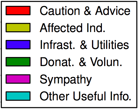
Written in long form: Caution & Advice; Affected Individuals; Infrastructure & Utilities; Donations & Volunteering; Sympathy & Emotional Support, and Other Useful Information. Below are the results of this analysis sorted by descending proportion of Caution & Advice related tweets (click to enlarge).

Screen Shot 2015-02-15 at 10.59.55 AM

The category with the largest number of tweets is “Other Useful Info.” On average 32% of tweets fall into this category (minimum 7%, maximum 59%). Interestingly, it appears that most crisis events that are spread over a relatively large geographical area (i.e., they are diffuse), tend to be associated with the lowest number of “Other” tweets. As my QCRI rightly colleagues note, “it is potentially useful to know that this type of tweet is not prevalent in the diffused events we studied.”

Tweets relating to Sympathy and Emotional Support are present in each of the 26 crises. On average, these account for 20% of all tweets. “The 4 crises in which the messages in this category were more prevalent (above 40%) were all instantaneous disasters.” This finding may imply that “people are more likely to offer sympathy when events […] take people by surprise.”

On average, 20% of tweets in the 26 crises relate to Affected Individuals. “The 5 crises with the largest proportion of this type of information (28%–57%) were human-induced, focalized, and instantaneous. These 5 events can also be viewed as particularly emotionally shocking.”

Tweets related to Donations & Volunteering accounted for 10% of tweets on average. “The number of tweets describing needs or offers of goods and services in each event varies greatly; some events have no mention of them, while for others, this is one of the largest information categories. “

Caution and Advice tweets constituted on average 10% of all tweets in a given crisis. The results show a “clear separation between human-induced hazards and natural: all human induced events have less caution and advice tweets (0%–3%) than all the events due to natural hazards (4%–31%).”

Finally, tweets related to Infrastructure and Utilities represented on average 7% of all tweets posted in a given crisis. The disasters with the highest number of such tweets tended to be flood situations.

In addition to the above analysis, Alexandra et al. also categorized tweets by their source:

Screen Shot 2015-02-15 at 11.23.19 AM

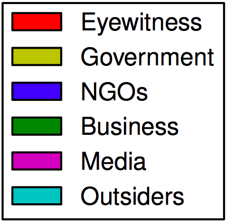
The results depicted below (click to enlarge) are sorted by descending order of eyewitness tweets.

Screen Shot 2015-02-15 at 11.27.57 AM

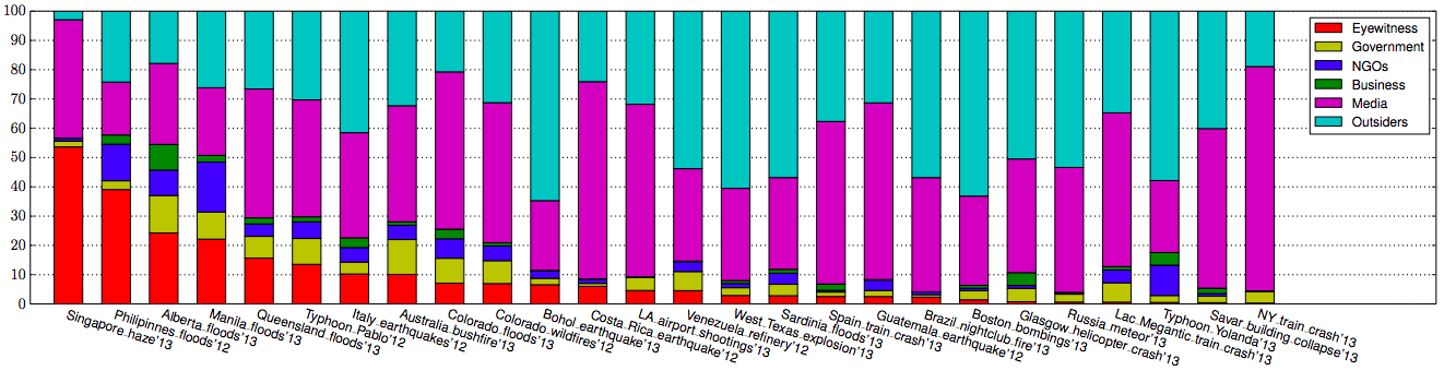
On average, about 9% of tweets generated during a given crises were written by Eyewitnesses; a figure that increased to 54% for the haze crisis in Singapore. “In general, we find a larger proportion of eyewitness accounts during diffused disasters caused by natural hazards.”

Traditional and/or Internet Media were responsible for 42% of tweets on average. ” The 6 crises with the highest fraction of tweets coming from a media source (54%–76%) are instantaneous, which make “breaking news” in the media.

On average, Outsiders posted 38% of the tweets in a given crisis while NGOs were responsible for about 4% of tweets and Governments 5%. My colleagues surmise that these low figures are due to the fact that both NGOs and governments seek to verify information before they release it. The highest levels of NGO and government tweets occur in response to natural disasters.

Finally, Businesses account for 2% of tweets on average. The Alberta floods of 2013 saw the highest proportion (9%) of tweets posted by businesses.

All the above findings are combined and displayed below (click to enlarge). The figure depicts the “average distribution of tweets across crises into combinations of information types (rows) and sources (columns). Rows and columns are sorted by total frequency, starting on the bottom-left corner. The cells in this figure add up to 100%.”

Screen Shot 2015-02-15 at 11.42.39 AM

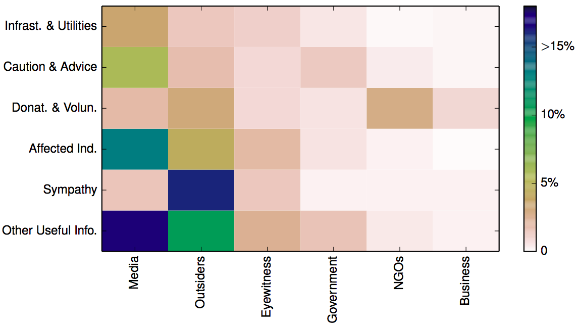
The above analysis suggests that “when the geographical spread [of a crisis] is diffused, the proportion of Caution and Advice tweets is above the median, and when it is focalized, the proportion of Caution and Advice tweets is below the median. For sources, […] human-induced accidental events tend to have a number of eyewitness tweets below the median, in comparison with intentional and natural hazards.” Additional analysis carried out by my colleagues indicate that “human-induced crises are more similar to each other in terms of the types of information disseminated through Twitter than to natural hazards.” In addition, crisis events that develop instantaneously also look the same when studied through the lens of tweets.

In conclusion, the analysis above demonstrates that “in some cases the most common tweet in one crisis (e.g. eyewitness accounts in the Singapore haze crisis in 2013) was absent in another (e.g. eyewitness accounts in the Savar building collapse in 2013). Furthermore, even two events of the same type in the same country (e.g. Typhoon Yolanda in 2013 and Typhoon Pablo in 2012, both in the Philippines), may look quite different vis-à-vis the information on which people tend to focus.” This suggests the uniqueness of each event.

“Yet, when we look at the Twitter data at a meta-level, our analysis reveals commonalities among the types of information people tend to be concerned with, given the particular dimensions of the situations such as hazard category (e.g. natural, human-induced, geophysical, accidental), hazard type (e.g. earth-quake, explosion), whether it is instantaneous or progressive, and whether it is focalized or diffused. For instance, caution and advice tweets from government sources are more common in progressive disasters than in instantaneous ones. The similarities do not end there. When grouping crises automatically based on similarities in the distributions of different classes of tweets, we also realize that despite the variability, human-induced crises tend to be more similar to each other than to natural hazards.”

Needless to say, these are exactly the kind of findings that can improve the way we use MicroMappers & other humanitarian technologies for disaster response. So if want to learn more, the full study is available here (PDF). In addition, all the Twitter datasets used for the analysis are available at CrisisLex. If you have questions on the research, simply post them in the comments section below and I’ll ask my colleagues to reply there.

bookcover

In the meantime, there is a lot more on humanitarian technology and computing in my new book Digital Humanitarians. As I note in said book, we also need enlightened policy making to tap the full potential of social media for disaster response. Technology alone can only take us so far. If we don’t actually create demand for relevant tweets in the first place, then why should social media users supply a high volume of relevant and actionable tweets to support relief efforts? This OCHA proposal on establishing specific social media standards for disaster response, and this official social media strategy developed and implemented by the Filipino government are examples of what enlightened leadership looks like.

Twitter, Crises and Early Detection: Why “Small Data” Still Matters

My colleagues John Brownstein and Rumi Chunara at Harvard Univer-sity’s HealthMap project are continuing to break new ground in the field of Digital Disease Detection. Using data obtained from tweets and online news, the team was able to identify a cholera outbreak in Haiti weeks before health officials acknowledged the problem publicly. Meanwhile, my colleagues from UN Global Pulse partnered with Crimson Hexagon to forecast food prices in Indonesia by carrying out sentiment analysis of tweets. I had actually written this blog post on Crimson Hexagon four years ago to explore how the platform could be used for early warning purposes, so I’m thrilled to see this potential realized.

There is a lot that intrigues me about the work that HealthMap and Global Pulse are doing. But one point that really struck me vis-a-vis the former is just how little data was necessary to identify the outbreak. To be sure, not many Haitians are on Twitter and my impression is that most humanitarians have not really taken to Twitter either (I’m not sure about the Haitian Diaspora). This would suggest that accurate, early detection is possible even without Big Data; even with “Small Data” that is neither representative or indeed verified. (Inter-estingly, Rumi notes that the Haiti dataset is actually larger than datasets typically used for this kind of study).

In related news, a recent peer-reviewed study by the European Commi-ssion found that the spatial distribution of crowdsourced text messages (SMS) following the earthquake in Haiti were strongly correlated with building damage. Again, the dataset of text messages was relatively small. And again, this data was neither collected using random sampling (i.e., it was crowdsourced) nor was it verified for accuracy. Yet the analysis of this small dataset still yielded some particularly interesting findings that have important implications for rapid damage detection in post-emergency contexts.

While I’m no expert in econometrics, what these studies suggests to me is that detecting change-over–time is ultimately more critical than having a large-N dataset, let alone one that is obtained via random sampling or even vetted for quality control purposes. That doesn’t mean that the latter factors are not important, it simply means that the outcome of the analysis is relatively less sensitive to these specific variables. Changes in the baseline volume/location of tweets on a given topic appears to be strongly correlated with offline dynamics.

What are the implications for crowdsourced crisis maps and disaster response? Could similar statistical analyses be carried out on Crowdmap data, for example? How small can a dataset be and still yield actionable findings like those mentioned in this blog post?

The Mathematics of War: On Earthquakes and Conflicts

A conversation with my colleague Sinan Aral at PopTech 2011 reminded me of some earlier research I had carried out on the mathematics of war. So this is a good time to share some of the findings from this research. The story begins some 60 years ago, when British physicist Lewis Fry Richardson found that international wars follow what is called a power law distribution. A power law distribution relates the frequency and “magnitude” of events. For example, the Richter scale, relates the size of earthquakes to their frequency. Richardson found that the frequency of international wars and the number of causalities each produced followed a power law.

More recently, my colleague Erik-Lars Cederman sought to explain Richardson’s findings in his 2003 peer-reviewed publication “Modeling the Size of Wars: From Billiard Balls to Sandpiles.” However, Lars used an invalid statistical technique to test for power law distributions. In 2005, I began collaborating with Pro-fessors Neil Johnson and Michael Spagat on related research after I came across their fascinating co-authored study that tested casualty distributions in new wars (internal conflicts) for power laws. Though he was not a co-author on the 2005 study, my colleague Sean Gourely presented this research at TED in 2009.

In any case, I invited Michael to present his research at The Fletcher School in the Fall of 2005 to generate interest here. Shortly after, I suggested to Michael that we test whether conflict events, in addition to casualties, followed a power law distribution. I had access to an otherwise proprietary dataset on conflict events that spanned a longer time period than the casualty datasets that he and Neils were working off. I also suggested we try to test whether casualties from natural disasters follow a power law distribution.

We chose to pursue the latter first and I submitted an abstract to the 2006 American Political Science Association (APSA) conference to present our findings. Soon after, I was accepted to the Santa Fe Institute’s Complex Systems Summer Institute for PhD students and took the opportunity to pursue my original research in testing conflict events for power law distributions with my colleague Dr. Ryan Woodard.

The APSA paper, presented in August 2006, was entitled “Natural Disasters, Casualties and Power Laws:  A Comparative Analysis with Armed Conflict” (PDF). Here is the paper’s abstract and findings:

Power-law relationships, relating events with magnitudes to their frequency, are common in natural disasters and violent conflict. Compared to many statistical distributions, power laws drop off more gradually, i.e. they have “fat tails”. Existing studies on natural disaster power laws are mostly confined to physical measurements, e.g., the Richter scale, and seldom cover casualty distributions. Drawing on the Center for Research on the Epidemiology of Disasters (CRED) International Disaster Database, 1980 to 2005, we find strong evidence for power laws in casualty distributions for all disasters combined, both globally and by continent except for North America and non-EU Europe. This finding is timely and gives useful guidance for disaster preparedness and response since natural catastrophes are increasing in frequency and affecting larger numbers of people.  We also find that the slopes of the disaster casualty power laws are much smaller than those for modern wars and terrorism, raising an open question of how to explain the differences. We show that many standard risk quantification methods fail in the case of natural disasters.

apsa1

Dr. Woodard and I presented our research on power laws and conflict events at SFI in June 2006. We produced a paper in August of that year entitled “Concerning Critical Correlations in Conflict, Cooperation and Casualties” (PDF). As the title implies, we also tested whether cooperative events followed a power law. As far as I know, we were the first to test conflict events not to mention cooperative events for power laws. In addition, we looked at conflict/cooperation (C/C) events in Western countries.

The abstract and some findings are included below:

Knowing that the number of casualties of war are distributed as a power law and given a rich data set of conflict and cooperation (C/C) events, we ask: Are there correlations among C/C events? Is there a correlation between C/C events and war casualties? Can C/C data be used as proxy for (potentially) less reliable casualty data? Can C/C data be used in conflict early warning systems? To begin to answer these questions we analyze the distribution of C/C event data for the period 1990–2004 in Afghanistan, Colombia, Iran, Iraq, North Korea, Switzerland, UK and USA. We find that the distributions of individual C/C event types scale as power laws, but only over approximately a single decade, leaving open the possibility of a more appropriate fit (for which we have not yet tested). However, the average exponent of the power law (2.5) is the same as that found in recent studies of casualties of war. We find low levels of correlations between C/C events in Iraq and Afghanistan but not in the other countries studied. We find that the distribution of the sum of all conflict or cooperation events scales exponentially. Finally, we find low levels of correlations between a two year time series of casualties in Afghanistan and the corresponding conflict events.

sfi1sfi2sfi3

I’m looking to discuss all this further with Sinan and learning more about his fascinating area of research.