Tag Archives: Tweets

Could This Be The Most Comprehensive Study of Crisis Tweets Yet?

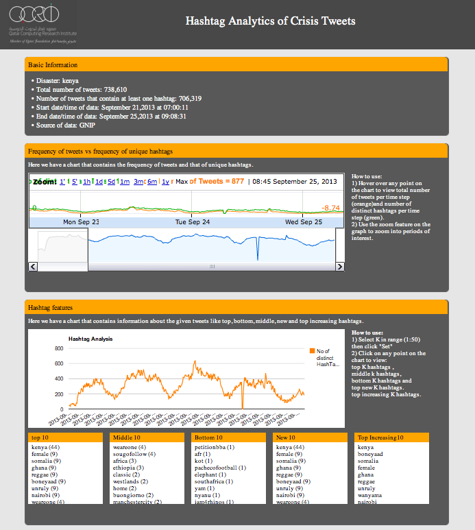
I’ve been looking forward to blogging about my team’s latest research on crisis computing for months; the delay being due to the laborious process of academic publishing, but I digress. I’m now able to make their  findings public. The goal of their latest research was to “understand what affected populations, response agencies and other stakeholders can expect—and not expect—from [crisis tweets] in various types of disaster situations.”

Screen Shot 2015-02-15 at 12.08.54 PM

As my colleagues rightly note, “Anecdotal evidence suggests that different types of crises elicit different reactions from Twitter users, but we have yet to see whether this is in fact the case.” So they meticulously studied 26 crisis-related events between 2012-2013 that generated significant activity on twitter. The lead researcher on this project, my colleague & friend Alexandra Olteanu from EPFL, also appears in my new book.

Alexandra and team first classified crisis related tweets based on the following categories (each selected based on previous research & peer-reviewed studies):

Screen Shot 2015-02-15 at 11.01.48 AM

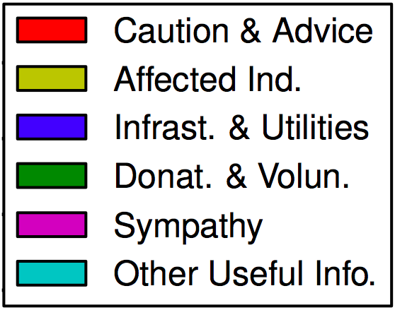
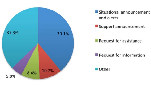
Written in long form: Caution & Advice; Affected Individuals; Infrastructure & Utilities; Donations & Volunteering; Sympathy & Emotional Support, and Other Useful Information. Below are the results of this analysis sorted by descending proportion of Caution & Advice related tweets (click to enlarge).

Screen Shot 2015-02-15 at 10.59.55 AM

The category with the largest number of tweets is “Other Useful Info.” On average 32% of tweets fall into this category (minimum 7%, maximum 59%). Interestingly, it appears that most crisis events that are spread over a relatively large geographical area (i.e., they are diffuse), tend to be associated with the lowest number of “Other” tweets. As my QCRI rightly colleagues note, “it is potentially useful to know that this type of tweet is not prevalent in the diffused events we studied.”

Tweets relating to Sympathy and Emotional Support are present in each of the 26 crises. On average, these account for 20% of all tweets. “The 4 crises in which the messages in this category were more prevalent (above 40%) were all instantaneous disasters.” This finding may imply that “people are more likely to offer sympathy when events […] take people by surprise.”

On average, 20% of tweets in the 26 crises relate to Affected Individuals. “The 5 crises with the largest proportion of this type of information (28%–57%) were human-induced, focalized, and instantaneous. These 5 events can also be viewed as particularly emotionally shocking.”

Tweets related to Donations & Volunteering accounted for 10% of tweets on average. “The number of tweets describing needs or offers of goods and services in each event varies greatly; some events have no mention of them, while for others, this is one of the largest information categories. “

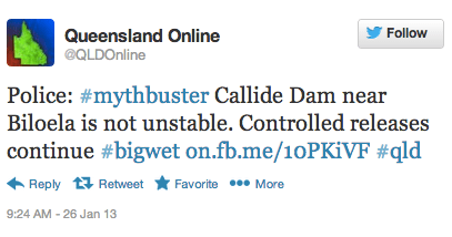
Caution and Advice tweets constituted on average 10% of all tweets in a given crisis. The results show a “clear separation between human-induced hazards and natural: all human induced events have less caution and advice tweets (0%–3%) than all the events due to natural hazards (4%–31%).”

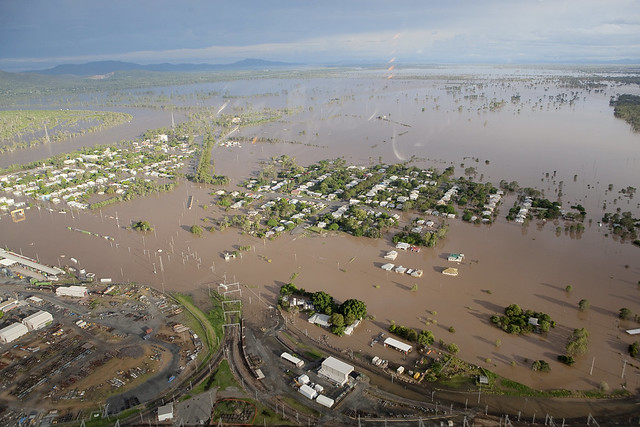
Finally, tweets related to Infrastructure and Utilities represented on average 7% of all tweets posted in a given crisis. The disasters with the highest number of such tweets tended to be flood situations.

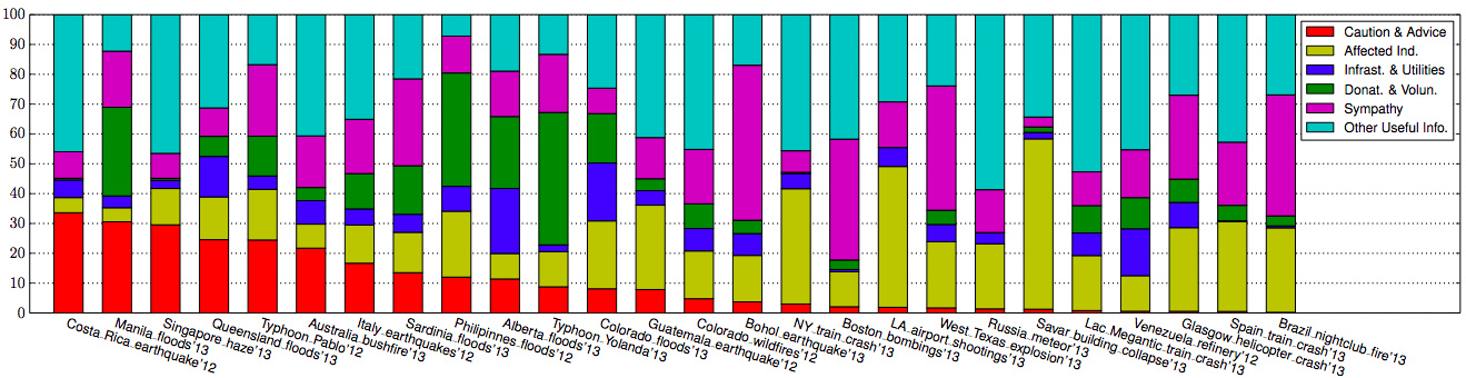
In addition to the above analysis, Alexandra et al. also categorized tweets by their source:

Screen Shot 2015-02-15 at 11.23.19 AM

The results depicted below (click to enlarge) are sorted by descending order of eyewitness tweets.

Screen Shot 2015-02-15 at 11.27.57 AM

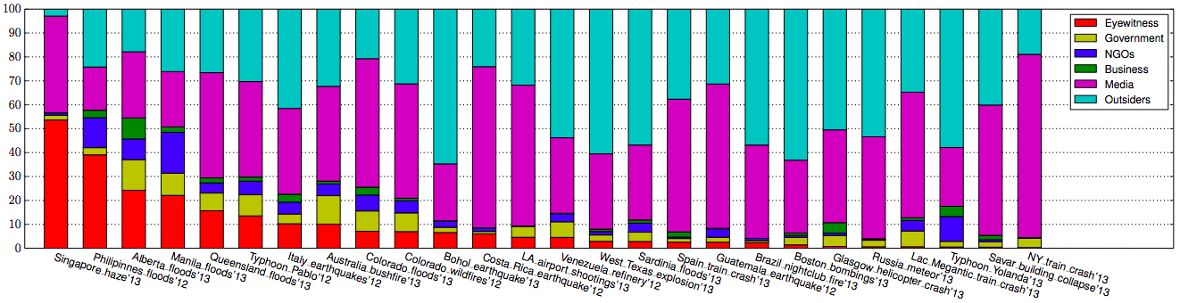
On average, about 9% of tweets generated during a given crises were written by Eyewitnesses; a figure that increased to 54% for the haze crisis in Singapore. “In general, we find a larger proportion of eyewitness accounts during diffused disasters caused by natural hazards.”

Traditional and/or Internet Media were responsible for 42% of tweets on average. ” The 6 crises with the highest fraction of tweets coming from a media source (54%–76%) are instantaneous, which make “breaking news” in the media.

On average, Outsiders posted 38% of the tweets in a given crisis while NGOs were responsible for about 4% of tweets and Governments 5%. My colleagues surmise that these low figures are due to the fact that both NGOs and governments seek to verify information before they release it. The highest levels of NGO and government tweets occur in response to natural disasters.

Finally, Businesses account for 2% of tweets on average. The Alberta floods of 2013 saw the highest proportion (9%) of tweets posted by businesses.

All the above findings are combined and displayed below (click to enlarge). The figure depicts the “average distribution of tweets across crises into combinations of information types (rows) and sources (columns). Rows and columns are sorted by total frequency, starting on the bottom-left corner. The cells in this figure add up to 100%.”

Screen Shot 2015-02-15 at 11.42.39 AM

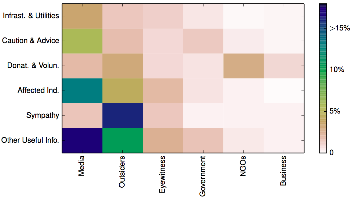
The above analysis suggests that “when the geographical spread [of a crisis] is diffused, the proportion of Caution and Advice tweets is above the median, and when it is focalized, the proportion of Caution and Advice tweets is below the median. For sources, […] human-induced accidental events tend to have a number of eyewitness tweets below the median, in comparison with intentional and natural hazards.” Additional analysis carried out by my colleagues indicate that “human-induced crises are more similar to each other in terms of the types of information disseminated through Twitter than to natural hazards.” In addition, crisis events that develop instantaneously also look the same when studied through the lens of tweets.

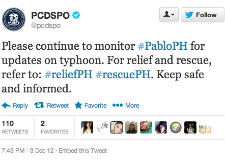
In conclusion, the analysis above demonstrates that “in some cases the most common tweet in one crisis (e.g. eyewitness accounts in the Singapore haze crisis in 2013) was absent in another (e.g. eyewitness accounts in the Savar building collapse in 2013). Furthermore, even two events of the same type in the same country (e.g. Typhoon Yolanda in 2013 and Typhoon Pablo in 2012, both in the Philippines), may look quite different vis-à-vis the information on which people tend to focus.” This suggests the uniqueness of each event.

“Yet, when we look at the Twitter data at a meta-level, our analysis reveals commonalities among the types of information people tend to be concerned with, given the particular dimensions of the situations such as hazard category (e.g. natural, human-induced, geophysical, accidental), hazard type (e.g. earth-quake, explosion), whether it is instantaneous or progressive, and whether it is focalized or diffused. For instance, caution and advice tweets from government sources are more common in progressive disasters than in instantaneous ones. The similarities do not end there. When grouping crises automatically based on similarities in the distributions of different classes of tweets, we also realize that despite the variability, human-induced crises tend to be more similar to each other than to natural hazards.”

Needless to say, these are exactly the kind of findings that can improve the way we use MicroMappers & other humanitarian technologies for disaster response. So if want to learn more, the full study is available here (PDF). In addition, all the Twitter datasets used for the analysis are available at CrisisLex. If you have questions on the research, simply post them in the comments section below and I’ll ask my colleagues to reply there.

bookcover

In the meantime, there is a lot more on humanitarian technology and computing in my new book Digital Humanitarians. As I note in said book, we also need enlightened policy making to tap the full potential of social media for disaster response. Technology alone can only take us so far. If we don’t actually create demand for relevant tweets in the first place, then why should social media users supply a high volume of relevant and actionable tweets to support relief efforts? This OCHA proposal on establishing specific social media standards for disaster response, and this official social media strategy developed and implemented by the Filipino government are examples of what enlightened leadership looks like.

#Westgate Tweets: A Detailed Study in Information Forensics

My team and I at QCRI have just completed a detailed analysis of the 13,200+ tweets posted from one hour before the attacks began until two hours into the attack. The purpose of this study, which will be launched at CrisisMappers 2013 in Nairobi tomorrow, is to make sense of the Big (Crisis) Data generated during the first hours of the siege. A summary of our results are displayed below. The full results of our analysis and discussion of findings are available as a GoogleDoc and also PDF. The purpose of this public GoogleDoc is to solicit comments on our methodology so as to inform the next phase of our research. Indeed, our aim is to categorize and study the entire Westgate dataset in the coming months (730,000+ tweets). In the meantime, sincere appreciation go to my outstanding QCRI Research Assistants, Ms. Brittany Card and Ms. Justine MacKinnon for their hard work on the coding and analysis of the 13,200+ tweets. Our study builds on this preliminary review.

The following 7 figures summarize the main findings of our study. These are discussed in more detail in the GoogleDoc/PDF.

Figure 1: Who Authored the Most Tweets?

Figure 2: Frequency of Tweets by Eyewitnesses Over Time?

Figure 3: Who Were the Tweets Directed At?

Figure 4: What Content Did Tweets Contain?

Figure 5: What Terms Were Used to Reference the Attackers?

Figure 6: What Terms Were Used to Reference Attackers Over Time?

Figure 7: What Kind of Multimedia Content Was Shared?

Analyzing Fake Content on Twitter During Boston Marathon Bombings

As iRevolution readers already know, the application of Information Forensics to social media is one of my primary areas of interest. So I’m always on the lookout for new and related studies, such as this one (PDF), which was just published by colleagues of mine in India. The study by Aditi Gupta et al. analyzes fake content shared on Twitter during the Boston Marathon Bombings earlier this year.

bostonstrong

Gupta et al. collected close to 8 million unique tweets posted by 3.7 million unique users between April 15-19th, 2013. The table below provides more details. The authors found that rumors and fake content comprised 29% of the content that went viral on Twitter, while 51% of the content constituted generic opinions and comments. The remaining 20% relayed true information. Interestingly, approximately 75% of fake tweets were propagated via mobile phone devices compared to true tweets which comprised 64% of tweets posted via mobiles.

Table1 Gupta et al

The authors also found that many users with high social reputation and verified accounts were responsible for spreading the bulk of the fake content posted to Twitter. Indeed, the study shows that fake content did not travel rapidly during the first hour after the bombing. Rumors and fake information only goes viral after Twitter users with large numbers of followers start propagating the fake content. To this end, “determining whether some information is true or fake, based on only factors based on high number of followers and verified accounts is not possible in the initial hours.”

Gupta et al. also identified close to 32,000 new Twitter accounts created between April 15-19 that also posted at least one tweet about the bombings. About 20% (6,073 accounts) of these new accounts were subsequently suspended by Twitter. The authors found that 98.7% of these suspended accounts did not include the word Boston in their names and usernames. They also note that some of these deleted accounts were “quite influential” during the Boston tragedy. The figure below depicts the number of suspended Twitter accounts created in the hours and days following the blast.

Figure 2 Gupta et al

The authors also carried out some basic social network analysis of the suspended Twitter accounts. First, they removed from the analysis all suspended accounts that did not interact with each other, which left just 69 accounts. Next, they analyzed the network typology of these 69 accounts, which produced four distinct graph structures: Single Link, Closed Community, Star Typology and Self-Loops. These are displayed in the figure below (click to enlarge).

Figure 3 Gupta et al

The two most interesting graphs are the Closed Community and Star Typology graphs—the second and third graphs in the figure above.

Closed Community: Users that retweet and mention each other, forming a closed community as indicated by the high closeness centrality values produced by the social network analysis. “All these nodes have similar usernames too, all usernames have the same prefix and only numbers in the suffixes are different. This indicates that either these profiles were created by same or similar minded people for posting common propaganda posts.” Gupta et al. analyzed the content posted by these users and found that all were “tweeting the same propaganda and hate filled tweet.”

Star Typology: Easily mistakable for the authentic “BostonMarathon” Twitter account, the fake account “BostonMarathons” created plenty of confusion. Many users propagated the fake content posted by the BostonMarathons account. As the authors note, “Impersonation or creating fake profiles is a crime that results in identity theft and is punishable by law in many countries.”

The automatic detection of these network structures on Twitter may enable us to detect and counter fake content in the future. In the meantime, my colleagues and I at QCRI are collaborating with Aditi Gupta et al. to develop a “Credibility Plugin” for Twitter based on this analysis and earlier peer-reviewed research carried out by my colleague ChaTo. Stay tuned for updates.

Bio

See also:

  • Boston Bombings: Analyzing First 1,000 Seconds on Twitter [link]
  • Taking the Pulse of the Boston Bombings on Twitter [link]
  • Predicting the Credibility of Disaster Tweets Automatically [link]
  • Auto-Ranking Credibility of Tweets During Major Events [link]
  • Auto-Identifying Fake Images on Twitter During Disasters [link]
  • How to Verify Crowdsourced Information from Social Media [link]
  • Crowdsourcing Critical Thinking to Verify Social Media [link]

Hashtag Analysis of #Westgate Crisis Tweets

In July 2013, my team and I at QCRI launched this dashboard to analyze hashtags used by Twitter users during crises. Our first case study, which is available here, focused on Hurricane Sandy. Since then, both the UN and Greenpeace have also made use of the dashboard to analyze crisis tweets.

QCRI_Dashboard

We just uploaded 700,000+ Westgate related tweets to the dashboard. The results are available here and also displayed above. The dashboard is still under development, so we very much welcome feedback on how to improve it for future analysis. You can upload your own tweets to the dashboard if you’d like to test drive the platform.

Bio

See also: Forensics Analysis of #Westgate Tweets (Link)

Map: 24 hours of Tweets in New York

The map below depicts geo-tagged tweets posted between May 4-5, 2013 in the New York City area. Over 36,000 tweets are posted on the map (click to enlarge). Since less than 3% of all tweets are geo-tagged, the map is missing the vast majority of tweets posted in this area during those 24 hours.

New York Tweets 24 hours

Contrast the above with the 1-month worth of tweets (April-May 2013) depicted in the map below. Again, the visualization misses the vast majority of tweets since these are not geo-tagged and thus not mappable.

New York 1 Month Tweets

These visuals are screenshots of Harvard’s Tweetmap platform, which is publicly available here. My colleague Todd Mostak is one of the main drivers behind Tweetmap, so worth sending him a quick thank you tweet! Todd is working on some exciting extensions and refinements, so stay tuned as I’ll be sure to blog about them when they go live.

Bio

Results: Analyzing 2 Million Disaster Tweets from Oklahoma Tornado

Thanks to the excellent work carried out by my colleagues Hemant Purohit and Professor Amit Sheth, we were able to collect 2.7 million tweets posted in the aftermath of the Category 4 Tornado that devastated Moore, Oklahoma. Hemant, who recently spent half-a-year with us at QCRI, kindly took the lead on carrying out some preliminary analysis of the disaster data. He sampled 2.1 million tweets posted during the first 48 hours for the analysis below.

oklahoma-tornado-20

About 7% of these tweets (~146,000 tweets) were related to donations of resources and services such as money, shelter, food, clothing, medical supplies and volunteer assistance. Many of the donations-related tweets were informative in nature, e.g.: “As President Obama said this morning, if you want to help the people of Moore, visit [link]”. Approximately 1.3% of the tweets (about 30,000 tweets) referred to the provision of financial assistance to the disaster-affected population. Just over 400 unique tweets sought non-monetary donations, such as “please help get the word out, we are accepting kid clothes to send to the lil angels in Oklahoma.Drop off.

Exactly 152 unique tweets related to offers of help were posted within the first 48 hours of the Tornado. The vast majority of these were asking how to get involved in helping others affected by the disaster. For example: “Anyone know how to get involved to help the tornado victims in Oklahoma??#tornado #oklahomacity” and “I want to donate to the Oklahoma cause shoes clothes even food if I can.” These two offers of help are actually automatically “matchable”, making the notion of a “Match.com” for disaster response a distinct possibility. Indeed, Hemant has been working with my team and I at QCRI to develop algorithms (classifiers) that not only identify relevant needs/offers from Twitter automatically but also suggests matches as a result.

Some readers may be suprised to learn that “only” several hundred unique tweets (out of 2+million) were related to needs/offers. The first point to keep in mind is that social media complements rather than replaces traditional information sources. All of us working in this space fully recognize that we are looking for the equivalent of needles in a haystack. But these “needles” may contain real-time, life-saving information. Second, a significant number of disaster tweets are retweets. This is not a negative, Twitter is particularly useful for rapid information dissemination during crises. Third, while there were “only” 152 unique tweets offering help, this still represents over 130 Twitter users who were actively seeking ways to help pro bono within 48 hours of the disaster. Plus, they are automatically identifiable and directly contactable. So these volunteers could also be recruited as digital humanitarian volunteers for MicroMappers, for example. Fourth, the number of Twitter users continues to skyrocket. In 2011, Twitter had 100 million monthly active users. This figure doubled in 2012. Fifth, as I’ve explained here, if disaster responders want to increase the number of relevant disaster tweets, they need to create demand for them. Enlightened leadership and policy is necessary. This brings me to point six: we were “only” able to collect ~2 million tweets but suspect that as many as 10 million were posted during the first 48 hours. So humanitarian organizations along with their partners need access to the Twitter Firehose. Hence my lobbying for Big Data Philanthropy.

Finally, needs/offers are hardly the only type of useful information available on Twitter during crises, which is why we developed several automatic classifiers to extract data on: caution and advice, infrastructure damage, casualties and injuries, missing people and eyewitness accounts. In the near future, when our AIDR platform is ready, colleagues from the American Red Cross, FEMA, UN, etc., will be able create their own classifiers on the fly to automatically collect information that is directly relevant to them and their relief operations. AIDR is spearheaded by QCRI colleague ChaTo and myself.

For now though, we simply emailed relevant geo-tagged and time-stamped data on needs/offers to colleagues at the American Red Cross who had requested this information. We also shared data related to gas leaks with colleagues at FEMA and ESRI, as per their request. The entire process was particularly insightful for Hemant and I, so we plan to follow up with these responders to learn how we can best support them again until AIDR becomes operational. In the meantime, check out the Twitris+ platform developed by Amit, Hemant and team at Kno.e.sis

bio

See also: Analysis of Multimedia Shared on Twitter After Tornado [Link

Using #Mythbuster Tweets to Tackle Rumors During Disasters

The massive floods that swept through Queensland, Australia in 2010/2011 put an area almost twice the size of the United Kingdom under water. And now, a year later, Queensland braces itself for even worse flooding:

Screen Shot 2013-01-26 at 11.38.38 PM

More than 35,000 tweets with the hashtag #qldfloods were posted during the height of the flooding (January 10-16, 2011). One of the most active Twitter accounts belonged to the Queensland Police Service Media Unit: @QPSMedia. Tweets from (and to) the Unit were “overwhelmingly focussed on providing situational information and advice” (1). Moreover, tweets between @QPSMedia and followers were “topical and to the point, significantly involving directly affected local residents” (2). @QPSMedia also “introduced innovations such as the #Mythbuster series of tweets, which aimed to intervene in the spread of rumor and disinformation” (3).

rockhampton floods 2011

On the evening of January 11, @QPSMedia began to post a series of tweets with #Mythbuster in direct response to rumors and misinformation circulating on Twitter. Along with official notices to evacuate, these #Mythbuster tweets were the most widely retweeted @QPSMedia messages.” They were especially successful. Here is a sample: “#mythbuster: Wivenhoe Dam is NOT about to collapse! #qldfloods”; “#mythbuster: There is currently NO fuel shortage in Brisbane. #qldfloods.”

Screen Shot 2013-01-27 at 12.19.03 AM

This kind of pro-active intervention reminds me of the #fakesandy hashtag used during Hurricane Sandy and FEMA’s rumor control initiative during Hurricane Sandy. I expect to see greater use of this approach by professional emergency responders in future disasters. There’s no doubt that @QPSMedia will provide this service again with the coming floods and it appears that @QLDonline is already doing so (above tweet). Brisbane’s City Council has also launched this Crowdmap marking latest road closures, flood areas and sandbag locations. Hoping everyone in Queensland stays safe!

In the meantime, here are some relevant statistics on the crisis tweets posted during the 2010/2011 floods in Queensland:

  • 50-60% of #qldfloods messages were retweets (passing along existing messages, and thereby  making them more visible); 30-40% of messages contained links to further information elsewhere on the Web.
  • During the crisis, a number of Twitter users dedicated themselves almost exclusively to retweeting #qldfloods messages, acting as amplifiers of emergency information and thereby increasing its reach.
  • #qldfloods tweets largely managed to stay on topic and focussed predominantly on sharing directly relevant situational information, advice, news media and multimedia reports.
  • Emergency services and media organisations were amongst the most visible participants in #qldfloods, especially also because of the widespread retweeting of their messages.
  • More than one in every five shared links in the #qldfloods dataset was to an image hosted on one of several image-sharing services; and users overwhelmingly depended on Twitpic and other Twitter-centric image-sharing services to upload and distribute the photographs taken on their smartphones and digital cameras
  • The tenor of tweets during the latter days of the immediate crisis shifted more strongly towards organising volunteering and fundraising efforts: tweets containing situational information and advice, and news media and multimedia links were retweeted disproportionately often.
  • Less topical tweets were far less likely to be retweeted.

Debating the Value of Tweets For Disaster Response (Intelligently)

With every new tweeted disaster comes the same old question: what is the added value of tweets for disaster response? Only a handful of data-driven studies actually bother to move the debate beyond anecdotes. It is thus high time that a meta-level empirical analysis of the existing evidence be conducted. Only then can we move towards a less superficial debate on the use of social media for disaster response and emergency management.

In her doctoral research Dr. Sarah Vieweg found that between 8% and 24% of disaster tweets she studied “contain information that provides tactical, action-able information that can aid people in making decisions, advise others on how to obtain specific information from various sources, or offer immediate post-impact help to those affected by the mass emergency.” Two of the disaster datasets that Vieweg analyzed were the Red River Floods of 2009 and 2010. The tweets from the 2010 disaster resulted in a small increase of actionable tweets (from ~8% to ~9%). Perhaps Twitter users are becoming more adept at using Twitter during crises? The lowest number of actionable tweets came from the Red River Floods of 2009, whereas the highest came from the Haiti Earthquake of 2010. Again, there is variation—this time over space.

In this separate study, over 64,000 tweets generated during Thailand’s major floods in 2011 were analyzed. The results indicate that about 39% of these tweets belonged to the “Situational Awareness and Alerts” category. “Twitter messages in this category include up-to-date situational and location-based information related to the flood such as water levels, traffic conditions and road conditions in certain areas. In addition, emergency warnings from authorities advising citizens to evacuate areas, seek shelter or take other protective measures are also included.” About 8% of all tweets (over 5,000 unique tweets) were “Requests for Assistance,” while 5% were “Requests for Information Categories.”

TwitterDistribution

In this more recent study, researchers mapped flood-related tweets and found a close match between that resulting map and the official government flood map. In the map below, tweets were normalized, such that values greater than one mean more tweets than would be expected in normal Twitter traffic. “Unlike many maps of online phenomena, careful analysis and mapping of Twitter data does NOT simply mirror population densities. Instead con-centration of twitter activity (in this case tweets containing the keyword flood) seem to closely reflect the actual locations of floods and flood alerts even when we simply look at the total counts.” This also implies that a relatively high number of flood-related tweets must have contained accurate information.

TwitterMapUKfloods

Shifting from floods to fires, this earlier research analyzed some 1,700 tweets generated during Australia’s worst bushfire in history. About 65% of the tweets had “factual details,” i.e., “more than three of every five tweets had useful infor-mation.” In addition, “Almost 22% of the tweets had geographical data thus identifying location of the incident which is critical in crisis reporting.” Around 7% of the tweets were seeking information, help or answers. Finally, close to 5% (about 80 tweets) were considered “directly actionable.”

Preliminary findings from applied research that I am carrying out with my Crisis Computing team at QCRI also reveal variation in value. In one disaster dataset we studied, up to 56% of the tweets were found to be informative. But in two other datasets, we found the number of informative tweets to be very low. Meanwhile, a recent Pew Research study found that 34% of tweets during Hurricane Sandy “involved news organizations providing content, government sources offering information, people sharing their own eyewitness accounts and still more passing along information posted by others.” In addition, “fully 25% [of tweets] involved people sharing photos and videos,” thus indicating “the degree to which visuals have become a more common element of this realm.”

Finally, this recent study analyzed over 35 million tweets posted by ~8 million users based on current trending topics. From this data, the authors identified 14 major events reflected in the tweets. These included the UK riots, Libya crisis, Virginia earthquake and Hurricane Irene, for example. The authors found that “on average, 30% of the content about an event, provides situational awareness information about the event, while 14% was spam.”

So what can we conclude from these few studies? Simply that the value of tweets for disaster response can vary considerably over time and space. The debate should thus not center around whether tweets yield added value for disaster response but rather what drives this variation in value. Identifying these drivers may enable those with influence to incentivize high-value tweets.

This interesting study, “Do All Birds Tweet the Same? Characterizing Twitter Around the World,” reveals some very interesting drivers. The social network analysis (SNA) of some 5 million users and 5 billion tweets across 10 countries reveals that “users in the US give Twitter a more informative purpose, which is reflected in more globalized communities, which are more hierarchical.” The study is available here (PDF). This American penchant for posting “informative” tweets is obviously not universal. To this end, studying network typologies on Twitter may yield further insights on how certain networks can be induced—at a structural level—to post more informative tweets following major disasters.

Twitter Pablo Gov

Regardless of network typology, however, policy still has an important role to play in incentivizing high-value tweets. To be sure, if demand for such tweets is not encouraged, why would supply follow? Take the forward-thinking approach by the Government of the Philippines, for example. The government actively en-couraged users to use specific hashtags for disaster tweets days before Typhoon Pablo made landfall. To make this kind of disaster reporting via twitter more actionable, the Government could also encourage the posting of pictures and the use of a structured reporting syntax—perhaps a simplified version of the Tweak the Tweet approach. Doing so would not only provide the government with greater situational awareness, it would also facilitate self-organized disaster response initiatives.

In closing, perhaps we ought to keep in mind that even if only, say, 0.001% of the 20 million+ tweets generated during the first five days of Hurricane Sandy were actionable and only half of these were accurate, this would still mean over a thousand informative, real-time tweets, or about 15,000 words, or 25 pages of single-space, relevant, actionable and timely disaster information.

PS. While the credibility and veracity of tweets is an important and related topic of conversation, I have already written at length about this.

MAQSA: Social Analytics of User Responses to News

Designed by QCRI in partnership with MIT and Al-Jazeera, MAQSA provides an interactive topic-centric dashboard that summarizes news articles and user responses (comments, tweets, etc.) to these news items. The platform thus helps editors and publishers in newsrooms like Al-Jazeera’s better “understand user engagement and audience sentiment evolution on various topics of interest.” In addition, MAQSA “helps news consumers explore public reaction on articles relevant to a topic and refine their exploration via related entities, topics, articles and tweets.” The pilot platform currently uses Al-Jazeera data such as Op-Eds from Al-Jazeera English.

Given a topic such as “The Arab Spring,” or “Oil Spill”, the platform combines time, geography and topic to “generate a detailed activity dashboard around relevant articles. The dashboard contains an annotated comment timeline and a social graph of comments. It utilizes commenters’ locations to build maps of comment sentiment and topics by region of the world. Finally, to facilitate exploration, MAQSA provides listings of related entities, articles, and tweets. It algorithmically processes large collections of articles and tweets, and enables the dynamic specification of topics and dates for exploration.”

While others have tried to develop similar dashboards in the past, these have “not taken a topic-centric approach to viewing a collection of news articles with a focus on their user comments in the way we propose.” The team at QCRI has since added a number of exciting new features for Al-Jazeera to try out as widgets on their site. I’ll be sure to blog about these and other updates when they are officially launched. Note that other media companies (e.g., UK Guardian) will also be able to use this platform and widgets once they become public.

As always with such new initiatives, my very first thought and question is: how might we apply them in a humanitarian context? For example, perhaps MAQSA could be repurposed to do social analytics of responses from local stakeholders with respect to humanitarian news articles produced by IRIN, an award-winning humanitarian news and analysis service covering the parts of the world often under-reported, misunderstood or ignored. Perhaps an SMS component could also be added to a MAQSA-IRIN platform to facilitate this. Or perhaps there’s an application for the work that Internews carries out with local journalists and consumers of information around the world. What do you think?