Augmented Reality for Crisis Mapping and Humanitarian Response

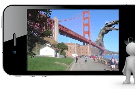
Could we leverage Augmented Reality (AR) apps for Crisis Mapping? I’ve been thinking about this question for a while but finally decided to experiment after bumping into Autonomy here at the IPI World Congress in Taipei. The company has a free AR app called Aurasma, which basically lets the user create their own AR action. So I gave it a spin, figuring that if people could animate the odd T-Rex splish-splashing in the Bay Area, there might also be some humanitarian applications worth exploring.

Autonomy’s AR app is available for the iPhone, iPad and the Android. What is especially neat is that you can cache the AR data and therefore use the app off-line, always a plus for crisis response. I experimented by using: (1) the amazing Humanitarian OpenStreetMap animated video of Haiti, (2) Internews’s excellent humanitarian technology report on Dadaab (a must read), and (3), a printout of WalkingPapers for some location in California.

I had to use an iPhone and iPad at the same time to film the AR in action, so apologies in advance for the less than smooth panning. In this first video, I point the iPad’s camera to a screenshot print-out of the OpenStreetMap (OSM) video, the cover of Internews’s report and a paper-based map from WalkingPapers. For the OSM screenshot, I superimposed the video animation. I added a dynamic visualization of an Ushahidi platform for Somalia on the front page of the Internews report and added AR red dots to the WalkingPapers handout.

The OSM video animation in AR is a little wobbly but comes out much nicer on this video which demo’s the iPhone app.

The Aurasma app was easy to use and the Autonomy Marketing Executive I spoke to said he’d be happy to support humanitarian applications of the platform. One idea would be to visualize MapAction GIS products in the field with an AR layer for crowdsourced data, for example. In other words, the hard copy maps could serve as informative base maps on top of which dynamic event-data could be visualized (and updated) via the Aurasma app. A related idea: visualize projected weather forecasts on top of a hard copy map of flood prone areas. Of course, the same types of visualizations could be done from a GIS platform but I’m thinking about mobile, rapid and off-line options for humanitarian professionals not conversant in GIS.

How would you apply AR to crisis mapping? Is AR even useful for humanitarian response or yet another unnecessary gadget? Feel free to share your thoughts in the comments section below. (As for fans of David Suarez’s book, The Daemon, yes, this brings us one step closer to Matthew Sobol’s vision).

The Standby Volunteer Task Force: One Year On

The Standby Volunteer Task Force (SBTF) was launched exactly a year ago tomorrow and what a ride it has been! It was on September 26, 2010, that I published the blog post below to begin rallying the first volunteers to the cause.

The first blog post announcing the SBTF

Some three hundred and sixty plus days later, no fewer than 621 volunteers have joined the SBTF. These amazing individuals are based in the following sixty plus countries, including: Afghanistan, Algeria, Argentina, Armenia, Australia, Belgium, Brazil, Canada, Chile, Colombia, Czech Republic, Denmark, Egypt, Finland, France, Germany, Ghana, Greece, Guam, Guatemala, Haiti, Hungary, India, Indonesia, Iran, Ireland, Israel, Italy, Japan, Jordan, Kenya, Republic of South Korea, Lebanon, Liberia, Libya, Mexico, Morocco, Nepal, Netherlands, New Zealand, Nigeria, Pakistan, Palestine, Peru, Philippines, Poland, Portugal, Senegal, Serbia, Singapore, Slovenia, Somalia, South Africa, Spain, Sudan, Switzerland, Tajikistan, Trinidad and Tobago, Tunisia, Turkey, Uganda, United Kingdom, United States and Venezuela.

Most members have added themselves to the SBTF map below.

Between them, members of the SBTF represent several hundred organizations, including the American Red Cross, the American University in Cairo, Australia’s National University, Bertelsmann Foundation, Briceland Volunteer Fire Department, Brussels School of International Studies, Carter Center, Columbia University, Crisis Commons, Deloitte Consulting, Engineers without Borders, European Commission Joint Research Center, Fairfax County International Search & Rescue Team, Fire Department of NYC, Fletcher School, GIS Corps, Global Voices Online, Google, Government of Ontario, Grameen Development Services, Habitat for Humanity, Harvard Humanitarian Initiative, International Labor Organization, International Organization for Migration, John Carroll University, Johns Hopkins University, Lewis and Clark College, Lund University, Mercy Corps, Ministry of Agriculture and Forestry of New Zealand, Medecins Sans Frontieres, NASA, National Emergency Management Association, National Institute for Urban Search and Rescue, Nethope, New York University, OCHA, Open Geospatial Consortium, OpenStreetMap, OSCE, Pan American Health Organization, Portuguese Red Cross, Sahana Software Foundation, Save the Children, Sciences Po Paris, Skoll Foundation, School of Oriental and African Studies, Tallinn University, Tech Change, Tulane University, UC Berkeley,  UN Volunteers, UNAIDS, UNDP Bangladesh, University of Algiers, University of Colorado, University of Portsmouth, UNOPS, Ushahidi-Liberia, WHO, World Bank and Yale University.

Over the past twelve months, major SBTF deployments have included the Colombia Disaster Simulation with UN OCHA Colombia, Sudan Vote Monitor, Cyclone Yasi, Christchurch Earthquake, Libya Crisis Map and the Alabama Tornado. SBTF volunteers were also involved in other projects in Mumbai, Khartoum, Somalia and Syria with partners such as UNHCR and AI-USA. The latter two saw the establishment of a brand new SBTF team, the Satellite Imagery Team, the eleventh team to joint the SBTF Group (see figure below).  SBTF Coordinators organized and held several trainings for new members in 2011, as have our partners like the Humanitarian OpenStreetMap Team. You can learn more about all this (and join!) by visiting the SBTF blog.

We’re  grateful to have been featured in the media on several occasions over the past year, documenting how we’re changing the world, one map at a time. CNN, UK Guardian, The Economist, Fast Company, IRIN News, Washington Post, Technology Review, PBS and NPR all covered our efforts. The SBTF has also been presented at numerous conferences such as TEDxSilicon Valley, The Skoll World Forum, Re:publica, ICRC Global Communications Forum, ESRI User Conference and Share Conference. But absolutely none of this would be possible without the inspiring dedication of SBTF members and Team Coordinators.

Indeed, were it not for them, the Libya Crisis Map that we launched for UN OCHA would have looked like this (as would all the other maps):

So this digital birthday cakes goes to every SBTF member who offered their time and thereby made what this global network is today, you all know who you are and have my sincere gratitude, respect and deep admiration. SBTF Coordinators and Core Team Members deserve very special thanks and recognition for the many, many extra days and indeed weeks they have committed to the SBTF. We are also most grateful to our partners, including Ning, UN OCHA-Geneva and OCHA-Colombia for their support, camaraderie and mentorship. So a big, big thank you to all and a very happy birthday, Mapsters! I look forward to the second candle!

Combining Crowdsourced Satellite Imagery Analysis with Crisis Reporting: An Update on Syria

Members of the the Standby Volunteer Task Force (SBTF) Satellite Team are currently tagging the location of hundreds of Syrian tanks and other heavy mili-tary equipment on the Tomnod micro-tasking platform using very recent high-resolution satellite imagery provided by Digital Globe.

We’re focusing our efforts on the following three key cities in Syria as per the request of Amnesty International USA’s (AI-USA) Science for Human Rights Program.

For more background information on the project, please see the following links:

To recap, the purpose of this experimental pilot project is to determine whether satellite imagery analysis can be crowdsourced and triangulated to provide data that might help AI-USA corroborate numerous reports of human rights abuses they have been collecting from a multitude of other sources over the past few months. The point is to use the satellite tagging in combination with other data, not in isolation.
 
To this end, I’ve recommended that we take it one step further. The Syria Tracker Crowdmap has been operations for months. Why not launch an Ushahidiplatform that combines the triangulated features from the crowdsourced satellite imagery analysis with crowdsourced crisis reports from multiple sources?

The satellite imagery analyzed by the SBTF was taken in early September. We could grab the August and September crisis data from Syria Tracker and turn the satellite imagery analysis data into layers. For example, the “Military tag” which includes large military equipment like tanks and artillery could be uploaded to Ushahidi as a KML file. This would allow AI-USA and others to cross-reference their own reports, with those on Syria Tracker and then also place that analysis into context vis-a-vis the location of military equipment, large crowds and check-points over the same time period.

The advantage of adding these layers to an Ushahidi platform is that they could be updated and compared over time. For example, we could compare the location of Syrian tanks versus on-the-ground reports of shelling for the month of August, September, October, etc. Perhaps we could even track the repositioning of  some military equipment if we repeated this crowdsourcing initiative more frequently. Incidentally, President Eisenhower proposed this idea to the UN during the Cold War, see here.

In any case, this initiative is still very much experimental and there’s lots to learn. The SBTF Tech Team headed by Nigel McNie is looking to make the above integration happen, which I’m super excited about. I’d love to see closer integration with satellite imagery analysis data in future Ushahidi deployments that crowdsource crisis reporting from the field. Incidentally, we could scale this feature tagging approach to include hundreds if not thousands of volunteers.

In other news, my SBTF colleague Shadrock Roberts and I had a very positive conference call with UNHCR this week. The SBTF will be partnering with HCR on an official project to tag the location of informal shelters in the Afgooye corridor in the near future. Unlike our trial run from several weeks ago, we will have a far more developed and detailed rule-set & feature-key thanks to some very useful information that our colleagues at HCR have just shared with us. We’ll be adding the triangulated features from the imagery analysis to a dedicated UNHCR Ushahidi platform. We hope to run this project in October and possibly again in January so HCR can do some simple change detection using Ushahidi.

In parallel, we’re hoping to partner with the Joint Research Center (JRC), which has developed automated methods for shelter detection. Comparing crowdsourced feature tagging with an automated approach would provide yet more information to UNHCR to corroborate their assessments.

Help Crowdsource Satellite Imagery Analysis for Syria: Building a Library of Evidence

Update: Project featured on UK Guardian Blog! Also, for the latest on the project, please see this blog post.

This blog post follows from this previous one: “Syria – Crowdsourcing Satellite Imagery Analysis to Identify Mass Human Rights Violations.” As part of the first phase of this project, we are building a library of satellite images for features we want to tag using crowdsourcing.

In particular, we are looking to identify the following evidence using high-resolution satellite imagery:

  • Large military equipment
  • Large crowds
  • Checkpoints
The idea is to provide volunteers the Standby Volunteer Task Force (SBTF) Satellite Team with as much of road map as possible so they know exactly what they’re looking for in the  satellite imagery they’ll be tagging using the Tomnod system:

Here are some of the pictures we’ve been able to identify thanks to the help of my good colleague Christopher Albon:
I’ve placed these and other examples in this Google Doc which is open for comment. We need your help to provide us with other imagery depicting heavy Syrian military equipment, large crowds and checkpoints. Please provide links and screenshots of such imagery in this open and editable Google Doc.Here are some of the links that Chris already sent us for the above imagery:


How to Crowdsource Crisis Response

I recently had the distinct pleasure of giving this year’s keynote address at the Global Communications Forum (#RCcom on Twitter) organized by the Interna-tional Committee of the Red Cross (ICRC) in Geneva. The conversations that followed were thoroughly fruitful and enjoyable.

Like many other humanitarian organizations, the ICRC is thinking hard about how to manage the social media challenge. In 2010, this study carried out by the American Red Cross (ARC) found that the public increasingly expects humanitarian organizations to respond to pleas for help posted on social media platforms like Facebook, Twitter, etc. The question is, how in the world are humanitarian organizations supposed to handle this significant increase in “customer service” requests? Even during non-emergencies, ARC’s Facebook page receives a large number of comments on a daily basis many of which solicit replies. This figure escalates significantly during crises. So what to do?

The answer, in my opinion, requires some organizational change. Clearly, the dramatic rise in customer service requests posted on social media platforms cannot be managed through existing organizational structures and work flows. Moreover, the vast majority of posted requests don’t reflect life threatening situations. In other words, responses to many requests don’t require professional emergency responders. So humanitarian organizations should consider taking a two-pronged strategy to address the social media challenge. The first is to upgrade their “customer service systems” and the second is to connect these systems with local networks of citizen crisis responders.

How do large private sector companies deal with the social media challenge? Well, some obviously do better than others. (Incidentally, this question was a recurring topic of conversation at the Same Wavelength conference in London where I spoke after Geneva). This explains why I recommended that my ICRC colleagues consider various social media customer service models used in the private sector and identify examples of positive deviance.

The latest innovation in the customer service space was just launched at TechCrunch Disrupt this week. TalkTo “allows consumers to send text messages to any business and get quick responses to questions, feedback, and more.” As TechCrunch writes, “no one wants to wait on the phone, and email can be slow as well. SMS Messaging is a natural form of communication these days and the most efficient for simple questions. It makes sense to bring this communication to businesses.” If successful, I wonder whether TalkTo will add Twitter and Facebook to their service as other communication media.

Some companies leverage crowdsourcing, like Best Buy’s TwelpForce. Over time, Best Buy “found that with some good foundational guideposts and training tools, the crowd began to self-organize and govern itself.  Leaders in the space popped up as coaches, or mentors – and pretty soon they had a really good support network in place.”

On the humanitarian side, the American Red Cross has begun to leverage their trained volunteers to manage responses to the organization’s official Facebook page, for example. With some good foundational guideposts and training tools, they should be able to scale this solution. In some ways, one could say that humanitarian organizations are increasingly required to play the role of “telephone” operator. So I’d be very interested in getting feedback from iRevolution readers on alternative, social media approaches to customer service in the private sector. If you know of any innovative ones, please feel free to share in the comments section below.

The second strategy that humanitarian organizations need to consider is linking this new customer service system to networks of citizen crisis responders. An “operator” on the ARC Facebook page, for example, would triage the incoming posts by “pushing” them into different bins according to topic and urgency. Posts that don’t reflect a life-threatening situation but still require operational response could simply be forwarded to local citizen crisis responders. The rest can be re-routed to professional emergency responders. Geo-fenced alerts from crisis mapping platforms could also play an important role in this respect.

One should remember that the majority of crisis responses are “crowdsourced” by definition since the real first responders are always local communities. For example, “it is well known that in case of earthquakes, such as the one that happened in Mexico City, the assistance to the victims comes first of all from the other survivors […]” (Gilbert 1998). In fact, estimates suggest that, “no more than 10 per cent of survival in emergencies can be contributed to external sources of relief aid” (Hillhorst 2004). So why not connect humanitarian customer service systems to local citizen crisis responders and thereby make the latter’s response more targeted and efficient rather than simply ad hoc? I’ve used the term “crowdfeeding” to describe this idea in previous blog posts like this one and this one. We basically need a Match.com for citizen based crisis response in which both problems and solutions are crowdsourced.

So where are these “new” citizen crisis responders to come from? How about leveraging existing networks like Community Emergency Response Teams (CERTs), the UN Volunteer system (UNVs), Red Cross volunteer networks and platforms like Red Cross Volunteer Match? Why not make use of existing training materials like FEMA’s online courses? Universities could also promote the idea of student crisis responders and offer credit for relevant courses.

Update: New app helps Queensland coordinate volunteers.

Syria: Crowdsourcing Satellite Imagery Analysis to Identify Mass Human Rights Violations

Update: See this blog post for the latest. Also, our project was just featured on the UK Guardian Blog!

What if we crowdsourced satellite imagery analysis of key cities in Syria to identify evidence of mass human rights violations? This is precisely the question that my colleagues at Amnesty International USA’s Science for Human Rights Program asked me following this pilot project I coordinated for Somalia. AI-USA has done similar work in the past with their Eyes on Darfur project, which I blogged about here in 2008. But using micro-tasking with backend triangulation to crowdsource the analysis of high resolution satellite imagery for human rights purposes is definitely breaking new ground.

A staggering amount of new satellite imagery is produced every day; millions of square kilometers’ worth according to one knowledgeable colleague. This is a big data problem that needs mass human intervention until the software can catch up. I recently spoke with Professor Ryan Engstrom, the Director of the Spatial Analysis Lab at George Washington University, and he confirmed that automated algorithms for satellite imagery analysis still have a long, long way to go. So the answer for now has to be human-driven analysis.

But professional satellite imagery experts who have plenty of time to volunteer their skills are far and few between. The Satellite Sentinel Project (SSP), which I blogged about here, is composed of a very small team and a few interns. Their focus is limited to the Sudan and they are understandably very busy. My colleagues at AI-USA analyze satellite imagery for several conflicts, but this takes them far longer than they’d like and their small team is still constrained given the number of conflicts and vast amounts of imagery that could be analyzed. This explains why they’re interested in crowdsourcing.

Indeed, crowdsourcing imagery analysis has proven to be a workable solution in several other projects & sectors. The “crowd” can indeed scan and tag vast volumes of satellite imagery data when that imagery is “sliced and diced” for micro-tasking. This is what we did for the Somalia pilot project thanks to the Tomnod platform and the imagery provided by Digital Globe. The yellow triangles below denote the “sliced images” that individual volunteers from the Standby Task Force (SBTF) analyzed and tagged one at a time.

We plan do the same with high resolution satellite imagery of three key cities in Syria selected by the AI-USA team. The specific features we will look for and tag include: “Burnt and/or darkened building features,” “Roofs absent,” “Blocks on access roads,” “Military equipment in residential areas,” “Equipment/persons on top of buildings indicating potential sniper positions,” “Shelters composed of different materials than surrounding structures,” etc. SBTF volunteers will be provided with examples of what these features look like from a bird’s eye view and from ground level.

Like the Somalia project, only when a feature—say a missing roof—is tagged identically  by at least 3 volunteers will that location be sent to the AI-USA team for review. In addition, if volunteers are unsure about a particular feature they’re looking at, they’ll take a screenshot of said feature and share it on a dedicated Google Doc for the AI-USA team and other satellite imagery experts from the SBTF team to review. This feedback mechanism is key to ensure accurate tagging and inter-coder reliability. In addition, the screenshots shared will be used to build a larger library of features, i.e., what a missing roof looks like as well military equipment in residential areas, road blocks, etc. Volunteers will also be in touch with the AI-USA team via a dedicated Skype chat.

There will no doubt be a learning curve, but the sooner we climb that learning curve the better. Democratizing satellite imagery analysis is no easy task and one or two individuals have opined that what we’re trying to do can’t be done. That may be, but we won’t know unless we try. This is how innovation happens. We can hypothesize and talk all we want, but concrete results are what ultimately matters. And results are what can help us climb that learning curve. My hope, of course, is that democratizing satellite imagery analysis enables AI-USA to strengthen their advocacy campaigns and makes it harder for perpetrators to commit mass human rights violations.

SBTF volunteers will be carrying out the pilot project this month in collaboration with AI-USA, Tomnod and Digital Globe. How and when the results are shared publicly will be up to the AI-USA team as this will depend on what exactly is found. In the meantime, a big thanks to Digital Globe, Tomnod and SBTF volunteers for supporting the AI-USA team on this initiative.

If you’re interested in reading more about satellite imagery analysis, the following blog posts may also be of interest:

• Geo-Spatial Technologies for Human Rights
• Tracking Genocide by Remote Sensing
• Human Rights 2.0: Eyes on Darfur
• GIS Technology for Genocide Prevention
• Geo-Spatial Analysis for Global Security
• US Calls for UN Aerial Surveillance to Detect Preparations for Attacks
• Will Using ‘Live’ Satellite Imagery to Prevent War in the Sudan Actually Work?
• Satellite Imagery Analysis of Kenya’s Election Violence: Crisis Mapping by Fire
• Crisis Mapping Uganda: Combining Narratives and GIS to Study Genocide
• Crowdsourcing Satellite Imagery Analysis for Somalia: Results of Trial Run
• Genghis Khan, Borneo & Galaxies: Crowdsourcing Satellite Imagery Analysis
• OpenStreetMap’s New Micro-Tasking Platform for Satellite Imagery Tracing


OpenStreetMap’s New Micro-Tasking Platform for Satellite Imagery Tracing

The Humanitarian OpenStreetMap Team’s (HOT) response to Haiti remains one of the most remarkable examples of what’s possible when volunteers, open source software and open data intersect. When the 7.0 magnitude earthquake struck on January 12th, 2010, the Google Map of downtown Port-au-Prince was simply too incomplete to be used for humanitarian response. Within days, however, several hundred volunteers from the OpenStreetMap (OSM) commu-nity used satellite imagery to trace roads, shelters and other important features to create the most detailed map of Haiti ever made.

OpenStreetMap – Project Haiti from ItoWorld on Vimeo.

The video animation above shows just how spectacular this initiative was. More than 1.4 million edits were made to the map during the first month following the earthquake. These individual edits are highlighted as bright flashes of light in the video. This detailed map went a long way to supporting the humanitarian community’s response in Haiti. In addition, the map enabled my colleagues and I at The Fletcher School to geo-locate reports from crowdsourced text messages from Mission 4636 on the Ushahidi Haiti Map.

HOT’s response was truly remarkable. They created wiki’s to facilitate mass collaboration such as this page on “What needs to be mapped?” They also used this “OSM Matrix” to depict which areas required more mapping:

The purpose of OSM’s new micro-tasking platform is to streamline mass and rapid collaboration on future satellite image tracing projects. I recently reached out to HOT’s Kate Chapman and Nicolas Chavent to get an overview of their new platform. After logging in using my OSM username and password, I can click through a list of various on-going projects. The one below relates to a very neat HOT project in Indonesia. As you can tell, the region that needs to be mapped on the right-hand side of the screen is divided into a grid.

After I click on “Take a task randomly”, the screen below appears, pointing me to one specific cell in the grid above. I then have the option of opening and editing this cell within JOSM, the standard interface for editing OpenStreetMap. I would then trace all roads and buildings in my square and submit the edit. (I was excited to also see a link to WalkingPapers which allows you to print out and annotate that cell using pen & paper and then digitize the result for import back into OSM).

There’s no doubt that this new Tasking Server will go a long way to coordinate and streamline future live tracing efforts such as for Somalia. For now, the team is mapping Somalia’s road network using their wiki approach. In the future, I hope that the platform will also enable basic feature tagging and back-end triangulation for quality assurance purposes—much like Tomnod. In the meantime, however, it’s important to note that OSM is far more than just a global open source map. OSM’s open data advocacy is imperative for disaster preparedness and response: open data saves lives.

Crowdsourcing and Crisis Mapping World War I

I came across some interesting finds at the National Air and Space Museum this weekend. The World War One (WWI) exhibit had this large, back-lit crisis map:

Now, war maps are nothing new. In this previous blog post, I noted that, “In 1668, Louis XIV of France commissioned three-dimensional scale models of eastern border towns, so that his generals in Paris and Versailles could plan realistic maneuvers. […] As late as World War II, the French government guarded them as military secrets with the highest security classification” (see picture). What struck me about the crisis map of WWI was the text above the title:

“To satisfy the public’s desire for information about the war, newspapers published war maps that provided the locations and military capabilities of the warring nations. This map, published at the outbreak of hostilities illustrates the British view of the war’s global scope.” I’m intrigued by this find and wonder how often these maps were updated and what sources were used. Would public opinion at the time have differed had live crowdsourced crisis maps existed?

Towards the end of the WWI exhibit, I came across this sign, originally posted near the entrances of the London Underground. The warning relates to hostile German aircraft that had begun to bomb London in early 1915. On September 8, a Zepellin raid on the city cause more than half a million pounds of damage.

What stuck me about this warning were the following instructions: “In the event of a hostile aircraft being seen in country districts, the nearest Naval, Military or Police Authorities should, if possible, be advised immediately by Telephone of the time of appearance, the direction of flight, and whether the aircraft is an Airship or an Aeroplane.” Crowdsourcing early warnings of WWI attacks.

Know of other interesting examples of crowsourcing during the first (or second) world war? If so, please feel free to share in the comments section below, I’d love to compile more examples.

Crowdsourcing Satellite Imagery Analysis for Somalia: Results of Trial Run

We’ve just completed our very first trial run of the Standby Task Volunteer Force (SBTF) Satellite Team. As mentioned in this blog post last week, the UN approached us a couple weeks ago to explore whether basic satellite imagery analysis for Somalia could be crowdsourced using a distributed mechanical turk approach. I had actually floated the idea in this blog post during the floods in Pakistan a year earlier. In any case, a colleague at Digital Globe (DG) read my post on Somalia and said: “Lets do it.”

So I reached out to Luke Barrington at Tomnod to set up distributed micro-tasking platform for Somalia. To learn more about Tomond’s neat technology, see this previous blog post. Within just a few days we had high resolution satellite imagery from DG and a dedicated crowdsourcing platform for imagery analysis, courtesy of Tomnod . All that was missing were some willing and able “mapsters” from the SBTF to tag the location of shelters in this imagery. So I sent out an email to the group and some 50 mapsters signed up within 48 hours. We ran our pilot from August 26th to August 30th. The idea here was to see what would go wrong (and right!) and thus learn as much as we could before doing this for real in the coming weeks.

It is worth emphasizing that the purpose of this trial run (and entire exercise) is not to replicate the kind of advanced and highly-skilled satellite imagery analysis that professionals already carry out.  This is not just about Somalia over the next few weeks and months. This is about Libya, Syria, Yemen, Afghanistan, Iraq, Pakistan, North Korea, Zimbabwe, Burma, etc. Professional satellite imagery experts who have plenty of time to volunteer their skills are far and few between. Meanwhile, a staggering amount of new satellite imagery is produced  every day; millions of square kilometers’ worth according to one knowledgeable colleague.

This is a big data problem that needs mass human intervention until the software can catch up. Moreover, crowdsourcing has proven to be a workable solution in many other projects and sectors. The “crowd” can indeed scan vast volumes of satellite imagery data and tag features of interest. A number of these crowds-ourcing platforms also have built-in quality assurance mechanisms that take into account the reliability of the taggers and tags. Tomnod’s CrowdRank algorithm, for example, only validates imagery analysis if a certain number of users have tagged the same image in exactly the same way. In our case, only shelters that get tagged identically by three SBTF mapsters get their locations sent to experts for review. The point here is not to replace the experts but to take some of the easier (but time-consuming) tasks off their shoulders so they can focus on applying their skill set to the harder stuff vis-a-vis imagery interpretation and analysis.

The purpose of this initial trial run was simply to give SBTF mapsters the chance to test drive the Tomnod platform and to provide feeback both on the technology and the work flows we put together. They were asked to tag a specific type of shelter in the imagery they received via the web-based Tomnod platform:

There’s much that we would do differently in the future but that was exactly the point of the trial run. We had hoped to receive a “crash course” in satellite imagery analysis from the Satellite Sentinel Project (SSP) team but our colleagues had hardly slept in days because of some very important analysis they were doing on the Sudan. So we did the best we could on our own. We do have several satellite imagery experts on the SBTF team though, so their input throughout the process was very helpful.

Our entire work flow along with comments and feedback on the trial run is available in this open and editable Google Doc. You’ll note the pages (and pages) of comments, questions and answers. This is gold and the entire point of the trial run. We definitely welcome additional feedback on our approach from anyone with experience in satellite imagery interpretation and analysis.

The result? SBTF mapsters analyzed a whopping 3,700+ individual images and tagged more than 9,400 shelters in the green-shaded area below. Known as the “Afgooye corridor,” this area marks the road between Mogadishu and Afgooye which, due to displacement from war and famine in the past year, has become one of the largest urban areas in Somalia. [Note, all screen shots come from Tomnod].

Last year, UNHCR used “satellite imaging both to estimate how many people are living there, and to give the corridor a concrete reality. The images of the camps have led the UN’s refugee agency to estimate that the number of people living in the Afgooye Corridor is a staggering 410,000. Previous estimates, in September 2009, had put the number at 366,000” (1).

The yellow rectangles depict the 3,700+ individual images that SBTF volunteers individually analyzed for shelters: And here’s the output of 3 days’ worth of shelter tagging, 9,400+ tags:

Thanks to Tomnod’s CrowdRank algorithm, we were able to analyze consensus between mapsters and pull out the triangulated shelter locations. In total, we get 1,423 confirmed locations for the types of shelters described in our work flows. A first cursory glance at a handful (“random sample”) of these confirmed locations indicate they are spot on. As a next step, we could crowdsource (or SBTF-source, rather) the analysis of just these 1,423 images to triple check consensus. Incidentally, these 1,423 locations could easily be added to Google Earth or a password-protected Ushahidi map.

We’ve learned a lot during this trial run and Luke got really good feedback on how to improve their platform moving forward. The data collected should also help us provide targeted feedback to SBTF mapsters in the coming days so they can further refine their skills. On my end, I should have been a lot more specific and detailed on exactly what types of shelters qualified for tagging. As the Q&A section on the Google Doc shows, many mapsters weren’t exactly sure at first because my original guidelines were simply too vague. So moving forward, it’s clear that we’ll need a far more detailed “code book” with many more examples of the features to look for along with features that do not qualify. A colleague of mine suggested that we set up an interactive, online quiz that takes volunteers through a series of examples of what to tag and not to tag. Only when a volunteer answers all questions correctly do they move on to live tagging. I have no doubt whatsoever that this would significantly increase consensus in subsequent imagery analysis.

Please note: the analysis carried out in this trial run is not for humanitarian organizations or to improve situational awareness, it is simply for testing purposes only. The point was to try something new and in the process work out the kinks so when the UN is ready to provide us with official dedicated tasks we don’t have to scramble and climb the steep learning curve there and then.

In related news, the Humanitarian Open Street Map Team (HOT) provided SBTF mapsters with an introductory course on the OSM platform this past weekend. The HOT team has been working hard since the response to Haiti to develop an OSM Tasking Server that would allow them to micro-task the tracing of satellite imagery. They demo’d the platform to me last week and I’m very excited about this new tool in the OSM ecosystem. As soon as the system is ready for prime time, I’ll get access to the backend again and will write up a blog post specifically on the Tasking Server.

How to Crowdsource Happiness

I was in Kansas last week for TEDxKC. The venue for the event was spectacular: The Nelson-Atkins Museum of Art. The curator kept the museum open that evening for participants to enjoy after the talks. I relished the tranquility and found myself lost in thought in front of a quiet masterpiece by Francois Boucher. I had shared my story “Changing the World, One Map at a Time” on the TEDx stage earlier that evening and realized that live maps and museums weren’t that different. Both are curated and display moments in history, the good and bad.

The opening speaker of TEDxKC 2011 was Jenn Lim, the CEO and Chief Happiness Officer of Delivering Happiness, a company she co-founded to inspire happiness in work, community and everyday life. I found Jenn during the reception and asked: “How about crowdsourcing happiness and creating a happiness map?” The thought had come to me just minutes before my talk. I’ve been focusing on crisis mapping for a while but there’s obviously so much more to live maps.

Historian Geoffrey Blainey argues that “for every thousand pages on the causes of war, there is less than one page on the causes of peace.” And yet, peace is far more pervasive than war, we simply don’t write about it. The same is true of things that go well in general. So what if we made the good stuff more visible and showed just how much more frequent and pervasive peace and happiness are then we may at first realize?

Current world happiness maps are computed by academics using various structural indicators and macro-level statistics. These maps are limited to the nation-state level of analysis which suggests that everyone in a given country is equally happy throughout an entire year. Maps don’t get more old school than this. What is blatantly missing is something like Gross National Happiness (GNH) data but disaggregated, user-generated and mapped in real-time.

I had pitched the same idea to Coca-Cola two years ago as part of their Expedition 206 campaign. Three “Happiness Ambassadors” travelled to 206 countries in 2010 to find what happiness means to the world. I had heard about the project through a good friend who had auditioned to be one of the Happiness Ambassadors.

The idea of a happiness world tour appealed to me a  lot but why not let people speak for themselves and map what happiness means to them? The Expedition 206 Team was already using social media and a map as part of their campaign, so a crowdsourced happiness world map made perfect sense.

This is precisely what I pitched to Coca-Cola as the screenshot below shows. My colleague and friend Caleb Bell from Ushahidi did some awesome interface design work for the pitch.

While Coca-Cola was intrigued by the idea, they had already launched their Expedition 206 Social Media strategy. In any case, this project came to mind just minutes before I got on the TEDxKC stage last week and it’s something I’d like to take up again and would love some help on.

We could customize the Ushahidi platform and smart phone apps. People could then share what happiness means to them by “checking in” with a status update and/or a picture. The content could then be automatically mapped on a World Happiness Map.

Happiness badges could also be won when people check into certain places and/or with certain updates. Happiness messages or pictures could be embedded across the map (geo-fencing) so that anyone checking in at any given time place/time would receive a message/picture that would make them smile.

One could also “Subscribe to Happiness!” by allowing people to receive any happiness updates/pictures from people around them. For example, Mike could subscribe to happiness updates say within a 5 mile radius of the Nelson-Atkins Art Museum. When Kelly checks in on her way to the museum, Mike would  get an update with the happiness message (either anonymous or with Kelly’s name/picture).

I think this could be quite a powerful campaign, especially given the state of the world economy and ongoing crises. Incidentally, smiling has been scientifically shown to have positive health effects such as extending lifespans, as my colleague Ron Gutman points out in this TED talk.

A crowdsourcing happiness campaign would  help remind people about what they do have and what they can be grateful for. One idea, then, might be to launch this campaign as part of the upcoming Thanksgiving holidays. I’d love to partner with someone to make this happen. So please get in touch if you’d like to help. In the meantime, smile! : )