Tag Archives: Satellite

Humanitarians in the Sky: Using UAVs for Disaster Response

The following is a presentation that I recently gave at the 2014 Remotely Piloted Aircraft Systems Conference (RPAS 2014) held in Brussels, Belgium. The case studies on the Philippines and Haiti are also featured in my upcoming book on “Digital Humanitarians: How Big Data is Changing the Face of Humanitarian Response.” The book is slated to be published in January/February 2015.

Screen Shot 2014-06-24 at 2.20.54 PM

Good afternoon and many thanks to Peter van Blyenburgh for the kind invitation to speak on the role of UAVs in humanitarian contexts beyond the European region. I’m speaking today on behalf of the Humanitarian UAV Network, which brings together seasoned humanitarian professionals with UAV experts to facilitate the use of UAVs in humanitarian settings. I’ll be saying more about the Humanitarian UAV Network (UAViators, pronounced “way-viators”) at the end of my talk.

Screen Shot 2014-06-24 at 2.21.19 PM

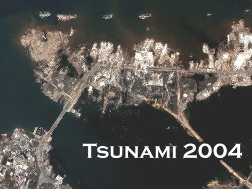
The view from above is key for humanitarian response. Indeed, satellite imagery has played an important role in relief operations since Hurricane Mitch in 1998. And the Indian Ocean Tsunami was the first to be captured from space as the way was still propagating. Some 650 images were produced using data from 15 different sensors. During the immediate aftermath of the Tsunami, satellite images were used at headquarters to assess the extent of the emergency. Later, satellite images were used in the field directly, distributed by the Humanitarian Information Center (HIC) and others to support and coordinate relief efforts. 

Screen Shot 2014-06-24 at 2.21.30 PM

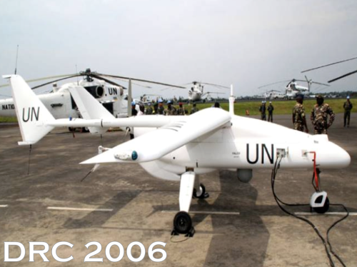
Satellites do present certain limitations, of course. These include cost, the time needed to acquire images, cloud cover, licensing issues and so on. In any event, two years after the Tsunami, an earlier iteration of the UN’s DRC Mission (MONUC) was supported by a European force (EUFOR), which used 4 Belgian UAVs. But I won’t be speaking about this type of UAV. For a variety of reasons, particularly affordability, ease of transport, regulatory concerns, and community engagement, UAVs used in humanitarian response are smaller systems or micro-UAVs that weigh just a few kilograms, such as one fixed-wing displayed below.

Screen Shot 2014-06-24 at 2.21.47 PM

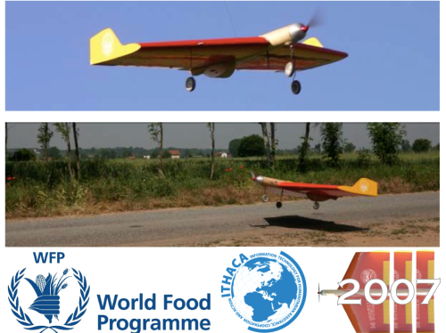
The World Food Program’s UAVs were designed and built at the University of Torino “way back” in 2007. But they’ve been grounded until this year due to lack of legislation in Italy.

Screen Shot 2014-06-24 at 2.22.05 PM

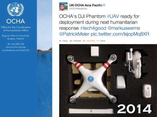
In June 2014, the UN’s Office for the Coordination of Humanitarian Affairs (OCHA) purchased a small quadcopter for use in humanitarian response and advocacy. Incidentally, OCHA is on the Advisory Board of the Humanitarian UAV Network, or UAViators. 

Screen Shot 2014-06-24 at 2.22.41 PM

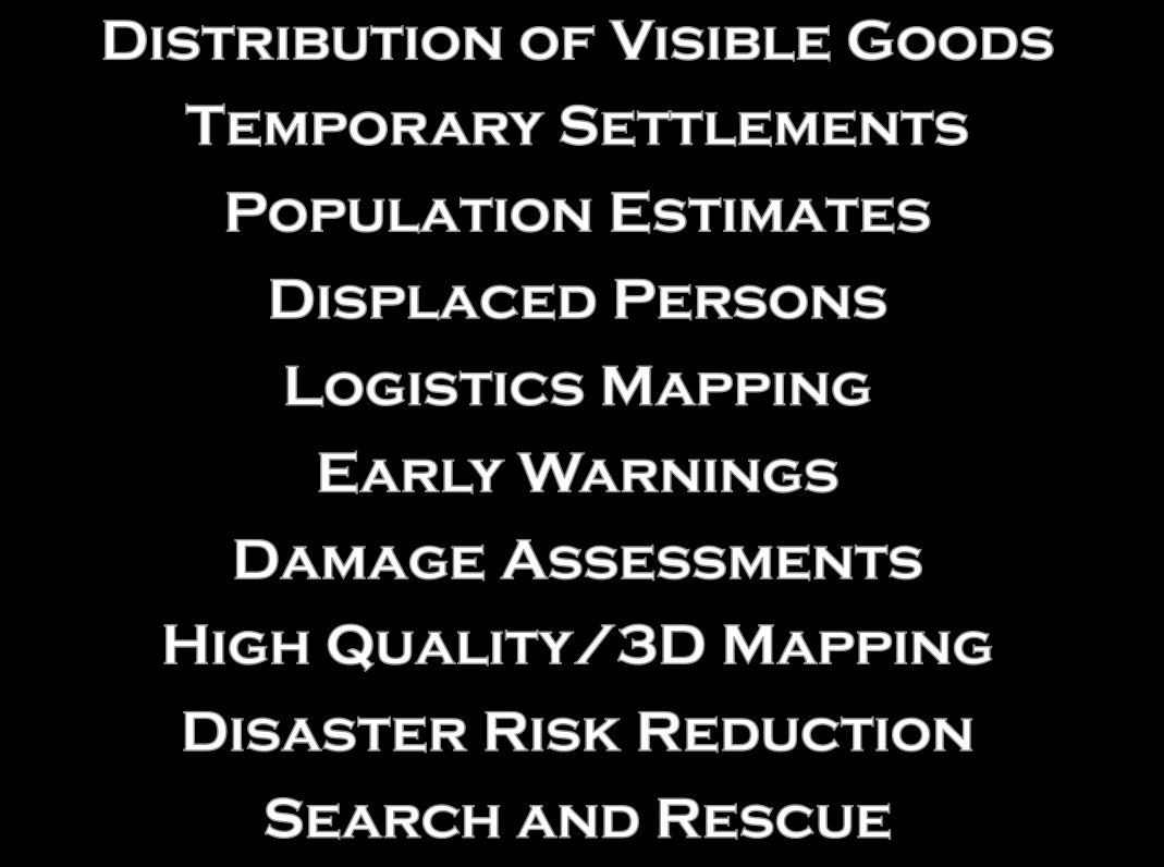
Now, there are many uses cases for the operation of UAVs in humanitarian settings (those listed above are only a subset). All of you here at RPAS 2014 are already very familiar with these applications. So let me jump directly to real world case studies from the Philippines and Haiti.

Screen Shot 2014-06-24 at 2.23.08 PM

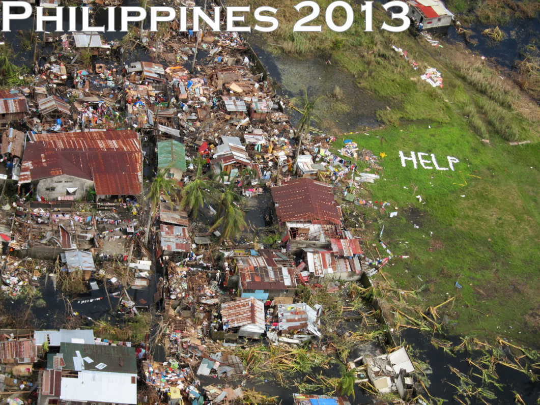
Typhoon Haiyan, or Yolanda as it was known locally, was the most powerful Typhoon in recorded human history to make landfall. The impact was absolutely devastated. I joined UN/OCHA in the Philippines following the Typhoon and was struck by how many UAV projects were being launched. What follows is just a few of said projects.

Screen Shot 2014-06-24 at 2.26.45 PM

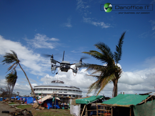
Danoffice IT, a company based in Lausanne, Switzerland, used the Sky-Watch Huginn X1 Quadcopter to support the humanitarian response in Tacloban. The rotary-wing UAV was used to identify where NGOs could set up camp. Later on, the UAV was used to support a range of additional tasks such as identifying which roads were passable for transportation/logistics. The quadcopter was also flown up the coast to assess the damage from the storm surge and flooding and to determine which villages had been most affected. This served to speed up the relief efforts and made the response more targeted vis-a-vis the provision of resources and assistance. Danoffice IT is also on the Board of the Humanitarian UAV Network (UAViators).

Screen Shot 2014-06-24 at 2.27.06 PM

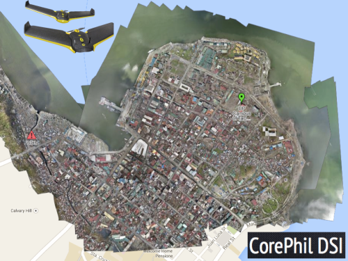
A second UAV project was carried out by local UAV start-up called CorePhil DSI. The team used an eBee to capture aerial imagery of downtown Tacloban, one of the areas hardest-hit by Typhoon Yolanda. They captured 22 Gigabytes of imagery and shared this with the Humanitarian OpenStreetMap Team (HOT) who are also on the Board of UAViators. HOT subsequently crowdsourced the tracing of this imagery (and satellite imagery) to create the most detailed and up-to-date maps of the area. These maps were shared with and used by multiple humanitarian organizations as well as the Filipino Government.

Screen Shot 2014-06-24 at 2.27.28 PM

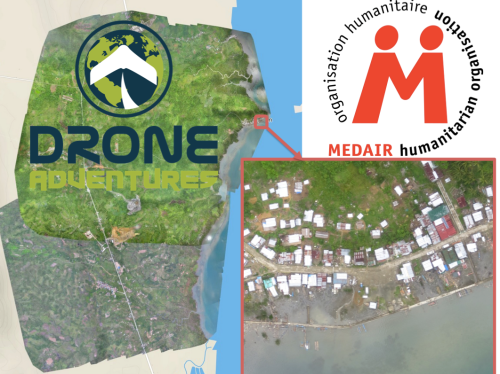
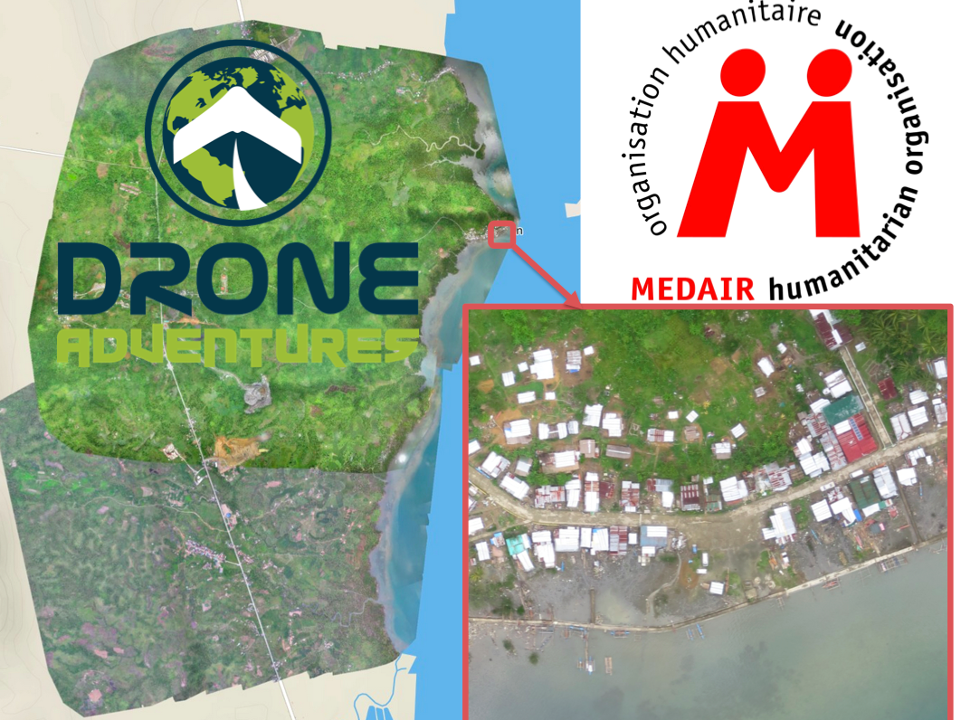
In a third project, the Swiss humanitarian organization Medair partnered with Drone Adventures to create a detailed set of 2D maps and 3D terrain models of the disaster-affected areas in which Medair works. These images were used to inform the humanitarian organization’s recovery and reconstruction programs. To be sure, Medair used the maps and models of Tacloban and Leyte to assist in assessing where the greatest need was and what level of assistance should be given to affected families as they continued to recover. Having these accurate aerial images of the affected areas allowed the Swiss organization to address the needs of individual households and—equally importantly—to advocate on their behalf when necessary.

Screen Shot 2014-06-24 at 3.20.08 PM

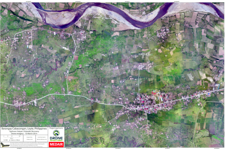
Drone Adventures also flew their fixed-wing UAVs (eBee’s) over Dulag, just north of Leyte, where more than 80% of homes and croplands were destroyed during the Typhoon. Medair is providing both materials and expertise to help build new shelters in Dulag. So the aerial imagery is proving invaluable to identify just how much material is needed and where. The captured imagery is also enabling community members themselves to better understand both where the greatest needs are an also what the potential solutions might be.

Screen Shot 2014-06-24 at 2.27.55 PM

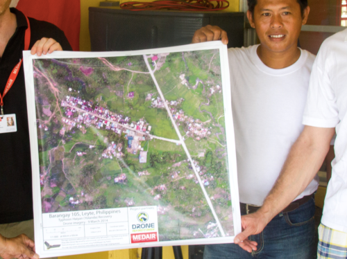
The partners are also committed to Open Data. The imagery captured was made available online and for free, enabling community leaders and humanitarian organizations to use the information to coordinate other reconstruction efforts. In addition, Drone Adventures and Medair presented locally-printed maps to community leaders within 24 hours of flying the UAVs. Some of these maps were printed on rollable, water proof banners, which make them more durable when used in the field.

Screen Shot 2014-06-24 at 2.28.11 PM

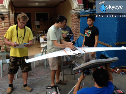
In yet another UAV project, the local Filipino start-up SkyEye Inc partnered with the University of the Philippines in Manila to develop expendable UAVs or xUAVs. The purpose of this initiative is to empower grassroots communities to deploy their own low-cost xUAVs and thus support locally-deployed response efforts. The team has trained 4 out of 5 teams across the Philippines to locally deploy UAVs in preparation for the next Typhoon season. In so doing, they are also transferring math, science and engineering skills to local communities. It is worth noting that community perceptions of UAVs in the Philippines and elsewhere has always been very positive. Indeed, local communities perceive small UAVs as toys more than anything else.

Screen Shot 2014-06-24 at 2.28.37 PM

SkyEye worked with this group from the University of Hawaii to create disaster risk reduction models of flood-prone areas.

Screen Shot 2014-06-24 at 2.29.22 PM

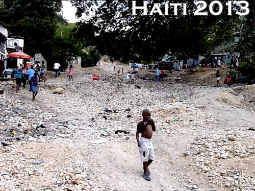
Moving to Haiti, the International Organization for Migration (IOM) has partnered with Drone Adventures and other to produce accurate topographical and 3D maps of disaster prone areas in the Philippines. These aerial images have been used to inform disaster risk reduction and community resilience programs. The UAVs have also enabled IOM to assess destroyed houses and other types of damage caused by floods and droughts. In addition, UAVs have been used to monitor IDP camps, helping aid workers identify when shelters are empty and thus ready to be closed. Furthermore, the high resolution aerial imagery has been used to support a census survey of public building, shelters, hospitals as well as schools.

Screen Shot 2014-06-24 at 2.29.46 PM

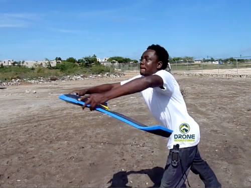
After Hurricane Sandy, for example, aerial imagery enabled IOM to very rapidly assess how many houses had collapsed near Rivière Grise and how many people were affected by the flooding. The aerial imagery was also used to identify areas of standing water where mosquitos and epidemics could easily thrive. Throughout their work with UAVs, IOM has stressed that regular community engagement has been critical for the successful use of UAVs. Indeed, informing local communities of the aerial mapping projects and explaining how the collected information is to be used is imperative. Local capacity building is also paramount, which is why Drone Adventures has trained a local team of Haitians to locally deploy and maintain their own eBee UAV.

Screen Shot 2014-06-24 at 2.30.27 PM

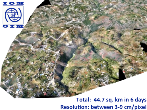
The pictures above and below are some of the information products produced by IOM and Drone Adventures. The 3D model above was used to model flood risk in the area and to inform subsequent disaster risk reduction projects.

Screen Shot 2014-06-24 at 2.30.47 PM

Several colleagues of mine have already noted that aerial imagery presents a Big Data challenge. This means that humanitarian organizations and others will need to use advanced computing (human computing and machine computing) to make sense of Big (Aerial) Data.

Screen Shot 2014-06-24 at 2.31.54 PM

My colleagues at the European Commission’s Joint Research Center (JRC) are already beginning to apply advanced computing to automatically analyze aerial imagery. In the example from Haiti below, the JRC deployed a machine learning classifier to automatically identify rubble left over from the massive earthquake that struck Port-au-Prince in 2010. Their classifier had an impressive accuracy of 92%, “suggesting that the method in its simplest form is sufficiently reliable for rapid damage assessment.”

Screen Shot 2014-06-24 at 2.32.06 PM

Human computing (or crowdsourcing) can also be used to make sense of Big Data. My team and I at QCRI have partnered with the UN (OCHA) to create the MicroMappers platform, which is a free and open-source tool to make sense of large datasets created during disasters, like aerial data. We have access to thousands of digital volunteers who can rapidly tag and trace aerial imagery; the resulting analysis of this tagging/tracing can be used to increase the situational awareness  of humanitarian organizations in the field.

Screen Shot 2014-06-24 at 2.32.43 PM


Digital volunteers can trace features of interest such as shelters without roofs. Our plan is to subsequently use these traced features as training data to develop machine learning classifiers that can automatically identify these features in future aerial images. We’re also exploring the second use-case depicted below, ie, the rapid transcription of imagery, which can then be automatically geo-tagged and added to a crisis map.

Screen Shot 2014-06-24 at 2.32.55 PM


The increasing use of UAVs during humanitarian disasters is why UAViators, the Humanitarian UAV Network, was launched. Recall the relief operations in response to Typhoon Yolanda; an unprecedented number of UAV projects were in operation. But most operators didn’t know about each other, so they were not coordinating flights let alone sharing imagery with local communities. Since the launch of UAViators, we’ve developed the first ever Code of Conduct for the use of UAVs in humanitarian settings, which includes guidelines on data protection and privacy. We have also drafted an Operational Check-List to educate those who are new to humanitarian UAVs. We are now in the process of carrying out a comprehensive evaluation of UAV models along with cameras, sensors, payload mechanism and image processing software. The purpose of this evaluation is to identify which are the best fit for use by humanitarians in the field. Since the UN and others are looking for training and certification programs, we are actively seeking partners to provide these services.

Screen Shot 2014-06-24 at 2.34.04 PM

The above goals are all for the medium to long term. More immediately, UAViators is working to educate humanitarian organizations on both the opportunities and challenges of using UAVs in humanitarian settings. UAViators is also working to facilitate the coordinate UAV flights during major disasters, enabling operators to share their flight plans and contact details with each other via the UAViators website. We are also planning to set up an SMS service to enable direct communication between operators and others in the field during UAV flights. Lastly, we are developing an online map for operators to easily share the imagery/videos they are collecting during relief efforts.

Screen Shot 2014-06-24 at 2.34.36 PM

Data collection (imagery capture) is certainly not the only use case for UAVs in humanitarian contexts. The transportation of payloads may play an increasingly important role in the future. To be sure, my colleagues at UNICEF are actively exploring this with a number of partners in Africa.

Screen Shot 2014-06-24 at 2.34.47 PM

Other sensors also present additional opportunities for the use of UAVs in relief efforts. Sensors can be used to assess the impact of disasters on communication infrastructure, such as cell phone towers, for example. Groups are also looking into the use of UAVs to provide temporary communication infrastructure (“aerial cell phone towers”) following major disasters.

Screen Shot 2014-06-24 at 2.34.59 PM

The need for Sense and Avoid systems (a.k.a. Detection & Avoid solutions) has been highlighted in almost every other presentation given at RPAS 2014. We really need this new technology earlier rather than later (and that’s a major  understatement). At the same time, it is important to emphasize that the main added value of UAVs in humanitarian settings is to capture imagery of areas that are overlooked or ignored by mainstream humanitarian relief operations; that is, of areas that are partially or completely disconnected logistically. By definition, disaster-affected communities in these areas are likely to be more vulnerable than others in urban areas. In addition, the airspaces in these disconnected regions are not complex airspaces and thus present fewer challenges around safety and coordination, for example.

Screen Shot 2014-06-24 at 2.35.19 PM

UAVs were ready to go following the mudslides in Oso, Washington back in March of this year. The UAVs were going to be used to look for survivors but the birds were not allowed to fly. The decision to ground UAVs and bar them from supporting relief and rescue efforts will become increasingly untenable when lives are at stake. I genuinely applaud the principle of proportionality applied by the EU and respective RPAS Associations vis-a-vis risks and regulations, but there is one very important variable missing in the proportionality equation: social benefit. Indeed, the cost benefit calculus of UAV risk & regulation in the context of humanitarian use must include the expected benefit of lives saved and suffering alleviated. Let me repeat this to make sure I’m crystal clear: risks must be weighed against potential lives saved.

Screen Shot 2014-06-24 at 2.35.39 PM

At the end of the day, the humanitarian context is different from precision agriculture or other commercial applications of UAVs such as film making. The latter have no relation to the Humanitarian Imperative. Having over-regulation stand in the way of humanitarian principles will simply become untenable. At the same time, the principle of Do No Harm must absolutely be upheld, which is why it features prominently in the Humanitarian UAV Network’s Code of Conduct. In sum, like the Do No Harm principle, the cost benefit analysis of proportionality must include potential or expected benefits as part of the calculus.

Screen Shot 2014-06-24 at 2.35.56 PM

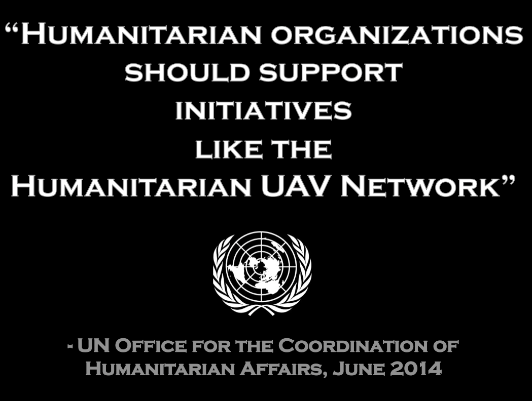
To conclude, a new (forthcoming) policy brief by the UN (OCHA) publicly calls on humanitarian organizations to support initiatives like the Humanitarian UAV Network. This is an important, public endorsement of our work thus far. But we also need support from non-humanitarian organizations like those you represent in this room. For example, we need clarity on existing legislation. Our partners like the UN need to have access to the latest laws by country to inform their use of UAVs following major disasters. We really need your help on this; and we also need your help in identifying which UAVs and related technologies are likely to be a good fit for humanitarians in the field. So if you have some ideas, then please find me during the break, I’d really like to speak with you, thank you!

bio

See Also:

  • Crisis Map of UAV/Aerial Videos for Disaster Response [link]
  • How UAVs are Making a Difference in Disaster Response [link]
  • Humanitarians Using UAVs for Post Disaster Recovery [link]
  • Grassroots UAVs for Disaster Response [link]
  • Using UAVs for Search & Rescue [link]
  • Debrief: UAV/Drone Search & Rescue Challenge [link]
  • Crowdsourcing Analysis of UAV Imagery for Search/Rescue [link]
  • Check-List for Flying UAVs in Humanitarian Settings [link]

Picture Credits:

  • Danoffice IT; Drone Adventures, SkyEye, JRC


The Best Way to Crowdsource Satellite Imagery Analysis for Disaster Response

My colleague Kirk Morris recently pointed me to this very neat study on iterative versus parallel models of crowdsourcing for the analysis of satellite imagery. The study was carried out by French researcher & engineer Nicolas Maisonneuve for the next GISscience2012 conference.

Nicolas finds that after reaching a certain threshold, adding more volunteers to the parallel model does “not change the representativeness of opinion and thus will not change the consensual output.” His analysis also shows that the value of this threshold has significant impact on the resulting quality of the parallel work and thus should be chosen carefully.  In terms of the iterative approach, Nicolas finds that “the first iterations have a high impact on the final results due to a path dependency effect.” To this end, “stronger commitment during the first steps are thus a primary concern for using such model,” which means that “asking expert/committed users to start,” is important.

Nicolas’s study also reveals that the parellel approach is better able to correct wrong annotations (wrong analysis of the satellite imagery) than the iterative model for images that are fairly straightforward to interpret. In contrast, the iterative model is better suited for handling more ambiguous imagery. But there is a catch: the potential path dependency effect in the iterative model means that  “mistakes could be propagated, generating more easily type I errors as the iterations proceed.” In terms of spatial coverage, the iterative model is more efficient since the parallel model leverages redundancy to ensure data quality. Still, Nicolas concludes that the “parallel model provides an output which is more reliable than that of a basic iterative [because] the latter is sensitive to vandalism or knowledge destruction.”

So the question that naturally follow is this: how can parallel and iterative methodologies be combined to produce a better overall result? Perhaps the parallel approach could be used as the default to begin with. However, images that are considered difficult to interpret would get pushed from the parallel workflow to the iterative workflow. The latter would first be processed by experts in order to create favorable path dependency. Could this hybrid approach be the wining strategy?

Crowdsourcing Satellite Imagery Analysis for UNHCR-Somalia: Latest Results


253,711

That is the total number of tags created by 168 volunteers after processing 3,909 satellite images in just five days. A quarter of a million tags in 120 hours; that’s more than 2,000 tags per hour. Wow. As mentioned in this earlier blog post, volunteers specifically tagged three different types of informal shelters to provide UNHCR with an estimate of the IDP population in the Afgooye Corridor. So what happens now?

Our colleagues at Tomnod are going to use their CrowdRank algorithm to triangulate the data. About 85% of 3,000+ images were analyzed by at least 3 volunteers. So the CrowdRank algorithm will determine which tags had the most consensus across volunteers. This built-in quality control mechanism is a distinct advantage of using micro-tasking platforms like Tomnod. The tags with the most consensus will then be pushed to a dedicated UNHCR Ushahidi platform for further analysis. This project represents an applied research & development initiative. In short, we certainly don’t have all the answers. This next phase is where the assessment and analysis begins.

In the meantime, I’ve been in touch with the EC’s Joint Research Center about running their automated shelter detection algorithm on the same set of satellite imagery. The purpose is to compare those results with the crowdsourced tags in order to improve both methodologies. Clearly, none of this would be possible without the imagery and  invaluable support from our colleagues at DigitalGlobe, so huge thanks to them.

And of course, there would be no project at all were it not for our incredible volunteers, the best “Mapsters” on the planet. Indeed, none of those 200,000+ tags would exist were it not for the combined effort between the Standby Volunteer Task Force (SBTF) and students from the American Society for Photogrammetry and Remote Sensing (ASPRS); Columbia University’s New Media Task Force (NMTF) who were joined by students from the New School; the Geography Departments at the University of Wisconsin-Madison, the University of Georgia, and George Mason University, and many other volunteers including humanitarian professionals from the United Nations and beyond.

As many already know, my colleague Shadrock Roberts played a pivotal role in this project. Shadrock is my fellow co-lead on the SBTF Satellite Team and he took the important initiative to draft the feature-key and rule-sets for this mission. He also answered numerous questions from many volunteers throughout past five days. Thank you, Shadrock!

It appears that word about this innovative project has gotten back to UNHCR’s Deputy High Commissioner, Professor Alexander Aleinikoff. Shadrock and I have just been invited to meet with him in Geneva on Monday, just before the 2011 International Conference of Crisis Mappers (ICCM 2011) kicks off. We’ll be sure to share with him how incredible this volunteer network is and we’ll definitely let all volunteers know how the meeting goes. Thanks again for being the best Mapsters around!


Syria: Crowdsourcing Satellite Imagery Analysis to Identify Mass Human Rights Violations

Update: See this blog post for the latest. Also, our project was just featured on the UK Guardian Blog!

What if we crowdsourced satellite imagery analysis of key cities in Syria to identify evidence of mass human rights violations? This is precisely the question that my colleagues at Amnesty International USA’s Science for Human Rights Program asked me following this pilot project I coordinated for Somalia. AI-USA has done similar work in the past with their Eyes on Darfur project, which I blogged about here in 2008. But using micro-tasking with backend triangulation to crowdsource the analysis of high resolution satellite imagery for human rights purposes is definitely breaking new ground.

A staggering amount of new satellite imagery is produced every day; millions of square kilometers’ worth according to one knowledgeable colleague. This is a big data problem that needs mass human intervention until the software can catch up. I recently spoke with Professor Ryan Engstrom, the Director of the Spatial Analysis Lab at George Washington University, and he confirmed that automated algorithms for satellite imagery analysis still have a long, long way to go. So the answer for now has to be human-driven analysis.

But professional satellite imagery experts who have plenty of time to volunteer their skills are far and few between. The Satellite Sentinel Project (SSP), which I blogged about here, is composed of a very small team and a few interns. Their focus is limited to the Sudan and they are understandably very busy. My colleagues at AI-USA analyze satellite imagery for several conflicts, but this takes them far longer than they’d like and their small team is still constrained given the number of conflicts and vast amounts of imagery that could be analyzed. This explains why they’re interested in crowdsourcing.

Indeed, crowdsourcing imagery analysis has proven to be a workable solution in several other projects & sectors. The “crowd” can indeed scan and tag vast volumes of satellite imagery data when that imagery is “sliced and diced” for micro-tasking. This is what we did for the Somalia pilot project thanks to the Tomnod platform and the imagery provided by Digital Globe. The yellow triangles below denote the “sliced images” that individual volunteers from the Standby Task Force (SBTF) analyzed and tagged one at a time.

We plan do the same with high resolution satellite imagery of three key cities in Syria selected by the AI-USA team. The specific features we will look for and tag include: “Burnt and/or darkened building features,” “Roofs absent,” “Blocks on access roads,” “Military equipment in residential areas,” “Equipment/persons on top of buildings indicating potential sniper positions,” “Shelters composed of different materials than surrounding structures,” etc. SBTF volunteers will be provided with examples of what these features look like from a bird’s eye view and from ground level.

Like the Somalia project, only when a feature—say a missing roof—is tagged identically  by at least 3 volunteers will that location be sent to the AI-USA team for review. In addition, if volunteers are unsure about a particular feature they’re looking at, they’ll take a screenshot of said feature and share it on a dedicated Google Doc for the AI-USA team and other satellite imagery experts from the SBTF team to review. This feedback mechanism is key to ensure accurate tagging and inter-coder reliability. In addition, the screenshots shared will be used to build a larger library of features, i.e., what a missing roof looks like as well military equipment in residential areas, road blocks, etc. Volunteers will also be in touch with the AI-USA team via a dedicated Skype chat.

There will no doubt be a learning curve, but the sooner we climb that learning curve the better. Democratizing satellite imagery analysis is no easy task and one or two individuals have opined that what we’re trying to do can’t be done. That may be, but we won’t know unless we try. This is how innovation happens. We can hypothesize and talk all we want, but concrete results are what ultimately matters. And results are what can help us climb that learning curve. My hope, of course, is that democratizing satellite imagery analysis enables AI-USA to strengthen their advocacy campaigns and makes it harder for perpetrators to commit mass human rights violations.

SBTF volunteers will be carrying out the pilot project this month in collaboration with AI-USA, Tomnod and Digital Globe. How and when the results are shared publicly will be up to the AI-USA team as this will depend on what exactly is found. In the meantime, a big thanks to Digital Globe, Tomnod and SBTF volunteers for supporting the AI-USA team on this initiative.

If you’re interested in reading more about satellite imagery analysis, the following blog posts may also be of interest:

• Geo-Spatial Technologies for Human Rights
• Tracking Genocide by Remote Sensing
• Human Rights 2.0: Eyes on Darfur
• GIS Technology for Genocide Prevention
• Geo-Spatial Analysis for Global Security
• US Calls for UN Aerial Surveillance to Detect Preparations for Attacks
• Will Using ‘Live’ Satellite Imagery to Prevent War in the Sudan Actually Work?
• Satellite Imagery Analysis of Kenya’s Election Violence: Crisis Mapping by Fire
• Crisis Mapping Uganda: Combining Narratives and GIS to Study Genocide
• Crowdsourcing Satellite Imagery Analysis for Somalia: Results of Trial Run
• Genghis Khan, Borneo & Galaxies: Crowdsourcing Satellite Imagery Analysis
• OpenStreetMap’s New Micro-Tasking Platform for Satellite Imagery Tracing


Crowdsourcing Satellite Imagery Analysis for Somalia: Results of Trial Run

We’ve just completed our very first trial run of the Standby Task Volunteer Force (SBTF) Satellite Team. As mentioned in this blog post last week, the UN approached us a couple weeks ago to explore whether basic satellite imagery analysis for Somalia could be crowdsourced using a distributed mechanical turk approach. I had actually floated the idea in this blog post during the floods in Pakistan a year earlier. In any case, a colleague at Digital Globe (DG) read my post on Somalia and said: “Lets do it.”

So I reached out to Luke Barrington at Tomnod to set up distributed micro-tasking platform for Somalia. To learn more about Tomond’s neat technology, see this previous blog post. Within just a few days we had high resolution satellite imagery from DG and a dedicated crowdsourcing platform for imagery analysis, courtesy of Tomnod . All that was missing were some willing and able “mapsters” from the SBTF to tag the location of shelters in this imagery. So I sent out an email to the group and some 50 mapsters signed up within 48 hours. We ran our pilot from August 26th to August 30th. The idea here was to see what would go wrong (and right!) and thus learn as much as we could before doing this for real in the coming weeks.

It is worth emphasizing that the purpose of this trial run (and entire exercise) is not to replicate the kind of advanced and highly-skilled satellite imagery analysis that professionals already carry out.  This is not just about Somalia over the next few weeks and months. This is about Libya, Syria, Yemen, Afghanistan, Iraq, Pakistan, North Korea, Zimbabwe, Burma, etc. Professional satellite imagery experts who have plenty of time to volunteer their skills are far and few between. Meanwhile, a staggering amount of new satellite imagery is produced  every day; millions of square kilometers’ worth according to one knowledgeable colleague.

This is a big data problem that needs mass human intervention until the software can catch up. Moreover, crowdsourcing has proven to be a workable solution in many other projects and sectors. The “crowd” can indeed scan vast volumes of satellite imagery data and tag features of interest. A number of these crowds-ourcing platforms also have built-in quality assurance mechanisms that take into account the reliability of the taggers and tags. Tomnod’s CrowdRank algorithm, for example, only validates imagery analysis if a certain number of users have tagged the same image in exactly the same way. In our case, only shelters that get tagged identically by three SBTF mapsters get their locations sent to experts for review. The point here is not to replace the experts but to take some of the easier (but time-consuming) tasks off their shoulders so they can focus on applying their skill set to the harder stuff vis-a-vis imagery interpretation and analysis.

The purpose of this initial trial run was simply to give SBTF mapsters the chance to test drive the Tomnod platform and to provide feeback both on the technology and the work flows we put together. They were asked to tag a specific type of shelter in the imagery they received via the web-based Tomnod platform:

There’s much that we would do differently in the future but that was exactly the point of the trial run. We had hoped to receive a “crash course” in satellite imagery analysis from the Satellite Sentinel Project (SSP) team but our colleagues had hardly slept in days because of some very important analysis they were doing on the Sudan. So we did the best we could on our own. We do have several satellite imagery experts on the SBTF team though, so their input throughout the process was very helpful.

Our entire work flow along with comments and feedback on the trial run is available in this open and editable Google Doc. You’ll note the pages (and pages) of comments, questions and answers. This is gold and the entire point of the trial run. We definitely welcome additional feedback on our approach from anyone with experience in satellite imagery interpretation and analysis.

The result? SBTF mapsters analyzed a whopping 3,700+ individual images and tagged more than 9,400 shelters in the green-shaded area below. Known as the “Afgooye corridor,” this area marks the road between Mogadishu and Afgooye which, due to displacement from war and famine in the past year, has become one of the largest urban areas in Somalia. [Note, all screen shots come from Tomnod].

Last year, UNHCR used “satellite imaging both to estimate how many people are living there, and to give the corridor a concrete reality. The images of the camps have led the UN’s refugee agency to estimate that the number of people living in the Afgooye Corridor is a staggering 410,000. Previous estimates, in September 2009, had put the number at 366,000” (1).

The yellow rectangles depict the 3,700+ individual images that SBTF volunteers individually analyzed for shelters: And here’s the output of 3 days’ worth of shelter tagging, 9,400+ tags:

Thanks to Tomnod’s CrowdRank algorithm, we were able to analyze consensus between mapsters and pull out the triangulated shelter locations. In total, we get 1,423 confirmed locations for the types of shelters described in our work flows. A first cursory glance at a handful (“random sample”) of these confirmed locations indicate they are spot on. As a next step, we could crowdsource (or SBTF-source, rather) the analysis of just these 1,423 images to triple check consensus. Incidentally, these 1,423 locations could easily be added to Google Earth or a password-protected Ushahidi map.

We’ve learned a lot during this trial run and Luke got really good feedback on how to improve their platform moving forward. The data collected should also help us provide targeted feedback to SBTF mapsters in the coming days so they can further refine their skills. On my end, I should have been a lot more specific and detailed on exactly what types of shelters qualified for tagging. As the Q&A section on the Google Doc shows, many mapsters weren’t exactly sure at first because my original guidelines were simply too vague. So moving forward, it’s clear that we’ll need a far more detailed “code book” with many more examples of the features to look for along with features that do not qualify. A colleague of mine suggested that we set up an interactive, online quiz that takes volunteers through a series of examples of what to tag and not to tag. Only when a volunteer answers all questions correctly do they move on to live tagging. I have no doubt whatsoever that this would significantly increase consensus in subsequent imagery analysis.

Please note: the analysis carried out in this trial run is not for humanitarian organizations or to improve situational awareness, it is simply for testing purposes only. The point was to try something new and in the process work out the kinks so when the UN is ready to provide us with official dedicated tasks we don’t have to scramble and climb the steep learning curve there and then.

In related news, the Humanitarian Open Street Map Team (HOT) provided SBTF mapsters with an introductory course on the OSM platform this past weekend. The HOT team has been working hard since the response to Haiti to develop an OSM Tasking Server that would allow them to micro-task the tracing of satellite imagery. They demo’d the platform to me last week and I’m very excited about this new tool in the OSM ecosystem. As soon as the system is ready for prime time, I’ll get access to the backend again and will write up a blog post specifically on the Tasking Server.

On Genghis Khan, Borneo and Galaxies: Using Crowdsourcing to Analyze Satellite Imagery

My colleague Robert Soden was absolutely right: Tomnod is definitely iRevolution material. This is why I reached out to the group a few days ago to explore the possibility of using their technology to crowdsource the analysis of satellite imagery for Somalia. You can read more about that project here. In this blog post, however, is to highlight the amazing work they’ve been doing with National Geographic in search of Genghis Khan’s tomb.

This “Valley of the Khans Project” represents a new approach to archeology. Together with National Geographic, Tomnod has collected thousands of GeoEye satellite images of the valley and designed a  simple user interface to crowdsource the tagging of roads, rivers and modern or ancient structures they. I signed up to give it a whirl and it was a lot of fun. A short video gives a quick guide on how to recognize different structures and then off you go!

You are assigned the rank “In Training” when you first begin. Once you’ve tagged your first 10 images, you progress to the next rank, which is “Novice 1”. The squares at the bottom left represent the number of individual satellite images you’ve tagged and how many are left. This is a neat game-like console and I wonder if there’s a scoreboard with names, listed ranks and images tagged.

In any case, a National Geographic team in Mongolia use the results to identify the most promising archeological sites. The field team also used Unmanned Areal Vehicles (UAVs) to supplement the satellite imagery analysis. You can learn more about the “Valley of the Khans Project” from this TEDx talk by Tomnod’s Albert Lin. Incidentally, Tomnod also offered their technology to map the damage from the devastating earthquake in New Zealand, earlier this year. But the next project I want to highlight focuses on the forests of Borneo.

I literally just found out about the “EarthWatchers: Planet Patrol” project thanks to Edwin Wisse’s comment on my previous blog post. As Edwin noted, EarthWatchers is indeed very similar to the Somalia initiative I blogged about. The project is “developing the (web)tools for students all over the world to monitor rainforests using updated satellite imagery to provide real time intelligence required to halt illegal deforestation.”

This is a really neat project and I’ve just signed up to participate. EarthWatchers has designed a free and open source platform to make it easy for students to volunteer. When you log into the platform, EarthWatchers gives you a hexagon-shaped area of the Borneo rainforest to monitor and protect using the satellite imagery displayed on the interface.

The platform also provides students with a number of contextual layers, such as road and river networks, to add context to the satellite imagery and create heat-maps of the most vulnerable areas. Forests near roads are more threatened since the logs are easier to transport, for example. In addition, volunteers can compare before-and-after images of their hexagon to better identify any changes. If you detect any worrying changes in your hexagon, you can create an alert that notifies all your friends and neighbors.

An especially neat feature about the interface is that it allows students to network online. For example, you can see who your neighbors in nearby hexagons are and even chat with them thanks to a native chat feature. This is neat because it facilitates collaboration mapping in real time and means you don’t feel alone or isolated as a volunteer. The chat feature helps to builds community.

If you’d like to learn more about this project, I recommend the presentation below by Eduardo Dias.

The third and final project I want to highlight is called Galaxy Zoo. I first came across this awesome example of citizen science in MacroWikinomics—an excellent book written by Don Tapscott and Anthony Williams. The purpose of Galaxy Zoo is to crowdsource the tagging and thus classification of galaxies as either spiral or elliptical. In order to participate, users to take a short tutorial on the basics of galaxy morphology.

While this project began as an experiment of sorts, the initiative is thriving with more than 275,000 users participating and 75 million classifications made. In addition, the data generated has resulted in several peer reviewed publica-tions real scientific discoveries. While the project uses imagery of the stars rather than earth, it really qualifies as a major success story in crowdsourcing the analysis of imagery.

Know of other intriguing applications of crowdsourcing for imagery analysis? If so, please do share in the comments section below.

Analyzing Satellite Imagery of the Somali Crisis Using Crowdsourcing

 Update: results of satellite imagery analysis available here.

You gotta love Twitter. Just two hours after I tweeted the above—in reference to this project—a colleague of mine from the UN who just got back from the Horn of Africa called me up: “Saw your tweet, what’s going on?” The last thing I wanted to was talk about the über frustrating day I’d just had. So he said, “Hey, listen, I’ve got an idea.” He reminded me of this blog post I had written a year ago on “Crowdsourcing the Analysis of Satellite for Disaster Response” and said, “Why not try this for Somalia? We could definitely use that kind of information.” I quickly forgot about my frustrating day.

Here’s the plan. He talks to UNOSAT and Google about acquiring high-resolution satellite imagery for those geographic areas for which they need more information on. A colleague of mine in San Diego just launched his own company to develop mechanical turk & micro tasking solutions for disaster response. He takes this satellite imagery and cuts it into say 50×50 kilometers square images for micro-tasking purposes.

We then develop a web-based interface where volunteers from the Standby Volunteer Task Force (SBTF) sign in and get one high resolution 50×50 km image displayed to them at a time. For each image, they answer the question: “Are there any human shelters discernible in this picture? [Yes/No].” If yes, what would you approximate the population of that shelter to be? [1-20; 21-50; 50-100; 100+].” Additional questions could be added. Note that we’d provide them with guidelines on how to identify human shelters and estimate population figures.

No shelters discernible in this image

Each 50×50 image would get rated by at least 3 volunteers for data triangulation and quality assurance purposes. That is, if 3 volunteers each tag an image as depicting a shelter (or more than one shelter) and each of the 3 volunteers approximate the same population range, then that image would get automatically pushed to an Ushahidi map, automatically turned into a geo-tagged incident report and automatically categorized by the population estimate. One could then filter by population range on the Ushahidi map and click on those reports to see the actual image.

If satellite imagery licensing is an issue, then said images need not be pushed to the Ushahidi map. Only the report including the location of where a shelter has been spotted would be mapped along with the associated population estimate. The satellite imagery would never be released in full, only small bits and pieces of that imagery would be shared with a trusted network of SBTF volunteers. In other words, the 50×50 images could not be reconstituted and patched together because volunteers would not get contiguous 50×50 images. Moreover, volunteers would sign a code of conduct whereby they pledge not to share any of the imagery with anyone else. Because we track which volunteers see which 50×50 images, we could easily trace any leaked 50×50 image back to the volunteer responsible.

Note that for security reasons, we could make the Ushahidi map password protected and have a public version of the map with very limited spatial resolution so that the location of individual shelters would not be discernible.

I’d love to get feedback on this idea from iRevolution readers, so if you have thoughts (including constructive criticisms), please do share in the comments section below.

A List of Completely Wrong Assumptions About Technology Use in Emerging Economies

I’ve spent the past week at the iLab in Liberia and got what I came for: an updated reality check on the limitations of technology adoption in developing countries. Below are some of the assumptions that I took for granted. They’re perfectly obvious in hindsight and I’m annoyed at myself for not having realized their obviousness sooner. I’d be very interested in hearing from others about these and reading their lists. This need not be limited to one particular sector like ICT for Development (ICT4D) or Mobile Health (mHealth). Many of these assumptions have repercussions across multiple disciplines.

The following examples come from conversations with my colleague Kate Cummings who directs Ushahidi Liberia and the iLab here in Monrovia. She and her truly outstanding team—Kpetermeni Siakor, Carter Draper, Luther Jeke and Anthony Kamah—spearheaded a number of excellent training workshops over the past few days. At one point we began discussing the reasons for the limited use of SMS in Liberia. There are the usual and obvious reasons. But the one hurdle I had not expected to hear was Nokia’s predictive text functionality. This feature is incredibly helpful since the mobile phone basically guesses which words you’re trying to write so you don’t have to type every single letter.

But as soon as she pointed out how confusing this can be, I immediately understood what she meant. If I had never seen or been warned about this feature before, I’d honestly think the phone was broken. It would really be impossible to type with. I’d get frustrated and give up (the tiny screen further adds to the frustration). And if I was new to mobile phones, it wouldn’t be obvious how to switch that feature off either. (There are several tutorials online on how to use the predictive text feature and how to turn it off, which clearly proves they’re not intuitive).

In one of the training workshops we just had, I was explaining what Walking Papers was about and how it might be useful in Liberia. So I showed the example below and continued talking. But Kate jumped in and asked participants: “What do you see in this picture? Do you see the trees, the little roads?” She pointed at the features as she described the individual shapes. This is when it dawned on me that there is absolutely nothing inherently intuitive about satellite images. Most people on this planet have not been on an airplane or a tall building. So why would a bird’s eye view of their village be anything remotely recognizable? I really kicked myself on that one. So I’ll write it again: there is nothing intuitive about satellite imagery. Nor is there anything intuitive about GPS and the existence of a latitude and longitude coordinate system.

Kate went on to explain that this kind of picture is what you would see if you were flying high like a bird. That was the way I should have introduced the image but I had taken it completely for granted that satellite imagery was self-explanatory when it simply isn’t. In further conversations with Kate, she explained that they too had made that assumption early on when trying to introduce the in’s and out’s of the Ushahidi platform. They quickly realized that they had to rethink their approach and decided to provide introductory courses on Google Maps instead.

More wrong assumptions revealed themselves during the workshpos. For example, the “+” and “-” markers on Google Map are not intuitive either nor is the concept of zooming in and out. How are you supposed to understand that pressing these buttons still shows the same map but at a different scale and not an entirely different picture instead? Again, when I took a moment to think about this, I realized how completely confusing that could be. And again I kicked myself. But contrast this to an entirely different setting, San Francisco, where some friends recently told me how their five year old went up to a framed picture in their living room and started pinching at it with his fingers, the exact same gestures one would use on an iPhone to zoom in and out of a picture. “Broken, broken” is all the five year old said after that disappointing experience.

The final example actually comes from Haiti where my colleague Chrissy Martin is one of the main drivers behind the Digicel Group’s mobile banking efforts in the country. There were of course a number of expected challenges on the road to launching Haiti’s first successful mobile banking service, TchoTcho Mobile. The hurdle that I had not expected, however, had to do with the pin code. To use the service, you would enter your own personal pin number on your mobile phone in order to access your account. Seems perfectly straight forward. But it really isn’t.

The concept of a pin number is one that many of us take completely for granted. But the idea is often foreign to many would-be users of mobile banking services and not just in Haiti. Think about it: all one has to do to access all my money is to simply enter four numbers on my phone. That does genuinely sound crazy to me at a certain level. Granted, if you guess the pin wrong three times, the phone gets blocked and you have to call TchoTcho’s customer service. But still, I can understand the initial hesitation that many users had. When I asked Chrissy how they overcame the hurdle, her answer was simply this: training. It takes time for users to begin trusting a completely new technology.

So those are some of the assumptions I’ve gotten wrong. I’d be grateful if readers could share theirs as there must be plenty of other assumptions I’m making which don’t fit reality. Incidentally, I realize that emerging economies vary widely in technology diffusion and adoption—not to mention sub-nationally as well. This is why having the iLab in Liberia is so important. Identifying which assumptions are wrong in more challenging environments is really important if our goal is to use technology to help contribute meaningfully to a community’s empowerment, development and independence.

Crisis Mapping by Fire: Satellite Imagery Analysis of Kenya’s Election Violence

My brother Brice just sent me a very interesting study that combines satellite imagery and field reporting to analyze Kenya’s 2008 election violence. The peer-reviewed piece is entitled “Violence and Exodus in Kenya’s Rift Valley, 2008: Predictable and Preventable?” and was pub- lished in the Journal of East African Studies.

Given the use of satellites to monitor the referendum in Sudan, this blog post reviews the methodology and insights gained from the Kenya analysis. I’ll do this by providing key excerpts from the study along with my own commentary. This case study is of particularly interest to me since I was in Kenya the time and because that was when the first Ushahidi platform was launched. For more information on the use of satellite imagery to document human rights abuses, I highly recommend Amnesty International’s Science for Human Rights Explorer.

I wasn’t aware how much scrambling for information was going on in the humanitarian community:

“Over the first days, and then weeks following the December election, information about the outbreak and extent of violence was fragmented and difficult to access. Even those tasked with responding most rapidly to violence and displacement faced problems in interpreting information that was frequently distorted by rumour and misinformation.”

Interesting to know that humanitarians were facing some of the same challenges as crowdsourcing presents. Would using SwiftRiver have made a difference to try and assess the validity of the information they were collecting?

“In the early days of January 2007, UN agencies and other humanitarian bodies had numerous sources reporting that tens of thousands of people had been displaced and dozens killed across the country, yet details on the extent, location, and chronology of the violence were hard to establish, making it difficult for these agencies to plan an effective response.”

Note the need for location and time-stamped information. Would drawing on reports from the Ushahidi platform have helped? See my co-authored study on Crisis Mapping Kenya’s Election Violence. That said, this was the first time that Ushahidi was deployed in Kenya so the reports may not have been of the highest quality.

“The Kenya Red Cross Society (KRCS), for example, implemented the election contingency plan it had put in place prior to the December polls, but staff could not confirm reports of violence, and could not deliver essential food and relief items to those people displaced by the fighting because of roadblocks mounted by protestors. Even after carrying out a helicopter assessment mission on 1 January 2008, the KRCS still found it difficult to present an overall picture of the location and timing of the violence.”

So UN agencies in Kenya turned to satellite imagery.

“In response to the challenges facing them in January 2007, UN agencies in Kenya asked UNOSAT to produce a series of maps showing the likely location of election-related violence in the west of the country. UNOSAT has a variety of satellite imaging data available to them, but one tool used to map conflict situations is data on active fires. Fire plays an important role in forcing people from their homes and terrorizing local populations, so the location of active burn sites in a conflict zone offers a reasonable indicator of where violence and displacement is occurring.”

“Indeed, upon examining available fire data from Kenya for 27 December to 3 January, staff at UNOSAT noticed unusual patterns of fires on tea plantations—areas where fire is never normally employed for agricultural management. They then carried out further analysis, and created maps of areas where, according to a chronological and spatial evaluation of the fire data, it was ‘probable that a majority of detected fires are directly or indirectly linked to the civil unrest’.”

“The result was five maps covering a portion of Rift Valley Province from Nakuru to Kitale, as well as the eastern edges of Nyanza and Western Provinces. Map 1 provides an aggregate view of all active fire locations from 27 December 2007 to 3 January 2008.”

“Maps 2-5 show fires on specific days during that period. Each of the diamonds on the maps represents an area of a square kilometre that contained an active fire location at the time a satellite passed overhead. Fires generally have to cover an area of about fifty square metres to be noticed by this technology, though intensity can affect this. The colouring in the background, on the other hand, is a function of the relative clustering of active fire locations—purely a tool to direct the map-reader and not an indication of fire intensity.”

“Apart from demonstrating the geographical dimensions of the arson and conflict occurring in the area, the maps also begin to provide a general chronology of events into which more specific accounts from witness testimonies and other sources can be integrated. UNOSAT’s four chronological maps (Maps 2-5) cover the majority of the eight day period: 27-28 December, 29-30 December, 1 January, and 2!3 January, and provide powerful visuals of how events unfolded.”

“It is important to bear in mind that gaps in data collection occurred on 31 December and 2 January, and that satellite imagery captures what is happening in a particular fraction of a second—data acquisition times generally occurred around 10:30 a.m., 1:30 p.m., and 11 p.m. Kenyan local time. Bearing this in mind, it is possible using the maps to begin to understand the broad pattern of the escalation of the violence over the period.”

The authors of the study point out some limitations:

“These maps are visually compelling, but we should note that they ‘hide’ important dimensions of the violence—on a map all fires look the same. Violence in urban areas, for instance, differed markedly from that in rural areas, and these maps do not represent this difference. Another example is how little these maps reveal about the increasingly serious situation in Mt Elgon.”

This limitation is inherent to static maps, not so for live crisis maps that are interactive and dynamic.

“The mark of a single fire in the southern part of the district included on two of the maps does not stand out from the other fire locations. However, we know from other sources that violence in Mt Elgon continued to increase in severity after the elections. If violence was occurring on the Chebyuk land settlement schemes on Mt Elgon at this time, then it did not involve fires of sufficient magnitude to be detected by this satellite technology.”

“The mapping of fires can therefore tell us only part of the story. Cohesive explanations of specific situations can only begin to emerge if we triangulate the evidence provided by the maps with other kinds of information. This research is continuing, but at this stage we can offer a preliminary analysis that highlights several significant points:

  • Even before the first wave of violence in the Rift Valley was sparked by the announcement of the presidential poll result on 30 December 2007, conflict had already broken out in some areas over the two days between the closure of the polls and the announcement of the presidential result. This correlates with evidence in media and human rights reports that some majimboist activists planned violence after the election regardless of the outcome of the vote.
  • Over the hours following Kivuitu’s announcement of Kibaki’s victory, violence broke out in several different locations across the province, some of this undoubtedly a spontaneous reaction to the alleged ‘theft’ of the election, and targeted against persons associated with the PNU and its allies. However, many other attacks were evidently planned and orchestrated. Kikuyu-settled areas of Eldoret were ablaze within two hours of Kibaki’s re-election, armed Kalenjin men arriving in lorries to carry out the attacks. These assaults were not confined to ‘aliens’, but included attacks upon properties owned by ex-president Moi and his close Kalenjin associates, including Nicholas Biwott, whose KANU party had made an electoral pact with PNU.
  • The locations of this first major wave of violence in the first week of January show a clear spatial pattern: the outbreaks were invariably in places where non-indigenous populations were living. The targets of this violence were predominantly Kikuyu and Kisii communities, who were identified as PNU supporters. Though many attacks were murderous, the main purpose was to ‘chase away’ the victims. By 6 January, the Kenya Red Cross estimated a national figure of 211,000 persons internally displaced in violence since 30 December, the vast majority of these being within Rift Valley.
  • The violence accordingly coalesced in two types of location: the first was larger and smaller towns, where populations are ethnically more mixed and where businesses are concentrated—for example the rapid upsurge of conflict in and around Eldoret. The second was on rural settlement schemes, where land has been purchased or leased by farmers from a wide range of ethnic groups—for example, Burnt Forest, Ndalat, and the Molo area of Nakuru District. The settlement schemes at Burnt Forest, the scene of dreadful violence in the 1990s, were completely cut off by road barricades by the morning of 1 January, impeding the work of relief agencies, in what was clearly an organized and coordinated assault.”

This study clearly shows the added value of combining satellite imagery analysis with reporting from the ground. This analysis was all carried out retroactively, however. To this end, lets hope that the Satellite Sentinel Project, which I blogged about here, and Sudan Vote Monitor, which uses the Ushahidi platform, will be sharing information to allow for near real-time integrated analysis.

Will Using ‘Live’ Satellite Imagery to Prevent War in the Sudan Actually Work?

Update: Heglig Crisis 2012, Border Clashes 2012, Invasion of Abyei 2012

The Satellite Sentinel Project has hired private satellites to monitor troop movements around the oil-rich region of Abyei during the upcoming Sudanese referendum and prevent war. The images and analysis will be made public on the Project’s website. George Clooney, who catalyzed this joint initiative between Google, UNOSAT, the Enough Project, Trellon and my colleagues at the Harvard Humanitarian Initiative (HHI), calls this the anti-genocide paparazzi:

“We want them to enjoy the level of celebrity attention that I usually get. If you know your actions are going to be covered, you tend to behave much differently than when you operate in a vacuum.”

The group hopes that they can deter war crimes by observing troop buildups and troop movements in advance. If successful, the project would accomplish an idea first proposed more than half-a-century ago  by US President Dwight Eisenhower during a US-Soviet Summit in Paris at the height of the Cold War. Eisenhower announced his plan to “submit to the United Nations a proposal for the creation of a United Nations aerial surveillance to detect preparations for attack.” Interestingly, Eisenhower had crafted this idea five years earlier as part of his Open Skies Proposal, which actually became a treaty in 2002:

“The Treaty establishes a regime of unarmed aerial observation flights over the entire territory of its participants. The Treaty is designed to enhance mutual understanding and confidence by giving all participants, regardless of size, a direct role in gathering information about military forces and activities of concern to them. Open Skies is one of the most wide-ranging international efforts to date to promote openness and transparency of military forces and activities.”

If you want to find out more about Eisenhower’s efforts, please see my blog post on the subject here.

So there is some precedence for what Clooney is trying to pull off. But how is the Sentinel project likely to fare as a non-state effort? Looking at other non-state actors who have already operationalized Eisenhower’s ideas may provide some insights. Take Amnesty International’s “Eyes on Darfur” initiative, which “leverages the power of high- resolution satellite imagery to provide unim- peachable evidence of the atrocities being committed in Darfur–enabling action by private citizens, policy makers and international courts.”

According to Amnesty, the project “broke new ground in protecting human rights by allowing people around the world to literally ‘watch over’ and protect twelve intact, but highly vulnerable, villages using commercially available satellite imagery.” The imagery also enabled Amnesty to capture the movement of Janjaweed forces. Amnesty claims that their project has had a deterrence effect. Apparently, the villages monitored by the project have not been attacked while neighboring ones have. That said, at least two of the monitored villages were removed from the site after reported attacks.

Still Amnesty argues that there have been notable changes in decisions made by the Bashir government since “Eyes on Darfur” went live. They also note that the government of Chad cited their as one of the reasons they accepted UN peacekeepers along their border.

In my blog post on Eisenhower’s UN surveillance speech I asked whether the UN would ever be allowed to monitor and detect preparations for attack using satellite imagery. I now have my answer given that UNOSAT is involved in the Sentinel Project which plans to “deter the resumption of war between North and South Sudan” by providing an “early warning system to deter mass atrocities by focusing world attention and generating rapid responses on human rights and human security concerns” (Sentinel). But will these efforts really create an effective deterrence-based “Global Panopticon”?

French philosopher Michel Foucault has famously written on the role of surveillance as an instrument of power. “He cites the example of Jeremy Bentham’s ‘Panopticon,’ an architectural model for a prison enabling a single guard, located in a central tower, to watch all of the inmates in their cells.  The ‘major effect of the Panopticon,’ writes Foucault, is ‘to induce in the inmate a state of conscious and permanent visibility that assures the automatic functioning of power.'”

According to Foucault, the Panopticon renders power both “visible and unverifiable”: Visible: the inmate will constantly have before his eyes the tall outline of the central tower from which he is being spied upon. Unverifiable: the inmate must never know whether he is being looked at at any one moment; but he must be sure that he may always be so. But potential perpetrators of the violence in the Sudan do not actually see the  outline of the satellites flying overhead. They are not being directly harassed by high-powered “cameras” stuck into their faces by the anti-genocide paparazzi. So the power is not directly visible in the traditional sense. But who exactly is the inmate in or connected to Abyei in the first place?

There are multiple groups in the area with different agendas that don’t necessarily tie back to the Sudanese government in Khartoum. The Arab Misseriya tribe has thus far remained north during this dry season to avert confrontation with the Ngok Dinka in the Southern part of Abyei. These nomadic tribes typically carry Kalashnikovs to guard their cattle. So distinguishing these nomads from armed groups prepared to raid and burn down villages is a challenge especially when dealing with satellite imagery. Using UAV’s may be more useful and cheaper. (Note that monitoring the location and movement of cattle could be insightful because cattle issues are political in the area).

If armed groups who intend to burn down villages are the intended inmates, do they even know or care about the Satellite Sentinel Project? The ICC has already struggled to connect the chain of command back to the Sudanese government. Besides, the expected turn-around time to develop the satellite imagery is between eight to twenty-four hours. Getting armed men on a truck and raiding a village or two doesn’t take more than a few hours. So the crimes may already have been committed by the time the pictures come in. And if more heavy military machinery like tanks are rolled in, well, one doesn’t need satellite imagery to detect those.

As scholars of the panopticon have noted, the successful use of surveillance has to be coupled with the threat of punishment for deviant acts. So putting aside the issue of who the intended inmates are, the question for the Sentinel Project is whether threats of punishment are perceived by inmates as sufficiently real enough for the deterrence to work. In international relations theory, “deterrence is a strategy by which governments threaten an immense retaliation if attacked, such that aggressors are deterred if they do not wish to suffer great damage as a result of an aggressive action.”

This means that official state actors need to step up and publicly pledge to carry out the necessary punishment if the satellite imagery collected by Sentinel provides evidence of wrong-doing. The ICC should make it crystal clear to all inmates (whoever they are) that evidence from the satellite imagery will be used for prosecution (and that they should care). There also need to be armed guards in  “the tower” who are proximate enough to be deployed and have the political will to use force if necessary. Or will the anti-genocide paparazzi’s many eyes be sufficient to keep the peace? It’s worth remembering that the Hollywood paparazzi haven’t exactly turned movie stars into alter boys or girls. But then again, they’d probably get away with a whole lot more without the paparazzi.

US spy satellites have no doubt monitored conflict-prone areas in the past but this  hasn’t necessarily deterred major crimes against humanity as far as I know. Of course, the imagery collected has remained classified, which means the general public hasn’t been able to lobby their governments and the international community to act based on this information and shared awareness.

The Sentinel Project’s open source approach changes this calculus. It may not deter the actual perpetrators, but the shared awareness created thanks to the open data will make it more difficult for those who can prevent the violence to look the other way. So the Satellite Sentinel Project may be more about keeping our own governments accountable to the Responsibility to Protect (R2P) than deterring actors in the Sudan from committing further crimes.

How will we know if Clooney succeeds? I’m not quite sure. But I do know that the Sentinel Project is a step in the right direction. More evidence is always more compelling than less evidence. And more public evidence is even better. I have no doubt therefore that Eisenhower would back this Open Skies project.

p.s. It is worth noting that the satellite imagery of Sri Lankan forces attacking civilians in 2009 were dismissed as fake by the Colombo government even though the imagery analysis was produced by UNOSAT.