Tag Archives: data

Stranger than Fiction: A Few Words About An Ethical Compass for Crisis Mapping

The good people at the Sudan Sentinel Project (SSP), housed at my former “alma matter,” the Harvard Humanitarian Initiative (HHI), have recently written this curious piece on crisis mapping and the need for an “ethical compass” in this new field. They made absolutely sure that I’d read the piece by directly messaging me via the @CrisisMappers twitter feed. Not to worry, good people, I read your masterpiece. Interestingly enough, it was published the day after my blog post reviewing IOM’s data protection standards.

To be honest, I was actually not going to spend any time writing up a response because the piece says absolutely nothing new and is hardly pro-active. Now, before any one spins and twists my words: the issues they raise are of paramount importance. But if the authors had actually taken the time to speak with their fellow colleagues at HHI, they would know that several of us participated in a brilliant workshop last year which addressed these very issues. Organized by World Vision, the workshop included representatives from the International Committee of the Red Cross (ICRC), Care International, Oxfam GB, UN OCHA, UN Foundation, Standby Volunteer Task Force (SBTF), Ushahidi, the Harvard Humanitarian Initiative (HHI) and obviously Word Vision. There were several data protection experts at this workshop, which made the event one of the most important workshops I attended in all of 2011. So a big thanks again to Phoebe Wynn-Pope at World Vision for organizing.

We discussed in-depth issues surrounding Do No Harm, Informed Consent, Verification, Risk Mitigation, Ownership, Ethics and Communication, Impar-tiality, etc. As expected, the outcome of the workshop was the clear need for data protection standards that are applicable for the new digital context we operate in, i.e., a world of social media, crowdsourcing and volunteer geographical informa-tion. Our colleagues at the ICRC have since taken the lead on drafting protocols relevant to a data 2.0 world in which volunteer networks and disaster-affected communities are increasingly digital. We expect to review this latest draft in the coming weeks (after Oxfam GB has added their comments to the document). Incidentally, the summary report of the workshop organized by World Vision is available here (PDF) and highly recommended. It was also shared on the Crisis Mappers Google Group. By the way, my conversations with Phoebe about these and related issues began at this conference in November 2010, just a month after the SBTF launched.

I should confess the following: one of my personal pet peeves has to do with people stating the total obvious and calling for action but actually doing absolutely nothing else. Talk for talk’s sake just makes it seem like the authors of the article are simply looking for attention. Meanwhile, many of us are working on these new data protection challenges in our own time, as volunteers. And by the way, the SSP project is first and foremost focused on satellite imagery analysis and the Sudan, not on crowdsourcing or on social media. So they’re writing their piece as outsiders and, well, are hence less informed as a result—particularly since they didn’t do their homework.

Their limited knowledge of crisis mapping is blatantly obvious throughout the article. Not only do the authors not reference the World Vision workshop, which HHI itself attended, they also seem rather confused about the term “crisis mappers” which they keep using. This is somewhat unfortunate since the Crisis Mappers Network is an offshoot of HHI. Moreover, SSP participated and spoke at last year’s Crisis Mappers Conference—just a few months ago, in fact. One outcome of this conference was the launch of a dedicated Working Group on Security and Privacy, which will now become two groups, one addressing security issues and the other data protection. This information was shared on the Crisis Mappers Google Group and one of the authors is actually part of the Security Working Group.

To this end, one would have hoped, and indeed expected, that the authors would write a somewhat more informed piece about these issues. At the very least, they really ought to have documented some of the efforts to date in this innovative space. But they didn’t and unfortunately several statements they make in their article are, well… completely false and rather revealing at the same time. (Incidentally, the good people at SSP did their best to disuade the SBTF from launching a Satellite Team on the premise that only experts are qualified to tag satellite imagery; seems like they’re not interested in citizen science even though some experts I’ve spoken to have referred to SSP as citizen science).

In any case, the authors keep on referring to “crisis mappers this” and “crisis mappers that” throughout their article. But who exactly are they referring to? Who knows. On the one hand, there is the International Network of Crisis Mappers, which is a loose, decentralized, and informal network of some 3,500 members and 1,500 organizations spanning 150+ countries. Then there’s the Standby Volunteer Task Force (SBTF), a distributed, global network of 750+ volunteers who partner with established organizations to support live mapping efforts. And then, easily the largest and most decentralized “group” of all, are all those “anonymous” individuals around the world who launch their own maps using whatever technologies they wish and for whatever purposes they want. By the way, to define crisis mapping as mapping highly volatile and dangerous conflict situations is really far from being accurate either. Also, “equating” crisis mapping with crowdsourcing, which the authors seem to do, is further evidence that they are writing about a subject that they have very little understanding of. Crisis mapping is possible without crowdsourcing or social media. Who knew?

Clearly, the authors are confused. They appear to refer to “crisis mappers” as if the group were a legal entity, with funding, staff, administrative support and brick-and-mortar offices. Furthermore, and what the authors don’t seem to realize, is that much of what they write is actually true of the formal professional humanitarian sector vis-a-vis the need for new data protection standards. But the authors have obviously not done their homework, and again, this shows. They are also confused about the term “crisis mapping” when they refer to “crisis mapping data” which is actually nothing other than geo-referenced data. Finally, a number of paragraphs in the article have absolutely nothing to do with crisis mapping even though the authors seem insinuate otherwise. Also, some of the sensationalism that permeates the article is simply unnecessary and poor taste.

The fact of the matter is that the field of crisis mapping is maturing. When Dr. Jennifer Leaning and I co-founded and co-directed HHI’s Program on Crisis Mapping and Early Warning from 2007-2009, the project was very much an exploratory, applied-research program. When Dr. Jen Ziemke and I launched the Crisis Mappers Network in 2009, we were just at the beginning of a new experiment. The field has come a long way since and one of the consequences of rapid innovation is obviously the lack of any how-to-guide or manual. These certainly need to be written and are being written.

So, instead of  stating the obvious, repeating the obvious, calling for the obvious and making embarrassing factual errors in a public article (which, by the way, is also quite revealing of the underlying motives), perhaps the authors could actually have done some research and emailed the Crisis Mappers Google Group. Two of the authors also have my email address; one even has my private phone number; oh, and they could also have DM’d me on Twitter like they just did.

On Crowdsourcing, Crisis Mapping and Data Protection Standards

The International Organization for Migration (IOM) just published their official Data Protection Manual. This report is hugely informative and should be required reading. At the same time, the 150-page report does not mention social media even once. This is perfectly understandable given IOM’s work, but there is no denying that disaster-affected communities are becoming more digitally-enabled—and thus increasingly the source of important, user-generated information. Moreover, it is difficult to ascertain exactly how to apply all of IOM’s Data Protection Principles to this new digital context and the work of the Standby Volunteer Task Force (SBTF).

The IOM Manual recommends that a risk-benefit assessment be conducted prior to data collection. This means weighing the probability of harm against the anticipated benefits and ensuring that the latter significantly outweigh the potential risks. But IOM explains that “the risk–benefit assessment is not a technical evaluation that is valid under all circumstances. Rather, it is a value judgement that often depends on various factors, including, inter alia, the prevailing social, cultural and religious attitudes of the target population group or individual data subject.”

The Manual also states that data collectors should always put themselves in the shoes of the data subject and consider: “How would a reasonable person, in the position of data subject, react to the data collection and data processing practices?” Again, this a value judgment rather than a technical evaluation. Applying this consistently across IOM will no doubt be a challenge.

The IOM Principles, which form the core of the manual, are as follows (keep in mind that they are obviously written with IOM’s mandate explicitly in mind):

1. Lawful & Fair Collection
2. Specified and Legitimate Purpose
3. Data quality
4. Consent
5. Transfer to Third Parties
6. Confidentiality
7. Access and Transparency
8. Data Security
9. Retention of Personal Data
10. Application of the Principles
11. Ownership of Personal Data
12. Oversight, Compliance & Internal Remedies
13. Exceptions

Take the first principle, which states that “Personal data must be obtained by lawful and fair means with the knowledge or consent of the data subject.” What does this mean when the data is self-generated and voluntarily placed in the public domain? This question also applies to a number of other principles including “Consent” and “Confidentiality”. In the section on “Consent”, the manual lists various ways that consent can be acquired. Perhaps the most a propos to our discussion is “Implicit Consent: no oral declaration or written statement is obtained, but the action or inaction of the data subjects un-equivocally indicates voluntary participation in the IOM project.”

Indeed, during the Ushahidi-Haiti Crisis Mapping Project (UHP), a renowned professor and lawyer at The Fletcher School of Law and Diplomacy was consulted to determine whether or not text messages from the disaster-affected community could be added to a public map). This professor stated there was “Implicit Consent” to map these text messages. (Incidentally, experts at Harvard’s Berkman Center were also consulted on this question at the time).

The first IOM principle further stipulates that “communication with data subjects should be encouraged at all stages of the data collection process.” But what if this communication poses a danger to the data subject? The manual further states that “Personal data should be collected in a safe and secure environment and data controllers should take all necessary steps to ensure that individual vulnerabilities and potential risks are not enhanced.” What if data subjects are not in a safe and secure environment but nevertheless voluntarily share potentially important information on social media channels?

Perhaps the only guidance provided by IOM on this question is as follows: “Data controllers should choose the most appropriate method of data collection that will enhance efficiency and protect the confidentiality of the personal data collected.” But again, what if the data subject has already volunteer information with their personal data and placed this information in the public domain?

The third principle, “Data Quality” is obviously key but the steps provided to ensure accuracy are difficult to translate within the context of crowdsourced information from the social media space. The same is true of several IOM Data Protection Principles. But some are certainly applicable with modification. Take the seventh principle on “Access and Transparency” which recommends that complaint procedures should be relatively straightforward so that data subjects can easily request to rectify or delete content previously collected from them.

“Data Security”, the eighth principle, is also directly applicable. For example, data from social media could be classified according the appropriate level of sensitivity and treated accordingly. During the response to the Haiti earthquake, for example, we kept new information on the location of orphans confidential, sharing this only with trusted colleagues in the humanitarian community. “Separating personal data from non-personal data” is another procedure that can (and has) been used in crisis mapping projects. This is for me an absolutely crucial point. Depending on the situation, we need to separate information mana-gement systems that contain data with personal identifiers from crisis mapping platforms. Obviously, the former thus need to be more secure. Encryption is also proposed for data security and applicable to crisis mapping.

The tenth IOM principle, i.e., “The Application of the Principles”, provides additional guidance on how to implement data protection and security. For example, the manual describes three appropriate methods for depersonalizing data: data-coding;  pseudonymization; and anonymization. Each of these could be applied to crisis mapping projects.

To conclude, the IOM Data Protection Manual is an important contribution and some of the principles described therein can be applied to crowdsourcing and crisis mapping. I look forward to folding these into the workflows and standard operating procedures of the SBTF (with guidance from the SBTF’s Advisory Board and other experts). There still remains a gap, however, vis-a-vis those IOM principles that are not easily customizable for the context in which the SBTF operates. There is also an issue vis-a-vis the Terms of Service of many social media platforms with respect to privacy and data protection standards.

This explains why I am actively collaborating with a major humanitarian organi-zation to explore the development of appropriate data protection standards for crowdsourcing crisis information in the context of social media. Many humanitarian organizations are struggling with these exact same issues. Yes, these organizations have long had data privacy and protection protocols in place but these were designed for a world devoid of social media. One major social media company is also looking to revisit its terms of service agreements given the increasing relevance of their platform in humanitarian response. The challenge, for all, will be to strike the right balance between innovation and regulation.

Information Forensics: Five Case Studies on How to Verify Crowdsourced Information from Social Media

My 20+ page study on verifying crowdsourced information is now publicly available here as a PDF and here as an open Google Doc for comments. I very much welcome constructive feedback from iRevolution readers so I can improve the piece before it gets published in an edited book next year.

Abstract

False information can cost lives. But no information can also cost lives, especially in a crisis zone. Indeed, information is perishable so the potential value of information must be weighed against the urgency of the situation. Correct information that arrives too late is useless. Crowdsourced information can provide rapid situational awareness, especially when added to a live crisis map. But information in the social media space may not be reliable or immediately verifiable. This may explain why humanitarian (and news) organizations are often reluctant to leverage crowdsourced crisis maps. Many believe that verifying crowdsourced information is either too challenging or impossible. The purpose of this paper is to demonstrate that concrete strategies do exist for the verification of geo-referenced crowdsourced social media information. The study first provides a brief introduction to crisis mapping and argues that crowdsourcing is simply non-probability sampling. Next, five case studies comprising various efforts to verify social media are analyzed to demonstrate how different verification strategies work. The five case studies are: Andy Carvin and Twitter; Kyrgyzstan and Skype; BBC’s User-Generated Content Hub; the Standby Volunteer Task Force (SBTF); and U-Shahid in Egypt. The final section concludes the study with specific recommendations.

Update: See also this link and my other posts on Information Forensics.

Beyond the Dot: Building Visual DNA for Crisis Mapping

Crisis mapping is often referred to as dots on a map. Perhaps the time has come to move beyond the dot. After all, what’s in a dot? A heck of a lot, as it turns out. When we add data to a map using a dot, we are collapsing important attributes and multiple dimensions into just one single dimension. This reduces entropy but information as well. Of course, simplification is important but this should be optional and not hard-wired in the form of static dot on a map. This is why I’m a big fan of GeoTime, i.e., 3D immersive mapping, which unpacks the temporal dimension by adding a Z-axis to dynamic crisis maps, i.e.,  time “flows upwards.”

This is a definite improvement in that the GeoTime map gives a more immediate at-a-glance understanding by uncollapsing dots into more dimensions and attributes. The icons still “hide” additional information, however. So how do we unpack as many attributes and dimensions as possible? How do we visualize the underlying DNA of a dot on a crisis map? I recently spoke to a colleague who may have an answer, which looks something like this:

And this:

No longer dots on map. Here, the geometric shapes, sizes, colors, relative distances, etc., all convey information unpacked from a single dot. Tags on steroids basically, especially since they don’t sit still, i.e., they all move or can be made to vibrate at various speeds referencing further information that is other-wise hidden in a collapsed dot. In other words, the toroids can represent live data from the field. Additional toroids and geometric shapes can be added to a “dot” to represent more attributes and temporal elements.

Unpacking dots in this way leads to more perceptivity and discoverability. Patterns that are not otherwise discernible as static dots emerge as curious geometric shapes that beg to be explained. When “flying through” the map below, for example, it was very clear that conflict events had very distinct geometric shapes and constructs that were simply not discernible when in the form of dots. New questions that we didn’t know to ask can now be asked and followed up on with hypothesis testing. This type of visual DNA also allows one to go beyond natural languages and use a common geometric language. Users can also compare their perceptions using objects rather than natural languages.

Reading these maps does require learning a new kind of language, but one that is perhaps easier and more intuitive to learn, not to mention customizable. The above is just a glimpse of the evolving work and the team behind it is not making any claims about anything just yet. The visualization code will be released as open source software in the near future. In the meantime, a big thanks to my colleague Jen Ziemke for putting me in touch with the team behind this remarkable tool.

Using Ushahidi Data to Study the Micro-Dynamics of Violent Conflict

The field of conflict analysis has long been handicapped by the country-year straightjacket. This is beginning to change thanks to the increasing availability of subnational and sub-annual conflict data. In the past, one was limited to macro-level data, such as the number of casualties resulting from violent conflict in a given county and year. Today, datasets such as the Armed Conflict Location Event Data (ACLED) provide considerably more temporal and spatial resolution. Another example is this quantitative study: “The Micro-dynamics of Reciprocity in an Asymmetric Conflict: Hamas, Israel, and the 2008-2009 Gaza Conflict,” authored by by NYU PhD Candidate Thomas Zeitzoff.

Picture 5

I’ve done some work on conflict event-data and reciprocity analysis in the past (such as this study of Afghanistan), but Thomas is really breaking new ground here with the hourly temporal resolution of the conflict analysis, which was made possible by Al-Jazeera’s War on Gaza project powered by the Ushahidi platform.

ABSTRACT

The Gaza Conflict (2008-2009) between Hamas and Israel was de fined the participants’ strategic use of force. Critics of Israel point to the large number of Palestinian casualties compared to Israelis killed as evidence of a disproportionate Israeli response. I investigate Israeli and Hamas response patterns by constructing a unique data set of hourly conflict intensity scores from new social media and news source over the nearly 600 hours of the conflict. Using vector autoregression techniques (VAR), I fi nd that Israel responds about twice as intensely to a Hamas escalation as Hamas responds to an Israeli escalation. Furthermore, I find that both Hamas’ and Israel’s response patterns change once the ground invasion begins and after the UN Security Council votes. (Study available as PDF here).

As Thomas notes, “Ushahidi worked with Al-Jazeera to track events on the ground in Gaza via SMS messages, email, or the web. Events were then sent in by reporters and civilians through the platform and put into a Twitter feed entitled AJGaza, which gave the event a time stamp. By cross-checking with other sources such as Reuters, the UN, and the Israeli newspaper Haaretz, I was able see that the time stamp was usually within a few minutes of event occurrence.”

Key Highlights from the study:

  • Hamas’ cumulative response intensity to an Israeli escalation decreases (by about 17 percent) after the ground invasion begins. Conversely, Israel’s cumulative response intensity after the invasion increases by about three fold.
  • Both Hamas and Israel’s cumulative response drop after the UN Security Council vote on January 8th, 2009 for an immediate cease-fi re, but Israel’s drops more than Hamas (about 30 percent to 20 percent decrease).
  • For the period covering the whole conflict, Hamas would react (on average) to a “surprise” 1 event (15 minute interval) of Israeli misinformation/psy-ops with the equivalent of 1 extra incident of mortar re/endangering civilians.
  • Before the invasion, Hamas would respond to a 1 hour shock of targeted air strikes with 3 incidents of endangering civilians. Comparatively, after the invasion, Hamas would only respond to that same Israeli shock with 3 incidents of psychological warfare.
  • The results con firm my hypotheses that Israel’s reactions were more dependent upon Hamas and that these responses were contextually dependent.
  • Wikipedia’s Timeline of the 2008-2009 Gaza Conflict was particularly helpful in sourcing and targeting events that might have diverging reports (i.e. controversial).

[An earlier version of this blog post appeared on my Early Warning blog]

Tracking Population Movements using Mobile Phones and Crisis Mapping: A Post-Earthquake Geospatial Study in Haiti

I’ve been meaning to blog about this project since it was featured on BBC last month: “Mobile Phones Help to Target Disaster Aid, says Study.” I’ve since had the good fortune of meeting Linus Bengtsson and Xin Lu, the two lead authors of this study (PDF), at a recent strategy meeting organized by GSMA. The authors are now launching “Flowminder” in affiliation with the Karolinska Institutet in Stockholm to replicate their excellent work beyond Haiti. If “Flowminder” sounds familiar, you may be thinking of Hans Rosling’s “Gapminder” which also came out of the Karolinska Institutet. Flowminder’s mission: “Providing priceless information for free for the benefit of those who need it the most.”

As the authors note, “population movements following disasters can cause important increases in morbidity and mortality.” That is why the UN sought to develop early warning systems for refugee flows during the 1980’s and 1990’s. These largely didn’t pan out; forecasting is not a trivial challenge. Nowcasting, however, may be easier. That said, “no rapid and accurate method exists to track population movements after disasters.” So the authors used “position data of SIM cards from the largest mobile phone company in Haiti (Digicel) to estimate the magnitude and trends of population movements following the Haiti 2010 earthquake and cholera outbreak.”

The geographic locations of SIM cards were determined by the location of the mobile phone towers that SIM cards were connecting to when calling. The authors followed the daily positions of 1.9 million SIM cards for 42 days prior to the earthquake and 158 days following the quake. The results of the analysis reveal that an estimated 20% of the population in Port-au-Prince left the city within three weeks of the earthquake. These findings corresponded well with of a large, retrospective population based survey carried out by the UN.

“To demonstrate feasibility of rapid estimates and to identify areas at potentially increased risk of outbreaks,” the authors “produced reports on SIM card move-ments from a cholera outbreak area at its immediate onset and within 12 hours of receiving data.” This latter analysis tracked close to 140,000 SIM cards over an 8 day period. In sum, the “results suggest that estimates of population movements during disasters and outbreaks can be delivered rapidly and with potentially high validity in areas with high mobile phone use.”

I’m really keen to see the Flowminder team continue their important work in and beyond Haiti. I’ve invited them to present at the International Conference of Crisis Mappers (ICCM 2011) in Geneva next month and hope they’ll be able to join us. I’m interested to explore the possibilities of combining this type of data and analysis with crowdsourced crisis information and satellite imagery analysis. In addition, mobile phone data can also be used to estimate the hardest hit areas after a disaster. For more on this, please see my previous blog post entitled “Analyzing Call Dynamics to Assess the Impact of Earthquakes” and this post on using mobile phone data to assess the impact of building damage in Haiti.

Detecting Emerging Conflicts with Web Mining and Crisis Mapping

My colleague Christopher Ahlberg, CEO of Recorded Future, recently got in touch to share some exciting news. We had discussed our shared interests a while back at Harvard University. It was clear then that his ideas and existing technologies were very closely aligned to those we were pursuing with Ushahidi’s Swift River platform. I’m thrilled that he has been able to accomplish a lot since we last spoke. His exciting update is captured in this excellent co-authored study entitled “Detecting Emergent Conflicts Through Web Mining and Visualization” which is available here as a PDF.

The study combines almost all of my core interests: crisis mapping, conflict early warning, conflict analysis, digital activism, pattern recognition, natural language processing, machine learning, data visualization, etc. The study describes a semi-automatic system which automatically collects information from pre-specified sources and then applies linguistic analysis to user-specified extract events and entities, i.e., structured data for quantitative analysis.

Natural Language Processing (NLP) and event-data extraction applied to crisis monitoring and analysis is of course nothing new. Back in 2004-2005, I worked for a company that was at the cutting edge of this field vis-a-vis conflict early warning. (The company subsequently joined the Integrated Conflict Early Warning System (ICEWS) consortium supported by DARPA). Just a year later, Larry Brilliant told TED 2006 how the Global Public Health Information Net-work (GPHIN) had leveraged NLP and machine learning to detect an outbreak of SARS 3 months before the WHO. I blogged about this, Global Incident Map, European Media Monitor (EMM), HavariaHealthMap and Crimson Hexagon back in 2008. Most recently, my colleague Kalev Leetaru showed how applying NLP to historical data could have predicted the Arab Spring. Each of these initiatives represents an important effort in leveraging NLP and machine learning for early detection of events of interest.

The RecordedFuture system works as follows. A user first selects a set of data sources (websites, RSS feeds, etc) and determines the rate at which to update the data. Next, the user chooses one or several existing “extractors” to find specific entities and events (or constructs a new type). Finally, a taxonomy is selected to specify exactly how the data is to be grouped. The data is then automatically harvested and passed through a linguistics analyzer which extracts useful information such as event types, names, dates, and places. Finally, the reports are clustered and visualized on a crisis map, in this case using an Ushahidi platform. This allows for all kinds of other datasets to be imported, compared and analyzed, such as high resolution satellite imagery and crowdsourced data.

A key feature of the RecordedFuture system is that extracts and estimates the time for the event described rather than the publication time of the newspaper article parsed, for example. As such, the harvested data can include both historic and future events.

In sum, the RecordedFuture system is composed of the following five features as described in the study:

1. Harvesting: a process in which text documents are retrieved from various sources and stored in the database. The documents are stored for long-term if permitted by terms of use and IPR legislation, otherwise they are only stored temporarily for the needed analysis.

2. Linguistic analysis: the process in which the retrieved texts are analyzed in order to extract entities, events, time and location, etc. In contrast to other components, the linguistic analysis is language dependent.

3. Refinement: additional information can be obtained in this process by synonym detection, ontology analysis, and sentiment analysis.

4. Data analysis: application of statistical and AI-based models such as Hidden Markov Models (HMMs) and Artificial Neural Networks (ANNs) to generate predictions about the future and detect anomalies in the data.

5. User experience: a web interface for ordinary users to interact with, and an API for interfacing to other systems.

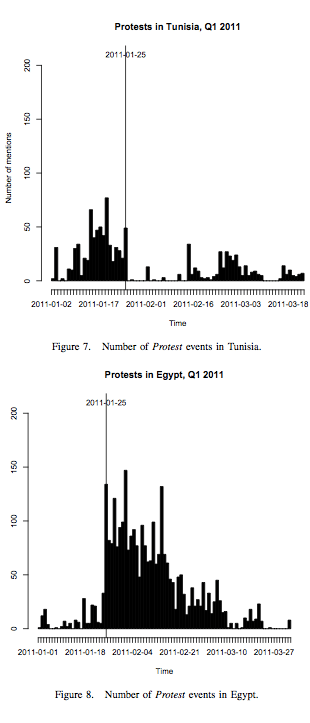
The authors ran a pilot that “manually” integrated the RecordedFuture system with the Ushahidi platform. The result is depicted in the figure below. In the future, the authors plan to automate the creation of reports on the Ushahidi platform via the RecordedFuture system. Intriguingly, the authors chose to focus on protest events to demo their Ushahidi-coupled system. Why is this intriguing? Because my dissertation analyzed whether access to new information and communication technologies (ICTs) are statistically significant predictors of protest events in repressive states. Moreover, the protest data I used in my econometric analysis came from an automated NLP algorithm that parsed Reuters Newswires.

Using RecordedFuture, the authors extracted some 6,000 protest event-data for Quarter 1 of 2011. These events were identified and harvested using a “trained protest extractor” constructed using the system’s event extractor frame-work. Note that many of the 6,000 events are duplicates because they are the same events but reported by different forces. Not surprisingly, Christopher and team plan to develop a duplicate detection algorithm that will also double as a triangulation & veracity scoring feature. I would be particularly interested to see them do this kind of triangulation and validation of crowdsourced data on the fly.

Below are the protest events picked up by RecordedFuture for both Tunisia and Egypt. From these two figures, it is possible to see how the Tunisian protests preceded those in Egypt.

The authors argue that if the platform had been set up earlier this year, a user would have seen the sudden rise in the number of protests in Egypt. However, the authors acknowledge that their data is a function of media interest and attention—the same issue I had with my dissertation. One way to overcome this challenge might be by complementing the harvested reports with crowdsourced data from social media and Crowdmap.

In the future, the authors plan to have the system auto-detect major changes in trends and to add support for the analysis of media in languages beyond English. They also plan to test the reliability and accuracy of their conflict early warning algorithm by comparing their forecasts of historical data with existing conflict data sets. I have several ideas of my own about next steps and look forward to speaking with Christopher’s team about ways to collaborate.

“No Data is Better Than Bad Data…” Really?

I recently tweeted the following:

“No data is better than bad data…” really? if you have no data, how do you know it’s bad data? doh.

This prompted a surprising number of DM’s, follow-up emails and even two in-person conversations. Everyone wholeheartedly agreed with my tweet, which was a delayed reaction to a response I got from a journalist who works for The Economist who in a rather derisive tone tweeted that “no data is better than bad data.” This is of course not the first time I’ve heard this statement so lets explore this issue further.

The first point to note is the rather contradictory nature of the statement “no data is better than bad data.” Indeed, you have to have data in order to deem it as bad in the first place. But Mr. Economist and company clearly overlook this little detail. Having “bad” data requires that this data be bad relative to other data and thus having said other data in the first place. So if data point A is bad compared to data point B, then by definition data point B is available and good data relative to A. I’m not convinced that a data point is either “good or bad” a priori unless the methods that produce that data are well understood and can themselves be judged. Of course, validating methods requires the comparison of data as well.

In any case, the problem is not bad versus good data, in my opinion. The question has to do with error margins. The vast majority of data shared seldom comes with associated error margins or any indication regarding the reliability of the data. This rightly leads to questions over data quality. I believe that introducing a simple lykert scale to tag the perceived quality of the data can go a long way. This is what we did back in 2003/2004 when I was on the team that launched the Conflict Early Warning and Response Network (CEWARN) in the Horn of Africa. While I still wonder whether the project had any real impact on conflict prevention since it launched in 2004, I believe that the initiative’s approach to information collection was pioneering at the time.

The screenshot below is of CEWARN’s online Incident Report Form. Note the “Information Source” and “Information Credibility” fields. These were really informative for us when aggregating the data and studying the corresponding time series. They allowed us to at least gain a certain level of understanding regarding the possible reliability of depicted trends over time. Indeed, we could start quantifying the level of uncertainty or margin of error. Interestingly, this also allowed us to look for patterns in varying credibility scores. Of course, these were perhaps largely based on perceptions but I believe this extra bit of information is worth having if the alternative is no qualifications on the possible credibility of individual reports.

Fast forward to 2011 and you see the same approach taken with the Ushahidi platform. The screenshot below is of the Matrix plugin for Ushahidi developed in partnership with ICT4Peace. The plugin allows reporters to tag reports with the reliability of the source and the probability that the information is correct. The result is the following graphic representing the trustworthiness of the report.

Some closing thoughts: many public health experts that I have spoken to in the field of emergency medicine repeatedly state they would rather have some data that is not immediately verifiable than no data at all. Indeed, in some ways all data begins life this way. They would rather have a potential rumor about a disease outbreak on their radar which they can follow up on and verify than have nothing appear on their radar until it’s too late if said rumor turns out to be true.

Finally, as noted in my previous post on “Tweetsourcing”, while some fear that bad data can cost lives, this doesn’t mean that no data doesn’t cost lives, especially in a crisis zone. Indeed, time is the most perishable commodity during a disaster—the “sell by” date of information is calculated in hours rather than days. This is in no way implies that I’m an advocate for bad data! The risks of basing decisions on bad data are obvious. At the end of the day, the question is about tolerance for uncertainty—different disciplines will have varying levels of tolerance depending on the situation, time and place. In sum, making the sweeping statement “no data is better than bad data” can come across as rather myopic.

Analyzing the Libya Crisis Map Data in 3D (Video)

I first blogged about GeoTime exactly two years ago in a blog post entitled “GeoTime: Crisis Mapping in 3D.” The rationale for visualizing geospatial data in 3D very much resonates with me and in my opinion becomes particularly compelling when analyzing crisis mapping data.

This is why I invited my GeoTime colleague Adeel Khamisa to present their platform at the first International Conference on Crisis Mapping (ICCM 2009). Adeel used the Ushahidi-Haiti data to demonstrate the added value of using a 3D approach, which you can watch in the short video below.

Earlier this year, I asked Adeel whether he might be interested in analyzing the Libya Crisis Map data using GeoTime. He was indeed curious and kindly produced the short video below on his preliminary findings.

The above visual overview of the Libya data is really worth watching. I hope that fellow Crisis Mappers will consider making more use of GeoTime in their projects. The platform really is ideal for Crisis Mapping Analysis.

Democracy in Cyberspace: What Information Technology Can and Cannot Do

Stunning. How can an article like this still be published in 2010 let alone in a peer-reviewed journal? Is the study of digital activism so shallow and superficial? Have we really learned nothing? This article could have been published years ago and even then one wonders what the added value would have been.

I wrote a blog post last year called “Breaking News: Repressive Regimes use Technology to Repress” to poke fun at those who sensationalize stories about digital repression. They make these anecdotes seem surprising and stupefying: “Who would have thought?!” is the general tone. The equivalent in a car magazine would be: “Wow! Cars can be used for Drive By Shootings and Picnics in the Park.” And speaking of anecdotes, articles like this one in Foreign Affairs is why I wrote that data hell and anecdotal heaven series on digital activism a while back. But still the discourse changes little.

Check out these groundbreaking “insights” from the Foreign Affairs article:

  • “… cyberspace is a complex space, and technological advances are not substitute for human wisdom.” Go figure
  • “… the tools of modern communications satisfy as wide a range of ambitions and appetites as their 20th century ancestors did, and many of these ambitions and appetites do not have anything to do with democracy.” Are you sure?
  • “Techno-optimists appear to ignore the fact that these tools [of modern communication] are value neutral; there is nothing inherently pro-democratic about them.’ Never thought of that
  • “[These technologies] are a megaphone, and have a multiplier effect, but they serve both those who want to speed up the cross-border flow of information and those who want to divert or manipulate it.” No way, who would have thought?
  • “If technology has helped citizens pressure authoritarian governments in several countries, it is not because the technology created a demand for that change. That demand must come from public anger at authoritarian rule.” That’s ridiculous
  • “Citizens are not the only ones active in cyberspace. The state is online, too, promoting it’s own ideas and limiting what the average user can see and do. Innovations in communications technology provide people with new sources of information and new opportunities to share ideas, but they also empower governments to manipulate the conversation and to monitor what people are saying.” Since when do governments have access to the Internet?
  • “China, Iran, Myanmar, North Korea, Saudi Arabia, and other authoritarian states cannot halt the proliferation of weapons of modern communications, but they can try to monitor and manipulate them for their own purposes.” But why would they do that?

There is little depth or analytical rigor to this piece. The contribution to the literature is close to nil. Lets hope this will be the last of its kind. The study of digital activism has got to move beyond sweeping generalizations and vague truisms. We know that governments use technology to repress, enough with broken-record-publications.

What we need is more granular, data-driven analysis and mixed methods research, which is why the Global Digital Activism Dataset (GDADS) project is long overdue. Ethan Zuckerman and Clay Shirky are both advisers to this initiative because they recognize that without more empirically grounded research, articles like this one in Foreign Affairs will continue to be published.