Tag Archives: Twitter

Did Terrorists Use Twitter to Increase Situational Awareness?

Those who are still skeptical about the value of Twitter for real-time situational awareness during a crisis ought to ask why terrorists likely think otherwise. In 2008, terrorists carried out multiple attacks on Mumbai in what many refer to as the worst terrorist incident in Indian history. This study, summarized below, explains how the terrorists in question could have used social media for coor-dination and decision-making purposes.

The study argues that “the situational information which was broadcast through live media and Twitter contributed to the terrorists’ decision making process and, as a result, it enhanced the effectiveness of hand-held weapons to accomplish their terrorist goal.” To be sure, the “sharing of real time situational information on the move can enable the ‘sophisticated usage of the most primitive weapons.'” In sum, “unregulated real time Twitter postings can contribute to increase the level of situation awareness for terrorist groups to make their attack decision.”

According to the study, “an analysis of satellite phone conversations between terrorist commandos in Mumbai and remote handlers in Pakistan shows that the remote handlers in Pakistan were monitoring the situation in Mumbai through live media, and delivered specific and situational attack commands through satellite phones to field terrorists in Mumbai.” These conversations provide “evidence that the Mumbai terrorist groups understood the value of up-to-date situation information during the terrorist operation. […] They under-stood that the loss of information superiority can compromise their operational goal.”

Handler: See, the media is saying that you guys are now in room no. 360 or 361. How did they come to know the room you guys are in?…Is there a camera installed there? Switch off all the lights…If you spot a camera, fire on it…see, they should not know at any cost how many of you are in the hotel, what condition you are in, where you are, things like that… these will compromise your security and also our operation […]

Terrorist: I don’t know how it happened…I can’t see a camera anywhere.

A subsequent phone conversation reveals that “the terrorists group used the web search engine to increase their decision making quality by employing the search engine as a complement to live TV which does not provide detailed information of specific hostages. For instance, to make a decision if they need to kill a hostage who was residing in the Taj hotel, a field attacker reported the identity of a hostage to the remote controller, and a remote controller used a search engine to obtain the detailed information about him.”

Terrorist: He is saying his full name is K.R.Ramamoorthy.

Handler: K.R. Ramamoorthy. Who is he? … A designer … A professor … Yes, yes, I got it …[The caller was doing an internet search on the name, and a results showed up a picture of Ramamoorthy] … Okay, is he wearing glasses? [The caller wanted to match the image on his computer with the man before the terrorists.]

Terrorist: He is not wearing glasses. Hey, … where are your glasses?

Handler: … Is he bald from the front?

Terrorist: Yes, he is bald from the front …

The terrorist group had three specific political agendas: “(1) an anti-India agenda, (2) an anti-Israel and anti-Jewish agenda, and (3) an anti-US and anti-Nato agenda.” A content analysis of 900+ tweets posted during the attacks reveal whether said tweets may have provided situational awareness information in support of these three political goals. The results: 18% of tweets contained “situa-tional information which can be helpful for Mumbai terrorist groups to make an operational decision of achieving their Anti-India political agenda. Also, 11.34% and 4.6% of posts contained operationally sensitive information which may help terrorist groups to make an operational decision of achieving their political goals of Anti-Israel/Anti-Jewish and Anti-US/Anti-Nato respectively.”

In addition, the content analysis found that “Twitter site played a significant role in relaying situational information to the mainstream media, which was monitored by Mumbai terrorists. Therefore, we conclude that the Mumbai Twitter page in-directly contributed to enhancing the situational awareness level of Mumbai terrorists, although we cannot exclude the possibility of its direct contribution as well.”

In conclusion, the study stresses the importance analyzing a terrorist group’s political goals in order to develop an appropriate information control strategy. “Because terrorists’ political goals function as interpretative filters to process situational information, understanding of adversaries’ political goals may reduce costs for security operation teams to monitor and decide which tweets need to be controlled.”

bio

See also: Analyzing Tweets Posted During Mumbai Terrorist Attacks [Link]

Update: Twitter Dashboard for Disaster Response

Project name: Artificial Intelligence for Disaster Response (AIDR). For a more recent update, please click here.

My Crisis Computing Team and I at QCRI have been working hard on the Twitter Dashboard for Disaster Response. We first announced the project on iRevolution last year. The experimental research we’ve carried out since has been particularly insightful vis-a-vis the opportunities and challenges of building such a Dashboard. We’re now using the findings from our empirical research to inform the next phase of the project—namely building the prototype for our humanitarian colleagues to experiment with so we can iterate and improve the platform as we move forward.

KnightDash

Manually processing disaster tweets is becoming increasingly difficult and unrealistic. Over 20 million tweets were posted during Hurricane Sandy, for example. This is the main problem that our Twitter Dashboard aims to solve. There are two ways to manage this challenge of Big (Crisis) Data: Advanced Computing and Human Computation. The former entails the use of machine learning algorithms to automatically tag tweets while the latter involves the use of microtasking, which I often refer to as Smart Crowdsourcing. Our Twitter Dashboard seeks to combine the best of both methodologies.

On the Advanced Computing side, we’ve developed a number of classifiers that automatically identify tweets that:

  • Contain informative content (in contrast to personal messages or information unhelpful for disaster response);
  • Are posted by eye-witnesses (as opposed to 2nd-hand reporting);
  • Include pictures, video footage, mentions from TV/radio
  • Report casualties and infrastructure damage;
  • Relate to people missing, seen and/or found;
  • Communicate caution and advice;
  • Call for help and important needs;
  • Offer help and support.

These classifiers are developed using state-of-the-art machine learning tech-niques. This simply means that we take a Twitter dataset of a disaster, say Hurricane Sandy, and develop clear definitions for “Informative Content,” “Eye-witness accounts,” etc. We use this classification system to tag a random sample of tweets from the dataset (usually 100+ tweets). We then “teach” algorithms to find these different topics in the rest of the dataset. We tweak said algorithms to make them as accurate as possible; much like training a dog new tricks like go-fetch (wink).

fetchball

We’ve found from this research that the classifiers are quite accurate but sensitive to the type of disaster being analyzed and also the country in which said disaster occurs. For example, a set of classifiers developed from tweets posted during Hurricane Sandy tend to be less accurate when applied to tweets posted for New Zealand’s earthquake. Each classifier is developed based on tweets posted during a specific disaster. In other words, while the classifiers can be highly accurate (i.e., tweets are correctly tagged as being damage-related, for example), they only tend to be accurate for the type of disaster they’ve been trained for, e.g., weather-related disasters (tornadoes), earth-related (earth-quakes) and water-related (floods).

So we’ve been busy trying to collect as many Twitter datasets of different disasters as possible, which has been particularly challenging and seriously time-consuming given Twitter’s highly restrictive Terms of Service, which prevents the direct sharing of Twitter datasets—even for humanitarian purposes. This means we’ve had to spend a considerable amount of time re-creating Twitter datasets for past disasters; datasets that other research groups and academics have already crawled and collected. Thank you, Twitter. Clearly, we can’t collect every single tweet for every disaster that has occurred over the past five years or we’ll never get to actually developing the Dashboard.

That said, some of the most interesting Twitter disaster datasets are of recent (and indeed future) disasters. Truth be told, tweets were still largely US-centric before 2010. But the international coverage has since increased, along with the number of new Twitter users, which almost doubled in 2012 alone (more neat stats here). This in part explains why more and more Twitter users actively tweet during disasters. There is also a demonstration effect. That is, the international media coverage of social media use during Hurricane Sandy, for example, is likely to prompt citizens in other countries to replicate this kind of pro-active social media use when disaster knocks on their doors.

So where does this leave us vis-a-vis the Twitter Dashboard for Disaster Response? Simply that a hybrid approach is necessary (see TEDx talk above). That is, the Dashboard we’re developing will have a number of pre-developed classifiers based on as many datasets as we can get our hands on (categorized by disaster type). In addition to that, the dashboard will also allow users to create their own classifiers on the fly by leveraging human computation. They’ll also be able to microtask the creation of new classifiers.

In other words, what they’ll do is this:

  • Enter a search query on the dashboard, e.g., #Sandy.
  • Click on “Create Classifier” for #Sandy.
  • Create a label for the new classifier, e.g., “Animal Rescue”.
  • Tag 50+ #Sandy tweets that convey content about animal rescue.
  • Click “Run Animal Rescue Classifier” on new incoming tweets.

The new classifier will then automatically tag incoming tweets. Of course, the classifier won’t get it completely right. But the beauty here is that the user can “teach” the classifier not to make the same mistakes, which means the classifier continues to learn and improve over time. On the geo-location side of things, it is indeed true that only ~3% of all tweets are geotagged by users. But this figure can be boosted to 30% using full-text geo-coding (as was done the TwitterBeat project). Some believe this figure can be doubled (towards 75%) by applying Google Translate to the full-text geo-coding. The remaining users can be queried via Twitter for their location and that of the events they are reporting.

So that’s where we’re at with the project. Ultimately, we envision these classifiers to be like individual apps that can be used/created, dragged and dropped on an intuitive widget-like dashboard with various data visualization options. As noted in my previous post, everything we’re building will be freely accessible and open source. And of course we hope to include classifiers for other languages beyond English, such as Arabic, Spanish and French. Again, however, this is purely experimental research for the time being; we want to be crystal clear about this in order to manage expectations. There is still much work to be done.

In the meantime, please feel free to get in touch if you have disaster datasets you can contribute to these efforts (we promise not to tell Twitter). If you’ve developed classifiers that you think could be used for disaster response and you’re willing to share them, please also get in touch. If you’d like to join this project and have the required skill sets, then get in touch, we may be able to hire you! Finally, if you’re an interested end-user or want to share some thoughts and suggestions as we embark on this next phase of the project, please do also get in touch. Thank you!

bio

Social Media: Pulse of the Planet?

In 2010, Hillary Clinton described social media as a new nervous system for our planet (1). So can the pulse of the planet be captured with social media? There are many who are skeptical not least because of the digital divide. “You mean the pulse of the Data Have’s? The pulse of the affluent?” These rhetorical questions are perfectly justified, which is why social media alone should not be the sole source of information that feeds into decision-making for policy purposes. But millions are joining the social media ecosystem everyday. So the selection bias is not increasing but decreasing. We may not be able to capture the pulse of the planet comprehensively and at a very high resolution yet, but the pulse of the majority world is certainly growing louder by the day.

mapnight2

This map of the world at night (based on 2011 data) reveals areas powered by electricity. Yes, Africa has far less electricity consumption. This is not misleading, it is an accurate proxy for industrial development (amongst other indexes). Does this data suffer from selection bias? Yes, the data is biased towards larger cities rather than the long tail. Does this render the data and map useless? Hardly. It all depends on what the question is.

Screen Shot 2013-02-02 at 8.22.49 AM

What if our world was lit up by information instead of lightbulbs? The map above from TweetPing does just that. The website displays tweets in real-time as they’re posted across the world. Strictly speaking, the platform displays 10% of the ~340 million tweets posted each day (i.e., the “Decahose” rather than the “Firehose”). But the volume and velocity of the pulsing ten percent is already breathtaking.

Screen Shot 2013-01-28 at 7.01.36 AM

One may think this picture depicts electricity use in Europe. Instead, this is a map of geo-located tweets (blue dots) and Flickr pictures (red dots). “White dots are locations that have been posted to both” (2). The number of active Twitter users grew an astounding 40% in 2012, making Twitter the fastest growing social network on the planet. Over 20% of the world’s internet population is now on Twitter (3). The Sightsmap below is a heat map based on the number of photographs submitted to Panoramio at different locations.

Screen Shot 2013-02-05 at 7.59.37 AM

The map below depicts friendship ties on Facebook. This was generated using data when there were “only” 500 million users compared to today’s 1 billion+.

FBmap

The following map does not depict electricity use in the US or the distribution of the population based on the most recent census data. Instead, this is a map of check-in’s on Foursquare. What makes this map so powerful is not only that it was generated using 500 million check-in’s but that “all those check-ins you see aren’t just single points—they’re links between all the other places people have been.”

FoursquareMap

TwitterBeat takes the (emotional) pulse of the planet by visualizing the Twitter Decahose in real-time using sentiment analysis. The crisis map in the YouTube video below comprises all tweets about Hurricane Sandy over time. “[Y]ou can see how the whole country lights up and how tweets don’t just move linearly up the coast as the storm progresses, capturing the advance impact of such a large storm and its peripheral effects across the country” (4).


These social media maps don’t only “work” at the country level or for Western industrialized states. Take the following map of Jakarta made almost exclusively from geo-tagged tweets. You can see the individual roads and arteries (nervous system). Granted, this map works so well because of the horrendous traffic but nevertheless a pattern emerges, one that is strongly correlated to the Jakarta’s road network. And unlike the map of the world at night, we can capture this pulse in real time and at a fraction of the cost.

Jakmap

Like any young nervous system, our social media system is still growing and evolving. But it is already adding value. The analysis of tweets predicts the flu better than the crunching of traditional data used by public health institutions, for example. And the analysis of tweets from Indonesia also revealed that Twitter data can be used to monitor food security in real-time.

The main problem I see about all this has much less to do with issues of selection bias and unrepresentative samples, etc. Far more problematic is the central-ization of this data and the fact that it is closed data. Yes, the above maps are public, but don’t be fooled, the underlying data is not. In their new study, “The Politics of Twitter Data,” Cornelius Puschmann and Jean Burgess argue that the “owners” of social media data are the platform providers, not the end users. Yes, access to Twitter.com and Twitter’s API is free but end users are limited to downloading just a few thousand tweets per day. (For comparative purposes, more than 20 million tweets were posted during Hurricane Sandy). Getting access to more data can cost hundreds of thousands of dollars. In other words, as Puschmann and Burgess note, “only corporate actors and regulators—who possess both the intellectual and financial resources to succeed in this race—can afford to participate,” which means “that the emerging data market will be shaped according to their interests.”

“Social Media: Pulse of the Planet?” Getting there, but only a few elite Doctors can take the full pulse in real-time.

Social Network Analysis for Digital Humanitarian Response

Monitoring social media for digital humanitarian response can be a massive undertaking. The sheer volume and velocity of tweets generated during a disaster makes real-time social media monitoring particularly challenging if not near impossible. However, two new studies argue that there is “a better way to track the spread of information on Twitter that is much more powerful.”

Twitter-Hadoop31

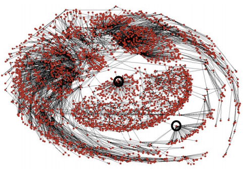
Manuel Garcia-Herranz and his team at the Autonomous University of Madrid in Spain use small groups of “highly connected Twitter users as ‘sensors’ to detect the emergence of new ideas. They point out that this works because highly co-nnected individuals are more likely to receive new ideas before ordinary users.” The test their hypothesis, the team studied 40 million Twitters users who “together totted up 1.5 billion follows’ and sent nearly half a billion tweets, including 67 million containing hashtags.”

They found that small groups of highly connected Twitter users detect “new hashtags about seven days earlier than the control group.  In fact, the lead time varied between nothing at all and as much as 20 days.” Manuel and his team thus argue that “there’s no point in crunching these huge data sets. You’re far better off picking a decent sensor group and watching them instead.” In other words, “your friends could act as an early warning system, not just for gossip, but for civil unrest and even outbreaks of disease.”

The second study, “Identifying and Characterizing User Communities on Twitter during Crisis Events,” (PDF) is authored by Aditi Gupta et al. Aditi and her co-lleagues analyzed three major crisis events (Hurricane Irene, Riots in England and Earthquake in Virginia) to “to identify the different user communities, and characterize them by the top central users.” Their findings are in line with those shared by the team in Madrid. “[T]he top users represent the topics and opinions of all the users in the community with 81% accuracy on an average.” In sum, “to understand a community, we need to monitor and analyze only these top users rather than all the users in a community.”

How could these findings be used to prioritize the monitoring of social media during disasters? See this blog post for more on the use of social network analysis (SNA) for humanitarian response.

The Problem with Crisis Informatics Research

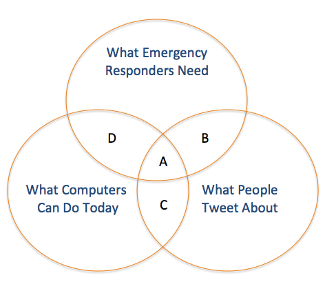
My colleague ChaTo at QCRI recently shared some interesting thoughts on the challenges of crisis informatics research vis-a-vis Twitter as a source of real-time data. The way he drew out the issue was clear, concise and informative. So I’ve replicated his diagram below.

ChaTo Diagram

What Emergency Managers Need: Those actionable tweets that provide situational awareness relevant to decision-making. What People Tweet: Those tweets posted during a crisis which are freely available via Twitter’s API (which is a very small fraction of the Twitter Firehose). What Computers Can Do: The computational ability of today’s algorithms to parse and analyze natural language at a large scale.

A: The small fraction of tweets containing valuable information for emergency responders that computer systems are able to extract automatically.
B: Tweets that are relevant to disaster response but are not able to be analyzed in real-time by existing algorithms due to computational challenges (e.g. data processing is too intensive, or requires artificial intelligence systems that do not exist yet).
C: Tweets that can be analyzed by current computing systems, but do not meet the needs of emergency managers.
D: Tweets that, if they existed, could be analyzed by current computing systems, and would be very valuable for emergency responders—but people do not write such tweets.

These limitations are not just academic. They make it more challenging to develop next-generation humanitarian technologies. So one question that naturally arises is this: How can we expand the size of A? One way is for governments to implement policies that expand access to mobile phones and the Internet, for example.

Area C is where the vast majority of social media companies operate today, on collecting business intelligence and sentiment analysis for private sector companies by combining natural language processing and machine learning methodologies. But this analysis rarely focuses on tweets posted during a major humanitarian crisis. Reaching out to these companies to let them know they could make a difference during disasters would help to expand the size of A + C.

Finally, Area D is composed of information that would be very valuable for emergency responders, and that could automatically extracted from tweets, but that Twitter users are simply not posting this kind of information during emergencies (for now). Here, government and humanitarian organizations can develop policies to incentivise disaster-affected communities to tweet about the impact of a hazard and resulting needs in a way that is actionable, for example. This is what the Philippine Government did during Typhoon Pablo.

Now recall that the circle “What People Tweet About” is actually a very small fraction of all posted tweets. The advantage of this small sample of tweets is that they are freely available via Twitter’s API. But said API limits the number of downloadable tweets to just a few thousand per day. (For comparative purposes, there were over 20 million tweets posted during Hurricane Sandy). Hence the need for data philanthropy for humanitarian response.

I would be grateful for your feedback on these ideas and the conceptual frame-work proposed by ChaTo. The point to remember, as noted in this earlier post, is that today’s challenges are not static; they can be addressed and overcome to various degrees. In other words, the sizes of the circles can and will change.


Social Network Analysis of Tweets During Australia Floods

This study (PDF) analyzes the community of Twitter users who disseminated  information during the crisis caused by the Australian floods in 2010-2011. “In times of mass emergencies, a phenomenon known as collective behavior becomes apparent. It consists of socio-behaviors that include intensified information search and information contagion.” The purpose of the Australian floods analysis is to reveal interesting patterns and features of this online community using social network analysis (SNA).

The authors analyzed 7,500 flood-related tweets to understand which users did the tweeting and retweeting. This was done to create nodes and links for SNA, which was able to “identify influential members of the online communities that emerged during the Queensland, NSW and Victorian floods as well as identify important resources being referred to. The most active community was in Queensland, possibly induced by the fact that the floods were orders of mag-nitude greater than in NSW and Victoria.”

The analysis also confirmed “the active part taken by local authorities, namely Queensland Police, government officials and volunteers. On the other hand, there was not much activity from local authorities in the NSW and Victorian floods prompting for the greater use of social media by the authorities concerned. As far as the online resources suggested by users are concerned, no sensible conclusion can be drawn as important ones identified were more of a general nature rather than critical information. This might be comprehensible as it was past the impact stage in the Queensland floods and participation was at much lower levels in the NSW and Victorian floods.”

Social Network Analysis is an under-utilized methodology for the analysis of communication flows during humanitarian crises. Understanding the topology of a social network is key to information diffusion. Think of this as a virus infecting a network. If we want to “infect” a social network with important crisis information as quickly and fully as possible, understanding the network’ topology is a requirement as is, therefore, social network analysis.

Comparing the Quality of Crisis Tweets Versus 911 Emergency Calls

In 2010, I published this blog post entitled “Calling 911: What Humanitarians Can Learn from 50 Years of Crowdsourcing.” Since then, humanitarian colleagues have become increasingly open to the use of crowdsourcing as a methodology to  both collect and process information during disasters.  I’ve been studying the use of twitter in crisis situations and have been particularly interested in the quality, actionability and credibility of such tweets. My findings, however, ought to be placed in context and compared to other, more traditional, reporting channels, such as the use of official emergency telephone numbers. Indeed, “Information that is shared over 9-1-1 dispatch is all unverified information” (1).

911ex

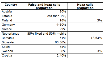
So I did some digging and found the following statistics on 911 (US) & 999 (UK) emergency calls:

  • “An astounding 38% of some 10.4 million calls to 911 [in New York City] during 2010 involved such accidental or false alarm ‘short calls’ of 19 seconds or less — that’s an average of 10,700 false calls a day”.  – Daily News
  • “Last year, seven and a half million emergency calls were made to the police in Britain. But fewer than a quarter of them turned out to be real emergencies, and many were pranks or fakes. Some were just plain stupid.” – ABC News

I also came across the table below in this official report (PDF) published in 2011 by the European Emergency Number Association (EENA). The Greeks top the chart with a staggering 99% of all emergency calls turning out to be false/hoaxes, while Estonians appear to be holier than the Pope with less than 1% of such calls.

Screen Shot 2012-12-11 at 4.45.34 PM

Point being: despite these “data quality” issues, European law enforcement agencies have not abandoned the use of emergency phone numbers to crowd-source the reporting of emergencies. They are managing the challenge since the benefit of these number still far outweigh the costs. This calculus is unlikely to change as law enforcement agencies shift towards more mobile-based solutions like the use of SMS for 911 in the US. This important shift may explain why tra-ditional emergency response outfits—such as London’s Fire Brigade—are putting in place processes that will enable the public to report via Twitter.

For more information on the verification of crowdsourced social media informa-tion for disaster response, please follow this link.

Tweeting is Believing? Analyzing Perceptions of Credibility on Twitter

What factors influence whether or not a tweet is perceived as credible? According to this recent study, users have “difficulty discerning truthfulness based on con-tent alone, with message topic, user name, and user image all impacting judg-ments of tweets and authors to varying degrees regardless of the actual truth-fulness of the item.”

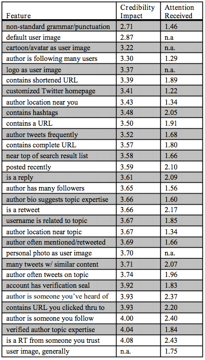
For example, “Features associated with low credibility perceptions were the use of non-standard grammar and punctuation, not replacing the default account image, or using a cartoon or avatar as an account image. Following a large number of users was also associated with lower author credibility, especially when unbalanced in comparison to follower count […].” As for features enhan-cing a tweet’s credibility, these included “author influence (as measured by follower, retweet, and  mention counts), topical expertise (as established through a Twitter homepage bio, history of on-topic tweeting, pages outside of Twitter, or having a location relevant to the topic of the tweet), and reputation (whether an author is someone a user follows, has heard of, or who has an official Twitter account verification seal). Content related features viewed as credibility-enhancing were containing a URL leading to a high-quality site, and the existence of other tweets conveying similar information.”

 In general, users’ ability to “judge credibility in practice is largely limited to those features visible at-a-glance in current UIs (user picture, user name, and tweet content). Conversely, features that often are obscured in the user interface, such as the bio of a user, receive little attention despite their ability to impact cred-ibility judgments.” The table below compares a features’s perceived credibility impact with the attention actually allotted to assessing that feature.

“Message topic influenced perceptions of tweet credibility, with science tweets receiving a higher mean tweet credibility rating than those about either politics  or entertainment. Message topic had no statistically significant impact on perceptions of author credibility.” In terms of usernames, “Authors with topical names were considered more credible than those with traditional user names, who were in turn considered more credible than those with internet name styles.” In a follow up experiment, the study analyzed perceptions of credibility vis-a-vis a user’s image, i.e., the profile picture associated with a given Twitter account. “Use of the default Twitter icon significantly lowers ratings of content and marginally lowers ratings of authors […]” in comparison to generic, topical, female and male images.

Obviously, “many of these metrics can be faked to varying extents. Selecting a topical username is trivial for a spam account. Manufacturing a high follower to following ratio or a high number of retweets is more difficult but not impossible. User interface changes that highlight harder to fake factors, such as showing any available relationship between a user’s network and the content in question, should help.” Overall, these results “indicate a discrepancy between features people rate as relevant to determining credibility and those that mainstream social search engines make available.” The authors of the study conclude by suggesting changes in interface design that will enhance a user’s ability to make credibility judgements.

“Firstly, author credentials should be accessible at a glance, since these add value and users rarely take the time to click through to them. Ideally this will include metrics that convey consistency (number of tweets on topic) and legitimization by other users (number of mentions or retweets), as well as details from the author’s Twitter page (bio, location, follower/following counts). Second, for con-tent assessment, metrics on number of retweets or number of times a link has been shared, along with who is retweeting and sharing, will provide consumers with context for assessing credibility. […] seeing clusters of tweets that conveyed similar messages was reassuring to users; displaying such similar clusters runs counter to the current tendency for search engines to strive for high recall by showing a diverse array of retrieved items rather than many similar ones–exploring how to resolve this tension is an interesting area for future work.”

In sum, the above findings and recommendations explain why platforms such as RapportiveSeriously Rapid Source Review (SRSR) and CrisisTracker add so much value to the process of assessing the credibility of tweets in near real-time. For related research: Predicting the Credibility of Disaster Tweets Automatically and: Automatically Ranking the Credibility of Tweets During Major Events.

Social Media = Social Capital = Disaster Resilience?

Do online social networks generate social capital, which, in turn, increases resilience to disasters? How might one answer this question? For example, could we analyze Twitter data to capture levels of social capital in a given country? If so, do countries with higher levels of social capital (as measured using Twitter) demonstrate greater resiliences to disasters?

Twitter Heatmap Hurricane

These causal loops are fraught with all kinds of intervening variables, daring assumptions and econometric nightmares. But the link between social capital and disaster resilience is increasingly accepted. In “Building Resilience: Social Capital in Post-Disaster Recover,” Daniel Aldrich draws on both qualitative and quantita-tive evidence to demonstrate that “social resources, at least as much as material ones, prove to be the foundation for resilience and recovery.” A concise summary of his book is available in my previous blog post.

So the question that follows is whether the link between social media, i.e., online social networks and social capital can be established. “Although real-world organizations […] have demonstrated their effectiveness at building bonds, virtual communities are the next frontier for social capital-based policies,” writes Aldrich. Before we jump into the role of online social networks, however, it is important to recognize the function of “offline” communities in disaster response and resilience.

iran-reliefs

“During the disaster and right after the crisis, neighbors and friends—not private firms, government agencies, or NGOs—provide the necessary resources for resilience.” To be sure, “the lack of systematic assistance from government and NGOs [means that] neighbors and community groups are best positioned to undertake efficient initial emergency aid after a disaster. Since ‘friends, family, or coworkers of victims and also passersby are always the first and most effective responders, “we should recognize their role on the front line of disasters.”

In sum, “social ties can serve as informal insurance, providing victims with information, financial help and physical assistance.” This informal insurance, “or mutual assistance involves friends and neighbors providing each other with information, tools, living space, and other help.” Data driven research on tweets posted during disasters reveal that many provide victims with information, help, tools, living space, assistance and other help. But this support is also provided to complete strangers since it is shared openly and publicly on Twitter. “[…] Despite—or perhaps because of—horrendous conditions after a crisis, survivors work together to solve their problems; […] the amount of (bounding) social capital seems to increase under difficult conditions.” Again, this bonding is not limited to offline dynamics but occurs also within and across online social networks. The tweet below was posted in the aftermath of Hurricane Sandy.

Sandy Tweets Mutual Aid

“By providing norms, information, and trust, denser social networks can implement a faster recovery.” Such norms also evolve on Twitter, as does information sharing and trust building. So is the degree of activity on Twitter directly proportional to the level of community resilience?

This data-driven study, “Do All Birds Tweet the Same? Characterizing Twitter Around the World,” may shed some light in this respect. The authors, Barbara Poblete, Ruth Garcia, Marcelo Mendoza and Alejandro Jaimes, analyze various aspects of social media–such as network structure–for the ten most active countries on Twitter. In total, the working dataset consisted close to 5 million users and over 5 billion tweets. The study is the largest one carried out to date on Twitter data, “and the first one that specifically examines differences across different countries.”

Screen Shot 2012-11-30 at 6.19.45 AM

The network statistics per country above reveals that Japan, Canada, Indonesia and South Korea have highest percentage of reciprocity on Twitter. This is important because according to Poblet et al., “Network reciprocity tells us about the degree of cohesion, trust and social capital in sociology.” In terms of network density, “the highest values correspond to South Korea, Netherlands and Australia.” Incidentally, the authors find that “communities which tend to be less hierarchical and more reciprocal, also displays happier language in their content updates. In this sense countries with high conversation levels (@) … display higher levels of happiness too.”

If someone is looking for a possible dissertation topic, I would recommend the following comparative case study analysis. Select two of the four countries with highest percentage of reciprocity on Twitter: Japan, Canada, Indonesia and South Korea. The two you select should have a close “twin” country. By that I mean a country that has many social, economic and political factors in common. The twin countries should also be in geographic proximity to each other since we ultimately want to assess how they weather similar disasters. The paired can-didates that come to mind are thus: Canada & US and Indonesia & Malaysia.

Next, compare the countries’ Twitter networks, particularly degrees of  recipro-city since this metric appears to be a suitable proxy for social capital. For example, Canada’s reciprocity score is 26% compared to 19% for the US. In other words, quite a difference. Next, identify recent  disasters that both countries have experienced. Do the affected cities in the respective countries weather the disasters differently? Is one community more resilient than the other? If so, do you find a notable quantitative difference in their Twitter networks and degrees of reciprocity? If so, does a subsequent comparative qualitative analysis support these findings?

As cautioned earlier, these causal loops are fraught with all kinds of intervening variables, daring assumptions and econometric nightmares. But if anyone wants to brave the perils of applied social science research, and finds the above re-search questions of interest, then please do get in touch!

Analyzing Tweets From Australia’s Worst Bushfires

As many as 400 fires were identified in Victoria on February 7, 2010. These resulted in Australia’s highest ever loss of life from a bushfire; 173 people were killed and over 400 injured. This analysis of 1,684 tweets generated during these fires found that they were “laden with actionable factual information which contrasts with earlier claims that tweets are of no value made of mere random personal notes.”

Of the 705 unique users who exchanged tweets during the fires, only two could be considered “official sources of communication”; both accounts were held by ABC Radio Melbourne. “This demonstrates the lack of state or government based initiatives to use social media tools for official communication purposes. Perhaps the growth in Twitter usage for political campaigns will force policy makers to reconsider.” In any event, about 65% of the tweets had “factual details,” i.e., “more than three of every five tweets had useful information.” In addition, “Almost 22% of the tweets had geographical data thus identifying location of the incident which is critical in crisis reporting.” Around 7% of the tweets were see-king information, help or answers. Finally, close to 5% (about 80 tweets) were “directly actionable.”

While 5% is obviously low, there’s no reason why this figure has to remain this low. If humanitarian organizations were to create demand for posting actionable information on Twitter, this would likely increase the supply of more actionable content. Take for example the pro-active role taken by the Philippines Govern-ment vis-a-vis the use of Twitter for disaster response. In any case, the findings from the above study do reveal that 65% of tweets had useful information. Surely contacting the publishers of those tweets could produce even more directly actionable content—which is why the BBC’s User-Generated Content Hub (UGC) uses follow-up as strategy to verify content posted on social media.

Finally, keep in mind that calls to emergency numbers like “911” in the US and “000” in Australia are not spontaneously actionable. That is, human operators who handle these emergency calls ask a series of detailed questions in order to turn the information into structured, actionable content. Some of these standard questions are: What is your emergency? What is your current location? What is your phone number? What is happening? When did the incident occur? Are there injuries? etc. In other words, without being prompted with specific questions, callers are unlikely to provide as much actionable information. The same is true for the use of twitter in crisis response.