I coined the term “bounded crowdsourcing” a couple years back to distinguish the approach from other methodologies for information collection. As tends to happen, some Muggles (in the humanitarian community) ridiculed the term. They freaked out about the semantics instead of trying to understand the under-lying concept. It’s not their fault though, they’ve never been to Hogwarts and have never taken Crowdsourcery 101 (joke!).
Open crowdsourcing or “unbounded crowdsourcing” refers to the collection of information with no intentional constraints. Anyone who hears about an effort to crowdsource information can participate. This definition is inline with the original description put forward by Jeff Howe: outsourcing a task to a generally large group of people in the form of an open call.
In contrast, the point of “bounded crowdsourcing” is to start with a small number of trusted individuals and to have these individuals invite say 3 additional individuals to join the project–individuals who they fully trust and can vouch for. After joining and working on the project, these individuals in turn invite 3 additional people they fully trust. And so on and so forth at an exponential rate if desired. Just like crowdsourcing is nothing new in the field of statistics, neither is “bounded crowdsourcing”; it’s analog being snowball sampling.
In snowball sampling, a number of individuals are identified who meet certain criteria but unlike purposive sampling they are asked to recommend others who also meet this same criteria—thus expanding the network of participants. Although these “bounded” methods are unlikely to produce representative samples, they are more likely to produce trustworthy information. In addition, there are times when it may be the best—or indeed only—method available. Incidentally, a recent study that analyzed various field research methodologies for conflict environments concluded that snowball sampling was the most effective method (Cohen and Arieli 2011).
I introduced the concept of bounded crowdsourcing to the field of crisis mapping in response to concerns over the reliability of crowd sourced information. One excellent real world case study of bounded crowdsourcing for crisis response is this remarkable example from Kyrgyzstan. The “boundary” in bounded crowd-sourcing is dynamic and can grow exponentially very quickly. Participants may not all know each other (just like in open crowdsourcing) so in some ways they become a crowd but one bounded by an invite-only criteria.
I have since recommended this approach to several groups using the Ushahidi platform, like the #OWS movement. The statistical method known as snowball sampling is decades old. So I’m not introducing a new technique, simply applying a conventional approach from statistics to the field of crisis mapping and calling it bounded to distinguish the methodology from regular crowdsourcing efforts. What is different and exciting about combining snowball sampling with crowd-sourcing is that a far larger group can be sampled, a lot more quickly and also more cost-effectively given today’s real-time, free social networking platforms.
I chose to focus my dissertation research on the impact of information and communication technologies (ICTs) during elections in repressive states. Why? Because the contentious relationship between state and society during elections is accentuated and the stakes are generally higher than periods in-between elections. To be sure, elections provide momentary opportunities for democratic change. Moreover, the impact of ICTs on competitive events such as contentious elections may be more observable than the impact on state-society relations during the regular calendar year. In other words, the use of ICTs during election periods may shed some light on whether said technologies empower coercive regimes at the expense of civil society or vice versa.
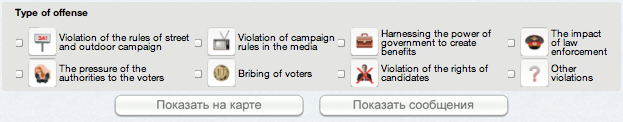
This was certainly the case this past week in Russia as a result of the above crowdsourced election-violations map, which was used to monitor the country’s Parliamentary Elections. The map displays over 5,000 reports of election viola-tions that span the following categories:
While this map is not powered by the Ushahidi platform (contrary to this claim), the many similarities suggest that the project was inspired by the earlier nation-wide use of the Ushahidi platform in 2010, namely the Russia Fires Help Map. In fact, the major initiator of the Violations Map attended a presentation on Ushahidi and Help Map in Boston earlier this year.
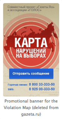
The Elections-Violation Map was launched by Golos, the country’s only independent election monitoring organization and Gazeta.ru, Russia’s leading Internet newspaper. This promotional banner for the map was initially displayed on Gazeta.ru’s website but was subsequently taken down by the Editor in Chief who cited commercial reasons for the action: “Right now we have such a period that this advertisement place is needed for commercial advertisement. But we’re still partners with Golos.”
The deputy editor from Gazeta who had curated the map resigned in protest: “After it became evident that the Violation Map ‘no longer suited the leadership and the owners of the website’, [the deputy editor said,] it would have been “cowardice” to continue the work. Despite Gazeta.ru’s withdrawal from the project, the Violation Map found another partner, “Slon.ru, a popular blog platform (~1 million unique visitors monthly).”
My colleague Alexey Sidorenko argues that the backlash against the Violations Map “induced the Streisand Effect, whereby any attempt to contain the spread of information results in the opposite reaction.” Indeed, as one Russian blogger tweeted: “Why are ‘United Russia’ representatives so short-sighted? It is evident that now half of the country will know about the Violation Map.” Needless to say, the Violations Map is one of the trending topics being discussed in Russia today (on election day).
As is well know, Golos is funded by both American and European organizations. Not surprisingly, Vladimir Putin is not a fan of Golos, as recently quoted in the Washington Post:
“Representatives of some states are organizing meetings with those who receive money from them, the so-called grant recipients, briefing them on how to ‘work’ in order to influence the course of the election campaign in our country,” Putin said.
“As the saying goes, it’s money down the drain,” he added. “First, because Judas is not the most respected of biblical characters among our people. And, second, they would do better to use that money to redeem their national debt and stop pursuing their costly and ineffective foreign policy.”
As expected by many, hackers took down the Golos website along with the Election-Violations Map. (The Sudanese government did the same last year when independent Sudanese civil society groups used the Ushahidi platform to monitor the country’s first presidential elections in two decades). Incidentally, Slon.ru seems to have evaded the take-down. In any case, the blocking of websites is just one very easy tactic available to hackers and repressive regimes. Take this other tactic, for example:
According to a Russian-speaking colleague of mine (who also pointed me to this pro-Kremlin activist video), the woman says that “mapping dots is a disease on the map of Russia.” The video shows her calling the Map’s dedicated number to report a false message (she gives a location that doesn’t exist) and subsequently fills out a false report online. In other words, this is an instructional video on how to submit false information to a crowdsourcing platform. A fully translated transcript of the video is available here.
This same colleague informed me that one of Russia’s State Television Channels subsequently broadcast a program in which it accused those behind the Violations Map of making false claims about the falsification of reports, accusing the “Maptivists” of using an American tool in efforts against the Russian ruling party. In addition, the head of Russia’s Election Committee submitted a complaint against the map to the court, which resulted in the organizers receiving a $1,000 fine (30,0000 Rubles).
Gregory Asmolov, a PhD student at LSE, argues that the Russian government’s nervous reaction to the crowdsourced map and its attempt to delegitimize and limit its presence in cyberspace is clear proof of the project’s impact. Gregory goes on to write that the crowdsourced map is an interim product, not a finished product, which serves as a diagnostic system in which individuals are the sensors. He also argues that crowdsourcing mirrors the reliability of society and thus claims that if there is low confidence in the reliability of crowdsourced information, this is a diagnosis of society and not the crowdsourcing tool itself.
Alexey Sidorenko concludes with the following: “The Violation Map incident is just an indicator of a much deeper trend – the growing will for the need of change, exercised by free, non-falsified elections. In previous election cycles, most journalists would not have resigned and no big portal would have been brave enough to advertise election violation monitoring. Aside from the deeper sociological undercurrent, technology plays a crucial role in all presented stories. […] none of these events would actually have happened if Golos and Gazeta.ru had not united in producing the Violation Map. Golos has had an election violation database since 2008, but it never was as influential as it is now. This suggests the success of the project relies heavily on its online mapping element (if any event gets concrete geographic coordinates it automatically gets more real and more appealing) and having a proper media partner.”
My dissertation research asked the following question: Do New ICTs Change the Balance of Power Between Repressive States and Civil Society? In the case of Russia’s Parliamentary Elections, it would seem so. So my next question is this: If Help Map inspired this week’s Election Violations Map, then what will the latter inspire now that many more have been exposed to the power of crowdsourcing and live maps? Stay tuned for the next round of Crowdsourcing vs. Putin.
My 20+ page study on verifying crowdsourced information is now publicly available here as a PDF and here as an open Google Doc for comments. I very much welcome constructive feedback from iRevolution readers so I can improve the piece before it gets published in an edited book next year.
Abstract
False information can cost lives. But no information can also cost lives, especially in a crisis zone. Indeed, information is perishable so the potential value of information must be weighed against the urgency of the situation. Correct information that arrives too late is useless. Crowdsourced information can provide rapid situational awareness, especially when added to a live crisis map. But information in the social media space may not be reliable or immediately verifiable. This may explain why humanitarian (and news) organizations are often reluctant to leverage crowdsourced crisis maps. Many believe that verifying crowdsourced information is either too challenging or impossible. The purpose of this paper is to demonstrate that concrete strategies do exist for the verification of geo-referenced crowdsourced social media information. The study first provides a brief introduction to crisis mapping and argues that crowdsourcing is simply non-probability sampling. Next, five case studies comprising various efforts to verify social media are analyzed to demonstrate how different verification strategies work. The five case studies are: Andy Carvin and Twitter; Kyrgyzstan and Skype; BBC’s User-Generated Content Hub; the Standby Volunteer Task Force (SBTF); and U-Shahid in Egypt. The final section concludes the study with specific recommendations.
Crisis mapping is often referred to as dots on a map. Perhaps the time has come to move beyond the dot. After all, what’s in a dot? A heck of a lot, as it turns out. When we add data to a map using a dot, we are collapsing important attributes and multiple dimensions into just one single dimension. This reduces entropy but information as well. Of course, simplification is important but this should be optional and not hard-wired in the form of static dot on a map. This is why I’m a big fan of GeoTime, i.e., 3D immersive mapping, which unpacks the temporal dimension by adding a Z-axis to dynamic crisis maps, i.e., time “flows upwards.”
This is a definite improvement in that the GeoTime map gives a more immediate at-a-glance understanding by uncollapsing dots into more dimensions and attributes. The icons still “hide” additional information, however. So how do we unpack as many attributes and dimensions as possible? How do we visualize the underlying DNA of a dot on a crisis map? I recently spoke to a colleague who may have an answer, which looks something like this:
And this:
No longer dots on map. Here, the geometric shapes, sizes, colors, relative distances, etc., all convey information unpacked from a single dot. Tags on steroids basically, especially since they don’t sit still, i.e., they all move or can be made to vibrate at various speeds referencing further information that is other-wise hidden in a collapsed dot. In other words, the toroids can represent live data from the field. Additional toroids and geometric shapes can be added to a “dot” to represent more attributes and temporal elements.
Unpacking dots in this way leads to more perceptivity and discoverability. Patterns that are not otherwise discernible as static dots emerge as curious geometric shapes that beg to be explained. When “flying through” the map below, for example, it was very clear that conflict events had very distinct geometric shapes and constructs that were simply not discernible when in the form of dots. New questions that we didn’t know to ask can now be asked and followed up on with hypothesis testing. This type of visual DNA also allows one to go beyond natural languages and use a common geometric language. Users can also compare their perceptions using objects rather than natural languages.
Reading these maps does require learning a new kind of language, but one that is perhaps easier and more intuitive to learn, not to mention customizable. The above is just a glimpse of the evolving work and the team behind it is not making any claims about anything just yet. The visualization code will be released as open source software in the near future. In the meantime, a big thanks to my colleague Jen Ziemke for putting me in touch with the team behind this remarkable tool.
The field of conflict analysis has long been handicapped by the country-year straightjacket. This is beginning to change thanks to the increasing availability of subnational and sub-annual conflict data. In the past, one was limited to macro-level data, such as the number of casualties resulting from violent conflict in a given county and year. Today, datasets such as the Armed Conflict Location Event Data (ACLED) provide considerably more temporal and spatial resolution. Another example is this quantitative study: “The Micro-dynamics of Reciprocity in an Asymmetric Conflict: Hamas, Israel, and the 2008-2009 Gaza Conflict,” authored by by NYU PhD Candidate Thomas Zeitzoff.
I’ve done some work on conflict event-data and reciprocity analysis in the past (such as this study of Afghanistan), but Thomas is really breaking new ground here with the hourly temporal resolution of the conflict analysis, which was made possible by Al-Jazeera’s War on Gaza project powered by the Ushahidi platform.
ABSTRACT
The Gaza Conflict (2008-2009) between Hamas and Israel was de fined the participants’ strategic use of force. Critics of Israel point to the large number of Palestinian casualties compared to Israelis killed as evidence of a disproportionate Israeli response. I investigate Israeli and Hamas response patterns by constructing a unique data set of hourly conflict intensity scores from new social media and news source over the nearly 600 hours of the conflict. Using vector autoregression techniques (VAR), I fi nd that Israel responds about twice as intensely to a Hamas escalation as Hamas responds to an Israeli escalation. Furthermore, I find that both Hamas’ and Israel’s response patterns change once the ground invasion begins and after the UN Security Council votes. (Study available as PDF here).
As Thomas notes, “Ushahidi worked with Al-Jazeera to track events on the ground in Gaza via SMS messages, email, or the web. Events were then sent in by reporters and civilians through the platform and put into a Twitter feed entitled AJGaza, which gave the event a time stamp. By cross-checking with other sources such as Reuters, the UN, and the Israeli newspaper Haaretz, I was able see that the time stamp was usually within a few minutes of event occurrence.”
Key Highlights from the study:
Hamas’ cumulative response intensity to an Israeli escalation decreases (by about 17 percent) after the ground invasion begins. Conversely, Israel’s cumulative response intensity after the invasion increases by about three fold.
Both Hamas and Israel’s cumulative response drop after the UN Security Council vote on January 8th, 2009 for an immediate cease-fi re, but Israel’s drops more than Hamas (about 30 percent to 20 percent decrease).
For the period covering the whole conflict, Hamas would react (on average) to a “surprise” 1 event (15 minute interval) of Israeli misinformation/psy-ops with the equivalent of 1 extra incident of mortar re/endangering civilians.
Before the invasion, Hamas would respond to a 1 hour shock of targeted air strikes with 3 incidents of endangering civilians. Comparatively, after the invasion, Hamas would only respond to that same Israeli shock with 3 incidents of psychological warfare.
The results con firm my hypotheses that Israel’s reactions were more dependent upon Hamas and that these responses were contextually dependent.
Wikipedia’s Timeline of the 2008-2009 Gaza Conflict was particularly helpful in sourcing and targeting events that might have diverging reports (i.e. controversial).
[An earlier version of this blog post appeared on my Early Warning blog]
Do new information and communication technologies (ICTs) empower repressive regimes at the expense of civil society, or vice versa? For example, does access to the Internet and mobile phones alter the balance of power between repressive regimes and civil society? These questions are especially pertinent today given the role that ICTs played during this year’s uprisings in Tunisia, Egypt and beyond. Indeed, as one Egyptian activist stated, “We use Facebook to schedule our protests, Twitter to coordinate and YouTube to tell the world.” But do these new ICTs—so called “liberation technologies”—really threaten repressive rule? The purpose of this dissertation is to use mixed-methods research to answer these questions.
The first half of my doctoral study comprised a large-N econometric analysis to test whether “liberation technologies” are a statistically significant predictor of anti-government protests in countries with repressive regimes. If using the Internet and mobile phones facilitates organization, mobilization and coordina-tion, then one should expect a discernible link between an increase in access to ICTs and the frequency of protests—particularly in repressive states. The results of the quantitative analysis were combined with other selection criteria to identify two country case studies for further qualitative comparative analysis: Egypt and the Sudan.
The second half of the dissertation assesses the impact of “liberation technologies” during the Egyptian Parliamentary Elections and Sudanese Presidential Elections of 2010. The analysis focused specifically on the use of Ushahidi—a platform often referred to as a “liberation technology.” Descriptive analysis, process tracing and semi-structured interviews were carried out for each case study. The results of the quantitative and qualitative analyses were mixed. An increase in mobile phone access was associated with a decrease in protests for four of the five regression models. Only in one model was an increase in Internet access associated with an increase in anti-government protests. As for Ushahidi, the Egyptian and Sudanese dictatorships were indeed threatened by the technology because it challenged the status quo. Evidence suggests that this challenge tipped the balance of power marginally in favor of civil society in Egypt, but not in the Sudan, and overall not significantly.
The main contributions and highlights of my dissertation include:
* New dataset on protests, ICTs, political and economic variables over 18 years. * New econometric analysis and contribution to quantitative political science. * New conceptual framework to assess impact of ICTs on social, political change. * New operational application of conceptual framework to assess impact of ICTs. * New datasets on independent citizen election observation in repressive states. * New insights into role of ICTs in civil resistance against authoritarian regimes. * New comprehensive literature on impact of ICTs on protests, activism, politics. * New targeted policy recommendations based on data driven empirical analysis. * New lessons learned and best practices in using the Ushahidi platform.
It is my great pleasure and honor to open the third International Conference of CrisisMappers. Thank you very much for being here and for contributing both your time and expertise to ICCM 2011. This past year has been a challenging and busy year for all of us in the CrisisMappers community. So the timing of this conference and its location in this quiet and scenic region of Switzerland provides the perfect opportunity to pause, take a deep breath and gently reflect on the past 12 months.
As many of you already know, the CrisisMappers Community is an informal network of members who operate at the cutting edge of crisis mapping and humanitarian technology. We are not a formal entity; we have no office, no one location, no staff, and no core funding to speak of. And yet, more than 3,000 individuals representing over 1,500 organizations in 140 countries around the world have joined this growing and thriving network.
Some of you here today were also with us in Cleveland for ICCM 2009, which is where and when, this Crisis Mappers Community was launched. We collectively founded this network for a very simple reason: to advance the study, practice and impact of crisis mapping by catalyzing information sharing and forming unique partnerships between members. A lot has happened since Cleveland, and yes, that is indeed an understatement. Take the following as just a simple proxy: shortly before ICCM 2009, I did a Google search for “crisis mapping”; this returned some 8,000 hits. Today, just two short years later, this number is well over a quarter million and growing rapidly. Much of this new content and activity is a direct result of our combined efforts, particularly in 2011.
To be sure, we have seen many new exciting developments in the field of crisis mapping and humanitarian technology in just the past 12 months. In fact, there are simply too many to highlight in these short introductory remarks, so I invite you to visit the CrisisMappers website for the full list of projects that you yourselves have ranked as most important in 2011. Over the next two days, many of these projects will be featured in Ignite Talks, demo’s and posters in the Techmology Fair and in the self-organized sessions as well.
In addition to these fine projects, a number of important and recurring themes have emerged over the past year. So I’d like to briefly touch on just five of these as a way to inform some of our conversations over the next two days.
The first is validation. We need to better assess the impact of our work. More specifically, we need independent experts who specialize in monitoring and evaluation (M&E) to critically assess our crisis mapping deployments. I thus urge our donors, many of you are here today, to make independent evaluations a requirement for all your grantees who actively deploy crisis mapping platforms. Rigorous evaluations do cost money so I strongly encourage you to make funding available in 2012 so we can validate our work.
A second theme is security. We all know that the majority of crisis mapping platforms and the technologies they integrate were not designed for highly hostile environments. At the same time, computer security is a highly specialized field and we are in serious need for security experts to lend their direct support at the coding level to resolve existing security risks. Talking is important, but coding is more important. Security experts who are members of the Crisis Mappers community already know what needs to be done. So lets get this done. What we do need to talk about is developing a clear and well defined set guidelines on how to handle Open (Social) Data that is crowdsourced from conflict zones. To be sure, we urgently need a code of conduct and one endorsed by an established and credible organization to hold ourselves accountable.
The third theme I would like to highlight is the consolidation of key partnerships between formal humanitarian organizations and informal volunteer networks. We began this conversation together exactly 12 months ago at ICCM 2010. And a considerable amount of time and energy has since gone into developing the initial scaffolding necessary to streamline these partnerships. But we still have much work to do. There is absolutely no doubt that these partnerships will continue to be critical in 2012, so we need to have these collaboration mechanisms in place earlier rather than later. To do this, we need to participate in joint crisis response simulations now to ensure that we end up with appropriate, and robust but flexible mechanisms in 2012.
A fourth recurring theme this year has been the increasing need to scale our crisis mapping efforts. This requires a change in data licensing, particularly around satellite imagery and the data derived thereof. We also need both micro-tasking platforms and automated filtering mechanisms to scale our efforts. On filtering, for example, we need natural language processing (NLP) tools to help us monitor, aggregate, triangulate and verify large volumes of social media data and text messages in real time. While these solutions already exist in the private sector and increasingly in public health, they are still not accessible or widely used by many members of the CrisisMappers community. This needs to change. The good news is that a number of colleagues who are here at ICCM have been actively working on developing micro-tasking and automated filtering solutions. I sincerely hope they’ll share their platforms more widely with the CrisisMappers community in 2012.
A fifth and final theme is of course “Mainstreaming Crisis Mapping,” the theme of this year’s international conference. Our co-hosts ICT4Peace and the JRC will discuss this theme in detail in their keynote address. So let me now turn it over to my fellow colleague and co-founder, Professor Jen Ziemke, to tell you more about our co-hosts and what to expect over the next two days…
That is the total number of tags created by 168 volunteers after processing 3,909 satellite images in just five days. A quarter of a million tags in 120 hours; that’s more than 2,000 tags per hour. Wow. As mentioned in this earlier blog post, volunteers specifically tagged three different types of informal shelters to provide UNHCR with an estimate of the IDP population in the Afgooye Corridor. So what happens now?
Our colleagues at Tomnod are going to use their CrowdRank algorithm to triangulate the data. About 85% of 3,000+ images were analyzed by at least 3 volunteers. So the CrowdRank algorithm will determine which tags had the most consensus across volunteers. This built-in quality control mechanism is a distinct advantage of using micro-tasking platforms like Tomnod. The tags with the most consensus will then be pushed to a dedicated UNHCR Ushahidi platform for further analysis. This project represents an applied research & development initiative. In short, we certainly don’t have all the answers. This next phase is where the assessment and analysis begins.
In the meantime, I’ve been in touch with the EC’s Joint Research Center about running their automated shelter detection algorithm on the same set of satellite imagery. The purpose is to compare those results with the crowdsourced tags in order to improve both methodologies. Clearly, none of this would be possible without the imagery and invaluable support from our colleagues at DigitalGlobe, so huge thanks to them.
And of course, there would be no project at all were it not for our incredible volunteers, the best “Mapsters” on the planet. Indeed, none of those 200,000+ tags would exist were it not for the combined effort between the Standby Volunteer Task Force (SBTF) and students from the American Society for Photogrammetry and Remote Sensing (ASPRS); Columbia University’s New Media Task Force (NMTF) who were joined by students from the New School; the Geography Departments at the University of Wisconsin-Madison, the University of Georgia, and George Mason University, and many other volunteers including humanitarian professionals from the United Nations and beyond.
As many already know, my colleague Shadrock Roberts played a pivotal role in this project. Shadrock is my fellow co-lead on the SBTF Satellite Team and he took the important initiative to draft the feature-key and rule-sets for this mission. He also answered numerous questions from many volunteers throughout past five days. Thank you, Shadrock!
It appears that word about this innovative project has gotten back to UNHCR’s Deputy High Commissioner, Professor Alexander Aleinikoff. Shadrock and I have just been invited to meet with him in Geneva on Monday, just before the 2011 International Conference of Crisis Mappers (ICCM 2011) kicks off. We’ll be sure to share with him how incredible this volunteer network is and we’ll definitely let all volunteers know how the meeting goes. Thanks again for being the best Mapsters around!
My good friend Riley Crane just co-authored a very interesting study entitled “Time-Critical Social Mobilization” in the peer-reviewed journal Science. Riley spearheaded the team at MIT that won the DARPA Red Balloon competition last year. His team found the locations of all 10 weather balloons hidden around the continental US in under 9 hours. While we were already discussing alternative approaches to crowdsourcing for social impact before the competition, the approach he designed to win the competition certainly gave us a whole lot more to talk about given the work I’d been doing on crowd sourcing crisis information and near real-time crisis mapping.
Crowd-solving non-trivial problems in quasi real-time poses two important challenges. A very large number of participants is typically required couple with extremely fast execution. Another common challenge is the need for some sort of search process. “For example, search may be conducted by members of the mobilized community for survivors after a natural disaster.” Recruiting large numbers of participants, however, requires that individuals be motivated to actually conduct the search and participate in the information diffusion. Clearly, “providing appropriate incentives is a key challenge in social mobilization.”
This explains the rationale behind DARPA decision to launch their Red Balloon Challenge: “to explore the roles the Internet and social networking play in the timely communication, wide-area team-building, and urgent mobilization required to solve broad-scope, time-critical problems.” So 10 red weather balloons were discretely placed at different locations in the continental US. A senior analyst at the National Geospatial-Intelligence Agency is said to have characterized the challenge is impossible for conventional intelligence-gathering methods. Riley’s team found all 10 balloons in 8 hours and 36 minutes. How did they do it?
Some 36 hours before the start of the challenge, the team at MIT had already recruited over 4,000 participants using a “recursive incentive mechanism.” They used the $40,000 prize money that would be awarded by the winners of the challenge as a “financial incentive structure rewarding not only the people who correctly located the balloons but also those connecting the finder [back to the MIT team].” If Riley and colleagues won:
we would allocate $4000 in prize money to each of the 10 balloons. We promised $2000 per balloon to the first person to send in the cor- rect balloon coordinates. We promised $1000 to the person who invited that balloon finder onto the team, $500 to whoever invited the in- viter, $250 to whoever invited that person, and so on. The underlying structure of the “recursive incentive” was that whenever a person received prize money for any reason, the person who in- vited them would also receive money equal to half that awarded to their invitee
In other words, the reward offers by Team MIT “scales with the size of the entire recruitment tree (because larger trees are more likely to succeed), rather than depending solely on the immediate recruited friends.” What is stunning about Riley et al.’s approach is that their “attrition rate” was almost half the rate of other comparable social network experiments. In other words, participants in the MIT recruitment tree were about twice as likely to “play the game” so-to-speak rather than give up. In addition, the number recruited by each individual followed a power law distribution, which suggests a possible tipping point dynamic.
In conclusion, the mechanism devised by the winning team “simultaneously provides incentives for participation and for recruiting more individuals to the cause.” So what insights does this study provide vis-a-vis live crisis mapping initiatives that are volunteer-based, like those spearheaded by the Standby Volunteer Task Force (SBTF) and the Humanitarian OpenStreetMap (HOT) communities? While these networks don’t have any funding to pay volunteers (this would go against the spirit of volunteerism in any case), I think a number of insights can nevertheless be drawn.
In the volunteer sector, the “currency of exchange” is credit. That is, the knowledge and acknowledgement that I participated in the Libya Crisis Map to support the UN’s humanitarian operations, for example. I recently introduced SBTF “deployment badges” to serve in part the public acknowledgment incentive. SBTF volunteers can now add badges for deployments there were engaged in, e.g., “Sudan 2011”; “New Zealand 2011”, etc.
What about using a recursive credit mechanism? For example, it would be ideal if volunteers could find out how a given report they worked on was ultimately used by a humanitarian colleague monitoring a live map. Using the Red Balloon analogy, the person who finds the balloon should be able to reward all those in her “recruitment tree” or in our case “SBTF network”. Lets say Helena works for the UN and used the Libya Crisis Map whilst in Tripoli. She finds an important report on the map and shares this with her colleagues on the Tunisian border who decide to take some kind of action as a result. Now lets say this report came from a tweet that Chrissy in the Media Monitoring Team found while volunteering on the deployment. She shared the tweet with Jess in the GPS Team who found the coordinates for the location referred to in that tweet. Melissa then added this to the live map being monitored by the UN. Wouldn’t be be ideal if each could be sent an email letting them know about Helena’s response? I realize this isn’t trivial to implement but what would have to be in place to make something like this actually happen? Any thoughts?
On the recruitment side, we haven’t really done anything explicitly to incentivize current volunteers to recruit additional volunteers. Could we incentivize this beyond giving credit? Perhaps we could design a game-like point system? Or a fun ranking system with different titles assigned according to the number of volunteers recruited? Another thought would be to simply ask existing volunteers to recruit one or two additional volunteers every year. We currently have about 700 volunteers in the SBTF, so this might be one way to increase substantially in size.
I’m not sure what type of mechanism we could devise to simultaneously provide incentives for participation and recruitment. Perhaps those incentives already exist, in the sense that the SBTF response to international crises, which perhaps serves as a sufficient draw. I’d love to hear what iRevolution readers think, especially if you have good ideas that we could realistically implement!
The Standby Volunteer Task Force (SBTF) recently launched a new team called the Satellite Imagery Team. This team has been activated twice within the past few months. The first was to carry out this trial run in Somalia and the second was in partnership with AI-USA for this human rights project in Syria. We’re now back in Somalia thanks to a new and promising partnership with UNHCR, DigitalGlobe, Tomnod, SBTF and Ushahidi.
The purpose of this joint project is to crowdsource the geolocation of shelters in Somalia’s Afgooye corridor. This resembles our first trial run initiative only this time we have developed formal and more specialized rule-set and feature-key in direct collaboration with our colleagues at UNHCR. As noted in this document, “Because access to the ground is difficult in Somalia, it is hard to know how many people, exactly, are affected and in what areas. By using satellite imagery to identify different types of housing/shelters, etc., we can make a better and more rapid population estimate of the number of people that live in these shelters. These estimates are important for logistics and planning purposes but are also important for understanding how the displaced population is moving and changing over time.” Hence the purpose of this project.
We’ll be tagging three different types of shelters: (1) Large permanent structures; (2) Temporary structures with a metal roof; and (3) Temporary shelters without a metal roof. Each of these shelter types is described in more details in the rule-set along with real satellite imagery examples—the feature key. The rule-set describes the shape, color, tone and clustering of the different shelter types. As per previous SBTF Satellite Team deployments, we will be using Tomnod’s excellent microtasking platform for satellite imagery analysis.
Over 100 members of the SBTF have joined the Satellite Team to support this project. One member of this team, Jamon, is an associate lecturer in the Geography Department at the University of Wisconsin-Madison. He teaches on a broad array of technologies and applications of Geographic Information Science, including GPS and satellite imagery analysis. He got in touch today to propose offering this project for class credit to his 36 undergraduate students who he will supervise during the exercise.
In addition, my colleague and fellow Satellite Team coordinator at the SBTF, has recruited many graduate students who are members of the American Society for Photogrammetry and Remote Sensing (ASPRS) to join the SBTF team on this project. The experience that these students bring to the team will be invaluable. Shadrock has also played a pivotal role in making this project happen: thanks to his extensive expertise in remote sensing and satellite imagery, he took the lead in developing the rule-set and feature-key in collaboration with UNHCR.
The project officially launches this Friday. The triangulated results will be pushed to a dedicated UNHCR Ushahidi map for review. This will allow UNCHR to add additional contextual data to the maps for further analysis. We also hope that our colleagues at the European Commission’s Joint Research Center (JRC) will run their automated shelter tagging algorithm on the satellite imagery for comparative analysis purposes. This will help us better understand the strengths and shortcomings of both approaches and more importantly provide us with insights on how to best improve each individually and in combination.
I thrive when working across disciplines, building diverse cross-cutting coalitions to create, translate and apply innovative strategies driven by shared values. This has enabled the 20+ organizations I’ve worked with, and those I’ve led, to accelerate meaningful and inclusive social impact.
Which is why I've been called a social entrepreneur and a translational leader by successful innovators. President Clinton once called me a digital pioneer, while recent colleagues describe me as kind, dedicated, values-driven, authentic, creative, ethical, and impactful.


