Category Archives: Crowdsourcing

Why the Share Economy is Important for Disaster Response and Resilience

A unique and detailed survey funded by the Rockefeller Foundation confirms the important role that social and community bonds play vis-à-vis disaster resilience. The new study, which focuses on resilience and social capital in the wake of Hurricane Sandy, reveals how disaster-affected communities self-organized, “with reports of many people sharing access to power, food and water, and providing shelter.” This mutual aid was primarily coordinated face-to-face. This may not always be possible, however. So the “Share Economy” can also play an important role in coordinating self-help during disasters.

In a share economy, “asset owners use digital clearinghouses to capitalize the unused capacity of things they already have, and consumers rent from their peers rather than rent or buy from a company” (1). During disasters, these asset owners can use the same digital clearinghouses to offer what they have at no cost. For example, over 1,400 kindhearted New Yorkers offered free housing to people heavily affected by the hurricane. They did this using AirBnB, as shown in the short video above. Meanwhile, on the West Coast, the City of San Francisco has just lunched a partnership with BayShare, a sharing economy advocacy group in the Bay Area. The partnership’s goal is to “harness the power of sharing to ensure the best response to future disasters in San Francisco” (2).

fon wifi sharing

While share economy platforms like AirBnB are still relatively new, many believe that “the share economy is a real trend and not some small blip (3). So it may be worth taking an inventory of share platforms out there that are likely to be useful for disaster response. Here’s a short list:

  • AirBnBA global travel rental platform with accommodations in 192 countries. This service has already been used for disaster response as described above.
  • FonEnables people to share some of their home Wi-Fi  in exchange for getting free Wi-Fi from 8 million people in Fon’s network. Access to information is always key during & after disasters. The map above  displays a subset of all Fon users in that part of Europe.
  • LendingClub: A cheaper service than credit cards for borrowers. Also provides better interest rates than savings accounts for investors. Access to liquidity is often necessary after a disaster.
  • LiquidSpaceProvides high quality temporary workspaces and office rentals. These can be rented by the hour and by the day.  Dedicated spaces are key for coordinating disaster response.
  • Lyft: An is on-demand ride-sharing smartphone app for cheaper, safer rides. This service could be used to transport people and supplies following a disaster. Similar to Sidecar.
  • RelayRides:  A car sharing marketplace where participants can rent out their own cars. Like Lyft, RelayRides could be used to transport goods and people. Similar to Getaround. Also, ParkingPanda is the parking equivalent.
  • TaskRabbit: Get your deliveries and errands completed easily & quickly by trusted individuals in your neighborhood. This service could be used to run quick errands following disasters. Similar to Zaarly, a marketplace that helps you discover and hire local services. 
  • Yerdle: An “eBay” for sharing items with your friends. This could be used to provide basic supplies to disaster-affected neighborhoods. Similar to SnapGood, which also allows for temporary sharing.

Feel free to add more examples via the comments section below if you know of other sharing economy platforms that could be helpful during disasters.

While these share tools don’t necessary reinforce bonding social capital since face-to-face interactions are not required, they do stand to increase levels of bridging social capital. The former refers to social capital within existing social networks while the latter refers to “cooperative connections with people from different walks of life,” and is often considered “more valuable than ‘bonding social capital'” (3). Bridging social capital is “closely related to thin trust, as opposed to the bonding social capital of thick trust” (4). Platforms that facilitate the sharing economy provide reassurance vis-à-vis the thin trust since they tend to vet participants. This extra reassurance can go a long way during disasters and may thus facilitate mutual-aid at a distance.

 bio

Analyzing Crisis Hashtags on Twitter (Updated)

Update: You can now upload your own tweets to the Crisis Hashtags Analysis Dashboard here

Hashtag footprints can be revealing. The map below, for example, displays the top 200 locations in the world with the most Twitter hashtags. The top 5 are Sao Paolo, London, Jakarta, Los Angeles and New York.

Hashtag map

A recent study (PDF) of 2 billion geo-tagged tweets and 27 million unique hashtags found that “hashtags are essentially a local phenomenon with long-tailed life spans.” The analysis also revealed that hashtags triggered by external events like disasters “spread faster than hashtags that originate purely within the Twitter network itself.” Like other metadata, hashtags can be  informative in and of themselves. For example, they can provide early warning signals of social tensions in Egypt, as demonstrated in this study. So might they also reveal interesting patterns during and after major disasters?

Tens of thousands of distinct crisis hashtags were posted to Twitter during Hurricane Sandy. While #Sandy and #hurricane featured most, thousands more were also used. For example: #SandyHelp, #rallyrelief, #NJgas, #NJopen, #NJpower, #staysafe, #sandypets, #restoretheshore, #noschool, #fail, etc. NJpower, for example, “helped keep track of the power situation throughout the state. Users and news outlets used this hashtag to inform residents where power outages were reported and gave areas updates as to when they could expect their power to come back” (1).

Sandy Hashtags

My colleagues and I at QCRI are studying crisis hashtags to better understand the variety of tags used during and in the immediate aftermath of major crises. Popular hashtags used during disasters often overshadow more hyperlocal ones making these less discoverable. Other challenges include the: “proliferation of hashtags that do not cross-pollinate and a lack of usability in the tools necessary for managing massive amounts of streaming information for participants who needed it” (2). To address these challenges and analyze crisis hashtags, we’ve just launched a Crisis Hashtags Analytics Dashboard. As displayed below, our first case study is Hurricane Sandy. We’ve uploaded about half-a-million tweets posted between October 27th to November 7th, 2012 to the dashboard.

QCRI_Dashboard

Users can visualize the frequency of tweets (orange line) and hashtags (green line) over time using different time-steps, ranging from 10 minute to 1 day intervals. They can also “zoom in” to capture more minute changes in the number of hashtags per time interval. (The dramatic drop on October 30th is due to a server crash. So if you have access to tweets posted during those hours, I’d be  grateful if you could share them with us).

Hashtag timeline

In the second part of the dashboard (displayed below), users can select any point on the graph to display the top “K” most frequent hashtags. The default value for K is 10 (e.g., top-10 most frequent hashtags) but users can change this by typing in a different number. In addition, the 10 least-frequent hashtags are displayed, as are the 10 “middle-most” hashtags. The top-10 newest hashtags posted during the selected time are also displayed as are the hashtags that have seen the largest increase in frequency. These latter two metrics, “New K” and “Top Increasing K”, may provide early warning signals during disasters. Indeed, the appearance of a new hashtag can reveal a new problem or need while a rapid increase in the frequency of some hashtags can denote the spread of a problem or need.

QCRI Dashboard 2

The third part of the dashboard allows users to visualize and compare the frequency of top hashtags over time. This feature is displayed in the screenshot below. Patterns that arise from diverging or converging hashtags may indicate important developments on the ground.

QCRI Dashboard 3

We’re only at the early stages of developing our hashtags analytics platform (above), but we hope the tool will provide insights during future disasters. For now, we’re simply experimenting and tinkering. So feel free to get in touch if you would like to collaborate and/or suggest some research questions.

Bio

Acknowledgements: Many thanks to QCRI colleagues Ahmed Meheina and Sofiane Abbar for their work on developing the dashboard.

Using Twitter to Analyze Secular vs. Islamist Polarization in Egypt (Updated)

Large-scale events leave an unquestionable mark on social media. This was true of Hurricane Sandy, for example, and is also true of the widespread protests in Egypt this week. On Wednesday, the Egyptian Military responded to the large-scale demonstrations against President Morsi by removing him from power. Can Twitter provide early warning signals of growing political tension in Egypt and elsewhere? My QCRI colleagues Ingmar Weber & Kiran Garimella and Al-Jazeera colleague Alaa Batayneh have been closely monitoring (PDF) these upheavals via Twitter since January 2013. Specifically, they developed a Political Polarization Index that provides early warning signals for increased social tensions and violence. I will keep updating this post with new data, analysis and graphs over the next 24 hours.

morsi_protests

The QCRI team analyzed some 17 million Egyptian tweets posted by two types of Twitter users—Secularists and Islamists. These user lists were largely drawn from this previous research and only include users that provide geographical information in their Twitter profiles. For each of these 7,000+ “seed users”, QCRI researchers downloaded their most recent 3,200 tweets along with a set of 200 users who retweet their posts. Note that both figures are limits imposed by the Twitter API. Ingmar, Kiran and Alaa have also analyzed users with no location information, corresponding to 65 million tweets and 20,000+ unique users. Below are word clouds of terms used in Twitter profiles created by Islamists (left) and secularists (right).

Screen Shot 2013-07-06 at 2.58.25 PM

QCRI compared the hashtags used by Egyptian Islamists and secularists over a year to create an insightful Political Polarization Index. The methodology used to create this index is described in more detail in this post’s epilogue. The graph below displays the overall hashtag polarity over time along with the number of distinct hashtags used per time interval. As you’ll note, the graph includes the very latest data published today. Click on the graph to enlarge.

hashtag_polarity_over_time_egypt_7_july

The spike in political polarization towards the end of 2011 appears to coincide with “the political struggle over the constitution and a planned referendum on the topic.” The annotations in the graph refer to the following violent events:

A – Assailants with rocks and firebombs gather outside Ministry of Defense to call for an end to military rule.

B – Demonstrations break out after President Morsi grants himself increased power to protect the nation. Clashes take place between protestors and Muslim Brotherhood supporters.

C, D – Continuing protests after the November 22nd declaration.

E – Demonstrations in Tahrir square, Port Said and all across the country.

F,G – Demonstrations in Tahrir square.

H,I – Massive demonstrations in Tahrir and removal of President Morsi.

In sum, the graph confirms that the political polarization hashtag can serve as a barometer for social tensions and perhaps even early warnings of violence. “Quite strikingly, all outbreaks of violence happened during periods where the hashtag polarity was comparatively high.” This also true for the events of the past week, as evidenced by QCRI’s political polarization dashboard below. Click on the figure to enlarge. Note that I used Chrome’s translate feature to convert hashtags from Arabic to English. The original screenshot in Arabic is available here (PNG).

Hashtag Analysis

Each bar above corresponds to a week of Twitter data analysis. When bars were initially green and yellow during the beginnings of Morsi’s Presidency (scroll left on the dashboard for the earlier dates). The change to red (heightened political polarization) coincides with increased tensions around the constitutional crisis in late November, early December. See this timeline for more information. The “Tending Score” in the table above combines volume with recency. A high trending score means the hashtag is more relevant to the current week. 

The two graphs below display political polarization over time. The first starts from January 1, 2013 while the second from June 1, 2013. Interestingly, February 14th sees a dramatic drop in polarization. We’re not sure if this is a bug in the analysis or whether a significant event (Valentine’s?) can explain this very low level of political polarization on February 14th. We see another major drop on May 10th. Any Egypt experts know why that might be?

graph1

The political polarization graph below reveals a steady increase from June 1st through to last week’s massive protests and removal of President Morsi.

graph2

To conclude, large-scale political events such as widespread political protests and a subsequent regime change in Egypt continue to leave a clear mark on social media activity. This pulse can be captured using a Political Polarization Index based on the hashtags used by Islamists and secularists on Twitter. Furthermore, this index appears to provide early warning signals of increasing tension. As my QCRI colleagues note, “there might be forecast potential and we plan to explore this further in the future.”

Bio

Acknowledgements: Many thanks to Ingmar and Kiran for their valuable input and feedback in the drafting of this blog post.

Methods: (written by Ingmar): The political polarization index was computed as follows. The analysis starts by identifying a set of Twitter users who are likely to support either Islamists or secularists in Egypt. This is done by monitoring retweets posted by a set of seed users. For example, users who frequently retweet Muhammad Morsi  and never retweeting El Baradei would be considered Islamist supporters. (This same approach was used by Michael Conover and colleagues to study US politics).

Once politically engaged and polarized users are identified, their use of hashtags is monitored over time. A “neutral” hashtags such as #fb or #ff is typically used by both camps in Egypt in roughly equal proportions and would hence be assigned a 50-50 Islamist-secular leaning. But certain hashtags reveal much more pronounced polarization. For example, the hashtag #tamarrod is assigned a 0-100 Islamist-secular score. Tamarrod refers to the “Rebel” movement, the leading grassroots movement behind the protests that led to Morsi’s ousting.

Similarly the hashtag #muslimsformorsi is assigned a 90-10 Islamist-secular score, which makes sense as it is clearly in support of Morsi. This kind of numerical analysis is done on a weekly basis. Hashtags with a 50-50 score in a given week have zero “tension” whereas hashtags with either 100-0 or 0-100 have maximal tension. The average tension value across all hashtags used in a given week is then plotted over time. Interestingly, this value, derived from hashtag usage in a language-agnostic manner, seems to coincide with outbreaks of violence on the ground as shown in bar chart above.

Big Data: Sensing and Shaping Emerging Conflicts

The National Academy of Engineering (NAE) and US Institute of Peace (USIP) co-organized a fascinating workshop on “Sensing & Shaping Emerging Conflicts” in November 2012. I had the pleasure of speaking at this workshop, the objective of which was to “identify major opportunities and impediments to providing better real-time information to actors directly involved in situations that could lead to deadly violence.” We explored “several scenarios of potential violence drawn from recent country cases,” and “considered a set of technologies, applications and strategies that have been particularly useful—or could be, if better adapted for conflict prevention.” 

neurons_cropped

The workshop report was finally published this week. If you don’t have time to leaf through the 40+page study, then the following highlights may be of interest. One of the main themes to emerge was the promise of machine learning (ML), a branch of Artificial Intelligence (AI). These approaches “continue to develop and be applied in un-anticipated ways, […] the pressure from the peacebuilding community directed at technology developers to apply these new technologies to the cause of peace could have tremendous benefits.” On a personal note, this is one of the main reasons I joined the Qatar Computing Research Institute (QCRI); namely to apply the Institute’s expertise in ML and AI to the cause of peace, development and disaster relief.

“As an example of the capabilities of new technologies, Rafal Rohozinski, principal with the SecDev Group, described a sensing exercise focused on Syria. Using social media analytics, his group has been able to identify the locations of ceasefire violations or regime deployments within 5 to 15 minutes of their occurrence. This information could then be passed to UN monitors and enable their swift response. In this way, rapid deductive cycles made possible through technology can contribute to rapid inductive cycles in which short-term predictions have meaningful results for actors on the ground. Further analyses of these events and other data also made it possible to capture patterns not seen through social media analytics. For example, any time regime forces moved to a particular area, infrastructure such as communications, electricity, or water would degrade, partly because the forces turned off utilities, a normal practice, and partly because the movement of heavy equipment through urban areas caused electricity systems go down. The electrical grid is connected to the Internet, so monitoring of Internet connections provided immediate warnings of force movements.”

This kind of analysis may not be possible in many other contexts. To be sure, the challenge of the “Digital Divide” is particularly pronounced vis-a-vis the potential use of Big Data for sensing and shaping emerging conflicts. That said, my colleague Duncan Watts “clarified that inequality in communications technology is substantially smaller than other forms of inequality, such as access to health care, clean water, transportation, or education, and may even help reduce some of these other forms of inequality. Innovation will almost always accrue first to the wealthier parts of the world, he said, but inequality is less striking in communications than in other areas.” By 2015, for example, Sub-Saharan Africa will have more people with mobile network access than with electricity at home.

Screen Shot 2013-03-16 at 5.46.35 PM

My colleague Chris Spence from NDI also presented at the workshop. He noted the importance of sensing the positive and not just the negative during an election. “In elections you want to focus as much on the positive as you do on the negative and tell a story that really does convey to the public what’s actually going on and not just a … biased sample of negative reports.” Chris also highlighted that “one problem with election monitoring is that analysts still typically work with the software tools they used in the days of manual reporting rather than the Web-based tools now available. There’s an opportunity that we’ve been trying to solve, and we welcome help.” Building on our expertise in Machine Learning and Artificial Intelligence, my QCRI colleagues and I want to develop classifiers that automatically categorize large volumes of crowdsourced election reports. So I’m exploring this further with Chris & NDI. Check out the Artificial Intelligence for Monitoring Elections (AIME) project for more information.

One of the most refreshing aspects of the day-long workshop was the very clear distinction made between warning and response. As colleague Sanjana Hattotuwa cautioned: “It’s an open question whether some things are better left unsaid and buried literally and metaphorically.”  Duncan added that, “The most important question is what to do with information once it has been gathered.” Indeed, “Simply giving people more information doesn’t necessarily lead to a better outcome, although some-times it does.” My colleague Dennis King summed it up very nicely, “Political will is not an icon on your computer screen… Generating political will is the missing factor in peacebuilding and conflict resolution.”

In other words, “the peacebuilding community often lacks actionable strategies to convert sensing into shaping,” as colleague Fred Tipson rightly noted. Libbie Prescott, who served as strategic advisor to the US Secretary of State and participated in the workshop, added: “Policymakers have preexisting agendas, and just presenting them with data does not guarantee a response.” As my colleague Peter Walker wrote in a book chapter published way back in 1992, “There is little point in investing in warning systems if one then ignores the warnings!” To be clear, “early warning should not be an end in itself; it is only a tool for preparedness, prevention and mitigation with regard to disasters, emergencies and conflict situations, whether short or long term ones. […] The real issue is not detecting the developing situation, but reacting to it.”

Now Fast froward to 2013: OCHA just published this groundbreaking report confirming that “early warning signals for the Horn of Africa famine in 2011 did not produce sufficient action in time, leading to thousands of avoidable deaths. Similarly, related research has shown that the 2010 Pakistan floods were predictable.” As DfID notes in this 2012 strategy document, “Even when good data is available, it is not always used to inform decisions. There are a number of reasons for this, including data not being available in the right format, not widely dispersed, not easily accessible by users, not being transmitted through training and poor information management. Also, data may arrive too late to be able to influence decision-making in real time operations or may not be valued by actors who are more focused on immediate action” (DfID)So how do we reconcile all this with Fred’s critical point: “The focus needs to be on how to assist the people involved to avoid the worst consequences of potential deadly violence.”

mind-the-gap

The fact of the matter is that this warning-response gap in the field of conflict prevention is over 20 years old. I have written extensively about the warning-response problem here (PDF) and here (PDF), for example. So this challenge is hardly a new one, which explains why a number of innovative and promising solutions have been put forward of the years, e..g, the decentralization of conflict early warning and response. As my colleague David Nyheim wrote five years ago:

A state-centric focus in conflict management does not reflect an understanding of the role played by civil society organisations in situations where the state has failed. An external, interventionist, and state-centric approach in early warning fuels disjointed and top down responses in situations that require integrated and multilevel action.” He added: “Micro-level responses to violent conflict by ‘third generation early warning systems’ are an exciting development in the field that should be encouraged further. These kinds of responses save lives.”

This explains why Sanjana is right when he emphasizes that “Technology needs to be democratized […], made available at the lowest possible grassroots level and not used just by elites. Both sensing and shaping need to include all people, not just those who are inherently in a position to use technology.” Furthermore, Fred is spot on when he says that “Technology can serve civil disobedience and civil mobilization […] as a component of broader strategies for political change. It can help people organize and mobilize around particular goals. It can spread a vision of society that contests the visions of authoritarian.”

In sum, As Barnett Rubin wrote in his excellent book (2002) Blood on the Doorstep: The Politics of Preventive Action, “prevent[ing] violent conflict requires not merely identifying causes and testing policy instruments but building a political movement.” Hence this 2008 paper (PDF) in which I explain in detail how to promote and facilitate technology-enabled civil resistance as a form of conflict early response and violence prevention.

Bio

See Also:

  • Big Data for Conflict Prevention [Link]

What is Big (Crisis) Data?

What does Big Data mean in the context of disaster response? Big (Crisis) Data refers to the relatively large volumevelocity and variety of digital information that may improve sense making and situational awareness during disasters. This is often referred to the 3 V’s of Big Data.

Screen Shot 2013-06-26 at 7.49.49 PM

Volume refers to the amount of data (20 million tweets were posted during Hurricane Sandy) while Velocity refers to the speed at which that data is generated (over 2,000 tweets per second were generated following the Japan Earthquake & Tsunami). Variety refers to the variety of data generated, e.g., Numerical (GPS coordinates), Textual (SMS), Audio (phone calls), Photographic (satellite Imagery) and Video-graphic (YouTube). Sources of Big Crisis Data thus include both public and private sources such images posted as social media (Instagram) on the one hand, and emails or phone calls (Call Record Data) on the other. Big Crisis Data also relates to both raw data (the text of individual Facebook updates) as well as meta-data (the time and place those updates were posted, for example).

Ultimately, Big Data describe datasets that are too large to be effectively and quickly computed on your average desktop or laptop. In other words, Big Data is relative to the computing power—the filters—at your finger tips (along with the skills necessary to apply that computing power). Put differently, Big Data is “Big” because of filter failure. If we had more powerful filters, said “Big” Data would be easier to manage. As mentioned in previous blog posts, these filters can be created using Human Computing (crowdsourcing, microtasking) and/or Machine Computing (natural language processing, machine learning, etc.).

BigData1

Take the above graph, for example. The horizontal axis represents time while the vertical one represents volume of information. On a good day, i.e., when there are no major disasters, the Digital Operations Center of the American Red Cross monitors and manually reads about 5,000 tweets. This “steady state” volume and velocity of data is represented by the green area. The dotted line just above denotes an organization’s (or individual’s) capacity to manage a given volume, velocity and variety of data. When disaster strikes, that capacity is stretched and often overwhelmed. More than 3 million tweets were posted during the first 48 hours after the Category 5 Tornado devastated Moore, Oklahoma, for example. What happens next is depicted in the graph below.

BigData 2

Humanitarian and emergency management organizations often lack the internal surge capacity to manage the rapid increase in data generated during disasters. This Big Crisis Data is represented by the red area. But the dotted line can be raised. One way to do so is by building better filters (using Human and/or Machine Computing). Real world examples of Human and Machine Computing used for disaster response are highlighted here and here respectively.

BigData 3

A second way to shift the dotted line is with enlightened leadership. An example is the Filipino Government’s actions during the recent Typhoon. More on policy here. Both strategies (advanced computing & strategic policies) are necessary to raise that dotted line in a consistent manner.

Bio

See also:

  • Big Data for Disaster Response: A List of Wrong Assumptions [Link]

Analyzing Foursquare Check-Ins During Hurricane Sandy

In this new study “Extracting Diurnal Patterns of Real World Activity from Social Media” (PDF), authors Nir Grinberg, Mor Naaman, Blake Shaw and Gild Lotan analyze Fousquare check-in’s and tweets to capture real-world activities related to coffee, food, nightlife and shopping. Here’s what an average week looks like on Foursquare, for example (click to enlarge):

Foursquare Week

“When rare events at the scale of Hurricane Sandy happen, we expect them to leave an unquestionable mark on Social Media activity.” So the authors applied the same methods used to produce the above graph to visualize and understand changes in behavior during Hurricane Sandy as reflected on Foursquare and Twitter. The results are displayed below (click to enlarge).

Sandy Analysis

“Prior to the storm, activity is relatively normal with the exception of iMac release on 10/25. The big spikes in divergent activity in the two days right before the storm correspond with emergency preparations and the spike in nightlife activity follows the ‘celebrations’ pattern afterwards. In the category of Grocery shopping (top panel) the deviations on Foursqaure and Twitter overlap closely, while on Nightlife the Twitter activity lags after Foursquare. On October 29 and 30 shops were mostly closed in NYC and we observe fewer checkins than usual, but interestingly more tweets about shopping. This finding suggests that opposing patterns of deviations may indicate of severe distress or abnormality, with the two platforms corroborating an alert.”

In sum, “the deviations in the case study of Hurricane Sandy clearly separate normal and abnormal times. In some cases the deviations on both platforms closely overlap, while in others some time lag (or even opposite trend) is evident. Moreover, during the height of the storm Foursquare activity diminishes significantly, while Twitter activity is on the rise. These findings have immediate implications for event detection systems, both in combining multiple sources of information and in using them to improving overall accuracy.”

Now if only this applied research could be transfered to operational use via a real-time dashboard, then this could actually make a difference for emergency responders and humanitarian organizations. See my recent post on the cognitive mismatch between computing research and social good needs.

bio

How ReCAPTCHA Can Be Used for Disaster Response

We’ve all seen prompts like this:

recaptcha_pic

More than 100 million of these ReCAPTCHAs get filled out every day on sites like Facebook, Twitter and CNN. Google uses them to simultaneously filter out spam and digitize Google Books and archives of the New York Times. For example:

recaptcha_pic2

So what’s the connection to disaster response? In early 2010, I blogged about using massive multiplayer games to tag crisis information and asked: What is the game equivalent of reCAPTCHA for tagging crisis information? (Big thanks to friend and colleague Albert Lin for reminding me of this recently). Well, the game equivalent is perhaps the Internet Response League (IRL). But what if we simply used ReCPATCHA itself for disaster response?

Humanitarian organizations like the American Red Cross regularly monitor Twitter for disaster-related information. But they are often overwhelmed with millions of tweets during major events. While my team and I at QCRI are developing automated solutions to manage this Big (Crisis) Data, we could also  use the ReCAPTCHA methodology. For example, our automated classifiers can tell us with a certain level of accuracy whether a tweet is disaster-related, whether it refers to infrastructure damage, urgent needs, etc. If the classifier is not sure—say the tweet is scored as having a 50% chance of being related to infrastructure damage—then we could automatically post it to our version of ReCAPCHA (see below). Perhaps a list of 3 tweets could be posted with the user prompted to tag which one of the 3 is damage-related. (The other two tweets could come from a separate database of random tweets).

ReCaptcha_pic3

There are reportedly 44,000 United Nations employees around the globe. World Vision also employs over 40,000, the International Committee of the Red Cross (ICRC) has more than 12,000 employees while Oxfam has about 7,000. That’s 100,000 people right there who probably log onto their work emails at least once a day. Why not insert a ReCaptcha when they log in? We could also add  ReCAPTCHAs to these organizations’ Intranets & portals like Virtual OSOCC. On a related note, Google recently added images from Google Street View to ReCAPTCHAS. So we could automatically collect images shared on social media during disasters and post them to our own disaster response ReCAPTCHAs:

Image ReCAPTCHA

In sum, as humanitarians log into their emails multiple times a day, they’d be asked to tag which tweets and/or pictures relate to on ongoing disaster. Last year, we tagged tweets and images in support of the UN’s disaster response efforts in the Philippines following Typhoon Pablo. Adding a customized ReCAPTCHA for disaster response would help us tap a much wider audience of “volunteers”, which would mean an even more rapid turn around time for damage assessments following major disasters.

Bio

Using Waze, Uber, AirBnB and SeeClickFix for Disaster Response

After the Category 5 Tornado in Oklahoma, map editors at Waze used the service to route drivers around the damage. While Uber increased their car service fares during Hurricane Sandy, they could have modified their App to encourage the shared use of Uber cars to fill unused seats. This would have taken some work, but AirBnB did modify their platform overnight to let over 1,400 kindhearted New Yorkers offer free housing to victims of the hurricane. SeeClick fix was used also to report over 800 issues in just 24 hours after Sandy made landfall. These included reports on the precise location of power outages, flooding, downed trees, downed electric lines, and other storm damage. Following the Boston Marathon Bombing, SeeClick fix was used to quickly find emergency housing for those affected by the tragedy.

Disaster-affected populations have always been the real first responders. Paid emergency response professionals cannot be everywhere at the same time, but the crowd is always there. Disasters are collective experiences; and today, disaster-affected crowds are increasingly “digital crowds” as well—that is, both a source and consumer of that digital information. In other words, they are also the first digital responders. Thanks to connection technologies like Waze, Uber, AirBnB and SeeClickFix, disaster affected communities can self-organize more quickly than ever before since these new technologies drastically reduce the cost and time necessary to self-organize. And because resilience is a function of a community’s ability to self-organize, these new technologies can also render disaster-prone populations more resilient by fostering social capital, thus enabling them to bounce back more quickly after a crisis.

When we’re affected by disasters, we tend to use the tools that we are most familiar with, i.e. those we use on a daily basis when there is no disaster. That’s why we often see so many Facebook updates, Instagram pictures, tweets, YouTube videos, etc., posted during a disaster. The same holds true for services like Waze and AirBnB, for example. So I’m thrilled to see more examples of these platforms used as humanitarian technologies and equally heartened to know that the companies behind these tools are starting to play a more active role during disasters, thus helping people help themselves. Each of these platforms have the potential to become hyper-local match.com’s for disaster response. Facilitating this kind of mutual-aid not only builds social capital, which is critical to resilience, it also shifts the burden and pressure off the shoulders of paid responders who are often overwhelmed during major disasters.

In sum, these useful everyday technologies also serve to crowdsource and democratize disaster response. Do you know of other examples? Other everyday smartphone apps and web-based apps that get used for disaster response? If so, I’d love to know. Feel free to post your examples in the comments section below. Thanks!

bio

Big Data for Disaster Response: A List of Wrong Assumptions

Screen Shot 2013-06-09 at 1.24.56 PM

Derrick Herris puts it best:

“It might be provocative to call into question one of the hottest tech movements in generations, but it’s not really fair. That’s because how companies and people benefit from Big Data, Data Science or whatever else they choose to call the movement toward a data-centric world is directly related to what they expect going in. Arguing that big data isn’t all it’s cracked up to be is a strawman, pure and simple—because no one should think it’s magic to begin with.”

So here is a list of misplaced assumptions about the relevance of Big Data for disaster response and emergency management:

•  “Big Data will improve decision-making for disaster response”

This recent groundbreaking study by the UN confirms that many decisions made by humanitarian professionals during disasters are not based on any kind of empirical data—regardless of how large or small a dataset may be and even when the data is fully trustworthy. In fact, humanitarians often use anecdotal information or mainstream news to inform their decision-making. So no, Big Data will not magically fix these decision-making deficiencies in humanitarian organizations, all of which pre-date the era of Big (Crisis) Data.

•  Big Data suffers from extreme sample bias.”

This is often true of any dataset collected using non-random sampling methods. The statement also seems to suggest that representative sampling methods can actually be carried out just as easily, quickly and cheaply. This is very rarely the case, hence the use of non-random sampling. In other words, sample bias is not some strange disease that only affects Big Data or social media. And even though Big Data is biased and not necessarily objective, Big Data such as social media still represents a “new, large, and arguably unfiltered insights into attitudes and behaviors that were previously difficult to track in the wild.”

digital prints

Statistical correlations in Big Data do not imply causation; they simply suggest that there may be something worth exploring further. Moreover, data that is collected via non-random, non-representative sampling does not invalidate or devalue the data collected. Much of the data used for medical research, digital disease detection and police work is the product of convenience sampling. Should they dismiss or ignore the resulting data because it is not representative? Of course not.

While the 911 system was set up in 1968, the service and number were not widely known until the 1970s and some municipalities did not have the crowdsourcing service until the 1980s. So it was hardly a representative way to collect emergency calls. Does this mean that the millions of 911 calls made before the more widespread adoption of the service in the 1990s were all invalid or useless? Of course not, even despite the tens of millions of false 911 calls and hoaxes that are made ever year. Point is, there has never been a moment in history in which everyone has had access to the same communication technology at the same time. This is unlikely to change for a while even though mobile phones are by far the most rapidly distributed and widespread communication technology in the history of our species.

There were over 20 million tweets posted during Hurricane Sandy last year. While “only” 16% of Americans are on Twitter and while this demographic is younger, more urban and affluent than the norm, as Kate Crawford rightly notes, this does not render the informative and actionable tweets shared during the Hurricane useless to emergency managers. After Typhoon Pablo devastated the Philippines last year, the UN used images and videos shared on social media as a preliminary way to assess the disaster damage. According to one Senior UN Official I recently spoke with, their relief efforts would have overlooked certain disaster-affected areas had it not been for this map.

PHILIPPINES-TYPHOON

Was the data representative? No. Were the underlying images and videos objective? No, they captured the perspective of those taking the pictures. Note that “only” 3% of the world’s population are active Twitter users and fewer still post images and videos online. But the damage captured by this data was not virtual, it was  real damage. And it only takes one person to take a picture of a washed-out bridge to reveal the infrastructure damage caused by a Typhoon, even if all other onlookers have never heard of social media. Moreover, this recent statistical study reveals that tweets are evenly geographically distributed according to the availability of electricity. This is striking given that Twitter has only been around for 7 years compared to the light bulb, which was invented 134 years ago.

•  Big Data enthusiasts suggest doing away with traditional sources of information for disaster response.”

I have yet to meet anyone who earnestly believes this. As Derrick writes, “social media shouldn’t usurp traditional customer service or market research data that’s still useful, nor should the Centers for Disease Control start relying on Google Flu Trends at the expense of traditional flu-tracking methodologies. Web and social data are just one more source of data to factor into decisions, albeit a potentially voluminous and high-velocity one.” In other words, the situation is not either/or, but rather a both/and. Big (Crisis) Data from social media can complement rather than replace traditional information sources and methods.

•  Big Data will make us forget the human faces behind the data.”

Big (Crisis) Data typically refers to user-generated content shared on social media, such as Twitter, Instagram, Youtube, etc. Anyone who follows social media during a disaster would be hard-pressed to forget where this data is coming from, in my opinion. Social media, after all, is social and increasingly visually social as witnessed by the tremendous popularity of Instagram and Youtube during disasters. These help us capture, connect and feel real emotions.

OkeTorn


bio

See also: 

  • “No Data is Better than Bad Data…” Really? [Link]
  • Crowdsourcing and the Veil of Ignorance [Link]

The Geography of Twitter: Mapping the Global Heartbeat

My colleague Kalev Leetaru recently co-authored this comprehensive study on the various sources and accuracies of geographic information on Twitter. This is the first detailed study of its kind. The detailed analysis, which runs some 50-pages long, has important implications vis-a-vis the use of social media in emergency management and humanitarian response. Should you not have the time to analyze the comprehensive study, this blog post highlights the most important and relevant findings.

Kalev et al. analyzed 1.5 billion tweets (collected from the Twitter Decahose via GNIP) between October 23 and November 30th, 2012. This came to 14.3 billion words posted by 35% of all active users at the time. Note that 2.9% of the world’s population are active Twitter users and that 87% of all tweets ever posted since the launch of Twitter in 2006 were posted in the past 24 months alone. On average, Kalev and company found that the lowest number of tweets posted per hour is one million; the highest is 2 million. In addition, almost 50% of all tweets are posted by 5% of users. (Click on images to enlarge).

Tweets

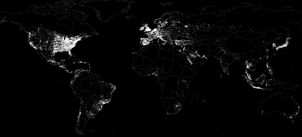
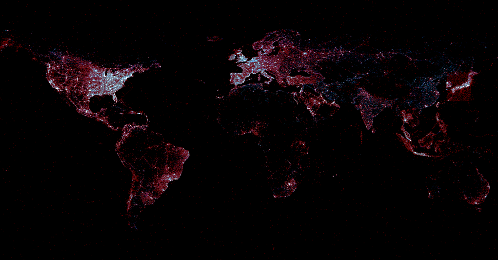
In terms of geography, there are two ways to easily capture geographic data from Twitter. The first is from the location information specified by a user when registering for a Twitter account (selected from a drop down menu of place names). The second, which is automatically generated, is from the coordinates of the Twitter user’s location when tweeting, which is typically provided via GPS or cellular triangulation. On a typical day, about 2.7% of Tweets contain GPS or cellular data while 2.02% of users list a place name when registering (1.4% have both). The figure above displays all GPS/cellular coordinates captured from tweets during the 39 days of study. In contrast, the figure below combines all Twitter locations, adding registered place names and GPS/cellular data (both in red), and overlays this with the location of electric lights (blue) based on satellite imagery obtained from NASA.

Tweets / Electricity

White areas depict locations with an equal balance of tweets and electricity. Red areas reveal a higher density of tweets than night lights while blue areas have more night lights than tweets.” Iran and China show substantially fewer tweets than their electricity levels would suggest, reflecting their bans on Twitter, while India shows strong clustering of Twitter usage along the coast and its northern border, even as electricity use is far more balanced throughout the country. Russia shows more electricity usage in its eastern half than Twitter usage, while most countries show far more Twitter usage than electricity would suggest.”

The Pearson correlation between tweets and lights is 0.79, indicating very high similarity. That is, wherever in the world electricity exists, the chances of there also being Twitter users is very high indeed. That is, tweets are evenly distributed geographically according to the availability of electricity. And so, event though “less than three percent of all tweets having geolocation information, this suggests they could be used as a dynamic reference baseline to evaluate the accuracy of other methods of geographic recovery.” Keep in mind that the light bulb was invented 134 years ago in contrast to Twitter’s short 7-year history. And yet, the correlation is already very strong. This is why they call it an information revolution. Still, just 1% of all Twitter users accounted for 66% of all georeferenced tweets during the period of study, which means that relying purely on these tweets may provide a skewed view of the Twitterverse, particularly over short periods of time. But whether this poses a problem ultimately depends on the research question or task at hand.

Twitter table

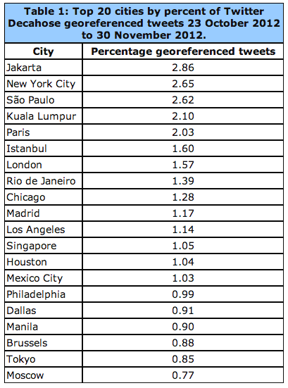
The linguistic geography of Twitter is critical: “If English is rarely used outside of the United States, or if English tweets have a fundamentally different geographic profile than other languages outside of the United States, this will significantly skew geocoding results.” As the table below reveals, georeferenced tweets with English content constitute 41.57% of all geo-tagged tweets.

Geo Tweets Language

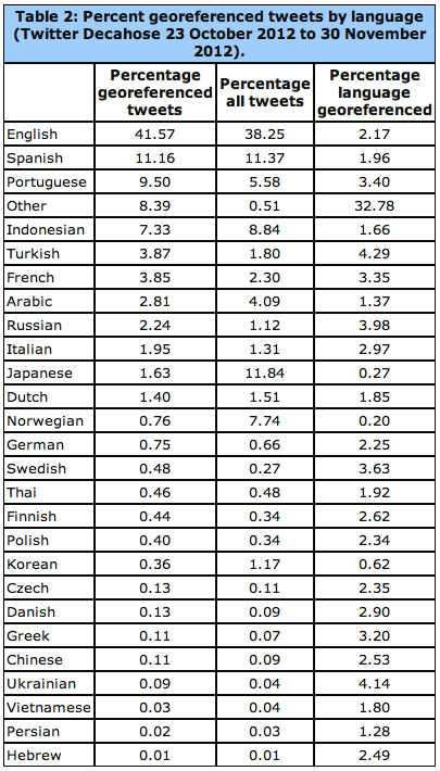
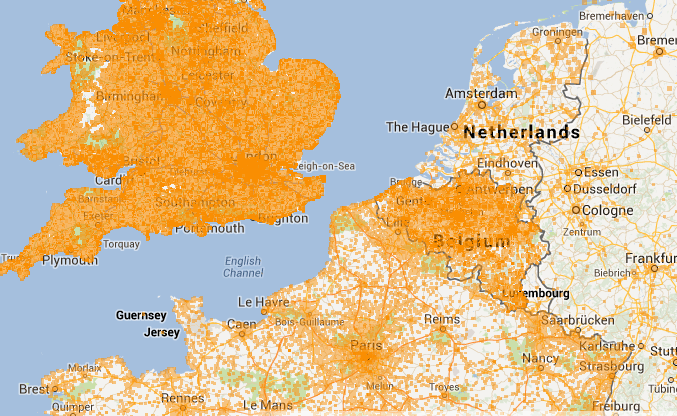
The data from the above table is displayed geographically below for the European region. See the global map here. “In cases where multiple languages are present at the same coordinate, the point is assigned to the most prevalent language at that point and colored accordingly.” Statistical analyses of geo-tagged English tweets compared to all other languages suggests that “English offers a spatial proxy for all languages and that a geocoding algorithm which processes only English will still have strong penetration into areas dominated by other languages (though English tweets may discuss different topics or perspectives).”

Twitter Languages Europe

Another important source of geographic information is a Twitter user’s bio. This public location information was available for 71% of all tweets studied by Kalev and company. Interestingly, “Approximately 78.4 percent of tweets include the user’s time zone in textual format, which offers an approximation of longitude […].” As Kalev et al. note, “Nearly one third of all locations on earth share their name with another location somewhere else on the planet, meaning that a reference to ‘Urbana’ must be disambiguated by a geocoding system to determine which of the 12 cities in the world it might refer to, including 11 cities in the United States with that name.”

There are several ways to get around this challenging, ranging from developing a Full Text Geocoder to using gazetteers such a Wikipedia Gazetteer and MaxFind which machine translation. Applying the latter has revealed that the “textual geographic density of Twitter changes by more than 53 percent over the course of each day. This has enormous ramifications for the use of Twitter as a global monitoring system, as it suggests that the representativeness of geographic tweets changes considerably depending on time of day.” That said, the success of a monitoring system is solely dependent on spatial data. Temporal factors and deviations from a baseline also enable early detection.  In any event, “The small volume of georeferenced tweets can be dramatically enhanced by applying geocoding algorithms to the textual content and metadata of each tweet.”

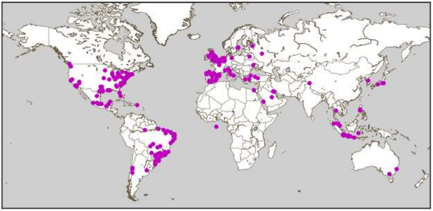
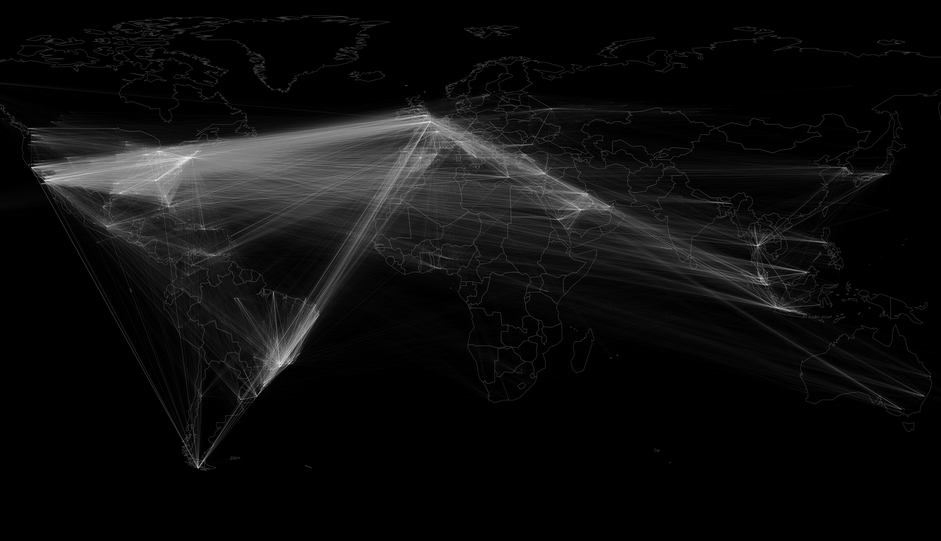
Kalet et al. also carried out a comprehensive analysis of geo-tagged retweets. They find that “geography plays little role in the location of influential users, with the volume of retweets instead simply being a factor of the total population of tweets originating from that city.” They also calculated that the average geographical distance between two Twitter users “connected” by retweets (RTs) and who geotag their tweets is about 750 miles or 1,200 kilometers. When a Twitter user references another (@), the average geographical distance between the two is 744 miles. This means that RTs and @’s cannot be used for geo-referencing Twitter data, even when coupling this information with time zone data. The figure below depicts the location of users retweeting other users. The geodata for this comes from the geotagged tweets (rather than account information or profile data).

Map of Retweets

On average, about 15.85% of geo-tagged tweets contain links. The most popular links for these include Foursquare, Instagram, Twitter and Facebook. See my previous blog post on the analysis & value of such content for disaster response. In terms of Twitter geography versus that of mainstream news, Kalev et al. analyzed all news items available via Google News during the same period as the tweets they collected. This came to over 3.3 million articles pointing to just under 165,000 locations. The latter are color-coded red in the data ziv below, while Tweets are blue and white areas denote equal balance of both.

Twitter vs News

“Mainstream media appears to have significantly less coverage of Latin America and vastly better greater of Africa. It also covers China and Iran much more strongly, given their bans on Twitter, as well as having enhanced coverage of India and the Western half of the United States. Overall, mainstream media appears to have more even coverage, with less clustering around major cities.” This suggests “there is a strong difference in the geographic profiles of Twitter and mainstream media and that the intensity of discourse mentioning a country does not necessarily match the intensity of discourse emanating from that country in social media. It also suggests that Twitter is not simply a mirror of mainstream media, but rather has a distinct geographic profile […].”

In terms of future growth, “the Middle East and Eastern Europe account for some of Twitter’s largest new growth areas, while Indonesia, Western Europe, Africa, and Central America have high proportions of the world’s most influential Twitter users.”

Bio

See also:

  • Social Media – Pulse of the Planet? [Link]
  • Big Data for Disaster Response – A list of Wrong Assumptions [Link]
  • A Multi-Indicator Approach for Geolocalization of Tweets [Link]