Category Archives: Social Computing

Egypt Twitter Map of iPhone, Android and Blackberry Users

Colleagues at GNIP and MapBox recently published this high-resolution map of iPhone, Android and Blackberry users in the US (click to enlarge). “More than 280 million Tweets posted from mobile phones reveal geographic usage patterns in unprecedented detail.” These patterns are often insightful. Some argue that “cell phone brands say something about socio-economics – it takes a lot of money to buy a new iPhone 5,” for example (1). So a map of iPhone users based on where these users tweet reveals where relatively wealthy people live.

Phones USA

As announced in this blog post, colleagues and I at QCRI, Harvard, MIT and UNDP are working on an experimental R&D project to determine whether Big Data can inform poverty reduction strategies in Egypt. More specifically, we are looking to test whether tweets provide a “good enough” signal of changes in unemployment and poverty levels. To do this, we need ground truth data. So my MIT colleague Todd Mostak put together the following maps of cell phone brand ownerships in Egypt using ~3.5 million geolocated tweets from October 2012 to June 2013. Red dots represent the location of tweets posted by Android users; Green dots – iPhone; Purple – Blackberry. Click figures below to enlarge.

Egypt Mobile Phones

Below is a heatmap of the % of Android users. As Todd pointed out in our email exchanges, “Note the lower intensity around Cairo.”

Egypt Android

This heatmap depicts the density of tweeting iPhone users:

Egypt iPhone users

Lastly, the heatmap below depicts geo-tagged tweets posted by Blackberry users.

BB Egypt

As Todd notes, “We can obviously break these down by shyiyakha and regress against census data to get a better idea of how usage of these different devices correlate with proxy for income, but at least from these maps it seems clear that iPhone and Blackberry are used more in urban, higher-income areas.” Since this data is time-stamped, we may be able to show whether/how these patterns changed during last week’s widespread protests and political upheaval.

bio

Using Twitter to Analyze Secular vs. Islamist Polarization in Egypt (Updated)

Large-scale events leave an unquestionable mark on social media. This was true of Hurricane Sandy, for example, and is also true of the widespread protests in Egypt this week. On Wednesday, the Egyptian Military responded to the large-scale demonstrations against President Morsi by removing him from power. Can Twitter provide early warning signals of growing political tension in Egypt and elsewhere? My QCRI colleagues Ingmar Weber & Kiran Garimella and Al-Jazeera colleague Alaa Batayneh have been closely monitoring (PDF) these upheavals via Twitter since January 2013. Specifically, they developed a Political Polarization Index that provides early warning signals for increased social tensions and violence. I will keep updating this post with new data, analysis and graphs over the next 24 hours.

morsi_protests

The QCRI team analyzed some 17 million Egyptian tweets posted by two types of Twitter users—Secularists and Islamists. These user lists were largely drawn from this previous research and only include users that provide geographical information in their Twitter profiles. For each of these 7,000+ “seed users”, QCRI researchers downloaded their most recent 3,200 tweets along with a set of 200 users who retweet their posts. Note that both figures are limits imposed by the Twitter API. Ingmar, Kiran and Alaa have also analyzed users with no location information, corresponding to 65 million tweets and 20,000+ unique users. Below are word clouds of terms used in Twitter profiles created by Islamists (left) and secularists (right).

Screen Shot 2013-07-06 at 2.58.25 PM

QCRI compared the hashtags used by Egyptian Islamists and secularists over a year to create an insightful Political Polarization Index. The methodology used to create this index is described in more detail in this post’s epilogue. The graph below displays the overall hashtag polarity over time along with the number of distinct hashtags used per time interval. As you’ll note, the graph includes the very latest data published today. Click on the graph to enlarge.

hashtag_polarity_over_time_egypt_7_july

The spike in political polarization towards the end of 2011 appears to coincide with “the political struggle over the constitution and a planned referendum on the topic.” The annotations in the graph refer to the following violent events:

A – Assailants with rocks and firebombs gather outside Ministry of Defense to call for an end to military rule.

B – Demonstrations break out after President Morsi grants himself increased power to protect the nation. Clashes take place between protestors and Muslim Brotherhood supporters.

C, D – Continuing protests after the November 22nd declaration.

E – Demonstrations in Tahrir square, Port Said and all across the country.

F,G – Demonstrations in Tahrir square.

H,I – Massive demonstrations in Tahrir and removal of President Morsi.

In sum, the graph confirms that the political polarization hashtag can serve as a barometer for social tensions and perhaps even early warnings of violence. “Quite strikingly, all outbreaks of violence happened during periods where the hashtag polarity was comparatively high.” This also true for the events of the past week, as evidenced by QCRI’s political polarization dashboard below. Click on the figure to enlarge. Note that I used Chrome’s translate feature to convert hashtags from Arabic to English. The original screenshot in Arabic is available here (PNG).

Hashtag Analysis

Each bar above corresponds to a week of Twitter data analysis. When bars were initially green and yellow during the beginnings of Morsi’s Presidency (scroll left on the dashboard for the earlier dates). The change to red (heightened political polarization) coincides with increased tensions around the constitutional crisis in late November, early December. See this timeline for more information. The “Tending Score” in the table above combines volume with recency. A high trending score means the hashtag is more relevant to the current week. 

The two graphs below display political polarization over time. The first starts from January 1, 2013 while the second from June 1, 2013. Interestingly, February 14th sees a dramatic drop in polarization. We’re not sure if this is a bug in the analysis or whether a significant event (Valentine’s?) can explain this very low level of political polarization on February 14th. We see another major drop on May 10th. Any Egypt experts know why that might be?

graph1

The political polarization graph below reveals a steady increase from June 1st through to last week’s massive protests and removal of President Morsi.

graph2

To conclude, large-scale political events such as widespread political protests and a subsequent regime change in Egypt continue to leave a clear mark on social media activity. This pulse can be captured using a Political Polarization Index based on the hashtags used by Islamists and secularists on Twitter. Furthermore, this index appears to provide early warning signals of increasing tension. As my QCRI colleagues note, “there might be forecast potential and we plan to explore this further in the future.”

Bio

Acknowledgements: Many thanks to Ingmar and Kiran for their valuable input and feedback in the drafting of this blog post.

Methods: (written by Ingmar): The political polarization index was computed as follows. The analysis starts by identifying a set of Twitter users who are likely to support either Islamists or secularists in Egypt. This is done by monitoring retweets posted by a set of seed users. For example, users who frequently retweet Muhammad Morsi  and never retweeting El Baradei would be considered Islamist supporters. (This same approach was used by Michael Conover and colleagues to study US politics).

Once politically engaged and polarized users are identified, their use of hashtags is monitored over time. A “neutral” hashtags such as #fb or #ff is typically used by both camps in Egypt in roughly equal proportions and would hence be assigned a 50-50 Islamist-secular leaning. But certain hashtags reveal much more pronounced polarization. For example, the hashtag #tamarrod is assigned a 0-100 Islamist-secular score. Tamarrod refers to the “Rebel” movement, the leading grassroots movement behind the protests that led to Morsi’s ousting.

Similarly the hashtag #muslimsformorsi is assigned a 90-10 Islamist-secular score, which makes sense as it is clearly in support of Morsi. This kind of numerical analysis is done on a weekly basis. Hashtags with a 50-50 score in a given week have zero “tension” whereas hashtags with either 100-0 or 0-100 have maximal tension. The average tension value across all hashtags used in a given week is then plotted over time. Interestingly, this value, derived from hashtag usage in a language-agnostic manner, seems to coincide with outbreaks of violence on the ground as shown in bar chart above.

Using Twitter to Map Blackouts During Hurricane Sandy

I recently caught up with Gilal Lotan during a hackathon in New York and was reminded of his good work during Sandy, the largest Atlantic hurricane on record. Amongst other analytics, Gilal created a dynamic map of tweets referring to power outages. “This begins on the evening October 28th as people mostly joke about the prospect of potentially losing power. As the storm evolves, the tone turns much more serious. The darker a region on the map, the more aggregate Tweets about power loss that were seen for that region.” The animated map is captured in the video below.

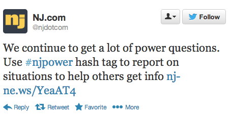
Hashtags played a key role in the reporting. The #NJpower hashtag, for example, was used to ‘help  keep track of the power situation throughout the state (1). As depicted in the tweet below, “users and news outlets used this hashtag to inform residents where power outages were reported and gave areas updates as to when they could expect their power to come back” (1). 

NJpower tweet

As Gilal notes, “The potential for mapping out this kind of information in realtime is huge. Think of generating these types of maps for different scenarios– power loss, flooding, strong winds, trees falling.” Indeed, colleagues at FEMA and ESRI had asked us to automatically extract references to gas leaks on Twitter in the immediate aftermath of the Category 5 Tornado in Oklahoma. One could also use a platform like GeoFeedia, which maps multiple types of social media reports based on keywords (i.e., not machine learning). But the vast majority of Twitter users do not geo-tag their tweets. In fact, only 2.7% of tweets are geotagged, according to this study. This explains why enlightened policies are also important for humanitarian technologies to work—like asking the public to temporally geo-tag their social media updates when these are relevant to disaster response.

While basing these observations on people’s Tweets might not always bring back valid results (someone may jokingly tweet about losing power),” Gilal argues that “the aggregate, especially when compared to the norm, can be a pretty powerful signal.” The key word here is norm. If an established baseline of geo-tagged tweets for the northeast were available, one would have a base-map of “normal” geo-referenced twitter activity. This would enable us to understand deviations from the norm. Such a base-map would thus place new tweets in temporal and geo-spatial context.

In sum, creating live maps of geo-tagged tweets is only a first step. Base-maps should be rapidly developed and overlaid with other datasets such as population and income distribution. Of course, these datasets are not always available acessing historical Twitter data can also be a challenge. The latter explains why Big Data Philanthropy for Disaster Response is so key.

bio

Big Data: Sensing and Shaping Emerging Conflicts

The National Academy of Engineering (NAE) and US Institute of Peace (USIP) co-organized a fascinating workshop on “Sensing & Shaping Emerging Conflicts” in November 2012. I had the pleasure of speaking at this workshop, the objective of which was to “identify major opportunities and impediments to providing better real-time information to actors directly involved in situations that could lead to deadly violence.” We explored “several scenarios of potential violence drawn from recent country cases,” and “considered a set of technologies, applications and strategies that have been particularly useful—or could be, if better adapted for conflict prevention.” 

neurons_cropped

The workshop report was finally published this week. If you don’t have time to leaf through the 40+page study, then the following highlights may be of interest. One of the main themes to emerge was the promise of machine learning (ML), a branch of Artificial Intelligence (AI). These approaches “continue to develop and be applied in un-anticipated ways, […] the pressure from the peacebuilding community directed at technology developers to apply these new technologies to the cause of peace could have tremendous benefits.” On a personal note, this is one of the main reasons I joined the Qatar Computing Research Institute (QCRI); namely to apply the Institute’s expertise in ML and AI to the cause of peace, development and disaster relief.

“As an example of the capabilities of new technologies, Rafal Rohozinski, principal with the SecDev Group, described a sensing exercise focused on Syria. Using social media analytics, his group has been able to identify the locations of ceasefire violations or regime deployments within 5 to 15 minutes of their occurrence. This information could then be passed to UN monitors and enable their swift response. In this way, rapid deductive cycles made possible through technology can contribute to rapid inductive cycles in which short-term predictions have meaningful results for actors on the ground. Further analyses of these events and other data also made it possible to capture patterns not seen through social media analytics. For example, any time regime forces moved to a particular area, infrastructure such as communications, electricity, or water would degrade, partly because the forces turned off utilities, a normal practice, and partly because the movement of heavy equipment through urban areas caused electricity systems go down. The electrical grid is connected to the Internet, so monitoring of Internet connections provided immediate warnings of force movements.”

This kind of analysis may not be possible in many other contexts. To be sure, the challenge of the “Digital Divide” is particularly pronounced vis-a-vis the potential use of Big Data for sensing and shaping emerging conflicts. That said, my colleague Duncan Watts “clarified that inequality in communications technology is substantially smaller than other forms of inequality, such as access to health care, clean water, transportation, or education, and may even help reduce some of these other forms of inequality. Innovation will almost always accrue first to the wealthier parts of the world, he said, but inequality is less striking in communications than in other areas.” By 2015, for example, Sub-Saharan Africa will have more people with mobile network access than with electricity at home.

Screen Shot 2013-03-16 at 5.46.35 PM

My colleague Chris Spence from NDI also presented at the workshop. He noted the importance of sensing the positive and not just the negative during an election. “In elections you want to focus as much on the positive as you do on the negative and tell a story that really does convey to the public what’s actually going on and not just a … biased sample of negative reports.” Chris also highlighted that “one problem with election monitoring is that analysts still typically work with the software tools they used in the days of manual reporting rather than the Web-based tools now available. There’s an opportunity that we’ve been trying to solve, and we welcome help.” Building on our expertise in Machine Learning and Artificial Intelligence, my QCRI colleagues and I want to develop classifiers that automatically categorize large volumes of crowdsourced election reports. So I’m exploring this further with Chris & NDI. Check out the Artificial Intelligence for Monitoring Elections (AIME) project for more information.

One of the most refreshing aspects of the day-long workshop was the very clear distinction made between warning and response. As colleague Sanjana Hattotuwa cautioned: “It’s an open question whether some things are better left unsaid and buried literally and metaphorically.”  Duncan added that, “The most important question is what to do with information once it has been gathered.” Indeed, “Simply giving people more information doesn’t necessarily lead to a better outcome, although some-times it does.” My colleague Dennis King summed it up very nicely, “Political will is not an icon on your computer screen… Generating political will is the missing factor in peacebuilding and conflict resolution.”

In other words, “the peacebuilding community often lacks actionable strategies to convert sensing into shaping,” as colleague Fred Tipson rightly noted. Libbie Prescott, who served as strategic advisor to the US Secretary of State and participated in the workshop, added: “Policymakers have preexisting agendas, and just presenting them with data does not guarantee a response.” As my colleague Peter Walker wrote in a book chapter published way back in 1992, “There is little point in investing in warning systems if one then ignores the warnings!” To be clear, “early warning should not be an end in itself; it is only a tool for preparedness, prevention and mitigation with regard to disasters, emergencies and conflict situations, whether short or long term ones. […] The real issue is not detecting the developing situation, but reacting to it.”

Now Fast froward to 2013: OCHA just published this groundbreaking report confirming that “early warning signals for the Horn of Africa famine in 2011 did not produce sufficient action in time, leading to thousands of avoidable deaths. Similarly, related research has shown that the 2010 Pakistan floods were predictable.” As DfID notes in this 2012 strategy document, “Even when good data is available, it is not always used to inform decisions. There are a number of reasons for this, including data not being available in the right format, not widely dispersed, not easily accessible by users, not being transmitted through training and poor information management. Also, data may arrive too late to be able to influence decision-making in real time operations or may not be valued by actors who are more focused on immediate action” (DfID)So how do we reconcile all this with Fred’s critical point: “The focus needs to be on how to assist the people involved to avoid the worst consequences of potential deadly violence.”

mind-the-gap

The fact of the matter is that this warning-response gap in the field of conflict prevention is over 20 years old. I have written extensively about the warning-response problem here (PDF) and here (PDF), for example. So this challenge is hardly a new one, which explains why a number of innovative and promising solutions have been put forward of the years, e..g, the decentralization of conflict early warning and response. As my colleague David Nyheim wrote five years ago:

A state-centric focus in conflict management does not reflect an understanding of the role played by civil society organisations in situations where the state has failed. An external, interventionist, and state-centric approach in early warning fuels disjointed and top down responses in situations that require integrated and multilevel action.” He added: “Micro-level responses to violent conflict by ‘third generation early warning systems’ are an exciting development in the field that should be encouraged further. These kinds of responses save lives.”

This explains why Sanjana is right when he emphasizes that “Technology needs to be democratized […], made available at the lowest possible grassroots level and not used just by elites. Both sensing and shaping need to include all people, not just those who are inherently in a position to use technology.” Furthermore, Fred is spot on when he says that “Technology can serve civil disobedience and civil mobilization […] as a component of broader strategies for political change. It can help people organize and mobilize around particular goals. It can spread a vision of society that contests the visions of authoritarian.”

In sum, As Barnett Rubin wrote in his excellent book (2002) Blood on the Doorstep: The Politics of Preventive Action, “prevent[ing] violent conflict requires not merely identifying causes and testing policy instruments but building a political movement.” Hence this 2008 paper (PDF) in which I explain in detail how to promote and facilitate technology-enabled civil resistance as a form of conflict early response and violence prevention.

Bio

See Also:

  • Big Data for Conflict Prevention [Link]

Automatically Identifying Fake Images Shared on Twitter During Disasters

Artificial Intelligence (AI) can be used to automatically predict the credibility of tweets generated during disasters. AI can also be used to automatically rank the credibility of tweets posted during major events. Aditi Gupta et al. applied these same information forensics techniques to automatically identify fake images posted on Twitter during Hurricane Sandy. Using a decision tree classifier, the authors were able to predict which images were fake with an accuracy of 97%. Their analysis also revealed retweets accounted for 86% of all tweets linking to fake images. In addition, their results showed that 90% of these retweets were posted by just 30 Twitter users.

Fake Images

The authors collected the URLs of fake images shared during the hurricane by drawing on the UK Guardian’s list and other sources. They compared these links with 622,860 tweets that contained links and the words “Sandy” & “hurricane” posted between October 20th and November 1st, 2012. Just over 10,300 of these tweets and retweets contained links to URLs of fake images while close to 5,800 tweets and retweets pointed to real images. Of the ~10,300 tweets linking to fake images, 84% (or 9,000) of these were retweets. Interestingly, these retweets spike about 12 hours after the original tweets are posted. This spike is driven by just 30 Twitter users. Furthermore, the vast majority of retweets weren’t made by Twitter followers but rather by those following certain hashtags. 

Gupta et al. also studied the profiles of users who tweeted or retweeted fake images  (User Features) and also the content of their tweets (Tweet Features) to determine whether these features (listed below) might be predictive of whether a tweet posts to a fake image. Their decision tree classifier achieved an accuracy of over 90%, which is remarkable. But the authors note that this high accuracy score is due to “the similar nature of many tweets since since a lot of tweets are retweets of other tweets in our dataset.” In any event, their analysis also reveals that Tweet-based Features (such as length of tweet, number of uppercase letters, etc.), were far more accurate in predicting whether or not a tweeted image was fake than User-based Features (such as number of friends, followers, etc.). One feature that was overlooked, however, is gender.

Information Forensics

In conclusion, “content and property analysis of tweets can help us in identifying real image URLs being shared on Twitter with a high accuracy.” These results reinforce the proof that machine computing and automated techniques can be used for information forensics as applied to images shared on social media. In terms of future work, the authors Aditi Gupta, Hemank Lamba, Ponnurangam Kumaraguru and Anupam Joshi plan to “conduct a larger study with more events for identification of fake images and news propagation.” They also hope to expand their study to include the detection of “rumors and other malicious content spread during real world events apart from images.” Lastly, they “would like to develop a browser plug-in that can detect fake images being shared on Twitter in real-time.” There full paper is available here.

Needless to say, all of this is music to my ears. Such a plugin could be added to our Artificial Intelligence for Disaster Response (AIDR) platform, not to mention our Verily platform, which seeks to crowdsource the verification of social media reports (including images and videos) during disasters. What I also really value about the authors’ approach is how pragmatic they are with their findings. That is, by noting their interest in developing a browser plugin, they are applying their data science expertise for social good. As per my previous blog post, this focus on social impact is particularly rare. So we need more data scientists like Aditi Gupta et al. This is why I was already in touch with Aditi last year given her research on automatically ranking the credibility of tweets. I’ve just reached out to her again to explore ways to collaborate with her and her team.

bio

What is Big (Crisis) Data?

What does Big Data mean in the context of disaster response? Big (Crisis) Data refers to the relatively large volumevelocity and variety of digital information that may improve sense making and situational awareness during disasters. This is often referred to the 3 V’s of Big Data.

Screen Shot 2013-06-26 at 7.49.49 PM

Volume refers to the amount of data (20 million tweets were posted during Hurricane Sandy) while Velocity refers to the speed at which that data is generated (over 2,000 tweets per second were generated following the Japan Earthquake & Tsunami). Variety refers to the variety of data generated, e.g., Numerical (GPS coordinates), Textual (SMS), Audio (phone calls), Photographic (satellite Imagery) and Video-graphic (YouTube). Sources of Big Crisis Data thus include both public and private sources such images posted as social media (Instagram) on the one hand, and emails or phone calls (Call Record Data) on the other. Big Crisis Data also relates to both raw data (the text of individual Facebook updates) as well as meta-data (the time and place those updates were posted, for example).

Ultimately, Big Data describe datasets that are too large to be effectively and quickly computed on your average desktop or laptop. In other words, Big Data is relative to the computing power—the filters—at your finger tips (along with the skills necessary to apply that computing power). Put differently, Big Data is “Big” because of filter failure. If we had more powerful filters, said “Big” Data would be easier to manage. As mentioned in previous blog posts, these filters can be created using Human Computing (crowdsourcing, microtasking) and/or Machine Computing (natural language processing, machine learning, etc.).

BigData1

Take the above graph, for example. The horizontal axis represents time while the vertical one represents volume of information. On a good day, i.e., when there are no major disasters, the Digital Operations Center of the American Red Cross monitors and manually reads about 5,000 tweets. This “steady state” volume and velocity of data is represented by the green area. The dotted line just above denotes an organization’s (or individual’s) capacity to manage a given volume, velocity and variety of data. When disaster strikes, that capacity is stretched and often overwhelmed. More than 3 million tweets were posted during the first 48 hours after the Category 5 Tornado devastated Moore, Oklahoma, for example. What happens next is depicted in the graph below.

BigData 2

Humanitarian and emergency management organizations often lack the internal surge capacity to manage the rapid increase in data generated during disasters. This Big Crisis Data is represented by the red area. But the dotted line can be raised. One way to do so is by building better filters (using Human and/or Machine Computing). Real world examples of Human and Machine Computing used for disaster response are highlighted here and here respectively.

BigData 3

A second way to shift the dotted line is with enlightened leadership. An example is the Filipino Government’s actions during the recent Typhoon. More on policy here. Both strategies (advanced computing & strategic policies) are necessary to raise that dotted line in a consistent manner.

Bio

See also:

  • Big Data for Disaster Response: A List of Wrong Assumptions [Link]
Analyzing Foursquare Check-Ins During Hurricane Sandy

In this new study “Extracting Diurnal Patterns of Real World Activity from Social Media” (PDF), authors Nir Grinberg, Mor Naaman, Blake Shaw and Gild Lotan analyze Fousquare check-in’s and tweets to capture real-world activities related to coffee, food, nightlife and shopping. Here’s what an average week looks like on Foursquare, for example (click to enlarge):

Foursquare Week

“When rare events at the scale of Hurricane Sandy happen, we expect them to leave an unquestionable mark on Social Media activity.” So the authors applied the same methods used to produce the above graph to visualize and understand changes in behavior during Hurricane Sandy as reflected on Foursquare and Twitter. The results are displayed below (click to enlarge).

Sandy Analysis

“Prior to the storm, activity is relatively normal with the exception of iMac release on 10/25. The big spikes in divergent activity in the two days right before the storm correspond with emergency preparations and the spike in nightlife activity follows the ‘celebrations’ pattern afterwards. In the category of Grocery shopping (top panel) the deviations on Foursqaure and Twitter overlap closely, while on Nightlife the Twitter activity lags after Foursquare. On October 29 and 30 shops were mostly closed in NYC and we observe fewer checkins than usual, but interestingly more tweets about shopping. This finding suggests that opposing patterns of deviations may indicate of severe distress or abnormality, with the two platforms corroborating an alert.”

In sum, “the deviations in the case study of Hurricane Sandy clearly separate normal and abnormal times. In some cases the deviations on both platforms closely overlap, while in others some time lag (or even opposite trend) is evident. Moreover, during the height of the storm Foursquare activity diminishes significantly, while Twitter activity is on the rise. These findings have immediate implications for event detection systems, both in combining multiple sources of information and in using them to improving overall accuracy.”

Now if only this applied research could be transfered to operational use via a real-time dashboard, then this could actually make a difference for emergency responders and humanitarian organizations. See my recent post on the cognitive mismatch between computing research and social good needs.

bio

Using Twitter to Detect Micro-Crises in Real-Time

Social media is increasingly used to communicate during major crises. But what about small-scale incidents such as a car crash or fire? These “micro-crises” typically generate a far smaller volume of social media activity during a much shorter period and more bounded geographical area. Detecting these small-scale events thus poses an important challenge for the field of Crisis Computing.

Axel Shulz et al

Axel Schulz just published co-authored a paper on this exact challenge. In this study, he and co-authors Petar Ristoski & Heiko Paulheim “present a solution for a real-time identifi cation of small scale incidents using microblogs,” which uses machine learning—combining text classi cation and semantic enrichment of microblogs—to increase situational awareness. The study draws on 7.5 million tweets posted in the city centers of Seattle and Memphis during November & December 2012 and February 2013. The authors used the “Seattle Real Time Fire 911 Calls” dataset to identify relevant keywords in the collected tweets. They also used WordNet to “extend this set by adding the direct hyponyms. For instance, the keyword “accident” was extended with ‘collision’, ‘crash’, ‘wreck’, ‘injury’, ‘fatal accident’, and ‘casualty’.”

An evaluation of this combined “text classi cation” and “semantic enrichment” approach shows that small scale incidents can be identified with an accuracy 89%. A copy of Axel et al.‘s paper is available here (PDF). This is a remarkable level of accuracy given the rare and micro-level nature of the incidents studied.

bio

Using Big Data to Inform Poverty Reduction Strategies

My colleagues and I at QCRI are spearheading a new experimental Research and Development (R&D) project with the United Nations Development Program (UNDP) team in Cairo, Egypt. Colleagues at Harvard University, MIT and UC Berkeley have also joined the R&D efforts as full-fledged partners. The research question: can an analysis of Twitter traffic in Egypt tell us anything about changes in unemployment and poverty levels? This question was formulated with UNDP’s Cairo-based Team during several conversations I had with them in early 2013.

Egyptian Tweets

As is well known, a major challenge in the development space is the lack of access to timely socio-economic data. So the question here is whether alternative, non-traditional sources of information (such as social media) can provide a timely and “good enough” indication of changing trends. Thanks to our academic partners, we have access to hundreds of millions of Egyptian tweets (both historical and current) along with census and demographic data for ground-truth purposes. If the research yields robust results, then our UNDP colleagues could draw on more real-time data to complement their existing datasets, which may better inform some of their local poverty reduction and development strategies. This more rapid feedback loop could lead to faster economic empowerment for local communities in Egypt. Of course, there are many challenges to working with social data vis-a-vis representation and sample bias. But that is precisely why this kind of experimental research is important—to determine whether any of our results are robust to biases in phone ownership, twitter-use, etc.

bio

How ReCAPTCHA Can Be Used for Disaster Response

We’ve all seen prompts like this:

recaptcha_pic

More than 100 million of these ReCAPTCHAs get filled out every day on sites like Facebook, Twitter and CNN. Google uses them to simultaneously filter out spam and digitize Google Books and archives of the New York Times. For example:

recaptcha_pic2

So what’s the connection to disaster response? In early 2010, I blogged about using massive multiplayer games to tag crisis information and asked: What is the game equivalent of reCAPTCHA for tagging crisis information? (Big thanks to friend and colleague Albert Lin for reminding me of this recently). Well, the game equivalent is perhaps the Internet Response League (IRL). But what if we simply used ReCPATCHA itself for disaster response?

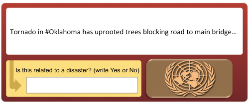
Humanitarian organizations like the American Red Cross regularly monitor Twitter for disaster-related information. But they are often overwhelmed with millions of tweets during major events. While my team and I at QCRI are developing automated solutions to manage this Big (Crisis) Data, we could also  use the ReCAPTCHA methodology. For example, our automated classifiers can tell us with a certain level of accuracy whether a tweet is disaster-related, whether it refers to infrastructure damage, urgent needs, etc. If the classifier is not sure—say the tweet is scored as having a 50% chance of being related to infrastructure damage—then we could automatically post it to our version of ReCAPCHA (see below). Perhaps a list of 3 tweets could be posted with the user prompted to tag which one of the 3 is damage-related. (The other two tweets could come from a separate database of random tweets).

ReCaptcha_pic3

There are reportedly 44,000 United Nations employees around the globe. World Vision also employs over 40,000, the International Committee of the Red Cross (ICRC) has more than 12,000 employees while Oxfam has about 7,000. That’s 100,000 people right there who probably log onto their work emails at least once a day. Why not insert a ReCaptcha when they log in? We could also add  ReCAPTCHAs to these organizations’ Intranets & portals like Virtual OSOCC. On a related note, Google recently added images from Google Street View to ReCAPTCHAS. So we could automatically collect images shared on social media during disasters and post them to our own disaster response ReCAPTCHAs:

Image ReCAPTCHA

In sum, as humanitarians log into their emails multiple times a day, they’d be asked to tag which tweets and/or pictures relate to on ongoing disaster. Last year, we tagged tweets and images in support of the UN’s disaster response efforts in the Philippines following Typhoon Pablo. Adding a customized ReCAPTCHA for disaster response would help us tap a much wider audience of “volunteers”, which would mean an even more rapid turn around time for damage assessments following major disasters.

Bio