Category Archives: Big Data

Making All Voices Count Using SMS and Advanced Computing

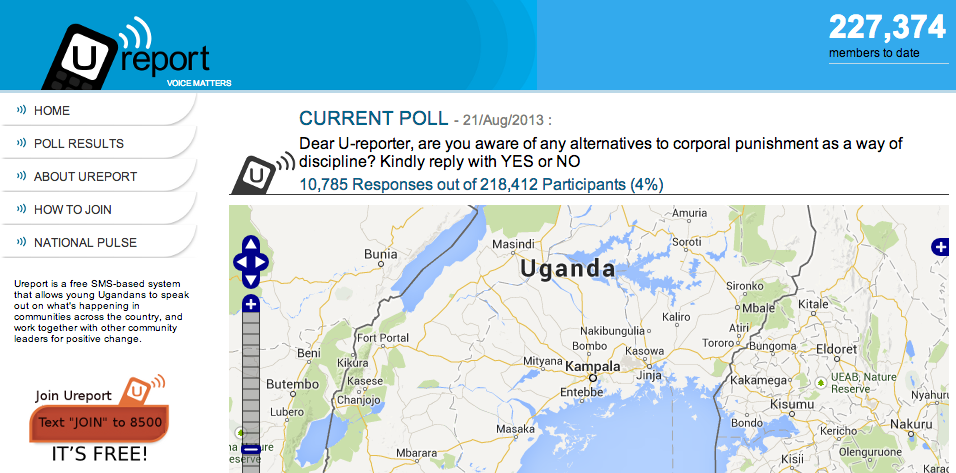
Local communities in Uganda send UNICEF some 10,000 text messages (SMS) every week. These messages reflect the voices of Ugandan youths who use UNICEF’s U-report SMS platform to share their views on a range of social issues. Some messages are responses to polls created by UNICEF while others are unsolicited reports of problems that youths witness in their communities. About 40% of text messages received by UNICEF require an SMS reply providing advice or an answer to a question while 7% of messages require immediate action. Over 220,000 young people in Uganda have enrolled in U-report, with 200 to 1,000 new users joining on daily basis. UNICEF doesn’t have months or the staff to manually analyze this high volume and velocity of incoming text messages. This is where advanced computing comes in.

UNICEF U-report

IBM recently partnered with UNICEF Uganda to develop an automated system to classify incoming text messages. (If this sounds familiar to iRevolution readers it is because my team and I at QCRI are developing a similar platform called Artificial Intelligence for Disaster Response, or AIDR. While our system is first and foremost geared towards classifying tweets, it can also be used to filter large volumes of SMS). The automated platform classifies incoming text messages into one (or more) of the following categories: water, health & nutrition, orphans & vulnerable children, violence against children, education, employment, social policy, emergency, u-report, energy, family & relationships, irrelevant and poll.

IBM analysis

IBM created machine learning classifiers that are 40% more accurate than a keyword based approach for automate classification. The predictive quality of the individual classifiers ranged from a low of 69.8% for family & relationships and a high of 98.4 for water-related issues. See full list of results in table above. Note that the IBM platform is limited to English-based text messages but the team is looking to provide multi-lingual support in the future.

UNICEF is using this system to automatically route classified tweets to the appropriate departments. For example, UNICEF recently received a surge of text messages about nodding disease and responded by sending out a series of mass SMS’s to communities living in the affected region. These text messages provided information on how to recognize symptoms and ways to get treated. The feedback loop also includes government agencies and ministries. Indeed, all Members of Parliament and Chief Administrative Officers receive SMS updates based on the automated classification platform.

U-report is now being deployed in Zambia, South Sudan, Yemen, Democratic Republic of Congo, Zimbabwe and Burundi. I plan to get in touch with the team at IBM to learn more about these deployments and explore where we at QCRI may be able to help given our related work on AIDR. In the meantime, many thanks to my colleague Claudia Perlich for pointing me to this project. To learn more about IBM’s automated system, please see this paper (PDF).

bio

Can Official Disaster Response Apps Compete with Twitter?

There are over half-a-billion Twitter users, with an average of 135,000 new users signing up on a daily basis (1). Can emergency management and disaster response organizations win over some Twitter users by convincing them to use their apps in addition to Twitter? For example, will FEMA’s smartphone app gain as much “market share”? The app’s new crowdsourcing feature, “Disaster Reporter,” allows users to submit geo-tagged disaster-related images, which are then added to a public crisis map. So the question is, will more images be captured via FEMA’s app or from Twitter users posting Instagram pictures?

fema_app

This question is perhaps poorly stated. While FEMA may not get millions of users to share disaster-related pictures via their app, it is absolutely critical for disaster response organizations to explicitly solicit crisis information from the crowd. See my blog post “Social Media for Emergency Management: Question of Supply and Demand” for more information on the importance demand-driven crowdsourcing. The advantage of soliciting crisis information from a smartphone app is that the sourced information is structured and thus easily machine readable. For example, the pictures taken with FEMA’s app are automatically geo-tagged, which means they can be automatically mapped if need be.

While many, many more picture may be posted on Twitter, these may be more difficult to map. The vast majority of tweets are not geo-tagged, which means more sophisticated computational solutions are necessary. Instagram pictures are geo-tagged, but this information is not publicly available. So smartphone apps are a good way to overcome these challenges. But we shouldn’t overlook the value of pictures shared on Twitter. Many can be geo-tagged, as demonstrated by the Digital Humanitarian Network’s efforts in response to Typhoon Pablo. More-over, about 40% of pictures shared on Twitter in the immediate aftermath of the Oklahoma Tornado had geographic data. In other words, while the FEMA app may have 10,000 users who submit a picture during a disaster, Twitter may have 100,000 users posting pictures. And while only 40% of the latter pictures may be geo-tagged, this would still mean 40,000 pictures compared to FEMA’s 10,000. Recall that over half-a-million Instagram pictures were posted during Hurricane Sandy alone.

The main point, however, is that FEMA could also solicit pictures via Twitter and ask eyewitnesses to simply geo-tag their tweets during disasters. They could also speak with Instagram and perhaps ask them to share geo-tag data for solicited images. These strategies would render tweets and pictures machine-readable and thus automatically mappable, just like the pictures coming from FEMA’s app. In sum, the key issue here is one of policy and the best solution is to leverage multiple platforms to crowdsource crisis information. The technical challenge is how to deal with the high volume of pictures shared in real-time across multiple platforms. This is where microtasking comes in and why MicroMappers is being developed. For tweets and images that do not contain automatically geo-tagged data, MicroMappers has a microtasking app specifically developed to crowd-source the manual tagging of images.

In sum, there are trade-offs. The good news is that we don’t have to choose one solution over the other; they are complementary. We can leverage both a dedicated smartphone app and very popular social media platforms like Twitter and Facebook to crowdsource the collection of crisis information. Either way, a demand-driven approach to soliciting relevant information will work best, both for smartphone apps and social media platforms.

Bio


Taking the Pulse of the Boston Marathon Bombings on Twitter

Social media networks are evolving a new nervous system for our planet. These real-time networks provide immediate feedback loops when media-rich societies experience a shock. My colleague Todd Mostak recently shared the tweet map below with me which depicts tweets referring to “marathon” (in red) shortly after the bombs went off during Boston’s marathon. The green dots represent all the other tweets posted at the time. Click on the map to enlarge. (It is always difficult to write about data visualizations of violent events because they don’t capture the human suffering, thus seemingly minimizing the tragic events).

Credit: Todd Mostak

Visualizing a social system at this scale gives a sense that we’re looking at a living, breathing organism, one that has just been wounded. This impression is even more stark in the dynamic visualization captured in the video below.

This an excerpt of Todd’s longer video, available here. Note that this data visualization uses less than 3% of all posted tweets because 97%+ of tweets are not geo-tagged. So we’re not even seeing the full nervous system in action. For more analysis of tweets during the marathon, see this blog post entitled “Boston Marathon Explosions: Analyzing First 1,000 Seconds on Twitter.”

bio

Radical Visualization of Photos Posted to Instagram During Hurricane Sandy

Sandy Instagram Pictures

This data visualization (click to enlarge) displays more than 23,500 photos taken in Brooklyn and posted to Instagram during Hurricane Sandy. A picture’s distance from the center (radius) corresponds to its mean hue while a picture’s position along the perimeter (angle) corresponds to the time that picture was taken. “Note the demarcation line that reveals the moment of a power outage in the area and indicates the intensity of the shared experience (dramatic decrease in the number of photos, and their darker colors to the right of the line)” (1).

Sandy Instagram 2

Click here to interact with the data visualization. The research methods behind this visualization are described here along with other stunning visuals.

bio

Stunning Wind Map of Hurricane Sandy

Surface wind data from the National Digital Forecast Database is updated on an hourly basis. More galleries of stunning wind maps here.

bio

Map: 24 hours of Tweets in New York

The map below depicts geo-tagged tweets posted between May 4-5, 2013 in the New York City area. Over 36,000 tweets are posted on the map (click to enlarge). Since less than 3% of all tweets are geo-tagged, the map is missing the vast majority of tweets posted in this area during those 24 hours.

New York Tweets 24 hours

Contrast the above with the 1-month worth of tweets (April-May 2013) depicted in the map below. Again, the visualization misses the vast majority of tweets since these are not geo-tagged and thus not mappable.

New York 1 Month Tweets

These visuals are screenshots of Harvard’s Tweetmap platform, which is publicly available here. My colleague Todd Mostak is one of the main drivers behind Tweetmap, so worth sending him a quick thank you tweet! Todd is working on some exciting extensions and refinements, so stay tuned as I’ll be sure to blog about them when they go live.

Bio

The First Ever Spam Filter for Disaster Response

While spam filters provide additional layers of security to websites, they can also be used to process all kinds of information. Perhaps most famously, for example, the reCAPTCHA spam filter was used to transcribe the New York Times’ entire paper-based archives. See my previous blog post to learn how this was done and how spam filters can also be used to process information for disaster response. Given the positive response I received from humanitarian colleagues who read the blog post, I teamed up with my colleagues at QCRI to create the first ever spam filter for disaster response.

During international disasters, the humanitarian community (often lead by the UN’s Office for the Coordination of Humanitarian Affairs, OCHA) needs to carry out rapid damage assessments. Recently, these assessments have included the analysis of pictures shared on social media following a disaster. For example, OCHA activated the Digital Humanitarian Network (DHN) to collect and quickly tag pictures that capture evidence of damage in response to Typhoon Pablo in the Philippines (as described here and TEDx talk above). Some of these pictures, which were found on Twitter, were also geo-referenced by DHN volunteers. This enabled OCHA to create (over night) the unique damage assessment map below.

Typhon PABLO_Social_Media_Mapping-OCHA_A4_Portrait_6Dec2012

OCHA intends to activate the DHN again in future disasters to replicate this type of rapid damage assessment operation. This is where spam filters come in. The DHN often needs support to quickly tag these pictures (which may number in the tens of thousands). Adding a spam filter that requires email users to tag which image captures disaster damage not only helps OCHA and other organizations carry out a rapid damage assessment, but also increases the security of email systems at the same time. And it only takes 3 seconds to use the spam filter.

OCHA reCAPTCHA

My team and I at QCRI have thus developed a spam filter plugin that can be easily added to email login pages like OCHA’s as shown above. When the Digital Humanitarian Network requires additional hands on deck to tag pictures during disasters, this plugin can simply be switched on. My team at QCRI can easily push the images to the plugin and pull data on which images have been tagged as showing disaster damage. The process for the end user couldn’t be simpler. Enter your username and password as normal and then simply select the picture below that shows disaster damage. If there are none, then simply click on “None” and then “Login”. The spam filter uses a predictive algorithm and an existing data-base of pictures as a control mechanism to ensure that the filter cannot be gamed. On that note, feel free to test the plugin here. We’d love your feedback as we continue testing.

recpatcha2

The desired outcome? Each potential disaster picture is displayed to 3 different email account users. Only if each of the 3 users tag the same picture as capturing disaster damage does that picture get automatically forwarded to members of the Digital Humanitarian Network. To tag more pictures after logging in, users are invited to do so via MicroMappers, which launches this September in partnership with OCHA. MicroMappers enables members of the public to participate in digital disaster response efforts with a simple click of the mouse.

I would ideally like to see an innovative and forward-thinking organization like OCHA pilot the plugin for a two week feasibility test. If the results are positive and promising, then I hope OCHA and other UN agencies engaged in disaster response adopt the plugin more broadly. As mentioned in my previous blog post, the UN employs well over 40,000 people around the world. Even if “only” 10% login in one day, that’s still 4,000 images effortlessly tagged for use by OCHA and others during their disaster relief operations. Again, this plugin would only be used in response to major disasters when the most help is needed. We’ll be making the code for this plugin freely available and open source.

Please do get in touch if you’d like to invite your organization to participate in this innovative humanitarian technology project. You can support disaster response efforts around the world by simply logging into your email account, web portal, or Intranet!

bio

TEDx: Microtasking for Disaster Response

My TEDx talk on Digital Humanitarians presented at TEDxTraverseCity. I’ve automatically forwarded the above video to a short 4 minute section of the talk in which I highlight how the Digital Humanitarian Network (DHN) used micro-tasking to support the UN Office for the Coordination of Humanitarian Affairs (OCHA) in response to Typhoon Pablo in the Philippines. See this blog post to learn more about the operation. As a result of this innovative use of micro-tasking, my team and I at QCRI are collaborating with UN OCHA colleagues to launch MicroMappers—a dedicated set of microtasking apps specifically designed for disaster response. These will go live in September 2013.


bio


Disaster Response Plugin for Online Games

The Internet Response League (IRL) was recently launched for online gamers to participate in supporting disaster response operations. A quick introduction to IRL is available here. Humanitarian organizations are increasingly turning to online volunteers to filter through social media reports (e.g. tweets, Instagram photos) posted during disasters. Online gamers already spend millions of hours online every day and could easily volunteer some of their time to process crisis information without ever having to leave the games they’re playing.

A message like this would greet you upon logging in. (Screenshot is from World of Warcraft and has been altered)

Lets take World of Warcraft, for example. If a gamer has opted in to receive disaster alerts, they’d see screens like the one above when logging in or like the one below whilst playing a game.

In game notification should have settings so as to not annoy players. (Screenshot is from World of Warcraft and has been altered)

If a gamer accepts the invitation to join the Internet Response League, they’d see the “Disaster Tagging” screen below. There they’d tag as many pictures as wish by clicking on the level of disaster damage they see in each photo. Naturally, gamers can exit the disaster tagging area at any time to return directly to their game.

A rough concept of what the tagging screen may look like. (Screenshot is from World of Warcraft and has been altered)

Each picture would be tagged by at least 3 gamers in order to ensure the accuracy of the tagging. That is, if 3 volunteers tag the same image as “Severe”, then we can be reasonably assured that the picture does indeed show infrastructure damage. These pictures would then be sent back to IRL and shared with humanitarian organizations for rapid damage assessment analysis. There are already precedents for this type of disaster response tagging. Last year, the UN asked volunteers to tag images shared on Twitter after a devastating Typhoon hit the Philippines. More specifically, they asked them to tag images that captured the damage caused by the Typhoon. You can learn more about this humanitarian response operation here.

IRL is now looking to develop a disaster response plugin like the one described above. This way, gaming companies will have an easily embeddable plugin that they can insert into their gaming environments. For more on this plugin and the latest updates on IRL, please visit the IRL website here. We’re actively looking for feedback and welcome collaborators and partnerships.

Bio

Acknowledgements: Screenshots created by my colleague Peter Mosur who is the co-founder of the IRL.

Using Social Media to Predict Disaster Resilience (Updated)

Social media is used to monitor and predict all kinds of social, economic, political and health-related behaviors these days. Could social media also help identify more disaster resilient communities? Recent empirical research reveals that social capital is the most important driver of disaster resilience; more so than economic and material resources. To this end, might a community’s social media footprint indicate how resilience it is to disasters? After all, “when extreme events at the scale of Hurricane Sandy happen, they leave an unquestionable mark on social media activity” (1). Could that mark be one of resilience?

Twitter Heatmap Hurricane

Sentiment analysis map of tweets posted during Hurricane Sandy.
Click on image to learn more.

In the immediate aftermath of a disaster, “social ties can serve as informal insurance, providing victims with information, financial help and physical assistance” (2). This informal insurance, “or mutual assistance involves friends and neighbors providing each other with information, tools, living space, and other help” (3). At the same time, social media platforms like Twitter are increasingly used to communicate during crises. In fact, data driven research on tweets posted during disasters reveal that many tweets provide victims with information, help, tools, living space, assistance and other more. Recent studies argue that “such interactions are not necessarily of inferior quality compared to simultaneous, face-to-face interactions” (4). What’s more, “In addition to the preservation and possible improvement of existing ties, interaction through social media can foster the creation of new relations” (5). Meanwhile, and “contrary to prevailing assumptions, there is evidence that the boom in social media that connects users globally may have simultaneously increased local connections” (6).

A recent study of 5 billion tweets found that Japan, Canada, Indonesia and South Korea have highest percentage of reciprocity on Twitter (6). This is important because “Network reciprocity tells us about the degree of cohesion, trust and social capital in sociology” (7). In terms of network density, “the highest values correspond to South Korea, Netherlands and Australia.” The findings further reveal that “communities which tend to be less hierarchical and more reciprocal, also displays happier language in their content updates. In this sense countries with high conversation levels … display higher levels of happiness too” (8).

A related study found that the language used in tweets can be used to predict the subjective well-being of those users (9). The same analysis revealed that the level of happiness expressed by Twitter users in a community are correlated with members of that same community who are not on social media. Data-driven studies on happiness also show that social bonds and social activities are more conducive to happiness than financial capital (10). Social media also includes blogs. A new study analyzed more than 18.5 million blog posts found that “bloggers with lower social capital have fewer positive moods and more negative moods [as revealed by their posts] than those with higher social capital” (11).

Collectivism vs Individualism countries

Finally, another recent study analyzed more than 2.3 million twitter users and found that users in collectivist countries engage with others more than those in individualistic countries (12). “In high collectivist cultures, users tend to focus more on the community to which they belong,” while  people in individualistic countries are “in a more loosely knit social network,” and so typically “look after themselves or only after immediate family members” (13). The map above displays collectivist and individualistic countries; with the former represented by lighter shades and the latter darker colors.

In sum, one should be able to measure “digital social capital” and thus disaster resilience by analyzing social media networks before, during and after disasters. “These disaster responses may determine survival, and we can measure the likelihood of them happening” via digital social capital dynamics reflected on social media (14). One could also combine social network analysis with sentiment analysis to formulate various indexes. Anyone interested in pursuing this line of research?

bio