Category Archives: Social Media

Analyzing Tweets Posted During Mumbai Terrorist Attacks

Over 1 million unique users posted more than 2.7 million tweets in just 3 days following the triple bomb blasts that struck Mumbai on July 13, 2011. Out of these, over 68,000 tweets were “original tweets” (in contrast to retweets) and related to the bombings. An analysis of these tweets yielded some interesting patterns. (Note that the Ushahidi Map of the bombings captured ~150 reports; more here).

One unique aspect of this study (PDF) is the methodology used to assess the quality of the Twitter dataset. The number of tweets per user was graphed in order to test for a power law distribution. The graph below shows the log distri-bution of the number of tweets per user. The straight lines suggests power law behavior. This finding is in line with previous research done on Twitter. So the authors conclude that the quality of the dataset is comparable to the quality of Twitter datasets used in other peer-reviewed studies.

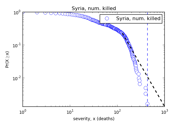
I find this approach intriguing because Professor Michael Spagat, Dr. Ryan Woodard and I carried out related research on conflict data back in 2006. One fascinating research question that emerges from all this, and which could be applied to twitter datasets, is whether the slope of the power law says anything about the type of conflict/disaster being tweeted about, the expected number of casualties or even the propagation of rumors.  If you’re interested in pursuing this research question (and have worked with power laws before), please do get in touch. In the meantime, I challenge the authors’ suggestion that a power law distribution necessarily says anything about the quality or reliability of the underlying data. Using the casualty data from SyriaTracker (which is also used by USAID in their official crisis maps), my colleague Dr. Ryan Woodard showed that this dataset does not follow a power law distribution—even thought it is one of the most reliable on Syria.

Syria_PL

Moving on to the content analysis of the Mumbai blast tweets:  “The number of URLs and @-mentions in tweets increase during the time of the crisis in com-parison to what researchers have exhibited for normal circumstances.” The table below lists the top 10 URLs shared on Twitter. Inter-estingly, the link to a Google Spreadsheet was amongst the most shared resource. Created by Twitter user Nitin Sagar, the spreadsheet was used to “coordinate relief operation among people. Within hours hundreds of people registered on the sheet via Twitter. People asked for or off ered help on that spreadsheet for many hours.”

The analysis also reveals that “the number of tweets or updates by authority users (those with large number of followers) are very less, i.e., majority of content generated on Twitter during the crisis comes from non authority users.”  In addition, tweets generated by authority users have a high level of retweets. The results also indicate that “the number of tweets generated by people with large follower base (who are generally like government owned accounts, cele-brities, media companies) were very few. Thus, the majority of content generated at the time of crisis was from unknown users. It was also observed that, though the number of posts were less by users with large number of followers, these posts registered high numbers of retweets.”

Rumors related to the blasts also spread through Twitter. For example, rumors began to circulate about a fourth bomb going off. “Some tweets even speci fied locations of 4th blast as Lemington street, Colaba and Charni. Around 500+ tweets and retweets were posted about this.” False rumors about hospital blood banks needing donations were also propagated via Twitter. “They were initiated by a user, @KapoorChetan and around 2,000 tweets and retweets were made regarding this by Twitter users.” The authors of the study believe that such false rumors and can be prevented if credible sources like the mainstream media companies and the government post updates on social media more frequently.

I did a bit of research on this and found that NDTV did use their twitter feed (which has over half-a-million followers) to counter these rumors. For example, “RT @ndtv: Mumbai police: Don’t believe rumours of more bombs. False rumours being spread deliberately.” Journalist Sonal Kalra also acted to counter rumors: “RT @sonalkalra: BBMs about bombs found in Delhi are FALSE. Pls pls don’t spread rumours. #mumbaiblasts.”

In conclusion, the study considers the “privacy threats during the Twitter activity after the blasts. People openly tweeted their phone numbers on social media websites like Twitter, since at such moment of crisis people wished to reach out to help others. But, long after the crisis was over, such posts still remained publicly available on the Internet.” In addition, “people also openly posted their blood group, home address, etc. on Twitter to off er help to victims of the blasts.” The Ushahidi Map also includes personal information. These data privacy and security issues continue to pose major challenges vis-a-vis the use of social media for crisis response.

Bio

See also: Did Terrorists Use Twitter to Increase Situational Awareness? [Link]

Humanitarian Technology and the Japan Earthquake (Updated)

My Internews colleagues have just released this important report on the role of communications in the 2011 Japan Earthquake. Independent reports like this one are absolutely key to building the much-needed evidence base of humanitarian technology. Internews should thus be applauded for investing in this important study. The purpose of my blog post is to highlight findings that I found most interesting and to fill some of the gaps in the report’s coverage.

sinsai_info

I’ll start with the gaps since there are far fewer of these. While the report does reference the Sinsai Crisis Map, it over looks a number of key points that were quickly identified in an email reply just 61 minutes after Internews posted the study on the CrisisMappers list-serve. These points were made by my Fletcher colleague Jeffrey Reynolds who spearheaded some of the digital response efforts from The Fletcher School in Boston:

“As one of the members who initiated crisis mapping effort in the aftermath of the Great East Japan Earthquake, I’d like to set the record straight on 4 points:

  • The crisis mapping effort started at the Fletcher School with students from Tufts, Harvard, MIT, and BU within a couple hours of the earthquake. We took initial feeds from the SAVE JAPAN! website and put them into the existing OpenStreetMap (OSM) for Japan. This point is not to take credit, but to underscore that small efforts, distant from a catastrophe, can generate momentum – especially when the infrastructure in area/country in question is compromised.
  • Anecdotally, crisis mappers in Boston who have since returned to Japan told me that at least 3 people were saved because of the map.
  • Although crisis mapping efforts may not have been well known by victims of the quake and tsunami, the embassy community in Tokyo leveraged the crisis map to identify their citizens in the Tohuku region. As the proliferation of crisis map-like platforms continues, e.g., Waze, victims in future crises will probably gravitate to social media faster than they did in Japan. Social media, specifically crisis mapping, has revolutionized the role of victim in disasters–from consumer of services, to consumer of relief AND supplier of information.
  • The crisis mapping community would be wise to work with Twitter and other suppliers of information to develop algorithms that minimise noise and duplication of information.

Thank you for telling this important story about the March 11 earthquake. May it lead to the reduction of suffering in current crises and those to come.” Someone else on CrisisMappers noted that “the first OSM mappers of satellite imagery from Japan were the mappers from Haiti who we trained after their own string of catastrophes.” I believe Jeffrey is spot on and would only add the following point: According to Hal, the crisis map received over one million unique views in the weeks and months that followed the Tsunami. The vast majority of these were apparently from inside Japan. So lets assume that 700,000 users accessed the crisis map but that only 1% of them found the map useful for their purposes. This means that 7,000 unique users found the map informative and of consequence. Unless a random sample of these 7,000 users were surveyed, then I find it rather myopic to claim so confidently that the map had no impact. Just because impact is difficult to measure doesn’t imply there was none to measure in the first place.

In any event, Internews’s reply to this feedback was exemplary and far more con-structive than the brouhaha that occurred over the Disaster 2.0 Report. So I applaud the team for how positive, pro-active and engaging they have been to our feedback. Thank you very much.

Screen Shot 2013-03-10 at 3.25.24 PM

In any event, the gaps should not distract from what is an excellent and important report on the use of technology in response to the Japan Earthquake. As my colleague Hal Seki (who spearheaded the Sinsai Crisis Map) noted on Crisis-Mappers, “the report was accurate and covered important on-going issues in Japan.” So I want to thank him again, and his entire team (including Sora, pictured above, the youngest volunteer behind the the crisis mapping efforts) and Jeffrey & team at Fletcher for all their efforts during those difficult weeks and months following the devastating disaster.

Below are multiple short excerpts from the 56-page Internews report that I found most interesting. So if you don’t have time to read the entire report, then simply glance through the list below.

  • Average tweets-per-minute in Japan before earthquake = 3,000
  • Average tweets-per-minute in Japan after earthquake = 11,000
  • DM’s per minute from Japan to world before earthquake = 200
  • DM’s per minute from Japan to world after earthquake = 1,000
  • Twitter’s global network facilitated search & rescue missions for survivors stranded by the tsunami. Within 3 days the Government of Japan had also set up its first disaster-related Twitter account.
  • Safecast, a volunteer-led project to collect and share radiation measurements, was created within a week of the disaster and generated over 3.5 million readings by December 2012.
  • If there is no information after a disaster, people become even more stressed and anxious. Old media works best in emergencies.
  • Community radio, local newspapers, newsletters–in some instances, hand written newsletters–and word of mouth played a key role in providing lifesaving information for communities. Radio was consistently ranked the most useful source of information by disaster-affected communities, from the day of the disaster right through until the end of the first week.
  • The second challenge involved humanitarian responders’ lack of awareness about the valuable information resources being generated by one very significant, albeit volunteer, community: the volunteer technical and crisis mapping communities.
  • The OpenStreet Map volunteer community, for instance, created a map of over 500,000 roads in disaster-affected areas while volunteers working with another crisis map, Sinsai.info, verified, categorised and mapped 12,000 tweets and emails from the affected regions for over three months. These platforms had the potential to close information gaps hampering the response and recovery operation, but it is unclear to what degree they were used by professional responders.
  • The “last mile” needs to be connected in even the most technologically advanced societies.
  • Still, due to the problems at the Fukushima nuclear plant and the scale of the devastation, there was still the issue of “mismatching” – where mainstream media coverage focused on the nuclear crisis and didn’t provide the information that people in evacuation centres needed most.
  • The JMA use a Short Message Service Cell Broadcast (SMS-CB) system to send mass alerts to mobile phone users in specific geographic locations. Earthquakes affect areas in different ways, so alerting phone users based on location enables region-specific alerts to be sent. The system does not need to know specific phone numbers so privacy is protected and the risk of counterfeit emergency alerts is reduced.
  • A smartphone application such as Yurekuru Call, meaning “Earthquake Coming”, can also be downloaded and it will send warnings before an earthquake, details of potential magnitude and arrival times depending on the location.
  • This started with a 14-year-old junior high school student who made a brave but risky decision to live stream NHK on Ustream using his iPhone camera [which is illegal]. This was done within 17 minutes of the earthquake happening on March 11.
  • So for most disaster- affected communities, local initiatives such as community radios, community (or hyper-local) newspapers and word of mouth provided information evacuees wanted the most, including information on the safety of friends and family and other essential information.
  • It is worth noting that it was not only professional reporters who committed themselves to providing information, but also community volunteers and other actors – and that is despite the fact that they too were often victims of the disaster.
  • And after the disaster, while the general level of public trust in media and in social media increased, radio gained the most trust from locals. It was also cited as being a more personable source of information – and it may even have been the most suitable after events as traumatic as these because distressing images couldn’t be seen.
  • Newspapers were also information lifelines in Ishinomaki, 90km from the epicentre of the earthquake. The local radio station was temporarily unable to broadcast due to a gasoline shortage so for a short period of time, the only information source in the city was a handwritten local newspaper, the Hibi Shimbun. This basic, low-cost, community initiative delivered essential information to people there.
  • Newsletters also proved to be a cost-efficient and effective way to inform communities living in evacuation centres, temporary shelters and in their homes.
  • Social networks such as Twitter, Mixi and Facebook provided a way for survivors to locate friends and family and let people know that they had survived.
  • Audio-visual content sharing platforms like YouTube and Ustream were used not only by established organisations and broadcasters, but also by survivors in the disaster-affected areas to share their experiences. There were also a number of volunteer initiatives, such as the crowdsourced disaster map, Sinsai.info, established to support the affected communities.
  • With approx 35 million account holders in Japan, Twitter is the most popular social networking site in that country. This makes Japan the third largest Twitter user in the world behind the USA and Brazil.
  • The most popular hash tags included: #anpi (for finding people) and #hinan (for evacuation centre information) as well as #jishin (earthquake information).
  • The Japanese site, Mixi, was cited as the most used social media in the affected Tohoku region and that should not be underestimated. In areas where there was limited network connectivity, Mixi users could easily check the last time fellow users had logged in by viewing their profile page; this was a way to confirm whether that user was safe. On March 16, 2011, Mixi released a new application that enabled users to view friends’ login history.
  • Geiger counter radiation readings were streamed by dozens, if not hundreds, of individuals based in the area.
  • Ustream also allowed live chats between viewers using their Twitter, Facebook and Instant Messenger accounts; this service was called “Social Stream”.
  • Local officials and NGOs commented that the content of the tweets or Facebook messages requesting assistance were often not relevant because many of the messages were based on secondary information or were simply being re-tweeted.
  • The JRC received some direct messages requesting help, but after checking the situation on the ground, it became clear that many of these messages were, for instance, re-tweets of aid requests or were no longer relevant, some being over a week old.
  • “Ultimately the opportunities (of social media) outweigh the risks. Social media is here to stay and non-engagement is simply not an option.”
  • The JRC also had direct experience of false information going viral; the organisation became the subject of a rumour falsely accusing it of deducting administration fees from cash donations. The rumour originated online and quickly spread across social networks, causing the JRC to invest in a nationwide advertising campaign confirming that 100 percent of the donations went to the affected people.
  • In February 2012 Facebook tested their Disaster Message Board, where users mark themselves and friends as “safe” after a major disaster. The service will only be activated after major emergencies.
  • Most page views [of Sinsai.info] came from the disaster-affected city of Sendai where internet penetration is higher than in surrounding rural areas. […] None of the survivors interviewed during field research in Miyagi and Iwate were aware of this crisis map.
  • The major mobile phone providers in Japan created emergency messaging services known as “disaster message boards” for people to type, or record messages, on their phones for relatives and friends to access. This involved two types of message boards. One was text based, where people could input a message on the provider’s website that would be stored online or automatically forwarded to pre-registered email addresses. The other was a voice recording that could be emailed to a recipient just like an answer phone message.
  • The various disaster message boards were used 14 million times after the earthquake and they significantly reduced congestion on the network – especially if the same number of people had to make a direct call.
  • Information & communication are a form of aid – although unfor-tunately, historically, the aid sector has not always recognised this. Getting information to people on the side of the digital divide, where there is no internet, may help them survive in times of crisis and help communities rebuild after immediate danger has passed.
  • Timely and accurate information for disaster- affected people as well as effective communication between local populations and those who provide aid also improve humanitarian responses to disasters. Using local media – such as community radio or print media – is one way to achieve this and it is an approach that should be embraced by humanitarian organisations.
  • With plans for a US$50 smartphone in the pipeline, the interna-tional humanitarian community needs to prepare for a transforma-tion in the way that information flows in disaster zones.
  • This report’s clear message is that the more channels of communication available during a disaster the better. In times of emergency it is simply not possible to rely on only one, or even three or four kinds, of communication. Both low tech and high tech methods of communication have proven themselves equally important in a crisis.

bio

Keynote: Next Generation Humanitarian Technology

I’m excited to be giving the Keynote address at the Social Media and Response Management Interface Event (SMARMIE 2013) in New York this morning. A big thank you to the principal driver behind this important event, Chuck Frank, for kindly inviting me to speak. This is my first major keynote since joining QCRI, so I’m thrilled to share what I’ve learned during this time and my vision for the future of humanitarian technology. But I’m even more excited by the selection of speakers and caliber of participants. I’m eager to learn about their latest projects, gain new insights and hopefully create pro-active partnerships moving forward.

You can follow this event via live stream and @smarmieNYC & #smarmie). I  plan to live tweeting the event at @patrickmeier. My slides are available for download here (125MB). Each slide include speaking notes, which may be of interest to folks who are unable to follow via live stream. Feel free to use my slides but strictly for non-commercial purposes and only with direct attribution. I’ll be sure to post the video of my talk on iRevolution when it becomes available. In the meantime, these videos and publications may be of interest. Also, I’ve curated the table of contents below with 60+ links to every project and/or concept referred to in my keynote and slides (in chronological order) so participants and others can revisit these after the conference—and more importantly keep our conver-sations going via Twitter and the comments section of the blog posts. I plan to hire a Research Assistant in the near future to turn these (and other posts) into a series of up-to-date e-books in which I’ll cite and fully credit the most interesting and insightful comments posted on iRevolution.

Social Media Pulse of Planet

http://iRevolution.net/2013/02/02/pulse-of-the-planet
http://iRevolution.net/2013/02/06/the-world-at-night
http://iRevolution.net/2011/04/20/network-witness

Big Crisis Data and Added Value

http://iRevolution.net/2011/06/22/no-data-bad-data

http://iRevolution.net/2012/02/26/mobile-technologies-crisis-mapping-disaster-response

http://iRevolution.net/2012/12/17/debating-tweets-disaster

http://iRevolution.net/2012/07/18/disaster-tweets-for-situational-awareness

http://iRevolution.net/2013/01/11/disaster-resilience-2-0

Standby Task Force (SBTF)

http://blog.standbytaskforce.com

http://iRevolution.net/2010/09/26/crisis-mappers-task-force

Libya Crisis Map

http://blog.standbytaskforce.com/libya-crisis-map-report

http://irevolution.net/2011/03/04/crisis-mapping-libya

http://iRevolution.net/2011/03/08/volunteers-behind-libya-crisis-map

http://iRevolution.net/2011/06/12/im-not-gaddafi-test

Philippines Crisis Map

http://iRevolution.net/2012/12/05/digital-response-to-typhoon-philippines

http://iRevolution.net/2012/12/08/digital-response-typhoon-pablo

http://iRevolution.net/2012/12/06/digital-disaster-response-typhoon

http://iRevolution.net/2012/06/03/geofeedia-for-crisis-mapping

http://iRevolution.net/2013/02/26/crowdflower-for-disaster-response

Digital Humanitarians 

http://www.digitalhumanitarians.com

Human Computation

http://iRevolution.net/2013/01/20/digital-humanitarian-micro-tasking

Human Computation for Disaster Response (submitted for publication)

Syria Crisis Map

http://iRevolution.net/2012/03/25/crisis-mapping-syria

http://iRevolution.net/2012/11/27/usaid-crisis-map-syria

http://iRevolution.net/2012/07/30/collaborative-social-media-analysis

http://iRevolution.net/2012/05/29/state-of-the-art-digital-disease-detection

Hybrid Systems for Disaster Response

http://iRevolution.net/2012/10/21/crowdsourcing-and-advanced-computing

http://iRevolution.net/2012/07/30/twitter-for-humanitarian-cluster

http://iRevolution.net/2013/02/11/update-twitter-dashboard

Credibility of Social Media: Compare to What?

http://iRevolution.net/2013/01/08/disaster-tweets-versus-911-calls

http://iRevolution.net/2010/09/22/911-system

Human Computed Crediblity 

http://iRevolution.net/2012/07/26/truth-and-social-media

http://iRevolution.net/2011/11/29/information-forensics-five-case-studies

http://iRevolution.net/2010/06/30/crowdsourcing-detective

http://iRevolution.net/2012/11/20/verifying-source-credibility

http://iRevolution.net/2012/09/16/accelerating-verification

http://iRevolution.net/2010/09/19/veracity-of-tweets-during-a-major-crisis

http://iRevolution.net/2011/03/26/technology-to-counter-rumors

http://iRevolution.net/2012/03/10/truthiness-as-probability

http://iRevolution.net/2013/01/27/mythbuster-tweets

http://iRevolution.net/2012/10/31/hurricane-sandy

http://iRevolution.net/2012/07/16/crowdsourcing-for-human-rights-monitoring-challenges-and-opportunities-for-information-collection-verification

Verily: Crowdsourced Verification

http://iRevolution.net/2013/02/19/verily-crowdsourcing-evidence

http://iRevolution.net/2011/11/06/time-critical-crowdsourcing

http://iRevolution.net/2012/09/18/six-degrees-verification

http://iRevolution.net/2011/09/26/augmented-reality-crisis-mapping

AI Computed Credibility

http://iRevolution.net/2012/12/03/predicting-credibility

http://iRevolution.net/2012/12/10/ranking-credibility-of-tweets

Future of Humanitarian Tech

http://iRevolution.net/2012/04/17/red-cross-digital-ops

http://iRevolution.net/2012/11/15/live-global-twitter-map

http://iRevolution.net/2013/02/16/crisis-mapping-minority-report

http://iRevolution.net/2012/04/09/humanitarian-future

http://iRevolution.net/2011/08/22/khan-borneo-galaxies

http://iRevolution.net/2010/03/24/games-to-turksource

http://iRevolution.net/2010/07/08/cognitive-surplus

http://iRevolution.net/2010/08/14/crowd-is-always-there

http://iRevolution.net/2011/09/14/crowdsource-crisis-response

http://iRevolution.net/2012/07/04/match-com-for-economic-resilience

http://iRevolution.net/2013/02/27/matchapp-disaster-response-app

http://iRevolution.net/2013/01/07/what-waze-can-teach-us

Policy

http://iRevolution.net/2012/12/04/catch-22

http://iRevolution.net/2012/02/05/iom-data-protection

http://iRevolution.net/2013/01/23/perils-of-crisis-mapping

http://iRevolution.net/2013/02/25/launching-sms-code-of-conduct

http://iRevolution.net/2013/02/26/haiti-lies

http://iRevolution.net/2012/06/04/big-data-philanthropy-for-humanitarian-response

http://iRevolution.net/2012/07/25/become-a-data-donor

Bio

ps. Please let me know if you find any broken links so I can fix them, thank you!

Social Media as Passive Polling: Prospects for Development & Disaster Response

My Harvard/MIT colleague Todd Mostak wrote his award-winning Master’s Thesis on “Social Media as Passive Polling: Using Twitter and Online Forums to Map Islamism in Egypt.” For this research, Todd evaluated the “potential of Twitter as a source of time-stamped, geocoded public opinion data in the context of the recent popular uprisings in the Middle East.” More specifically, “he explored three ways of measuring a Twitter user’s degree of political Islamism.” Why? Because he wanted to test the long-standing debate on whether Islamism is associated with poverty.

Screen Shot 2013-02-18 at 11.17.09 AM

So Todd collected millions of geo-tagged tweets from Egypt over a six month period, which he then aggregated by census district in order to regress proxies for poverty against measures of Islamism drived from the tweets and the users’ social graphs. His findings reveal that “Islamist sentiment seems to be positively correlated with male unemployment, illiteracy, and percentage of land used in agriculture and negatively correlated with percentage of men in their youth aged 15-25. Note that female variables for unemployment and age were statistically insignificant.” As with all research, there are caveats such as the weighting scale used for the variables and questions over the reliability of census variables.

Screen Shot 2013-02-18 at 11.15.59 AM

To carry out his graduate research, Todd built a web-enabled database (MapD) powered by a Graphics Processing Units (GPU) to perform real-time querying and visualization of big datasets. He is now working with Harvard’s Center for Geographic Analysis (CGA) to put make this available via a public web interface called Tweetmap. This Big Data streaming and exploration tool presen-tly displays 119 million tweets from 12/10/2012 to 12/31/2012. He is adding 6-7 million new georeferenced tweets per day (but these are not yet publicly available on Tweetmap). According to Todd, the time delay from live tweet to display on the map is about 1 second. Thanks to this GPU-powered approach, he expects that billions of tweets could be displayed in real-time.

Screen Shot 2013-02-18 at 11.14.02 AM

As always with impressive projects, no one single person was behind the entire effort. Ben Lewis, who heads the WorldMap initiative at CGA deserves a lot of credit for making Tweetmap a reality. Indeed, Todd collaborated directly with CGA’s Ben Lewis throughout this project and benefited extensively from his expertise. Matt Bertrand (lead developer for CGA) did the WorldMap-side integration of MapD to create the TweetMap interface.

Todd and I recently spoke about integrating his outstanding work on automated live mapping to QCRI’s Twitter Dashboard for Disaster Response. Exciting times. In the meantime, Todd has kindly shared his dataset of 700+ million geotagged tweets for my team and I to analyze. The reason I’m excited about this approach is best explained with this heatmap of the recent snow-storm in the northeastern US. Todd is already using Tweetmap for live crisis mapping. While this system filters by keyword, our Dashboard will use machine learning to provide more specific streams of relevant tweets, some of which could be automatically mapped on Tweetmap. See Todd’s Flickr page for more Tweetmap visuals.

Screen Shot 2013-02-18 at 11.30.54 AM

I’m also excited by Todd’s GPU-powered approach for a project I’m exploring with UN and World Bank colleagues. The purpose of that research project is to determine whether socio-economic trends such as poverty and unemployment can be captured via Twitter. Our first case study is Egypt. Depending on the results, we may be able to take it one step further by applying sentiment analysis to real-time, georeferenced tweets to visualize Twitter users’ per-ception vis-a-vis government services—a point of interest for my UN colleagues in Cairo.

bio

Verily: Crowdsourced Verification for Disaster Response

Social media is increasingly used for communicating during crises. This rise in Big (Crisis) Data means that finding the proverbial needle in the growing haystack of information is becoming a major challenge. Social media use during Hurricane Sandy produced a “haystack” of half-a-million Instagram photos and 20 million tweets. But which of these were actually relevant for disaster response and could they have been detected in near real-time? The purpose of QCRI’s experimental Twitter Dashboard for Disaster Response project is to answer this question. But what about the credibility of the needles in the info-stack?

10-Red-Balloons

To answer this question, our Crisis Computing Team at QCRI has partnered with the Social Computing & Artificial Intelligence Lab at the Masdar Institute of Science and Technology. This applied research project began with a series of conversations in mid-2012 about DARPA’s Red Balloon Challenge. This challenge posted in 2009 offered $40K to the individual or team that could find the correct location of 10 red weather balloons discretely placed across the continental United States, an area covering well over 3 million square miles (8 million square kilometers). My friend Riley Crane at MIT spearheaded the team that won the challenge in 8 hours and 52 minutes by using social media.

Riley and I connected right after the Haiti Earthquake to start exploring how we might apply his team’s winning strategy to disaster response. But we were pulled in different directions due to PhD & post-doc obligations and start-up’s. Thank-fully, however, Riley’s colleague Iyad Rahwan got in touch with me to continue these conversations when I joined QCRI. Iyad is now at the Masdar Institute. We’re collaborating with him and his students to apply collective intelligence insights from the balloon to address the problem of false or misleading content shared on social media during  disasters.

Screen Shot 2013-02-16 at 2.26.41 AM

If 10 balloons planted across 3 million square miles can be found in under 9 hours, then surely the answer to the question “Did Hurricane Sandy really flood this McDonald’s in Virginia?” can be found in under 9 minutes given that  Virginia is 98% smaller than the “haystack” of the continental US. Moreover, the location of the restaurant would already be known or easily findable. The picture below, which made the rounds on social media during the hurricane is in reality part of an art exhibition produced in 2009. One remarkable aspect of the social media response to Hurricane Sandy was how quickly false information got debunked and exposed as false—not only by one good (digital) Samaritan, but by several.

SandyFake

Having access to accurate information during a crisis leads to more targeted self-organized efforts at the grassroots level. Accurate information is also important for emergency response professionals. The verification efforts during Sandy were invaluable but disjointed and confined to the efforts of a select few individuals. What if thousands could be connected and mobilized to cross-reference and verify suspicious content shared on social media during a disaster?

Say an earthquake struck Santiago, Chile a few minutes ago and contradictory reports begin to circulate on social media that the bridge below may have been destroyed. Determining whether transportation infrastructure is still useable has important consequences for managing the logistics of a disaster response opera-tion. So what if instead of crowdsourcing the correct location of  balloons across an entire country, one could crowdsource the collection of evidence in just one city struck by a disaster to determine whether said bridge had actually been destroyed in a matter of minutes?

santiagobridge

To answer these questions, QCRI and Masdar have launched an experimental  platform called Verily. We are applying best practices in time-critical crowd-sourcing coupled with gamification and reputation mechanisms to leverage the good will of (hopefully) thousands of digital Samaritans during disasters. This is experimental research, which means it may very well not succeed as envisioned. But that is a luxury we have at QCRI—to innovate next-generation humanitarian technologies via targeted iteration and experimentation. For more on this project, our concept paper is available as a Google Doc here. We invite feedback and welcome collaborators.

In the meantime, we are exploring the possibility of integrating the InformCam mobile application as part of Verily. InformaCam adds important metadata to images and videos taken by eyewitnesses. “The metadata includes information like the user’s current GPS coordinates, altitude, compass bearing, light meter readings, the signatures of neighboring devices, cell towers, and wifi net-works; and serves to shed light on the exact circumstances and contexts under which the digital image was taken.” We are also talking to our partners at MIT’s Computer Science & Artificial Intelligence Lab in Boston about other mobile solutions that may facilitate the use of Verily.

Again, this is purely experimental and applied research at this point. We hope to have an update on our progress in the coming months.

Bio

See also:

  •  Crowdsourcing Critical Thinking to Verify Social Media During Crises [Link]
  •  Using Crowdsourcing to Counter Rumors on Social Media [Link]

Video: Minority Report Meets Crisis Mapping

This short video was inspired by the pioneering work of the Standby Volunteer Task Force (SBTF). A global network of 1,000+ digital humanitarians in 80+ countries, the SBTF is responsible for some of the most important live crisis mapping operations that have supported both humanitarian and human rights organizations over the past 2+ years. Today, the SBTF is a founding and active member of the Digital Humanitarian Network (DHN) and remains committed to rapid learning and innovation thanks to an outstanding team of volunteers (“Mapsters”) and their novel use of next-generation humanitarian technologies.

The video first aired on the National Geographic Television Channel in February 2013. A big thanks to the awesome folks from National Geographic and the outstanding Evolve Digital Cinema Team for visioning the future of digital humanitarian technologies—a future that my Crisis Computing Team and I at QCRI are working to create.

An aside: I tried on several occasions to hack the script and say “We” rather than “I” since crisis mapping is very rarely a solo effort but the main sponsor insisted that the focus be on one individual. On the upside, one of the scenes in the commercial is of a Situation Room full of Mapsters coupled with the narration: “Our team can map the pulse of the planet, from anywhere, getting aid to the right places.” Our team = SBTF! Which is why the $$ received for being in this commercial will go towards supporting Mapsters.

bio

Did Terrorists Use Twitter to Increase Situational Awareness?

Those who are still skeptical about the value of Twitter for real-time situational awareness during a crisis ought to ask why terrorists likely think otherwise. In 2008, terrorists carried out multiple attacks on Mumbai in what many refer to as the worst terrorist incident in Indian history. This study, summarized below, explains how the terrorists in question could have used social media for coor-dination and decision-making purposes.

The study argues that “the situational information which was broadcast through live media and Twitter contributed to the terrorists’ decision making process and, as a result, it enhanced the effectiveness of hand-held weapons to accomplish their terrorist goal.” To be sure, the “sharing of real time situational information on the move can enable the ‘sophisticated usage of the most primitive weapons.'” In sum, “unregulated real time Twitter postings can contribute to increase the level of situation awareness for terrorist groups to make their attack decision.”

According to the study, “an analysis of satellite phone conversations between terrorist commandos in Mumbai and remote handlers in Pakistan shows that the remote handlers in Pakistan were monitoring the situation in Mumbai through live media, and delivered specific and situational attack commands through satellite phones to field terrorists in Mumbai.” These conversations provide “evidence that the Mumbai terrorist groups understood the value of up-to-date situation information during the terrorist operation. […] They under-stood that the loss of information superiority can compromise their operational goal.”

Handler: See, the media is saying that you guys are now in room no. 360 or 361. How did they come to know the room you guys are in?…Is there a camera installed there? Switch off all the lights…If you spot a camera, fire on it…see, they should not know at any cost how many of you are in the hotel, what condition you are in, where you are, things like that… these will compromise your security and also our operation […]

Terrorist: I don’t know how it happened…I can’t see a camera anywhere.

A subsequent phone conversation reveals that “the terrorists group used the web search engine to increase their decision making quality by employing the search engine as a complement to live TV which does not provide detailed information of specific hostages. For instance, to make a decision if they need to kill a hostage who was residing in the Taj hotel, a field attacker reported the identity of a hostage to the remote controller, and a remote controller used a search engine to obtain the detailed information about him.”

Terrorist: He is saying his full name is K.R.Ramamoorthy.

Handler: K.R. Ramamoorthy. Who is he? … A designer … A professor … Yes, yes, I got it …[The caller was doing an internet search on the name, and a results showed up a picture of Ramamoorthy] … Okay, is he wearing glasses? [The caller wanted to match the image on his computer with the man before the terrorists.]

Terrorist: He is not wearing glasses. Hey, … where are your glasses?

Handler: … Is he bald from the front?

Terrorist: Yes, he is bald from the front …

The terrorist group had three specific political agendas: “(1) an anti-India agenda, (2) an anti-Israel and anti-Jewish agenda, and (3) an anti-US and anti-Nato agenda.” A content analysis of 900+ tweets posted during the attacks reveal whether said tweets may have provided situational awareness information in support of these three political goals. The results: 18% of tweets contained “situa-tional information which can be helpful for Mumbai terrorist groups to make an operational decision of achieving their Anti-India political agenda. Also, 11.34% and 4.6% of posts contained operationally sensitive information which may help terrorist groups to make an operational decision of achieving their political goals of Anti-Israel/Anti-Jewish and Anti-US/Anti-Nato respectively.”

In addition, the content analysis found that “Twitter site played a significant role in relaying situational information to the mainstream media, which was monitored by Mumbai terrorists. Therefore, we conclude that the Mumbai Twitter page in-directly contributed to enhancing the situational awareness level of Mumbai terrorists, although we cannot exclude the possibility of its direct contribution as well.”

In conclusion, the study stresses the importance analyzing a terrorist group’s political goals in order to develop an appropriate information control strategy. “Because terrorists’ political goals function as interpretative filters to process situational information, understanding of adversaries’ political goals may reduce costs for security operation teams to monitor and decide which tweets need to be controlled.”

bio

See also: Analyzing Tweets Posted During Mumbai Terrorist Attacks [Link]

Update: Twitter Dashboard for Disaster Response

Project name: Artificial Intelligence for Disaster Response (AIDR). For a more recent update, please click here.

My Crisis Computing Team and I at QCRI have been working hard on the Twitter Dashboard for Disaster Response. We first announced the project on iRevolution last year. The experimental research we’ve carried out since has been particularly insightful vis-a-vis the opportunities and challenges of building such a Dashboard. We’re now using the findings from our empirical research to inform the next phase of the project—namely building the prototype for our humanitarian colleagues to experiment with so we can iterate and improve the platform as we move forward.

KnightDash

Manually processing disaster tweets is becoming increasingly difficult and unrealistic. Over 20 million tweets were posted during Hurricane Sandy, for example. This is the main problem that our Twitter Dashboard aims to solve. There are two ways to manage this challenge of Big (Crisis) Data: Advanced Computing and Human Computation. The former entails the use of machine learning algorithms to automatically tag tweets while the latter involves the use of microtasking, which I often refer to as Smart Crowdsourcing. Our Twitter Dashboard seeks to combine the best of both methodologies.

On the Advanced Computing side, we’ve developed a number of classifiers that automatically identify tweets that:

  • Contain informative content (in contrast to personal messages or information unhelpful for disaster response);
  • Are posted by eye-witnesses (as opposed to 2nd-hand reporting);
  • Include pictures, video footage, mentions from TV/radio
  • Report casualties and infrastructure damage;
  • Relate to people missing, seen and/or found;
  • Communicate caution and advice;
  • Call for help and important needs;
  • Offer help and support.

These classifiers are developed using state-of-the-art machine learning tech-niques. This simply means that we take a Twitter dataset of a disaster, say Hurricane Sandy, and develop clear definitions for “Informative Content,” “Eye-witness accounts,” etc. We use this classification system to tag a random sample of tweets from the dataset (usually 100+ tweets). We then “teach” algorithms to find these different topics in the rest of the dataset. We tweak said algorithms to make them as accurate as possible; much like training a dog new tricks like go-fetch (wink).

fetchball

We’ve found from this research that the classifiers are quite accurate but sensitive to the type of disaster being analyzed and also the country in which said disaster occurs. For example, a set of classifiers developed from tweets posted during Hurricane Sandy tend to be less accurate when applied to tweets posted for New Zealand’s earthquake. Each classifier is developed based on tweets posted during a specific disaster. In other words, while the classifiers can be highly accurate (i.e., tweets are correctly tagged as being damage-related, for example), they only tend to be accurate for the type of disaster they’ve been trained for, e.g., weather-related disasters (tornadoes), earth-related (earth-quakes) and water-related (floods).

So we’ve been busy trying to collect as many Twitter datasets of different disasters as possible, which has been particularly challenging and seriously time-consuming given Twitter’s highly restrictive Terms of Service, which prevents the direct sharing of Twitter datasets—even for humanitarian purposes. This means we’ve had to spend a considerable amount of time re-creating Twitter datasets for past disasters; datasets that other research groups and academics have already crawled and collected. Thank you, Twitter. Clearly, we can’t collect every single tweet for every disaster that has occurred over the past five years or we’ll never get to actually developing the Dashboard.

That said, some of the most interesting Twitter disaster datasets are of recent (and indeed future) disasters. Truth be told, tweets were still largely US-centric before 2010. But the international coverage has since increased, along with the number of new Twitter users, which almost doubled in 2012 alone (more neat stats here). This in part explains why more and more Twitter users actively tweet during disasters. There is also a demonstration effect. That is, the international media coverage of social media use during Hurricane Sandy, for example, is likely to prompt citizens in other countries to replicate this kind of pro-active social media use when disaster knocks on their doors.

So where does this leave us vis-a-vis the Twitter Dashboard for Disaster Response? Simply that a hybrid approach is necessary (see TEDx talk above). That is, the Dashboard we’re developing will have a number of pre-developed classifiers based on as many datasets as we can get our hands on (categorized by disaster type). In addition to that, the dashboard will also allow users to create their own classifiers on the fly by leveraging human computation. They’ll also be able to microtask the creation of new classifiers.

In other words, what they’ll do is this:

  • Enter a search query on the dashboard, e.g., #Sandy.
  • Click on “Create Classifier” for #Sandy.
  • Create a label for the new classifier, e.g., “Animal Rescue”.
  • Tag 50+ #Sandy tweets that convey content about animal rescue.
  • Click “Run Animal Rescue Classifier” on new incoming tweets.

The new classifier will then automatically tag incoming tweets. Of course, the classifier won’t get it completely right. But the beauty here is that the user can “teach” the classifier not to make the same mistakes, which means the classifier continues to learn and improve over time. On the geo-location side of things, it is indeed true that only ~3% of all tweets are geotagged by users. But this figure can be boosted to 30% using full-text geo-coding (as was done the TwitterBeat project). Some believe this figure can be doubled (towards 75%) by applying Google Translate to the full-text geo-coding. The remaining users can be queried via Twitter for their location and that of the events they are reporting.

So that’s where we’re at with the project. Ultimately, we envision these classifiers to be like individual apps that can be used/created, dragged and dropped on an intuitive widget-like dashboard with various data visualization options. As noted in my previous post, everything we’re building will be freely accessible and open source. And of course we hope to include classifiers for other languages beyond English, such as Arabic, Spanish and French. Again, however, this is purely experimental research for the time being; we want to be crystal clear about this in order to manage expectations. There is still much work to be done.

In the meantime, please feel free to get in touch if you have disaster datasets you can contribute to these efforts (we promise not to tell Twitter). If you’ve developed classifiers that you think could be used for disaster response and you’re willing to share them, please also get in touch. If you’d like to join this project and have the required skill sets, then get in touch, we may be able to hire you! Finally, if you’re an interested end-user or want to share some thoughts and suggestions as we embark on this next phase of the project, please do also get in touch. Thank you!

bio

The World at Night Through the Eyes of the Crowd

Ushahidi has just uploaded the location of all CrowdMap reports to DevSeed’s awesome MapBox and the result looks gorgeous. Click this link to view the map below in an interactive, full-browser window. Ushahidi doesn’t disclose the actual number of reports depicted, only the number of maps that said reports have been posted to and the number of countries that CrowdMaps have been launched for. But I’m hoping they’ll reveal that figure soon as well. (Update from Ushahidi: This map shows the 246,323 unique locations used for reports from the launch of Crowdmap on Aug 9, 2010 to Jan 18, 2013).

Screen Shot 2013-02-06 at 3.10.38 AM

In any event, I’ve just emailed my colleagues at Ushahidi to congratulate them and ask when their geo-dataset will be made public since they didn’t include a link to said dataset in their recent blog post. I’ll be sure to let readers know in the comments section as soon as I get a reply. There are a plethora of fascinating research questions that this dataset could potentially help us answer. I’m really excited and can’t wait for my team and I at QCRI to start playing with the data. I’d also love to see this static map turned into a live map; one that allows users to actually click on individual reports as they get posted to a CrowdMap and to display the category (or categories) they’ve been tagged with. Now that would be just be so totally über cool—especially if/when Ushahidi opens up that data to the public, even if at a spatially & temporally aggregated level.

For more mesmerizing visualizations like this one, see my recent blog post entitled “Social Media: Pulse of the Planet?” which is also cross-posted on the National Geographic blog here. In the meantime, I’m keeping my fingers crossed that Ushahidi will embrace an Open Data policy from here on out and highly recommend the CrowdGlobe Report to readers interested in learning more about CrowdMap and Ushahidi.

bio

Big Data for Development: From Information to Knowledge Societies?

Unlike analog information, “digital information inherently leaves a trace that can be analyzed (in real-time or later on).” But the “crux of the ‘Big Data’ paradigm is actually not the increasingly large amount of data itself, but its analysis for intelligent decision-making (in this sense, the term ‘Big Data Analysis’ would actually be more fitting than the term ‘Big Data’ by itself).” Martin Hilbert describes this as the “natural next step in the evolution from the ‘Information Age’ & ‘Information Societies’ to ‘Knowledge Societies’ […].”

Hilbert has just published this study on the prospects of Big Data for inter-national development. “From a macro-perspective, it is expected that Big Data informed decision-making will have a similar positive effect on efficiency and productivity as ICT have had during the recent decade.” Hilbert references a 2011 study that concluded the following: “firms that adopted Big Data Analysis have output and productivity that is 5–6 % higher than what would be expected given their other investments and information technology usage.” Can these efficiency gains be brought to the unruly world of international development?

To answer this question, Hilbert introduces the above conceptual framework to “systematically review literature and empirical evidence related to the pre-requisites, opportunities and threats of Big Data Analysis for international development.” Words, Locations, Nature and Behavior are types of data that are becoming increasingly available in large volumes.

“Analyzing comments, searches or online posts [i.e., Words] can produce nearly the same results for statistical inference as household surveys and polls.” For example, “the simple number of Google searches for the word ‘unemployment’ in the U.S. correlates very closely with actual unemployment data from the Bureau of Labor Statistics.” Hilbert argues that the tremendous volume of free textual data makes “the work and time-intensive need for statistical sampling seem almost obsolete.” But while the “large amount of data makes the sampling error irrelevant, this does not automatically make the sample representative.” 

The increasing availability of Location data (via GPS-enabled mobile phones or RFIDs) needs no further explanation. Nature refers to data on natural processes such as temperature and rainfall. Behavior denotes activities that can be captured through digital means, such as user-behavior in multiplayer online games or economic affairs, for example. But “studying digital traces might not automatically give us insights into offline dynamics. Besides these biases in the source, the data-cleaning process of unstructured Big Data frequently introduces additional subjectivity.”

The availability and analysis of Big Data is obviously limited in areas with scant access to tangible hardware infrastructure. This corresponds to the “Infra-structure” variable in Hilbert’s framework. “Generic Services” refers to the production, adoption and adaptation of software products, since these are a “key ingredient for a thriving Big Data environment.” In addition, the exploitation of Big Data also requires “data-savvy managers and analysts and deep analytical talent, as well as capabilities in machine learning and computer science.” This corresponds to “Capacities and Knowledge Skills” in the framework.

The third and final side of the framework represents the types of policies that are necessary to actualize the potential of Big Data for international develop-ment. These policies are divided into those that elicit a Positive Feedback Loops such as financial incentives and those that create regulations such as interoperability, that is, Negative Feedback Loops.

The added value of Big Data Analytics is also dependent on the availability of publicly accessible data, i.e., Open Data. Hilbert estimates that a quarter of US government data could be used for Big Data Analysis if it were made available to the public. There is a clear return on investment in opening up this data. On average, governments with “more than 500 publicly available databases on their open data online portals have 2.5 times the per capita income, and 1.5 times more perceived transparency than their counterparts with less than 500 public databases.” The direction of “causality” here is questionable, however.

Hilbert concludes with a warning. The Big Data paradigm “inevitably creates a new dimension of the digital divide: a divide in the capacity to place the analytic treatment of data at the forefront of informed decision-making. This divide does not only refer to the availability of information, but to intelligent decision-making and therefore to a divide in (data-based) knowledge.” While the advent of Big Data Analysis is certainly not a panacea,”in a world where we desperately need further insights into development dynamics, Big Data Analysis can be an important tool to contribute to our understanding of and improve our contributions to manifold development challenges.”

I am troubled by the study’s assumption that we live in a Newtonian world of decision-making in which for every action there is an automatic equal and opposite reaction. The fact of the matter is that the vast majority of development policies and decisions are not based on empirical evidence. Indeed, rigorous evidence-based policy-making and interventions are still very much the exception rather than the rule in international development. Why? “Account-ability is often the unhappy byproduct rather than desirable outcome of innovative analytics. Greater accountability makes people nervous” (Harvard 2013). Moreover, response is always political. But Big Data Analysis runs the risk de-politicize a problem. As Alex de Waal noted over 15 years ago, “one universal tendency stands out: technical solutions are promoted at the expense of political ones.” I hinted at this concern when I first blogged about the UN Global Pulse back in 2009.

In sum, James Scott (one of my heroes) puts it best in his latest book:

“Applying scientific laws and quantitative measurement to most social problems would, modernists believed, eliminate the sterile debates once the ‘facts’ were known. […] There are, on this account, facts (usually numerical) that require no interpretation. Reliance on such facts should reduce the destructive play of narratives, sentiment, prejudices, habits, hyperbole and emotion generally in public life. […] Both the passions and the interests would be replaced by neutral, technical judgment. […] This aspiration was seen as a new ‘civilizing project.’ The reformist, cerebral Progressives in early twentieth-century American and, oddly enough, Lenin as well believed that objective scientific knowledge would allow the ‘administration of things’ to largely replace politics. Their gospel of efficiency, technical training and engineering solutions implied a world directed by a trained, rational, and professional managerial elite. […].”

“Beneath this appearance, of course, cost-benefit analysis is deeply political. Its politics are buried deep in the techniques […] how to measure it, in what scale to use, […] in how observations are translated into numerical values, and in how these numerical values are used in decision making. While fending off charges of bias or favoritism, such techniques […] succeed brilliantly in entrenching a political agenda at the level of procedures and conventions of calculation that is doubly opaque and inaccessible. […] Charged with bias, the official can claim, with some truth, that ‘I am just cranking the handle” of a nonpolitical decision-making machine.”

See also:

  • Big Data for Development: Challenges and Opportunities [Link]
  • Beware the Big Errors of Big Data (by Nassim Taleb) [Link]
  • How to Build Resilience Through Big Data [Link]