Why the Share Economy is Important for Disaster Response and Resilience

A unique and detailed survey funded by the Rockefeller Foundation confirms the important role that social and community bonds play vis-à-vis disaster resilience. The new study, which focuses on resilience and social capital in the wake of Hurricane Sandy, reveals how disaster-affected communities self-organized, “with reports of many people sharing access to power, food and water, and providing shelter.” This mutual aid was primarily coordinated face-to-face. This may not always be possible, however. So the “Share Economy” can also play an important role in coordinating self-help during disasters.

In a share economy, “asset owners use digital clearinghouses to capitalize the unused capacity of things they already have, and consumers rent from their peers rather than rent or buy from a company” (1). During disasters, these asset owners can use the same digital clearinghouses to offer what they have at no cost. For example, over 1,400 kindhearted New Yorkers offered free housing to people heavily affected by the hurricane. They did this using AirBnB, as shown in the short video above. Meanwhile, on the West Coast, the City of San Francisco has just lunched a partnership with BayShare, a sharing economy advocacy group in the Bay Area. The partnership’s goal is to “harness the power of sharing to ensure the best response to future disasters in San Francisco” (2).

fon wifi sharing

While share economy platforms like AirBnB are still relatively new, many believe that “the share economy is a real trend and not some small blip (3). So it may be worth taking an inventory of share platforms out there that are likely to be useful for disaster response. Here’s a short list:

  • AirBnBA global travel rental platform with accommodations in 192 countries. This service has already been used for disaster response as described above.
  • FonEnables people to share some of their home Wi-Fi  in exchange for getting free Wi-Fi from 8 million people in Fon’s network. Access to information is always key during & after disasters. The map above  displays a subset of all Fon users in that part of Europe.
  • LendingClub: A cheaper service than credit cards for borrowers. Also provides better interest rates than savings accounts for investors. Access to liquidity is often necessary after a disaster.
  • LiquidSpaceProvides high quality temporary workspaces and office rentals. These can be rented by the hour and by the day.  Dedicated spaces are key for coordinating disaster response.
  • Lyft: An is on-demand ride-sharing smartphone app for cheaper, safer rides. This service could be used to transport people and supplies following a disaster. Similar to Sidecar.
  • RelayRides:  A car sharing marketplace where participants can rent out their own cars. Like Lyft, RelayRides could be used to transport goods and people. Similar to Getaround. Also, ParkingPanda is the parking equivalent.
  • TaskRabbit: Get your deliveries and errands completed easily & quickly by trusted individuals in your neighborhood. This service could be used to run quick errands following disasters. Similar to Zaarly, a marketplace that helps you discover and hire local services. 
  • Yerdle: An “eBay” for sharing items with your friends. This could be used to provide basic supplies to disaster-affected neighborhoods. Similar to SnapGood, which also allows for temporary sharing.

Feel free to add more examples via the comments section below if you know of other sharing economy platforms that could be helpful during disasters.

While these share tools don’t necessary reinforce bonding social capital since face-to-face interactions are not required, they do stand to increase levels of bridging social capital. The former refers to social capital within existing social networks while the latter refers to “cooperative connections with people from different walks of life,” and is often considered “more valuable than ‘bonding social capital'” (3). Bridging social capital is “closely related to thin trust, as opposed to the bonding social capital of thick trust” (4). Platforms that facilitate the sharing economy provide reassurance vis-à-vis the thin trust since they tend to vet participants. This extra reassurance can go a long way during disasters and may thus facilitate mutual-aid at a distance.

 bio

Analyzing Crisis Hashtags on Twitter (Updated)

Update: You can now upload your own tweets to the Crisis Hashtags Analysis Dashboard here

Hashtag footprints can be revealing. The map below, for example, displays the top 200 locations in the world with the most Twitter hashtags. The top 5 are Sao Paolo, London, Jakarta, Los Angeles and New York.

Hashtag map

A recent study (PDF) of 2 billion geo-tagged tweets and 27 million unique hashtags found that “hashtags are essentially a local phenomenon with long-tailed life spans.” The analysis also revealed that hashtags triggered by external events like disasters “spread faster than hashtags that originate purely within the Twitter network itself.” Like other metadata, hashtags can be  informative in and of themselves. For example, they can provide early warning signals of social tensions in Egypt, as demonstrated in this study. So might they also reveal interesting patterns during and after major disasters?

Tens of thousands of distinct crisis hashtags were posted to Twitter during Hurricane Sandy. While #Sandy and #hurricane featured most, thousands more were also used. For example: #SandyHelp, #rallyrelief, #NJgas, #NJopen, #NJpower, #staysafe, #sandypets, #restoretheshore, #noschool, #fail, etc. NJpower, for example, “helped keep track of the power situation throughout the state. Users and news outlets used this hashtag to inform residents where power outages were reported and gave areas updates as to when they could expect their power to come back” (1).

Sandy Hashtags

My colleagues and I at QCRI are studying crisis hashtags to better understand the variety of tags used during and in the immediate aftermath of major crises. Popular hashtags used during disasters often overshadow more hyperlocal ones making these less discoverable. Other challenges include the: “proliferation of hashtags that do not cross-pollinate and a lack of usability in the tools necessary for managing massive amounts of streaming information for participants who needed it” (2). To address these challenges and analyze crisis hashtags, we’ve just launched a Crisis Hashtags Analytics Dashboard. As displayed below, our first case study is Hurricane Sandy. We’ve uploaded about half-a-million tweets posted between October 27th to November 7th, 2012 to the dashboard.

QCRI_Dashboard

Users can visualize the frequency of tweets (orange line) and hashtags (green line) over time using different time-steps, ranging from 10 minute to 1 day intervals. They can also “zoom in” to capture more minute changes in the number of hashtags per time interval. (The dramatic drop on October 30th is due to a server crash. So if you have access to tweets posted during those hours, I’d be  grateful if you could share them with us).

Hashtag timeline

In the second part of the dashboard (displayed below), users can select any point on the graph to display the top “K” most frequent hashtags. The default value for K is 10 (e.g., top-10 most frequent hashtags) but users can change this by typing in a different number. In addition, the 10 least-frequent hashtags are displayed, as are the 10 “middle-most” hashtags. The top-10 newest hashtags posted during the selected time are also displayed as are the hashtags that have seen the largest increase in frequency. These latter two metrics, “New K” and “Top Increasing K”, may provide early warning signals during disasters. Indeed, the appearance of a new hashtag can reveal a new problem or need while a rapid increase in the frequency of some hashtags can denote the spread of a problem or need.

QCRI Dashboard 2

The third part of the dashboard allows users to visualize and compare the frequency of top hashtags over time. This feature is displayed in the screenshot below. Patterns that arise from diverging or converging hashtags may indicate important developments on the ground.

QCRI Dashboard 3

We’re only at the early stages of developing our hashtags analytics platform (above), but we hope the tool will provide insights during future disasters. For now, we’re simply experimenting and tinkering. So feel free to get in touch if you would like to collaborate and/or suggest some research questions.

Bio

Acknowledgements: Many thanks to QCRI colleagues Ahmed Meheina and Sofiane Abbar for their work on developing the dashboard.

Boston Marathon Explosions: Analyzing First 1,000 Seconds on Twitter

My colleagues Rumi Chunara and John Brownstein recently published a short co-authored study entitled “Twitter as a Sentinel in Emergency Situations: Lessons from the Boston Marathon Explosions.” At 2.49pm EDT on April 15, two improvised bombs exploded near the finish line of the 117th Boston Marathon. Ambulances left the scene approximately 9 minutes later just as public health authorities alerted regional emergency departments of the incident.

Meanwhile, on Twitter:

BostonTweets

An analysis of tweets posted within a 35 mile radius of the finish line reveals that the word stems containing “explos*” and “explod*” appeared on Twitter just 3 minutes after the explosions. “While an increase in messages indicating an emergency from a particular location may not make it possible to fully ascertain the circumstances of an incident without computational or human review, analysis of such data could help public safety officers better understand the location or specifics of explosions or other emergencies.”

In terms of geographical coverage, many of the tweets posted during the first 10 minutes were from witnesses in the immediate vicinity of the finish line. “Because of their proximity to the event and content of their postings, these individuals might be witnesses to the bombings or be of close enough proximity to provide helpful information. These finely detailed geographic data can be used to localize and characterize events assisting emergency response in decision-making.”

BostonBombing2

Ambulances were already on site for the marathon. This is rarely the case for the majority of crises, however. In those more common situations, “crowdsourced information may uniquely provide extremely timely initial recognition of an event and specific clues as to what events may be unfolding.” Of course, user-generated content is not always accurate. Filtering and analyzing this content in real-time is the first step in the verification process, hence the importance of advanced computing. More on this here.

“Additionally, by comparing newly observed data against temporally adjusted keyword frequencies, it is possible to identify aberrant spikes in keyword use. The inclusion of geographical data allows these spikes to be geographically adjusted, as well. Prospective data collection could also harness larger and other streams of crowdsourced data, and use more comprehensive emergency-related keywords and language processing to increase the sensitivity of this data source.” Furthermore, “the analysis of multiple keywords could further improve these prior probabilities by reducing the impact of single false positive keywords derived from benign events.”

bio

Egypt Twitter Map of iPhone, Android and Blackberry Users

Colleagues at GNIP and MapBox recently published this high-resolution map of iPhone, Android and Blackberry users in the US (click to enlarge). “More than 280 million Tweets posted from mobile phones reveal geographic usage patterns in unprecedented detail.” These patterns are often insightful. Some argue that “cell phone brands say something about socio-economics – it takes a lot of money to buy a new iPhone 5,” for example (1). So a map of iPhone users based on where these users tweet reveals where relatively wealthy people live.

Phones USA

As announced in this blog post, colleagues and I at QCRI, Harvard, MIT and UNDP are working on an experimental R&D project to determine whether Big Data can inform poverty reduction strategies in Egypt. More specifically, we are looking to test whether tweets provide a “good enough” signal of changes in unemployment and poverty levels. To do this, we need ground truth data. So my MIT colleague Todd Mostak put together the following maps of cell phone brand ownerships in Egypt using ~3.5 million geolocated tweets from October 2012 to June 2013. Red dots represent the location of tweets posted by Android users; Green dots – iPhone; Purple – Blackberry. Click figures below to enlarge.

Egypt Mobile Phones

Below is a heatmap of the % of Android users. As Todd pointed out in our email exchanges, “Note the lower intensity around Cairo.”

Egypt Android

This heatmap depicts the density of tweeting iPhone users:

Egypt iPhone users

Lastly, the heatmap below depicts geo-tagged tweets posted by Blackberry users.

BB Egypt

As Todd notes, “We can obviously break these down by shyiyakha and regress against census data to get a better idea of how usage of these different devices correlate with proxy for income, but at least from these maps it seems clear that iPhone and Blackberry are used more in urban, higher-income areas.” Since this data is time-stamped, we may be able to show whether/how these patterns changed during last week’s widespread protests and political upheaval.

bio

Using Twitter to Analyze Secular vs. Islamist Polarization in Egypt (Updated)

Large-scale events leave an unquestionable mark on social media. This was true of Hurricane Sandy, for example, and is also true of the widespread protests in Egypt this week. On Wednesday, the Egyptian Military responded to the large-scale demonstrations against President Morsi by removing him from power. Can Twitter provide early warning signals of growing political tension in Egypt and elsewhere? My QCRI colleagues Ingmar Weber & Kiran Garimella and Al-Jazeera colleague Alaa Batayneh have been closely monitoring (PDF) these upheavals via Twitter since January 2013. Specifically, they developed a Political Polarization Index that provides early warning signals for increased social tensions and violence. I will keep updating this post with new data, analysis and graphs over the next 24 hours.

morsi_protests

The QCRI team analyzed some 17 million Egyptian tweets posted by two types of Twitter users—Secularists and Islamists. These user lists were largely drawn from this previous research and only include users that provide geographical information in their Twitter profiles. For each of these 7,000+ “seed users”, QCRI researchers downloaded their most recent 3,200 tweets along with a set of 200 users who retweet their posts. Note that both figures are limits imposed by the Twitter API. Ingmar, Kiran and Alaa have also analyzed users with no location information, corresponding to 65 million tweets and 20,000+ unique users. Below are word clouds of terms used in Twitter profiles created by Islamists (left) and secularists (right).

Screen Shot 2013-07-06 at 2.58.25 PM

QCRI compared the hashtags used by Egyptian Islamists and secularists over a year to create an insightful Political Polarization Index. The methodology used to create this index is described in more detail in this post’s epilogue. The graph below displays the overall hashtag polarity over time along with the number of distinct hashtags used per time interval. As you’ll note, the graph includes the very latest data published today. Click on the graph to enlarge.

hashtag_polarity_over_time_egypt_7_july

The spike in political polarization towards the end of 2011 appears to coincide with “the political struggle over the constitution and a planned referendum on the topic.” The annotations in the graph refer to the following violent events:

A – Assailants with rocks and firebombs gather outside Ministry of Defense to call for an end to military rule.

B – Demonstrations break out after President Morsi grants himself increased power to protect the nation. Clashes take place between protestors and Muslim Brotherhood supporters.

C, D – Continuing protests after the November 22nd declaration.

E – Demonstrations in Tahrir square, Port Said and all across the country.

F,G – Demonstrations in Tahrir square.

H,I – Massive demonstrations in Tahrir and removal of President Morsi.

In sum, the graph confirms that the political polarization hashtag can serve as a barometer for social tensions and perhaps even early warnings of violence. “Quite strikingly, all outbreaks of violence happened during periods where the hashtag polarity was comparatively high.” This also true for the events of the past week, as evidenced by QCRI’s political polarization dashboard below. Click on the figure to enlarge. Note that I used Chrome’s translate feature to convert hashtags from Arabic to English. The original screenshot in Arabic is available here (PNG).

Hashtag Analysis

Each bar above corresponds to a week of Twitter data analysis. When bars were initially green and yellow during the beginnings of Morsi’s Presidency (scroll left on the dashboard for the earlier dates). The change to red (heightened political polarization) coincides with increased tensions around the constitutional crisis in late November, early December. See this timeline for more information. The “Tending Score” in the table above combines volume with recency. A high trending score means the hashtag is more relevant to the current week. 

The two graphs below display political polarization over time. The first starts from January 1, 2013 while the second from June 1, 2013. Interestingly, February 14th sees a dramatic drop in polarization. We’re not sure if this is a bug in the analysis or whether a significant event (Valentine’s?) can explain this very low level of political polarization on February 14th. We see another major drop on May 10th. Any Egypt experts know why that might be?

graph1

The political polarization graph below reveals a steady increase from June 1st through to last week’s massive protests and removal of President Morsi.

graph2

To conclude, large-scale political events such as widespread political protests and a subsequent regime change in Egypt continue to leave a clear mark on social media activity. This pulse can be captured using a Political Polarization Index based on the hashtags used by Islamists and secularists on Twitter. Furthermore, this index appears to provide early warning signals of increasing tension. As my QCRI colleagues note, “there might be forecast potential and we plan to explore this further in the future.”

Bio

Acknowledgements: Many thanks to Ingmar and Kiran for their valuable input and feedback in the drafting of this blog post.

Methods: (written by Ingmar): The political polarization index was computed as follows. The analysis starts by identifying a set of Twitter users who are likely to support either Islamists or secularists in Egypt. This is done by monitoring retweets posted by a set of seed users. For example, users who frequently retweet Muhammad Morsi  and never retweeting El Baradei would be considered Islamist supporters. (This same approach was used by Michael Conover and colleagues to study US politics).

Once politically engaged and polarized users are identified, their use of hashtags is monitored over time. A “neutral” hashtags such as #fb or #ff is typically used by both camps in Egypt in roughly equal proportions and would hence be assigned a 50-50 Islamist-secular leaning. But certain hashtags reveal much more pronounced polarization. For example, the hashtag #tamarrod is assigned a 0-100 Islamist-secular score. Tamarrod refers to the “Rebel” movement, the leading grassroots movement behind the protests that led to Morsi’s ousting.

Similarly the hashtag #muslimsformorsi is assigned a 90-10 Islamist-secular score, which makes sense as it is clearly in support of Morsi. This kind of numerical analysis is done on a weekly basis. Hashtags with a 50-50 score in a given week have zero “tension” whereas hashtags with either 100-0 or 0-100 have maximal tension. The average tension value across all hashtags used in a given week is then plotted over time. Interestingly, this value, derived from hashtag usage in a language-agnostic manner, seems to coincide with outbreaks of violence on the ground as shown in bar chart above.

Global Heat Map of Protests in 2013

My colleague Kalev Leetaru recently launched GDELT (Global Data on Events, Location and Tone), which includes over 250 million events ranging from riots and protests to diplomatic exchanges and peace appeals. The data is based on dozens of news sources such as AFP, AP, BBC, UPI, Washington Post, New York Times and all national & international news from Google News. Given the recent wave of protests in Cairo and Istanbul, a collaborator of Kalev’s, John Beieler, just produced this digital dynamic map of protests events thus far in 2013. John left out the US because “it was a shining beacon of protest activity that distracted from the other parts of the map.” Click on the maps below to enlarge & zoom in.

World

Heat Map Protests

Egypt

Egypt Protests

India

GDELT India

As Kalev notes, “Right now its just a [temporally] static map, it was done as a pilot just to see what it would look like in the first place, but the ultimate goal would be to do realtime updates, we just need to find someone with the interest and time to do this.” Any readers want to take up the challenge? Having a live map of protests (including US data) with “slow motion replay” functionality could be quite insightful given current upheavals. In the meantime, other stunning visualizations of the GDELT data are available here.

And to think that the quantitative analysis section of my doctoral dissertation was an econometric analysis of protest data coded at the country-year level based on just one news source, Reuters. I wonder if/how my findings would change with GDELT’s data. Anyone looking for a dissertation topic?

bio

Using Twitter to Map Blackouts During Hurricane Sandy

I recently caught up with Gilal Lotan during a hackathon in New York and was reminded of his good work during Sandy, the largest Atlantic hurricane on record. Amongst other analytics, Gilal created a dynamic map of tweets referring to power outages. “This begins on the evening October 28th as people mostly joke about the prospect of potentially losing power. As the storm evolves, the tone turns much more serious. The darker a region on the map, the more aggregate Tweets about power loss that were seen for that region.” The animated map is captured in the video below.

Hashtags played a key role in the reporting. The #NJpower hashtag, for example, was used to ‘help  keep track of the power situation throughout the state (1). As depicted in the tweet below, “users and news outlets used this hashtag to inform residents where power outages were reported and gave areas updates as to when they could expect their power to come back” (1). 

NJpower tweet

As Gilal notes, “The potential for mapping out this kind of information in realtime is huge. Think of generating these types of maps for different scenarios– power loss, flooding, strong winds, trees falling.” Indeed, colleagues at FEMA and ESRI had asked us to automatically extract references to gas leaks on Twitter in the immediate aftermath of the Category 5 Tornado in Oklahoma. One could also use a platform like GeoFeedia, which maps multiple types of social media reports based on keywords (i.e., not machine learning). But the vast majority of Twitter users do not geo-tag their tweets. In fact, only 2.7% of tweets are geotagged, according to this study. This explains why enlightened policies are also important for humanitarian technologies to work—like asking the public to temporally geo-tag their social media updates when these are relevant to disaster response.

While basing these observations on people’s Tweets might not always bring back valid results (someone may jokingly tweet about losing power),” Gilal argues that “the aggregate, especially when compared to the norm, can be a pretty powerful signal.” The key word here is norm. If an established baseline of geo-tagged tweets for the northeast were available, one would have a base-map of “normal” geo-referenced twitter activity. This would enable us to understand deviations from the norm. Such a base-map would thus place new tweets in temporal and geo-spatial context.

In sum, creating live maps of geo-tagged tweets is only a first step. Base-maps should be rapidly developed and overlaid with other datasets such as population and income distribution. Of course, these datasets are not always available acessing historical Twitter data can also be a challenge. The latter explains why Big Data Philanthropy for Disaster Response is so key.

bio

Big Data: Sensing and Shaping Emerging Conflicts

The National Academy of Engineering (NAE) and US Institute of Peace (USIP) co-organized a fascinating workshop on “Sensing & Shaping Emerging Conflicts” in November 2012. I had the pleasure of speaking at this workshop, the objective of which was to “identify major opportunities and impediments to providing better real-time information to actors directly involved in situations that could lead to deadly violence.” We explored “several scenarios of potential violence drawn from recent country cases,” and “considered a set of technologies, applications and strategies that have been particularly useful—or could be, if better adapted for conflict prevention.” 

neurons_cropped

The workshop report was finally published this week. If you don’t have time to leaf through the 40+page study, then the following highlights may be of interest. One of the main themes to emerge was the promise of machine learning (ML), a branch of Artificial Intelligence (AI). These approaches “continue to develop and be applied in un-anticipated ways, […] the pressure from the peacebuilding community directed at technology developers to apply these new technologies to the cause of peace could have tremendous benefits.” On a personal note, this is one of the main reasons I joined the Qatar Computing Research Institute (QCRI); namely to apply the Institute’s expertise in ML and AI to the cause of peace, development and disaster relief.

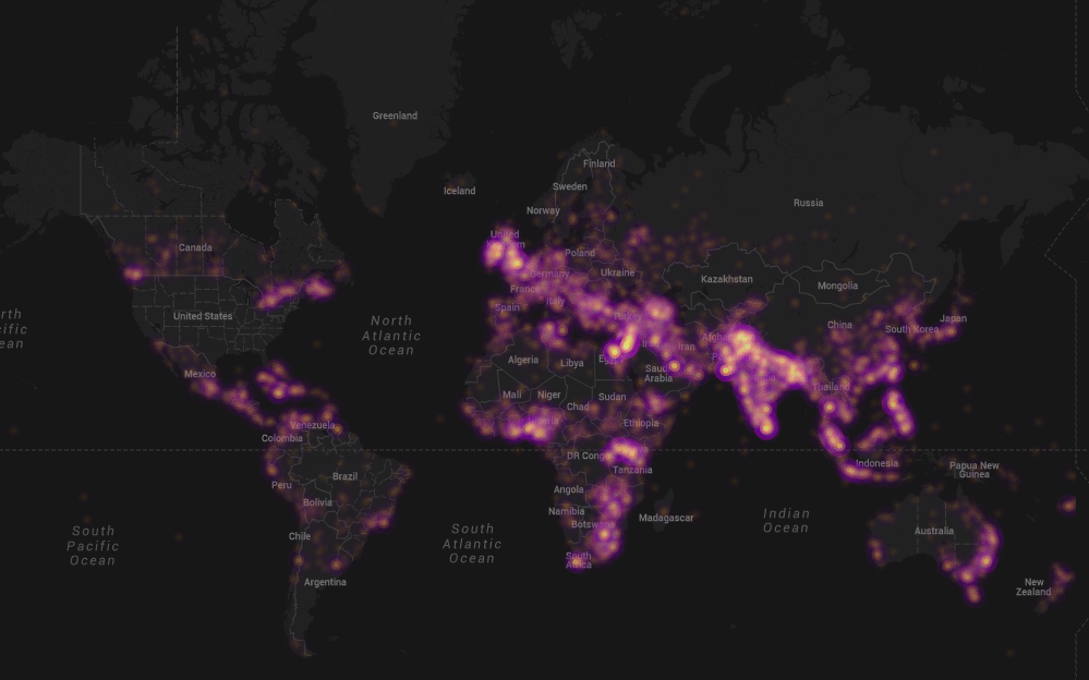
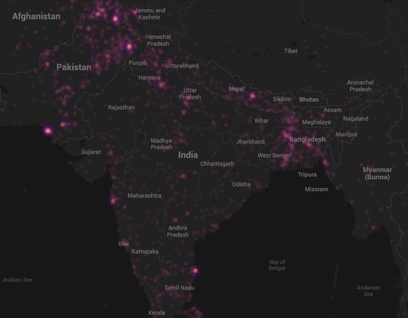
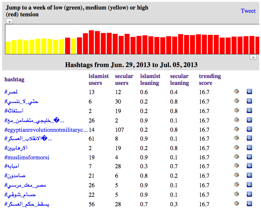
“As an example of the capabilities of new technologies, Rafal Rohozinski, principal with the SecDev Group, described a sensing exercise focused on Syria. Using social media analytics, his group has been able to identify the locations of ceasefire violations or regime deployments within 5 to 15 minutes of their occurrence. This information could then be passed to UN monitors and enable their swift response. In this way, rapid deductive cycles made possible through technology can contribute to rapid inductive cycles in which short-term predictions have meaningful results for actors on the ground. Further analyses of these events and other data also made it possible to capture patterns not seen through social media analytics. For example, any time regime forces moved to a particular area, infrastructure such as communications, electricity, or water would degrade, partly because the forces turned off utilities, a normal practice, and partly because the movement of heavy equipment through urban areas caused electricity systems go down. The electrical grid is connected to the Internet, so monitoring of Internet connections provided immediate warnings of force movements.”

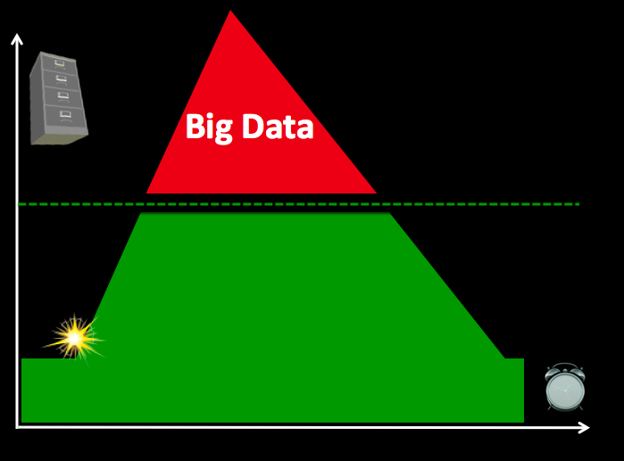
This kind of analysis may not be possible in many other contexts. To be sure, the challenge of the “Digital Divide” is particularly pronounced vis-a-vis the potential use of Big Data for sensing and shaping emerging conflicts. That said, my colleague Duncan Watts “clarified that inequality in communications technology is substantially smaller than other forms of inequality, such as access to health care, clean water, transportation, or education, and may even help reduce some of these other forms of inequality. Innovation will almost always accrue first to the wealthier parts of the world, he said, but inequality is less striking in communications than in other areas.” By 2015, for example, Sub-Saharan Africa will have more people with mobile network access than with electricity at home.

Screen Shot 2013-03-16 at 5.46.35 PM

My colleague Chris Spence from NDI also presented at the workshop. He noted the importance of sensing the positive and not just the negative during an election. “In elections you want to focus as much on the positive as you do on the negative and tell a story that really does convey to the public what’s actually going on and not just a … biased sample of negative reports.” Chris also highlighted that “one problem with election monitoring is that analysts still typically work with the software tools they used in the days of manual reporting rather than the Web-based tools now available. There’s an opportunity that we’ve been trying to solve, and we welcome help.” Building on our expertise in Machine Learning and Artificial Intelligence, my QCRI colleagues and I want to develop classifiers that automatically categorize large volumes of crowdsourced election reports. So I’m exploring this further with Chris & NDI. Check out the Artificial Intelligence for Monitoring Elections (AIME) project for more information.

One of the most refreshing aspects of the day-long workshop was the very clear distinction made between warning and response. As colleague Sanjana Hattotuwa cautioned: “It’s an open question whether some things are better left unsaid and buried literally and metaphorically.”  Duncan added that, “The most important question is what to do with information once it has been gathered.” Indeed, “Simply giving people more information doesn’t necessarily lead to a better outcome, although some-times it does.” My colleague Dennis King summed it up very nicely, “Political will is not an icon on your computer screen… Generating political will is the missing factor in peacebuilding and conflict resolution.”

In other words, “the peacebuilding community often lacks actionable strategies to convert sensing into shaping,” as colleague Fred Tipson rightly noted. Libbie Prescott, who served as strategic advisor to the US Secretary of State and participated in the workshop, added: “Policymakers have preexisting agendas, and just presenting them with data does not guarantee a response.” As my colleague Peter Walker wrote in a book chapter published way back in 1992, “There is little point in investing in warning systems if one then ignores the warnings!” To be clear, “early warning should not be an end in itself; it is only a tool for preparedness, prevention and mitigation with regard to disasters, emergencies and conflict situations, whether short or long term ones. […] The real issue is not detecting the developing situation, but reacting to it.”

Now Fast froward to 2013: OCHA just published this groundbreaking report confirming that “early warning signals for the Horn of Africa famine in 2011 did not produce sufficient action in time, leading to thousands of avoidable deaths. Similarly, related research has shown that the 2010 Pakistan floods were predictable.” As DfID notes in this 2012 strategy document, “Even when good data is available, it is not always used to inform decisions. There are a number of reasons for this, including data not being available in the right format, not widely dispersed, not easily accessible by users, not being transmitted through training and poor information management. Also, data may arrive too late to be able to influence decision-making in real time operations or may not be valued by actors who are more focused on immediate action” (DfID)So how do we reconcile all this with Fred’s critical point: “The focus needs to be on how to assist the people involved to avoid the worst consequences of potential deadly violence.”

mind-the-gap

The fact of the matter is that this warning-response gap in the field of conflict prevention is over 20 years old. I have written extensively about the warning-response problem here (PDF) and here (PDF), for example. So this challenge is hardly a new one, which explains why a number of innovative and promising solutions have been put forward of the years, e..g, the decentralization of conflict early warning and response. As my colleague David Nyheim wrote five years ago:

A state-centric focus in conflict management does not reflect an understanding of the role played by civil society organisations in situations where the state has failed. An external, interventionist, and state-centric approach in early warning fuels disjointed and top down responses in situations that require integrated and multilevel action.” He added: “Micro-level responses to violent conflict by ‘third generation early warning systems’ are an exciting development in the field that should be encouraged further. These kinds of responses save lives.”

This explains why Sanjana is right when he emphasizes that “Technology needs to be democratized […], made available at the lowest possible grassroots level and not used just by elites. Both sensing and shaping need to include all people, not just those who are inherently in a position to use technology.” Furthermore, Fred is spot on when he says that “Technology can serve civil disobedience and civil mobilization […] as a component of broader strategies for political change. It can help people organize and mobilize around particular goals. It can spread a vision of society that contests the visions of authoritarian.”

In sum, As Barnett Rubin wrote in his excellent book (2002) Blood on the Doorstep: The Politics of Preventive Action, “prevent[ing] violent conflict requires not merely identifying causes and testing policy instruments but building a political movement.” Hence this 2008 paper (PDF) in which I explain in detail how to promote and facilitate technology-enabled civil resistance as a form of conflict early response and violence prevention.

Bio

See Also:

  • Big Data for Conflict Prevention [Link]

Automatically Identifying Fake Images Shared on Twitter During Disasters

Artificial Intelligence (AI) can be used to automatically predict the credibility of tweets generated during disasters. AI can also be used to automatically rank the credibility of tweets posted during major events. Aditi Gupta et al. applied these same information forensics techniques to automatically identify fake images posted on Twitter during Hurricane Sandy. Using a decision tree classifier, the authors were able to predict which images were fake with an accuracy of 97%. Their analysis also revealed retweets accounted for 86% of all tweets linking to fake images. In addition, their results showed that 90% of these retweets were posted by just 30 Twitter users.

Fake Images

The authors collected the URLs of fake images shared during the hurricane by drawing on the UK Guardian’s list and other sources. They compared these links with 622,860 tweets that contained links and the words “Sandy” & “hurricane” posted between October 20th and November 1st, 2012. Just over 10,300 of these tweets and retweets contained links to URLs of fake images while close to 5,800 tweets and retweets pointed to real images. Of the ~10,300 tweets linking to fake images, 84% (or 9,000) of these were retweets. Interestingly, these retweets spike about 12 hours after the original tweets are posted. This spike is driven by just 30 Twitter users. Furthermore, the vast majority of retweets weren’t made by Twitter followers but rather by those following certain hashtags. 

Gupta et al. also studied the profiles of users who tweeted or retweeted fake images  (User Features) and also the content of their tweets (Tweet Features) to determine whether these features (listed below) might be predictive of whether a tweet posts to a fake image. Their decision tree classifier achieved an accuracy of over 90%, which is remarkable. But the authors note that this high accuracy score is due to “the similar nature of many tweets since since a lot of tweets are retweets of other tweets in our dataset.” In any event, their analysis also reveals that Tweet-based Features (such as length of tweet, number of uppercase letters, etc.), were far more accurate in predicting whether or not a tweeted image was fake than User-based Features (such as number of friends, followers, etc.). One feature that was overlooked, however, is gender.

Information Forensics

In conclusion, “content and property analysis of tweets can help us in identifying real image URLs being shared on Twitter with a high accuracy.” These results reinforce the proof that machine computing and automated techniques can be used for information forensics as applied to images shared on social media. In terms of future work, the authors Aditi Gupta, Hemank Lamba, Ponnurangam Kumaraguru and Anupam Joshi plan to “conduct a larger study with more events for identification of fake images and news propagation.” They also hope to expand their study to include the detection of “rumors and other malicious content spread during real world events apart from images.” Lastly, they “would like to develop a browser plug-in that can detect fake images being shared on Twitter in real-time.” There full paper is available here.

Needless to say, all of this is music to my ears. Such a plugin could be added to our Artificial Intelligence for Disaster Response (AIDR) platform, not to mention our Verily platform, which seeks to crowdsource the verification of social media reports (including images and videos) during disasters. What I also really value about the authors’ approach is how pragmatic they are with their findings. That is, by noting their interest in developing a browser plugin, they are applying their data science expertise for social good. As per my previous blog post, this focus on social impact is particularly rare. So we need more data scientists like Aditi Gupta et al. This is why I was already in touch with Aditi last year given her research on automatically ranking the credibility of tweets. I’ve just reached out to her again to explore ways to collaborate with her and her team.

bio

What is Big (Crisis) Data?

What does Big Data mean in the context of disaster response? Big (Crisis) Data refers to the relatively large volumevelocity and variety of digital information that may improve sense making and situational awareness during disasters. This is often referred to the 3 V’s of Big Data.

Screen Shot 2013-06-26 at 7.49.49 PM

Volume refers to the amount of data (20 million tweets were posted during Hurricane Sandy) while Velocity refers to the speed at which that data is generated (over 2,000 tweets per second were generated following the Japan Earthquake & Tsunami). Variety refers to the variety of data generated, e.g., Numerical (GPS coordinates), Textual (SMS), Audio (phone calls), Photographic (satellite Imagery) and Video-graphic (YouTube). Sources of Big Crisis Data thus include both public and private sources such images posted as social media (Instagram) on the one hand, and emails or phone calls (Call Record Data) on the other. Big Crisis Data also relates to both raw data (the text of individual Facebook updates) as well as meta-data (the time and place those updates were posted, for example).

Ultimately, Big Data describe datasets that are too large to be effectively and quickly computed on your average desktop or laptop. In other words, Big Data is relative to the computing power—the filters—at your finger tips (along with the skills necessary to apply that computing power). Put differently, Big Data is “Big” because of filter failure. If we had more powerful filters, said “Big” Data would be easier to manage. As mentioned in previous blog posts, these filters can be created using Human Computing (crowdsourcing, microtasking) and/or Machine Computing (natural language processing, machine learning, etc.).

BigData1

Take the above graph, for example. The horizontal axis represents time while the vertical one represents volume of information. On a good day, i.e., when there are no major disasters, the Digital Operations Center of the American Red Cross monitors and manually reads about 5,000 tweets. This “steady state” volume and velocity of data is represented by the green area. The dotted line just above denotes an organization’s (or individual’s) capacity to manage a given volume, velocity and variety of data. When disaster strikes, that capacity is stretched and often overwhelmed. More than 3 million tweets were posted during the first 48 hours after the Category 5 Tornado devastated Moore, Oklahoma, for example. What happens next is depicted in the graph below.

BigData 2

Humanitarian and emergency management organizations often lack the internal surge capacity to manage the rapid increase in data generated during disasters. This Big Crisis Data is represented by the red area. But the dotted line can be raised. One way to do so is by building better filters (using Human and/or Machine Computing). Real world examples of Human and Machine Computing used for disaster response are highlighted here and here respectively.

BigData 3

A second way to shift the dotted line is with enlightened leadership. An example is the Filipino Government’s actions during the recent Typhoon. More on policy here. Both strategies (advanced computing & strategic policies) are necessary to raise that dotted line in a consistent manner.

Bio

See also:

  • Big Data for Disaster Response: A List of Wrong Assumptions [Link]