Automatically Ranking the Credibility of Tweets During Major Events

In their study, “Credibility Ranking of Tweets during High Impact Events,” authors Aditi Gupta and Ponnurangam Kumaraguru “analyzed the credibility of information in tweets corresponding to fourteen high impact news events of 2011 around the globe.” According to their analysis, “30% of total tweets  about an event contained situational information about the event while 14% was spam.” In addition, about 17% of total tweets contained situational awareness information that was credible.

Workflow

The study analyzed over 35 million tweets posted by ~8 million users based on current trending topics. From this data, the authors identified 14 major events reflected in the tweets. These included the UK riots, Libya crisis, Virginia earthquake and Hurricane Irene, for example.

“Using regression analysis, we identi ed the important content and sourced based features, which can predict the credibility of information in a tweet. Prominent content based features were number of unique characters, swear words, pronouns, and emoticons in a tweet, and user based features like the number of followers and length of username. We adopted a supervised machine learning and relevance feedback approach using the above features, to rank tweets according to their credibility score. The performance of our ranking algorithm signi cantly enhanced when we applied re-ranking strategy. Results show that extraction of credible information from Twitter can be automated with high confi dence.”

The paper is available here (PDF). For more applied research on “information forensics,” please see this link.

See also:

  • Analyzing Fake Content on Twitter During Boston Bombings [link]
  • Predicting the Credibility of Disaster Tweets Automatically [link]
  • Auto-Identifying Fake Images on Twitter During Disasters [link]
  • How to Verify Crowdsourced Information from Social Media [link]
  • Crowdsourcing Critical Thinking to Verify Social Media [link]

How the UN Used Social Media in Response to Typhoon Pablo (Updated)

Our mission as digital humanitarians was to deliver a detailed dataset of pictures and videos (posted on Twitter) which depict damage and flooding following the Typhoon. An overview of this digital response is available here. The task of our United Nations colleagues at the Office of the Coordination of Humanitarian Affairs (OCHA), was to rapidly consolidate and analyze our data to compile a customized Situation Report for OCHA’s team in the Philippines. The maps, charts and figures below are taken from this official report (click to enlarge).

Typhon PABLO_Social_Media_Mapping-OCHA_A4_Portrait_6Dec2012

This map is the first ever official UN crisis map entirely based on data collected from social media. Note the “Map data sources” at the bottom left of the map: “The Digital Humanitarian Network’s Solution Team: Standby Volunteer Task Force (SBTF) and Humanity Road (HR).” In addition to several UN agencies, the government of the Philippines has also made use of this information.

Screen Shot 2012-12-08 at 7.26.19 AM

Screen Shot 2012-12-08 at 7.29.24 AM

The cleaned data was subsequently added to this Google Map and also made public on the official Google Crisis Map of the Philippines.

Screen Shot 2012-12-08 at 7.32.17 AM

One of my main priorities now is to make sure we do a far better job at leveraging advanced computing and microtasking platforms so that we are better prepared the next time we’re asked to repeat this kind of deployment. On the advanced computing side, it should be perfectly feasible to develop an automated way to crawl twitter and identify links to images  and videos. My colleagues at QCRI are already looking into this. As for microtasking, I am collaborating with PyBossa and Crowdflower to ensure that we have highly customizable platforms on stand-by so we can immediately upload the results of QCRI’s algorithms. In sum, we have got to move beyond simple crowdsourcing and adopt more agile micro-tasking and social computing platforms as both are far more scalable.

In the meantime, a big big thanks once again to all our digital volunteers who made this entire effort possible and highly insightful.

Statistics on First Tweets to Report the #Japan Earthquake (Updated)

Update: The first (?) YouTube video of earthquake shared on Twitter.

An 7.3 magnitude earthquake just struck 300km off the eastern coast of Japan, prompting a tsunami warning for Japan’s Miyagi Prefecture. The quake struck at 5.18pm local time (3.18am New York Time). Twitter’s team in Japan have just launched this page of recommended hashtags. There are currently over 1,200 tweets per minute being posted in Tokyo, according to this site.

Screen Shot 2012-12-07 at 4.20.49 AM

Hashtags.org has the following graph on the frequency of tweets carrying the Japan #hashtag over the past 24 hours:

Screen Shot 2012-12-07 at 4.27.52 AM

The first tweets to report the earthquake on twitter using the hashtag #Japan were posted at 5.19pm local time (3.19am New York). You can click on each for the original link.

Screen Shot 2012-12-07 at 4.07.43 AM

Screen Shot 2012-12-07 at 4.08.05 AM Screen Shot 2012-12-07 at 4.08.20 AM

Screen Shot 2012-12-07 at 4.17.53 AM

Screen Shot 2012-12-07 at 4.16.11 AM

 Screen Shot 2012-12-07 at 4.10.35 AM Screen Shot 2012-12-07 at 4.10.55 AM Screen Shot 2012-12-07 at 4.11.16 AM

These tweets were each posted within 2 minutes of the earthquake. I will update this blog post when I get more relevant details.

Summary: Digital Disaster Response to Philippine Typhoon

Update: How the UN Used Social Media in Response to Typhoon Pablo

The United Nations Office for the Coordination of Humanitarian Affairs (OCHA) activated the Digital Humanitarian Network (DHN) on December 5th at 3pm Geneva time (9am New York). The activation request? To collect all relevant tweets about Typhoon Pablo posted on December 4th and 5th; identify pictures and videos of damage/flooding shared in those tweets; geo-locate, time-stamp and categorize this content. The UN requested that this database be shared with them by 5am Geneva time the following day. As per DHN protocol, the activation request was reviewed within an hour. The UN was informed that the request had been granted and that the DHN was formally activated at 4pm Geneva.

pablo_impact

The DHN is composed of several members who form Solution Teams when the network is activated. The purpose of Digital Humanitarians is to support humanitarian organizations in their disaster response efforts around the world. Given the nature of the UN’s request, both the Standby Volunteer Task Force (SBTF) and Humanity Road (HR) joined the Solution Team. HR focused on analyzing all tweets posted December 4th while the SBTF worked on tweets posted December 5th. Over 20,000 tweets were analyzed. As HR will have a blog post describing their efforts shortly (please check here), I will focus on the SBTF.

Geofeedia Pablo

The Task Force first used Geofeedia to identify all relevant pictures/videos that were already geo-tagged by users. About a dozen were identified in this manner. Meanwhile, the SBTF partnered with the Qatar Foundation Computing Research Institute’s (QCRI) Crisis Computing Team to collect all tweets posted on December 5th with the hashtags endorsed by the Philippine Government. QCRI ran algorithms on the dataset to remove (1) all retweets and (2) all tweets without links (URLs). Given the very short turn-around time requested by the UN, the SBTF & QCRI Teams elected to take a two-pronged approach in the hopes that one, at least, would be successful.

The first approach used  Crowdflower (CF), introduced here. Workers on Crowd-flower were asked to check each Tweet’s URL and determine whether it linked to a picture or video. The purpose was to filter out URLs that linked to news articles. CF workers were also asked to assess whether the tweets (or pictures/videos) provided sufficient geographic information for them to be mapped. This methodology worked for about 2/3 of all the tweets in the database. A review of lessons learned and how to use Crowdflower for disaster response will be posted in the future.

Pybossa Philippines

The second approach was made possible thanks to a partnership with PyBossa, a free, open-source crowdsourcing and micro-tasking platform. This effort is described here in more detail. While we are still reviewing the results of this approach, we expect that  this tool will become the standard for future activations of the Digital Humanitarian Network. I will thus continue working closely with the PyBossa team to set up a standby PyBossa platform ready-for-use at a moment’s notice so that Digital Humanitarians can be fully prepared for the next activation.

Now for the results of the activation. Within 10 hours, over 20,000 tweets were analyzed using a mix of methodologies. By 4.30am Geneva time, the combined efforts of HR and the SBTF resulted in a database of 138 highly annotated tweets. The following meta-data was collected for each tweet:

  • Media Type (Photo or Video)
  • Type of Damage (e.g., large-scale housing damage)
  • Analysis of Damage (e.g., 5 houses flooded, 1 damaged roof)
  • GPS coordinates (latitude/longitude)
  • Province
  • Region
  • Date
  • Link to Photo or Video

The vast majority of curated tweets had latitude and longitude coordinates. One SBTF volunteer (“Mapster”) created this map below to plot the data collected. Another Mapster created a similar map, which is available here.

Pablo Crisis Map Twitter Multimedia

The completed database was shared with UN OCHA at 4.55am Geneva time. Our humanitarian colleagues are now in the process of analyzing the data collected and writing up a final report, which they will share with OCHA Philippines today by 5pm Geneva time.

Needless to say, we all learned a lot thanks to the deployment of the Digital Humanitarian Network in the Philippines. This was the first time we were activated to carry out a task of this type. We are now actively reviewing our combined efforts with the concerted aim of streamlining our workflows and methodologies to make this type effort far easier and quicker to complete in the future. If you have suggestions and/or technologies that could facilitate this kind of digital humanitarian work, then please do get in touch either by posting your ideas in the comments section below or by sending me an email.

Lastly, but definitely most importantly, a big HUGE thanks to everyone who volunteered their time to support the UN’s disaster response efforts in the Philippines at such short notice! We want to publicly recognize everyone who came to the rescue, so here’s a list of volunteers who contributed their time (more to be added!). Without you, there would be no database to share with the UN, no learning, no innovating and no demonstration that digital volunteers can and do make a difference. Thank you for caring. Thank you for daring.

Help Tag Tweets from Typhoon Pablo to Support UN Disaster Response!

Update: Summary of digital humanitarian response efforts available here.

The United Nations Office for the Coordination of Humanitarian Affairs (OCHA) has just activated the Digital Humanitarian Network (DHN) to request support in response to Typhoo Pablo. They also need your help! Read on!

pablopic

The UN has asked for pictures and videos of the damage to be collected from tweets posted over the past 48 hours. These pictures/videos need to be geo-tagged if at all possible, and time-stamped. The Standby Volunteer Task Force (SBTF) and Humanity Road (HR), both members of Digital Humanitarians, are thus collaborating to provide the UN with the requested data, which needs to be submitted by today 10pm 11pm New York time, 5am Geneva time tomorrow. Given this very short turn around time, we only have 10 hours (!), the Digital Humani-tarian Network needs your help!

Pybossa Philippines

The SBTF has partnered with colleagues at PyBossa to launch this very useful microtasking platform for you to assist the UN in these efforts. No prior experience necessary. Click here or on the display above to see just how easy it is to support the disaster relief operations on the ground.

A very big thanks to Daniel Lombraña González from PyBossa for turning this around at such short notice! If you have any questions about this project or with respect to volunteering, please feel free to add a comment to this blog post below. Even if you only have time tag one tweet, it counts! Please help!

Some background information on this project is available here.

Digital Humanitarian Response to Typhoon Pablo in Philippines

Update: Please help the UN! Tag tweets to support disaster response!

The purpose of this post is to keep notes on our efforts to date with the aim of revisiting these at a later time to write a more polished blog post on said efforts. By “Digital Humanitarian Response” I mean the process of using digital tech-nologies to aid disaster response efforts.

pablo-photos

My colleagues and I at QCRI have been collecting disaster related tweets on Typhoon Pablo since Monday. More specifically, we’ve been collecting those tweets with the hashtags officially endorsed by the government. There were over 13,000 relevant tweets posted on Tuesday alone. We then paid Crowdflower workers to micro-task the tagging of these hash-tagged tweets based on the following categories (click picture to zoom in):

Crowdflower

Several hundred tweets were processed during the first hour. On average, about 750 tweets were processed per hour. Clearly, we’d want that number to be far higher, (hence the need to combine micro-tasking with automated algorithms, as explained in the presentation below). In any event, the micro-tasking could also be accelerated if we increased the pay to Crowdflower workers. As it is, the total cost for processing the 13,000+ tweets came to about $250.

The database of processed tweets was then shared (every couple hours) with the Standby Volunteer Task Force (SBTF). SBTF volunteers (“Mapsters”) only focused on tweets that had been geo-tagged and tagged as relevant (e.g., “Casaualties,” “Infrastructure Damage,” “Needs/Asks,” etc.) by Crowdflower workers. SBTF volunteers then mapped these tweets on a Crowdmap as part of a training exercise for new Mapsters.

Geofeedia Pablo

We’re now talking with a humanitarian colleague in the Philippines who asked whether we can identify pictures/videos shared on social media that show damage, bridges down, flooding, etc. The catch is that these need to have a  location and time/date for them to be actionable. So I went on Geofeedia and scraped the relevant content available there (which Mapsters then added to the Crowdmap). One constraint of Geofeedia (and many other such platforms), however, is that they only map content that has been geo-tagged by users posting said content. This means we may be missing the majority of relevant content.

So my colleagues at QCRI are currently pulling all tweets posted today (Wed-nesday) and running an automated algorithm to identify tweets with URLs/links. We’ll ask Crowdflower workers to process the most recent tweets (and work backwards) by tagging those that: (1) link to pictures/video of damage/flooding, and (2) have geographic information. The plan is to have Mapsters add those tweets to the Crowdmap and to share the latter with our humanitarian colleague in the Philippines.

There are several parts of the above workflows that can (and will) be improved. I for one have already learned a lot just from the past 24 hours. But this is the subject of a future blog post as I need to get back to the work at hand.

Analyzing Disaster Tweets from Major Thai Floods

The 2011 Thai Floods was one of the country’s worst disasters in recent history.  The flooding began in July and lasted until December. Over 13 million people were affected. More than 800 were killed. The World Bank estimated $45 billion in total economic damage. This new study, “The Role of Twitter during a Natural Disaster: Case Study of 2011 Thai Flood,” analyzes how twitter was used during these major floods.

The number of tweets increase significantly in October, which is when the flooding reached parts of the Bangkok Metropolitan area. The month before (Sept-to-Oct) also a notable increase of tweets, which may “demonstrate that Thais were using Twitter to search for realtime and practical information that traditional media could not provide during the natural disaster period.”

To better understand the type of information shared on Twitter during the floods, the authors analyzed 175,551 tweets that used the hashtag #thaiflood. They removed “retweets” and duplicates, yielding a dataset of 64,582 unique tweets. Using keyword analysis and a rule based approach, the authors auto-matically classified these tweets into 5 categories:

Situational Announcements and Alerts: Tweets about up-to-date situational and location-based information related to the flood such as water levels, traffic conditions and road conditions in certain areas. In addition, emergency warnings from authorities advising citizens to evacuate areas, seek shelter or take other protective measures are also included.

Support Announcements: Tweets about free parking availability, free emergency survival kits distribution and free consulting services for home repair, etc.

Requests for Assistance: Tweets requesting any types of assistance; such as food, water, medical supplies, volunteers or transportation.

Requests for Information: Tweets including general inquiries related to the flood and flood relief such as inquiries for telephone numbers of relevant authorities, regarding the current situation in specific locations and about flood damage compensation.

Other: Tweets including all other messages, such as general comments; complaints and expressions of opinions.

The results of this analysis are shown in the figures below. The first shows the number of tweets per each category, while the second shows the distribution of these categories over time.

Messages posted during the first few weeks “included current water levels in certain areas and roads; announcements for free parking availability; requests for volunteers to make sandbags and pack emergency survival kits; announce-ments for evacuation in certain areas and requests for boats, food, water supplies and flood donation information. For the last few weeks when water started to recede, Tweet messages included reports on areas where water had receded, information on home cleaning andrepair and guidance regarding the process to receive flood damage compensation from the government.”

To determine the credibility of tweets, the authors identify the top 10 most re-tweeted users during the floods. They infer that the most retweeted tweets signal that the content of said tweets is perceived as credible. “The majority of these top users are flood/disaster related government or private organizations.” Siam Arsa, one of the leading volunteer networks helping flood victims in Thailand, was one of the top users ranked by retweets. The group utilizes social media on both Facebook  (www.facebook.com/siamarsa) and Twitter (@siamarsa) to share information about flooding and related volunteer work.”

In conclusion, “if the government plans to implement social media as a tool for disaster response, it would be well advised to prepare some measures or pro-tocols that help officials verify incoming information and eliminate false information. The  citizens should also be educated to take caution when receiving news and information via social media, and to think carefully about the potential effect before disseminating certain content.”

Gov Twitter

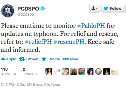
My QCRI colleagues and I are collecting tweets about Typhoon Pablo, which is making landfall in the Philippines. We’re specifically tracking tweets with one or more of the following hashtags: #PabloPh, #reliefPH and #rescuePH, which the government is publicly encouraging Filipinos to use. We hope to carry out an early analysis of these tweets to determine which ones provide situational aware-ness. The purpose of this applied action research is to ultimately develop a real-time dashboard for humanitarian response. This explains why we launched this Library of Crisis Hashtags. For further reading, please see this post on “What Percentage of Tweets Generated During a Crisis Are Relevant for Humanitarian Response?”

To Tweet or Not To Tweet During a Disaster?

Yes, only a small percentage of tweets generated during a disaster are directly relevant and informative for disaster response. No, this doesn’t mean we should dismiss Twitter as a source for timely, disaster-related information. Why? Because our efforts ought to focus on how that small percentage of informative tweets can be increased. What incentives or policies can be put in place? The following tweets by the Filipino government may shed some light.

Gov Twitter Pablo

The above tweet was posted three days before Typhoon Bopha (designated Pablo locally) made landfall in the Philippines. In the tweet below, the government directly and publicly encourages Filipinos to use the #PabloPH hashtag and to follow the Philippine Atmospheric, Geophysical & Astronomical Services Admin-istration (PAGASA) twitter feed, @dost_pagasa, which has over 400,000 follow-ers and also links to this official Facebook page.

Gov Twitter

The government’s official Twitter handle (@govph) is also retweeting tweets posted by The Presidential Communications Development and Strategic Plan-ning Office (@PCDCSO). This office is the “chief message-crafting body of the Office of the President.” In one such retweet (below), the office encourages those on Twitter to use different hashtags for different purposes (relief vs rescue). This mimics the use of official emergency numbers for different needs, e.g., police, fire, Ambulance, etc.

Twitter Pablo Gov

Given this kind of enlightened disaster response leadership, one would certainly expect that the quality of tweets received will be higher than without government endorsement. My team and I at QCRI are planning to analyze these tweets to de-termine whether or not this is the case. In the meantime, I expect we’ll see more examples of self-organized disaster response efforts using these hashtags, as per the earlier floods in August, which I blogged about here: Crowdsourcing Crisis Response following the Philippine Floods. This tech-savvy self-organization dynamic is important since the government itself may be unable to follow up on every tweeted request.

Sentiment Analysis of #COP18 Tweets from the UN Climate Conference

The Qatar Foundation’s Computing Research Institute (QCRI) has just launched a live sentiment analysis tool of all #COP18 tweets being posted during the United Nations (UN) Climate Change Conference in Doha, Qatar. The event kicked off on Monday, November 26th and will conclude on Friday, December 7th. While the world’s media is actively covering COP18, social media reports are equally insightful. This explains the rationale behind QCRI’s Live #COP18 Twitter Sentiment Analysis Tool.

QCRI_COP18_Sentiment_Analysis

The first timeline displays the number of positive versus negative tweets posted with the COP18 hashtag. The tweets are automatically tagged as positive or negative using the SentiStrength algorithm, which has the same level of accuracy as that of a person if s/he were to manually tag the tweets. The second timeline simply depicts the average sentiment of #COP18 tweets. Both graphs are auto-matically updated every hour. Note that tweets in all languages are analyzed, not just English-language tweets.

These timelines enable journalists, activists and others to monitor the general mood and reaction to presentations, announcements & conversations happening at the UN Climate Conference. For example, we see a major spike in positive tweets (and to a lesser extent negative tweets) between 10am-11am on November 26th. This is when the Opening Ceremony kicks off, as can be seen from the conference agenda.

Screen Shot 2012-12-01 at 9.30.25 AM

The next highest peak occurs between 6pm-7pm on the 27th, which corresponds to the opening plenary of the Ad Hoc Working Group on the Durban Platform for Enhanced Action (ADP). This group is tasked with establishing an agreement that will legally bind all parties to climate targets for the first time. The tweets are primarily positive, which may reflect a positive start to negotiations on opera-tionalizing the Durban Platform. This news article appears to support this hypo-thesis. At 2pm time on November 28th, the number of positive and negative tweets both peak at approximately the same number, 160 tweets. Twitter users may be evenly divided on a topic being discussed.

QCRI Sentiment Analysis

To find out more, simply scroll to the right of the timelines. You’ll see two twitter streams displayed. The first provides a list of selected positive and negative tweets. More specifically, the most frequently retweeted positive and negative tweets for each day are displayed. This feature enables users to understand how some tweets are driving the sentiment analyses displayed on the timelines. The second twitter stream displays the most recent tweets on the UN Conference.

If you’re interested in displaying these live graphs on your website, simply click on the “Embed link” to grab the code. The code is free, we simply ask that you credit and link to QCRI. If you analyze #COP18 tweets using these timelines, please let us know so we can benefit from your insights during this pivotal conference. The sentiment analysis dashboard was put together by QCRI’s Sofiane AbbarWalid Magdy and myself. We welcome your feedback on how to make this dashboard more useful for future conferences and events. Please note that this site was put together “overnight”; i.e., it was rushed. As such it is only an initial prototype.

Predicting the Credibility of Disaster Tweets Automatically

“Predicting Information Credibility in Time-Sensitive Social Media” is one of this year’s most interesting and important studies on “information forensics”. The analysis, co-authored by my QCRI colleague ChaTo Castello, will be published in Internet Research and should be required reading for anyone interested in the role of social media for emergency management and humanitarian response. The authors study disaster tweets and find that there are measurable differences in the way they propagate. They show that “these differences are related to the news-worthiness and credibility of the information conveyed,” a finding that en-abled them to develop an automatic and remarkably accurate way to identify credible information on Twitter.

The new study builds on this previous research, which analyzed the veracity of tweets during a major disaster. The research found “a correlation between how information propagates and the credibility that is given by the social network to it. Indeed, the reflection of real-time events on social media reveals propagation patterns that surprisingly has less variability the greater a news value is.” The graphs below depict this information propagation behavior during the 2010 Chile Earthquake.

The graphs depict the re-tweet activity during the first hours following earth-quake. Grey edges depict past retweets. Some of the re-tweet graphs reveal interesting patterns even within 30-minutes of the quake. “In some cases tweet propagation takes the form of a tree. This is the case of direct quoting of infor-mation. In other cases the propagation graph presents cycles, which indicates that the information is being commented and replied, as well as passed on.” When studying false rumor propagation, the analysis reveals that “false rumors tend to be questioned much more than confirmed truths […].”

Building on these insights, the authors studied over 200,000 disaster tweets and identified 16 features that best separate credible and non-credible tweets. For example, users who spread credible tweets tend to have more followers. In addition, “credible tweets tend to include references to URLs which are included on the top-10,000 most visited domains on the Web. In general, credible tweets tend to include more URLs, and are longer than non credible tweets.” Further-more, credible tweets also tend to express negative feelings whilst non-credible tweets concentrate more on positive sentiments. Finally, question- and exclama-tion-marks tend to be associated with non-credible tweets, as are tweets that use first and third person pronouns. All 16 features are listed below.

• Average number of tweets posted by authors of the tweets on the topic in past.
• Average number of followees of authors posting these tweets.
•  Fraction of tweets having a positive sentiment.
•  Fraction of tweets having a negative sentiment.
•  Fraction of tweets containing a URL that contain most frequent URL.
•  Fraction of tweets containing a URL.
•  Fraction of URLs pointing to a domain among top 10,000 most visited ones.
•  Fraction of tweets containing a user mention.
•  Average length of the tweets.
•  Fraction of tweets containing a question mark.
•  Fraction of tweets containing an exclamation mark.
•  Fraction of tweets containing a question or an exclamation mark.
•  Fraction of tweets containing a “smiling” emoticons.
•  Fraction of tweets containing a first-person pronoun.
•  Fraction of tweets containing a third-person pronoun.
•  Maximum depth of the propagation trees.

Using natural language processing (NLP) and machine learning (ML), the authors used the insights above to develop an automatic classifier for finding credible English-language tweets. This classifier had a 86% AUC. This measure, which ranges from 0 to 1, captures the classifier’s predictive quality. When applied to Spanish-language tweets, the classifier’s AUC was still relatively high at 82%, which demonstrates the robustness of the approach.

Interested in learning more about “information forensics”? See this link and the articles below: