Category Archives: Social Computing

Big Data for Disaster Response: A List of Wrong Assumptions

Screen Shot 2013-06-09 at 1.24.56 PM

Derrick Herris puts it best:

“It might be provocative to call into question one of the hottest tech movements in generations, but it’s not really fair. That’s because how companies and people benefit from Big Data, Data Science or whatever else they choose to call the movement toward a data-centric world is directly related to what they expect going in. Arguing that big data isn’t all it’s cracked up to be is a strawman, pure and simple—because no one should think it’s magic to begin with.”

So here is a list of misplaced assumptions about the relevance of Big Data for disaster response and emergency management:

•  “Big Data will improve decision-making for disaster response”

This recent groundbreaking study by the UN confirms that many decisions made by humanitarian professionals during disasters are not based on any kind of empirical data—regardless of how large or small a dataset may be and even when the data is fully trustworthy. In fact, humanitarians often use anecdotal information or mainstream news to inform their decision-making. So no, Big Data will not magically fix these decision-making deficiencies in humanitarian organizations, all of which pre-date the era of Big (Crisis) Data.

•  Big Data suffers from extreme sample bias.”

This is often true of any dataset collected using non-random sampling methods. The statement also seems to suggest that representative sampling methods can actually be carried out just as easily, quickly and cheaply. This is very rarely the case, hence the use of non-random sampling. In other words, sample bias is not some strange disease that only affects Big Data or social media. And even though Big Data is biased and not necessarily objective, Big Data such as social media still represents a “new, large, and arguably unfiltered insights into attitudes and behaviors that were previously difficult to track in the wild.”

digital prints

Statistical correlations in Big Data do not imply causation; they simply suggest that there may be something worth exploring further. Moreover, data that is collected via non-random, non-representative sampling does not invalidate or devalue the data collected. Much of the data used for medical research, digital disease detection and police work is the product of convenience sampling. Should they dismiss or ignore the resulting data because it is not representative? Of course not.

While the 911 system was set up in 1968, the service and number were not widely known until the 1970s and some municipalities did not have the crowdsourcing service until the 1980s. So it was hardly a representative way to collect emergency calls. Does this mean that the millions of 911 calls made before the more widespread adoption of the service in the 1990s were all invalid or useless? Of course not, even despite the tens of millions of false 911 calls and hoaxes that are made ever year. Point is, there has never been a moment in history in which everyone has had access to the same communication technology at the same time. This is unlikely to change for a while even though mobile phones are by far the most rapidly distributed and widespread communication technology in the history of our species.

There were over 20 million tweets posted during Hurricane Sandy last year. While “only” 16% of Americans are on Twitter and while this demographic is younger, more urban and affluent than the norm, as Kate Crawford rightly notes, this does not render the informative and actionable tweets shared during the Hurricane useless to emergency managers. After Typhoon Pablo devastated the Philippines last year, the UN used images and videos shared on social media as a preliminary way to assess the disaster damage. According to one Senior UN Official I recently spoke with, their relief efforts would have overlooked certain disaster-affected areas had it not been for this map.

PHILIPPINES-TYPHOON

Was the data representative? No. Were the underlying images and videos objective? No, they captured the perspective of those taking the pictures. Note that “only” 3% of the world’s population are active Twitter users and fewer still post images and videos online. But the damage captured by this data was not virtual, it was  real damage. And it only takes one person to take a picture of a washed-out bridge to reveal the infrastructure damage caused by a Typhoon, even if all other onlookers have never heard of social media. Moreover, this recent statistical study reveals that tweets are evenly geographically distributed according to the availability of electricity. This is striking given that Twitter has only been around for 7 years compared to the light bulb, which was invented 134 years ago.

•  Big Data enthusiasts suggest doing away with traditional sources of information for disaster response.”

I have yet to meet anyone who earnestly believes this. As Derrick writes, “social media shouldn’t usurp traditional customer service or market research data that’s still useful, nor should the Centers for Disease Control start relying on Google Flu Trends at the expense of traditional flu-tracking methodologies. Web and social data are just one more source of data to factor into decisions, albeit a potentially voluminous and high-velocity one.” In other words, the situation is not either/or, but rather a both/and. Big (Crisis) Data from social media can complement rather than replace traditional information sources and methods.

•  Big Data will make us forget the human faces behind the data.”

Big (Crisis) Data typically refers to user-generated content shared on social media, such as Twitter, Instagram, Youtube, etc. Anyone who follows social media during a disaster would be hard-pressed to forget where this data is coming from, in my opinion. Social media, after all, is social and increasingly visually social as witnessed by the tremendous popularity of Instagram and Youtube during disasters. These help us capture, connect and feel real emotions.

OkeTorn


bio

See also: 

  • “No Data is Better than Bad Data…” Really? [Link]
  • Crowdsourcing and the Veil of Ignorance [Link]

The Geography of Twitter: Mapping the Global Heartbeat

My colleague Kalev Leetaru recently co-authored this comprehensive study on the various sources and accuracies of geographic information on Twitter. This is the first detailed study of its kind. The detailed analysis, which runs some 50-pages long, has important implications vis-a-vis the use of social media in emergency management and humanitarian response. Should you not have the time to analyze the comprehensive study, this blog post highlights the most important and relevant findings.

Kalev et al. analyzed 1.5 billion tweets (collected from the Twitter Decahose via GNIP) between October 23 and November 30th, 2012. This came to 14.3 billion words posted by 35% of all active users at the time. Note that 2.9% of the world’s population are active Twitter users and that 87% of all tweets ever posted since the launch of Twitter in 2006 were posted in the past 24 months alone. On average, Kalev and company found that the lowest number of tweets posted per hour is one million; the highest is 2 million. In addition, almost 50% of all tweets are posted by 5% of users. (Click on images to enlarge).

Tweets

In terms of geography, there are two ways to easily capture geographic data from Twitter. The first is from the location information specified by a user when registering for a Twitter account (selected from a drop down menu of place names). The second, which is automatically generated, is from the coordinates of the Twitter user’s location when tweeting, which is typically provided via GPS or cellular triangulation. On a typical day, about 2.7% of Tweets contain GPS or cellular data while 2.02% of users list a place name when registering (1.4% have both). The figure above displays all GPS/cellular coordinates captured from tweets during the 39 days of study. In contrast, the figure below combines all Twitter locations, adding registered place names and GPS/cellular data (both in red), and overlays this with the location of electric lights (blue) based on satellite imagery obtained from NASA.

Tweets / Electricity

White areas depict locations with an equal balance of tweets and electricity. Red areas reveal a higher density of tweets than night lights while blue areas have more night lights than tweets.” Iran and China show substantially fewer tweets than their electricity levels would suggest, reflecting their bans on Twitter, while India shows strong clustering of Twitter usage along the coast and its northern border, even as electricity use is far more balanced throughout the country. Russia shows more electricity usage in its eastern half than Twitter usage, while most countries show far more Twitter usage than electricity would suggest.”

The Pearson correlation between tweets and lights is 0.79, indicating very high similarity. That is, wherever in the world electricity exists, the chances of there also being Twitter users is very high indeed. That is, tweets are evenly distributed geographically according to the availability of electricity. And so, event though “less than three percent of all tweets having geolocation information, this suggests they could be used as a dynamic reference baseline to evaluate the accuracy of other methods of geographic recovery.” Keep in mind that the light bulb was invented 134 years ago in contrast to Twitter’s short 7-year history. And yet, the correlation is already very strong. This is why they call it an information revolution. Still, just 1% of all Twitter users accounted for 66% of all georeferenced tweets during the period of study, which means that relying purely on these tweets may provide a skewed view of the Twitterverse, particularly over short periods of time. But whether this poses a problem ultimately depends on the research question or task at hand.

Twitter table

The linguistic geography of Twitter is critical: “If English is rarely used outside of the United States, or if English tweets have a fundamentally different geographic profile than other languages outside of the United States, this will significantly skew geocoding results.” As the table below reveals, georeferenced tweets with English content constitute 41.57% of all geo-tagged tweets.

Geo Tweets Language

The data from the above table is displayed geographically below for the European region. See the global map here. “In cases where multiple languages are present at the same coordinate, the point is assigned to the most prevalent language at that point and colored accordingly.” Statistical analyses of geo-tagged English tweets compared to all other languages suggests that “English offers a spatial proxy for all languages and that a geocoding algorithm which processes only English will still have strong penetration into areas dominated by other languages (though English tweets may discuss different topics or perspectives).”

Twitter Languages Europe

Another important source of geographic information is a Twitter user’s bio. This public location information was available for 71% of all tweets studied by Kalev and company. Interestingly, “Approximately 78.4 percent of tweets include the user’s time zone in textual format, which offers an approximation of longitude […].” As Kalev et al. note, “Nearly one third of all locations on earth share their name with another location somewhere else on the planet, meaning that a reference to ‘Urbana’ must be disambiguated by a geocoding system to determine which of the 12 cities in the world it might refer to, including 11 cities in the United States with that name.”

There are several ways to get around this challenging, ranging from developing a Full Text Geocoder to using gazetteers such a Wikipedia Gazetteer and MaxFind which machine translation. Applying the latter has revealed that the “textual geographic density of Twitter changes by more than 53 percent over the course of each day. This has enormous ramifications for the use of Twitter as a global monitoring system, as it suggests that the representativeness of geographic tweets changes considerably depending on time of day.” That said, the success of a monitoring system is solely dependent on spatial data. Temporal factors and deviations from a baseline also enable early detection.  In any event, “The small volume of georeferenced tweets can be dramatically enhanced by applying geocoding algorithms to the textual content and metadata of each tweet.”

Kalet et al. also carried out a comprehensive analysis of geo-tagged retweets. They find that “geography plays little role in the location of influential users, with the volume of retweets instead simply being a factor of the total population of tweets originating from that city.” They also calculated that the average geographical distance between two Twitter users “connected” by retweets (RTs) and who geotag their tweets is about 750 miles or 1,200 kilometers. When a Twitter user references another (@), the average geographical distance between the two is 744 miles. This means that RTs and @’s cannot be used for geo-referencing Twitter data, even when coupling this information with time zone data. The figure below depicts the location of users retweeting other users. The geodata for this comes from the geotagged tweets (rather than account information or profile data).

Map of Retweets

On average, about 15.85% of geo-tagged tweets contain links. The most popular links for these include Foursquare, Instagram, Twitter and Facebook. See my previous blog post on the analysis & value of such content for disaster response. In terms of Twitter geography versus that of mainstream news, Kalev et al. analyzed all news items available via Google News during the same period as the tweets they collected. This came to over 3.3 million articles pointing to just under 165,000 locations. The latter are color-coded red in the data ziv below, while Tweets are blue and white areas denote equal balance of both.

Twitter vs News

“Mainstream media appears to have significantly less coverage of Latin America and vastly better greater of Africa. It also covers China and Iran much more strongly, given their bans on Twitter, as well as having enhanced coverage of India and the Western half of the United States. Overall, mainstream media appears to have more even coverage, with less clustering around major cities.” This suggests “there is a strong difference in the geographic profiles of Twitter and mainstream media and that the intensity of discourse mentioning a country does not necessarily match the intensity of discourse emanating from that country in social media. It also suggests that Twitter is not simply a mirror of mainstream media, but rather has a distinct geographic profile […].”

In terms of future growth, “the Middle East and Eastern Europe account for some of Twitter’s largest new growth areas, while Indonesia, Western Europe, Africa, and Central America have high proportions of the world’s most influential Twitter users.”

Bio

See also:

  • Social Media – Pulse of the Planet? [Link]
  • Big Data for Disaster Response – A list of Wrong Assumptions [Link]
  • A Multi-Indicator Approach for Geolocalization of Tweets [Link]

Analysis of Multimedia Shared in Millions of Tweets After Tornado (Updated)

Humanitarian organizations and emergency management offices are increasingly interested in capturing multimedia content shared on social media during crises. Last year, the UN Office for the Coordination of Humanitarian Affairs (OCHA) activated the Digital Humanitarian Network (DHN) to identify and geotag pictures and videos shared on Twitter that captured the damage caused by Typhoon Pablo, for example. So I’m collaborating with my colleague Hemant Purohit to analyze the multimedia content shared in the millions of tweets posted after the Category 5 Tornado devastated the city of Moore, Oklahoma on May 20th. The results are shared below along with details of a project I am spearheading at QCRI to provide disaster responders with relevant multimedia content in real time during future disasters.

Multimedia_Tornado

For this preliminary multimedia analysis, we focused on the first 48 hours after the Tornado and specifically on the following multimedia sources/types: Twitpic, Instagram, Flickr, JPGs, YouTube and Vimeo. JPGs refers to URLs shared on Twitter that include “.jpg”. Only ~1% of tweets posted during the 2-day period included URLs to multimedia content. We filtered out duplicate URLs to produce the following unique counts depicted above and listed below.

  • Twitpic = 784
  • Instagram = 11,822
  • Flickr = 33
  • JPGs = 347 
  • YouTube = 5,474
  • Vimeo = 88

Clearly, Instagram and Youtube are important sources of multimedia content during disasters. The graphs below (click to enlarge) depict the frequency of individual multimedia types by hour during the first 48 hours after the Tornado. Note that we were only able to collect about 2 million tweets during this period using the Twitter Streaming API but expect that millions more were posted, which is why access to the Twitter Firehose is important and why I’m a strong advocate of Big Data Philanthropy for Humanitarian Response.

Twitpic_Tornado

A comparison of the above Twitpic graph with the Instagram one below suggests very little to no time lag between the two unique streams.

Instagram_Tornado

Clearly Flickr pictures are not widely shared on Twitter during disasters. Only 53 links to Flickr were tweeted compared to 11,822 unique Instagram pictures.

Flickr_Tornado

The sharing of JPG images is more popular than links to Flickr but the total number of uniques still pales in comparison to the number of Instagram pictures.

JPGs_Tornado

The frequency of tweets sharing unique links to Youtube videos does not vary considerably over time.

Youtube_Tornado

In contrast to the large volume of Youtube links shared on twitter, only 88 unique links to Vimeo were shared.

Vimeo_Tornado

Geographic information is of course imperative for disaster response. We collected about 2.7 million tweets during the 10-day period after Tornado and found that 51.23% had geographic data—either the tweet was geo-tagged or the Twitter user’s bio included a location. During the first 48 hours, about 45% of Tweets with links to Twitpic had geographic data; 40% for Flickr and 38% for Instagram . Most digital pictures include embedded geographic information (i.e., the GPS coordinates of the phone or camera, for example). So we’re working on automatically  extracting this information as well.

An important question that arises is which Instagram pictures & Youtube videos actually captured evidence of the damage caused of the Tornado? Of these, which are already geotagged and which could be quickly geotagged manually? The Digital Humanitarian Network was able to answer these questions within 12 hours following the devastating Typhoon that ravaged the Philippines last year (see map below). The reason it took that long is because we spent most of the time customizing the microtasking apps to tag the tweets/links. Moreover, we were looking at every single link shared on twitter, i.e., not just those that linked directly to Instagram, Youtube, etc. We need to do better, and we can.

This is why we’re launching MicroMappers in partnership with the United Nations. MicroMappers are very user-friendly microtasking apps that allows anyone to support humanitarian response efforts with a simple click of the mouse. This means anyone can be a Digital Humanitarian Volunteer. In the case of the Tornado, volunteers could easily have tagged the Instagram pictures posted on Twitter. During Hurricane Sandy, about half-a-million Instagram pictures were shared. This is certainly a large number but other microtasking communities like my friends at Zooniverse tagged millions of pictures in a matter of days. So it is possible.

Incidentally, hundreds of the geo-tagged Instagram pictures posted during the Hurricane captured the same damaged infrastructure across New York, like the same fallen crane, blocked road or a flooded neighborhood. These pictures, taken by multiple eyewitnesses from different angles can easily be “stitched” together to create a 2D or even 3D tableau of the damage. Photosynth (below) already does this stitching automatically for free. Think of Photosynth as Google Street View but using crowdsourced pictures instead. One simply needs to a collection of related pictures, which is what MicroMappers will provide.

Photosynth

Disasters don’t wait. Another major Tornado caused havoc in Oklahoma just yesterday. So we are developing MicroMappers as we speak and plan to test the apps soon. Stay tuned for future blog post updates!

bio

See also: Analyzing 2 Million Disaster Tweets from Oklahoma Tornado [Link]

Crowdsourcing Crisis Information from Syria: Twitter Firehose vs API

Over 400 million tweets are posted every day. But accessing 100% of these tweets (say for disaster response purposes) requires access to Twitter’s “Firehose”. The latter, however, can be prohibitively expensive and also requires serious infrastructure to manage. This explains why many (all?) of us in the Crisis Computing & Humanitarian Technology space use Twitter’s “Streaming API” instead. But how representative are tweets sampled through the API vis-a-vis overall activity on Twitter? This is important question is posed and answered in this new study using Syria as a case study.

Tweets Syria

The analysis focused on “Tweets collected in the region around Syria during the period from December 14, 2011 to January 10, 2012.” The first dataset was collected using Firehose access while the second was sampled from the API. The tag clouds above (click to enlarge) displays the most frequent top terms found in each dataset. The hashtags and geoboxes used for the data collection are listed in the table below.

Syria List

The graph below shows the number of tweets collected between December 14th, 2011 and January 10th, 2012. This amounted 528,592 tweets from the API and 1,280,344 tweets from the Firehose. On average, the API captures 43.5% of tweets available on the Firehose. “One of the more interesting results in this dataset is that as the data in the Firehose spikes, the Streaming API coverage is reduced. One possible explanation for this phenomenon could be that due to the Western holidays observed at this time, activity on Twitter may have reduced causing the 1% threshold to go down.”

Syria Graph

The authors, Fred Morstatter, Jürgen Pfeffer, Huan Liu and Kathleen Carley, also carry out hashtag analysis using each dataset. “Here we see mixed results at small values of n [top hashtags], indicating that the Streaming data may not be good for finding the top hashtags. At larger values of n, we see that the Streaming API does a better job of estimating the top hashtags in the Firehose data.” In addition, the analysis reveals that the “Streaming API data does not consistently find the top hashtags, in some cases revealing reverse correlation with the Firehose data […]. This could be indicative of a filtering process in Twitter’s Streaming API which causes a misrepresentation of top hashtags in the data.”

In terms of social network analysis, the the authors were able to show that “50% to 60% of the top 100 key-players [can be identified] when creating the networks based on one day of Streaming API data.” Aggregating more days’ worth of data “can increase the accuracy substantially. For network level measures, first in-depth analysis revealed interesting correlation between network centralization indexes and the proportion of data covered by the Streaming API.”

Finally, study also compares the geolocation of tweets. More specifically, the authors assess how the “geographic distribution of the geolocated tweets is affected by the sampling performed by the Streaming API. The number of geotagged tweets is low, with only 16,739 geotagged tweets in the Streaming data (3.17%) and 18,579 in the Firehose data (1.45%).” Still, the authors find that “despite the difference in tweets collected on the whole we get 90.10% coverage of geotagged tweets.”

In sum, the study finds that “the results of using the Streaming API depend strongly on the coverage and the type of analysis that the researcher wishes to perform. This leads to the next question concerning the estimation of how much data we actually get in a certain time period.” This is critical if researchers want to place their results into context and potentially apply statistical methods to account (and correct) for bias. The authors suggest that in some cases the Streaming API coverage can be estimated. In future research, they hope to “find methods to compensate for the biases in the Streaming API to provide a more accurate picture of Twitter activity to researchers.” In particularly they want to “determine whether the methodology presented here will yield similar results for Twitter data collected from other domains, such as natural, protest & elections.”

The authors will present their paper at this year’s International Conference on Weblogs and Social Media (ICWSM). So I look forward to meeting them there to discuss related research we are carrying out at QCRI.

bio

 See also:

Results: Analyzing 2 Million Disaster Tweets from Oklahoma Tornado

Thanks to the excellent work carried out by my colleagues Hemant Purohit and Professor Amit Sheth, we were able to collect 2.7 million tweets posted in the aftermath of the Category 4 Tornado that devastated Moore, Oklahoma. Hemant, who recently spent half-a-year with us at QCRI, kindly took the lead on carrying out some preliminary analysis of the disaster data. He sampled 2.1 million tweets posted during the first 48 hours for the analysis below.

oklahoma-tornado-20

About 7% of these tweets (~146,000 tweets) were related to donations of resources and services such as money, shelter, food, clothing, medical supplies and volunteer assistance. Many of the donations-related tweets were informative in nature, e.g.: “As President Obama said this morning, if you want to help the people of Moore, visit [link]”. Approximately 1.3% of the tweets (about 30,000 tweets) referred to the provision of financial assistance to the disaster-affected population. Just over 400 unique tweets sought non-monetary donations, such as “please help get the word out, we are accepting kid clothes to send to the lil angels in Oklahoma.Drop off.

Exactly 152 unique tweets related to offers of help were posted within the first 48 hours of the Tornado. The vast majority of these were asking how to get involved in helping others affected by the disaster. For example: “Anyone know how to get involved to help the tornado victims in Oklahoma??#tornado #oklahomacity” and “I want to donate to the Oklahoma cause shoes clothes even food if I can.” These two offers of help are actually automatically “matchable”, making the notion of a “Match.com” for disaster response a distinct possibility. Indeed, Hemant has been working with my team and I at QCRI to develop algorithms (classifiers) that not only identify relevant needs/offers from Twitter automatically but also suggests matches as a result.

Some readers may be suprised to learn that “only” several hundred unique tweets (out of 2+million) were related to needs/offers. The first point to keep in mind is that social media complements rather than replaces traditional information sources. All of us working in this space fully recognize that we are looking for the equivalent of needles in a haystack. But these “needles” may contain real-time, life-saving information. Second, a significant number of disaster tweets are retweets. This is not a negative, Twitter is particularly useful for rapid information dissemination during crises. Third, while there were “only” 152 unique tweets offering help, this still represents over 130 Twitter users who were actively seeking ways to help pro bono within 48 hours of the disaster. Plus, they are automatically identifiable and directly contactable. So these volunteers could also be recruited as digital humanitarian volunteers for MicroMappers, for example. Fourth, the number of Twitter users continues to skyrocket. In 2011, Twitter had 100 million monthly active users. This figure doubled in 2012. Fifth, as I’ve explained here, if disaster responders want to increase the number of relevant disaster tweets, they need to create demand for them. Enlightened leadership and policy is necessary. This brings me to point six: we were “only” able to collect ~2 million tweets but suspect that as many as 10 million were posted during the first 48 hours. So humanitarian organizations along with their partners need access to the Twitter Firehose. Hence my lobbying for Big Data Philanthropy.

Finally, needs/offers are hardly the only type of useful information available on Twitter during crises, which is why we developed several automatic classifiers to extract data on: caution and advice, infrastructure damage, casualties and injuries, missing people and eyewitness accounts. In the near future, when our AIDR platform is ready, colleagues from the American Red Cross, FEMA, UN, etc., will be able create their own classifiers on the fly to automatically collect information that is directly relevant to them and their relief operations. AIDR is spearheaded by QCRI colleague ChaTo and myself.

For now though, we simply emailed relevant geo-tagged and time-stamped data on needs/offers to colleagues at the American Red Cross who had requested this information. We also shared data related to gas leaks with colleagues at FEMA and ESRI, as per their request. The entire process was particularly insightful for Hemant and I, so we plan to follow up with these responders to learn how we can best support them again until AIDR becomes operational. In the meantime, check out the Twitris+ platform developed by Amit, Hemant and team at Kno.e.sis

bio

See also: Analysis of Multimedia Shared on Twitter After Tornado [Link

Data Science for Social Good and Humanitarian Action

My (new) colleagues at the University of Chicago recently launched a new and exciting program called “Data Science for Social Good”. The program, which launches this summer, will bring together dozens top-notch data scientists, computer scientists an social scientists to address major social challenges. Advisors for this initiative include Eric Schmidt (Google), Raed Ghani (Obama Administration) and my very likable colleague Jake Porway (DataKind). Think of “Data Science for Social Good” as a “Code for America” but broader in scope and application. I’m excited to announce that QCRI is looking to collaborate with this important new program given the strong overlap with our Social Innovation Vision, Strategy and Projects.

My team and I at QCRI are hoping to mentor and engage fellows throughout the summer on key humanitarian & development projects we are working on in partnership with the United Nations, Red Cross, World Bank and others. This would provide fellows with the opportunity to engage in  “real world” challenges that directly match their expertise and interests. Second, we (QCRI) are hoping to replicate this type of program in Qatar in January 2014.

Why January? This will give us enough time to design the new program based on the result of this summer’s experiment. More importantly, perhaps, it will be freezing in Chicago ; ) and wonderfully warm in Doha. Plus January is an easier time for many students and professionals to take “time off”. The fellows program will likely be 3 weeks in duration (rather than 3 months) and will focus on applying data science to promote social good projects in the Arab World and beyond. Mentors will include top Data Scientists from QCRI and hopefully the University of Chicago. We hope to create 10 fellowship positions for this Data Science for Social Good program. The call for said applications will go out this summer, so stay tuned for an update.

bio

Artificial Intelligence for Monitoring Elections (AIME)

Citizen-based, crowdsourced election observation initiatives are on the rise. Leading election monitoring organizations are also looking to leverage citizen-based reporting to complement their own professional election monitoring efforts. Meanwhile, the information revolution continues apace, with the number of new mobile phone subscriptions up by over 1 billion in just the past 36 months alone. The volume of election-related reports generated by “the crowd” is thus expected to grow significantly in the coming years. But international, national and local election monitoring organizations are completely unprepared to deal with the rise of Big (Election) Data.

Liberia2011

The purpose of this collaborative research project, AIME, is to develop a free and open source platform to automatically filter relevant election reports from the crowd. The platform will include pre-defined classifiers (e.g., security incidents,  intimidation, vote-buying, ballot stuffing etc.) for specific countries and will also allow end-users to create their own classifiers on the fly. The project, launched by QCRI and several key partners, will specifically focus on unstructured user-generated content from SMS and Twitter. AIME partners include a major international election monitoring organization and several academic research centers. The AIME platform will use the technology being developed for QCRI’s AIDR project: Artificial Intelligence for Disaster Response.

Bio

  • Acknowledgements Fredrik Sjoberg kindly provided the Uchaguzi data which he scraped from the public website at the time.
  • Qualification: Professor Michael Best has rightly noted that these preliminary results are overstated given that the machine learning analysis was carried out on corpus of pre-structured reports.

Self-Organized Crisis Response to #BostonMarathon Attack

I’m going to keep this blog post technical because the emotions from yesterday’s events are still too difficult to deal with. Within an hour of the bombs going off, I received several emails asking me to comment on the use of social media in Boston and how it differed to the digital humanitarian response efforts I am typically engaged in. So here are just a few notes, nothing too polished, but some initial reactions.

I Stand with Boston

Once again, we saw the outpouring of operational support from the “Crowd” with over two thousand people in the Boston area volunteering to take people in if they needed help, and this within 60 minutes of the attack. This was coordinated via a Google Spreadsheet & Google Form. This is not the first time that these web-based solutions were used for disaster response. For example, Google Spreadsheets was used to coordinate grassroots response efforts during the major Philippine floods in 2012.

We’re not all affected the same way during a crisis and those of us who are less affected almost always look for ways to help. Unlike the era of television broadcasting, the crowd can now become an operational actor in disaster response. To be sure, paid disaster response professionals cannot be everywhere at the same time, but the crowd is always there. This explains I have look called for a “Match.com for disaster response” to match local needs with local resources. So while I received numerous pings on Twitter, Skype and email about launching a crisis map for Boston, I am skeptical that doing so would have added much value.

What was/is needed is real-time filtering of social media content and matching of local needs (information and material needs) with local resources. There are two complementary ways to do this: human computing (e.g., crowdsourcing, microtasking, etc) and machine computing (natural language processing, machine learning, etc), which is why my team and I at QCRI are working on developing these solutions.

Other observations from the response to yesterday’s tragedy:

  • Boston Police made active use of their Twitter account to inform and advise. They also asked other Twitter users to spread their request for everyone to leave the city center area. The police and other emergency services also actively crowdsourced photographs and video footage to begin their criminal investigations. There was such heavy multimedia social media activity in the area that one could no doubt develop a Photosynth rendering of the scene.
  • There were calls for residents to unlock their Wifi networks to enable people in the streets to get access to the Internet. This was especially important after the cellphone network was taken offline for security reasons. To be sure, access to information is equally important as access to water, food, shelter, etc, during a crisis.

I’d welcome any other observation from readers, e.g., similarities and differences between the use of technologies for domestic emergency management versus international humanitarian efforts. I would also be interested to hear thoughts about how the two could be integrated or at the very least learn from each other.

bio

Humanitarianism in the Network Age: Groundbreaking Study

My colleagues at the United Nations Office for the Coordination of Humanitarian Affairs (OCHA) have just published a groundbreaking must-read study on Humanitarianism in the Network Age; an important and forward-thinking policy document on humanitarian technology and innovation. The report “imagines how a world of increasingly informed, connected and self-reliant communities will affect the delivery of humanitarian aid. Its conclusions suggest a fundamental shift in power from capital and headquarters to the people [that] aid agencies aim to assist.” The latter is an unsettling prospect for many. To be sure, Humanitarianism in the Network Age calls for “more diverse and bottom-up forms of decision-making—something that most Governments and humanitarian organizations were not designed for. Systems constructed to move information up and down hierarchies are facing a new reality where information can be generated by any-one, shared with anyone and acted by anyone.”

Screen Shot 2013-04-04 at 10.35.40 AM

The purpose of this blog post (available as a PDF) is to summarize the 120-page OCHA study. In this summary, I specifically highlight the most important insights and profound implications. I also fill what I believe are some of the report’s most important gaps. I strongly recommend reading the OCHA publication in full, but if you don’t have time to leaf through the study, reading this summary will ensure that you don’t miss a beat. Unless otherwise stated, all quotes and figures below are taken directly from the OCHA report.

All in all, this is an outstanding, accurate, radical and impressively cross-disciplinary study. In fact, what strikes me most about this report is how far we’ve come since the devastating Haiti Earthquake of 2010. Just three short years ago, speaking the word “crowdsourcing” was blasphemous, like “Voldermort” (for all you Harry Potter fans). This explains why some humanitarians called me the CrowdSorcerer at the time (thinking it was a derogatory term). CrisisMappers was only launched three months before Haiti. The Standby Volunteer Task Force (SBTF) didn’t even exist at the time and the Digital Humanitarian Network (DHN) was to be launched 2 years hence. And here we are, just three short years later, with this official, high-profile humanitarian policy document that promotes crowdsourcing, digital humanitarian response and next generation humanitarian technology. Exciting times. While great challenges remain, I dare say we’re trying our darned best to find some solutions, and this time through collaboration, CrowdSorcerers and all. The OCHA report is a testament to this collaboration.

Screen Shot 2013-04-04 at 10.43.15 AM

Summary

the Rise of big (crisis) data

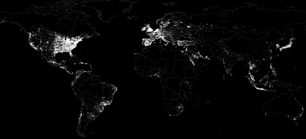
Over 100 countries have more mobile phone subscriptions than they have people. One in four individuals in developing countries use the Internet. This figure will double within 20 months. About 70% of Africa’s total population are mobile subscribers. In short, “The planet has gone online, producing and sharing vast quantities of information.” Meanwhile, however, hundreds of millions of people are affected by disasters every year—more than 250 million in 2010 alone. There have been over 1 billion new mobile phone subscriptions since 2010. In other words, disaster affected communities are becoming increasingly “digital” as a result of the information revolution. These new digital technologies continue are evolving new nervous system for our planet, taking the pulse of our social, economic and political networks in real-time.

“Filipinos sent an average of 2 billion SMS messages every day in early 2012,” for example. When disaster strikes, many of these messages are likely to relay crisis information. In Japan, over half-a-million new users joined Twitter the day after the 2011 Earthquake. More than 177 million tweets about the disaster were posted that same day—that is, 2,000 tweets per second on average. Welcome to “The Rise of Big (Crisis) Data.” Meanwhile, back in the US, 80% of the American public expects emergency responders to monitor social media; and almost as many expect them to respond within three hours of posting a request on social media (1). These expectations have been shown to increase year-on year. “At the same time,” however, the OCHA report notes that “there are greater numbers of people […] who are willing and able to respond to needs.”

communities first

A few brave humanitarian organizations are embracing these changes and new realities, “reorienting their approaches around the essential objectives of helping people to help themselves.” That said, “the frontline of humanitarian action has always consisted of communities helping themselves before outside aid arrives.” What is new, however, is “affected people using technology to communicate, interact with and mobilize their social networks quicker than ever before […].” To this end, “by rethinking how aid agencies work and communicate with people in crisis, there is a chance that many more lives can be saved.” In sum, “the increased reach of communications networks and the growing network of people willing and able to help, are defining a new age—a network age—for humanitarian assistance.”

This stands in stark contrast to traditional notions of humanitarian assistance, which refer to “a small group of established international organizations, often based in and funded by high-income countries, providing help to people in a major crisis. This view is now out of date.” As my colleague Tim McNamara noted on the CrisisMappers list-serve, (cited in the OCHA report), this is “…not simply a technological shift [but] also a process of rapid decentralization of power. With extremely low barriers to entry, many new entrants are appearing in the fields of emergency and disaster response. They are ignoring the traditional hierarchies, because the new entrants perceive that there is something they can do which benefits others.” In other words, the humanitarian “world order” is shifting towards a more multipolar system. And so, while Tim was “referring to the specific case of volunteer crisis mappers […], the point holds true across all types of humanitarian work.”

Take the case of Somalia Speaks, for example. A journalist recently asked me to list the projects I am most proud of in this field. Somalia Speaks ranks very high. I originally pitched the idea to my Al-Jazeera colleagues back in September 2011; the project was launched three months later. Together with my colleagues at Souktelwe texted 5,000 Somalis across the country to ask how were personally affected by the crisis.

SomaliaSpeaksPic

As the OCHA study notes, we received over 3,000 responses, which were translated into English and geotagged by the Diaspora and subsequently added to a crisis map hosted on the Al-Jazeera website. From the OCHA report: “effective communication can also be seen as an end itself in promoting human dignity. More than 3,000 Somalis responded to the Somalia Speaks project, and they seemed to feel that speaking out was a worthwhile activity.” In sum, “The Somalia Speaks project enabled the voices of people from one of the world’s most inaccessible, conflict-ridden areas, in a language known to few outside their community, to be heard by decision makers from across the planet.” The project has since been replicated several times; see Uganda Speaks for example. The OCHA study refers to Somalia Speaks at least four times, highlighting the project as an example of networked humanitarianism.

PRIVACY, SECURITY & PROTECTION

The report also emphasizes the critical importance of data security, privacy and protection in the network age. OCHA’s honest and balanced approach to the topic is another reason why this report is so radical and forward thinking. “Concern over the protection of information and data is not a sufficient reason to avoid using new communications technologies in emergencies, but it must be taken into account. To adapt to increased ethical risks, humanitarian responders and partners need explicit guidelines and codes of conduct for managing new data sources.” This is precisely why I worked with GSMA’s Disaster Response Program to draft and publish the first ever Code of Conduct for the Use of SMS in Disaster Response. I have also provided extensive feedback to the International Committee of the Red Cross’s (ICRC) latest edition of the “Professional Standards for Protection Work,” which was just launched in Geneva this month. My colleagues Emmanuel Letouzé and Patrick Vinck also included a section on data security and ethics in our recent publication on the use of Big Data for Conflict Prevention. In addition, I have blogged about this topic quite a bit: herehere and here, for example.

crisis in decision making

“As the 2010 Haiti crisis revealed, the usefulness of new forms of information gathering is limited by the awareness of responders that new data sources exist, and their applicability to existing systems of humanitarian decision-making.” The fact of the matter is that humanitarian decision-making structures are simply not geared towards using Big Crisis Data let alone new data sources. More pointedly, however, humanitarian decision-making processes are often not based on empirical data in the first place, even when the data originate from traditional sources. As DfID notes in this 2012 strategy document, “Even when good data is available, it is not always used to inform decisions. There are a number of reasons for this, including data not being available in the right format, not widely dispersed, not easily accessible by users, not being transmitted through training and poor information management. Also, data may arrive too late to be able to influence decision-making in real time operations or may not be valued by actors who are more focused on immediate action.”

This is the classic warning-response gap, which has been discussed ad nauseum for decades in the field of famine early warning systems and conflict early warning systems. More data in no way implies action. Take the 2011 Somalia Famine, which was one of the best documented crises yet. So the famine didn’t occur because data was lacking. “Would more data have driven a better decision making process that could have averted disaster? Unfortunately, this does not appear to be the case. There had, in fact, been eleven months of escalating warnings emanating from the famine early warning systems that monitor Somalia. Somalia was, at the time, one of the most frequently surveyed countries in the world, with detailed data available on malnutrition prevalence, mortality rates, and many other indicators. The evolution of the famine was reported in almost real time, yet there was no adequate scaling up of humanitarian intervention until too late” (2).

At other times, “Information is sporadic,” which is why OCHA notes that “decisions can be made on the basis of anecdote rather than fact.” Indeed, “Media reports can significantly influence allocations, often more than directly transmitted community statements of need, because they are more widely read or better trusted.” (It is worth keeping in mind that the media makes mistakes; the New York Times alone makes over 7,000 errors every year). Furthermore, as acknowledged, by OCHA, “The evidence suggests that new information sources are no less representative or reliable than more traditional sources, which are also imperfect in crisis settings.” This is one of the most radical statements in the entire report. OCHA should be applauded for their remarkable fortitude in plunging into this rapidly shifting information landscape. Indeed, they go on to state that, “Crowdsourcing has been used to validate information, map events, translate text and integrate data useful to humanitarian decision makers.”

Screen Shot 2013-04-04 at 10.40.50 AM

The vast major of disaster datasets are not perfect, regardless of whether they are drawn from traditional or non-traditional sources. “So instead of criticizing the lack of 100% data accuracy, we need to use it as a base and ensure our Monitoring and Evaluation (M&E) and community engagement pieces are strong enough to keep our programming relevant” (Bartosiak 2013). And so, perhaps the biggest impact of new technologies and recent disasters on the humanitarian sector is the self disrobing of the Emperor’s Clothes (or Data). “Analyses of emergency response during the past five years reveal that poor information management has severely hampered effective action, costing many lives.” Disasters increasingly serve as brutal audits of traditional humanitarian organizations; and the cracks are increasingly difficult to hide in an always-on social media world. The OCHA study makes clear that  decision-makers need to figure out “how to incorporate these sources into decisions.”

Fact is, “To exploit the opportunity of the network age, humanitarians must understand how to use the new range of available data sources and have the capacity to transform this data into useful information.” Furthermore, it is imperative “to ensure new partners have a better understanding of how [these] decisions are made and what information is useful to improve humanitarian action.” These new partners include the members of the Digital Humanitarian Network (DHN), for example. Finally, decision-makers also need to “invest in building analytic capacity across the entire humanitarian network.” This analytic capacity can no longer rest on manual solutions alone. The private sector already makes use of advanced computing platforms for decision-making purposes. The humanitarian industry would be well served to recognize that their problems are hardly unique. Of course, investing in greater analytic capacity is an obvious solution but many organizations are already dealing with limited budgets and facing serious capacity constraints. I provide some creative solutions to this challenge below, which I refer to as “Data Science Philanthropy“.

Commentary

Near Perfection

OCHA’s report is brilliant, honest and forward thinking. This is by far the most important official policy document yet on humanitarian technology and digital humanitarian response—and thus on the very future of humanitarian action. The study should be required reading for everyone in the humanitarian and technology communities, which is why I plan to organize a panel on the report at CrisisMappers 2013 and will refer to the strategy document in all of my forthcoming talks and many a future blog post. In the meantime, I would like to highlight and address a some of the issues that I feel need to be discussed to take this discussion further.

Ironically, some of these gaps appear to reflect a rather limited understanding of advanced computing & next generation humanitarian technology. The following topics, for example, are missing from the OCHA report: Microtasking, Sentiment Analysis and Information Forensics. In addition, the report does not relate OCHA’s important work to disaster resilience and people-centered early warning. So I’m planning to expand on the OCHA report in the technology chapter for this year’s World Disaster Report (WDR 2013). This high-profile policy document is an ideal opportunity to amplify OCHA’s radical insights and to take these to their natural and logical conclusions vis-à-vis Big (Crisis) Data. To be clear, and I must repeat this, the OCHA report is the most important forward thinking policy document yet on the future of humanitarian response. The gaps I seek to fill in no way make the previous statement any less valid. The team at OCHA should be applauded, recognized and thanked for their tremendous work on this report. So despite some of the key shortcomings described below, this policy document is by far the most honest, enlightened and refreshing look at the state of the humanitarian response today; a grounded and well-researched study that provides hope, leadership and a clear vision for the future of humanitarianism in the network age.

BIG DATA HOW

OCHA recognizes that “there is a significant opportunity to use big data to save lives,” and they also get that, “finding ways to make big data useful to humanitarian decision makers is one of the great challenges, and opportunities, of the network age.” Moreover, they realize that “While valuable information can be generated anywhere, detecting the value of a given piece of data requires analysis and understanding.” So they warn, quite rightly, that “the search for more data can obscure the need for more analysis.” To this end, they correctly conclude that “identifying the best uses of crowdsourcing and how to blend automated and crowdsourced approaches is a critical area for study.” But the report does not take these insights to their natural and logical conclusions. Nor does the report explore how to tap these new data sources let alone analyze them in real time.

Yet these Big Data challenges are hardly unique. Our problems in the humanitarian space are not that “special” or  different. OCHA rightly notes that “Understanding which bits of information are valuable to saving lives is a challenge when faced with this ocean of data.” Yes. But such challenges have been around for over a decade in other disciplines. The field of digital disease detection, for example, is years ahead when it comes to real-time analysis of crowdsourced big data, not to mention private sector companies, research institutes and even new startups whose expertise is Big Data Analytics. I can also speak to this from my own professsional experience. About a decade ago, I worked with a company specializing in conflict forecasting and early using Reuters news data (Big Data).

In sum, the OCHA report should have highlighted the fact that solutions to many of these Big Data challenges already exist, which is precisely why I joined the Qatar Computing Research Institute (QCRI). What’s more, a number of humanitarian technology projects at QCRI are already developing prototypes based on these solutions; and OCHA is actually the main partner in one such project, so it is a shame they did not get credit for this in their own report.

sentiment analysis

While I introduced the use of sentiment analysis during the Haiti Earthquake, this has yet to be replicated in other humanitarian settings. Why is sentiment analysis key to humanitarianism in the network age? The answer is simple: “Communities know best what works for them; external actors need to listen and model their response accordingly.” Indeed, “Affected people’s needs must be the starting point.” Actively listening to millions of voices is a Big Data challenge that has already been solved by the private sector. One such solution is real-time sentiment analysis to capture brand perception. This is a rapidly growing multimillion dollar market, which is why many companies like Crimson Hexagon exist. Numerous Top 500 Fortune companies have been actively using automated sentiment analysis for years now. Why? Because these advanced listening solutions enable them to better understand customer perceptions.

Screen Shot 2013-04-08 at 5.49.56 AM

In Haiti, I applied this approach to tens of thousands of text messages sent by the disaster-affected population. It allowed us to track the general mood of this population on a daily basis. This is important because sentiment analysis as a feedback loop works particularly well with Big Data, which explains why the private sector is all over it. If just one or two individuals in a community are displeased with service delivery during a disaster, they may simply be “an outlier”  or perhaps exaggerating. But if the sentiment analysis at the community level suddenly starts to dip, then this means hundreds, perhaps thousands of affected individuals are now all feeling the same way about a situation. In other words, sentiment analysis serves as a triangulating mechanism. The fact that the OCHA report makes no mention of this existing solution is unfortunate since sentiment feedback loops enable organizations to assess the impact of their interventions by capturing their clients’ perceptions.

Information forensics

“When dealing with the vast volume and complexity of information available in the network age, understanding how to assess the accuracy and utility of any data source becomes critical.” Indeed, and the BBC’s User-Generated Content (UGC) Hub has been doing just this since 2005—when Twitter didn’t even exist. The field of digital information forensics may be new to the humanitarian sector, but that doesn’t mean it is new to every other sector on the planet. Furthermore, recent research on crisis computing has revealed that the credibility of social media reporting can be modeled and even predicted. Twitter has even been called a “Truth Machine” because of the self-correcting dynamic that has been empirically observed. Finally, one of QCRI’s humanitarian technology projects, Verily, focuses precisely on the issue of verifying crowdsourced social media information from social media. And the first organization I reached out to for feedback on this project was OCHA.

microtasking

The OCHA report overlooks microtasking as well. Yes, the study does address and promote the use of crowdsourcing repeatedly, but again, this  tends to focus on the collection of information rather than the processing of said information. Microtasking applications in the humanitarian space are not totally unheard of, however. Microtasking was used to translate and geolocate tens of thousands of text messages following the Haiti Earthquake. (As the OCHA study notes, “some experts estimated that 90 per cent [of the SMS’s] were ‘repetition’, or ‘white noise’, meaning useless chatter”). There have been several other high profile uses of microtasking for humanitarian operations such as this one thanks to OCHA’s leadership in response to Typhoon Pablo. In sum, microtasking has been used extensively in other sectors to manage the big data and quality control challenge for many years now. So this important human computing solution really ought to have appeared in the OCHA report along with the immense potential of microtasking humanitarian information using massive online multiplayer games (more here).

Open Data is Open Power

OCHA argues that “while information can be used by anyone, power remains concentrated in the hands of a limited number of decision makers.” So if the latter “do not use this information to make decisions in the interests of the people they serve, its value is lost.” I don’t agree that the value is lost. One of the reports’ main themes is the high-impact agency and ingenuity of disaster-affected communities. As OCHA rightly points out, “The terrain is continually shifting, and people are finding new and brilliant ways to cope with crises every day.” Openly accessible crisis information posted on social media has already been used by affected populations for almost a decade now. In other words, communities affected by crises are (quite rightly) taking matters into their own hands in today’s networked world—just like they did in the analog era of yesteryear. As noted earlier, “affected people [are] using technology to communicate, interact with and mobilize their social networks quicker than ever before […].” This explains why “the failure to share [information] is no longer a matter of institutional recalcitrance: it can cost lives.”

creative partnerships

The OCHA study emphasizes that “Humanitarian agencies can learn from other agencies, such as fire departments or militaries, on how to effectively respond to large amounts of often confusing information during a fast-moving crisis.” This is spot on. Situational awareness is first and foremost a military term. The latest Revolution in Military Affairs (RMA) provides important insights into the future of humanitarian technology—see these recent developments, for example. Mean-while, the London Fire Brigade has announced plans to add Twitter as a communication channel, which means city residents will have the option of reporting a fire alert via Twitter. Moreover, the 911 service in the US (999 in the UK) is quite possibly the oldest and longest running crowdsourced emergency service in the world. So there much that humanitarian can learn from 911. But the fact of the matter is that most domestic emergency response agencies are completely unprepared to deal with the tidal wave of Big (Crisis) Data, which is precisely why the Fire Department of New York City (FDNY) and San Francisco City’s Emergency Response Team have recently reached out to me.

Screen Shot 2013-04-04 at 11.08.13 AM

But some fields are way ahead of the curve. The OCHA report should thus have pointed to crime mapping and digital disease detection since these fields have more effectively navigated the big data challenge. As for the American Red Cross’s Digital Operations Center, the main technology they are using, Radian6, has been used by private sector clients for years now. And while the latter can afford the very expensive licensing fees, it is unlikely that cash-strapped domestic emergency response officers and international humanitarian organizations will ever be able to afford these advanced solutions. This is why we need more than just “Data Philanthropy“.

We also need “Data Science Philanthropy“. As the OCHA report states, decision-makers need to “invest in building analytic capacity across the entire humanitarian network.” This is an obvious recommendation, but perhaps not particularly realistic given the limited budgets and capacity constraints in the humanitarian space. This means we need to create more partnerships with Data Science groups like DataKind, Kaggle and the University of Chicago’s Data Science for Social Good program. I’m in touch with these groups and others for this reason. I’ve also been (quietly) building a global academic network called “Data Science for Humanitarian Action” which will launch very soon. Open Source solutions are also imperative for building analytic capacity, which is why the humanitarian technology platforms being developed by QCRI will all be Open Source and freely available.

DISASTER RESILIENCE

This points to the following gap in the OCHA report: there is no reference whatsoever to resilience. While the study does recognize that collective self-help behavior is typical in disaster response and should be amplified, the report does not make the connection that this age-old mutual-aid dynamic is the humanitarian sector’s own lifeline during a major disaster. Resilience has to do with a community’s capacity for self-organization. Communication technologies increasingly play a pivotal role in self-organization. This explains why disaster preparedness and disaster risk reduction programs ought to place greater emphasis on building the capacity of at-risk communities to self-organize and mitigate the impact of disasters on their livelihoods. More about this here. Creating resilience through big data is also more academic curiosity, as explained here.

DECENTRALIZING RESPONSE

As more and more disaster-affected communities turn to social media in time of need, “Governments and responders will soon need answers to the questions: ‘Where were you? We Facebooked/tweeted/texted for help, why didn’t someone come?'” Again, customer support challenges are hardly unique to the humanitarian sector. Private sector companies have had to manage parallel problems by developing more advanced customer service platforms. Some have even turned to crowdsourcing to manage customer support. I blogged about this here to drive the point home that solutions to these humanitarian challenges already exist in other sectors.

Yes, that’s right, I am promoting the idea of crowdsourcing crisis response. Fact is, disaster response has always been crowdsourced. The real first responders are the disaster affected communities themselves. Thanks to new technologies, this crowdsourced response can be accelerated and made more efficient. And yes, there’s an app (in the making) for that: MatchApp. This too is a QCRI humanitarian technology project (in partnership with MIT’s Computer Science and Artificial Intelligence Lab). The purpose of MatchApp is to decentralize disaster response. After all, the many small needs that arise following a disaster rarely require the attention of paid and experienced emergency responders. Furthermore, as a colleague of mine at NYU shared based on her disaster efforts following Hurricane Sandy, “Solving little challenges can make the biggest differences” for disaster-affected communities.

As noted above, more and more individuals believe that emergency responders should monitor social media during disasters and respond accordingly. This is “likely to increase the pressure on humanitarian responders to define what they can and cannot provide. The extent of communities’ desires may exceed their immediate life-saving needs, raising expectations beyond those that humanitarian responders can meet. This can have dangerous consequences. Expectation management has always been important; it will become more so in the network age.”

Screen Shot 2013-04-04 at 11.20.15 AM

PEOPLE-CENTERED

“Community early warning systems (CEWS) can buy time for people to implement plans and reach safety during a crisis. The best CEWS link to external sources of assistance and include the pre-positioning of essential supplies.” At the same time, “communities do not need to wait for information to come from outside sources, […] they can monitor local hazards and vulnerabilities themselves and then shape the response.” This sense and shaping capacity builds resilience, which explains why “international humanitarian organizations must embrace the shift of warning systems to the community level, and help Governments and communities to prepare for, react and respond to emergencies using their own resources and networks.”

This is absolutely spot on and at least 7 years old as far as  UN policy goes. In 2006, the UN’s International Strategy for Disaster Risk Reduction (UNISDR) published this policy document advocating for a people-centered approach to early warning and response systems. They defined the purpose of such as systems as follows:

“… to empower individuals and communities threatened by hazards to act in sufficient time and in an appropriate manner so as to reduce the possibility of personal injury, loss of life, damage to property and the environment, and loss of livelihoods.”

Unfortunately, the OCHA report does not drive these insights to their logical conclusion. Disaster-affected communities are even more ill-equipped to manage the rise of Big (Crisis) Data. Storing, let alone analyzing Big Data Analytics in real-time, is a major technical challenge. As noted here vis-à-vis Big Data Analytics on Twitter, “only corporate actors and regulators—who possess both the intellectual and financial resources to succeed in this race—can afford to participate […].” Indeed, only a handful of research institutes have the technical ability and large funding base carry out the real-time analysis of Big (Crisis) Data. My team and I at QCRI, along with colleagues at UN Global Pulse and GSMA are trying to change this. In the meantime, however, the “Big Data Divide” is already here and very real.

information > Food

“Information is not water, food or shelter; on its own, it will not save lives. But in the list of priorities, it must come shortly after these.” While I understand the logic behind this assertion, I consider it a step back, not forward from the 2005 World Disaster Report (WDR 2005), which states that “People need information as much as water, food, medicine or shelter. Information can save lives, livelihoods and resources.” In fact, OCHA’s assertion contradicts an earlier statement in the report; namely that “information in itself is a life-saving need for people in crisis. It is as important as water, food and shelter.” Fact is: without information, how does one know where/when and from whom clean water and food might be available? How does one know which shelters are open, whether they can accommodate your family and whether the road to the shelter is safe to drive on?

Screen Shot 2013-04-08 at 5.39.51 AM

OCHA writes that, “Easy access to data and analysis, through technology, can help people make better life-saving decisions for themselves and mobilize the right types of external support. This can be as simple as ensuring that people know where to go and how to get help. But to do so effectively requires a clear understanding of how information flows locally and how people make decisions.” In sum, access to information is paramount, which means that local communities should have easy access to next generation humanitarian technologies that can manage and analyze Big Crisis Data. As a seasoned humanitarian colleague recently told me, “humanitarians sometimes have a misconception that all aid and relief comes through agencies.  In fact, (especially with things such a shelter) people start to recover on their own or within their communities. Thus, information is vital in assuring that they do this safely and properly.  Think of the Haiti, build-back-better campaign and the issues with cholera outbreaks.”

Them not us

The technologies of the network age should not be restricted to empowering second- and third-level responders. Unfortunately, as OCHA rightly observes, “there is still a tendency for people removed from a crisis to decide what is best for the people living through that crisis.” Moreover, these paid responders cannot be everywhere at the same time. But the crowd is always there. And as OCHA points out, there are “growing groups of people willing able to help those in need;” groups that unlike their analog counterparts of yesteryear now operate in the “network age with its increased reach of communications networks.” So information is not simply or “primarily a tool for agencies to decide how to help people, it must be understood as a product, or service, to help affected communities determine their own priorities.” Recall the above definition of people-centered early warning. This definition does not all of a sudden become obsolete in the network age. The purpose of next generation technologies is to “empower individuals and communities threatened by hazards to act in sufficient time and in an appropriate manner so as to reduce the possibility of personal injury, loss of life, damage to property and the environment, and loss of livelihoods.”

Screen Shot 2013-04-08 at 5.36.05 AM

Digital humanitarian volunteers are also highly unprepared to deal with the rise of Big Crisis Data, even though they are at the frontlines and indeed the pioneers of digital response. This explains why the Standby Volunteer Task Force (SBTF), a network of digital volunteers that OCHA refers to half-a-dozen times throughout the report, are actively looking to becoming early adopters of next generation humanitarian technologies. Burn out is a serious issue with digital volunteers. They too require access to these next generation technologies, which is precisely why the American Red Cross equips their digital volunteers with advanced computing platforms as part of their Digital Operations Center. Unfortunately, some humanitarians still think that they can just as easily throw more (virtual) volunteers at the Big Crisis Data challenge. Not only are they terribly misguided but also insensitive, which is why, As OCHA notes, “Using new forms of data may also require empowering technical experts to overrule the decisions of their less informed superiors.” As the OCHA study concludes, “Crowdsourcing is a powerful tool, but ensuring that scarce volunteer and technical resources are properly deployed will take further research and the expansion of collaborative models, such as SBTF.”

Conclusion

So will next generation humanitarian technology solve everything? Of course not, I don’t know anyone naïve enough to make this kind of claim. (But it is a common tactic used by the ignorant to attack humanitarian innovation). I have already warned about techno-centric tendencies in the past, such as here and here (see epilogue). Furthermore, one of the principal findings from this OECD report published in 2008 is that “An external, interventionist, and state-centric approach in early warning fuels disjointed and top down responses in situations that require integrated and multilevel action.” You can throw all the advanced computing technology you want at this dysfunctional structural problem but it won’t solve a thing. The OECD thus advocates for “micro-level” responses to crises because “these kinds of responses save lives.” Preparedness is obviously central to these micro-level responses and self-organization strategies. Shockingly, however, the OCHA study reveals that, “only 3% of humanitarian aid goes to disaster prevention and preparedness,” while barely “1% of all other development assistance goes towards disaster risk reduction.” This is no way to build disaster resilience. I doubt these figures will increase substantially in the near future.

This reality makes it even more pressing to ensure that “responders listen to affected people and find ways to respond to their priorities will require a mindset change.” To be sure, “If aid organizations are willing to listen, learn and encourage innovation on the front lines, they can play a critical role in building a more inclusive and more effective humanitarian system.” This need to listen and learn is why next generation humanitarian technologies are not optional. Ensuring that first, second and third-level responders have access to next generation humanitarian technologies is critical for the purposes of self-help, mutual aid and external response.

bio

A Research Framework for Next Generation Humanitarian Technology and Innovation

Humanitarian donors and organizations are increasingly championing innovation and the use of new technologies for humanitarian response. DfID, for example, is committed to using “innovative techniques and technologies more routinely in humanitarian response” (2011). In a more recent strategy paper, DfID confirmed that it would “continue to invest in new technologies” (2012). ALNAP’s important report on “The State of the Humanitarian System” documents the shift towards greater innovation, “with new funds and mechanisms designed to study and support innovation in humanitarian programming” (2012). A forthcoming land-mark study by OCHA makes the strongest case yet for the use and early adoption of new technologies for humanitarian response (2013).

picme8

These strategic policy documents are game-changers and pivotal to ushering in the next wave of humanitarian technology and innovation. That said, the reports are limited by the very fact that the authors are humanitarian professionals and thus not necessarily familiar with the field of advanced computing. The purpose of this post is therefore to set out a more detailed research framework for next generation humanitarian technology and innovation—one with a strong focus on information systems for crisis response and management.

In 2010, I wrote this piece on “The Humanitarian-Technology Divide and What To Do About It.” This divide became increasingly clear to me when I co-founded and co-directed the Harvard Humanitarian Initiative’s (HHI) Program on Crisis Mapping & Early Warning (2007-2009). So I co-founded the annual Inter-national CrisisMappers Conference series in 2009 and have continued to co-organize this unique, cross-disciplinary forum on humanitarian technology. The CrisisMappers Network also plays an important role in bridging the humanitarian and technology divide. My decision to join Ushahidi as Director of Crisis Mapping (2009-2012) was a strategic move to continue bridging the divide—and to do so from the technology side this time.

The same is true of my move to the Qatar Computing Research Institute (QCRI) at the Qatar Foundation. My experience at Ushahidi made me realize that serious expertise in Data Science is required to tackle the major challenges appearing on the horizon of humanitarian technology. Indeed, the key words missing from the DfID, ALNAP and OCHA innovation reports include: Data Science, Big Data Analytics, Artificial Intelligence, Machine Learning, Machine Translation and Human Computing. This current divide between the humanitarian and data science space needs to be bridged, which is precisely why I joined the Qatar Com-puting Research Institute as Director of Innovation; to develop and prototype the next generation of humanitarian technologies by working directly with experts in Data Science and Advanced Computing.

bridgetech

My efforts to bridge these communities also explains why I am co-organizing this year’s Workshop on “Social Web for Disaster Management” at the 2013 World Wide Web conference (WWW13). The WWW event series is one of the most prestigious conferences in the field of Advanced Computing. I have found that experts in this field are very interested and highly motivated to work on humanitarian technology challenges and crisis computing problems. As one of them recently told me: “We simply don’t know what projects or questions to prioritize or work on. We want questions, preferably hard questions, please!”

Yet the humanitarian innovation and technology reports cited above overlook the field of advanced computing. Their policy recommendations vis-a-vis future information systems for crisis response and management are vague at best. Yet one of the major challenges that the humanitarian sector faces is the rise of Big (Crisis) Data. I have already discussed this here, here and here, for example. The humanitarian community is woefully unprepared to deal with this tidal wave of user-generated crisis information. There are already more mobile phone sub-scriptions than people in 100+ countries. And fully 50% of the world’s population in developing countries will be using the Internet within the next 20 months—the current figure is 24%. Meanwhile, close to 250 million people were affected by disasters in 2010 alone. Since then, the number of new mobile phone subscrip-tions has increased by well over one billion, which means that disaster-affected communities today are increasingly likely to be digital communities as well.

In the Philippines, a country highly prone to “natural” disasters, 92% of Filipinos who access the web use Facebook. In early 2012, Filipinos sent an average of 2 billion text messages every day. When disaster strikes, some of these messages will contain information critical for situational awareness & rapid needs assess-ment. The innovation reports by DfID, ALNAP and OCHA emphasize time and time again that listening to local communities is a humanitarian imperative. As DfID notes, “there is a strong need to systematically involve beneficiaries in the collection and use of data to inform decision making. Currently the people directly affected by crises do not routinely have a voice, which makes it difficult for their needs be effectively addressed” (2012). But how exactly should we listen to millions of voices at once, let alone manage, verify and respond to these voices with potentially life-saving information? Over 20 million tweets were posted during Hurricane Sandy. In Japan, over half-a-million new users joined Twitter the day after the 2011 Earthquake. More than 177 million tweets about the disaster were posted that same day, i.e., 2,000 tweets per second on average.

Screen Shot 2013-03-20 at 1.42.25 PM

Of course, the volume and velocity of crisis information will vary from country to country and disaster to disaster. But the majority of humanitarian organizations do not have the technologies in place to handle smaller tidal waves either. Take the case of the recent Typhoon in the Philippines, for example. OCHA activated the Digital Humanitarian Network (DHN) to ask them to carry out a rapid damage assessment by analyzing the 20,000 tweets posted during the first 48 hours of Typhoon Pablo. In fact, one of the main reasons digital volunteer networks like the DHN and the Standby Volunteer Task Force (SBTF) exist is to provide humanitarian organizations with this kind of skilled surge capacity. But analyzing 20,000 tweets in 12 hours (mostly manually) is one thing, analyzing 20 million requires more than a few hundred dedicated volunteers. What’s more, we do not have the luxury of having months to carry out this analysis. Access to information is as important as access to food; and like food, information has a sell-by date.

We clearly need a research agenda to guide the development of next generation humanitarian technology. One such framework is proposed her. The Big (Crisis) Data challenge is composed of (at least) two major problems: (1) finding the needle in the haystack; (2) assessing the accuracy of that needle. In other words, identifying the signal in the noise and determining whether that signal is accurate. Both of these challenges are exacerbated by serious time con-straints. There are (at least) two ways too manage the Big Data challenge in real or near real-time: Human Computing and Artificial Intelligence. We know about these solutions because they have already been developed and used by other sectors and disciplines for several years now. In other words, our information problems are hardly as unique as we might think. Hence the importance of bridging the humanitarian and data science communities.

In sum, the Big Crisis Data challenge can be addressed using Human Computing (HC) and/or Artificial Intelligence (AI). Human Computing includes crowd-sourcing and microtasking. AI includes natural language processing and machine learning. A framework for next generation humanitarian technology and inno-vation must thus promote Research and Development (R&D) that apply these methodologies for humanitarian response. For example, Verily is a project that leverages HC for the verification of crowdsourced social media content generated during crises. In contrast, this here is an example of an AI approach to verification. The Standby Volunteer Task Force (SBTF) has used HC (micro-tasking) to analyze satellite imagery (Big Data) for humanitarian response. An-other novel HC approach to managing Big Data is the use of gaming, something called Playsourcing. AI for Disaster Response (AIDR) is an example of AI applied to humanitarian response. In many ways, though, AIDR combines AI with Human Computing, as does MatchApp. Such hybrid solutions should also be promoted   as part of the R&D framework on next generation humanitarian technology. 

There is of course more to humanitarian technology than information manage-ment alone. Related is the topic of Data Visualization, for example. There are also exciting innovations and developments in the use of drones or Unmanned Aerial Vehicles (UAVs), meshed mobile communication networks, hyper low-cost satellites, etc.. I am particularly interested in each of these areas will continue to blog about them. In the meantime, I very much welcome feedback on this post’s proposed research framework for humanitarian technology and innovation.

 bio