Big Data for Development: From Information to Knowledge Societies?

Unlike analog information, “digital information inherently leaves a trace that can be analyzed (in real-time or later on).” But the “crux of the ‘Big Data’ paradigm is actually not the increasingly large amount of data itself, but its analysis for intelligent decision-making (in this sense, the term ‘Big Data Analysis’ would actually be more fitting than the term ‘Big Data’ by itself).” Martin Hilbert describes this as the “natural next step in the evolution from the ‘Information Age’ & ‘Information Societies’ to ‘Knowledge Societies’ […].”

Hilbert has just published this study on the prospects of Big Data for inter-national development. “From a macro-perspective, it is expected that Big Data informed decision-making will have a similar positive effect on efficiency and productivity as ICT have had during the recent decade.” Hilbert references a 2011 study that concluded the following: “firms that adopted Big Data Analysis have output and productivity that is 5–6 % higher than what would be expected given their other investments and information technology usage.” Can these efficiency gains be brought to the unruly world of international development?

To answer this question, Hilbert introduces the above conceptual framework to “systematically review literature and empirical evidence related to the pre-requisites, opportunities and threats of Big Data Analysis for international development.” Words, Locations, Nature and Behavior are types of data that are becoming increasingly available in large volumes.

“Analyzing comments, searches or online posts [i.e., Words] can produce nearly the same results for statistical inference as household surveys and polls.” For example, “the simple number of Google searches for the word ‘unemployment’ in the U.S. correlates very closely with actual unemployment data from the Bureau of Labor Statistics.” Hilbert argues that the tremendous volume of free textual data makes “the work and time-intensive need for statistical sampling seem almost obsolete.” But while the “large amount of data makes the sampling error irrelevant, this does not automatically make the sample representative.” 

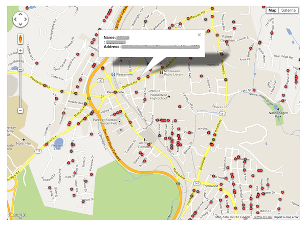
The increasing availability of Location data (via GPS-enabled mobile phones or RFIDs) needs no further explanation. Nature refers to data on natural processes such as temperature and rainfall. Behavior denotes activities that can be captured through digital means, such as user-behavior in multiplayer online games or economic affairs, for example. But “studying digital traces might not automatically give us insights into offline dynamics. Besides these biases in the source, the data-cleaning process of unstructured Big Data frequently introduces additional subjectivity.”

The availability and analysis of Big Data is obviously limited in areas with scant access to tangible hardware infrastructure. This corresponds to the “Infra-structure” variable in Hilbert’s framework. “Generic Services” refers to the production, adoption and adaptation of software products, since these are a “key ingredient for a thriving Big Data environment.” In addition, the exploitation of Big Data also requires “data-savvy managers and analysts and deep analytical talent, as well as capabilities in machine learning and computer science.” This corresponds to “Capacities and Knowledge Skills” in the framework.

The third and final side of the framework represents the types of policies that are necessary to actualize the potential of Big Data for international develop-ment. These policies are divided into those that elicit a Positive Feedback Loops such as financial incentives and those that create regulations such as interoperability, that is, Negative Feedback Loops.

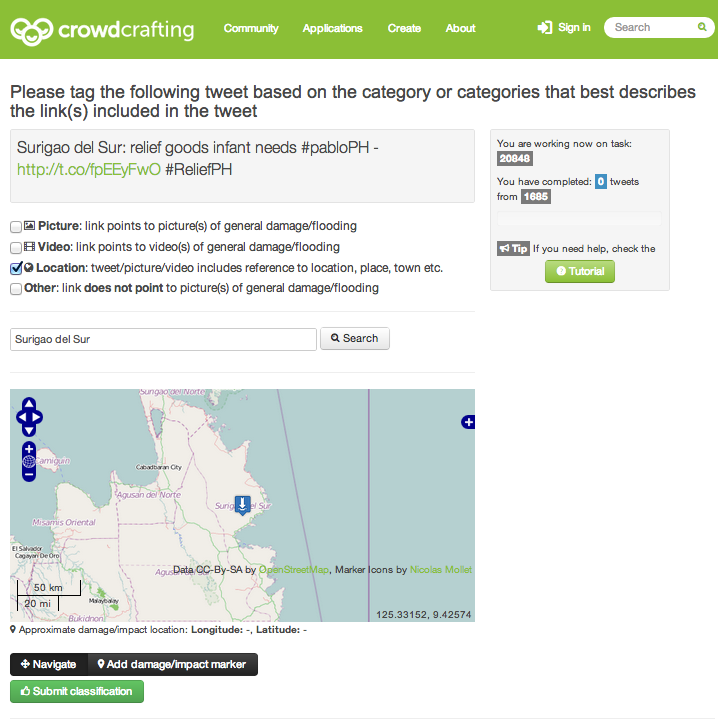
The added value of Big Data Analytics is also dependent on the availability of publicly accessible data, i.e., Open Data. Hilbert estimates that a quarter of US government data could be used for Big Data Analysis if it were made available to the public. There is a clear return on investment in opening up this data. On average, governments with “more than 500 publicly available databases on their open data online portals have 2.5 times the per capita income, and 1.5 times more perceived transparency than their counterparts with less than 500 public databases.” The direction of “causality” here is questionable, however.

Hilbert concludes with a warning. The Big Data paradigm “inevitably creates a new dimension of the digital divide: a divide in the capacity to place the analytic treatment of data at the forefront of informed decision-making. This divide does not only refer to the availability of information, but to intelligent decision-making and therefore to a divide in (data-based) knowledge.” While the advent of Big Data Analysis is certainly not a panacea,”in a world where we desperately need further insights into development dynamics, Big Data Analysis can be an important tool to contribute to our understanding of and improve our contributions to manifold development challenges.”

I am troubled by the study’s assumption that we live in a Newtonian world of decision-making in which for every action there is an automatic equal and opposite reaction. The fact of the matter is that the vast majority of development policies and decisions are not based on empirical evidence. Indeed, rigorous evidence-based policy-making and interventions are still very much the exception rather than the rule in international development. Why? “Account-ability is often the unhappy byproduct rather than desirable outcome of innovative analytics. Greater accountability makes people nervous” (Harvard 2013). Moreover, response is always political. But Big Data Analysis runs the risk de-politicize a problem. As Alex de Waal noted over 15 years ago, “one universal tendency stands out: technical solutions are promoted at the expense of political ones.” I hinted at this concern when I first blogged about the UN Global Pulse back in 2009.

In sum, James Scott (one of my heroes) puts it best in his latest book:

“Applying scientific laws and quantitative measurement to most social problems would, modernists believed, eliminate the sterile debates once the ‘facts’ were known. […] There are, on this account, facts (usually numerical) that require no interpretation. Reliance on such facts should reduce the destructive play of narratives, sentiment, prejudices, habits, hyperbole and emotion generally in public life. […] Both the passions and the interests would be replaced by neutral, technical judgment. […] This aspiration was seen as a new ‘civilizing project.’ The reformist, cerebral Progressives in early twentieth-century American and, oddly enough, Lenin as well believed that objective scientific knowledge would allow the ‘administration of things’ to largely replace politics. Their gospel of efficiency, technical training and engineering solutions implied a world directed by a trained, rational, and professional managerial elite. […].”

“Beneath this appearance, of course, cost-benefit analysis is deeply political. Its politics are buried deep in the techniques […] how to measure it, in what scale to use, […] in how observations are translated into numerical values, and in how these numerical values are used in decision making. While fending off charges of bias or favoritism, such techniques […] succeed brilliantly in entrenching a political agenda at the level of procedures and conventions of calculation that is doubly opaque and inaccessible. […] Charged with bias, the official can claim, with some truth, that ‘I am just cranking the handle” of a nonpolitical decision-making machine.”

See also:

  • Big Data for Development: Challenges and Opportunities [Link]
  • Beware the Big Errors of Big Data (by Nassim Taleb) [Link]
  • How to Build Resilience Through Big Data [Link]

Why Ushahidi Should Embrace Open Data

“This is the report that Ushahidi did not want you to see.” Or so the rumors in certain circles would have it. Some go as far as suggesting that Ushahidi tried to burry or delay the publication. On the other hand, some rumors claim that the report was a conspiracy to malign and discredit Ushahidi. Either way, what is clear is this: Ushahidi is an NGO that prides itself in promoting transparency & accountability; an organization prepared to take risks—and yes fail—in the pursuit of this  mission.

The report in question is CrowdGlobe: Mapping the Maps. A Meta-level Analysis of Ushahidi & Crowdmap. Astute observers will discover that I am indeed one of the co-authors. Published by Internews in collaboration with George Washington University, the report (PDF) reveals that 93% of 12,000+ Crowdmaps analyzed had fewer than 10 reports while a full 61% of Crowdmaps had no reports at all. The rest of the findings are depicted in the infographic below (click to enlarge) and eloquently summarized in the above 5-minute presentation delivered at the 2012 Crisis Mappers Conference (ICCM 2012).

Infographic_2_final (2)

Back in 2011, when my colleague Rob Baker (now with Ushahidi) generated the preliminary results of the quantitative analysis that underpins much of the report, we were thrilled to finally have a baseline against which to measure and guide the future progress of Ushahidi & Crowdmap. But when these findings were first publicly shared (August 2012), they were dismissed by critics who argued that the underlying data was obsolete. Indeed, much of the data we used in the analysis dates back to 2010 and 2011. Far from being obsolete, however, this data provides a baseline from which the use of the platform can be measured over time. We are now in 2013 and there are apparently 36,000+ Crowdmaps today rather than just 12,000+.

To this end, and as a member of Ushahidi’s Advisory Board, I have recommended that my Ushahidi colleagues run the same analysis on the most recent Crowdmap data in order to demonstrate the progress made vis-a-vis the now-outdated public baseline. (This analysis takes no more than an hour a few days to carry out). I also strongly recommend that all this anonymized meta-data be made public on a live dashboard in the spirit of open data and transparency. Ushahidi, after all, is a public NGO funded by some of the biggest proponents of open data and transparency in the world.

Embracing open data is one of the best ways for Ushahidi to dispel the harmful rumors and conspiracy theories that continue to swirl as a result of the Crowd-Globe report. So I hope that my friends at Ushahidi will share their updated analysis and live dashboard in the coming weeks. If they do, then their bold support of this report and commitment to open data will serve as a model for other organizations to emulate. If they’ve just recently resolved to make this a priority, then even better.

In the meantime, I look forward to collaborating with the entire Ushahidi team on making the upcoming Kenyan elections the most transparent to date. As referenced in this blog post, the Standby Volunteer Task Force (SBTF) is partnering with the good people at PyBossa to customize an awesome micro-tasking platform that will significantly facilitate and accelerate the categorization and geo-location of reports submitted to the Ushahidi platform. So I’m working hard with both of these outstanding teams to make this the most successful, large-scale microtasking effort for election monitoring yet. Now lets hope for everyone’s sake that the elections remain peaceful. Onwards!

Social Media: Pulse of the Planet?

In 2010, Hillary Clinton described social media as a new nervous system for our planet (1). So can the pulse of the planet be captured with social media? There are many who are skeptical not least because of the digital divide. “You mean the pulse of the Data Have’s? The pulse of the affluent?” These rhetorical questions are perfectly justified, which is why social media alone should not be the sole source of information that feeds into decision-making for policy purposes. But millions are joining the social media ecosystem everyday. So the selection bias is not increasing but decreasing. We may not be able to capture the pulse of the planet comprehensively and at a very high resolution yet, but the pulse of the majority world is certainly growing louder by the day.

mapnight2

This map of the world at night (based on 2011 data) reveals areas powered by electricity. Yes, Africa has far less electricity consumption. This is not misleading, it is an accurate proxy for industrial development (amongst other indexes). Does this data suffer from selection bias? Yes, the data is biased towards larger cities rather than the long tail. Does this render the data and map useless? Hardly. It all depends on what the question is.

Screen Shot 2013-02-02 at 8.22.49 AM

What if our world was lit up by information instead of lightbulbs? The map above from TweetPing does just that. The website displays tweets in real-time as they’re posted across the world. Strictly speaking, the platform displays 10% of the ~340 million tweets posted each day (i.e., the “Decahose” rather than the “Firehose”). But the volume and velocity of the pulsing ten percent is already breathtaking.

Screen Shot 2013-01-28 at 7.01.36 AM

One may think this picture depicts electricity use in Europe. Instead, this is a map of geo-located tweets (blue dots) and Flickr pictures (red dots). “White dots are locations that have been posted to both” (2). The number of active Twitter users grew an astounding 40% in 2012, making Twitter the fastest growing social network on the planet. Over 20% of the world’s internet population is now on Twitter (3). The Sightsmap below is a heat map based on the number of photographs submitted to Panoramio at different locations.

Screen Shot 2013-02-05 at 7.59.37 AM

The map below depicts friendship ties on Facebook. This was generated using data when there were “only” 500 million users compared to today’s 1 billion+.

FBmap

The following map does not depict electricity use in the US or the distribution of the population based on the most recent census data. Instead, this is a map of check-in’s on Foursquare. What makes this map so powerful is not only that it was generated using 500 million check-in’s but that “all those check-ins you see aren’t just single points—they’re links between all the other places people have been.”

FoursquareMap

TwitterBeat takes the (emotional) pulse of the planet by visualizing the Twitter Decahose in real-time using sentiment analysis. The crisis map in the YouTube video below comprises all tweets about Hurricane Sandy over time. “[Y]ou can see how the whole country lights up and how tweets don’t just move linearly up the coast as the storm progresses, capturing the advance impact of such a large storm and its peripheral effects across the country” (4).


These social media maps don’t only “work” at the country level or for Western industrialized states. Take the following map of Jakarta made almost exclusively from geo-tagged tweets. You can see the individual roads and arteries (nervous system). Granted, this map works so well because of the horrendous traffic but nevertheless a pattern emerges, one that is strongly correlated to the Jakarta’s road network. And unlike the map of the world at night, we can capture this pulse in real time and at a fraction of the cost.

Jakmap

Like any young nervous system, our social media system is still growing and evolving. But it is already adding value. The analysis of tweets predicts the flu better than the crunching of traditional data used by public health institutions, for example. And the analysis of tweets from Indonesia also revealed that Twitter data can be used to monitor food security in real-time.

The main problem I see about all this has much less to do with issues of selection bias and unrepresentative samples, etc. Far more problematic is the central-ization of this data and the fact that it is closed data. Yes, the above maps are public, but don’t be fooled, the underlying data is not. In their new study, “The Politics of Twitter Data,” Cornelius Puschmann and Jean Burgess argue that the “owners” of social media data are the platform providers, not the end users. Yes, access to Twitter.com and Twitter’s API is free but end users are limited to downloading just a few thousand tweets per day. (For comparative purposes, more than 20 million tweets were posted during Hurricane Sandy). Getting access to more data can cost hundreds of thousands of dollars. In other words, as Puschmann and Burgess note, “only corporate actors and regulators—who possess both the intellectual and financial resources to succeed in this race—can afford to participate,” which means “that the emerging data market will be shaped according to their interests.”

“Social Media: Pulse of the Planet?” Getting there, but only a few elite Doctors can take the full pulse in real-time.

Using #Mythbuster Tweets to Tackle Rumors During Disasters

The massive floods that swept through Queensland, Australia in 2010/2011 put an area almost twice the size of the United Kingdom under water. And now, a year later, Queensland braces itself for even worse flooding:

Screen Shot 2013-01-26 at 11.38.38 PM

More than 35,000 tweets with the hashtag #qldfloods were posted during the height of the flooding (January 10-16, 2011). One of the most active Twitter accounts belonged to the Queensland Police Service Media Unit: @QPSMedia. Tweets from (and to) the Unit were “overwhelmingly focussed on providing situational information and advice” (1). Moreover, tweets between @QPSMedia and followers were “topical and to the point, significantly involving directly affected local residents” (2). @QPSMedia also “introduced innovations such as the #Mythbuster series of tweets, which aimed to intervene in the spread of rumor and disinformation” (3).

rockhampton floods 2011

On the evening of January 11, @QPSMedia began to post a series of tweets with #Mythbuster in direct response to rumors and misinformation circulating on Twitter. Along with official notices to evacuate, these #Mythbuster tweets were the most widely retweeted @QPSMedia messages.” They were especially successful. Here is a sample: “#mythbuster: Wivenhoe Dam is NOT about to collapse! #qldfloods”; “#mythbuster: There is currently NO fuel shortage in Brisbane. #qldfloods.”

Screen Shot 2013-01-27 at 12.19.03 AM

This kind of pro-active intervention reminds me of the #fakesandy hashtag used during Hurricane Sandy and FEMA’s rumor control initiative during Hurricane Sandy. I expect to see greater use of this approach by professional emergency responders in future disasters. There’s no doubt that @QPSMedia will provide this service again with the coming floods and it appears that @QLDonline is already doing so (above tweet). Brisbane’s City Council has also launched this Crowdmap marking latest road closures, flood areas and sandbag locations. Hoping everyone in Queensland stays safe!

In the meantime, here are some relevant statistics on the crisis tweets posted during the 2010/2011 floods in Queensland:

  • 50-60% of #qldfloods messages were retweets (passing along existing messages, and thereby  making them more visible); 30-40% of messages contained links to further information elsewhere on the Web.
  • During the crisis, a number of Twitter users dedicated themselves almost exclusively to retweeting #qldfloods messages, acting as amplifiers of emergency information and thereby increasing its reach.
  • #qldfloods tweets largely managed to stay on topic and focussed predominantly on sharing directly relevant situational information, advice, news media and multimedia reports.
  • Emergency services and media organisations were amongst the most visible participants in #qldfloods, especially also because of the widespread retweeting of their messages.
  • More than one in every five shared links in the #qldfloods dataset was to an image hosted on one of several image-sharing services; and users overwhelmingly depended on Twitpic and other Twitter-centric image-sharing services to upload and distribute the photographs taken on their smartphones and digital cameras
  • The tenor of tweets during the latter days of the immediate crisis shifted more strongly towards organising volunteering and fundraising efforts: tweets containing situational information and advice, and news media and multimedia links were retweeted disproportionately often.
  • Less topical tweets were far less likely to be retweeted.

Perils of Crisis Mapping: Lessons from Gun Map

Any CrisisMapper who followed the social firestorm surrounding the gun map published by the Journal News will have noted direct parallels with the perils of Crisis Mapping. The digital and interactive gun map displayed the (lega-lly acquired) names and addresses of 33,614 handgun permit holders in two counties of New York. Entitled “The Gun Owner Next Door,” the project was launched on December 23, 2012 to highlight the extent of gun proliferation in the wake of the school shooting in Newtown. The map has been viewed over 1 million times since. This blog post documents the consequences of the gun map and explains how to avoid making the same mistakes in the field of Crisis Mapping.

gunmap

The backlash against Journal News was swift, loud and intense. The interactive map included the names and addresses of police officers and other law enforcement officials such as prison guards. The latter were subsequently threatened by inmates who used the map to find out exactly where they lived. Former crooks and thieves confirmed the map would be highly valuable for planning crimes (“news you can use”). They warned that criminals could easily use the map either to target houses with no guns (to avoid getting shot) or take the risk and steal the weapons themselves. Shotguns and hand-guns have a street value of $300-$400 per gun. This could lead to a proliferation of legally owned guns on the street.

The consequences of publishing the gun map didn’t end there. Law-abiding citizens who do not own guns began to fear for their safety. A Democratic legislator told the media: “I never owned a gun but now I have no choice […]. I have been exposed as someone that has no gun. And I’ll do anything, anything to protect my family.” One resident feared that her ex-husband, who had attempted to kill her in the past, might now be able to find her thanks to the map. There were also consequences for the journalists who published the map. They began to receive death threats and had to station an armed guard outside one of their offices. One disenchanted blogger decided to turn the tables (reverse panopticon) by publishing a map with the names and addresses of key editorial staffers who work at  Journal News. The New York Times reported that the location of the editors’ children’s schools had also been posted online. Suspicious packages containing white powder were also mailed to the newsroom (later found to be harmless).

News about a burglary possibly tied to the gun map began to circulate (although I’m not sure whether the link was ever confirmed). But according to one report, “said burglars broke in Saturday evening, and went straight for the gun safe. But they could not get it open.” Even if there was no link between this specific burglary and the gun map, many county residents fear that their homes have become a target. The map also “demonized” gun owners.

gunmap2

After weeks of fierce and heated “debate” the Journal News took the map down. But were the journalists right in publishing their interactive gun map in the first place? There was nothing illegal about it. But should the map have been published? In my opinion: No. At least not in that format. The rationale behind this public map makes sense. After all, “In the highly charged debate over guns that followed the shooting, the extent of ownership was highly relevant. […] By publishing the ‘gun map,’ the Journal News gave readers a visceral understanding of the presence of guns in their own community.” (Politico). It was the implementation of the idea that was flawed.

I don’t agree with the criticism that suggests the map was pointless because criminals obviously don’t register their guns. Mapping criminal activity was simply not the rationale behind the map. Also, while Journal News could simply have published statistics on the proliferation of gun ownership, the impact would not have been as … dramatic. Indeed, “ask any editor, advertiser, artist or curator—hell, ask anyone whose ever made a PowerPoint presentation—which editorial approach would be a more effective means of getting the point across” (Politico). No, this is not an endorsement of the resulting map, simply an acknowledgement that the decision to use mapping as a medium for data visualization made sense.

The gun map could have been published without the interactive feature and without corresponding names and addresses. This is eventually what the jour-nalists decided to do, about four weeks later. Aggregating the statistics would have also been an option in order to get away from individual dots representing specific houses and locations. Perhaps a heat map that leaves enough room for geographic ambiguity would have been less provocative but still effective in de-picting the extent of gun proliferation. Finally, an “opt out” feature should have been offered, allowing those owning guns to remove themselves from the map (still in the context of a heat map). Now, these are certainly not perfect solutions—simply considerations that could mitigate some of the negative consequences that come with publishing a hyper-local map of gun ownership.

The point, quite simply, is that there are various ways to map sensitive data such that the overall data visualization is rendered relatively less dangerous. But there is another perhaps more critical observation that needs to be made here. The New York Time’s Bill Keller gets to the heart of the matter in this piece on the gun map:

“When it comes to privacy, we are all hypocrites. We howl when a newspaper publishes public records about personal behavior. At the same time, we are acquiescing in a much more sweeping erosion of our privacy —government surveillance, corporate data-mining, political micro-targeting, hacker invasions—with no comparable outpouring of protest. As a society we have no coherent view of what information is worth defending and how to defend it. When our personal information is exploited this way, we may grumble, or we may seek the largely false comfort of tweaking our privacy settings […].”

In conclusion, the “smoking guns” (no pun intended) were never found. Law enforcement officials and former criminals seemed to imply that thieves would go on a rampage with map in hand. So why did we not see a clear and measurable increase in burglaries? The gun map should obviously have given thieves the edge. But no, all we have is just one unconfirmed report of an unsuccessful crime that may potentially be linked to the map. Surely, there should be an arsenal of smoking guns given all the brouhaha.

In any event, the controversial gun map provides at least six lessons for those of us engaged in crisis mapping complex humanitarian emergencies:

First, just because data is publicly-accessible does not mean that a map of said data is ethical or harmless. Second, there are dozens of ways to visualize and “blur” sensitive data on a map. Third, a threat and risk mitigation strategy should be standard operating procedure for crisis maps. Fourth, since crisis mapping almost always entails risk-taking when tracking conflicts, the benefits that at-risk communities gain from the resulting map must always and clearly outweigh the expected costs. This means carrying out a Cost Benefit Analysis, which goes to the heart of the “Do No Harm” principle. Fifth, a code of conduct on data protection and data security for digital humanitarian response needs to be drafted, adopted and self-enforced; something I’m actively working on with both the International Committee of the Red Cross (ICRC) and GSMA’s  Disaster Response Program. Sixth, the importance of privacy can—and already has—been hijacked by attention-seeking hypocrites who sensationalize the issue to gain notoriety and paralyze action. Non-action in no way implies no-harm.

Update: Turns out the gan ownership data was highly inaccurate!

See also:

  • Does Digital Crime Mapping Work? Insights on Engagement, Empowerment & Transparency [Link]
  • On Crowdsourcing, Crisis Mapping & Data Protection [Link]
  • What do Travel Guides and  Nazi Germany have to do with Crisis Mapping and Security? [Link]

Social Network Analysis for Digital Humanitarian Response

Monitoring social media for digital humanitarian response can be a massive undertaking. The sheer volume and velocity of tweets generated during a disaster makes real-time social media monitoring particularly challenging if not near impossible. However, two new studies argue that there is “a better way to track the spread of information on Twitter that is much more powerful.”

Twitter-Hadoop31

Manuel Garcia-Herranz and his team at the Autonomous University of Madrid in Spain use small groups of “highly connected Twitter users as ‘sensors’ to detect the emergence of new ideas. They point out that this works because highly co-nnected individuals are more likely to receive new ideas before ordinary users.” The test their hypothesis, the team studied 40 million Twitters users who “together totted up 1.5 billion follows’ and sent nearly half a billion tweets, including 67 million containing hashtags.”

They found that small groups of highly connected Twitter users detect “new hashtags about seven days earlier than the control group.  In fact, the lead time varied between nothing at all and as much as 20 days.” Manuel and his team thus argue that “there’s no point in crunching these huge data sets. You’re far better off picking a decent sensor group and watching them instead.” In other words, “your friends could act as an early warning system, not just for gossip, but for civil unrest and even outbreaks of disease.”

The second study, “Identifying and Characterizing User Communities on Twitter during Crisis Events,” (PDF) is authored by Aditi Gupta et al. Aditi and her co-lleagues analyzed three major crisis events (Hurricane Irene, Riots in England and Earthquake in Virginia) to “to identify the different user communities, and characterize them by the top central users.” Their findings are in line with those shared by the team in Madrid. “[T]he top users represent the topics and opinions of all the users in the community with 81% accuracy on an average.” In sum, “to understand a community, we need to monitor and analyze only these top users rather than all the users in a community.”

How could these findings be used to prioritize the monitoring of social media during disasters? See this blog post for more on the use of social network analysis (SNA) for humanitarian response.

Digital Humanitarian Response: Moving from Crowdsourcing to Microtasking

A central component of digital humanitarian response is the real-time monitor-ing, tagging and geo-location of relevant reports published on mainstream and social media. This has typically been a highly manual and time-consuming process, which explains why dozens if not hundreds of digital volunteers are often needed to power digital humanitarian response efforts. To coordinate these efforts, volunteers typically work off Google Spreadsheets which, needless to say, is hardly the most efficient, scalable or enjoyable interface to work on for digital humanitarian response.

complicated128

The challenge here is one of design. Google Spreadsheets was simply not de-signed to facilitate real-time monitoring, tagging and geo-location tasks by hundreds of digital volunteers collaborating synchronously and asynchronously across multiple time zones. The use of Google Spreadsheets not only requires up-front training of volunteers but also oversight and management. Perhaps the most problematic feature of Google Spreadsheets is the interface. Who wants to spend hours staring at cells, rows and columns? It is high time we take a more volunteer-centered design approach to digital humanitarian response. It is our responsibility to reduce the “friction” and make it as easy, pleasant and re-warding as possible for digital volunteers to share their time for the better good. While some deride the rise of “single-click activism,” we have to make it as easy as a double-click-of-the-mouse to support digital humanitarian efforts.

This explains why I have been actively collaborating with my colleagues behind the free & open-source micro-tasking platform, PyBossa. I often describe micro-tasking as “smart crowdsourcing”. Micro-tasking is simply the process of taking a large task and breaking it down into a series of smaller tasks. Take the tagging and geo-location of disaster tweets, for example. Instead of using Google Spread-sheets, tweets with designated hashtags can be imported directly into PyBossa where digital volunteers can tag and geo-locate said tweets as needed. As soon as they are processed, these tweets can be pushed to a live map or database right away for further analysis.

Screen Shot 2012-12-18 at 5.00.39 PM

The Standby Volunteer Task Force (SBTF) used PyBossa in the digital disaster response to Typhoon Pablo in the Philippines. In the above example, a volunteer goes to the PyBossa website and is presented with the next tweet. In this case: “Surigao del Sur: relief good infant needs #pabloPH [Link] #ReliefPH.” If a tweet includes location information, e.g., “Surigao del Sur,” a digital volunteer can simply copy & paste that information into the search box or  pinpoint the location in question directly on the map to generate the GPS coordinates. Click on the screenshot above to zoom in.

The PyBossa platform presents a number of important advantages when it comes to digital humanitarian response. One advantage is the user-friendly tutorial feature that introduces new volunteers to the task at hand. Furthermore, no prior experience or additional training is required and the interface itself can be made available in multiple languages. Another advantage is the built-in quality control mechanism. For example, one can very easily customize the platform such that every tweet is processed by 2 or 3 different volunteers. Why would we want to do this? To ensure consensus on what the right answers are when processing a tweet. For example, if three individual volunteers each tag a tweet as having a link that points to a picture of the damage caused by Typhoon Pablo, then we may find this to be more reliable than if only one volunteer tags a tweet as such. One additional advantage of PyBossa is that having 100 or 10,000 volunteers use the platform doesn’t require additional management and oversight—unlike the use of Google Spreadsheets.

There are many more advantages of using PyBossa, which is why my SBTF colleagues and I are collaborating with the PyBossa team with the ultimate aim of customizing a standby platform specifically for digital humanitarian response purposes. As a first step, however, we are working together to customize a PyBossa instance for the upcoming elections in Kenya since the SBTF was activated by Ushahidi to support the election monitoring efforts. The plan is to microtask the processing of reports submitted to Ushahidi in order to significantly accelerate and scale the live mapping process. Stay tuned to iRevolution for updates on this very novel initiative.

crowdflower-crowdsourcing-site

The SBTF also made use of CrowdFlower during the response to Typhoon Pablo. Like PyBossa, CrowdFlower is a micro-tasking platform but one developed by a for-profit company and hence primarily geared towards paying workers to complete tasks. While my focus vis-a-vis digital humanitarian response has chiefly been on (integrating) automated and volunteer-driven micro-tasking solutions, I believe that paid micro-tasking platforms also have a critical role to play in our evolving digital humanitarian ecosystem. Why? CrowdFlower has an unrivaled global workforce of more than 2 million contributors along with rigor-ous quality control mechanisms.

While this solution may not scale significanlty given the costs, I’m hoping that CrowdFlower will offer the Digital Humanitarian Network (DHN) generous discounts moving forward. Either way, identifying what kinds of tasks are best completed by paid workers versus motivated volunteers is a questions we must answer to improve our digital humanitarian workflows. This explains why I plan to collaborate with CrowdFlower directly to set up a standby platform for use by members of the Digital Humanitarian Network.

There’s one major catch with all microtasking platforms, however. Without well-designed gamification features, these tools are likely to have a short shelf-life. This is true of any citizen-science project and certainly relevant to digital human-itarian response as well, which explains why I’m a big, big fan of Zooniverse. If there’s a model to follow, a holy grail to seek out, then this is it. Until we master or better yet partner with the talented folks at Zooniverse, we’ll be playing catch-up for years to come. I will do my very best to make sure that doesn’t happen.

The Problem with Crisis Informatics Research

My colleague ChaTo at QCRI recently shared some interesting thoughts on the challenges of crisis informatics research vis-a-vis Twitter as a source of real-time data. The way he drew out the issue was clear, concise and informative. So I’ve replicated his diagram below.

ChaTo Diagram

What Emergency Managers Need: Those actionable tweets that provide situational awareness relevant to decision-making. What People Tweet: Those tweets posted during a crisis which are freely available via Twitter’s API (which is a very small fraction of the Twitter Firehose). What Computers Can Do: The computational ability of today’s algorithms to parse and analyze natural language at a large scale.

A: The small fraction of tweets containing valuable information for emergency responders that computer systems are able to extract automatically.
B: Tweets that are relevant to disaster response but are not able to be analyzed in real-time by existing algorithms due to computational challenges (e.g. data processing is too intensive, or requires artificial intelligence systems that do not exist yet).
C: Tweets that can be analyzed by current computing systems, but do not meet the needs of emergency managers.
D: Tweets that, if they existed, could be analyzed by current computing systems, and would be very valuable for emergency responders—but people do not write such tweets.

These limitations are not just academic. They make it more challenging to develop next-generation humanitarian technologies. So one question that naturally arises is this: How can we expand the size of A? One way is for governments to implement policies that expand access to mobile phones and the Internet, for example.

Area C is where the vast majority of social media companies operate today, on collecting business intelligence and sentiment analysis for private sector companies by combining natural language processing and machine learning methodologies. But this analysis rarely focuses on tweets posted during a major humanitarian crisis. Reaching out to these companies to let them know they could make a difference during disasters would help to expand the size of A + C.

Finally, Area D is composed of information that would be very valuable for emergency responders, and that could automatically extracted from tweets, but that Twitter users are simply not posting this kind of information during emergencies (for now). Here, government and humanitarian organizations can develop policies to incentivise disaster-affected communities to tweet about the impact of a hazard and resulting needs in a way that is actionable, for example. This is what the Philippine Government did during Typhoon Pablo.

Now recall that the circle “What People Tweet About” is actually a very small fraction of all posted tweets. The advantage of this small sample of tweets is that they are freely available via Twitter’s API. But said API limits the number of downloadable tweets to just a few thousand per day. (For comparative purposes, there were over 20 million tweets posted during Hurricane Sandy). Hence the need for data philanthropy for humanitarian response.

I would be grateful for your feedback on these ideas and the conceptual frame-work proposed by ChaTo. The point to remember, as noted in this earlier post, is that today’s challenges are not static; they can be addressed and overcome to various degrees. In other words, the sizes of the circles can and will change.


Social Network Analysis of Tweets During Australia Floods

This study (PDF) analyzes the community of Twitter users who disseminated  information during the crisis caused by the Australian floods in 2010-2011. “In times of mass emergencies, a phenomenon known as collective behavior becomes apparent. It consists of socio-behaviors that include intensified information search and information contagion.” The purpose of the Australian floods analysis is to reveal interesting patterns and features of this online community using social network analysis (SNA).

The authors analyzed 7,500 flood-related tweets to understand which users did the tweeting and retweeting. This was done to create nodes and links for SNA, which was able to “identify influential members of the online communities that emerged during the Queensland, NSW and Victorian floods as well as identify important resources being referred to. The most active community was in Queensland, possibly induced by the fact that the floods were orders of mag-nitude greater than in NSW and Victoria.”

The analysis also confirmed “the active part taken by local authorities, namely Queensland Police, government officials and volunteers. On the other hand, there was not much activity from local authorities in the NSW and Victorian floods prompting for the greater use of social media by the authorities concerned. As far as the online resources suggested by users are concerned, no sensible conclusion can be drawn as important ones identified were more of a general nature rather than critical information. This might be comprehensible as it was past the impact stage in the Queensland floods and participation was at much lower levels in the NSW and Victorian floods.”

Social Network Analysis is an under-utilized methodology for the analysis of communication flows during humanitarian crises. Understanding the topology of a social network is key to information diffusion. Think of this as a virus infecting a network. If we want to “infect” a social network with important crisis information as quickly and fully as possible, understanding the network’ topology is a requirement as is, therefore, social network analysis.

Why the Public Does (and Doesn’t) Use Social Media During Disasters

The University of Maryland has just published an important report on “Social Media Use During Disasters: A Review of the Knowledge Base and Gaps” (PDF). The report summarizes what is empirically known and yet to be determined about social media use pertaining to disasters. The research found that members of the public use social media for many different reasons during disasters:

  • Because of convenience
  • Based on social norms
  • Based on personal recommendations
  • For humor & levity
  • For information seeking
  • For timely information
  • For unfiltered information
  • To determine disaster magnitude
  • To check in with family & friends
  • To self-mobilize
  • To maintain a sense of community
  • To seek emotional support & healing

Conversely, the research also identified reasons why some hesitate to use social media during disasters: (1) privacy and security fears, (2) accuracy concerns, (3) access issues, and (4) knowledge deficiencies. By the latter they mean the lack of knowledge on how to use social media prior to disasters. While these hurdles present important challenges they are far from being insurmountable. Educa-tion, awareness-raising, improving technology access, etc., are all policies that can address the stated constraints. In terms of accuracy, a number of advanced computing research centers such as QCRI are developing methodologies and pro-cesses to quantify credibility on social media. Seasoned journalists have also been developing strategies to verify crowdsourced information on social media.

Perhaps the biggest challenge is privacy, security and ethics. Perhaps the new mathematical technique, “differential privacy,” may provide the necessary break-through to tackle the privacy/security challenge. Scientific American writes that differential privacy “allows for the release of data while meeting a high standard for privacy protection. A differentially private data release algorithm allows researchers to ask practically any question about a database of sensitive informa-tion and provides answers that have been ‘blurred’ so that they reveal virtually nothing about any individual’s data—not even whether the individual was in the database in the first place.”

The approach has already been used in a real-world applications: a Census Bureau project called OnTheMap, “which gives researchers access to agency data. Also, differential privacy researchers have fielded preliminary inquiries from Facebook and the federally funded iDASH center at the University of California, San Diego, whose mandate in large part is to find ways for researchers to share biomedical data without compromising privacy.” So potential solutions are al-ready on the horizon and more research is on the way. This doesn’t mean there are no challenges left. There will absolutely be more. But the point I want to drive home is that we are not completely helpless in the face of these challenges.

The Report concludes with the following questions, which are yet to be answered:

  • What, if any, unique roles do various social media play for commu-nication during disasters?
  • Are some functions that social media perform during disasters more important than others?
  • To what extent can the current body of research be generalized to the U.S. population?
  • To what extent can the research on social media use during a specific disaster type, such as hurricanes, be generalized to another disaster type, such as terrorism?

Have any thoughts on what the answers might be and why? If so, feel free to add them in the comments section below. Incidentally, some of these questions could make for strong graduate theses and doctoral dissertations. To learn more about what people actually tweet during this disasters, see these findings here.