Using CrowdFlower to Microtask Disaster Response

Cross-posted from CrowdFlower blog

A devastating earthquake struck Port-au-Prince on January 12, 2010. Two weeks later, on January 27th, a CrowdFlower was used to translate text messages from Haitian Creole to English. Tens of thousands of messages were sent by affected Haitians over the course of several months. All of these were heroically translated by hundreds of dedicated Creole-speaking volunteers based in dozens of countries across the globe. While Ushahidi took the lead by developing the initial translation platform used just days after the earthquake, the translation efforts were eventually rerouted to CrowdFlower. Why? Three simple reasons:

  1. CrowdFlower is one of the leading and most highly robust micro-tasking platforms there is;
  2. CrowdFlower’s leadership is highly committed to supporting digital humanitarian response efforts;
  3. Haitians in Haiti could now be paid for their translation work.

While the CrowdFlower project was launched 15 days after the earthquake, i.e., following the completion of search and rescue operations, every single digital humanitarian effort in Haiti was reactive. The key takeaway here was the proof of concept–namely that large-scale micro-tasking could play an important role in humanitarian information management. This was confirmed months later when devastating floods inundated much of Pakistan. CrowdFlower was once again used to translate incoming messages from the disaster affected population. While still reactive, this second use of CrowdFlower demonstrated replicability.

The most recent and perhaps most powerful use of CrowdFlower for disaster response occurred right after Typhoon Pablo devastated the Philippines in early December 2012. The UN Office for the Coordination of Humanitarian Affairs (OCHA) activated the Digital Humanitarian Network (DHN) to rapidly deliver a detailed dataset of geo-tagged pictures and video footage (posted on Twitter) depicting the damage caused by the Typhoon. The UN needed this dataset within 12 hours, which required that 20,000 tweets to be analyzed as quickly as possible. The Standby Volunteer Task Force (SBTF), a member of Digital Huma-nitarians, immediately used CrowdFlower to identify all tweets with links to pictures & video footage. SBTF volunteers subsequently analyzed those pictures and videos for damage and geographic information using other means.

This was the most rapid use of CrowdFlower following a disaster. In fact, this use of CrowdFlower was pioneering in many respects. This was the first time that a member of the Digital Humanitarian Network made use of CrowdFlower (and thus micro-tasking) for disaster response. It was also the first time that Crowd-Flower’s existing workforce was used for disaster response. In addition, this was the first time that data processed by CrowdFlower contributed to an official crisis map produced by the UN for disaster response (see above).

These three use-cases, Haiti, Pakistan and the Philippines, clearly demonstrate the added value of micro-tasking (and hence CrowdFlower) for disaster response. If CrowdFlower had not been available in Haiti, the alternative would have been to pay a handful of professional translators. The total price could have come to some $10,000 for 50,000 text messages (at 0.20 cents per word). Thanks to CrowdFlower, Haitians in Haiti were given the chance to make some of that money by translating the text messages themselves. Income generation programs are absolutely critical to rapid recovery following major disasters. In Pakistan, the use of CrowdFlower enabled Pakistani students and the Diaspora to volunteer their time and thus accelerate the translation work for free. Following Typhoon Pablo, paid CrowdFlower workers from the Philippines, India and Australia categorized several thousand tweets in just a couple hours while the volunteers from the Standby Volunteer Task Force geo-tagged the results. Had CrowdFlower not been available then, it is highly, highly unlikely that the mission would have succeeded given the very short turn-around required by the UN.

While impressive, the above use-cases were also reactive. We need to be a lot more pro-active, which is why I’m excited to be collaborating with CrowdFlower colleagues to customize a standby platform for use by the Digital Humanitarian Network. Having a platform ready-to-go within minutes is key. And while digital volunteers will be able to use this standby platform, I strongly believe that paid CrowdFlower workers also have a key role to play in the digital huma-nitarian ecosystem. Indeed, CrowdFlower’s large, multinational and multi-lingual global workforce is simply unparalleled and has the distinct advantage of being very well versed in the CrowdFlower platform.

In sum, it is high time that the digital humanitarian space move from crowd-sourcing to micro-tasking. It has been three years since the tragic earthquake in Haiti but we have yet to adopt micro-tasking more widely. CrowdFlower should thus play a key role in promoting and enabling this important shift. Their con-tinued important leadership in digital humanitarian response should also serve as a model for other private sector companies in the US and across the globe.

bio

Launching: SMS Code of Conduct for Disaster Response

Shortly after the devastating Haiti Earthquake of January 12, 2010, I published this blog post on the urgent need for an SMS code of conduct for disaster response. Several months later, I co-authored this peer-reviewed study on the lessons learned from the unprecedented use of SMS following the Haiti Earth-quake. This week, at the Mobile World Congress (MWC 2013) in Barcelona, GSMA’s Disaster Response Program organized two panels on mobile technology for disaster response and used the event to launch an official SMS Code of Conduct for Disaster Response (PDF). GSMA members comprise nearly 800 mobile operators based in more than 220 countries.

Screen Shot 2013-02-18 at 2.27.32 PM

Thanks to Kyla Reid, Director for Disaster Response at GSMA, and to Souktel’s Jakob Korenblummy calls for an SMS code of conduct were not ignored. The three of us spent a considerable amount of time in 2012 drafting and re-drafting a detailed set of principles to guide SMS use in disaster response. During this process, we benefited enormously from many experts on the mobile operators side and the humanitarian community; many of whom are at MWC 2013 for the launch of the guidelines. It is important to note that there have been a number of parallel efforts that our combined work has greatly benefited from. The Code of Conduct we launched this week does not seek to duplicate these important efforts but rather serves to inform GSMA members about the growing importance of SMS use for disaster response. We hope this will help catalyze a closer relationship between the world’s leading mobile operators and the international humanitarian community.

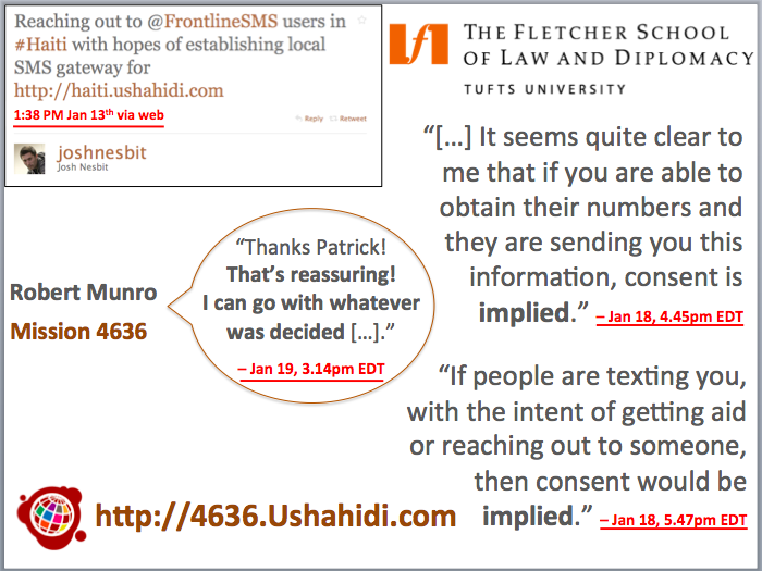
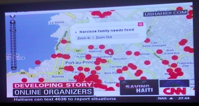
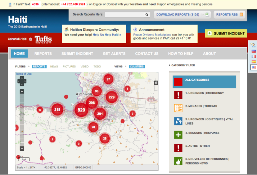
Since the impetus for this week’s launch began in response to the Haiti Earth-quake, I was invited to reflect on the crisis mapping efforts I spearheaded at the time. (My slides for the second panel organized by GSMA are available here. My more personal reflections on the 3rd year anniversary of the earthquake are posted here). For several weeks, digital volunteers updated the Ushahidi-Haiti Crisis Map (pictured above) with new information gathered from hundreds of different sources. One of these information channels was SMS. My colleague Josh Nesbit secured an SMS short code for Haiti thanks to a tweet he posted at 1:38pm on Jan 13th (top left in image below). Several days later, the short code (4636) was integrated with the Ushahidi-Haiti Map.

Screen Shot 2013-02-18 at 2.40.09 PM

We received about 10,000 text messages from the disaster-affected population during the during the Search and Rescue phase. But we only mapped about 10% of these because we prioritized the most urgent and actionable messages. While mapping these messages, however, we had to address a critical issue: data privacy and protection. There’s an important trade-off here: the more open the data, the more widely useable that information is likely to be for professional disaster responders, local communities and the Diaspora—but goodbye privacy.

Time was not a luxury we had; an an entire week had already passed since the earthquake. We were at the tail end of the search and rescue phase, which meant that literally every hour counted for potential survivors still trapped under the rubble. So we immediately reached out to 2 trusted lawyers in Boston, one of them a highly reputable Law Professor at The Fletcher School of Law and Diplomacy who also a specialist on Haiti. You can read the lawyers’ written email replies along with the day/time they were received on the right-hand side of the slide. Both lawyers opined that consent was implied vis-à-vis the publishing of personal identifying information. We shared this opinion with all team members and partners working with us. We then made a joint decision 24 hours later to move ahead and publish the full content of incoming messages. This decision was supported by an Advisory Board I put together comprised of humanitarian colleagues from the Harvard Humanitarian Initiative who agreed that the risks of making this info public were minimal vis-à-vis the principle of Do No HarmUshahidi thus launched a micro-tasking platform to crowdsource the translation efforts and hosted this on 4636.Ushahidi.com [link no longer live], which volunteers from the Diaspora used to translate the text messages.

I was able to secure a small amount of funding in March 2010 to commission a fully independent evaluation of our combined efforts. The project was evaluated a year later by seasoned experts from Tulane University. The results were mixed. While the US Marine Corps publicly claimed to have saved hundreds of lives thanks to the map, it was very hard for the evaluators to corroborate this infor-mation during their short field visit to Port-au-Prince more than 12 months after the earthquake. Still, this evaluation remains the only professional, independent and rigorous assessment of Ushahidi and 4636 to date.

Screen Shot 2013-02-25 at 2.10.47 AM

The use of mobile technology for disaster response will continue to increase for years to come. Mobile operators and humanitarian organizations must therefore be pro-active in managing this increase demand by ensuring that the technology is used wisely. I, for one, never again want to spend 24+ precious hours debating whether or not urgent life-and-death text messages can or cannot be mapped because of uncertainties over data privacy and protection—24 hours during a Search and Rescue phase is almost certain to make the difference between life and death. More importantly, however, I am stunned that a bunch of volunteers with little experience in crisis response and no affiliation whatsoever to any established humanitarian organization were able to secure and use an official SMS short code within days of a major disaster. It is little surprise that we made mistakes. So a big thank you to Kyla and Jakob for their leadership and perseverance in drafting and launching GSMA’s official SMS Code of Conduct to make sure the same mistakes are not made again.

While the document we’ve compiled does not solve every possible challenge con-ceivable, we hope it is seen as a first step towards a more informed and responsible use of SMS for disaster response. Rest assured that these guidelines are by no means written in stone. Please, if you have any feedback, kindly share them in the comments section below or privately via email. We are absolutely committed to making this a living document that can be updated.

To connect this effort with the work that my CrisisComputing Team and I are doing at QCRI, our contact at Digicel during the Haiti response had given us the option of sending out a mass SMS broadcast to their 2 million subscribers to get the word out about 4636. (We had thus far used local community radio stations). But given that we were processing incoming SMS’s manually, there was no way we’d be able to handle the increased volume and velocity of incoming text messages following the SMS blast. So my team and I are exploring the use of advanced computing solutions to automatically parse and triage large volumes of text messages posted during disasters. The project, which currently uses Twitter, is described here in more detail.

bio

Social Media as Passive Polling: Prospects for Development & Disaster Response

My Harvard/MIT colleague Todd Mostak wrote his award-winning Master’s Thesis on “Social Media as Passive Polling: Using Twitter and Online Forums to Map Islamism in Egypt.” For this research, Todd evaluated the “potential of Twitter as a source of time-stamped, geocoded public opinion data in the context of the recent popular uprisings in the Middle East.” More specifically, “he explored three ways of measuring a Twitter user’s degree of political Islamism.” Why? Because he wanted to test the long-standing debate on whether Islamism is associated with poverty.

Screen Shot 2013-02-18 at 11.17.09 AM

So Todd collected millions of geo-tagged tweets from Egypt over a six month period, which he then aggregated by census district in order to regress proxies for poverty against measures of Islamism drived from the tweets and the users’ social graphs. His findings reveal that “Islamist sentiment seems to be positively correlated with male unemployment, illiteracy, and percentage of land used in agriculture and negatively correlated with percentage of men in their youth aged 15-25. Note that female variables for unemployment and age were statistically insignificant.” As with all research, there are caveats such as the weighting scale used for the variables and questions over the reliability of census variables.

Screen Shot 2013-02-18 at 11.15.59 AM

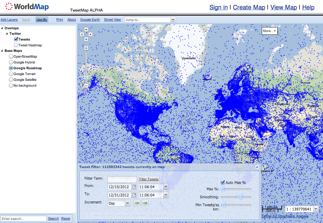
To carry out his graduate research, Todd built a web-enabled database (MapD) powered by a Graphics Processing Units (GPU) to perform real-time querying and visualization of big datasets. He is now working with Harvard’s Center for Geographic Analysis (CGA) to put make this available via a public web interface called Tweetmap. This Big Data streaming and exploration tool presen-tly displays 119 million tweets from 12/10/2012 to 12/31/2012. He is adding 6-7 million new georeferenced tweets per day (but these are not yet publicly available on Tweetmap). According to Todd, the time delay from live tweet to display on the map is about 1 second. Thanks to this GPU-powered approach, he expects that billions of tweets could be displayed in real-time.

Screen Shot 2013-02-18 at 11.14.02 AM

As always with impressive projects, no one single person was behind the entire effort. Ben Lewis, who heads the WorldMap initiative at CGA deserves a lot of credit for making Tweetmap a reality. Indeed, Todd collaborated directly with CGA’s Ben Lewis throughout this project and benefited extensively from his expertise. Matt Bertrand (lead developer for CGA) did the WorldMap-side integration of MapD to create the TweetMap interface.

Todd and I recently spoke about integrating his outstanding work on automated live mapping to QCRI’s Twitter Dashboard for Disaster Response. Exciting times. In the meantime, Todd has kindly shared his dataset of 700+ million geotagged tweets for my team and I to analyze. The reason I’m excited about this approach is best explained with this heatmap of the recent snow-storm in the northeastern US. Todd is already using Tweetmap for live crisis mapping. While this system filters by keyword, our Dashboard will use machine learning to provide more specific streams of relevant tweets, some of which could be automatically mapped on Tweetmap. See Todd’s Flickr page for more Tweetmap visuals.

Screen Shot 2013-02-18 at 11.30.54 AM

I’m also excited by Todd’s GPU-powered approach for a project I’m exploring with UN and World Bank colleagues. The purpose of that research project is to determine whether socio-economic trends such as poverty and unemployment can be captured via Twitter. Our first case study is Egypt. Depending on the results, we may be able to take it one step further by applying sentiment analysis to real-time, georeferenced tweets to visualize Twitter users’ per-ception vis-a-vis government services—a point of interest for my UN colleagues in Cairo.

bio

Verily: Crowdsourced Verification for Disaster Response

Social media is increasingly used for communicating during crises. This rise in Big (Crisis) Data means that finding the proverbial needle in the growing haystack of information is becoming a major challenge. Social media use during Hurricane Sandy produced a “haystack” of half-a-million Instagram photos and 20 million tweets. But which of these were actually relevant for disaster response and could they have been detected in near real-time? The purpose of QCRI’s experimental Twitter Dashboard for Disaster Response project is to answer this question. But what about the credibility of the needles in the info-stack?

10-Red-Balloons

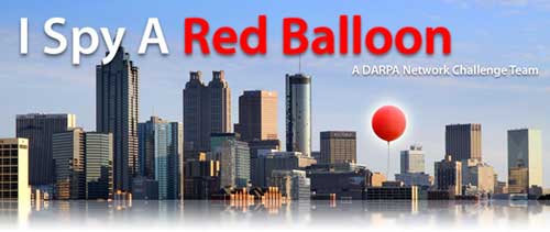
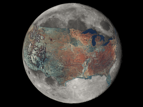
To answer this question, our Crisis Computing Team at QCRI has partnered with the Social Computing & Artificial Intelligence Lab at the Masdar Institute of Science and Technology. This applied research project began with a series of conversations in mid-2012 about DARPA’s Red Balloon Challenge. This challenge posted in 2009 offered $40K to the individual or team that could find the correct location of 10 red weather balloons discretely placed across the continental United States, an area covering well over 3 million square miles (8 million square kilometers). My friend Riley Crane at MIT spearheaded the team that won the challenge in 8 hours and 52 minutes by using social media.

Riley and I connected right after the Haiti Earthquake to start exploring how we might apply his team’s winning strategy to disaster response. But we were pulled in different directions due to PhD & post-doc obligations and start-up’s. Thank-fully, however, Riley’s colleague Iyad Rahwan got in touch with me to continue these conversations when I joined QCRI. Iyad is now at the Masdar Institute. We’re collaborating with him and his students to apply collective intelligence insights from the balloon to address the problem of false or misleading content shared on social media during  disasters.

Screen Shot 2013-02-16 at 2.26.41 AM

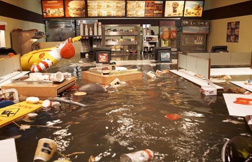
If 10 balloons planted across 3 million square miles can be found in under 9 hours, then surely the answer to the question “Did Hurricane Sandy really flood this McDonald’s in Virginia?” can be found in under 9 minutes given that  Virginia is 98% smaller than the “haystack” of the continental US. Moreover, the location of the restaurant would already be known or easily findable. The picture below, which made the rounds on social media during the hurricane is in reality part of an art exhibition produced in 2009. One remarkable aspect of the social media response to Hurricane Sandy was how quickly false information got debunked and exposed as false—not only by one good (digital) Samaritan, but by several.

SandyFake

Having access to accurate information during a crisis leads to more targeted self-organized efforts at the grassroots level. Accurate information is also important for emergency response professionals. The verification efforts during Sandy were invaluable but disjointed and confined to the efforts of a select few individuals. What if thousands could be connected and mobilized to cross-reference and verify suspicious content shared on social media during a disaster?

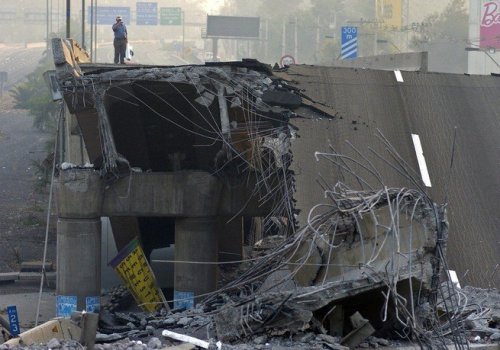
Say an earthquake struck Santiago, Chile a few minutes ago and contradictory reports begin to circulate on social media that the bridge below may have been destroyed. Determining whether transportation infrastructure is still useable has important consequences for managing the logistics of a disaster response opera-tion. So what if instead of crowdsourcing the correct location of  balloons across an entire country, one could crowdsource the collection of evidence in just one city struck by a disaster to determine whether said bridge had actually been destroyed in a matter of minutes?

santiagobridge

To answer these questions, QCRI and Masdar have launched an experimental  platform called Verily. We are applying best practices in time-critical crowd-sourcing coupled with gamification and reputation mechanisms to leverage the good will of (hopefully) thousands of digital Samaritans during disasters. This is experimental research, which means it may very well not succeed as envisioned. But that is a luxury we have at QCRI—to innovate next-generation humanitarian technologies via targeted iteration and experimentation. For more on this project, our concept paper is available as a Google Doc here. We invite feedback and welcome collaborators.

In the meantime, we are exploring the possibility of integrating the InformCam mobile application as part of Verily. InformaCam adds important metadata to images and videos taken by eyewitnesses. “The metadata includes information like the user’s current GPS coordinates, altitude, compass bearing, light meter readings, the signatures of neighboring devices, cell towers, and wifi net-works; and serves to shed light on the exact circumstances and contexts under which the digital image was taken.” We are also talking to our partners at MIT’s Computer Science & Artificial Intelligence Lab in Boston about other mobile solutions that may facilitate the use of Verily.

Again, this is purely experimental and applied research at this point. We hope to have an update on our progress in the coming months.

Bio

See also:

  •  Crowdsourcing Critical Thinking to Verify Social Media During Crises [Link]
  •  Using Crowdsourcing to Counter Rumors on Social Media [Link]

Video: Minority Report Meets Crisis Mapping

This short video was inspired by the pioneering work of the Standby Volunteer Task Force (SBTF). A global network of 1,000+ digital humanitarians in 80+ countries, the SBTF is responsible for some of the most important live crisis mapping operations that have supported both humanitarian and human rights organizations over the past 2+ years. Today, the SBTF is a founding and active member of the Digital Humanitarian Network (DHN) and remains committed to rapid learning and innovation thanks to an outstanding team of volunteers (“Mapsters”) and their novel use of next-generation humanitarian technologies.

The video first aired on the National Geographic Television Channel in February 2013. A big thanks to the awesome folks from National Geographic and the outstanding Evolve Digital Cinema Team for visioning the future of digital humanitarian technologies—a future that my Crisis Computing Team and I at QCRI are working to create.

An aside: I tried on several occasions to hack the script and say “We” rather than “I” since crisis mapping is very rarely a solo effort but the main sponsor insisted that the focus be on one individual. On the upside, one of the scenes in the commercial is of a Situation Room full of Mapsters coupled with the narration: “Our team can map the pulse of the planet, from anywhere, getting aid to the right places.” Our team = SBTF! Which is why the $$ received for being in this commercial will go towards supporting Mapsters.

bio

Did Terrorists Use Twitter to Increase Situational Awareness?

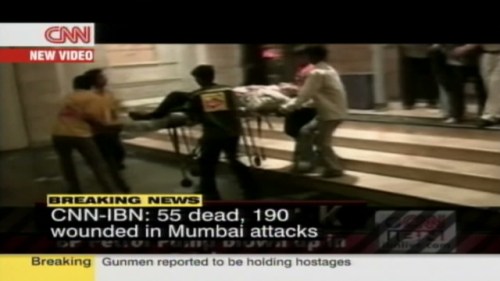
Those who are still skeptical about the value of Twitter for real-time situational awareness during a crisis ought to ask why terrorists likely think otherwise. In 2008, terrorists carried out multiple attacks on Mumbai in what many refer to as the worst terrorist incident in Indian history. This study, summarized below, explains how the terrorists in question could have used social media for coor-dination and decision-making purposes.

The study argues that “the situational information which was broadcast through live media and Twitter contributed to the terrorists’ decision making process and, as a result, it enhanced the effectiveness of hand-held weapons to accomplish their terrorist goal.” To be sure, the “sharing of real time situational information on the move can enable the ‘sophisticated usage of the most primitive weapons.'” In sum, “unregulated real time Twitter postings can contribute to increase the level of situation awareness for terrorist groups to make their attack decision.”

According to the study, “an analysis of satellite phone conversations between terrorist commandos in Mumbai and remote handlers in Pakistan shows that the remote handlers in Pakistan were monitoring the situation in Mumbai through live media, and delivered specific and situational attack commands through satellite phones to field terrorists in Mumbai.” These conversations provide “evidence that the Mumbai terrorist groups understood the value of up-to-date situation information during the terrorist operation. […] They under-stood that the loss of information superiority can compromise their operational goal.”

Handler: See, the media is saying that you guys are now in room no. 360 or 361. How did they come to know the room you guys are in?…Is there a camera installed there? Switch off all the lights…If you spot a camera, fire on it…see, they should not know at any cost how many of you are in the hotel, what condition you are in, where you are, things like that… these will compromise your security and also our operation […]

Terrorist: I don’t know how it happened…I can’t see a camera anywhere.

A subsequent phone conversation reveals that “the terrorists group used the web search engine to increase their decision making quality by employing the search engine as a complement to live TV which does not provide detailed information of specific hostages. For instance, to make a decision if they need to kill a hostage who was residing in the Taj hotel, a field attacker reported the identity of a hostage to the remote controller, and a remote controller used a search engine to obtain the detailed information about him.”

Terrorist: He is saying his full name is K.R.Ramamoorthy.

Handler: K.R. Ramamoorthy. Who is he? … A designer … A professor … Yes, yes, I got it …[The caller was doing an internet search on the name, and a results showed up a picture of Ramamoorthy] … Okay, is he wearing glasses? [The caller wanted to match the image on his computer with the man before the terrorists.]

Terrorist: He is not wearing glasses. Hey, … where are your glasses?

Handler: … Is he bald from the front?

Terrorist: Yes, he is bald from the front …

The terrorist group had three specific political agendas: “(1) an anti-India agenda, (2) an anti-Israel and anti-Jewish agenda, and (3) an anti-US and anti-Nato agenda.” A content analysis of 900+ tweets posted during the attacks reveal whether said tweets may have provided situational awareness information in support of these three political goals. The results: 18% of tweets contained “situa-tional information which can be helpful for Mumbai terrorist groups to make an operational decision of achieving their Anti-India political agenda. Also, 11.34% and 4.6% of posts contained operationally sensitive information which may help terrorist groups to make an operational decision of achieving their political goals of Anti-Israel/Anti-Jewish and Anti-US/Anti-Nato respectively.”

In addition, the content analysis found that “Twitter site played a significant role in relaying situational information to the mainstream media, which was monitored by Mumbai terrorists. Therefore, we conclude that the Mumbai Twitter page in-directly contributed to enhancing the situational awareness level of Mumbai terrorists, although we cannot exclude the possibility of its direct contribution as well.”

In conclusion, the study stresses the importance analyzing a terrorist group’s political goals in order to develop an appropriate information control strategy. “Because terrorists’ political goals function as interpretative filters to process situational information, understanding of adversaries’ political goals may reduce costs for security operation teams to monitor and decide which tweets need to be controlled.”

bio

See also: Analyzing Tweets Posted During Mumbai Terrorist Attacks [Link]

Update: Twitter Dashboard for Disaster Response

Project name: Artificial Intelligence for Disaster Response (AIDR). For a more recent update, please click here.

My Crisis Computing Team and I at QCRI have been working hard on the Twitter Dashboard for Disaster Response. We first announced the project on iRevolution last year. The experimental research we’ve carried out since has been particularly insightful vis-a-vis the opportunities and challenges of building such a Dashboard. We’re now using the findings from our empirical research to inform the next phase of the project—namely building the prototype for our humanitarian colleagues to experiment with so we can iterate and improve the platform as we move forward.

KnightDash

Manually processing disaster tweets is becoming increasingly difficult and unrealistic. Over 20 million tweets were posted during Hurricane Sandy, for example. This is the main problem that our Twitter Dashboard aims to solve. There are two ways to manage this challenge of Big (Crisis) Data: Advanced Computing and Human Computation. The former entails the use of machine learning algorithms to automatically tag tweets while the latter involves the use of microtasking, which I often refer to as Smart Crowdsourcing. Our Twitter Dashboard seeks to combine the best of both methodologies.

On the Advanced Computing side, we’ve developed a number of classifiers that automatically identify tweets that:

  • Contain informative content (in contrast to personal messages or information unhelpful for disaster response);
  • Are posted by eye-witnesses (as opposed to 2nd-hand reporting);
  • Include pictures, video footage, mentions from TV/radio
  • Report casualties and infrastructure damage;
  • Relate to people missing, seen and/or found;
  • Communicate caution and advice;
  • Call for help and important needs;
  • Offer help and support.

These classifiers are developed using state-of-the-art machine learning tech-niques. This simply means that we take a Twitter dataset of a disaster, say Hurricane Sandy, and develop clear definitions for “Informative Content,” “Eye-witness accounts,” etc. We use this classification system to tag a random sample of tweets from the dataset (usually 100+ tweets). We then “teach” algorithms to find these different topics in the rest of the dataset. We tweak said algorithms to make them as accurate as possible; much like training a dog new tricks like go-fetch (wink).

fetchball

We’ve found from this research that the classifiers are quite accurate but sensitive to the type of disaster being analyzed and also the country in which said disaster occurs. For example, a set of classifiers developed from tweets posted during Hurricane Sandy tend to be less accurate when applied to tweets posted for New Zealand’s earthquake. Each classifier is developed based on tweets posted during a specific disaster. In other words, while the classifiers can be highly accurate (i.e., tweets are correctly tagged as being damage-related, for example), they only tend to be accurate for the type of disaster they’ve been trained for, e.g., weather-related disasters (tornadoes), earth-related (earth-quakes) and water-related (floods).

So we’ve been busy trying to collect as many Twitter datasets of different disasters as possible, which has been particularly challenging and seriously time-consuming given Twitter’s highly restrictive Terms of Service, which prevents the direct sharing of Twitter datasets—even for humanitarian purposes. This means we’ve had to spend a considerable amount of time re-creating Twitter datasets for past disasters; datasets that other research groups and academics have already crawled and collected. Thank you, Twitter. Clearly, we can’t collect every single tweet for every disaster that has occurred over the past five years or we’ll never get to actually developing the Dashboard.

That said, some of the most interesting Twitter disaster datasets are of recent (and indeed future) disasters. Truth be told, tweets were still largely US-centric before 2010. But the international coverage has since increased, along with the number of new Twitter users, which almost doubled in 2012 alone (more neat stats here). This in part explains why more and more Twitter users actively tweet during disasters. There is also a demonstration effect. That is, the international media coverage of social media use during Hurricane Sandy, for example, is likely to prompt citizens in other countries to replicate this kind of pro-active social media use when disaster knocks on their doors.

So where does this leave us vis-a-vis the Twitter Dashboard for Disaster Response? Simply that a hybrid approach is necessary (see TEDx talk above). That is, the Dashboard we’re developing will have a number of pre-developed classifiers based on as many datasets as we can get our hands on (categorized by disaster type). In addition to that, the dashboard will also allow users to create their own classifiers on the fly by leveraging human computation. They’ll also be able to microtask the creation of new classifiers.

In other words, what they’ll do is this:

  • Enter a search query on the dashboard, e.g., #Sandy.
  • Click on “Create Classifier” for #Sandy.
  • Create a label for the new classifier, e.g., “Animal Rescue”.
  • Tag 50+ #Sandy tweets that convey content about animal rescue.
  • Click “Run Animal Rescue Classifier” on new incoming tweets.

The new classifier will then automatically tag incoming tweets. Of course, the classifier won’t get it completely right. But the beauty here is that the user can “teach” the classifier not to make the same mistakes, which means the classifier continues to learn and improve over time. On the geo-location side of things, it is indeed true that only ~3% of all tweets are geotagged by users. But this figure can be boosted to 30% using full-text geo-coding (as was done the TwitterBeat project). Some believe this figure can be doubled (towards 75%) by applying Google Translate to the full-text geo-coding. The remaining users can be queried via Twitter for their location and that of the events they are reporting.

So that’s where we’re at with the project. Ultimately, we envision these classifiers to be like individual apps that can be used/created, dragged and dropped on an intuitive widget-like dashboard with various data visualization options. As noted in my previous post, everything we’re building will be freely accessible and open source. And of course we hope to include classifiers for other languages beyond English, such as Arabic, Spanish and French. Again, however, this is purely experimental research for the time being; we want to be crystal clear about this in order to manage expectations. There is still much work to be done.

In the meantime, please feel free to get in touch if you have disaster datasets you can contribute to these efforts (we promise not to tell Twitter). If you’ve developed classifiers that you think could be used for disaster response and you’re willing to share them, please also get in touch. If you’d like to join this project and have the required skill sets, then get in touch, we may be able to hire you! Finally, if you’re an interested end-user or want to share some thoughts and suggestions as we embark on this next phase of the project, please do also get in touch. Thank you!

bio

The World at Night Through the Eyes of the Crowd

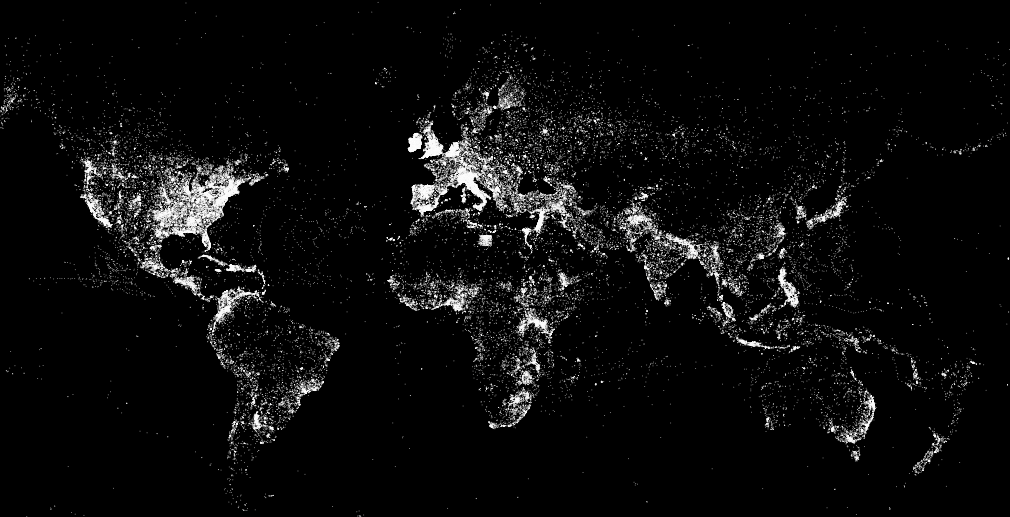
Ushahidi has just uploaded the location of all CrowdMap reports to DevSeed’s awesome MapBox and the result looks gorgeous. Click this link to view the map below in an interactive, full-browser window. Ushahidi doesn’t disclose the actual number of reports depicted, only the number of maps that said reports have been posted to and the number of countries that CrowdMaps have been launched for. But I’m hoping they’ll reveal that figure soon as well. (Update from Ushahidi: This map shows the 246,323 unique locations used for reports from the launch of Crowdmap on Aug 9, 2010 to Jan 18, 2013).

Screen Shot 2013-02-06 at 3.10.38 AM

In any event, I’ve just emailed my colleagues at Ushahidi to congratulate them and ask when their geo-dataset will be made public since they didn’t include a link to said dataset in their recent blog post. I’ll be sure to let readers know in the comments section as soon as I get a reply. There are a plethora of fascinating research questions that this dataset could potentially help us answer. I’m really excited and can’t wait for my team and I at QCRI to start playing with the data. I’d also love to see this static map turned into a live map; one that allows users to actually click on individual reports as they get posted to a CrowdMap and to display the category (or categories) they’ve been tagged with. Now that would be just be so totally über cool—especially if/when Ushahidi opens up that data to the public, even if at a spatially & temporally aggregated level.

For more mesmerizing visualizations like this one, see my recent blog post entitled “Social Media: Pulse of the Planet?” which is also cross-posted on the National Geographic blog here. In the meantime, I’m keeping my fingers crossed that Ushahidi will embrace an Open Data policy from here on out and highly recommend the CrowdGlobe Report to readers interested in learning more about CrowdMap and Ushahidi.

bio

Map or Be Mapped: Otherwise You Don’t Exist

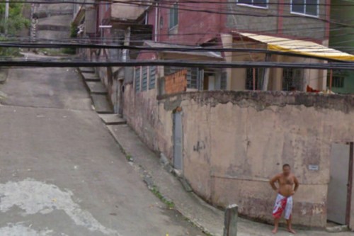
“There are hardly any street signs here. There are no official zip codes. No addresses. Just word of mouth” (1). Such is the fate of Brazil’s Mare shanty-town and that of most shantytowns around the world where the spoken word is king (and not necessarily benevolent). “The sprawling complex of slums, along with the rest of Rio de Janerio’s favelas, has hung in a sort of ‘legal invisibility’ since 1937, when a city ordinance ruled that however unsightly, favelas should be kept off maps because they were merely ‘temporary'” (2).

shantytown

The socio-economic consequences were far-reaching. For decades, this infor-mality meant that “entire neighborhoods did not receive mail. It had also blocked people from giving required information on job applications, getting a bank account or telling the police or fire department where to go in an emergency call. Favela residents had to pick up their mail from their neighborhood associations, and entire slums housing a small town’s worth of residents had to use the zip code of the closest officially recognized street” (3).

All this is starting to change thanks to a grassroots initiative that is surveying Mare’s 16 favelas, home to some 130,000 people. This community-driven project has appropriated the same survey methodology used by the Brazilian government’s Institute of Geography and Statistics. The collected data includes “not only street names but the history of the original smaller favelas that make up the community” (4). This data is then “formatted into pocket guides and distributed gratis to residents. These guides also offer background on certain streets’ namesakes, but leave some blank so that residents can fill them in as Mare […] continues shifting out from the shadows of liminal space to a city with distinct identities” (5). And so, “residents of Rio’s famed favelas are undergoing their first real and ‘fundamental step toward citizenship'” (6).

These bottom-up, counter-mapping efforts are inherently political—call it guerrilla mapping. Traditionally, maps have represented “not just the per-spective of the cartographer herself, but of much larger institutions—of corporations, organizations, and governments” (7). The scale was fixed at one and only one scale, that of the State. Today, informal communities can take matters into their own hands and put themselves on the map; at the scale of their choosing. But companies like Google still have the power to make these communities vanish. In Brazil, Google said it “would tweak the site’s [Google Maps’] design, namely its text size and district labeling to show favela names only after users zoomed in on those areas.”

GmapNK

Meanwhile, Google is making North Korea’s capital city more visible. But I had an uncomfortable feeling after reading National Geographic’s take on Google’s citizen mapping expedition to North Korea. The Director for National Geographic Maps, Juan José Valdéscautions that, “In many parts of the world such citizen mapping has proven challenging, if not downright dangerous. In many places, little can be achieved without the approval of local and or national authorities—especially in North Korea.” Yes, but in many parts of the world citizen mapping is safe and possible. More importantly, citizen mapping can be a powerful tool for digital activism. My entire doctoral dissertation focuses on exactly this issue.

Yes, Valdés is absolutely correct when he writes that “In many countries, place-names, let alone the alignment of boundaries, remain a powerful symbol of independence and national pride, and not merely indicators of location. This is where citizen cartographers need to understand the often subtle nuances and potential pitfalls of mapping.” As the New Yorker notes, “Maps are so closely associated with power that dictatorships regard information on geography as a state secret.” But map-savvy digital activists already know this better than most, and they deliberately seek to exploit this to their advantage in their struggles for democracy.

National Geographic’s mandate is of course very different. “From National Geographic’s perspective, all a map should accomplish is the actual portrayal of national sovereignty, as it currently exists. It should also reflect the names as closely as possible to those recognized by the political entities of the geographic areas being mapped. To do otherwise would give map readers an unrealistic picture of what is occurring on the ground.”

natgeomaps

This makes perfect sense for National Geographic. But as James Scott reminds us in his latest book, “A great deal of the symbolic work of official power is precisely to obscure the confusion, disorder, spontaneity, error, and improvisation of political power as it is in fact exercised, beneath a billiard-ball-smooth surface of order, deliberation, rationality, and control. I think of this as the ‘miniaturization of order.'” Scott adds that, “The order, rationality, abstractness and synoptic legibility of certain kinds of schemes of naming, landscape, architecture, and work processes lend themselves to hierarchical power […] ‘landscapes of control and appropriation.'”

Citizen mapping, especially in repressive environments, often seeks to change that balance of power by redirecting the compass of political power with the  use of subversive digital maps. Take last year’s example of Syrian pro-democracy activists changing place & street names depicted on on the Google Map of Syria. They did this intentionally as an act of resistance and defiance. Again, I fully understand and respect that National Geographic’s mandate is completely different to that of pro-democracy activists fighting for freedom. I just wish that Valdés had a least added one sentence to acknowledge the importance of maps for the purposes of resistance and pro-democracy movements. After all, he is himself a refugee from Cuba’s political repression.

There is of course a flip side to all this. While empowering, visibility and legibility can also undermine a community’s autonomy. As Pierre-Joseph Proudhon famously put it, “To be governed is to be watched, inspected, spied upon, directed, law-driven, numbered, regulated, enrolled, indoctrinated, preached at, controlled, checked, estimated, valued, censured, commanded, by creatures who have neither the right nor the wisdom nor the virtue to do so.” To be digitally mapped is to be governed, but perhaps at multiple scales including the preferred scale of self-governance and self-determination.

And so, we find ourselves repeating the words of Shakespeare’s famous character Hamlet: “To be, or not to be,” to map, or not to map.


See also:

  • Spying with Maps [Link]
  • How to Lie With Maps [Link]
  • Folksomaps for Community Mapping [Link]
  • From Social Mapping to Crisis Mapping [Link]
  • Crisis Mapping Somalia with the Diaspora [Link]
  • Perils of Crisis Mapping: Lessons from Gun Map [Link]
  • Crisis Mapping the End of Sudan’s Dictatorship? [Link]
  • Threat and Risk Mapping Analysis in the Sudan [Link]
  • Rise of Amateur Professionals & Future of Crisis Mapping [Link]
  • Google Inc + World Bank = Empowering Citizen Cartographers? [Link]

Note: Readers interested in the topics discussed above may also be interested in a forthcoming book to be published by Oxford University Press entitled “Information and Communication Technologies in Areas of Limited State-hood.” I have contributed a chapter to this book entitled “Crisis Mapping in Areas of Limited Statehood,” which analyzes how the rise of citizen-genera-ted crisis mapping replaces governance in areas of limited statehood. The chapter distills the conditions for the success of these crisis mapping efforts in these non-permissive and resource-restricted environments. 

Big Data for Development: From Information to Knowledge Societies?

Unlike analog information, “digital information inherently leaves a trace that can be analyzed (in real-time or later on).” But the “crux of the ‘Big Data’ paradigm is actually not the increasingly large amount of data itself, but its analysis for intelligent decision-making (in this sense, the term ‘Big Data Analysis’ would actually be more fitting than the term ‘Big Data’ by itself).” Martin Hilbert describes this as the “natural next step in the evolution from the ‘Information Age’ & ‘Information Societies’ to ‘Knowledge Societies’ […].”

Hilbert has just published this study on the prospects of Big Data for inter-national development. “From a macro-perspective, it is expected that Big Data informed decision-making will have a similar positive effect on efficiency and productivity as ICT have had during the recent decade.” Hilbert references a 2011 study that concluded the following: “firms that adopted Big Data Analysis have output and productivity that is 5–6 % higher than what would be expected given their other investments and information technology usage.” Can these efficiency gains be brought to the unruly world of international development?

To answer this question, Hilbert introduces the above conceptual framework to “systematically review literature and empirical evidence related to the pre-requisites, opportunities and threats of Big Data Analysis for international development.” Words, Locations, Nature and Behavior are types of data that are becoming increasingly available in large volumes.

“Analyzing comments, searches or online posts [i.e., Words] can produce nearly the same results for statistical inference as household surveys and polls.” For example, “the simple number of Google searches for the word ‘unemployment’ in the U.S. correlates very closely with actual unemployment data from the Bureau of Labor Statistics.” Hilbert argues that the tremendous volume of free textual data makes “the work and time-intensive need for statistical sampling seem almost obsolete.” But while the “large amount of data makes the sampling error irrelevant, this does not automatically make the sample representative.” 

The increasing availability of Location data (via GPS-enabled mobile phones or RFIDs) needs no further explanation. Nature refers to data on natural processes such as temperature and rainfall. Behavior denotes activities that can be captured through digital means, such as user-behavior in multiplayer online games or economic affairs, for example. But “studying digital traces might not automatically give us insights into offline dynamics. Besides these biases in the source, the data-cleaning process of unstructured Big Data frequently introduces additional subjectivity.”

The availability and analysis of Big Data is obviously limited in areas with scant access to tangible hardware infrastructure. This corresponds to the “Infra-structure” variable in Hilbert’s framework. “Generic Services” refers to the production, adoption and adaptation of software products, since these are a “key ingredient for a thriving Big Data environment.” In addition, the exploitation of Big Data also requires “data-savvy managers and analysts and deep analytical talent, as well as capabilities in machine learning and computer science.” This corresponds to “Capacities and Knowledge Skills” in the framework.

The third and final side of the framework represents the types of policies that are necessary to actualize the potential of Big Data for international develop-ment. These policies are divided into those that elicit a Positive Feedback Loops such as financial incentives and those that create regulations such as interoperability, that is, Negative Feedback Loops.

The added value of Big Data Analytics is also dependent on the availability of publicly accessible data, i.e., Open Data. Hilbert estimates that a quarter of US government data could be used for Big Data Analysis if it were made available to the public. There is a clear return on investment in opening up this data. On average, governments with “more than 500 publicly available databases on their open data online portals have 2.5 times the per capita income, and 1.5 times more perceived transparency than their counterparts with less than 500 public databases.” The direction of “causality” here is questionable, however.

Hilbert concludes with a warning. The Big Data paradigm “inevitably creates a new dimension of the digital divide: a divide in the capacity to place the analytic treatment of data at the forefront of informed decision-making. This divide does not only refer to the availability of information, but to intelligent decision-making and therefore to a divide in (data-based) knowledge.” While the advent of Big Data Analysis is certainly not a panacea,”in a world where we desperately need further insights into development dynamics, Big Data Analysis can be an important tool to contribute to our understanding of and improve our contributions to manifold development challenges.”

I am troubled by the study’s assumption that we live in a Newtonian world of decision-making in which for every action there is an automatic equal and opposite reaction. The fact of the matter is that the vast majority of development policies and decisions are not based on empirical evidence. Indeed, rigorous evidence-based policy-making and interventions are still very much the exception rather than the rule in international development. Why? “Account-ability is often the unhappy byproduct rather than desirable outcome of innovative analytics. Greater accountability makes people nervous” (Harvard 2013). Moreover, response is always political. But Big Data Analysis runs the risk de-politicize a problem. As Alex de Waal noted over 15 years ago, “one universal tendency stands out: technical solutions are promoted at the expense of political ones.” I hinted at this concern when I first blogged about the UN Global Pulse back in 2009.

In sum, James Scott (one of my heroes) puts it best in his latest book:

“Applying scientific laws and quantitative measurement to most social problems would, modernists believed, eliminate the sterile debates once the ‘facts’ were known. […] There are, on this account, facts (usually numerical) that require no interpretation. Reliance on such facts should reduce the destructive play of narratives, sentiment, prejudices, habits, hyperbole and emotion generally in public life. […] Both the passions and the interests would be replaced by neutral, technical judgment. […] This aspiration was seen as a new ‘civilizing project.’ The reformist, cerebral Progressives in early twentieth-century American and, oddly enough, Lenin as well believed that objective scientific knowledge would allow the ‘administration of things’ to largely replace politics. Their gospel of efficiency, technical training and engineering solutions implied a world directed by a trained, rational, and professional managerial elite. […].”

“Beneath this appearance, of course, cost-benefit analysis is deeply political. Its politics are buried deep in the techniques […] how to measure it, in what scale to use, […] in how observations are translated into numerical values, and in how these numerical values are used in decision making. While fending off charges of bias or favoritism, such techniques […] succeed brilliantly in entrenching a political agenda at the level of procedures and conventions of calculation that is doubly opaque and inaccessible. […] Charged with bias, the official can claim, with some truth, that ‘I am just cranking the handle” of a nonpolitical decision-making machine.”

See also:

  • Big Data for Development: Challenges and Opportunities [Link]
  • Beware the Big Errors of Big Data (by Nassim Taleb) [Link]
  • How to Build Resilience Through Big Data [Link]