Category Archives: Crowdsourcing

To Tweet or Not To Tweet During a Disaster?

Yes, only a small percentage of tweets generated during a disaster are directly relevant and informative for disaster response. No, this doesn’t mean we should dismiss Twitter as a source for timely, disaster-related information. Why? Because our efforts ought to focus on how that small percentage of informative tweets can be increased. What incentives or policies can be put in place? The following tweets by the Filipino government may shed some light.

Gov Twitter Pablo

The above tweet was posted three days before Typhoon Bopha (designated Pablo locally) made landfall in the Philippines. In the tweet below, the government directly and publicly encourages Filipinos to use the #PabloPH hashtag and to follow the Philippine Atmospheric, Geophysical & Astronomical Services Admin-istration (PAGASA) twitter feed, @dost_pagasa, which has over 400,000 follow-ers and also links to this official Facebook page.

Gov Twitter

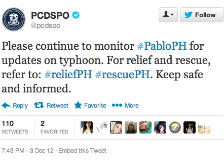
The government’s official Twitter handle (@govph) is also retweeting tweets posted by The Presidential Communications Development and Strategic Plan-ning Office (@PCDCSO). This office is the “chief message-crafting body of the Office of the President.” In one such retweet (below), the office encourages those on Twitter to use different hashtags for different purposes (relief vs rescue). This mimics the use of official emergency numbers for different needs, e.g., police, fire, Ambulance, etc.

Twitter Pablo Gov

Given this kind of enlightened disaster response leadership, one would certainly expect that the quality of tweets received will be higher than without government endorsement. My team and I at QCRI are planning to analyze these tweets to de-termine whether or not this is the case. In the meantime, I expect we’ll see more examples of self-organized disaster response efforts using these hashtags, as per the earlier floods in August, which I blogged about here: Crowdsourcing Crisis Response following the Philippine Floods. This tech-savvy self-organization dynamic is important since the government itself may be unable to follow up on every tweeted request.

Predicting the Credibility of Disaster Tweets Automatically

“Predicting Information Credibility in Time-Sensitive Social Media” is one of this year’s most interesting and important studies on “information forensics”. The analysis, co-authored by my QCRI colleague ChaTo Castello, will be published in Internet Research and should be required reading for anyone interested in the role of social media for emergency management and humanitarian response. The authors study disaster tweets and find that there are measurable differences in the way they propagate. They show that “these differences are related to the news-worthiness and credibility of the information conveyed,” a finding that en-abled them to develop an automatic and remarkably accurate way to identify credible information on Twitter.

The new study builds on this previous research, which analyzed the veracity of tweets during a major disaster. The research found “a correlation between how information propagates and the credibility that is given by the social network to it. Indeed, the reflection of real-time events on social media reveals propagation patterns that surprisingly has less variability the greater a news value is.” The graphs below depict this information propagation behavior during the 2010 Chile Earthquake.

The graphs depict the re-tweet activity during the first hours following earth-quake. Grey edges depict past retweets. Some of the re-tweet graphs reveal interesting patterns even within 30-minutes of the quake. “In some cases tweet propagation takes the form of a tree. This is the case of direct quoting of infor-mation. In other cases the propagation graph presents cycles, which indicates that the information is being commented and replied, as well as passed on.” When studying false rumor propagation, the analysis reveals that “false rumors tend to be questioned much more than confirmed truths […].”

Building on these insights, the authors studied over 200,000 disaster tweets and identified 16 features that best separate credible and non-credible tweets. For example, users who spread credible tweets tend to have more followers. In addition, “credible tweets tend to include references to URLs which are included on the top-10,000 most visited domains on the Web. In general, credible tweets tend to include more URLs, and are longer than non credible tweets.” Further-more, credible tweets also tend to express negative feelings whilst non-credible tweets concentrate more on positive sentiments. Finally, question- and exclama-tion-marks tend to be associated with non-credible tweets, as are tweets that use first and third person pronouns. All 16 features are listed below.

• Average number of tweets posted by authors of the tweets on the topic in past.
• Average number of followees of authors posting these tweets.
•  Fraction of tweets having a positive sentiment.
•  Fraction of tweets having a negative sentiment.
•  Fraction of tweets containing a URL that contain most frequent URL.
•  Fraction of tweets containing a URL.
•  Fraction of URLs pointing to a domain among top 10,000 most visited ones.
•  Fraction of tweets containing a user mention.
•  Average length of the tweets.
•  Fraction of tweets containing a question mark.
•  Fraction of tweets containing an exclamation mark.
•  Fraction of tweets containing a question or an exclamation mark.
•  Fraction of tweets containing a “smiling” emoticons.
•  Fraction of tweets containing a first-person pronoun.
•  Fraction of tweets containing a third-person pronoun.
•  Maximum depth of the propagation trees.

Using natural language processing (NLP) and machine learning (ML), the authors used the insights above to develop an automatic classifier for finding credible English-language tweets. This classifier had a 86% AUC. This measure, which ranges from 0 to 1, captures the classifier’s predictive quality. When applied to Spanish-language tweets, the classifier’s AUC was still relatively high at 82%, which demonstrates the robustness of the approach.

Interested in learning more about “information forensics”? See this link and the articles below:

Why USAID’s Crisis Map of Syria is so Unique

While static, this crisis map includes a truly unique detail. Click on the map below to see a larger version as this may help you spot what is so striking.

For a hint, click this link. Still stumped? Look at the sources listed in the Key.


Rapidly Verifying the Credibility of Information Sources on Twitter

One of the advantages of working at QCRI is that I’m regularly exposed to peer-reviewed papers presented at top computing conferences. This is how I came across an initiative called “Seriously Rapid Source Review” or SRSR. As many iRevolution readers know, I’m very interested in information forensics as applied to crisis situations. So SRSR certainly caught my attention.

The team behind SRSR took a human centered design approach in order to integrate journalistic practices within the platform. There are four features worth noting in this respect. The first feature to note in the figure below is the automated filter function, which allows one to view tweets generated by “Ordinary People,” “Journalists/Bloggers,” “Organizations,” “Eyewitnesses” and “Uncategorized.” The second feature, Location, “shows a set of pie charts indica-ting the top three locations where the user’s Twitter contacts are located. This cue provides more location information and indicates whether the source has a ‘tie’ or other personal interest in the location of the event, an aspect of sourcing exposed through our preliminary interviews and suggested by related work.”


The third feature worth noting is the “Eyewitness” icon. The SRSR team developed the first ever automatic classifier to identify eyewitness reports shared on Twitter. My team and I at QCRI are developing a second one that focuses specifically on automatically classifying eyewitness reports during sudden-onset natural disasters. The fourth feature is “Entities,” which displays the top five entities that the user has mentioned in their tweet history. These include references to organizations, people and places, which can reveal important patterns about the twitter user in question.

Journalists participating in this applied research found the “Location” feature particularly important when assess the credibility of users on Twitter. They noted that “sources that had friends in the location of the event were more believable, indicating that showing friends’ locations can be an indicator of credibility.” One journalist shared the following: “I think if it’s someone without any friends in the region that they’re tweeting about then that’s not nearly as authoritative, whereas if I find somebody who has 50% of friends are in [the disaster area], I would immediately look at that.”

In addition, the automatic identification of “eyewitnesses” was deemed essential by journalists who participated in the SRSR study. This should not be surprising since “news organizations often use eyewitnesses to add credibility to reports by virtue of the correspondent’s on-site proximity to the event.” Indeed, “Witness-ing and reporting on what the journalist had witnessed have long been seen as quintessential acts of journalism.” To this end, “social media provides a platform where once passive witnesses can become active and share their eyewitness testimony with the world, including with journalists who may choose to amplify their report.”

In sum, SRSR could be used to accelerate the verification of social media con-tent, i.e., go beyond source verification alone. For more on SRSR, please see this computing paper (PDF), which was authored by Nicholas Diakopoulos, Munmun De Choudhury and Mor Naaman.

The Most Impressive Live Global Twitter Map, Ever?

My colleague Kalev Leetaru has just launched The Global Twitter Heartbeat Project in partnership with the Cyber Infrastructure and Geospatial Information Laboratory (CIGI) and GNIP. He shared more information on this impressive initiative with the CrisisMappers Network this morning.

According to Kalev, the project “uses an SGI super-computer to visualize the Twitter Decahose live, applying fulltext geocoding to bring the number of geo-located tweets from 1% to 25% (using a full disambiguating geocoder that uses all of the user’s available information in the Twitter stream, not just looking for mentions of major cities), tone-coding each tweet using a twitter-customized dictionary of 30,000 terms, and applying a brand-new four-stage heatmap engine (this is where the supercomputer comes in) that makes a map of the number of tweets from or about each location on earth, a second map of the average tone of all tweets for each location, a third analysis of spatial proximity (how close tweets are in an area), and a fourth map as needed for the percent of all of those tweets about a particular topic, which are then all brought together into a single heatmap that takes all of these factors into account, rather than a sequence of multiple maps.”

Kalev added that, “For the purposes of this demonstration we are processing English only, but are seeing a nearly identical spatial profile to geotagged all-languages tweets (though this will affect the tonal results).” The Twitterbeat team is running a live demo showing both a US and world map updated in realtime at Supercomputing on a PufferSphere and every few seconds on the SGI website here.”


So why did Kalev share all this with the CrisisMappers Network? Because he and his team created a rather unique crisis map composed of all tweets about Hurricane Sandy, see the YouTube video above. “[Y]ou  can see how the whole country lights up and how tweets don’t just move linearly up the coast as the storm progresses, capturing the advance impact of such a large storm and its peripheral effects across the country.” The team also did a “similar visualization of the recent US Presidential election showing the chaotic nature of political communication in the Twittersphere.”


To learn more about the project, I recommend watching Kalev’s 2-minute introductory video above.

Crowdsourcing the Evaluation of Post-Sandy Building Damage Using Aerial Imagery

Update (Nov 2): 5,739 aerial images tagged by over 3,000 volunteers. Please keep up the outstanding work!

My colleague Schuyler Erle from Humanitarian OpenStreetMap  just launched a very interesting effort in response to Hurricane Sandy. He shared the info below via CrisisMappers earlier this morning, which I’m turning into this blog post to help him recruit more volunteers.

Schuyler and team just got their hands on the Civil Air Patrol’s (CAP) super high resolution aerial imagery of the disaster affected areas. They’ve imported this imagery into their Micro-Tasking Server MapMill created by Jeff Warren and are now asking volunteers to help tag the images in terms of the damage depicted in each photo. “The 531 images on the site were taken from the air by CAP over New York, New Jersey, Rhode Island, and Massachusetts on 31 Oct 2012.”

To access this platform, simply click here: http://sandy.hotosm.org. If that link doesn’t work,  please try sandy.locative.us.

“For each photo shown, please select ‘ok’ if no building or infrastructure damage is evident; please select ‘not ok’ if some damage or flooding is evident; and please select ‘bad’ if buildings etc. seem to be significantly damaged or underwater. Our *hope* is that the aggregation of the ok/not ok/bad ratings can be used to help guide FEMA resource deployment, or so was indicated might be the case during RELIEF at Camp Roberts this summer.”

A disaster response professional working in the affected areas for FEMA replied (via CrisisMappers) to Schuyler’s efforts to confirm that:

“[G]overnment agencies are working on exploiting satellite imagery for damage assessments and flood extents. The best way that you can help is to help categorize photos using the tool Schuyler provides […].  CAP imagery is critical to our decision making as they are able to work around some of the limitations with satellite imagery so that we can get an area of where the worst damage is. Due to the size of this event there is an overwhelming amount of imagery coming in, your assistance will be greatly appreciated and truly aid in response efforts.  Thank you all for your willingness to help.”

Schuyler notes that volunteers can click on the Grid link from the home page of the Micro-Tasking platform to “zoom in to the coastlines of Massachusetts or New Jersey” and see “judgements about building damages beginning to aggregate in US National Grid cells, which is what FEMA use operationally. Again, the idea and intention is that, as volunteers judge the level of damage evident in each photo, the heat map will change color and indicate at a glance where the worst damage has occurred.” See above screenshot.

Even if you just spend 5 or 10 minutes tagging the imagery, this will still go a long way to supporting FEMA’s response efforts. You can also help by spreading the word and recruiting others to your cause. Thank you!

What Was Novel About Social Media Use During Hurricane Sandy?

We saw the usual spikes in Twitter activity and the typical (reactive) launch of crowdsourced crisis maps. We also saw map mashups combining user-generated content with scientific weather data. Facebook was once again used to inform our social networks: “We are ok” became the most common status update on the site. In addition, thousands of pictures where shared on Instagram (600/minute), documenting both the impending danger & resulting impact of Hurricane Sandy. But was there anything really novel about the use of social media during this latest disaster?

I’m asking not because I claim to know the answer but because I’m genuinely interested and curious. One possible “novelty” that caught my eye was this FrankenFlow experiment to “algorithmically curate” pictures shared on social media. Perhaps another “novelty” was the embedding of webcams within a number of crisis maps, such as those below launched by #HurricaneHacker and Team Rubicon respectively.

Another “novelty” that struck me was how much focus there was on debunking false information being circulated during the hurricane—particularly images. The speed of this debunking was also striking. As regular iRevolution readers will know, “information forensics” is a major interest of mine.

This Tumblr post was one of the first to emerge in response to the fake pictures (30+) of the hurricane swirling around the social media whirlwind. Snopes.com also got in on the action with this post. Within hours, The Atlantic Wire followed with this piece entitled “Think Before You Retweet: How to Spot a Fake Storm Photo.” Shortly after, Alexis Madrigal from The Atlantic published this piece on “Sorting the Real Sandy Photos from the Fakes,” like the one below.

These rapid rumor-bashing efforts led BuzzFeed’s John Herman to claim that Twitter acted as a truth machine: “Twitter’s capacity to spread false information is more than cancelled out by its savage self-correction.” This is not the first time that journalists or researchers have highlighted Twitter’s tendency for self-correction. This peer-reviewed, data-driven study of disaster tweets generated during the 2010 Chile Earthquake reports the same finding.

What other novelties did you come across? Are there other interesting, original and creative uses of social media that ought to be documented for future disaster response efforts? I’d love to hear from you via the comments section below. Thanks!

The Limits of Crowdsourcing Crisis Information and The Promise of Advanced Computing


First, I want to express my sincere gratitude to the dozen or so iRevolution readers who recently contacted me. I have indeed not been blogging for the past few weeks but this does not mean I have decided to stop blogging altogether. I’ve simply been ridiculously busy (and still am!). But I truly, truly appreciate the kind encouragement to continue blogging, so thanks again to all of you who wrote in.

Now, despite the (catchy?) title of this blog post, I am not bashing crowd-sourcing or worshipping on the alter of technology. My purpose here is simply to suggest that the crowdsourcing of crisis information is an approach that does not scale very well. I have lost count of the number of humanitarian organizations who said they simply didn’t have hundreds of volunteers available to manually monitor social media and create a live crisis map. Hence my interest in advanced computing solutions.

The past few months at the Qatar Computing Research Institute (QCRI) have made it clear to me that developing and applying advanced computing solutions to address major humanitarian challenges is anything but trivial. I have learned heaps about social computing, machine learning and big data analytics. So I am now more aware of the hurdles but am even more excited than before about the promise that advanced computing holds for the development of next-generation humanitarian technology.

The way forward combines both crowdsourcing and advanced computing. The next generation of humanitarian technologies will take a hybrid approach—at times prioritizing “smart crowdsourcing” and at other times leading with automated algorithms. I shall explain what I mean by smart crowdsourcing in a future post. In the meantime, the video above from my recent talk at TEDxSendai expands on the themes I have just described.

The Best Way to Crowdsource Satellite Imagery Analysis for Disaster Response

My colleague Kirk Morris recently pointed me to this very neat study on iterative versus parallel models of crowdsourcing for the analysis of satellite imagery. The study was carried out by French researcher & engineer Nicolas Maisonneuve for the next GISscience2012 conference.

Nicolas finds that after reaching a certain threshold, adding more volunteers to the parallel model does “not change the representativeness of opinion and thus will not change the consensual output.” His analysis also shows that the value of this threshold has significant impact on the resulting quality of the parallel work and thus should be chosen carefully.  In terms of the iterative approach, Nicolas finds that “the first iterations have a high impact on the final results due to a path dependency effect.” To this end, “stronger commitment during the first steps are thus a primary concern for using such model,” which means that “asking expert/committed users to start,” is important.

Nicolas’s study also reveals that the parellel approach is better able to correct wrong annotations (wrong analysis of the satellite imagery) than the iterative model for images that are fairly straightforward to interpret. In contrast, the iterative model is better suited for handling more ambiguous imagery. But there is a catch: the potential path dependency effect in the iterative model means that  “mistakes could be propagated, generating more easily type I errors as the iterations proceed.” In terms of spatial coverage, the iterative model is more efficient since the parallel model leverages redundancy to ensure data quality. Still, Nicolas concludes that the “parallel model provides an output which is more reliable than that of a basic iterative [because] the latter is sensitive to vandalism or knowledge destruction.”

So the question that naturally follow is this: how can parallel and iterative methodologies be combined to produce a better overall result? Perhaps the parallel approach could be used as the default to begin with. However, images that are considered difficult to interpret would get pushed from the parallel workflow to the iterative workflow. The latter would first be processed by experts in order to create favorable path dependency. Could this hybrid approach be the wining strategy?

Six Degrees of Separation: Implications for Verifying Social Media

The Economist recently published this insightful article entitled” Six Degrees of Mobilisation: To what extent can social networking make it easier to find people and solve real-world problems?” The notion, six degrees of separation, comes from Stanley Milgram’s experiment in the 1960s which found that there were, on average, six degrees of separation between any two people in the US. Last year, Facebook found that users on the social network were separated by an average of 4.7 hops. The Economist thus asks the following, fascinating question:

“Can this be used to solve real-world problems, by taking advantage of the talents and connections of one’s friends, and their friends? That is the aim of a new field known as social mobilisation, which treats the population as a distributed knowledge resource which can be tapped using modern technology.”

The article refers to DARPA’s Red Balloon Challenge, which I already blogged about here: “Time-Critical Crowdsourcing for Social Mobilization and Crowd-Solving.”  The Economist also references DARPA’s TagChallenge. In both cases, the winning teams leveraged social media using crowdsourcing and clever incentive mechanisms. Can this approach also be used to verify social media content during a crisis?

This new study on disasters suggests that the “degrees of separation” between any two organizations in the field is 5. So if the location of red balloons and individuals can be crowdsourced surprisingly quickly, then can the evidence necessary to verify social media content during a disaster be collected as rapidly and reliably? If we are only separated by four-to-six degrees, then this would imply that it only takes that many hops to find someone connected to me (albeit indirectly) who could potentially confirm or disprove the authenticity of a particularly piece of information. This approach was used very successfully in Kyrgyzstan a couple years ago. Can we develop a platform to facilitate this process? And if so, what design features (e.g., gamification) are necessary to mobilize participants and make this tool a success?