Using Social Media to Predict Economic Activity in Cities

Economic indicators in most developing countries are often outdated. A new study suggests that social media may provide useful economic signals when traditional economic data is unavailable. In “Taking Brazil’s Pulse: Tracking Growing Urban Economies from Online Attention” (PDF), the authors accurately predict the GDPs of 45 Brazilian cities by analyzing data from a popular micro-blogging platform (Yahoo Meme). To make these predictions, the authors used the concept of glocality, which notes that “economically successful cities tend to be involved in interactions that are both local and global at the same time.” The results of the study reveals that “a city’s glocality, measured with social media data, effectively signals the city’s economic well-being.”

The authors are currently expanding their work by predicting social capital for these 45 cities based on social media data. As iRevolution readers will know, I’ve blogged extensively on using social media to measure social capital footprints at the city and sub-city level. So I’ve contacted the authors of the study and look forward to learning more about their research. As they rightly note:

“There is growing interesting in using digital data for development opportunities, since the number of people using social media is growing rapidly in developing countries as well. Local impacts of recent global shocks – food, fuel and financial – have proven not to be immediately visible and trackable, often unfolding ‘beneath the radar of traditional monitoring systems’. To tackle that problem, policymakers are looking for new ways of monitoring local impacts […].”


bio

New Insights on How To Verify Social Media

The “field” of information forensics has seen some interesting developments in recent weeks. Take the Verification Handbook or Twitter Lie-Detector project, for example. The Social Sensor project is yet another new initiative. In this blog post, I seek to make sense of these new developments and to identify where this new field may be going. In so doing, I highlight key insights from each initiative. 

VHandbook1

The co-editors of the Verification Handbook remind us that misinformation and rumors are hardly new during disasters. Chapter 1 opens with the following account from 1934:

“After an 8.1 magnitude earthquake struck northern India, it wasn’t long before word circulated that 4,000 buildings had collapsed in one city, causing ‘innumerable deaths.’ Other reports said a college’s main building, and that of the region’s High Court, had also collapsed.”

These turned out to be false rumors. The BBC’s User Generated Content (UGC) Hub would have been able to debunk these rumors. In their opinion, “The business of verifying and debunking content from the public relies far more on journalistic hunches than snazzy technology.” So they would have been right at home in the technology landscape of 1934. To be sure, they contend that “one does not need to be an IT expert or have special equipment to ask and answer the fundamental questions used to judge whether a scene is staged or not.” In any event, the BBC does not “verify something unless [they] speak to the person that created it, in most cases.” What about the other cases? How many of those cases are there? And how did they ultimately decide on whether the information was true or false even though they did not  speak to the person that created it?  

As this new study argues, big news organizations like the BBC aim to contact the original authors of user generated content (UGC) not only to try and “protect their editorial integrity but also because rights and payments for newsworthy footage are increasingly factors. By 2013, the volume of material and speed with which they were able to verify it [UGC] were becoming significant frustrations and, in most cases, smaller news organizations simply don’t have the manpower to carry out these checks” (Schifferes et al., 2014).

Credit: ZDnet

Chapter 3 of the Handbook notes that the BBC’s UGC Hub began operations in early 2005. At the time, “they were reliant on people sending content to one central email address. At that point, Facebook had just over 5 million users, rather than the more than one billion today. YouTube and Twitter hadn’t launched.” Today, more than 100 hours of content is uploaded to YouTube every minute; over 400 million tweets are sent each day and over 1 million pieces of content are posted to Facebook every 30 seconds. Now, as this third chapter rightly notes, “No technology can automatically verify a piece of UGC with 100 percent certainty. However, the human eye or traditional investigations aren’t enough either. It’s the combination of the two.” New York Times journalists concur: “There is a problem with scale… We need algorithms to take more onus off human beings, to pick and understand the best elements” (cited in Schifferes et al., 2014).

People often (mistakenly) see “verification as a simple yes/no action: Something has been verified or not. In practice, […] verification is a process” (Chapter 3). More specifically, this process is one of satisficing. As colleagues Leysia Palen et al.  note in this study, “Information processing during mass emergency can only satisfice because […] the ‘complexity of the environment is immensely greater than the computational powers of the adaptive system.'” To this end, “It is an illusion to believe that anyone has perfectly accurate information in mass emergency and disaster situations to account for the whole event. If someone did, then the situation would not be a disaster or crisis.” This explains why Leysia et al seek to shift the debate to one focused on the helpfulness of information rather the problematic true/false dichotomy.

Credit: Ann Wuyts

“In highly contextualized situations where time is of the essence, people need support to consider the content across multiple sources of information. In the online arena, this means assessing the credibility and content of information distributed across [the web]” (Leysia et al., 2011). This means that, “Technical support can go a long way to help collate and inject metadata that make explicit many of the inferences that the every day analyst must make to assess credibility and therefore helpfulness” (Leysia et al., 2011). In sum, the human versus computer debate vis-a-vis the verification of social media is somewhat pointless. The challenge moving forward resides in identifying the best ways to combine human cognition with machine computing. As Leysia et al. rightly note, “It is not the job of the […] tools to make decisions but rather to allow their users to reach a decision as quickly and confidently as possible.”

This may explain why Chapter 7 (which I authored) applies both human and advanced computing techniques to the verification challenge. Indeed, I explicitly advocate for a hybrid approach. In contrast, the Twitter Lie-Detector project known as Pheme apparently seeks to use machine learning alone to automatically verify online rumors as they spread on social networks. Overall, this is great news—the more groups that focus on this verification challenge, the better for those us engaged in digital humanitarian response. It remains to be seen, however, whether machine learning alone will make Pheme a success.

pheme

In the meantime, the EU’s Social Sensor project is developing new software tools to help journalists assess the reliability of social media content (Schifferes et al., 2014). A preliminary series of interviews revealed that journalists were most interested in Social Sensor software for:

1. Predicting or alerting breaking news

2. Verifying social media content–quickly identifying who has posted a tweet or video and establishing “truth or lie”

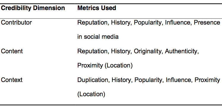
So the Social Sensor project is developing an “Alethiometer” (Alethia is Greek for ‘truth’) to “meter the credibility of of information coming from any source by examining the three Cs—Contributors, Content and Context. These seek to measure three key dimensions of credibility: the reliability of contributors, the nature of the content, and the context in which the information is presented. This reflects the range of considerations that working journalists take into account when trying to verify social media content. Each of these will be measured by multiple metrics based on our research into the steps that journalists go through manually. The results of [these] steps can be weighed and combined [metadata] to provide a sense of credibility to guide journalists” (Schifferes et al., 2014).

SocialSensor1

On our end, my colleagues and at QCRI are continuing to collaborate with several partners to experiment with advanced computing methods to address the social media verification challenge. As noted in Chapter 7, Verily, a platform that combines time-critical crowdsourcing and critical thinking, is still in the works. We’re also continuing our collaboration on a Twitter credibility plugin (more in Chapter 7). In addition, we are exploring whether we can microtask the computation of source credibility scores using MicroMappers.

Of course, the above will sound like “snazzy technologies” to seasoned journalists with no background or interest in advanced computing. But this doesn’t seem to stop them from complaining that “Twitter search is very hit and miss;” that what Twitter “produces is not comprehensive and the filters are not comprehensive enough” (BBC social media expert, cited in Schifferes et al., 2014). As one of my PhD dissertation advisors (Clay Shirky) noted a while back already, information overflow (Big Data) is due to “Filter Failure”. This is precisely why my colleagues and I are spending so much of our time developing better filters—filters powered by human and machine computing, such as AIDR. These types of filters can scale. BBC journalists on their own do not, unfortunately. But they can act on hunches and intuition based on years of hands-on professional experience.

The “field” of digital information forensics has come along way since I first wrote about how to verify social media content back in 2011. While I won’t touch on the Handbook’s many other chapters here, the entire report is an absolute must read for anyone interested and/or working in the verification space. At the very least, have a look at Chapter 9, which combines each chapter’s verification strategies in the form of a simple check-list. Also, Chapter 10 includes a list of  tools to aid in the verification process.

In the meantime, I really hope that we end the pointless debate about human versus machine. This is not an either/or issue. As a colleague once noted, what we really need is a way to combine the power of algorithms and the wisdom of the crowd with the instincts of experts.

bio

See also:

  • Predicting the Credibility of Disaster Tweets Automatically [link]
  • Auto-Ranking Credibility of Tweets During Major Events [link]
  • Auto-Identifying Fake Images on Twitter During Disasters [link]
  • Truth in the Age of Social Media: A Big Data Challenge [link]
  • Analyzing Fake Content on Twitter During Boston Bombings [link]
  • How to Verify Crowdsourced Information from Social Media [link]
  • Crowdsourcing Critical Thinking to Verify Social Media [link]

Crisis Mapping without GPS Coordinates (Updated)

Update: Video introduction to What3Words:

I recently spoke with a UK start-up that is doing away with GPS coordinates even though their company focuses on geographic information and maps. The start-up, What3Words, has divided the globe into 57 trillion squares and given each of these 3-by-3 meter areas a unique three-word code. Goodbye long postal addresses and cryptic GPS coordinates. Hello planet.inches.most. The start-up also offers a service called OneWord, which allows you to customize a one-word name for any square. In addition, the company has expanded to other languages such as Spanish, Swedish and Russian. They’re now working on including Arabic, Chinese, Japanese and others by mid-January 2014. Meanwhile, their API lets anyone build new applications that tap their global map of 57 trillion squares.

Credit: What3Words

When I spoke with CEO Chris Sheldrick, he noted that their very first users were emergency response organizations. One group in Australia, for example, is using What3Words as part of their SMS emergency service. “This will let people identify their homes with just three words, ensuring that emergency vehicles can find them as quickly as possible.” Such an approach provides greater accuracy, which is vital in rural areas. “Our ambulances have a terrible time with street addresses, particularly in The Bush.” Moreover, many places in the world have no addresses at all. So What3Words may also be useful for certain ICT4D projects in addition to crisis mapping. The real key to this service is simplicity, i.e., communicating three words over the phone, via SMS/Twitter or email is far easier (and less error prone) than dictating a postal address or a complicated set of GPS coordinates.

Credit: What3Words

How else do you think this service could be used vis-à-vis disaster response?

Bio

Quantifying Information Flow During Emergencies

I was particularly pleased to see this study appear in the top-tier journal, Nature. (Thanks to my colleague Sarah Vieweg for flagging). Earlier studies have shown that “human communications are both temporally & spatially localized following the onset of emergencies, indicating that social propagation is a primary means to propagate situational awareness.” In this new study, the authors analyze crisis events using country-wide mobile phone data. To this end, they also analyze the communication patterns of mobile phone users outside the affected area. So the question driving this study is this: how do the communication patterns of non-affected mobile phone users differ from those affected? Why ask this question? Understanding the communication patterns of mobile phone users outside the affected areas sheds light on how situational awareness spreads during disasters.

Nature graphs

The graphs above (click to enlarge) simply depict the change in call volume for three crisis events and one non-emergency event for the two types of mobile phone users. The set of users directly affected by a crisis is labeled G0 while users they contact during the emergency are labeled G1. Note that G1 users are not affected by the crisis. Since the study seeks to assess how G1 users change their communication patterns following a crisis, one logical question is this: do the call volume of G1 users increase like those of G0 users? The graphs above reveal that G1 and G0 users have instantaneous and corresponding spikes for crisis events. This is not the case for the non-emergency event.

“As the activity spikes for G0 users for emergency events are both temporally and spatially localized, the communication of G1 users becomes the most important means of spreading situational awareness.” To quantify the reach of situational awareness, the authors study the communication patterns of G1 users after they receive a call or SMS from the affected set of G0 users. They find 3 types of communication patterns for G1 users, as depicted below (click to enlarge).

Nature graphs 2

Pattern 1: G1 users call back G0 users (orange edges). Pattern 2: G1 users call forward to G2 users (purple edges). Pattern 3: G1 users call other G1 users (green edges). Which of these 3 patterns is most pronounced during a crisis? Pattern 1, call backs, constitute 25% of all G1 communication responses. Pattern 2, call forwards, constitutes 70% of communications. Pattern 3, calls between G1 users only represents 5% of all communications. This means that the spikes in call volumes shown in the above graphs is overwhelmingly driven by Patterns 1 and 2: call backs and call forwards.

The graphs below (click to enlarge) show call volumes by communication patterns 1 and 2. In these graphs, Pattern 1 is the orange line and Pattern 2 the dashed purple line. In all three crisis events, Pattern 1 (call backs) has clear volume spikes. “That is, G1 users prefer to interact back with G0 users rather than contacting with new users (G2), a phenomenon that limits the spreading of information.” In effect, Pattern 1 is a measure of reciprocal communications and indeed social capital, “representing correspondence and coordination calls between social neighbors.” In contrast, Pattern 2 measures the dissemination of the “dissemination of situational awareness, corresponding to information cascades that penetrate the underlying social network.”

Nature graphs 3

The histogram below shows average levels of reciprocal communication for the 4 events under study. These results clearly show a spike in reciprocal behavior for the three crisis events compared to the baseline. The opposite is true for the non-emergency event.Nature graphs 4

In sum, a crisis early warning system based on communication patterns should seek to monitor changes in the following two indicators: (1) Volume of Call Backs; and (2) Deviation of Call Backs from baseline. Given that access to mobile phone data is near-impossible for the vast majority of academics and humanitarian professionals, one question worth exploring is whether similar communication dynamics can be observed on social networks like Twitter and Facebook.

 bio

Using Crowd Computing to Analyze UAV Imagery for Search & Rescue Operations

My brother recently pointed me to this BBC News article on the use of drones for Search & Rescue missions in England’s Lake District, one of my favorite areas of the UK. The picture below is one I took during my most recent visit. In my earlier blog post on the use of UAVs for Search & Rescue operations, I noted that UAV imagery & video footage could be quickly analyzed using a microtasking platform (like MicroMappers, which we used following Typhoon Yolanda). As it turns out, an enterprising team at the University of Central Lancashire has been using microtasking as part of their UAV Search & Rescue exercises in the Lake District.

Lake District

Every year, the Patterdale Mountain Rescue Team assists hundreds of injured and missing persons in the North of the Lake District. “The average search takes several hours and can require a large team of volunteers to set out in often poor weather conditions.” So the University of Central Lancashire teamed up with the Mountain Rescue Team to demonstrate that UAV technology coupled with crowdsourcing can reduce the time it takes to locate and rescue individuals.

The project, called AeroSee Experiment, worked as follows. The Mountain Rescue service receives a simulated distress call. As they plan their Search & Rescue operation, the University team dispatches their UAV to begin the search. Using live video-streaming, the UAV automatically transmits pictures back to the team’s website where members of the public can tag pictures that members of the Mountain Rescue service should investigate further. These tagged pictures are then forwarded to “the Mountain Rescue Control Center for a final opinion and dispatch of search teams.” Click to enlarge the diagram below.

AeroSee

Members of the crowd would simply log on to the AeroSee website and begin tagging. Although the experiment is over, you can still do a Practice Run here. Below is a screenshot of the microtasking interface (click to enlarge). One picture at a time is displayed. If the picture displays potentially important clues, then the digital volunteer points to said area of the picture and types in why they believe the clue they’re pointing at might be important.

AeroSee MT2

The results were impressive. A total of 335 digital volunteers looked through 11,834 pictures and the “injured” walker (UAV image below) was found within 69 seconds of the picture being uploaded to microtasking website. The project team subsequently posted this public leaderboard to acknowledge all volunteers who participated, listing their scores and levels of accuracy for feedback purposes.

Aero MT3

Upon further review of the data and results, the project team concluded that the experiment was a success and that digital Search & Rescue volunteers were able to “home in on the location of our missing person before the drones had even landed!” The texts added to the tagged images were also very descriptive, which helped the team “locate the casualty very quickly from the more tentative tags on other images.”

If the area being surveyed during a Search & Rescue operation is fairly limited, then using the crowd to process UAV images is a quick and straightforward, especially if the crowd is relatively large. We have over 400 digital humanitarian volunteers signed up for MicroMappers (launched in November 2013) and hope to grow this to 1,000+ in 2014. But for much larger areas, like Kruger National Park, one would need far more volunteers. Kruger covers 7,523 square miles compared to the Lake District’s 885 square miles.

kruger-gate-sign

One answer to this need for more volunteers could be the good work that my colleagues over at Zooniverse are doing. Launched in February 2009, Zooniverse has a unique volunteer base of one million volunteers. Another solution is to use machine computing to prioritize the flights paths of UAVs in the first place, i.e., use advanced algorithms to considerably reduce the search area by ruling out areas that missing people or other objects of interest (like rhinos in Kruger) are highly unlikely to be based on weather, terrain, season and other data.

This is the area that my colleague Tom Snitch works in. As he noted in this recent interview (PDF), “We want to plan a flight path for the drone so that the number of unprotected animals is as small as possible.” To do this, he and his team use “exquisite mathematics and complex algorithms” to learn how “animals, rangers and poachers move through space and time.” In the case Search & Rescue, ruling out areas that are too steep and impossible for humans to climb or walk through could go a long way to reducing the search area not to mention the search time.

bio

See also:

  • Using UAVs for Search & Rescue [link]
  • MicroMappers: Microtasking for Disaster Response [link]
  • Results of MicroMappers Response to Typhoon Yolanda [link]
  • How UAVs are Making a Difference in Disaster Response [link]
  • Crowdsourcing Evaluation of Sandy Building Damage [link]

Crisis Mapping in Areas of Limited Statehood

I had the great pleasure of contributing a chapter to this new book recently published by Oxford University Press: Bits and Atoms: Information and Communication Technology in Areas of Limited Statehood. My chapter addresses the application of crisis mapping to areas of limited statehood, drawing both on theory and hands-on experience. The short introduction to my chapter is provided below to help promote and disseminate the book.

Collection-national-flags

Introduction

Crises often challenge or limit statehood and the delivery of government services. The concept of “limited statehood” thus allows for a more realistic description of the territorial and temporal variations of governance and service delivery. Total statehood, in any case, is mostly imagined—a cognitive frame or pre-structured worldview. In a sense, all states are “spatially challenged” in that the projection of their governance is hardly enforceable beyond a certain geographic area and period of time. But “limited statehood” does not imply the absence of governance or services. Rather, these may simply take on alternate forms, involving procedures that are non-institutional (see Chapter 1). Therein lies the tension vis-à-vis crises, since “the utopian, immanent, and continually frustrated goal of the modern state is to reduce the chaotic, disorderly, constantly changing social reality beneath it to something more closely resembling the administrative grid of its observations” (Scott 1998). Crises, by definition, publicly disrupt these orderly administrative constructs. They are brutal audits of governance structures, and the consequences can be lethal for state continuity. Recall the serious disaster response failures that occurred following the devastating cyclone of 1970 in East Pakistan.

To this day, Cyclone Bhola still remains the most deadly cyclone on record, killing some 500,000 people. The lack of timely and coordinated government response was one of the triggers for the war of independence that resulted in the creation of Bangladesh (Kelman 2007). While crises can challenge statehood, they also lead to collective, self-help behavior among disaster-affected communities—particularly in areas of limited statehood. Recently, this collective action—facilitated by new information and communication technologies—has swelled and resulted in the production of live crisis maps that identify the disaggregated, raw impact of a given crisis along with resulting needs for services typically provided by the government (see Chapter  7). These crisis maps are sub-national and are often crowdsourced in near real-time. They empirically reveal the limited contours of governance and reframe how power is both perceived and projected (see Chapter 8).

Indeed, while these live maps outline the hollows of governance during times of upheaval, they also depict the full agency and public expression of citizens who self-organize online and offline to fill these troughs with alternative, parallel forms of services and thus governance. This self-organization and public expression also generate social capital between citizen volunteers—weak and strong ties that nurture social capital and facilitate future collective action both on and offline.

The purpose of this chapter is to analyze how the rise of citizen-generated crisis maps replaces governance in areas of limited statehood and to distill the conditions for their success. Unlike other chapters in this book, the analysis below focuses on a variable that has been completely ignored in the literature:  digital social capital. The chapter is thus structured as follows. The first section provides a brief introduction to crisis mapping and frames this overview using James Scott’s discourse from Seeing Like a State (1998). The next section briefly highlights examples of crisis maps in action—specifically those responding to natural disasters, political crises, and contested elections. The third section provides a broad comparative analysis of these case studies, while the fourth section draws on the findings of this analysis to produce a list of ingredients that are likely to render crowdsourced crisis-mapping more successful in areas of limited statehood. These ingredients turn out to be factors that nurture and thrive on digital social capital such as trust, social inclusion, and collective action. These drivers need to be studied and monitored as conditions for successful crisis maps and as measures of successful outcomes of online digital collaboration. In sum, digital crisis maps both reflect and change social capital.

Bio

Rapid Disaster Damage Assessments: Reality Check

The Multi-Cluster/Sector Initial Rapid Assessment (MIRA) is the methodology used by UN agencies to assess and analyze humanitarian needs within two weeks of a sudden onset disaster. A detailed overview of the process, methodologies and tools behind MIRA is available here (PDF). These reports are particularly insightful when comparing them with the processes and methodologies used by digital humanitarians to carry out their rapid damage assessments (typically done within 48-72 hours of a disaster).

MIRA PH

Take the November 2013 MIRA report for Typhoon Haiyan in the Philippines. I am really impressed by how transparent the report is vis-à-vis the very real limitations behind the assessment. For example:

  • “The barangays [districts] surveyed do not constitute a represen-tative sample of affected areas. Results are skewed towards more heavily impacted municipalities […].”
  • “Key informant interviews were predominantly held with baranguay captains or secretaries and they may or may not have included other informants including health workers, teachers, civil and worker group representatives among others.”
  • Barangay captains and local government staff often needed to make their best estimate on a number of questions and therefore there’s considerable risk of potential bias.”
  • Given the number of organizations involved, assessment teams were not trained in how to administrate the questionnaire and there may have been confusion on the use of terms or misrepresentation on the intent of the questions.”
  • “Only in a limited number of questions did the MIRA checklist contain before and after questions. Therefore to correctly interpret the information it would need to be cross-checked with available secondary data.”

In sum: The data collected was not representative; The process of selecting interviewees was biased given that said selection was based on a convenience sample; Interviewees had to estimate (guesstimate?) the answer for several questions, thus introducing additional bias in the data; Since assessment teams were not trained to administrate the questionnaire, this also introduces the problem of limited inter-coder reliability and thus limits the ability to compare survey results; The data still needs to be validated with secondary data.

I do not share the above to criticize, only to relay what the real world of rapid assessments resembles when you look “under the hood”. What is striking is how similar the above challenges are to the those that digital humanitarians have been facing when carrying out rapid damage assessments. And yet, I distinctly recall rather pointed criticisms leveled by professional humanitarians against groups using social media and crowdsourcing for humanitarian response back in 2010 & 2011. These criticisms dismissed social media reports as being unrepresentative, unreliable, fraught with selection bias, etc. (Some myopic criticisms continue to this day). I find it rather interesting that many of the shortcomings attributed to crowdsourcing social media reports are also true of traditional information collection methodologies like MIRA.

The fact is this: no data or methodology is perfect. The real world is messy, both off- and online. Being transparent about these limitations is important, especially for those who seek to combine both off- and online methodologies to create more robust and timely damage assessments.

bio

Inferring International and Internal Migration Patterns from Twitter

My QCRI colleagues Kiran Garimella and Ingmar Weber recently co-authored an important study on migration patterns discerned from Twitter. The study was co-authored with  Bogdan State (Stanford)  and lead author Emilio Zagheni (CUNY). The authors analyzed 500,000 Twitter users based in OECD countries between May 2011 and April 2013. Since Twitter users are not representative of the OECD population, the study uses a “difference-in-differences” approach to reduce selection bias when in out-migration rates for individual countries. The paper is available here and key insights & results are summarized below.

Twitter Migration

To better understand the demographic characteristics of the Twitter users under study, the authors used face recognition software (Face++) to estimate both the gender and age of users based on their profile pictures. “Face++ uses computer vision and data mining techniques applied to a large database of celebrities to generate estimates of age and sex of individuals from their pictures.” The results are depicted below (click to enlarge). Naturally, there is an important degree of uncertainty about estimates for single individuals. “However, when the data is aggregated, as we did in the population pyramid, the uncertainty is substantially reduced, as overestimates and underestimates of age should cancel each other out.” One important limitation is that age estimates may still be biased if users upload younger pictures of themselves, which would result in underestimating the age of the sample population. This is why other methods to infer age (and gender) should also be applied.

Twitter Migration 3

I’m particularly interested in the bias-correction “difference-in-differences” method used in this study, which demonstrates one can still extract meaningful information about trends even though statistical inferences cannot be inferred since the underlying data does not constitute a representative sample. Applying this method yields the following results (click to enlarge):

Twitter Migration 2

The above graph reveals a number of interesting insights. For example, one can observe a decline in out-migration rates from Mexico to other countries, which is consistent with recent estimates from Pew Research Center. Meanwhile, in Southern Europe, the results show that out-migration flows continue to increase for  countries that were/are hit hard by the economic crisis, like Greece.

The results of this study suggest that such methods can be used to “predict turning points in migration trends, which are particularly relevant for migration forecasting.” In addition, the results indicate that “geolocated Twitter data can substantially improve our understanding of the relationships between internal and international migration.” Furthermore, since the study relies in publicly available, real-time data, this approach could also be used to monitor migration trends on an ongoing basis.

To which extent the above is feasible remains to be seen. Very recent mobility data from official statistics are simply not available to more closely calibrate and validate the study’s results. In any event, this study is an important towards addressing a central question that humanitarian organizations are also asking: how can we make statistical inferences from online data when ground-truth data is unavailable as a reference?

I asked Emilio whether techniques like “difference-in-differences” could be used to monitor forced migration. As he noted, there is typically little to no ground truth data available in humanitarian crises. He thus believes that their approach is potentially relevant to evaluate forced migration. That said, he is quick to caution against making generalizations. Their study focused on OECD countries, which represent relatively large samples and high Internet diffusion, which means low selection bias. In contrast, data samples for humanitarian crises tend to be far smaller and highly selected. This means that filtering out the bias may prove more difficult. I hope that this is a challenge that Emilio and his co-authors choose to take on in the near future.

bio

Using UAVs for Search & Rescue

UAVs (or drones) are starting to be used for search & rescue operations, such as in the Philippines following Typhoon Yolanda a few months ago. They are also used to find missing people in the US, which may explain why members of the North Texas Drone User Group (NTDUG) are organizing the (first ever?) Search & Rescue challenge in a few days. The purpose of this challenge is to 1) encourage members to build better drones and 2) simulate a real world positive application of civilian drones.

Drones for SA

Nine teams have signed up to compete in Saturday’s challenge, which will be held in a wheat field near Renaissance Fair in Waxahachie, Texas (satellite image below). The organizers have already sent these teams a simulated missing person’s report. This will include a mock photo, age, height, hair color, ethnicity, clothing and where/when this simulated lost person was last seen. Each drone must have a return to home function and failsafe as well as live video streaming.

Challenge location

When the challenge launches, each team will need to submit a flight plan to the contest’s organizers before being allowed to search for the missing items (at set times). An item is considered found when said item’s color or shape can be described and if the location of this item can be pointed to on a Google Map. These found objects then count as points. Points are also awarded for finding tracks made by humans or animals, for example. Points will be deducted for major crashes, for flying at an altitude above the 375 feet limit and risk disqualification for flying over people.

While I can’t make it to Waxahachie this weekend to observe the challenge first-hand, I’m thrilled that the DC Drones group (which I belong to), is preparing to host its own drones search & rescue challenge this Spring. So I hope to be closely involved with this event in the coming months.

Wildlife challenge

Although search & rescue is typically thought of as searching for people, UAVs are also beginning to appear in conversations about anti-poaching operations. At the most recent DC Drones MeetUp, we heard a presentation on the first ever Wildlife Conservation UAV Challenge (wcUAVc). The team has partnered with Krueger National Park to support their anti-poaching efforts in the face of skyrocketing Rhino poaching.

Rhino graph

The challenge is to “design low cost UAVs that can be deployed over the rugged terrain of Kruger, equipped with sensors able to detect and locate poachers, and communications able to relay accurate and timely intelligence to Park Rangers.” In addition, the UAVs will have to “collect RFID tag data throughout the sector; detect, classify, and tack all humans; regularly report on the location of all rhinos and humans; and receive commands to divert from general surveillance to support poacher engagement anywhere in the sector. They also need to be able to safely operate in same air space with manned helicopters, assisting special helicopter borne rangers engage poachers.” All this for under $3,000.

Why RFID tag data? Because rangers and tourists in Krueger National Park all carry RFID tags so they can be easily located. If a UAV automatically detects a group of humans moving through the bush and does not find an RFID signature for them, the UAV will automatically conclude that they may be poachers. When I spoke with one of the team members following the presentation, he noted that they were also interested in having UAVs automatically detect whether humans are carrying weapons. This is no small challenge, which explains why the total cash prize is $65,000 and an all-inclusive 10-day trip to Krueger National Park for the winning team.

I think it would be particularly powerful if the team could open up the raw footage for public analysis via microtasking, i.e., include a citizen science component to this challenge to engage and educate people from around the world about the plight of rhinos in South Africa. Participants would be asked to tag imagery that show rhinos and humans, for example. In so doing, they’d learn more about the problem, thus becoming better educated and possibly more engaged. Perhaps something along the lines of what we do for digital humanitarian response, as described here.

Drone Innovation Award

In any event, I’m a big proponent of using UAVs for positive social impact, which is precisely why I’m honored to be an advisor for the (first ever?) Drones Social Innovation Award. The award was set up by my colleague Timothy Reuter (founder of the the Drone User Group Network, DUGN). Timothy is also launching a startup, AirDroids, to further democratize the use of micro-copters. Unlike similar copters out there, these heavy-lift AirDroids are easier to use, cheaper and far more portable.

http://www.youtube.com/watch?v=0iyz8eTp2u0

As more UAVs like AirDroids hit the market, we will undoubtedly see more and more aerial photo- and videography uploaded to sites like Flickr and YouTube. Like social media, I expect such user-generated imagery to become increasingly useful in humanitarian response operations. If users can simply slip their smartphones into their pocket UAV, they could provide valuable aerial footage for rapid disaster damage assessments purposes, for example. Why smart-phones? Because people already use their smartphones to snap pictures during disasters. In addition, relatively cheap hardware add-on’s can easily turn smartphones for LIDAR sensing and thermal imaging.

All this may eventually result in an overflow of potentially useful aerial imagery, which is where MicroMappers would come in. Digital volunteers could easily use MicroMappers to quickly tag UAV footage in support of humanitarian relief efforts. Of course, UAV footage from official sources will also continue to play a more important role in the future (as happened following Hurricane Sandy). But professional UAV teams are already outnumbered by DIY UAV users. They simply can’t be everywhere at the same time. But the crowd can. And in time, a bird’s eye view may become less important than a flock’s eye view, especially for search & rescue and rapid disaster assessments.

Bio

 See also:

  • How UAVs are Making a Difference in Disaster Response [link]
  • UN World Food Program to Use UAVs [link]
  • Drones for Human Rights: Brilliant or Foolish? [link]
  • The Use of Drones for Nonviolent Civil Resistance [link]

Social Media: The First 2,000 Years

What do Papyrus rolls and Twitter have in common? Both were used as a means of “instant” communication. Indeed, a careful reading of history reveals just how ancient social media really is. Further, the questions we pose about social media today have already been debated countless times over hundreds of years. Author Tom Standage traces this fascinating history of social media in his thought-provoking book Writing on the Wall: Social Media – The First 2,000 YearsIn so doing, Tom forces us to rethink our understanding and assumptions of social media use today. To be sure, this book will change the way you think about social media. I highlight some of the most intriguing insights below.

Marcus Tullius Cicero (106 BC to 43 BC) was a Roman philosopher, politician and lawyer. When Julius Caesar relocated him from Rome to a distant output, Cicero drew on an elaborate communication system and social network to stay abreast of events in the capital. Printing presses did not exist at the time, nor did paper for that matter. So papyrus rolls were used to exchange letters and other documents, which were in turn copied, commented on and shared. In this way, Cicero received timely updates on politics and gossip coming from Rome, having asked his contacts in the capital to write him daily. Common abbreviations were soon used to save space and time, much like today’s acronyms on social media (e.g., BTW, AFAIK) . SVBEEV (si vales, bene est, ego valeo), for example, was a popular acronym for “if you are well, that is good, I am well.” Often, letters were also quoted in other letters, much like blog posts today. In fact, some letters during Cicero’s time were “addressed to several people and were written [….] to be posted in public for general consumption.”

The enabling infrastructure of this information system was slavery—many of the scribes and messengers who copied and delivered messages were slaves. In short, “slaves were the Roman equivalent of broadband.” Friends were also used to carry letters across cities, countries and indeed continents. “One advantage of getting friends to pass on the news was that they could highlight items of interest and add their own comments or background information in the covering letters they sent along with the copied letters. The combination of personal letters and impersonal news was more valuable then either in isolation, because each provided additional context for the other. And then, as now, one was far more likely to pay attention if a friend said it was important or expressed an opinion about it.”

wax tablets

Not all letters during Cicero’s time were sent via papyrus rolls. Wax tablets (pictured above) mounted in wooden frames “that fold together like a book” were used for messages sent over a short distance, which required a quick reply. “To modern eyes, these tablets […] look strikingly similar to tablet computers. The recipient’s response could be scratched onto the same tablet, and the messenger who had delivered it would then take it straight back to the sender.” Earlier, in Mesopotamia, “letters were written in cuneiform on small clay tablets that fit neatly into the palm of the hand. Letters almost always fit onto a single tablet, which imposed a limit on the length of the message.” One can’t help but draw parallels with smartphones and Twitter.

Graffiti was also served as a social media some 2,000 years ago. In Pompeii, for example, ancient graffiti was found on the streets, in bars and also in private houses. Writing graffiti was not regarded as defacement at the time. “The most prominent messages, painted in large letters, were political slogans expressing support for candidates running for election […].” Criticisms of political candidates were also found in Pompeii’s ancient graffiti, as were advertisements for events and even rental vacancies. As author Tom Standage notes, “the great merit of graffiti is that one did not have to be a magistrate […] to add one’s voice to the conversation; the walls were open to everyone.”

The following graffiti messages found in Pompeii reveal what ordinary people were thinking about:

“I won 8,522 denarii by gaming, fair play!”

“I made bread”

“The man I am having dinner with is a barbarian”

“Atimetus got me pregnant”

These provided “glimpses of everyday activities, rather like status updates on modern social networks.” In addition, graffiti messages were left near inns as advice to potential customers, serving both positive and negative reviews, much like today’s Yelp and related websites. “More practical still were the messages addressed to specific people.” Examples include:

“Samius to Cornelius: go hang yourself!”

“Gaius Sabinus says a fond hello to Statius. Traveler, eat bread in Pompeii but go to Nuceria to drink. At Nuceria, the drinking is better”

According to Tom, there are “even a few examples of dialogues, where an inscription inspired comments or responses.” Not surprisingly, perhaps, “the sexual boasts and scatological humor familiar from modern graffiti in public lavatories can also be found in Pompeii […].” Like much of social media today, a lot of the ancient graffiti that appeared on the walls of Pompeii was of no interest to anyone. As one graffiti message, which appeared four times in the ancient city laments: “Oh wall, I am amazed you haven’t fallen down, since you bear the tedious scribblings of so many writers.”

Pompeii-street-graffiti-631

In the 1500’s, as printing presses multiplied and religious pamphlets vent viral, there was growing anxiety about the potential spread of false information (and seditious books). This ignited a heated debate on whether printing should be tightly regulated. In England, the company that had been given draconian powers to destroy unregistered printing presses and books that painted the Monarchy in bad light. This company argued the following:

“If every man may print, that is so disposed, it may be a means, that heresies, treasons, and seditious libelles shall be too often dispersed, whereas if only known men do print this inconvenience is avoided.”

Again, the parallels with today’s debate over the reliability of crowdsourcing and user-generated content are clear. But the growing desire for new in Europe during the Thirty Year’s War (early 1600’s) made crowdsourcing a compelling approach for the collection of news reports. Indeed, the increasing demand for “news about the war led to the appearance of a new type of publication: the coranto. This was a single sheet, printed on both sides, with a compilation of items, usually letters or eyewitness accounts of battles or other notable events. […]. Being anonymous, corantos were regarded as less trustworthy than handwritten news letters, which often related news at first hand.” So a backlash against corantos was inevitable, with criticism that we hear today about social media. For example, one critic at the time “thought it dangerous for ordinary people to have greater access to news, because printing allowed rumors and falsehoods to spread, causing social and political instability.”

In any event, “the pamphlets of the 1640’s existed in an interconnected web, constantly referring to, quoting, or in dialogue with each other, like blog posts today.” As this information web continued continued to scale, “the bewildering variety of new voices and formats made it very difficult to work out what was going on. As one observer put it, ‘oft times we have much more printed than is true.” But John Milton didn’t buy the arguments for regulating written speech. Milton countered that no one is truly capable of acting as a reasonable censor since humans are susceptible to  error or bias. While press freedom would allow “bad or erroneous works to be printed,” Milton argued that this was actually a good thing. “If more readers came into contact with bad ideas because of printing, those ideas could be more swiftly and easily disproved.” In essence, Milton was making the case for crowdsourced verification of information. Similar arguments have recently been made.

coffee-house

Meanwhile, at the coffee house. The first caffeinated drink reached Europe around the 1600’s. “And along with the coffee bean itself came the institution of the coffeehouse, which had become an important meeting place and source of news in the Arab world.” The same was to happen in Europe, where coffeehouses served the same function as today’s co-working spaces and innovation hubs/labs. Some coffee houses were “thronged with businessmen, who would keep regular hours at particular coffee houses so that their associates would know where to find them, and who used coffee houses as offices, meeting rooms, and venues for trade.” Indeed, “the main business of coffee houses was the sharing and discussion of news and opinion […].” In sum, “coffee houses were an alluring social platform for sharing information.”

There’s a lot more to “Writing on the Wall” than summarized above, such as the tension between press regulation and freedom, how the era of centralized, mass media dominance was a two-century anomaly in the natural course of social media, the origins of the political economy of mass media, etc. So I highly recommend this book to iRevolution readers. I, for one, relished it.


bio