Category Archives: Social Computing

Results of MicroMappers Response to Pakistan Earthquake (Updated)

Update: We’re developing & launching MicroFilters to improve MicroMappers.

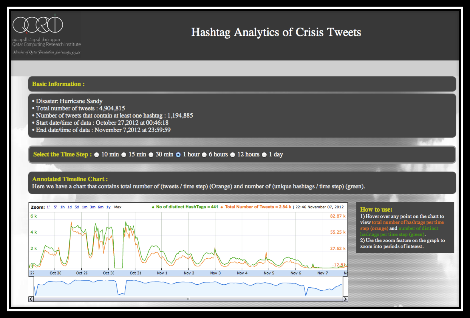
About 47 hours ago, the UN Office for the Coordination of Humanitarian Affairs (OCHA) activated the Digital Humanitarian Network (DHN) in response to the Pakistan Earthquake. The activation request was for 48 hours, so the deployment will soon phase out. As already described here, the Standby Volunteer Task Force (SBTF) teamed up with QCRI to carry out an early test of MicroMappers, which was not set to launch until next month. This post shares some initial thoughts on how the test went along with preliminary results.

Pakistan Quake

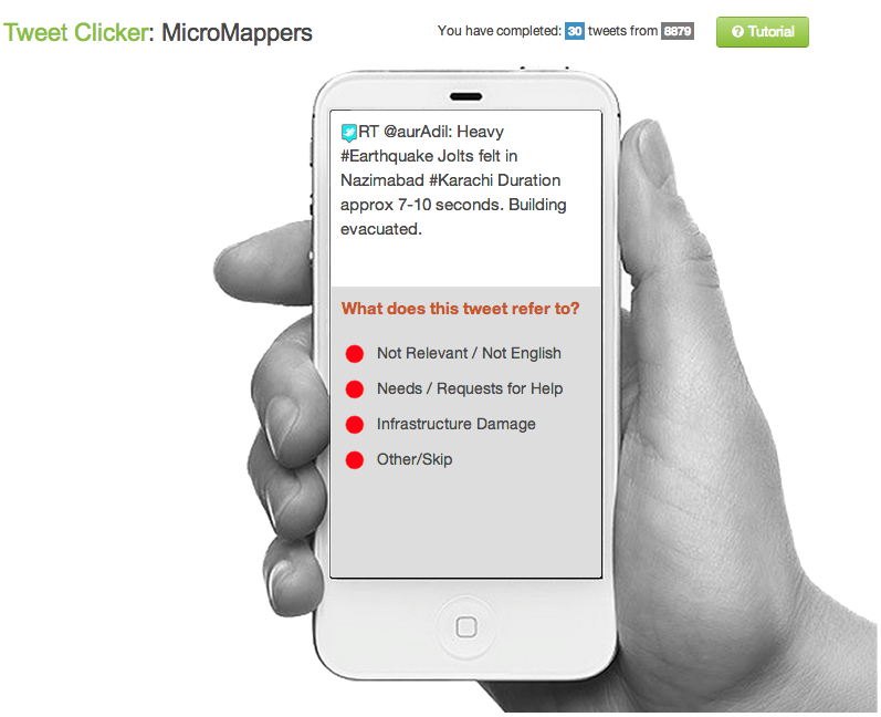
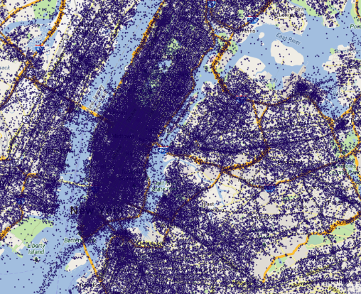
During ~40 hours, 109 volunteers from the SBTF and the public tagged just over 30,000 tweets that were posted during the first 36 hours or so after the quake. We were able to automatically collect these tweets thanks to our partnership with GNIP and specifically filtered for said tweets using half-a-dozen hashtags. Given the large volume of tweets collected, we did not require that each tweet be tagged at least 3 times by individual volunteers to ensure data quality control. Out of these 30,000+ tweets, volunteers tagged a total of 177 tweets as noting needs or infrastructure damage. A review of these tweets by the SBTF concluded that none were actually informative or actionable.

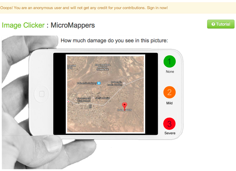
Just over 350 pictures were tweeted in the aftermath of the earthquake. These were uploaded to the ImageClicker for tagging purposes. However, none of the pictures captured evidence of infrastructure damage. In fact, the vast majority were unrelated to the earthquake. This was also true of pictures published in news articles. Indeed, we used an automated algorithm to identify all tweets with links to news articles; this algorithm would then crawl these articles for evidence of images. We found that the vast majority of these automatically extracted pictures were related to politics rather than infrastructure damage.

Pakistan Quake2

A few preliminary thoughts and reflections from this first test of MicroMappers. First, however, a big, huge, gigantic thanks to my awesome QCRI team: Ji Lucas, Imran Muhammad and Kiran Garimella; to my outstanding colleagues on the SBTF Core Team including but certainly not limited to Jus Mackinnon, Melissa Elliott, Anahi A. Iaccuci, Per Aarvik & Brendan O’Hanrahan (bios here); to the amazing SBTF volunteers and members of the general public who rallied to tag tweets and images—in particular our top 5 taggers: Christina KR, Leah H, Lubna A, Deborah B and Joyce M! Also bravo to volunteers in the Netherlands, UK, US and Germany for being the most active MicroMappers; and last but certainly not least, big, huge and gigantic thanks to Andrew Ilyas for developing the algorithms to automatically identify pictures and videos posted to Twitter.

So what did we learn over the past 48 hours? First, the disaster-affected region is a remote area of south-western Pakistan with a very light social media footprint, so there was practically no user-generated content directly relevant to needs and damage posted on Twitter during the first 36 hours. In other words, there were no needles to be found in the haystack of information. This is in stark contrast to our experience when we carried out a very similar operation following Typhoon Pablo in the Philippines. Obviously, if there’s little to no social media footprint in a disaster-affected area, then monitoring social media is of no use at all to anyone. Note, however, that MicroMappers could also be used to tag 30,000+ text messages (SMS). (Incidentally, since the earthquake struck around 12noon local time, there was only about 18 hours of daylight during the 36-hour period for which we collected the tweets).

Second, while the point of this exercise was not to test our pre-processing filters, it was clear that the single biggest problem was ultimately with the filtering. Our goal was to upload as many tweets as possible to the Clickers and stress-test the apps. So we only filtered tweets using a number of general hashtags such as #Pakistan. Furthermore, we did not filter out any retweets, which probably accounted for 2/3 of the data, nor did we filter by geography to ensure that we were only collecting and thus tagging tweets from users based in Pakistan. This was a major mistake on our end. We were so pre-occupied with testing the actual Clickers that we simply did not pay attention to the pre-processing of tweets. This was equally true of the images uploaded to the ImageClicker.

Pakistan Quake 3

So where do we go from here? Well we have pages and pages worth of feedback to go through and integrate in the next version of the Clickers. For me, one of the top priorities is to optimize our pre-processing algorithms and ensure that the resulting output can be automatically uploaded to the Clickers. We have to refine our algorithms and make damned sure that we only upload unique tweets and images to our Clickers. At most, volunteers should not see the same tweet or image more than 3 times for verification purposes. We should also be more careful with our hashtag filtering and also consider filtering by geography. Incidentally, when our free & open source AIDR platform becomes operational in November, we’ll also have the ability to automatically identify tweets referring to needs, reports of damage, and much, much more.

In fact, AIDR was also tested for the very first time. SBTF volunteers tagged about 1,000 tweets, and just over 130 of the tags enabled us to create an accurate classifier that can automatically identify whether a tweet is relevant for disaster response efforts specifically in Pakistan (80% accuracy). Now, we didn’t apply this classifier on incoming tweets because AIDR uses streaming Twitter data, not static, archived data which is what we had (in the form of CSV files). In any event, we also made an effort to create classifiers for needs and infrastructure damage but did not get enough tags to make these accurate enough. Typically, we need a minimum of 20 or so tags (i.e., examples of actual tweets referring to needs or damage). The more tags, the more accurate the classifier.

The reason there were so few tags, however, is because there were very few to no informative tweets referring to needs or infrastructure damage during the first 36 hours. In any event, I believe this was the very first time that a machine learning classifier was crowdsourced for disaster response purposes. In the future, we may want to first crowdsource a machine learning classifier for disaster relevant tweets and then upload the results to MicroMappers; this would reduce the number of unrelated tweets  displayed on a TweetClicker.

As expected, we have also received a lot of feedback vis-a-vis user experience and the user interface of the Clickers. Speed is at the top of the list. That is, making sure that once I’ve clicked on a tweet/image, the next tweet/image automatically appears. At times, I had to wait more than 20 seconds for the next item to load. We also need to add more progress bars such as the number of tweets or images that remain to be tagged—a countdown display, basically. I could go on and on, frankly, but hopefully these early reflections are informative and useful to others developing next-generation humanitarian technologies. In sum, there is a lot of work to be done still. Onwards!

bio

MicroMappers Launched for Pakistan Earthquake Response (Updated)

Update 1: MicroMappers is now public! Anyone can join to help the efforts!
Update 2: Results of MicroMappers Response to Pakistan Earthquake [Link]

MicroMappers was not due to launch until next month but my team and I at QCRI received a time-sensitive request by colleagues at the UN to carry out an early test of the platform given yesterday’s 7.7 magnitude earthquake, which killed well over 300 and injured hundreds more in south-western Pakistan.

pakistan_quake_2013

Shortly after this request, the UN Office for the Coordination of Humanitarian Affairs (OCHA) in Pakistan officially activated the Digital Humanitarian Network (DHN) to rapidly assess the damage and needs resulting from the earthquake. The award-winning Standby Volunteer Task Force (SBTF), a founding member of the DHN. teamed up with QCRI to use MicroMappers in response to the request by OCHA-Pakistan. This exercise, however, is purely for testing purposes only. We made this clear to our UN partners since the results may be far from optimal.

MicroMappers is simply a collection of microtasking apps (we call them Clickers) that we have customized for disaster response purposes. We just launched both the Tweet and Image Clickers to support the earthquake relief and may also launch the Tweet and Image GeoClickers as well in the next 24 hours. The TweetClicker is pictured below (click to enlarge).

MicroMappers_Pakistan1

Thanks to our partnership with GNIP, QCRI automatically collected over 35,000 tweets related to Pakistan and the Earthquake (we’re continuing to collect more in real-time). We’ve uploaded these tweets to the TweetClicker and are also filtering links to images for upload to the ImageClicker. Depending on how the initial testing goes, we may be able to invite help from the global digital village. Indeed, “crowdsourcing” is simply another way of saying “It takes a village…” In fact, that’s precisely why MicroMappers was developed, to enable anyone with an Internet connection to become a digital humanitarian volunteer. The Clicker for images is displayed below (click to enlarge).

MicroMappers_Pakistan2

Now, whether this very first test of the Clickers goes well remains to be seen. As mentioned, we weren’t planning to launch until next month. But we’ve already learned heaps from the past few hours alone. For example, while the Clickers are indeed ready and operational, our automatic pre-processing filters are not yet optimized for rapid response. The purpose of these filters is to automatically identify tweets that link to images and videos so that they can be uploaded to the Clickers directly. In addition, while our ImageClicker is operational, our VideoClicker is still under development—as is our TranslateClicker, both of which would have been useful in this response. I’m sure will encounter other issues over the next 24-36 hours. We’re keeping track of these in a shared Google Spreadsheet so we can review them next week and make sure to integrate as much of the feedback as possible before the next disaster strikes.

Incidentally, we (QCRI) also teamed up with the SBTF to test the very first version of the Artificial Intelligence for Disaster Response (AIDR) platform for about six hours. As far as we know, this test represents the first time that machine learning classifiers for disaster resposne were created on the fly using crowdsourcing. We expect to launch AIDR publicly at the 2013 CrisisMappers conference this November (ICCM 2013). We’ll be sure to share what worked and didn’t work during this first AIDR pilot test. So stay tuned for future updates via iRevolution. In the meantime, a big, big thanks to the SBTF Team for rallying so quickly and for agreeing to test the platforms! If you’re interested in becoming a digital humanitarian volunteer, simply join us here.

Bio

Taking the Pulse of the Boston Marathon Bombings on Twitter

Social media networks are evolving a new nervous system for our planet. These real-time networks provide immediate feedback loops when media-rich societies experience a shock. My colleague Todd Mostak recently shared the tweet map below with me which depicts tweets referring to “marathon” (in red) shortly after the bombs went off during Boston’s marathon. The green dots represent all the other tweets posted at the time. Click on the map to enlarge. (It is always difficult to write about data visualizations of violent events because they don’t capture the human suffering, thus seemingly minimizing the tragic events).

Credit: Todd Mostak

Visualizing a social system at this scale gives a sense that we’re looking at a living, breathing organism, one that has just been wounded. This impression is even more stark in the dynamic visualization captured in the video below.

This an excerpt of Todd’s longer video, available here. Note that this data visualization uses less than 3% of all posted tweets because 97%+ of tweets are not geo-tagged. So we’re not even seeing the full nervous system in action. For more analysis of tweets during the marathon, see this blog post entitled “Boston Marathon Explosions: Analyzing First 1,000 Seconds on Twitter.”

bio

Radical Visualization of Photos Posted to Instagram During Hurricane Sandy

Sandy Instagram Pictures

This data visualization (click to enlarge) displays more than 23,500 photos taken in Brooklyn and posted to Instagram during Hurricane Sandy. A picture’s distance from the center (radius) corresponds to its mean hue while a picture’s position along the perimeter (angle) corresponds to the time that picture was taken. “Note the demarcation line that reveals the moment of a power outage in the area and indicates the intensity of the shared experience (dramatic decrease in the number of photos, and their darker colors to the right of the line)” (1).

Sandy Instagram 2

Click here to interact with the data visualization. The research methods behind this visualization are described here along with other stunning visuals.

bio

Map: 24 hours of Tweets in New York

The map below depicts geo-tagged tweets posted between May 4-5, 2013 in the New York City area. Over 36,000 tweets are posted on the map (click to enlarge). Since less than 3% of all tweets are geo-tagged, the map is missing the vast majority of tweets posted in this area during those 24 hours.

New York Tweets 24 hours

Contrast the above with the 1-month worth of tweets (April-May 2013) depicted in the map below. Again, the visualization misses the vast majority of tweets since these are not geo-tagged and thus not mappable.

New York 1 Month Tweets

These visuals are screenshots of Harvard’s Tweetmap platform, which is publicly available here. My colleague Todd Mostak is one of the main drivers behind Tweetmap, so worth sending him a quick thank you tweet! Todd is working on some exciting extensions and refinements, so stay tuned as I’ll be sure to blog about them when they go live.

Bio

Data Science for 100 Resilient Cities

The Rockefeller Foundation recently launched a major international initiative called “100 Resilient Cities.” The motivation behind this global project stems from the recognition that cities are facing increasing stresses driven by the unprecedented pace urbanization. More than 75% of people expected to live in cities by 2050. The Foundation is thus rightly concerned: “As natural and man-made shocks and stresses grow in frequency, impact and scale, with the ability to ripple across systems and geographies, cities are largely unprepared to respond to, withstand, and bounce back from disasters” (1).

Resilience is the capacity to self-organize, and smart self-organization requires social capital and robust feedback loops. I’ve discussed these issues and related linkages at lengths in the posts listed below and so shan’t repeat myself here. 

  • How to Create Resilience Through Big Data [link]
  • On Technology and Building Resilient Societies [link]
  • Using Social Media to Predict Disaster Resilience [link]
  • Social Media = Social Capital = Disaster Resilience? [link]
  • Does Social Capital Drive Disaster Resilience? [link]
  • Failing Gracefully in Complex Systems: A Note on Resilience [link]

Instead, I want to make a case for community-driven “tactical resilience” aided (not controlled) by data science. I came across the term “tactical urbanism” whilst at the “The City Resilient” conference co-organized by PopTech & Rockefeller in June. Tactical urbanism refers to small and temporary projects that demonstrate what could be. We also need people-centered tactical resilience initiatives to show small-scale resilience in action and demonstrate what these could mean at scale. Data science can play an important role in formulating and implementing tactical resilience interventions and in demonstrating their resulting impact at various scales.

Ultimately, if tactical resilience projects do not increase local capacity for smart and scalable self-organization, then they may not render cities more resilient. “Smart Cities” should mean “Resilient Neighborhoods” but the former concept takes a mostly top-down approach focused on the physical layer while the latter recognizes the importance of social capital and self-organization at the neighborhood level. “Indeed, neighborhoods have an impact on a surprisingly wide variety of outcomes, including child health, high-school graduation, teen births, adult mortality, social disorder and even IQ scores” (1).

So just like IBM is driving the data science behind their Smart Cities initiatives, I believe Rockefeller’s 100 Resilient Cities grantees would benefit from similar data science support and expertise but at the tactical and neighborhood level. This explains why my team and I plan to launch a Data Science for Resilience Program at the Qatar Foundation’s Computing Research Institute (QCRI). This program will focus on providing data science support to promising “tactical resilience” projects related to Rockefeller’s 100 Resilient Cities initiative.

The initial springboard for these conversations will be the PopTech & Rockefeller Fellows Program on “Community Resilience Through Big Data and Technology”. I’m really honored and excited to have been selected as one of the PopTech and Rockefeller Fellows to explore the intersections of Big Data, Technology and Resilience. As mentioned to the organizers, one of my objectives during this two-week brainstorming session is to produce a joint set of “tactical resilience” project proposals with well articulated research questions. My plan is to select the strongest questions and make them the basis for our initial data science for resilience research at QCRI.

bio

Disaster Response Plugin for Online Games

The Internet Response League (IRL) was recently launched for online gamers to participate in supporting disaster response operations. A quick introduction to IRL is available here. Humanitarian organizations are increasingly turning to online volunteers to filter through social media reports (e.g. tweets, Instagram photos) posted during disasters. Online gamers already spend millions of hours online every day and could easily volunteer some of their time to process crisis information without ever having to leave the games they’re playing.

A message like this would greet you upon logging in. (Screenshot is from World of Warcraft and has been altered)

Lets take World of Warcraft, for example. If a gamer has opted in to receive disaster alerts, they’d see screens like the one above when logging in or like the one below whilst playing a game.

In game notification should have settings so as to not annoy players. (Screenshot is from World of Warcraft and has been altered)

If a gamer accepts the invitation to join the Internet Response League, they’d see the “Disaster Tagging” screen below. There they’d tag as many pictures as wish by clicking on the level of disaster damage they see in each photo. Naturally, gamers can exit the disaster tagging area at any time to return directly to their game.

A rough concept of what the tagging screen may look like. (Screenshot is from World of Warcraft and has been altered)

Each picture would be tagged by at least 3 gamers in order to ensure the accuracy of the tagging. That is, if 3 volunteers tag the same image as “Severe”, then we can be reasonably assured that the picture does indeed show infrastructure damage. These pictures would then be sent back to IRL and shared with humanitarian organizations for rapid damage assessment analysis. There are already precedents for this type of disaster response tagging. Last year, the UN asked volunteers to tag images shared on Twitter after a devastating Typhoon hit the Philippines. More specifically, they asked them to tag images that captured the damage caused by the Typhoon. You can learn more about this humanitarian response operation here.

IRL is now looking to develop a disaster response plugin like the one described above. This way, gaming companies will have an easily embeddable plugin that they can insert into their gaming environments. For more on this plugin and the latest updates on IRL, please visit the IRL website here. We’re actively looking for feedback and welcome collaborators and partnerships.

Bio

Acknowledgements: Screenshots created by my colleague Peter Mosur who is the co-founder of the IRL.

Using Social Media to Predict Disaster Resilience (Updated)

Social media is used to monitor and predict all kinds of social, economic, political and health-related behaviors these days. Could social media also help identify more disaster resilient communities? Recent empirical research reveals that social capital is the most important driver of disaster resilience; more so than economic and material resources. To this end, might a community’s social media footprint indicate how resilience it is to disasters? After all, “when extreme events at the scale of Hurricane Sandy happen, they leave an unquestionable mark on social media activity” (1). Could that mark be one of resilience?

Twitter Heatmap Hurricane

Sentiment analysis map of tweets posted during Hurricane Sandy.
Click on image to learn more.

In the immediate aftermath of a disaster, “social ties can serve as informal insurance, providing victims with information, financial help and physical assistance” (2). This informal insurance, “or mutual assistance involves friends and neighbors providing each other with information, tools, living space, and other help” (3). At the same time, social media platforms like Twitter are increasingly used to communicate during crises. In fact, data driven research on tweets posted during disasters reveal that many tweets provide victims with information, help, tools, living space, assistance and other more. Recent studies argue that “such interactions are not necessarily of inferior quality compared to simultaneous, face-to-face interactions” (4). What’s more, “In addition to the preservation and possible improvement of existing ties, interaction through social media can foster the creation of new relations” (5). Meanwhile, and “contrary to prevailing assumptions, there is evidence that the boom in social media that connects users globally may have simultaneously increased local connections” (6).

A recent study of 5 billion tweets found that Japan, Canada, Indonesia and South Korea have highest percentage of reciprocity on Twitter (6). This is important because “Network reciprocity tells us about the degree of cohesion, trust and social capital in sociology” (7). In terms of network density, “the highest values correspond to South Korea, Netherlands and Australia.” The findings further reveal that “communities which tend to be less hierarchical and more reciprocal, also displays happier language in their content updates. In this sense countries with high conversation levels … display higher levels of happiness too” (8).

A related study found that the language used in tweets can be used to predict the subjective well-being of those users (9). The same analysis revealed that the level of happiness expressed by Twitter users in a community are correlated with members of that same community who are not on social media. Data-driven studies on happiness also show that social bonds and social activities are more conducive to happiness than financial capital (10). Social media also includes blogs. A new study analyzed more than 18.5 million blog posts found that “bloggers with lower social capital have fewer positive moods and more negative moods [as revealed by their posts] than those with higher social capital” (11).

Collectivism vs Individualism countries

Finally, another recent study analyzed more than 2.3 million twitter users and found that users in collectivist countries engage with others more than those in individualistic countries (12). “In high collectivist cultures, users tend to focus more on the community to which they belong,” while  people in individualistic countries are “in a more loosely knit social network,” and so typically “look after themselves or only after immediate family members” (13). The map above displays collectivist and individualistic countries; with the former represented by lighter shades and the latter darker colors.

In sum, one should be able to measure “digital social capital” and thus disaster resilience by analyzing social media networks before, during and after disasters. “These disaster responses may determine survival, and we can measure the likelihood of them happening” via digital social capital dynamics reflected on social media (14). One could also combine social network analysis with sentiment analysis to formulate various indexes. Anyone interested in pursuing this line of research?

bio

Analyzing Crisis Hashtags on Twitter (Updated)

Update: You can now upload your own tweets to the Crisis Hashtags Analysis Dashboard here

Hashtag footprints can be revealing. The map below, for example, displays the top 200 locations in the world with the most Twitter hashtags. The top 5 are Sao Paolo, London, Jakarta, Los Angeles and New York.

Hashtag map

A recent study (PDF) of 2 billion geo-tagged tweets and 27 million unique hashtags found that “hashtags are essentially a local phenomenon with long-tailed life spans.” The analysis also revealed that hashtags triggered by external events like disasters “spread faster than hashtags that originate purely within the Twitter network itself.” Like other metadata, hashtags can be  informative in and of themselves. For example, they can provide early warning signals of social tensions in Egypt, as demonstrated in this study. So might they also reveal interesting patterns during and after major disasters?

Tens of thousands of distinct crisis hashtags were posted to Twitter during Hurricane Sandy. While #Sandy and #hurricane featured most, thousands more were also used. For example: #SandyHelp, #rallyrelief, #NJgas, #NJopen, #NJpower, #staysafe, #sandypets, #restoretheshore, #noschool, #fail, etc. NJpower, for example, “helped keep track of the power situation throughout the state. Users and news outlets used this hashtag to inform residents where power outages were reported and gave areas updates as to when they could expect their power to come back” (1).

Sandy Hashtags

My colleagues and I at QCRI are studying crisis hashtags to better understand the variety of tags used during and in the immediate aftermath of major crises. Popular hashtags used during disasters often overshadow more hyperlocal ones making these less discoverable. Other challenges include the: “proliferation of hashtags that do not cross-pollinate and a lack of usability in the tools necessary for managing massive amounts of streaming information for participants who needed it” (2). To address these challenges and analyze crisis hashtags, we’ve just launched a Crisis Hashtags Analytics Dashboard. As displayed below, our first case study is Hurricane Sandy. We’ve uploaded about half-a-million tweets posted between October 27th to November 7th, 2012 to the dashboard.

QCRI_Dashboard

Users can visualize the frequency of tweets (orange line) and hashtags (green line) over time using different time-steps, ranging from 10 minute to 1 day intervals. They can also “zoom in” to capture more minute changes in the number of hashtags per time interval. (The dramatic drop on October 30th is due to a server crash. So if you have access to tweets posted during those hours, I’d be  grateful if you could share them with us).

Hashtag timeline

In the second part of the dashboard (displayed below), users can select any point on the graph to display the top “K” most frequent hashtags. The default value for K is 10 (e.g., top-10 most frequent hashtags) but users can change this by typing in a different number. In addition, the 10 least-frequent hashtags are displayed, as are the 10 “middle-most” hashtags. The top-10 newest hashtags posted during the selected time are also displayed as are the hashtags that have seen the largest increase in frequency. These latter two metrics, “New K” and “Top Increasing K”, may provide early warning signals during disasters. Indeed, the appearance of a new hashtag can reveal a new problem or need while a rapid increase in the frequency of some hashtags can denote the spread of a problem or need.

QCRI Dashboard 2

The third part of the dashboard allows users to visualize and compare the frequency of top hashtags over time. This feature is displayed in the screenshot below. Patterns that arise from diverging or converging hashtags may indicate important developments on the ground.

QCRI Dashboard 3

We’re only at the early stages of developing our hashtags analytics platform (above), but we hope the tool will provide insights during future disasters. For now, we’re simply experimenting and tinkering. So feel free to get in touch if you would like to collaborate and/or suggest some research questions.

Bio

Acknowledgements: Many thanks to QCRI colleagues Ahmed Meheina and Sofiane Abbar for their work on developing the dashboard.

Boston Marathon Explosions: Analyzing First 1,000 Seconds on Twitter

My colleagues Rumi Chunara and John Brownstein recently published a short co-authored study entitled “Twitter as a Sentinel in Emergency Situations: Lessons from the Boston Marathon Explosions.” At 2.49pm EDT on April 15, two improvised bombs exploded near the finish line of the 117th Boston Marathon. Ambulances left the scene approximately 9 minutes later just as public health authorities alerted regional emergency departments of the incident.

Meanwhile, on Twitter:

BostonTweets

An analysis of tweets posted within a 35 mile radius of the finish line reveals that the word stems containing “explos*” and “explod*” appeared on Twitter just 3 minutes after the explosions. “While an increase in messages indicating an emergency from a particular location may not make it possible to fully ascertain the circumstances of an incident without computational or human review, analysis of such data could help public safety officers better understand the location or specifics of explosions or other emergencies.”

In terms of geographical coverage, many of the tweets posted during the first 10 minutes were from witnesses in the immediate vicinity of the finish line. “Because of their proximity to the event and content of their postings, these individuals might be witnesses to the bombings or be of close enough proximity to provide helpful information. These finely detailed geographic data can be used to localize and characterize events assisting emergency response in decision-making.”

BostonBombing2

Ambulances were already on site for the marathon. This is rarely the case for the majority of crises, however. In those more common situations, “crowdsourced information may uniquely provide extremely timely initial recognition of an event and specific clues as to what events may be unfolding.” Of course, user-generated content is not always accurate. Filtering and analyzing this content in real-time is the first step in the verification process, hence the importance of advanced computing. More on this here.

“Additionally, by comparing newly observed data against temporally adjusted keyword frequencies, it is possible to identify aberrant spikes in keyword use. The inclusion of geographical data allows these spikes to be geographically adjusted, as well. Prospective data collection could also harness larger and other streams of crowdsourced data, and use more comprehensive emergency-related keywords and language processing to increase the sensitivity of this data source.” Furthermore, “the analysis of multiple keywords could further improve these prior probabilities by reducing the impact of single false positive keywords derived from benign events.”

bio